Quantcast
Channel: Envato Tuts+ Design & Illustration
Viewing all 6352 articles
Browse latest View live

The Amazing Illustrations of Marta de Andres

$
0
0

Today we bring you a collection of illustrations from Spanish designer Marta De Andres. Marta’s artwork features a wide variety of artistic styles including matte paintings and her signature style of digital impressionism.


Spaceships Sky City

This stunning Sci-fi inspired matte painting features an incredible amount of detail in all of the spacecraft as well as the surrounding scenery.


Post Apocalyptic Fantasy

This portrait features a beautiful character developed by Marta. The whole painting features a lot of depth in the characters expression and overall appearance.


Fantasy Matte Painting

Here is another one of Marta’s matte paintings, this time we see some exotic scenery and wonderful composition of the overall environment.


Winter Heart

This digital painting features Marta’s design style that she calls Digital Impressionism. The wonderful combination of colors makes for an overall stunning painting.


Floating Rock

This client piece that Marta created contains some more stunning exotic scenery with realistic texturing and great composition/


Black Swan Ugly Duckling

This piece features some more imaginative painting mixed with a wide array of great colors that blend together perfectly.


Castle and City Wall Village

Another interesting landscape painting that features some impressive and complete architecture of a city lost in time and space.


Achilles Concept Art

More digital impressionism, this time we have an ominous character with some interesting abilities. Once again the mixture of colors and patterns works to perfection in this unique art style.


Latex Heroine

Here we see some more character development but this time it is painted in a more realistic fashion and it still looks fantastic.


White Fairy

This illustration is a little out of Marta’s usual style of paintings but she still ends up creating a beautiful painting. The emotion in the character as well as the whole atmosphere of the painting make for great fantasy artwork.


Dragon Warrior

Here is another example of Marta’s talent to create wonderful fantasy scenery while at the same time using a great selection of colors that are vibrant and beautiful.


Earth Matte

This matte painting shows off some realistic texture effects as well as an overall space atmosphere that looks mesmerizing.


Underground City

This matte painting like the first features a ton of amazing detail. From the contours of the rocks to the spacecraft, everything looks unique


Ari Concept Art

Another great attempt at a wide combination of colors and textures that come together perfectly.


Fantasy Matte Painting Snow

The last piece of Marta’s we will feature is this calm and serene matte painting. The composition of the environment looks fantastic as all of the natural lighting and coloring is perfect.


Marta on the Web


Create a Fabric Textured Web Layout Using Photoshop

$
0
0

This tutorial is another collaboration with a very good friend Ciursa Ionut. In this web design tutorial we will create a portfolio web layout using fabric textures. You will be taken through the process of designing the logo using Adobe Illustrator, creating spotlights for the "services" area and how to apply textures to the layout in a subtle way that will increase the quality of the final result. Let’s get started!


Tutorial Assets

The following assets were used during the production of this tutorial.


Introduction

In this tutorial we will use the 960 Grid System. Download it and unzip the archive file. Then open the “960_grid_12_col.psd” file in Photoshop.

The 12 red columns that you see is the grid that we are going to use. You can hide the red bars by clicking on the eye icon of the “12 Col Grid” layer. This PSD file contains some guides as well, which will be very useful. To activate them go to View > Show > Guides, or use the shortcut Command/Ctrl + ;. I usually hide the red bars and activate the guides whenever I need them.

Also, smart guides are very useful when designing web layouts. Activate/deactivate them by going to View > Show > Smart Guides. They will help you align each layer depending on the position of other layers.

During this tutorial you will be asked you to create shapes with certain dimensions. When you create a shape you will see its exact width and height in the Info panel (Window > Info).

Now that we covered the basics of using the 960 Grid System, we can move on to creating the actual web layout. Let’s get started!


Step 1: Setting up the document

Open the "960_grid_12_col.psd" file in Photoshop. Then go to Image > Canvas Size and set the width to 1200px and the height to 2400px. This will give us enough space to work with.


Step 2: Creating the header of our web layout

Create a new group and name it "Header". Select the Rectangle Tool (U) and create a rectangle with the dimensions 1200px by 520px and the color #595e61. Name this layer "header bg", right-click on it and select Convert to Smart Object.

Go to Filter > Noise > Add Noise and use the settings from the image below. This will create a nice subtle texture.

Download this pack of fabric patterns and open the .PAT file in Photoshop. Then double-click on the "header bg" layer to open the Layer Style window and add a Pattern Overlay effect with the settings from the image below and a pattern from the pack you downloaded.


Step 3: Creating the navigation background

Select the Rectangle Tool (U) and create a rectangle at the top of your document with the height 120px and the color #000000. Name this layer "navigation bg". Set the Fill of this layer to 20%, double-click on it and use the settings from the image below for Inner Shadow.

Now we will add a circle to the "navigation bg" layer to make room for the logo later on. Select the Ellipse Tool (U) and click on the "Add to shape area (+)" button from the option bar above your image.

Click on the vector mask of the "navigation bg" layer to make it active. Then using the Ellipse Tool, hold down the Shift key and create a circle in the middle of the navigation bar with the radius 140px. Take a look at the following image for reference.


Step 4: Creating a dotted line pattern

Create a new document (Command/Ctrl + N) with the dimensions 3px by 1px. Zoom in as much as you can. Then select the Rectangular Marquee Tool (M) and create a square selection as you see in the following image. Create a new layer and fill the selection with white.

Hide the "Background" layer by clicking on its eye icon. Then hit Command/Ctrl + D to deselect. Save your pattern by going to Edit > Define Pattern. Give your pattern a name and click OK.

Go back to your web layout document. Select the Line Tool (U) and set the Weight to 1px. Then hold down the Shift key and create a horizontal line at the bottom of your navigation bar.

Set the Fill of this layer to 0% and the Opacity to 20%. Double-click on this layer to open the Layer Style window and add the pattern you created earlier.

Now we need to erase the area of the dotted line that goes over the circle. Use the Rectangular Marquee Tool (M) to select that area. Then go to Layer > Layer Mask > Hide Selection.


Step 5: Adding gradients to the header background

Use the Rectangular Marquee Tool (M) to create a selection as you see in the image below (1). Then go to Layer > New Fill Layer > Gradient and use the settings from the following image (2).

Click on the mask of this layer to make it active. Then select a black soft brush (B) and paint with it over the area where the gradient covers the navigation bar circle (3). Set the opacity of this layer to 3% (4).

Now we will add a radial gradient at the bottom of the header background. Hold down the Command/Ctrl key and click on the thumbnail of the "header bg" layer to load a selection of it. Then go to Layer > New Fill Layer > Gradient and use the settings from the image below (1).

With the Gradient Fill window still opened, click on your image and drag down. Set the blend mode of this layer to Soft Light 40%.


Step 6: Adding subtle grunge brushes to the header background

Download this pack of brushes and open them in Photoshop. Create a new group and name it "brushes". Then create a selection of the "header bg" layer (hold down the Command/Ctrl key and click on its thumbnail). Make sure that the "brushes" layer is active and go to Layer > Layer Mask > Reveal Selection. Now everything we put inside this group will be visible only over the header area.

Create a new layer inside this group. Set the foreground color to white. Select the Brush Tool (B) and use some of the brushes you downloaded to add a subtle grunge effect to the header. Create a new layer for each brush you use and adjust the opacity of each layer. Then set the blend mode of the "brushes" group to Soft Light. Take a look at the following image for reference.


Step 7

Select the Line Tool (U), hold down the Shift key and create a horizontal line with the Weight 1px and the color #50565a. Name this layer "1px line" and put it at the bottom of the header area.

Duplicate this layer (Command/Ctrl + J), select the Move Tool (V) and hit the up arrow key on your keyboard to move it one pixel up. Change the color of this line to #8e9496.


Step 8: Creating the logo

To create the logo we will use both Adobe Photoshop and Illustrator. First, we will create the text and a circle with dashed stroke in Illustrator and then we will complete the logo using Photoshop.

Fire up Adobe Illustrator and create a new document. Select the Type Tool (T) and write "My Folio". Put each word in a separate object. The font that I used is called Akzidenz-Grotesk Condensed Medium Italic.

Select the two text objects using the Selection Tool (V) and go to Object > Expand. This will make the text layers editable so we can modify the anchor points.

Select the word "My" and move it down to connect the bottom area of the letter "Y" with the top area of the letter "F".

Use the Direct Selection Tool (A) to select the anchor points from the bottom of the "Y" letter, as you see in the image below. Then hit the Backspace key to delete them.

Use the Pen Tool (P) to reconstruct the bottom area of the letter "Y" and connect it to the "F" letter. Make sure that you close the path. Take a look at the following image for reference.

Now we need to create a circle with a white dashed stroke. Select the Ellipse Tool (L), hold down the Shift key and create a circle with no Fill and a 1pt white Stroke. Then go to the Stroke panel (Window > Stroke) and use the settings from the following image.

Change the color of the text to white. I added a grey rectangle underneath all objects in order to see the text and the circle.

Finishing the logo in Adobe Photoshop

Go back to Photoshop, create a new group and name it "Logo". Then select the Ellipse Tool (U) and create a circle with the dimensions 125px by 125px and the color #2e3134.

Name this layer "circle", double-click on it to open the Layer Style window and add a Pattern Overlay effect using the following settings. The leather pattern that I used is from the pack you downloaded at the beginning of this tutorial.

Copy the text objects from Illustrator, go back to Photoshop and paste them as a smart object. Use Free Transform (Command/Ctrl + T) to change the size of this layer and put it in the center of the dark circle. Add a Color Overlay effect to this layer using the color #f4f4f4.

Copy the dashed circle from Illustrator and paste it in Photoshop as smart object. Use Free Transform (Command/Ctrl + T) to change the size of this layer and put it in the middle of the dark circle. Name this layer "dashed circle" and set its opacity to 60%.

Duplicate the "dashed circle" layer (Command/Ctrl + J). Use Free Transform (Command/Ctrl + T) to change the size of this layer until it reaches the curved edge underneath the logo. Name this layer "bottom border".

Use the Rectangular Marquee Tool (M) to select the upper area of the circle as you see in the image below. Then go to Layer > Layer Mask > Hide Selection. This will leave a dotted curved line underneath the logo, just like we want.


Step 9: Adding the navigation

Create a new group and name it "Navigation". Select the Type Tool (T) and write the name for your navigation menu items using the font Oswald and the color white. Spread your navigation items equally in the left and right hand side of the logo.

Creating the style for the active menu item

Select the Rounded Rectangle Tool (U) and set the Radius to 4px. Then create a rounded rectangle underneath one of our navigation items with the height 32px and the color black.

Set the Fill of this layer to 25%, double-click on it to open the Layer Style window and use the settings from the following image.


Step 10: Creating the "Featured" area

Create a new group and name it "Featured". Select the Type Tool (T) and write the name of your project using the font Oswald with the size 22pt and the color white. Put this layer in the left hand side of the layout and at 50px underneath the navigation bar.

Select the Line Tool (U) and create a horizontal line with the width 300px. Set the Fill of this layer to 0% and the Opacity to 50%. Double-click on this layer and add the dotted line pattern that you created earlier in this tutorial.

Use the Type Tool (T) to add a block of text underneath the horizontal line. Use the font Helvetica with the color white and the size 13pt. Go to the Character panel (Window > Character) and set the leading (the distance between lines of type) to 24 pt to make the text more readable.

Creating a "Read More" button

Create a new group and name it "button". Select the Rectangle Tool (U) and set the Radius to 4px. Then create a rounded rectangle underneath the block of text with the size 110px by 30px and the color #9ca2a6. Name this layer "button".

Duplicate the "button" layer (Command/Ctrl + J) and move this new layer underneath the original one. Select the Move Tool (V) and hit the down arrow on your keyboard once to move this layer one pixel down. Set the opacity of this layer to 50%.

Duplicate the previous layer (Command/Ctrl + J) and change its color to #54585b. Move this layer one pixel down and set its opacity to 100%.

Now you should have three "button" layers. Double-click on the top one to open the Layer Style window and use the settings from the image below. The color that I used for the Stroke effect is #54585b.

Hold down the Command/Ctrl key and select the two "button" layers from the bottom. Right-click on one of them and select Convert to Smart Object.

Double-click on this layer to open the Layer Style window and use the settings from the following image for Gradient Overlay. This will add a subtle 3D effect to the button.

Hold down the Command/Ctrl + Shift keys and click on the thumbnail of the "button" smart object and then on the vector mask of the "button" layer. This will create a selection of the entire button. Create a new layer and fill the selection with white. Hit Command/Ctrl + D to deselect.

Right-click on this layer and select Convert to Smart Object. Then go to Filter > Noise > Add Noise and use the settings from the image below. Set the blend mode of this layer to Multiply 25%.

Now select the Type Tool (T) and write "Read More" on your button using the font Oswald with the size 15pt and the color white. Double-click on this layer to open the Layer Style window and use the settings from the following image for Drop Shadow.


Step 11: Adding an image slider

Create a new group and name it "image slider". Select the Rectangle Tool (U) and create a rectangle with the dimensions 620px by 300px. Name this layer "image_holder", double-click on it to open the Layer Style window and use and use the setting from the following image for Outer Glow.

Open an image in Photoshop that you want you feature in this area and move it into your web layout document using the Move Tool (V). Name this layer "image" and put it over the "image_holder" layer. Then right click on it and select Create Clipping Mask. Now your image will be visible only over the area of the "image_holder" layer.

Creating the image slider arrows

Select the Custom Shape Tool (U), right-click on your image and select one of the arrow shapes. Then create an arrow in the right hand side of your image slider using the color #e2e6e8.

Name this layer "right arrow", double-click on it to open the Layer Style window and use the settings from the following image. Right-click on this layer and select Convert to Smart Object. Then set its opacity to 40%.

Duplicate this layer (Command/Ctrl + J) and name the new one "left arrow". Then go to Edit > Transform > Flip Horizontal. Move this arrow in the left hand side of the web layout. Take a look at the following image for reference.

Creating the navigation bullets for the image slider

Create a new group and name it "navigation bullets". Select the Ellipse Tool (U), hold down the Shift key and create a circle with the dimensions 10px by 10px and the color #4d5357. Name this layer "navigation bullet".

Duplicate this layer (Command/Ctrl + J) a few times and arrange them as you see in the image below.

Select the Ellipse Tool (U) again and create a smaller circle in the middle of a navigation bullet to indicate the active image. For this circle use the color #9ca2a4.


Step 12: Creating "Services" area

Create a new group and name it "Services". Select the Rectangle Tool (U) and create a rectangle with the height 450px and the color #fafafa.

Name this layer "services bg", right-click on it and select Convert to Smart Object. Then go to Go to Filter > Noise > Add Noise and use the settings from the following image.

Double-click on this layer to open the Layer Style window and use the settings from the following image for Inner Shadow and Outer Glow.

Select the Line Tool (U) and drag a horizontal line at the bottom of the "services" area using the color #d2d2d2. Name this layer "1px line".

Duplicate this layer (Command/Ctrl + J) and change the color of the new line to white. Then move this layer 1px up.


Step 13: Adding the content for the "Services" area

Select the Type Tool (T) and write the word "Services" with the size 38pt and the color #5b656a. Put this layer in the left hand area of the web layout and at 40px underneath the "featured" area.

Create a new group and name it "web design". Create another group inside this one and name it "spotlights". We will design a 3D-looking room with some spotlights over an image.

Select the Rectangle Tool (U) and create a rectangle with the dimensions 300px by 100px and the color #3b444a. Name this layer "border", right-click on it and select Convert to Smart Object.

Go to Go to Filter > Noise > Add Noise and use the settings from the image below. Then double-click on this layer to open the Layer Style window and use the settings from the following image for Gradient Overlay.

Now I will show you how to create the 3D-looking room. First, select the Rectangle Tool (U) and create a gray rectangle with the dimensions 286px by 86px and put it in the center of the "border" rectangle. This is a temporary layer that will help us create the walls.

Select the Rectangle Tool (U) and create a rectangle with the height 22px and the color #434f57. Make sure this layer does not go over the gray rectangle. Name this layer "floor", double-click on it to open the Layer Style window and use the settings from the following image.

Create a new rectangle with the dimensions 240px by 64px and the color #3b4851. Name this layer "front wall" and position it as you see in the image below. Ten add a Gradient Overlay effect to this layer.

Using the Direct Selection Tool (A), select the upper right hand corner of the "floor" layer and move it to the left. Then select the upper left hand corner and move it to the right. Take a look at the following image for reference.

Create a rectangle in the left hand side of the 3D room with the color #39444b. Use the Direct Selection Tool (A) to reposition the bottom right hand corner of this rectangle, as you see in the image below. Double-click on this layer to open the Layer Style window and use the settings from the following image.

Duplicate this layer (Command/Ctrl + J) and move it to the right. Then change the angle of the Gradient Overlay to 0.

Create a new rectangle at the top of the 3D room using the color #505e67. Name this layer "ceiling" and use the Direct Selection Tool (A) to adjust the bottom corners like you did for the "floor" layer. Double-click on this layer to open the Layer Style window and use the settings from the following image.

Now you can delete the gray rectangle you added at the beginning of this step. Below you can see how my "3d room" group looks like.

Right-click on the "3d room" group and select Convert to Smart Object. Then go to Go to Filter > Noise > Add Noise and use the settings from the following image.

Double-click on this layer to open the Layer Style window and use the settings from the image below.


Step 14: Creating the spotlights

Create a new group and name it "top lights". Then select the Ellipse Tool (U) and create a white circle, as you see in the image below. Right-click on this layer and select Convert to Smart Object. Then go to Filter > Blur > Radial Blur and use the settings from the image below. Name this layer "light 1".

Create a new circle, bigger than the previous one. Name this layer "light 2" and convert it to smart object. Then apply a Radial Blur Filter with the same settings.

Repeat the process one more time with a bigger circle. Name this layer "light 3". Take a look at the following image for reference.

Group the three "light" layers together and set the opacity of each one as follows:

  • "light 1" – 70%
  • "light 2" – 50%
  • "light 3" – Soft Light 40%

Duplicate the group two times and arrange your spotlights as you see in the image below.

Hold down the Command/Ctrl + Shift keys and click on the thumbnail of each "light" layer to select them. Then go to Layer > New Adjustment Layer > Hue & Saturation and use the settings from the following image. This will add a subtle blue color to the lights.

Some of the lights might go over the border of the 3D room. To correct this, hold down the Command/Ctrl key and click on the thumbnail of the "3d room" layer. Then click on the "top lights" group to make it active and go to Layer > Layer Mask > Reveal Selection.

Create a new group and name it "floor lights". Then use the Ellipse Tool (U) to create three ellipses as you see in the image below. Convert each layer to a smart object. Then add a Gaussian Blur filter and a Noise filter to each layer. Set the opacity of these layers to 40%.

Then you can add an image in the middle of the 3d room that represents the design service you added. I used the Webdesign Tuts+ logo.


Step 15

Select the Rectangle Tool (U) and create a white rectangle with the dimensions 300px by 210px underneath the spotlights area. Name this layer "content bg", double-click on it to open the Layer Style window and use the settings from the following image for Outer Glow.

Select the Pen Tool (P) and create a triangle shape using the color #d1d6da, as you see in the image below. You can activate the guides to help you create this shape.

Name this layer "top triangle", double-click on it to open the Layer Style window and use the settings from the following image. The color that I used for the Stroke effect is #c5cace.

Select the Type Tool (T) and add the content for this service box. For the headline use the font Oswald with the size 20pt and the color #747d82.

For the block of text use the font Helvetica Regular with the size 13pt and the color #5f6c74. Also, set the leading of this text layer to 24pt from the Character panel.

Create a new black dotted line pattern just like you created the white one at the beginning of this tutorial. Then use the Line Tool (U) to drag a horizontal line between the headline and the block of text. Set the Fill of this layer to 0% and apply the pattern you created.

Copy the "Read more" button from the "featured" area (right-click on its group and select Duplicate Group). Then move the new button underneath the block of text from the "services" area. Take a look at the following image for reference.


Step 16

Duplicate the "web design" group two times and arrange the new columns as you see in the image below. Then replace the headlines and the images that are under the spotlights.


Step 17: Creating the "Portfolio" area

Create a new group underneath the "Services" group and name it "Portfolio". Then select the Rectangle Tool (U) and create a rectangle with the height 590px and the color #f1f1f1 underneath the "services" area.

Name this layer "portfolio bg", right-click on it and select Convert to Smart Object. Go to Filter > Noise > Add Noise and use the settings from the following image. Then double-click on this layer to open the Layer Style window and apply one of the fabric textures you downloaded.

Select the Type Tool (T) and write "Portfolio" in the upper left corner of this area. I used the font Oswald with the size 38pt and the color #5b656a.


Step 18: Adding the portfolio items

Create a new group and name it "images". Then select the Rectangle Tool (U) and create a rectangle with the dimensions 180px by 140px. Name this layer "image_holder".

Duplicate this layer (Command/Ctrl + J) and move the new rectangle to the right at 10px distance from the first one. Continue to duplicate this layer until you create a grid like you see in the image below.

Open some images that you want to showcase in the "portfolio" area. Drag each image over one "image_holder" layer, right-click on the layers of the images and select Create Clipping Mask. This will put an image inside each rectangle.

In the image below there are two columns where I did not add any images. We will use that area to add a detailed portfolio item.


Step 19: Adding a detailed portfolio item

Create a new group and name it "active project". Select the Rectangle Tool (U) and create a rectangle over the two columns that have no images using the color #595e61.

Select the Rectangle Tool again and create an image holder with the dimensions 330px by 160px. Open an image that you want to display in this area and put it over the "image_holder" layer. Right-click on the "image" layer and select Create Clipping Mask.

Select the Type Tool (T) and add some content to this area. For the headline use the font Oswald with the size 22pt and the color white. For the block of text use the font Helvetica Regular with the size 13pt and the color #fafafa.

Duplicate one of the previous "Read more" buttons and put it underneath the block of text from the "active project" area.

Create a new group and name it "close button". Select the Rectangle Tool (U), hold down the Shift key and create a square with the dimensions 20px by 20px and the color #484c4f. Put this rectangle in the upper right corner of the "active project" area.

Select the Line Tool (U) and create two diagonal lines to form an "X" shape. Hold down the Shift key to drag a line at 45°.


Step 20: Creating the "Blog" area

Create a new group and name it "blog". Select the Rectangle Tool (U) and create a rectangle with the height 340px underneath the "portfolio" area using the color #fafafa.

Right-click on this layer and select Convert to Smart Object. Go to Filter > Noise > Add Noise and use the settings from the image below.

Select the Line Tool (U) and create a horizontal line at the top of this rectangle using the color #d2d2d2. Duplicate this layer (Command/Ctrl + J) and move the new line one pixel down. Change the color of this line to white.


Step 21: Adding blog posts

Select the Type Tool (T) and write "Blog" in the upper left corner of this area using the font Oswald with the size 38pt and the color #5b656a.

Create a new group and name it "post #1". Select the Rectangle Tool (U) and create an image holder with the dimensions 180px by 140px. Open an image that you want to display in this area and drag it over the "image_holder" layer. Right-click on the "image" layer and select Create Clipping Mask to make it visible only over the area of the "image_holder" layer.

Select the Type Tool (T) and add some content next to the image. For the headline use the font Oswald with the size 22pt and the color #747d82. For the block of text use the font Helvetica Regular with the size 13pt and the color #5f6c74. Also, set the leading of this paragraph to 24pt. Then add a "Read more" button underneath the block of text.

Duplicate the "post #1" group and move the new one to the right. Then you can change the image and content for this new blog post.


Step 22: Creating the "Footer" area

Create a new group and name it "footer". Duplicate the "header bg" layer (Command/Ctrl + J) from the "Header" group and move it at the bottom of the layout, underneath the "Blog" area. Name this layer "footer bg".

Hold down the Command/Ctrl key and click on the thumbnail of the "footer bg" layer to select it. Then go to Layer > New Fill Layer > Gradient and use the settings from the image below. While the Gradient Fill window is still opened, click on your image and move the gradient up, as you see in the following image.

Set the blend mode of this layer to Soft Light 40%.

Select the Line Tool (U) and create a horizontal line at the top of your "Footer" area using the color #50565a. Name this layer "1px line".

Duplicate this layer (Command/Ctrl + J) and move it one pixel down. Then change the color of this line to #8e9496.


Step 23: Creating the "About" area

Now we will split the footer into three columns: "About", "Twitter" and "Contact".

Create a new group and name it "about". Select the Type Tool (T) and write "About me" at the top of the first column. Leave a distance of 40px between the top edge of the "footer" area and this text layer.

Select the Line Tool (U) and create a horizontal line underneath the headline. Set the Fill of this layer to 0% and the opacity to 50%. Then apply to this layer the white dotted line pattern that you created in this tutorial.

Use the Type Tool (T) to add a block of text underneath the dotted line using the font Helvetica Regular and the color #fafafa. Set the leading of this paragraph to 24pt from the Character panel. Then add a "Read more" button underneath the block of text.


Step 24: Creating the "Follow me" area

Create a new group and name it "follow me". Then add a headline and a couple of tweets in this area. Use the same dotted line to separate the blocks of text.

Add a "Read more" button underneath the tweets. Select the Type Tool (T) and change the text into "Follow me".

Download this set of Twitter birds and move a couple of them into your web layout document, underneath the "follow me" area. Add a Drop Shadow effect to these bird layers using the settings from the image below.


Step 25: Creating the "Contact" area

Create a new group and name it "Contact". Then add a headline to this area and a dotted line underneath it.

Use the Rectangle Tool (U) to create the contact form, as you see in the following image. Fill each rectangle with the color #eff0f0. Then add an Inner Glow and a Stroke effect to each rectangle layer. The color that I used for the Stroke layer style is #4d5254.

Select the Type Tool (T) and write inside each rectangle what it represents (name, subject, email, message).

Add a "Read more" button button underneath the Contact Form and change the text to read "Send".


Step 26: Adding the "Copyright" area

Create a new group and name it "Copyright". Then select the Rectangle Tool (U) and create a black rectangle as you see in the image below. Name this layer "copyright bg" and set its the blend mode to Overlay 20%.

Select the Line Tool (U) and create a horizontal line at the top of the rectangle you created earlier. Set the Fill of this layer to 0% and the Opacity to 35%. Then apply the dotted line pattern that you created in this tutorial.

Select the Type Tool (T) and add a copyright statement in the middle of the dark rectangle. Use the font Helvetica Regular with the size 12pt and the color #b1b5b7.


Final Result

We’re finished. Below you can see the final result of this tutorial. Click on the image to see the full-size version.

I hope you enjoyed this tutorial and you learned some new things for designing web interfaces. Leave any comments or questions you have in the comments section below.


A Look into Slashthree’s Latest Experiment “Quote Unquote”

$
0
0

The talented designers over at Slashthree have recently released a new exhibition that they named Quote Unquote. Each work of art features an interesting quote that the artist decided to draw inspiration from. The whole exhibition contains over 50 various types of works that range from visual illustrations, photographs, and even music.


We Are of Peace Always by Erik Schumacher


Time by Ed Lopez


They Were Here by Alexander Latille


The Creators by Anthony Giacomino


Spirit by Przemek Nawrocki


Rebirth by Wojciech Magierski


Dark Allies by Rob Shields


The Left Hand of Darkness by Rob Shields


Locus Amoenus by Anthony Giacomino


Impact by Martin De Diego Sadaba

Just before the New Era project was launched, Slashthree welcomed Tarin Yuangtrakul, a 19 year old artist from Thailand. Tarin’s impact on the collective was instantaneous, and his two submissions to “Quote Unquote” demonstrate the progress he has made as an artist since joining the collective, and showed true dedication to the exhibition. Tarin’s sublime mixture of traditional and digital art was something new which captivated the entire artist core. Tarin Yuangtrakul has become not only the first traditional artist to be named as the “featured artist” for a Slashthree exhibition, but also the youngest artist in Slashthree’s history to receive the honour. Site Director Saad Moosajee sat down with Tarin to discuss life and art; you can read the interview here. -Saad Moosajee

Hammer to Fall by Leonardo Dentico


Esta Especie De Alma by Samuel Pereira


Erinye by Wojciech Pijecki


Don’t Watch TV on LSD by Vladimir Tomin


Carry the Fire by Marco Casalvieri


Carefull What You Fish For by Vladimir Tomin


The Mountains Are Calling And I Must Go by Neil Hanvey


Enimies Still Stay by Tarin Yuangtrakul


La Martiniana by Edmar Cisneros


Land Within by Ed Lopez


More Information

Keep an eye on the Slashthree home page, as well as their Facebook and Twitter accounts for announcements and updates! For now though, please feast your eyes on Exhibition 17: “Quote Unquote”.


Professional Sharpening Techniques in Photoshop

$
0
0

You might be surprised how many images are sharpened at some point in Photoshop before you see them in print or online. In this detailed tutorial we will explain how sharpening works, when you should apply sharpening to your images, and how best to do it during the post production process. Let’s get started!


Create a Surreal, Politically-Charged Photo Manipulation – Tuts+ Premium Tutorial

$
0
0

Photoshop is a fantastic tool to help you create all types of artwork. By combining the right photographs, you can say just about anything you want without saying a word. In this Tuts+ Premium tutorial, author Mario Sánchez Nevado will demonstrate how to create a politically charged photo manipulation using quite a few stock photographs. This tutorial is available exclusively to Tuts+ Premium Members. If you are looking to take your photo manipulation skills to the next level then Log in or Join Now to get started!

Tuts+ Premium Members can login now for instant access to this tutorial. Membership to Tuts+ Premium gets you access to hundreds of exclusive premium tutorials, top selling ebooks, in-depth courses, member forums, and much more. To learn more about Tuts+ Premium, Take the Tour or Join Today.


Quick Tip: Create a Stitched Web Ribbon in Photoshop

$
0
0

You don’t have to search the web for very long to find a web ribbon in the corner of an image. In this quick tip tutorial we will show you how to create your own. Let’s get started!


Tutorial Assets

The following assets were used during the production of this tutorial.


Step 1

Create a new document and name it “Ribbon”. For this example, we’ll do a 600×600 pixel canvas.


Step 2

Create a new layer and name it “Background Texture”. Now fill it with a light color (I used #cccccc). Now go Filter > Noise > Add Noise and add some noise to the layer to help create some texture. I used the following settings:

  • Amount: 10%
  • Distribution: Gaussian
  • Monochromatic: Checked

Now set the “Background Texture” layer opacity to 15%


Step 3

Now let’s create the box where our image goes. For this example, I am using the rectangle tool with a fixed dimension of 300×200 pixels.

Just place it in the middle of the canvas and name the layer “Clipping Mask”


Step 4

Add the following layer styles to the “Clipping Mask” to give it a nice shadow and outline.


Step 5

Using whatever image you like (I used the PSD Tuts screenshot) place it in the document, on top of the “Clipping Mask” layer and go to Layer > Create Clipping Mask


Step 6

Now we’ve got our image upon which we’ll place our ribbon. Start by using the rectangle tool and draw the ribbon. You’ll then want to rotate it about 35 degrees. Use the free transform tool (keyboard shortcut for free transform (Command/Ctrl + T) or go to Edit > Free Transfrom). Make sure your ribbon’s corners extend beyond the image mask size.

The ribbon color doesn’t matter right now because we’ll set a gradient overlay in the layer settings. Name the layer “Ribbon”.


Step 7

We’re going to make a layer mask for the “Ribbon” layer. This will hide the parts of the ribbon that extend beyond the image. Do the following:

  1. Command/Ctrl + Click the vector mask of the “Clipping Mask” layer. This will create a scrolling marquee around the clipping mask.
  2. We want our ribbon to extend slightly beyond the boundaries of the image, so expand the selection by going Select > Modify > Expand and expand the selection by about 4 pixels.
  3. With your current selection, choose the “Ribbon” layer and create a layer mask. You can do this one of two ways:
    • Layer > Layer Mask > Reveal Selection
    • Click the “Add Layer Mask” at the bottom of the Layers panel (see image)

Step 8

Let’s apply some layer styles to our ribbon shape. These styles help give our ribbons some shadows, highlights, and texture to improve it’s look. We’ll apply the following:

  • Drop Shadow (outer shadow)
  • Inner Glow (texture)
  • Bevel and Emboss (edge highlights)
  • Gradient Overlay (ribbon coloring)
  • Stroke (help define the outer edge of the ribbon)

We now have something that looks like this:


Step 9

No we want to create the folds in the ribbon. Remember how we made sure the Ribbon expanded beyond the image’s edges by about 4 pixels? This is where we will add the fold in the ribbon, as if it is bending behind the image.

  1. Create a new layer called “Ribbon Fold” and place it above the “Background Texture” and below the “Clipping Mask”
  2. Select a dark color for the foreground color (I used #240500)
  3. Select the brush tool adjust the settings to a small sized brush (about 9px) with 100% hardness.

Now use the brush to paint a small circle on both of the bottom edges. Because the layer is below the clipping mask, you’ll only see the dark part of the brush around the ribbon corners that overlap the image.

To help illustrate this point, look at the image below. This is what our PSD would look like if we turned down the opacity on all the layers above the “Ribbon Fold” where we painted with our brush.


Step 10

Let’s add our text. I used the following:

  1. Chunk Five
  2. 24pt
  3. 75 letter spacing
  4. Color #240500

Place the text on your ribbon and rotate it 35 degrees (using the Transform tool as we did with the ribbon shape in step #6)

Now let’s add some layer styles to make our text appear indented on the ribbon.

Now you should have something that looks like this:


Step 11

Finally we’ll add the stitching to our ribbon. Grab the text tool and type a bunch of hyphens. Then change the character settings as follow:

  1. Chunk Five
  2. 13pt
  3. 200 letter spacing
  4. Color #700404
  5. Text Layer Opacity: 50%

Place the text on your ribbon and rotate it 35 degrees (using the Transform tool as we did with the ribbon shape in steps #6 and #10). Now let’s add some layer styles to make our stitching appear more realistic.

Duplicate that text and move it down to the bottom edge of the ribbon. Now you should have something that looks like this:


Step 12

The last thing we need to do is apply a layer mask to our stitching so it doesn’t go beyond the image’s edges. To do this, simply duplicate the layer mask on the “Ribbon” layer and move it to the new text hyphen (stitching) layer.

Apply the effect to both stitching layers and that’s it! You should now have something like this:


Final Image

That’s it! Now you know how to make a simple ribbon in Photoshop. You could play around with other options like changing the colors. Or, you could try making rounded edges on the ribbon where it crosses the image. That could be accomplished by using a combination of the pen tool and the existing layer masks. Good luck!


The Amazing Digital Art Of David Fuhrer (AKA Microbot)

$
0
0

Today we are featuring the art of David Fuhrer AKA Microbot, David has a true knack for creating extremely detailed artwork that features an array of wonderful scenes, ranging from outer space galaxies to mechanized robots. There is a lot of stunning art to see here so make sure not to miss this great showcase.


Last Days

An exciting illustration that David submitted to Depthcore’s art exhibition Noir.


Magrathea

Another piece of art that showcases David’s unique concepts and his knack for detail.


The Homeworld

You can only truly appreciate this illustration at full view to capture every single detail in the atmosphere of this awesome non-spherical planet.


CODENAME L.A.P.D.

This piece features some amazing creativity in constructing this whole robot as well as its interesting environment.


Black Death

A rather gruesome illustration but the level of detail and accuracy can make up for that quickly.


Heart Shaped Box

This piece, done fully in Photoshop by David features some interesting surreal painting techniques and imagery.


Bot World

This is another imaginative concept with top-notch execution and attention to detail.


Subway

This is a client illustration that David made for Subway.


Menerga – Energy Systems

This is probably one of the coolest illustrations featured in this list, and we even had to cut it down because it was too long. Make sure to check this stunning piece out to see it in its full glory.


Red Apple

More surrealism mixed in with David’s signature style.


Big Tree

Another completely new and imaginative world created by David with tons of detailed parts.


Blue Moon

A breathtaking illustration that shows the highest level of artistic creativity and detail on the part of David.


Archetype

An illustration David made for the upcoming video game Archetype.


Drug Free Zone

A very ironic piece that claims it’s a Drug Free Zone yet has some very psychedelic and surreal aspects to it, either way its another imaginative design.


Far Away

A very interesting illustration that mixes David’s surreal style with some abstract characteristics.


David on the Web


Design a Detailed Audio Receiver Icon in Photoshop

$
0
0

In this tutorial we will show you how to create a detailed audio receiver icon using Photoshop’s vector editing capabilities. Let’s get started!


Tutorial Assets

The following assets were used during the production of this tutorial.


Step 1

Open Photoshop and create a new document sized at 900 px wide and 500 px high with resolution of 72 px/inch.


Step 2

Use the Rounded Rectangle Tool (U) with radius of 5px to draw light grey (#f0efef) rectangle. This rectangle will be the base of our receiver. Apply Bevel and Emboss from Layer Style panel.


Step 3

Cmd/Ctrl-click on Vector mask thumbnail to create selection, create new layer on top, add Clipping Mask, fill layer with white color, and then add noise by choosing Filter > Noise > Add Noise from the main menu with settings of 30%, Gaussian and Monochromatic.

Blur the noise by choosing Filter>Blur>Motion Blur with an angle of 0 and a distance of 55 pixels, to create brushed metal effect. Apply Gradient Overlay to this layer, change Blend Mode to Multiply and set Opacity to 80%.


Step 4

Pick up Rectangle Tool (U) and draw small black rectangle – “foot”, apply Gradient Overlay from Layer Style, and position this layer below receiver “body” layer.

Draw another black rectangle using Rectangle Tool (U) just below “foot” layer.

Repeat the process to create the other foot.


Step 5

Create grey (#6e6e6e) rectangle, using Rounded Rectangle Tool (U) with radius set to 3px and apply following layer styles.

Position this rectangle below receiver body using the image below as reference.


Step 6

Create black (#141414) rounded rectangle with radius of 70px and apply Bevel and Emboss and Stroke from Layer Style panel. Give this layer name “display”.

Cmd/Ctrl-click on Vector mask thumbnail to create selection, go to Select > Modify > Expand to expand selection by 3px, then create new layer just below rounded rectangle and fill it with black color. Clear the selection by pressing Cmd/Ctrl + D on keyboard. Name this layer “display background”.


Step 7

Let’s create dvd tray. Draw black rounded rectangle with 10px radius and position it like on the image below.

Cmd/Ctrl-click on Vector mask thumbnail of “display” to create selection around, make sure you are on “dvd tray” layer, inverse selection (Select > Inverse), and then hit Delete on keyboard to delete the top part of rectangle.

Add following layer styles to “dvd tray” layer.

Create selection around “dvd tray” layer (Cmd/Ctrl-click on layer thumbnail), expand selection by 3px (Select > Modify > Expand), create new layer below “dvd tray”, fill with black color and apply Bevel and Emboss.

Choose Custom Shape Tool (U), load Nature Shapes and draw Sun2 shape using #4c4c4c color.


Step 8

It’s time add command button. Grab Ellipse Tool (U), create black circle and add this blending options to the circle.

Draw a white circle in the middle of the prevoius one and add Outer Glow and Color Overlay.

Draw another circle (#242424) in the middle of the prevoius one, but just a bit smaller, and give this layer Gradient Overlay.

With Ellipse Tool (U) create one more circle (#1d1d1d) in the middle and apply Bevel and Emboss and Stoke from Layer Style panel.

Add command name in the middle using Horizontal Type Tool (T), and direction arrows using Polygon Tool (U). For the color use #777777.


Step 9

Using method explained in Step 8 create command button on the right side of the receiver. Create stop, play, pause, forward, rewind and eject commands using Rectangle and Polygon Tool. For the color use #777777.


Step 10

Use the Horizontal Type Tool (T) to add some text and numbers on display. Use a range of type sizes and weight to provide focus to the important elements. For the color use #64efdd. Add an Outer Glow using the same fill color.


Step 11

Open up a new document at 4px by 4px. Zoom into the document and use the Pencil Tool (B) to draw two horizontal lines across the canvas. Go to Edit > Define Pattern and give it a name of LED.

Add an Pattern Overlay to the text and numbers on display.


Step 13

Add more figures on display and apply Outer Glow and Pattern Overlay as described in Step 10 and Step11. The Musical sign can be found in Custom Shape Tool > Music Shapes > Eight Note, while the other signs can be easily created using Rectangle and Ellipse Tool.


Step 14

Cmd/Ctrl-click on “display background” to create selection around it, create new layer on top, drag a white to transparent gradient, from top to bottom, to create a highlight, then change the Blend Mode to Soft Light.


Step 15

In this step we are going to add phones and aux inputs. Draw circle using Ellipse Tool and fill it with #777777 color. Edit Layer Styles to include Inner Shadow, Inner Glow, Bevel and Emboss and set Fill to 0%.

Create another circle using #777777 color and scale into position to sit centrally. Set Fill to 0% and apply following layer styles.

Create one more circle using #353535 and place it centrally. Add input name using Type Tool and apply Drop Shadow. Group these layers into "phones" group.

Duplicate “phones” group, move it a bit to the right and change input name to AUX and group name to “aux”.


Step 16

Let’s move on. It’s time to create USB connector. Grab Rectangle Tool and draw black rectangle. Set Fill to 0% and add layer styles.

Draw another black rectangle, a bit smaller then previous one, lower Fill to 0%, open Layer Styles and apply Drop Shadow, Gradient Overlay and Stroke.

Draw one more black rectangle, again bit smaller then previous one, and apply following layer styles.

Finally create one more black rectangle, set Fill to 0%, double click on layer to open Layer Style and apply Inner Glow, Gradient Overlay and Stroke.

At the end add connector title and signs. Apply Drop Shadow to text and signs.


Step 17

In this step we will create command buttons. With the Ellipse Tool (U) create a grey (#777777) circle, set Fill to 0% and add Inner Shadow, Inner Glow and Bevel and Emboss.

Add another circle, smaller then first one, open Layer Style, apply Inner Shadow, Outer Glow, Inner Glow, Gradient Overlay and Fill to 0%.

It’s time for another circle but this light grey (#e4e4e4), and the add following Layer Styles.

The last circle – set Fill to 0% and apply Outer Glow and Gradient Overlay from Layer Style panel.

Finish this step by adding title to the button. Also apply Drop Shadow.


Step 18

Use method explaind in Step 17 to create input and volume buttons.


Step 19

Add receiver model number using Type Tool and apply Drop Shadow from Layer Style panel.

Open up Powered By Envato API logo (listed in Tutorial Assets) in Photoshop, grab only Envato logo, and import in our design. Scale it down and position like on the image below. Double click on layer to open Layer Style, and give this layer Inner Shadow, Bevel and Emboss and Color Overlay.


Step 20

We’re almost there! Create new layer just above background layer, create an ellipse selection and fill it with black. Go to Filter > Blur > Gaussian Blur and apply blur with a 8px radius.

Create new layer above our shadow layer, then create ellipse selection with Elliptical Marquee Tool (M), around left “foot”, fill it with black, and give this layer Gaussian Blur with 2px radius. Lower the Opacity to 90%.

Duplicate this layer (Cmd/Ctrl + J) and position it below the right “foot”.

Finally apply Gradient Overlay to the background.


Conclusion

That’s it. I hope you learned something new from this tutorial and I also hope you liked it and had fun!


Showcase of Festive Holiday-Themed Artwork

$
0
0

The holidays are right around the corner so we thought it would be great to feature some digital art created specifically for the holiday season. Some of the art features stunning snowy landscapes, others show off re-imaginings of classic holiday characters. Let’s take a look!


The Evil Snowman by Beloved-Creature

This painting takes a nice comedic approach to a classic holiday icon, the snowman. The artist made a great attempt at giving the snowman some personality and character in the piece.


Winter Bay by Ed Lopez

This surreal landscape definitely gives the viewer a crisp reminder of the cold months when everything gets snowed in. The matte painting itself is stunning with perfect composition for the lighting and blending of stocks. See the tutorial here on Psdtuts.


Snowman by Alex Boca

This gory reimagining of a friendly snowman turned evil, looks phenomenal. The execution by the designer was perfect as he added enough detail in the expression and body to really make for a frightening character.


Scribblenauts Holiday by Ushio18

Here we have a great attempt at a holiday greeting card. The artist included many holiday themed decorations that are painted perfectly and make for an overall great illustration.


Holiday Card by Mark Mayers

Next on our list is Mark Mayers’ awesome pop up holiday card that was created as a tutorial for Psdtuts. This holiday illustration features some great vivid colors along with some unique positioning to make it a pop up card.


Lego Holiday by Jeremy Vickery

Here we have a great festive painting of a Lego town during the holiday season. The overall tone of the magazine cover is warm and welcoming, exactly what the holidays are about, the artist does a great job of portraying that in his painting.


Snowed Over by Superspacemonkey

This is another stunning matte painting of a city covered by a blanket of snow.


Scorching the Evil Snowman by Jackaloftrades

Here is another example of stunning composition in a painting, the artist created a wonderfully detailed snowman as the focal point of this illustration and also added some other key pieces to make for an overall great painting.


Christmas by Sol

This illustration features great use of Photo manipulation techniques. The artist built a festive and warm environment from an assortment of stocks, and everything blends together very well.


Operation Secret Santa by Lynton Levengood

This painting itself if full of detail and all that detail tells a story in itself, which makes this a great illustration with stunning visuals.


Badass Santa by Alex Boca

Digital painter Alex Boca takes the classic Santa we all know and love and turns him into a grungy looking Biker with a gang of drunken elves. The whole reimagining of a classic character into a complete polar opposite is a great idea and the execution behind it is flawless.


Christmas in the Silent Forest by Lek Chan

Although this whole illustration itself is somewhat simple it features a wonderful atmosphere that is calming. The expressions on the characters as well as the coloring all work together perfectly in this piece.


Merry Grinchmas by Justin Orr

Here we have a postcard created for the holidays that features another recognizable holiday character, The Grinch.


Pirate Santa by Robb Mommaerts

In this illustration Santa got re-imagined into a Pirate. This quality illustration features a great cartooned design style that works well for this cheery character.


Snowman vs Santa by Kai Spannuth

And lastly we feature a digital painting with an evil snowman squaring off against Santa. The design definitely gets its point across, to wish everyone a happy holiday as well as be comedic in the illustration.


Create Hipstamatic and Instagram Style Effects With Photoshop and Retrographer

$
0
0

If you are on Facebook or Twitter, chances are you’ve seen your friends post vintage, retro, worn, or decayed looking photos to their profile using apps like Instagram or Hipstamatic. Mobile apps like Instagram and Hipstamatic make it easy to produce these types of effects on your mobile device but unfortunately, it can be quite difficult and time-consuming to produce a similar effect using Photoshop alone. In this tutorial, author Mark Heaps will introduce you to Retrographer, a fantastic plugin for Photoshop that will allow you to apply similar effects to your photos in minutes with powerful fine-tuning control not possible in fixed preset applications. Let’s get started!


This tutorial was sponsored by Mister Retro.


New Video Course: Identity Design

$
0
0

We’re pleased to announce our 7th in-depth course available to Tuts+ Premium members: Identity Design with Ben Gribbin. Over 18 lessons and nearly 3hrs of video training, you’ll learn all the foundational skills needed to start doing identity design work for clients. This includes: research, brainstorming, sketching, designing a logo, business cards, print flyers, web elements (such as banner ads), as well as timescaling, pricing and where to find clients.

Not a member? Not to worry! There are four public lessons available. Links after the jump.


Public Lessons

  • Introduction to Identity Design – We’re going to first look at what Identity Design is and consider what the main differences are between a logo, a brand, and an identity.
  • Understanding and Interpreting the Design Brief – We’re going to look at what is often the first step in an identity design project: the design brief. We’ll look at what a design brief does and how it effects your design process.
  • Brainstorming & Sketching – Today we are covering sketching and brainstorming. Specifically we’re going to look at brainstorming an identity design project.
  • What is a Logo? – We’re going to cover just exactly what a logo is and what makes a good logo. A logo is not a brand. So just exactly what is a logo and where does it fit in your brand?

If you’re on the fence about joining, try becoming a member for a single month, and see how it goes! We have a 30-day, no questions asked, money back promise.

Members: Get Started!

Make yourself a cup of coffee, a pot of tea, or a cool glass of water – and get started with the first lesson!

Questions?

If you have any questions about the Tuts+ Premium service, just leave a comment; I’d be glad to help out any way that I can.


Create High-End Action Figure Packaging – Tuts + Premium Tutorial

$
0
0

With collectables, the packaging of the product is often as important as the craftsmanship of the product itself. In this two-part Tuts+ Premium tutorial, author Tim Kyde will explain how to create packaging for a high-end 1/6 scale action figure. Part 1 of this tutorial will explain how to shoot your own photography and create a print-ready outer sleeve and inner packaging for our action figure. Part 2 will go on to explain how to create a 3-dimensional rendering of the packaging to present to clients. This tutorial is available exclusively to Tuts+ Premium Members. If you are looking to take your package design skills to the next level then Log in or Join Now to get started!

Tuts+ Premium Members can login now for instant access to this tutorial. Membership to Tuts+ Premium gets you access to hundreds of exclusive premium tutorials, top selling ebooks, in-depth courses, member forums, and much more. To learn more about Tuts+ Premium, Take the Tour or Join Today.


Stay Tuned for Part 2

In Part 2 of this tutorial we will explain how to turn the print-ready version of this design into a 3D render that you can present to your clients. Take a look at the preview below.


Create a Mobile Calendar App in Photoshop

$
0
0

In this tutorial we will show you how to design a Mobile Calendar App in Photoshop. Let’s get started!


Tutorial Assets


Step 1

Create a new file. Set Width to 640 and Height to 960 and the resolution to 326 PPI.


Step 2

Make a new Group and name it Header. Using Rectangle Tool (U) make a rectangle shape just like the one in the example, set the fill color to #ff3600 and apply the Layer Styles. Here you will have to download and install this Custom Pattern, which will be used throughout the tutorial on different steps.


Step 3

Now using Horizontal Type Tool (T) write down “November 2011″ and apply the Layer Style.


Step 4

Using Rounded Rectangle Tool (U) set the Radius to 3px and make two shapes like the ones in the example. Set the fill color to #388cff and apply the Layer Styles.


Step 5

Use Custom Shape Tool (U) and load the custom set called Shapes, from where select the Triangle shape and draw two triangles just like the ones in the example. Apply the Layer Style.


Step 6

Now using Ellipse Tool (U) make to circles like the ones in the example, set the fill color to #1d1d1d and apply the Layer Styles.


Step 7

Draw a shape just like the one in the example using Pen Tool (P), afterwards go to Filter > Blur > Gaussian Blur and set the Radius to 2.5px. Reduce the Fill level to 50% and proceed to the next step.


Step 8

Using Rounded Rectangle Tool (U) set the Radius to 15px and draw a shape like the one in the example. Set the Fill color to #d8bc56 and apply the Layer Styles.


Step 9

In this step we will apply some shadows and highlights to give more depth to our elements. Using Brush Tool (B) pick a medium size brush and like indicated in the example above make different color strokes and change the Blending mode for the layer and the Fill level as indicated in te example. When you are done creating this 3 layers you will have to select them and transform them in to Clipping Masks.


Step 10

Make a new Group and name it Staples. Now using Rounded Rectangle Tool (U) set the Radius to 15 px and draw three shapes just like the ones in the example. Set the fill color to #9f9f9f and apply the Layer Styles. Be sure to use the same colors in the gradient used for the Stroke Style.


Step 11

Make a new Group, name it Category and place beneath the previous Group Header. Now using Rectangle Tool (U) draw a shape like the one in the example and apply the Layer Style.


Step 12

Now using Pen Tool (U) we will draw a shape with a zig zaggy bottom that imitates a torn paper. Try to be as natural as you can so the final result doesn’t look like something very precise.


Step 13

Using Horizontal Type Tool (T) set the Font to Myriad Pro and the Font size to 4.58px and write the same words like seen in the example. Set the Fill color to #6c7174.


Step 14

Now with the help of Rectangle Tool draw two shapes just like the ones in the example. Set the fill color to #f0f4f7. Pick Pen Tool (P) and on the bottom right side of the last rectangle we did, make a black #333333 triangle just like the one in the example and apply the Layer Style. Now go to Custom Shapes Tool (U), load the Symbols shapes and place the Information symbol like in the example.


Step 15

Using Pen Tool (P) draw a shape just like the one in the example. Set the fill color to #ff4810 and apply the Layer Styles.


Step 16

Once again using Pen Tool (P) make a white #ffffff rectangle just like the one in the example.


Step 17

In this step we will make the Grid. Using Rectangle Tool (U) set the fill color to #dedede and build a grid like the one in the example.


Step 18

Now lets add some text in our Grid. Using Horizontal Type Tool (T) set the Font to Myriad Pro, and the Font size to 5.86pt and the numbers exactly like in the example. Use the indicated Text Color in the example for each category. For the white #ffffff 18 text apply the Layer Style in the example.


Step 19

Using Ellipse Tool (U) we will make two circles just like the ones in the example. Set the fill color for the left one to #fb4710 and for the right one to #ffffff.


Step 20

In this step we will be creating a content slider. Using Rounded Rectangle Tool (U) set the Radius to 15px and the fill color to #545454 and draw a shape just like the one in the example, than set the Blending Mode for the layer to Multiply and the Opacity level to 50%. Make another shape, this time smaller, and on the top part of the other one just like in the example.


Step 21

Using Rounded Rectangle Tool (U) set the Radius to 2px and draw three shapes just like the ones in the example. Set the fill color to #000000 and reduce the Fill level to 34%, afterwards apply the Layer Styles. Now using Rounded Rectangle Tool (U) keep the Radius to 2px and draw another shape just like the previous three, but change the fill color from #000000 to #296dca and apply the Layer Styles.


Step 22

Now let’s add some text to our tabs. Using Horizontal Type Tool (T) set the Font to Myriad Pro and the Font size to 7.98pt and add the same text like seen in the example and apply the Layer Style. We will add some more text, so using Horizontal Type Tool (T) keep the same font but change the Font size to 5.32pt and the Text Color to #c7c7c7, write down the same text seen in the example and apply the Layer Style.


Step 23

Create a new Group and name it Menu. Using Rectangle Tool (U) draw a shape like the one in the example. Set the fill color to #131313 and apply the Layer Styles. Make a new Layer and using Brush Tool (B) select a medium size brush with hardness set to 0 and fill color to #255ba5 and make a dot just like the one in the example. Next using Rectangle Tool (U) make a shape like the one in the example, set the fill color to #4090ff and apply the Layer Style.


Step 24

Using Rectangle Tool (U) draw two more shapes like the ones in the example. Set the fill color to #131313 and aply the Layer Styles.


Step 25

Final touch is to add some text to our menu tabs. Using Horizontal Type Tool (U) set the Font to Arial and the Font size to 6px and write down the text you see in the example for the side tabs. Set the Text color to #ffffff and apply the Layer Styles. Using Horizontal Type Tool (T) keep the same Font but change the Font size to 7px and the Text color to #3388fc and apply the Layer Style.


Conclusion

If you like, you can incorporate your design into an iPhone mockup.


Interview With Stephen Petrany

$
0
0

Recently, I had the opportunity to chat with Psdtuts author and designer Stephen Petrany. Stephen has a talent for creating highly realistic still life images from scratch using Photoshop. In our discussion we talked about he discovered some of the techniques that he uses in his designs, how he grows as an artist, and more. Let’s take a look!


Q You mentioned that the pencil was the first still life image that you created. Why did you decide to create this piece? Why not just take a photo? What did you learn from this and do you think others could learn the same from creating their own still-life objects in Photoshop?

Yes, this was my first real attempt at still life. I’ve been using Photoshop for over a decade, but mostly for image touch-ups and photo manipulations. I love reading tutorials, but wanted to create my own image, rather than someone else’s. I saw a red pencil on my desk and thought it would be a good time to challenge myself to recreate it; specifically without relying on traditional painting techniques. I really tried to study what would make the pencil appear as real as possible. I spent a lot of time dissecting the shadows and determining how they interact with each component in the scene. For me, creating something from nothing is an exciting journey. Along the way, I learned what Photoshop was capable of. When I encountered a problem, I took the time to examine what tools I had at my disposal that could create a solution. Exercises like this are great for anyone trying to learn more about Photoshop.


Q We received a lot of positive feedback from the phone tutorial. Everyone was very impressed with how you created the cord using the smudge tool. How did you discover this effect? Where did the idea for the phone tutorial come from?

This scene is one in which the technique came first and the concept second. I came about the effect by accident when working on editing a photo in which I used the Smudge Tool at the wrong setting. I noticed some interesting results and did a few studies to fine-tune the technique. I encourage everyone to experiment in Photoshop. Pay attention to mistakes, as they may actually be useful in another application. As far as an idea for the scene, this actually came from the comments section on Psdtuts. Around that same time, there was a buzz about how there were too many ‘phone’ tutorials out there; I thought it would be a fun little joke to create another phone tutorial, but make it an ‘old-school’ phone – with cord and all!


Q In the wine bottle tutorial you showed how to create an incredibly realistic bottle of wine and glass. Why did you decide to use smart objects in this tutorial? What were the benefits?

Thank you. This image actually started as a study on Smart Objects. I was testing copies of Smart Objects as reflections and really liked the results. I wanted to demonstrate this in a more practical image, but, as I started to create the wine bottle, I quickly found more ways to implement Smart Objects. The use of Smart Objects for the wine bottle scene allows you to essentially create a new wine bottle without starting over. For example, if you change the color of the wine, it will not only update the caustic pattern on the ground plane, but the color will also automatically update in the reflection that appears on the wine glass.


Q The snow tutorial is one of the best tutorials I’ve ever seen demonstrating how to create snow from scratch in Photoshop. How long did it take you to perfect the process? What is it about this piece that makes the snow look so realistic?

It took me a little over a month to get this technique right. When I started this scene, my goal was to find a way to create realistic snow (I love winter and the beauty of snow). Getting the texture of the snow to have depth was probably the most challenging part. Also, I really wanted to capture that glistening effect that occurs when light bounces off individual snowflakes. It’s this effect that I attribute to that quality that gives the snow some life.


Q Tell us a bit about the picture frame tutorial. How did the idea come about? What was the most challenging aspect of the design? What did you learn from it?

There’s a story behind this tutorial. A friend of mine was deployed to Iraq where he met a fellow soldier whose dog had tragically died just before the deployment. My friend asked me to do a quick sketching and send it over in a frame. So, the sketch you see is actually the sketch I sent over to Iraq. I used this idea to create a tutorial of the framed image. Eventually, I developed the theme in to a completed scene. The most challenging part was seamlessly combining all of the elements. I created each section separately; the frame, the tabletop, the chair and the background table and wall. Each element had to fit together to form a believable perspective. At one point, I had to recreate the perspective of the table because it just wasn’t working.


Q Textures are an important aspect of any realistic looking composition. What process do you use to create a new texture? How do you discover new techniques? Does this happen by accident or is it a result of experience?

The first thing is to be familiar with as many Layer Styles and Filters as possible. The most common approach I take when creating a new texture is to study it in the real world if possible. I want to deconstruct the texture and figure out what basic elements can be rebuilt in a digital environment. A lot of it is trial and error; sometimes, I’ll even stumble upon a texture that I never intended to create. However, the Wood texture is an example of a texture that I deliberately set out to create. When trying to create this, I knew the hardest part would be to emulate the grain accurately. That’s where I started and worked backwards (the order in which this texture is created is the exact reverse of how I developed it). A quick note: I actually use this texture frequently in my images. In fact, it’s used three separate times in the scene with the framed sketching of a dog.


More Tutorials

Please take a moment to review more of Stephen’s tutorials.


Create A Realistic Loaf of Bread in Photoshop


Create a Flowerpot From Scratch in Photoshop


Create a Paint Brush in Photoshop


Use Photoshop to Create a Still-Life Lamp, Nightstand, and Picture Frame


Create a Lakeside Scene From Scratch in Photoshop


Create a Stitched Text Effect for an iPad Wallpaper


Create a Dark, Conceptual Photo Manipulation With Stock Photography

$
0
0

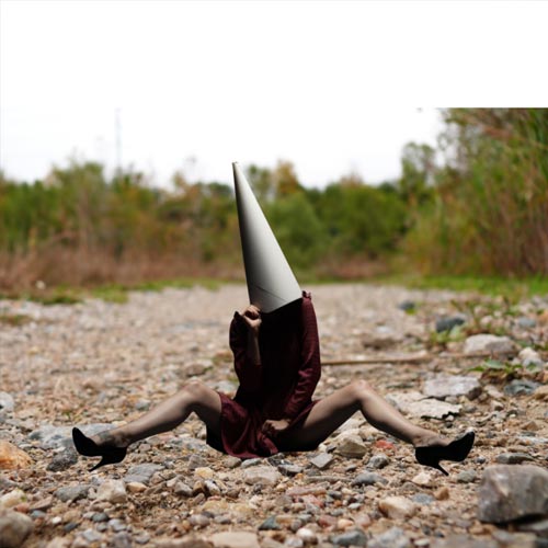
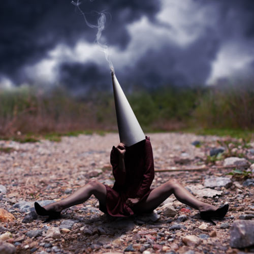
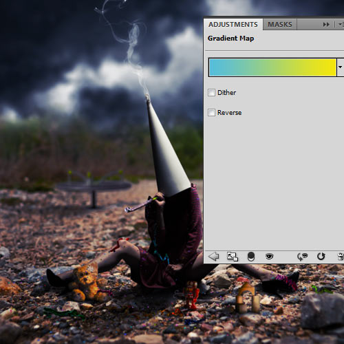
In this tutorial we will be teaching how to integrate elements from different sources to create a realistic photo manipulation with dark and conceptual elements. You will learn some lighting and blending techniques as well as some interesting post-production tips. Let’s get started!
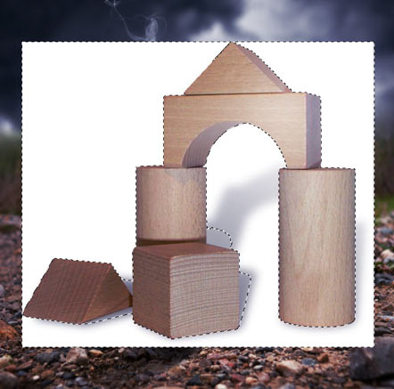
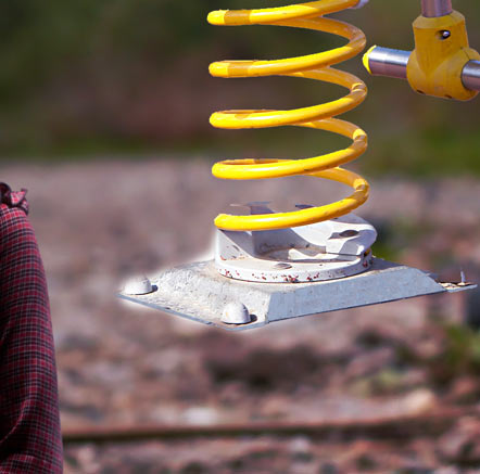

Tutorial Assets

The following assets were used during the production of this tutorial.


Step 1

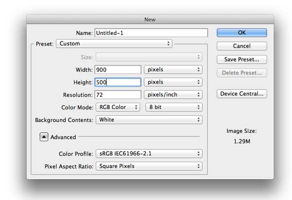
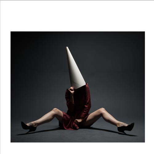
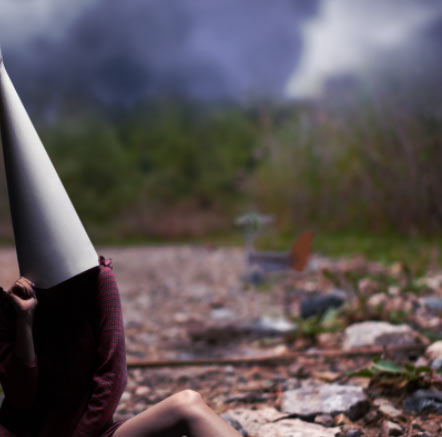
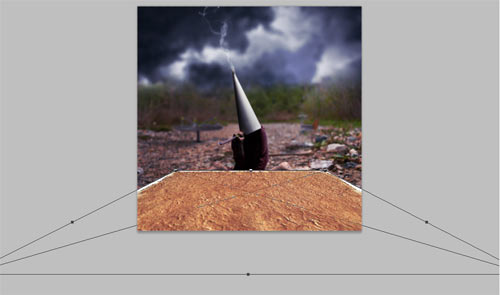
Open a new document, 3,000 x 3,000 pixels, at 300 dpi resolution. Drag and drop the model stock photo, resize to fit using Edit > Free Transform (Command/Ctrl + T) leaving some margins by the sides. Hold Shift to keep the aspect ratio. Name this layer "Model".


Step 2

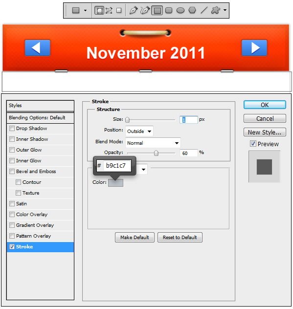
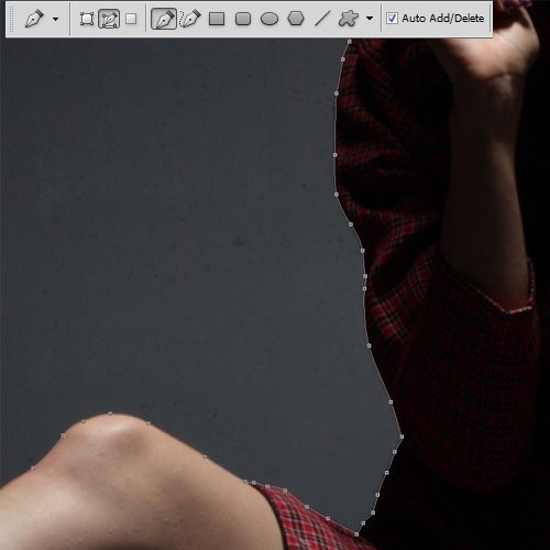
Select the Pen Tool (P) to cut out the model from the background. Be sure that Paths mode is selected and that you are not using the Free Mode. To follow the shapes of the body, if you are not very familiar with this tool, you will have to click wherever you want to start, then, when you are going to do the second point, Click and hold, then move your mouse to adapt the path to the shape.

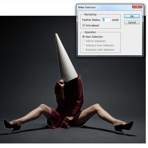
Once you are done, Right – Click and select Make Selection. Select a Feather Radius of 0 and check the Anti-aliased box.

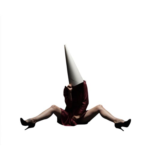
Now go to Select > Inverse or Command/Ctrl + Shift + I and then press Delete. Put the image in Actual Pixels using the Zoom Tool (Z) and Right – Click, selecting that option from the emerging menu, or Double – Clicking on the Zoom Tool, to see if there are parts that have not been well cut out and use the Pen Tool (P) again to get rid of them. Now go to Edit > Free Transform (Command/Ctrl + T) again, hold Shift, and resize the layer to occupy an area similar to the one shown in the screenshot below:


Step 3

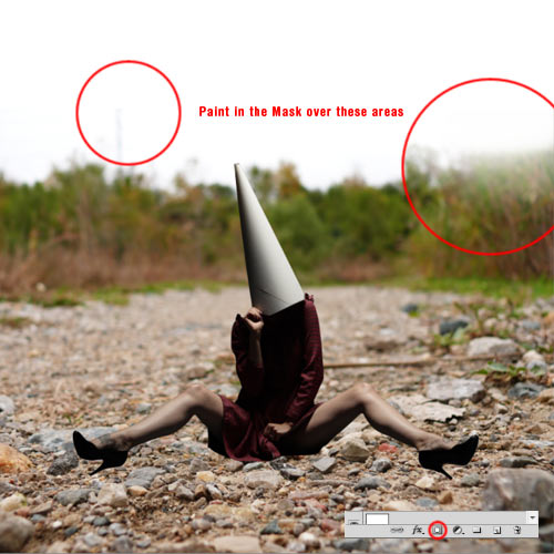
Add the Background image and Free Transform it (Edit > Free Transform or Command/Ctrl + T) to fit the canvas, again holding Shift to maintain the aspect ratio. Place this layer under the "Model" one. Name this layer "BG" and be sure that the "Model" layer is in the center of the Depth of Field of the "BG" layer, which is the most sharpened part of the ground.

Create a new Mask for this layer clicking on Add Layer Mask in the Layers Palette, then select the Brush Tool (B) and pick a 700 pixels size black brush, with 50% Opacity and Flow and 0% Hardness, and paint over the edges of the layer (inside the Mask) to blend it with the white background.


Step 4

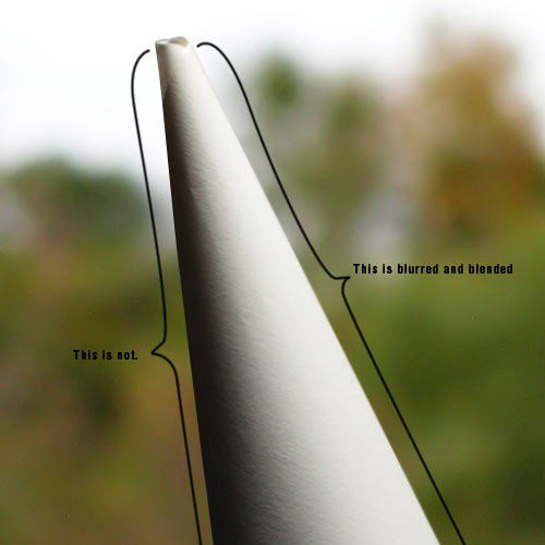
Now we will blend the borders of the "Model" layer. This way, it will look more integrated with the sorroundings, because if the edges are too sharpened, it will look like pasted on the canvas. Select the Blur Tool (R) with 30% Strenght and use a 0% Hardness brush, 40 pixels size, over the edges of the image. The result will be unseen if the image is Fit to Screen, but it will help integration in full view mode as well as if the image gets printed.
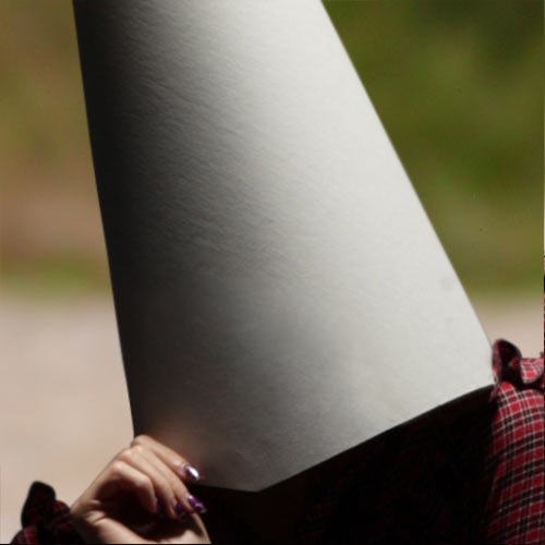

Step 5

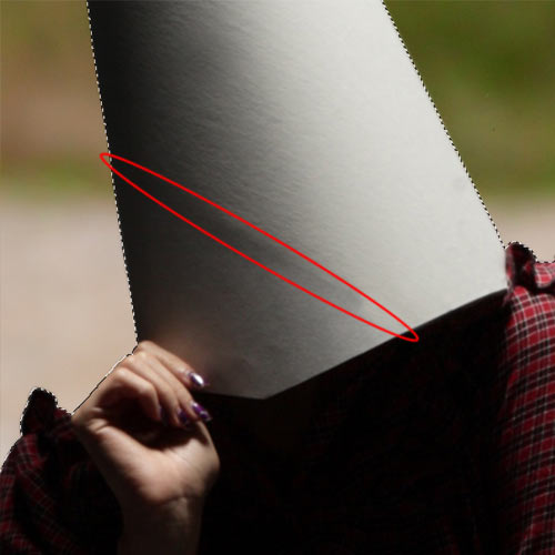
Now we are going to get rid of certain details of the "Model" layer that we do not want anymore, like the paper borders in the cone and the tattoos of the feet. Command/Ctrl – Click the "Model" layer to make a selection of the entire layer because we don’t want to create new pixels outside the original shape. We are going to use the Clone Stamp Tool (S) selecting a 0% Hardness brush, 40 pixels size and 100% Opacity and Flow. Press the Alt key near the area we want to override to take that as a reference for the Clone Stamp Tool, and then paint over the paper border.

You should get something like the image above. To get rid of that darker shape, select a bigger soft brush (around 80 pixels size), and lower Opacity to 30%, and keep on painting over the dark line. Lower Opacity even more and paint carefully until the cone looks like the image below:

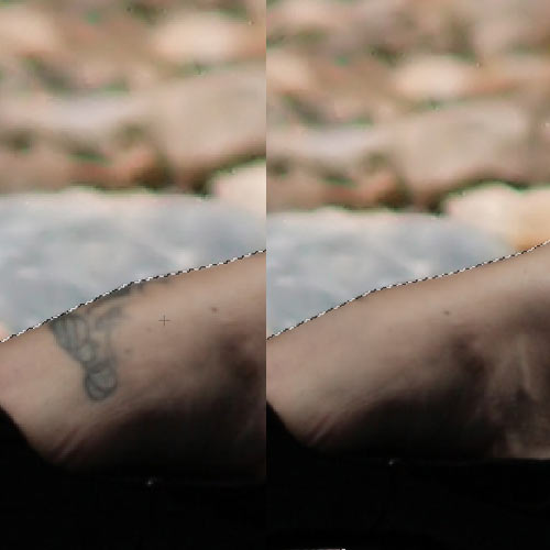
Repeat the process with the feet tattoos, except for using the bigger brush because you won’t be needing that, since the area is not as regular as the cone is. Play with different opacities to get the desired result.


Step 6

Add the sky image and name the layer "Sky". Place it above BG layer and under the "Model" one. Click on Add Layer Mask in the Layers Palette. Select a 600 pixels size brush, 0% Hardness, 20% Opacity and 60% Flow, and paint in the lower part of the layer to blend it with the BG one.
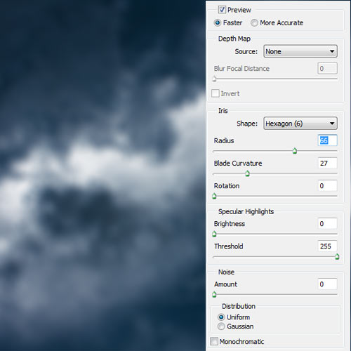

Step 7

Go to Filters > Blur > Lens Blur and use the following settings. This way you are adapting this layer to the original Depth of Filed the BG layer has.
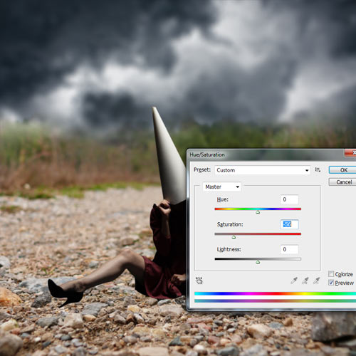

Step 8

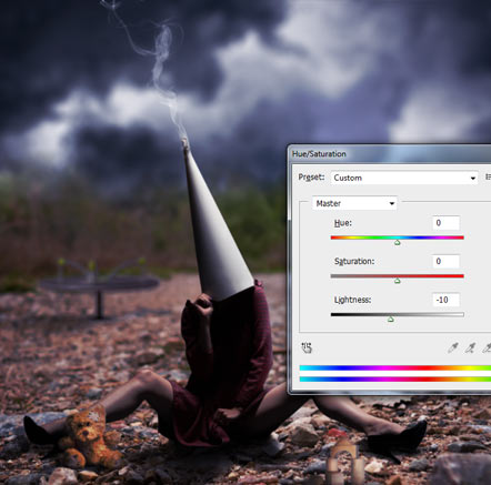
Now go to Image > Adjustments > Hue/Saturation (Command/Ctrl + U) and drag the Saturation bar to the left like in the screenshot below, or input a value of -56, to lower the saturation of the "Sky" layer.
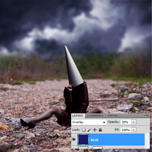

Step 9

Add a New Layer (Layer > New > Layer or Command/Ctrl + Shift + N) and name it "Blue". Place it above all layers. Select the Paint Bucket Tool (G) and pick the color #1a1664 (or a similar one of your liking) as a Foreground Color and click in any part of the layer. Set it in Overlay Blending Mode and lower its Opacity to 35%.
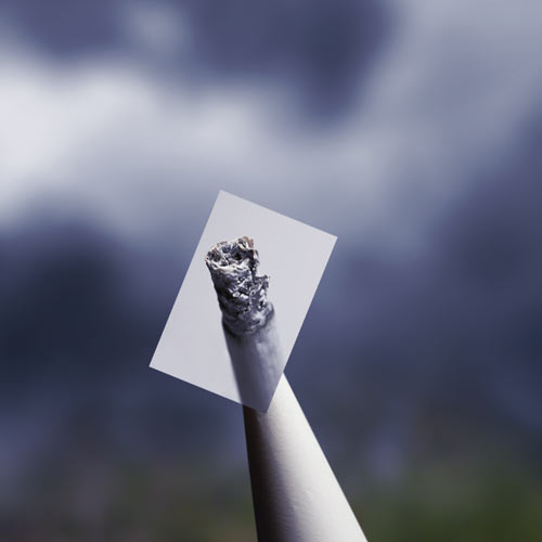

Step 10

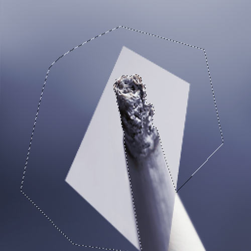
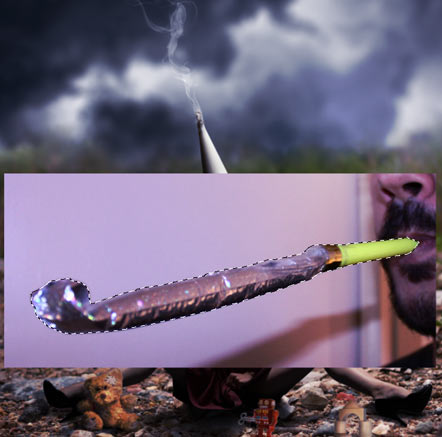
Add the cigarette layer and name it "Ash". Place it above the "Model" layer and again, Free Transform it (Command/Ctrl + T, hold Shift key) to make it fit with the top of the cone.

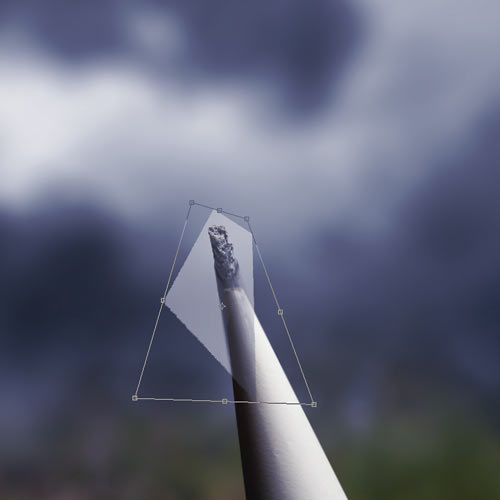
Once the "Ash" layer is fitting with the top part of the cone, Free Transform it again, Right – Click and select Distort in the emerging menu. Expand the box by the lower corners and play with it until the borders of the cigarette fit perfectly with the cone shape. Do this in Actual Pixels mode (Zoom Tool (Z), Right – Click, then select Actual Pixels, or Double – Click the Zoom Tool icon) to get an accurate result.

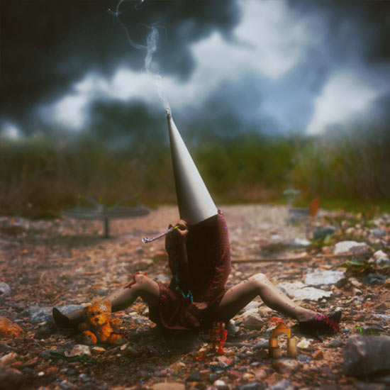
Now we have to cut out the ash from the background. The obvious procedure with a solid background would be to select the Magic Wand Tool (W), but it will select some parts of the ash as well, so preferably pick the Pen Tool (P), Zoom In the image with the Zoom Tool (Z) selecting the ash area and start making the selection with the Pen Tool. Once you are done, Right – Click and in the emerging menu select Make Selection.. Then go to Select > Invert or Command/Ctrl + Shift + I and press the Delete key.

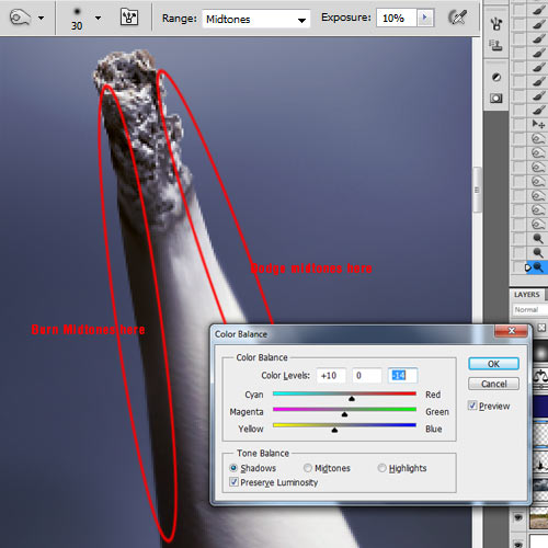
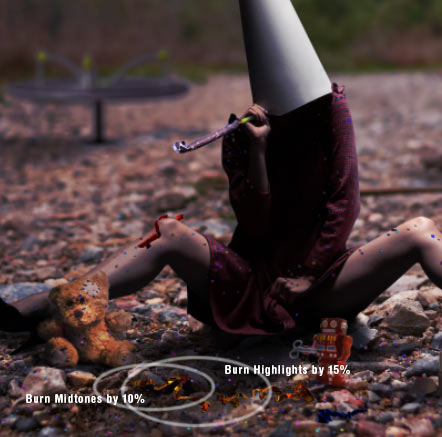
Select the Burn Tool (O) and choose a 30 pixels size brush, 0% Hardness, with Midtones Range and an Exposure of 10% and paint carefully in the left side of the cigarette to make the shadows fit with the ones of the cone. When you are done, pick the Dodge Tool (O) with the same settings and paint the right side of the cigarette to make the lighting fit. Then go to Image > Adjustments > Color Balance or Command/Ctrl + B and put the following settings in the Shadows Tone Balance panel: +10, 0, -14. And at last, select the Blur Tool (R), with a small soft brush and paint over the borders like we did in Step Four.


Step 11

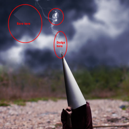
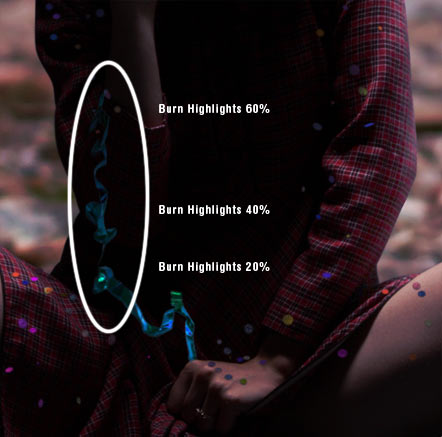
Add the smoke image, name the layer "Smoke" and place it above the "Ash" layer. Select the Screen Blending Mode. Go to Image > Adjustments > Desaturate or just Command/Ctrl + Shift + U. Pick the Burn Tool (O) and select Shadows in the dropdown Range menu as well as an Exposure of 35% and paint over the white areas on the edges and corners of the layer to make the background completely transparent. Burn also a bit on the smoke "knot" in Highlights Range Mode with an Exposure of 10%. Use the Dodge Tool (O) in Highlights Range mode with an exposure of 15% in the base of the smoke to make it more visible.


Step 12

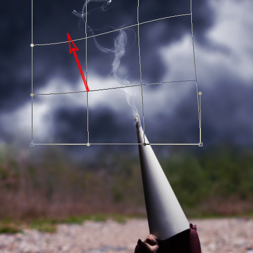
Now let’s use again the Free Transform command (Command/Ctrl + T) and Right – Click selecting the Warp mode. Drag the upper part of the image so the cut borders go outside of the canvas.


Step 13

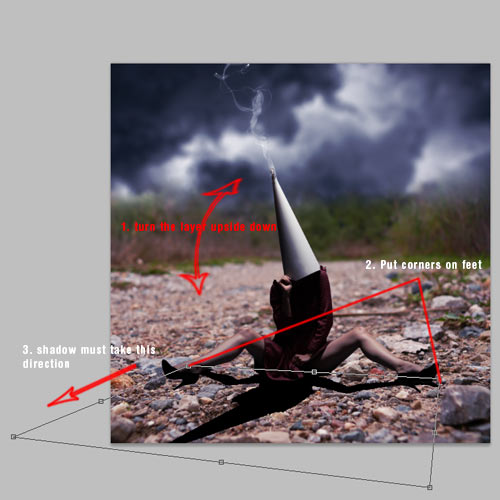
Duplicate "Model" layer and name this new one as "Shadow". Go to Image > Adjustments > Hue/Saturation (Command/Ctrl + U) and in the Lightness bar drag it completely to the right, until it marks -100. You will get a black version of the model image. Place it under the "Model" layer and Free Transform it (Command/Ctrl + T). Then Right – Click and in the submenu select Flip Vertical and drag the layer until both feet get in touch. Now Right – Click again and select Distort. According to the model’s lighting, it is coming from the upper right part, so we have to make the shadow take direction a bit to the left, so drag the bottom left corner of the transform box to the left.


Step 14

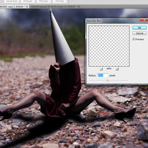
Duplicate "Shadow" layer and hide the original. In the new layer, go to Filter > Blur > Gaussian Blur and put an amount of 20,5 pixels. Create a new Layer Mask and pick a big black soft brush with the Brush Tool (B) and paint in the Mask deleting the blur near the model, leaving only blurred the farthest part (chest and cone).

Now make the original "Shadow" layer visible again, Mask it and again, use the same brush to delete exactly the opposite parts you have kept in the duplicated layer, so it looks like this:

In "Shadow" layer, go again to Filter > Blur > Gaussian Blur and put the amount in 3 pixels.

Merge "Shadow" and its copy, selecting the one that is above and going to Layer > Merge Down or pressing Command/Ctrl + E, applying the masks when asked. Then, create a new Mask in this new merged layer, select the Brush Tool (B), pick black color (#000000), 200 pixels size, 30% Opacity and 50% Flow and carefully paint in the Mask the parts that are farther from the model, being the cone the most erased part (but not deleted at all) and then the chest. Erase a bit also the knees shadows since they are farther from the body than the ones generated by the feet. The end result should look like this:


Step 15

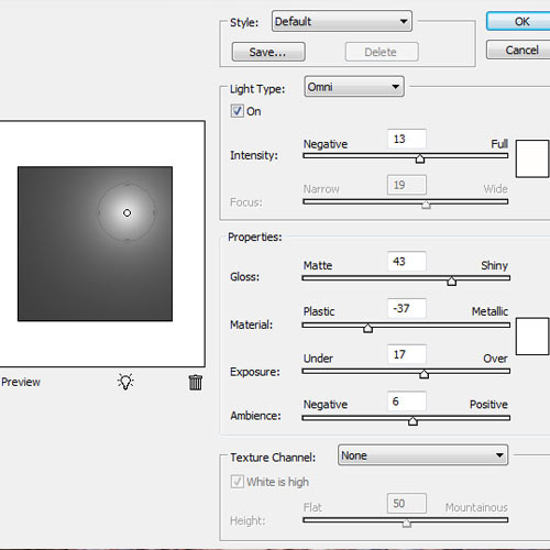
We are going to add a lighting focus to equalize all elements in composition. Create a new layer (Layer > New > Layer or Command/Ctrl + Shift + N) and name it "Light", pick the Paint Bucket Tool (G) and Click on the layer with white color (#ffffff) selected. Then go to Filter > Render > Lighting Effects and use the following settings:

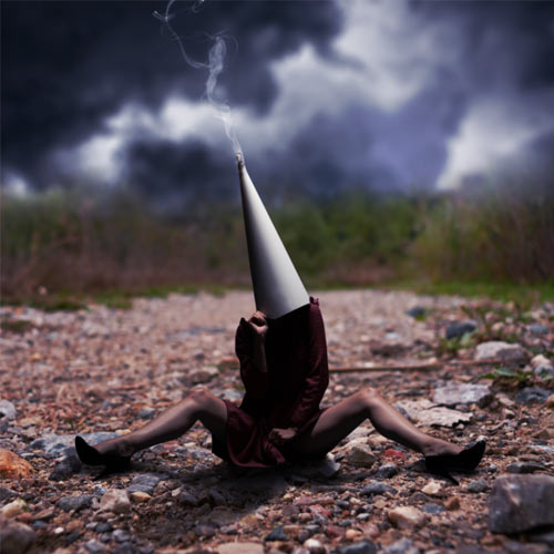
When you are done, put the layer in Overlay Blending Mode with 60% Opacity. It will look like this:


Step 16

Now we are going to adapt the "BG" and "Model" layers to the lighting we have just created. We will be using the Dodge and Burn Tools (O). Remember where the light focus is coming: the top right corner. Knowing this, we have to paint both layers with these tools. Everything has to look accordingly to the lighting source, so if we do this right, we will be near of doing a realistic photo manipulation: lighting is the key. We will be using the following method in all future compositive elements. In the screenshot below, you can find a sort of "map" of the lighting here. You have to use the Burn Tool (O) in the darker area of the image, first in Midtones Range and then in Highlighs Range. Use always big soft brushes, with no more than 20% Strength. Take as a reference the bottom left corner, which will be the darkest area of the ground, being the most highlighted the area before and after the right model’s leg. Here, use specially the Dodge Tool in Highlights Range. In the "Model" layer, you should use the Dodge Tool first in Midtones Range and then in Highlights Range. Use a smaller brush size than the one you used with the Burn Tool but keep it being with 0% Hardness and less than 20% Strength, and paint over the right leg and arm, and lower by 10% the Strength to paint over the left leg and arm. There is no need to use the Burn Tool on this layer since the shadows are fitting with the overall lighting and are hard enough.

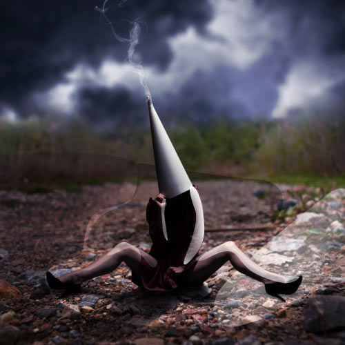
Keep on painting (but not too much) until your image looks similar to this one:

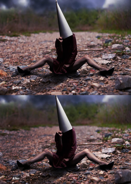
Now let’s see a before/after example:


Step 17

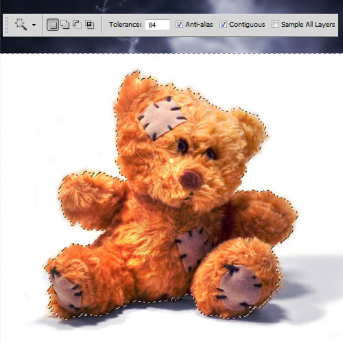
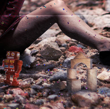
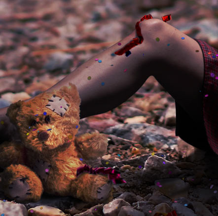
Now we are going to start adding elements to the composition, that will add some conceptual depth to our image. First, add the teddy bear image and name this layer "Teddy" and place it above the "Model" layer. Then select the Magic Wand Tool (W) and use a Tolerance of 84 pixels and the settings shown in the example below. Then Click in the white background and in any areas of the shadow that might not be selected at first while you hold Shift Key to make multiple selections at once.

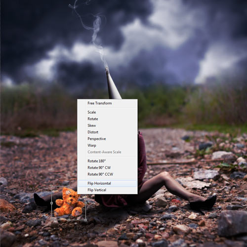
Now use Free Transform (Command/Ctrl + T) holding the Shift key to maintin the aspect ratio of the image. Resize it keeping the reality of proportions shown in the image, and then Right – Click and in the menu choose Flip Horizontal, since the original lighting of the "Teddy" layer is inverted according to the lighting we are applying to the composition.

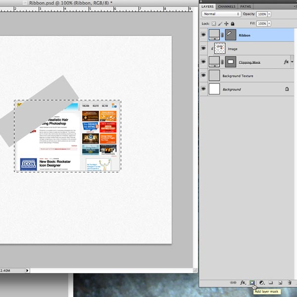
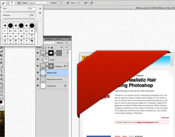
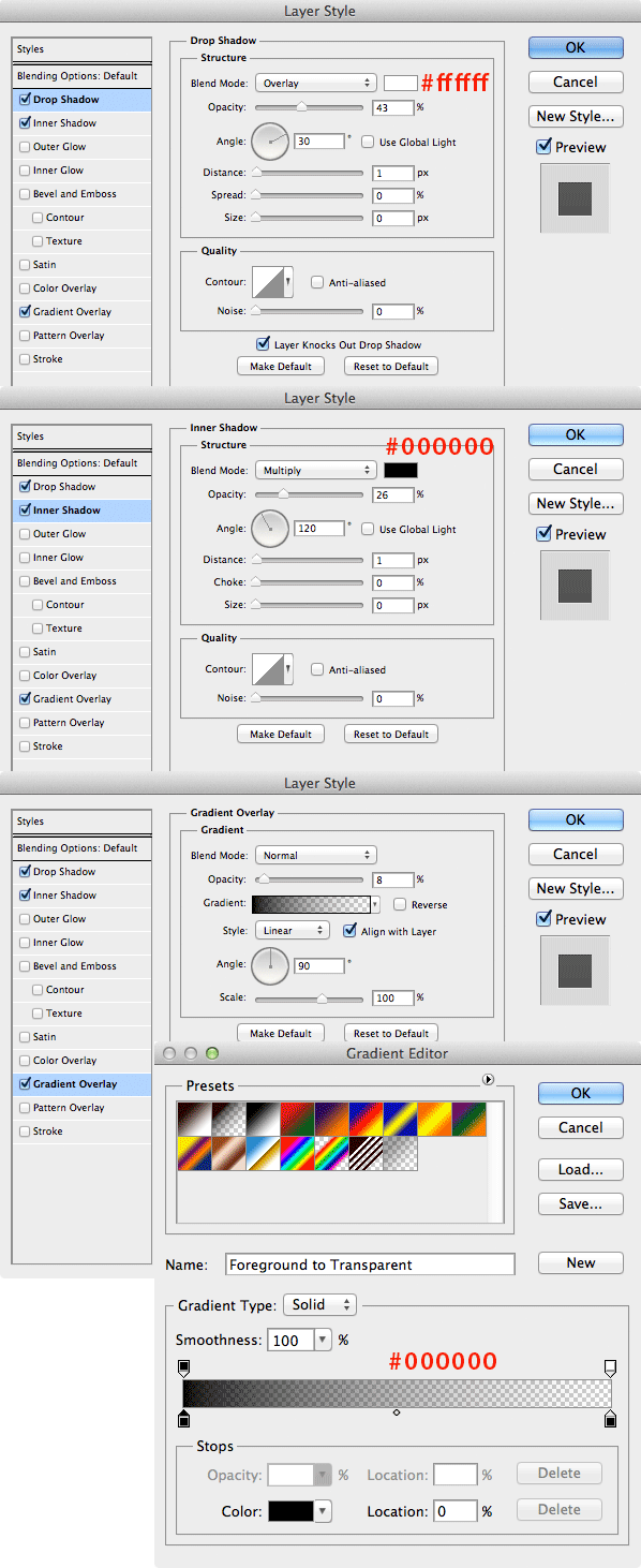
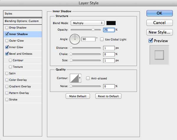
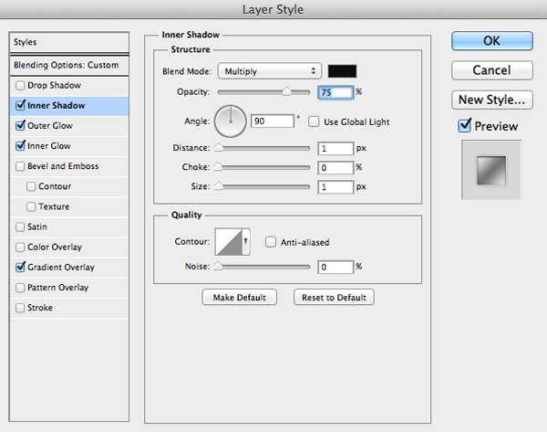
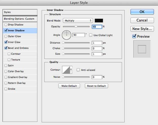
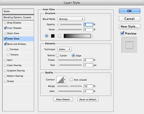
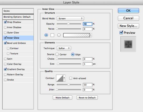
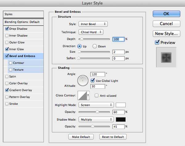
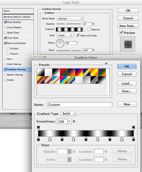
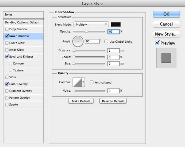
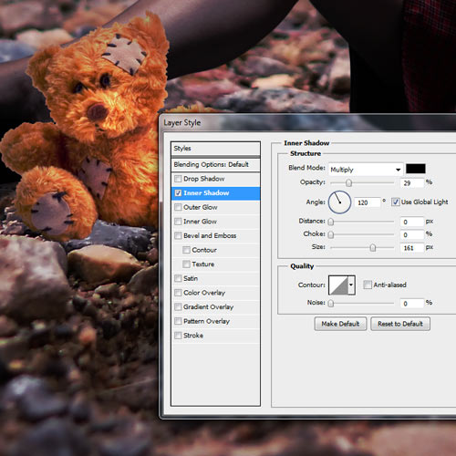
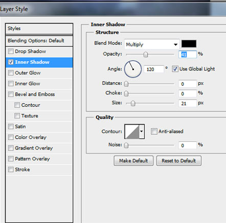
So, we have some annoying white borders around the image. Double – Click in the "Teddy" layer to display the Layer Style window. Go to Inner Shadow and apply the following settings: Blend Mode Multiply, 29% Opacity, 120º Angle, 0 pixels Distance, 0 pixels Choke, 161 pixels Size. This is a good shortcut to avoid cutting out the image again, specially in this case where no max highlights will be used on this layer since it’s far from the light focus.

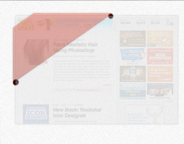
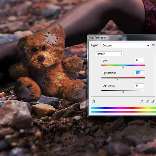
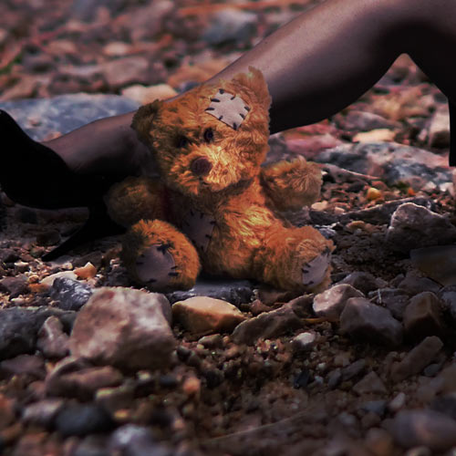
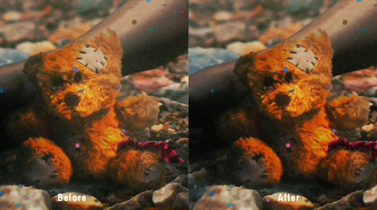
Now select the Blur Tool (R) and as we did in Steps 4 and 10, blur a bit the borders of the layer for a better blending with the scene, using a very small brush since this element is smaller than the ones we blurred borders before. Then we are going to repeat Step 16 on this layer. Use the Burn Tool (O) with 20% Strength and with Midtones Range selected over the borders that seem to be lighter than the rest with a very small soft brush. Once you are rid of the borders, use a bigger brush to Burn Midtones over the dark areas according to lighting: full left arm, left parts of head, chest and both legs. Then use the Burn Tool in Highlights Range with very low Strength (between 5% – 10%) and paint over the same parts. Don’t use the Dodge Tool this time. Sometimes using Dodge and Burn might end up in over saturated colors, so go to Image > Adjustments > Hue/Saturation or Command/Ctrl + U, and drag the Saturation bar -30 pixels to the left. With all of this done, your "Teddy" layer should look like this:


Step 18

Create a new layer (Layer > New > Layer or Command/Ctrl + Shift + N) below the "Teddy" one and name it "Teddy Shadow". Pick the Brush Tool (B), select black color (#000000), 50 pixels size, 25% of Hardness, 50% Opacity and Flow, and paint carefully under the bear.

Now put Brush Hardness at 0% and decrease Opacity by 25% and paint around the ground where the bear is, specially on the left side.


Step 19

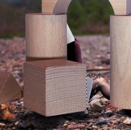
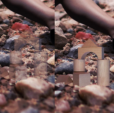
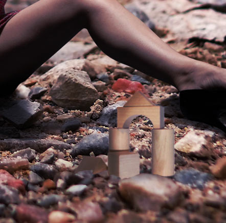
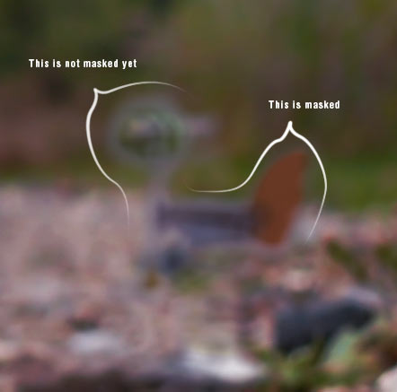
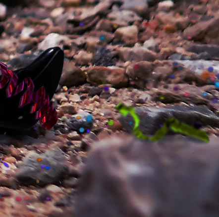
Add the pieces image, name it "Pieces" and place it above the "Model" layer. Use the Magic Wand Tool (W) with 60 pixels Tolerance and click on the white background, then press Delete.

Now select the Polygonal Lasso Tool (L) and make a selection of the grey areas created by the figure shadows. Then press Delete again.

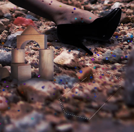
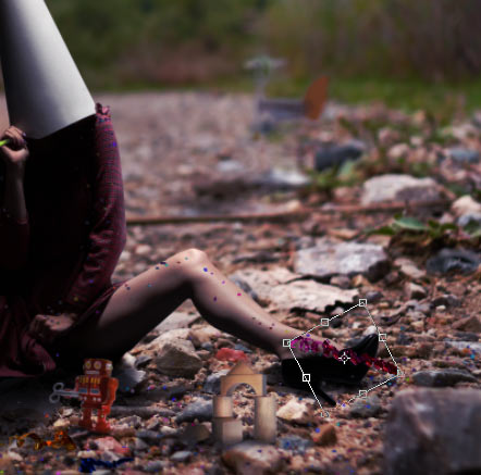
Now use Free Transform (Command/Ctrl + T) holding Shift to keep aspect ratio and resize the layer to keep proportions with the rest of the elements. Place it near the right shoe. Lower the Opacity of the layer to around 70% and create a new Layer Mask. Now select the Pen Tool (P). You have to make a selection according to the rock shapes. Once you have the Path closed, Right – Click and select Make Selection. Paint it black with the Brush Tool (B) or the Paint Bucket Tool (G) in the Mask to make it disappear. Restore the layer Opacity to 100% when you are done.


Step 20

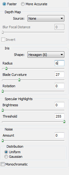
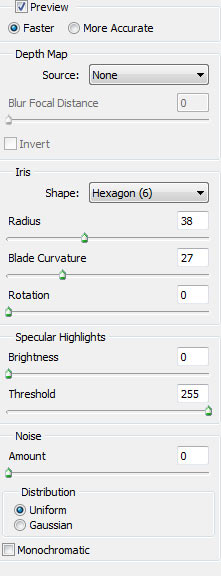
Go to Filter > Blur > Lens Blur and use the following settings. Again, we want to integrate this item within the Depth of Field of the image.


Step 21

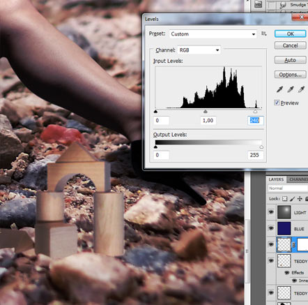
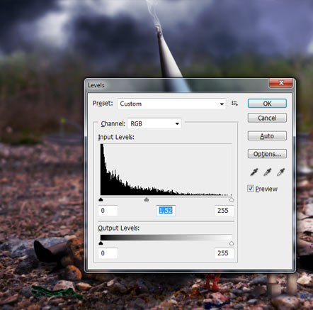
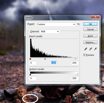
Use the Burn Tool (O) to raise shadows in the Midtones Range on the left part of the layer as well as the bottom, then go to Image > Adjustments > Levels (Command/Ctrl + L) to raise a bit the lightings.


Step 22

Create a New Layer (Layer > New > Layer or Command/Ctrl + Shift + N), place it under "Pieces" and name it "Shadow Pieces". Use the Brush Tool (B), 60 pixels size, 0% Hardness, 25% Opacity and only 2% Flow, pick black color (#000000) and paint under the pieces just to darken a bit the area. Then take a smaller brush, and raise Opacity to 30% and Flow to 10% and paint the nearer shadows where the figure is touching the ground. You might need to paint also the borders of the near rocks.


Step 23

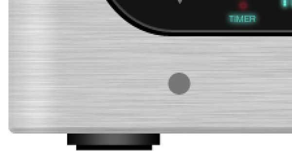
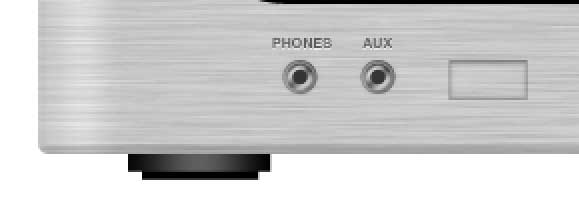
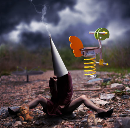
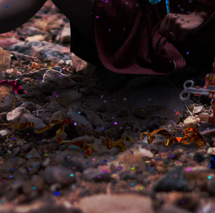
Grab the Toy1 image to the canvas, resize with Free Transform (Command/Ctrl + T) holding Shift key to fit the canvas, then select the Magic Wand Tool (W) with 50 pixels Tolerance and select the white background, then press Delete. Name this layer "Toy1".

Now place the layer under "Shadow" layer and Free Transform it again to make it smaller. Place it at the left of the model. The top part of this layer should be at the same height where the bushes start to grow. Go to Filter > Blur > Lens Blur and use the following settings:

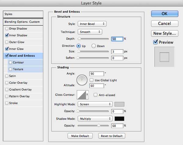
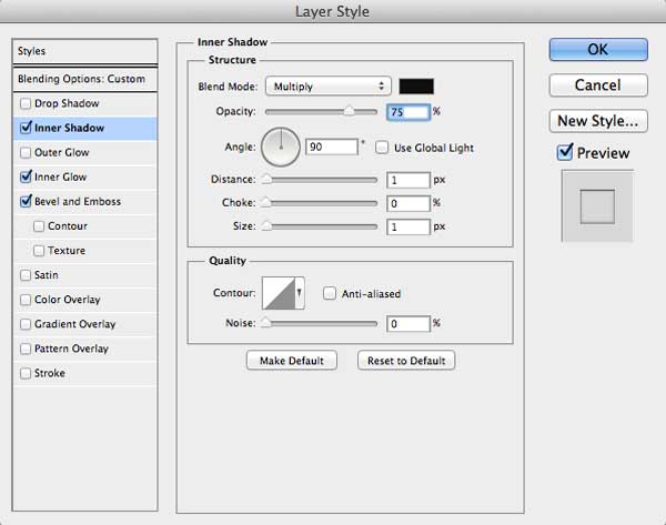
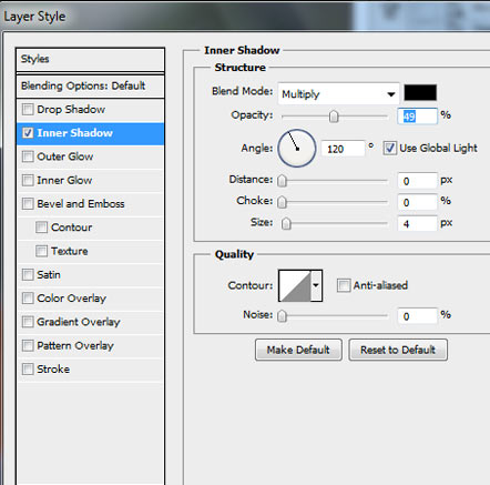
Double – Click this layer to open the Layer Style menu, select Inner Shadow and put the following settings. This way, we will get rid of the white borders. We don’t need them anymore since the item is placed in a dark area of the image.


Step 24

Create a New Layer (Layer > New > Layer or Command/Ctrl + Shift + N), place it under "Toy1" and name it "Toy1 Shadow". Use the Brush Tool (B) 80 pixels size, 0% Hardness, 25% Opacity and 15% Flow, pick the black color, and paint the shadows casted to the left. The nearer to the item, the darker it should be.


Step 25

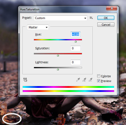
Return to the layer "Toy1" and go to Image > Adjustments > Hue/Saturation or Command/Ctrl + U and in the Lightness bar, drag it a bit to the left or put in the field a -10 value to darken a bit this layer.


Step 26

Take the Toy2 image, add it to the canvas, name it "Toy2", Free Transform it (Command/Ctrl + T, hold Shift key) to fit on screen, add a Layer Mask, then select the Magic Wand Tool (W) with 50 pixels Tolerance and select the white background. Grab the Paint Bucket Tool (G) with black color selected, and go to the Mask and fill the selection to make it disappear.

When we deleted the background, we also erased some parts of the toy base. We are going to do something that is not very fancy, but it will work combined with the next step. Go to the Mask in "Toy2" layer, pick the Brush Tool (B), 100% Opacity and Flow, 0% Hardness and select white color (#ffffff) and paint in the disappeared areas to make them come back. Don’t worry if you end up painting a bit and revealing parts of the white background again.

If you haven’t applied any Filter since the last time we did it, press Command/Ctrl + F: This will repeat the last filter we used. Or just go to the Filter menu. The first option should be to Apply Last Filter, which in our case was the Lens Blur we used in "Toy1" layer. Apply it again. In case this option is not available anymore (you might have closed Photoshop in between steps, etc), just use the Lens Blur settings of Step 23. You will now notice why we had not to worry about the base. When you are done, Double – Click the layer to open the Layer Style window, go to Inner Shadow and use the following settings to get rid, again, of the white borders… although not at all yet.

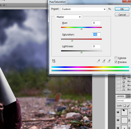
Use Free Transform (Command/Ctrl + T), Right – Click and select Flip Horizontal. We do this because the original lighting of the layer is opposite than the one we have in the composition. Then go to Image > Adjustments > Hue/Saturation (Command/Ctrl + U), put Saturation -46.

Go to the Mask, select the Brush Tool (B), 15 pixels size, 0% Hardness, 40% Opacity and 25% Flow and paint carefully over the light grey edges, so we can get rid of them at last to enhace the layer integration. You can see the difference in the screenshot below.


Step 27

Create a new layer (Layer > New > Layer or Command/Ctrl + Shift + N), name it "Toy2 Shadow"and place it under "Toy2". Basically, what we have to do here is exactly what we did in Step 24 when we added the casted shadow of the "Toy1" item: Use the Brush Tool (B) 80 pixels size, 0% Hardness, 25% Opacity and 15% Flow, pick the black color, and paint the shadows casted to the left. The nearer to the item, the darker they should be.


Step 28

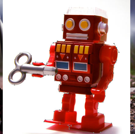
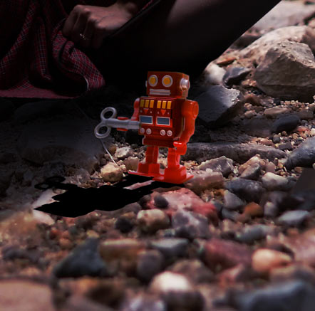
Take the robot image to the canvas. To erase the background, the best option here is to use the Pen Tool (P) with the same settings we have been using during this tutorial, so be sure that Paths mode is selected and that you are not using the Free Mode. Don’t worry about the white/transparent thing on the robot’s head… you are free to keep it, but in my case, I will just get rid of it.

When you are done, Right – Click and select Make Selection, then delete the background. Use the Pen Tool also to delete the white areas inside the clockwork. Use the Magic Wand Tool (W) with 50 pixels Tolerance to select the space between the legs faster. Now Free Transform it (Command/Ctrl + T) holding Shift. Resize and place as shown below and name this layer "Robot":

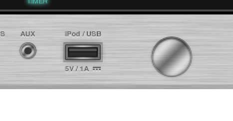
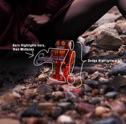
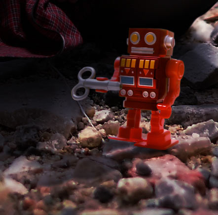
We have to adjust the lighting of this item. Use the Dodge Tool (O) with Highlights Range selected, Exposure of 8%, and paint over the right parts of the head, right arm and right foot. Now use the Burn Tool (O), first in Highlights Range with an Exposure of 15%, with a soft brush of 100 pixels Size, and paint over the left part of the robot as shown in the image below. This shadow occurs because the robot is under the shadow casted by the model. To finish, set the Burn Tool Range to Midtones, and use smaller brush and paint the areas more oriented to the left.
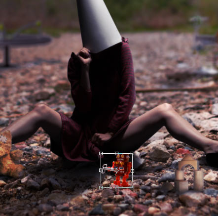
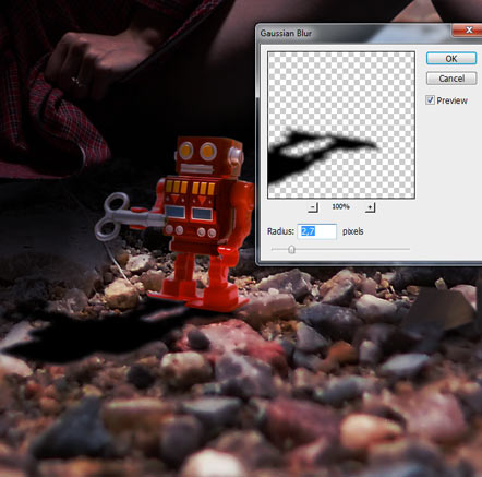

Step 29

Duplicate the "Robot" layer, go to Image > Adjustments > Hue/Saturation (Command/Ctrl + U )and use a value of -100 in the Lighting bar. Place this layer under the original one, use Free transform (Command/Ctrl + T), Right – Click, select Flip Vertical, drag it until both feet are touching, then Right – Click again and select Distort. Drag from the bottom left corner to make the shadow be casted to the left as usual and then drag from the bottom right corner to create a diagonal.

Go to Filter > Blur > Gaussian Blur and use an amount of 2.7 pixels.

Create a New Mask for this layer and pick the Brush Tool (B), 80 pixels size, 0% Hardness, 40% Opacity and 25% Flow. As we are doing with all casted shadows, the farther the shadow is, the less it has to be seen, so start erasing from the part on the left and keep darker the shadows under the feet.


Step 30

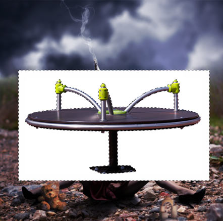
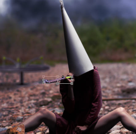
Drag the party blower image to the canvas, name it "Party Blower" and use the Pen Tool (P) to cut it out using the same method as with the rest of elements. Place this layer above the "Model" one.

Free Transform it (Command/Ctrl + T) holding Shift and resize it until it fits within the shape of the left hand, then rotate it a bit to the left to follow the direction generated by the posture.

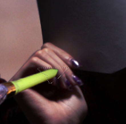
Use the Blur Tool (R) to blur a bit the borders (20 pixels size, soft, 50% Strength) to integrate the image in the composition. Then hide this layer and use the Pen Tool (P) to make a selection of the fingers like shown in the screenshot below. Command/Ctrl – Click and Make Selection, then erase it and make the layer visible again.

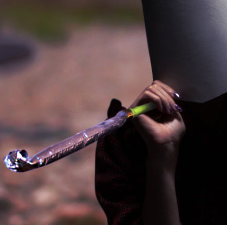
Use the Burn Tool (O) in Highlights Range with 35% Hardness, 20 pixels size and 15% Exposure to darken the part of the item that is being held by the hand. Darken the bottom part of it as well. Then put the Burn Tool in Midtones Range to darken the bottom part of the party blower. When you are done, grab the Sharpen Tool (R) with 23% Strenght and with Protect Detail checkbox enabled, use it to sharpen the left part of the party blower which was a bit out of focus in the original stock photo.


Step 31

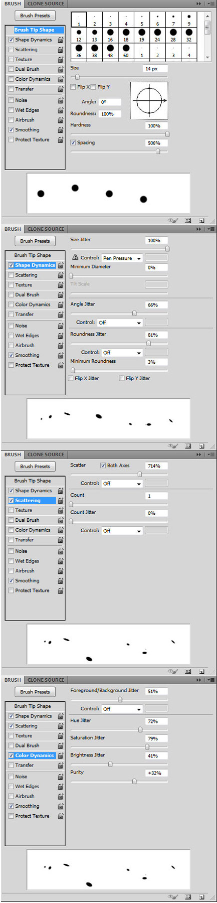
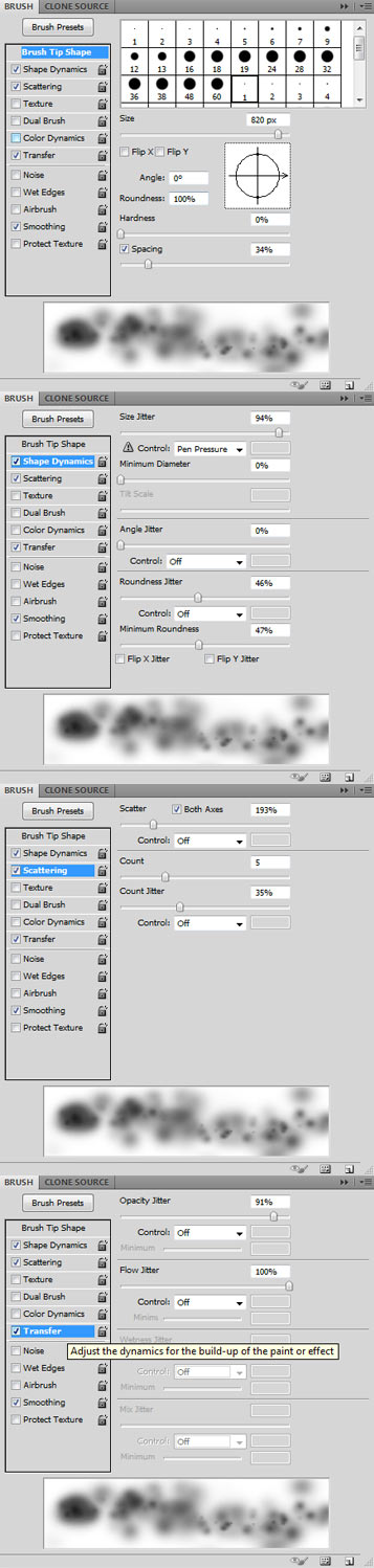
Create a new layer (Layer > New > Layer or Command/Ctrl + Shift + N) and place it under the "Blue" one. Name it "Confetti". Now we are going to have some real fun. We are going to throw some confetti over the area and we want it to be very realistic. Select the Brush Tool (B) and go to the Brush Panel by pressing F5. Select any normal brush and use the following setting to create the new brush we are going to use to throw the confetti all around. When you are done, pick the color #ff00f0.


Step 32

Paint over the model (but not the cone), especially over the areas that could allow the confetti to be placed without falling, like shoulders, upper part of the legs, etc. Paint some confetti also on the ground, but not behind the model. Put some as well on the teddy bear.

We might have ended up painting outside the areas we wanted to, since the brush had the Scattering mode activated, so use the Eraser Tool (E), 100% Hardness, Flow and Opacity and with a size of about 30 pixels, delete any painted part that is outside of the model.

Select the Burn Tool (O), with Midtones Range and a Strength of 15%. Now, according to the casted shadows and overall lighting of the image, paint over the confetti parts that are standing out too much and that are obviously out of any concordance here, for example in the model’s shadows.

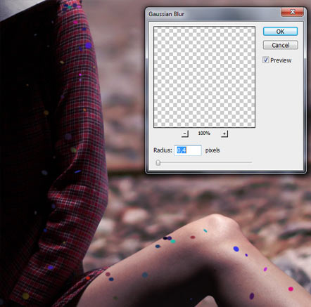
Go to Filter > Blur > Gaussian Blur and apply it with a Radius of 0,4 pixels.

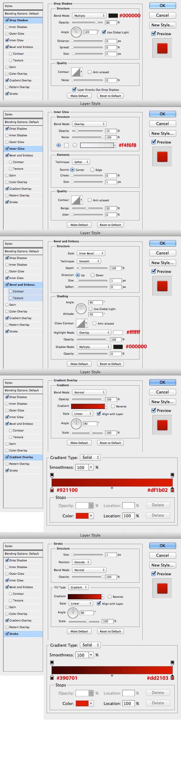
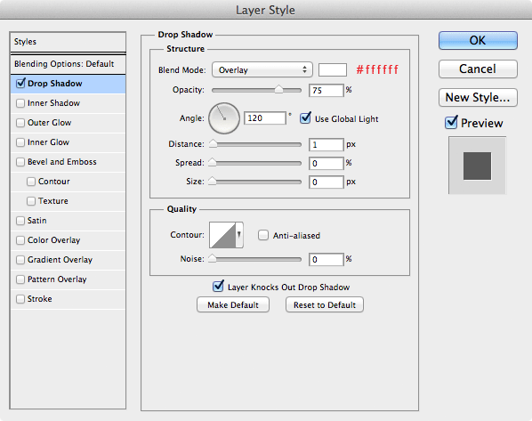
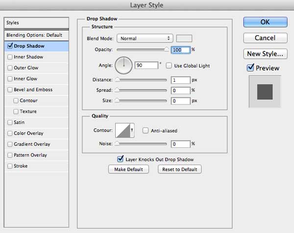
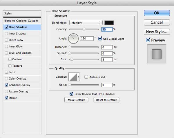
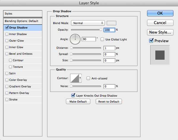
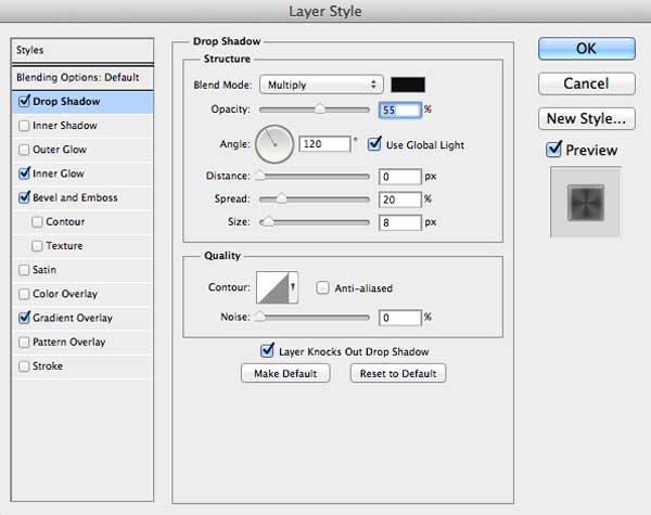
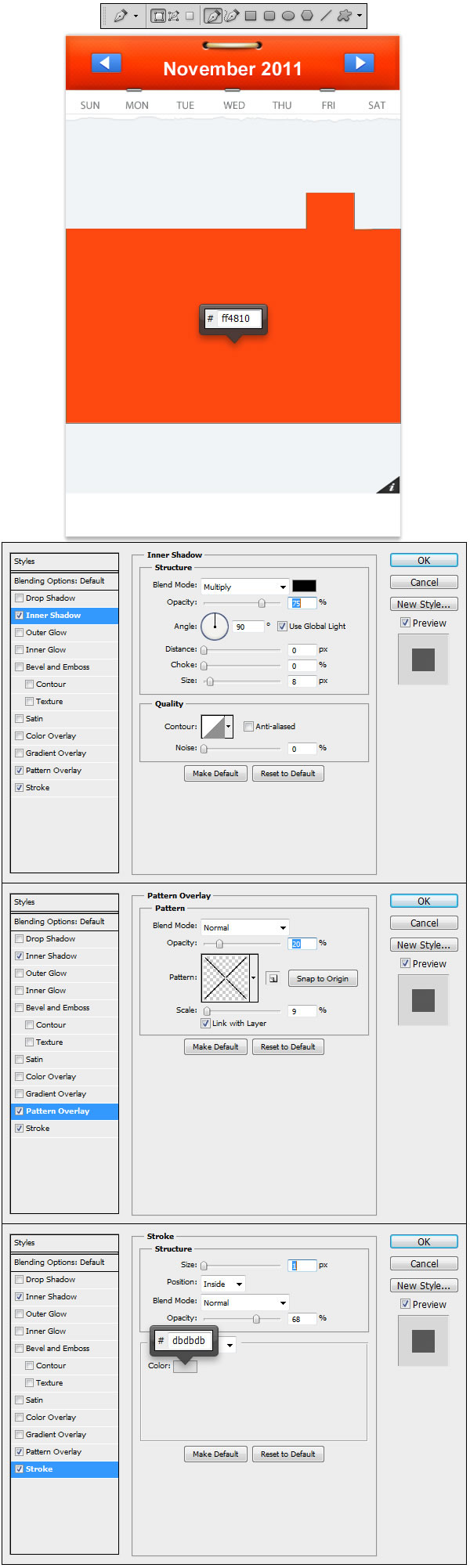
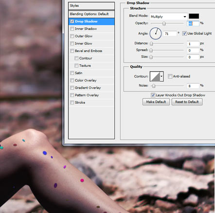
Double – Click the layer to open the Layer Style panel. Go to Drop Shadow and set it as follows:

Use the Blur Tool (R) with 50% Strength and start blurring the parts that should be affected by the Depth of Field, like the bottom of the image and behind the model.

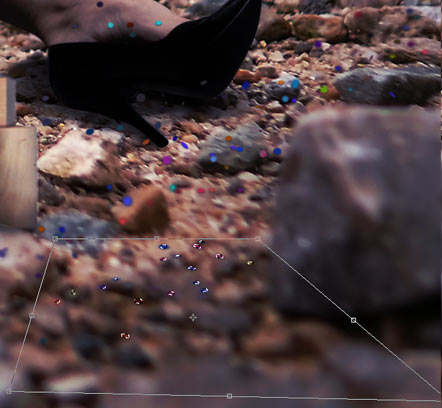
Now with the Polygonal Lasso Tool (L) start selecting the confetti by areas. What we are going to do now is to apply some perspective so they won’t look like pasted anymore. Do it by small areas. With every selection, use Free Transform (Command/Ctrl + T) and then Right – Click and in the emerging menu choose Distort, then drag from the bottom corners and open the field until they look adjusted to the perspective of the ground. Do this with all the confetti at the bottom of the image. When it’s finished, if you find any confetti that, due to its roundness, looks strange, just take the Eraser Tool (E), 100% Hardness, Opacity and Flow and no bigger than 20 pixels and delete it.


Step 33

We can make the confetti we have just created a bit more realistic, so let’s go to add some paper texture to it. Insert the paper texture and name it "Paper". Press Command/Ctrl + T to Free Transform it, Right – Click to open the menu and select Perspective. Grab any of the bottom corners and expand the box, then grab one from the upper side and make it smaller, like in the screenshot below, then press Enter:

Go to Image > Adjustments > Desaturate or just Command/Ctrl + Shift + U. Set the Blending Mode of the Layer to Soft Light, then Command/Ctrl – Click the layer "Confetti" to select all of its content. Invert the selection with Command/Ctrl + Shift + I or go to Select > Inverse and press Delete in the "Paper" layer. We are done with the confetti, at last!


Step 34

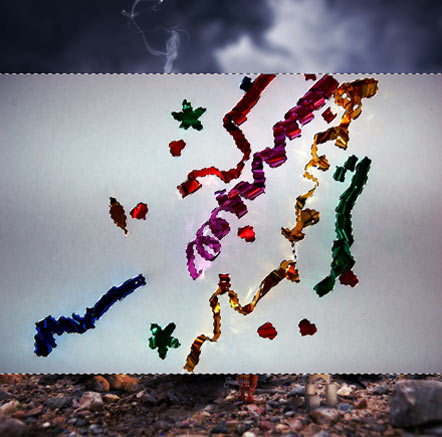
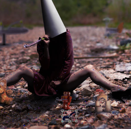
Grab the streamers stock image, name it "Streamer" and place it above the "Confetti" layer. Select the Magic Wand Tool (W), put its Tolerance to 50 pixels, and very important, uncheck the Contiguous check box if it is checked, then Click on the background and press Delete.

We are going to place all the streamers around the image, in separate layers and we will give different treatments to them. We will be getting them from its original layer ("Streamer"). Select first the blue one with the Polygonal Lasso Tool (L), and Copy/Paste it by pressing Command/Ctrl + C and then Command/Ctrl + V, or if you prefer, go to Edit > Copy and Edit > Paste. Name this new layer "Streamer2". Don’t forget to hide "Streamer" layer now.

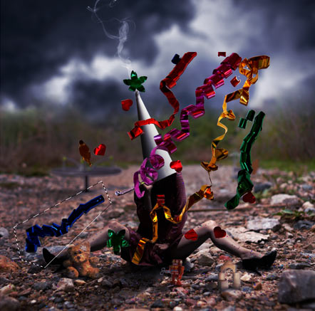
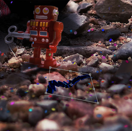
Free transform the blue streamer (Command/Ctrl + T, hold Shift as usual for aspect ratio maintenance) and place it under the robot.

Still in Free Transform mode, Right – Click and select Distort. Play with the image until it looks right with the perspective.

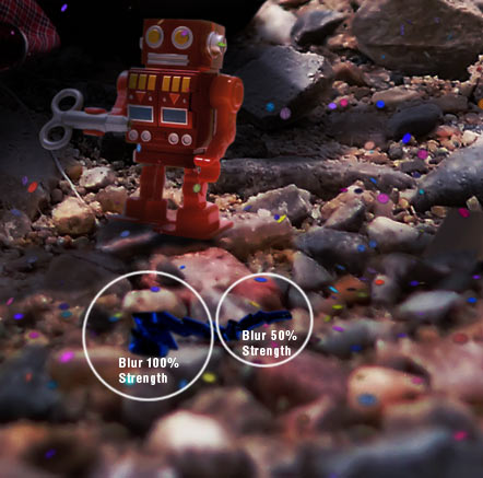
Take the Blur Tool (R), and with 50% Strength blur the right zone, and with 100% Strength the left one, to adjust the streamer to the Depth of Field. By the way, don’t worry about the casted shadows for now: we will be applying them when all streamers are placed.
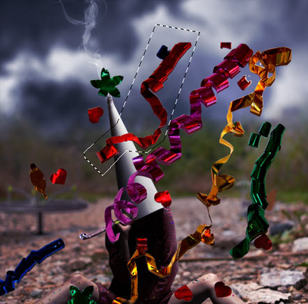

Step 35

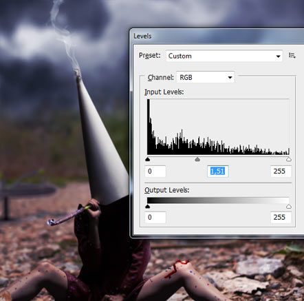
Make the layer "Streamer" visible again, and with the Polygonal Lasso Tool (L), select the red streamer, Copy/Paste it again (Command/Ctrl + C and Command/Ctrl + V) and name this new layer "Streamer3". Hide "Streamer" layer again.

Free Transform (Command/Ctrl + T, then hold Shift) and go to Image > Adjustments > Level or press Command/Ctrl + L. The arrow in the middle controls the midtones of the image, so drag it closer to the dark, to the left, or put a value of 1,51.

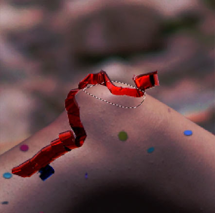
Place the item in the left knee of the model, lower its Opacity by 80% and create a New Mask. Use the Pen Tool (P) to make a path on the knee, Right – Click and select Make Selection, and fill it with black color using the Paint Bucket Tool (G) on the Mask. Restore the Opacity of the layer.

Select the Blur Tool (R) and with a 10 pixels size brush blur a bit the edges of the streamer in the layer, not in the Mask.


Step 36

Return to "Streamer" layer, make it visible, and again, with the Polygonal Lasso Tool (L), select the yellow streamer, Copy/Paste it (Command/Ctrl + C, Command/Ctrl + V), name the new layer "Streamer4" and hide "Streamer" layer as well.

Resize the image with Free Transform (Command/Ctrl + T , then hold Shift). Blur the borders as usual with the Blur Tool (R), and then use Burn Tool (O) in Highlights Range with 15% Strength to darken all the area of the streamer under the casted shadow of the model. Change the Range to Midtones, lower Strength to 10% and burn the end of the streamer (the part more to the left).


Step 37

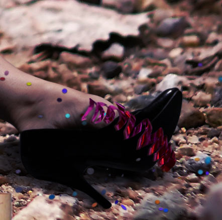
I guess it is obvious what we have to do now: Make visible "Streamer" layer, select the pink streamer with the Polygonal Lasso Tool (L), Copy/Paste (Command/Ctrl + C, Command/Ctrl + V), name the new layer "Streamer5" and hide "Streamer".

Resize (Command/Ctrl + T, hold Shift), rotate a bit to the left and move it to the right shoe.

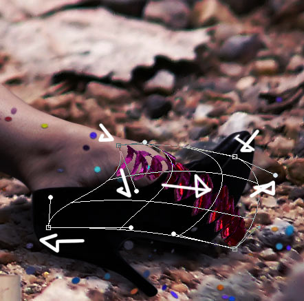
Still in Free Transform, Right Click and switch to Warp mode. You have to adapt the streamer to the shape of the foot. Follow the directions of the arrows in the screenshot below. When you are done use the Blur Tool (R) to blur the borders.


Step 38

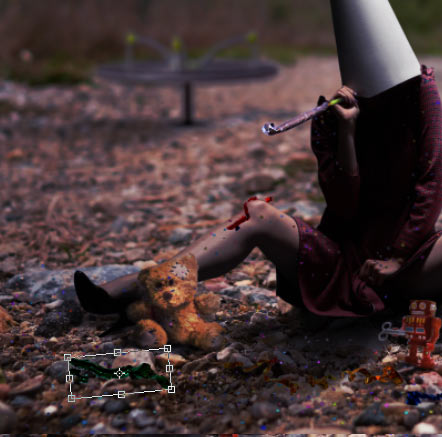
Make visible "Streamer" layer, select the green streamer with the Polygonal Lasso Tool (L), Copy/Paste (Command/Ctrl + C, Command/Ctrl + V), name the new layer "Streamer6" and hide "Streamer".

Free Transform (Command/Ctrl + T, hold Shift), resize and place it near the teddy bear. Don’t forget to blur the borders with the Blur Tool (R).

Go to Image > Adjustments > Levels or press Command/Ctrl + L and move the Midtones bar a bit to the left or put a value of 1,52.


Step 39

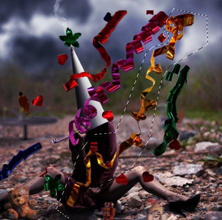
This Step is optional and up to you. What we are going to do is to put some more streamers in the composition. You can duplicate any of the streamers layers (Going to Layer > Duplicate Layer, or pressing Command/Ctrl + J), or extract them again from the "Streamer" layer. Due to some modifications in the streamers layers, some might not be useful for duplicating. Don’t be afraid and get as creative as you wish, playing with different options to place your own streamers.

Now I am going to explain a quick guide of what I have done with the new streamers. The method to manipulate them is the same we have been using with the rest of streamers. Duplicate "Streamer2", Free Transform, then Right – Click and select Flip Horizontal, Image > Adjustments > Hue/Saturation (Command/Ctrl + U) and change the Hue bar to any color you like. Place it in the plushie’s right leg.

Go to Image > Adjustments > Levels (Command/Ctrl + L) and move the midtone bar to the left or enter a value of 1,62. When you are done, Free Transform (Command/Ctrl + T), select Warp mode and adjust the streamer to the plushie.

Duplicate (Command/Ctrl + J) "Streamer4", Change its color with Hue/Saturation (Command/Ctrl + U), use the Pen Tool (P) and cut the bottom part to make it look like our character is holding it.

Use the Burn Tool in Highlights Range mode and darken specially on top. This area is very dark according to overall lighting, so you will have to increase Strength while you get on top of the layer.

Duplicate (Command/Ctrl + J) "Streamer3", change its color (Command/Ctrl + U), Flip Horizontal and apply a Gaussian Blur with a 4 pixels Radius.


Step 40

Create a New Layer (Layer > New > Layer, or Command/Ctrl +Shift + N) and name it "Streamer Shadows". Place it under the original "Streamer" layer. Pick the Brush Tool (B) and select a 10 pixels Size, 10% Hardness, 30% Opacity and 15% Flow brush and start painting under the streamers. Creating a base shadow under them all will be enough, but always following the original shapes. Also, remember than in all cases shadows must be casted to the left.


Step 41

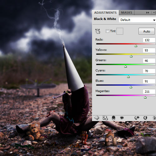
Now, we are done with the composition. In the following steps, I am going to explain some post-production techniques to give a fine high-end effect to our photo manipulation. Select the "Light" layer and go to Layer > New Adjustment Layer > Black & White or click on the Create New Fill or Adjustment Layer icon on the Layers palette and select it. Use the following settings and put the Blending Mode of the layer in Soft Light with 37% Opacity.


Step 42

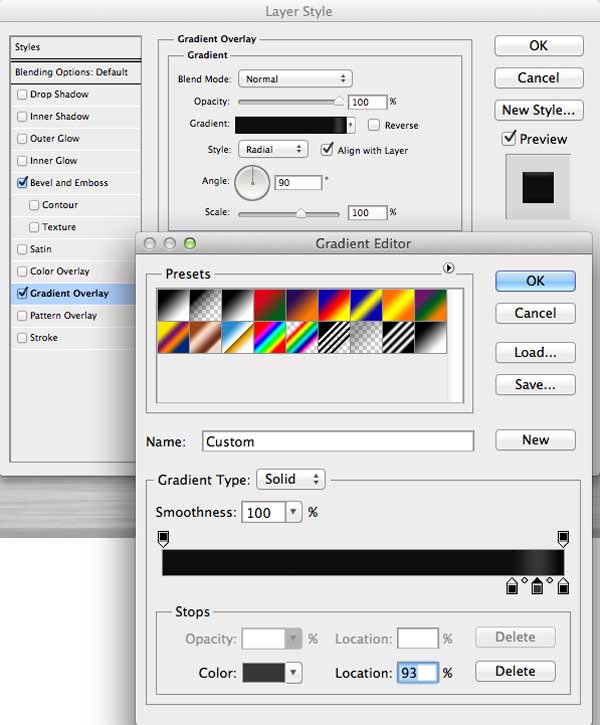
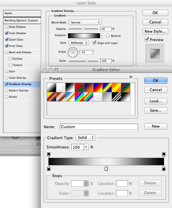
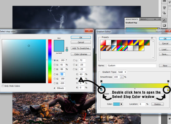
Layer > New Adjustment Layer > Gradient Map. Click on the gradient image to open the Gradient Editor. In this new window, Double – Click on the left Color Stop marker (in the gradient bar, they are located below, in the right bottom corner). This way you will open the window of Select Stop Color. Choose #55bedc. Now Double – Click in the left Color Stop marker and choose #f5e70b. Click OK in the Gradient Editor. Set the Blending Mode of the Gradient Map to Overlay, and lower Opacity to 15%.


Step 43

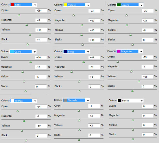
Layer > New Adjustment Layer > Selective Color. We are going to enhace the natural colors of the image. For that reason, we have to change a bit its base colors. Choose one and start editing the settings. Leave Blacks unchanged.


Step 44

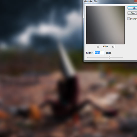
Let’s give some blurry atmosphere to our picture. Stamp Visible Layers by pressing Command/Ctrl + Shift + Alt + E. This will create a new layer containing all the items in the rest of layers, without affecting them. Name this layer "BW". Go to Filter > Blur > Gaussian Blur and set an Amount of 48,6 pixels. Set the Blending Mode of the layer to Screen and lower Opacity to 42%. Desaturate this layer by pressing Command/Ctrl + Shift + U or going to Image > Adjustments > Desaturate. Then Duplicate the layer (Layer > Duplicate Layer or Command/Ctrl + J) and change the Blending Mode to Soft Light.


Step 45

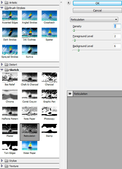
Now we are going to add some noise to the entire image. This way, we will get a more photographic approach, because it will be visible both in sharpened and blurred areas and will make the image to be more homogeneous. Again, Stamp Visible Layers by pressing Command/Ctrl + Shift + Alt + E. Go to Filter > Sketch > Reticulation. Set Density to 1, Foreground Level to 2 and Background Level to 6.

Set the Blending Mode of this layer to Luminosity, and Opacity to 22%.

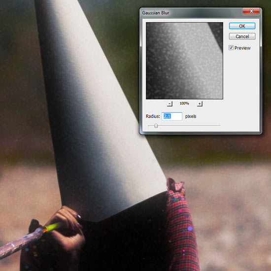
Go to Filter > Blur > Gaussian Blur and set an Radius amount of 2,1 pixels.

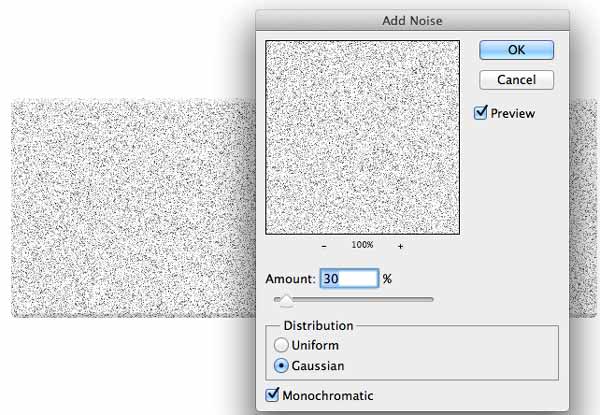
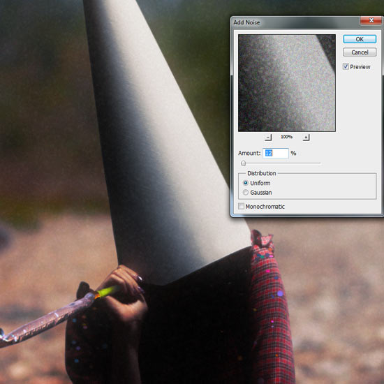
We are almost there. Go to Filter > Noise > Add Noise. Set an Amount of 12% and select Uniform Distribution.


Step 46

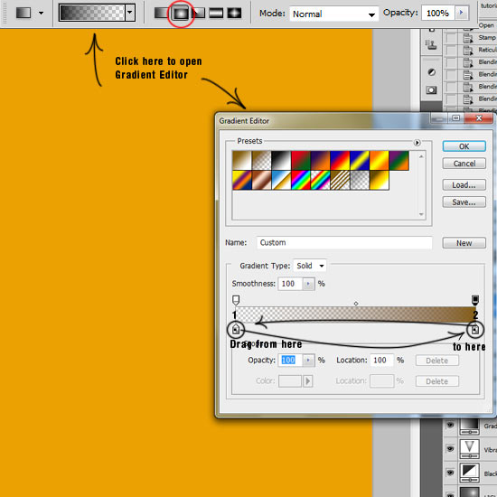
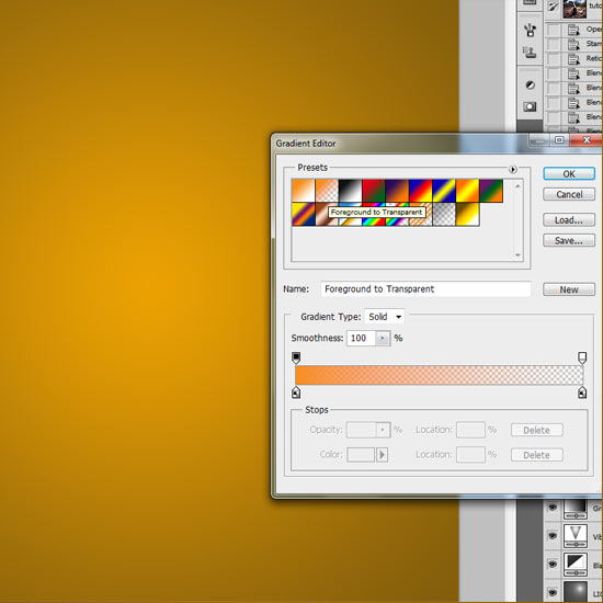
Create a New Layer (Layer > New > Layer or Command/Ctrl + Shift + N). Name this layer "Gradient". Use the Paint Bucket Tool (G) to fill this layer with the color #eba102. Press de Paint Bucket Tool icon until it shows a small submenu and pick the Gradient Tool. Choose from the top menu the Radial Gradient and Click on the Gradient bar to open the Gradient Editor. Now we are going to invert the gradient, so that way, when we create the gradient, it will affect from outside to the inside, so we will add color basically to the corners and sides and we will leave the center without changes. In the Gradient Presets, choose the second one (Foreground to Transparent). Double – Click the left Color Marker to open the Select Stop Color window and pick #845e0c. Click OK. Now, to invert the Gradient, grab from the left Color Marker and move it to the right corner, and then grab the right Color Marker and move it to the left corner. If you did it well, the gradient bar should look like the one in the screenshot below. Click OK.

Click and hold in the center of the canvas and drag the cursor to any of the corners, then release to create the gradient. It should look like this:

We still need one more gradient. Open again the Gradient Editor and Click on the Foreground to Transparent icon to get back to normal. Double – Click the left bottom Color Marker on the Gradient Bar and pick the color #f88e1c. Click OK and Click and hold on the center of the canvas, drag to one of the corners and release.

Set the Blending Mode of this layer to Soft Light. Now we are going to play a bit with the atmosphere. You can leave the colors as they are now, but if you are not into warm tones, maybe you will prefer to switch them a little. Go to Image > Adjustments > Hue/Saturation or press Command/Ctrl + U. Drag the Hue marker until you find a color combo that suits you well. In my case, I am choosing blues. When you are done, click OK and lower the Layer Opacity to 30%.

Let’s adjust the lighting of this layer a bit. Go to Image > Adjustments > Levels or press Command/Ctrl + L. We have to darken a bit the gradient, so drag the Shadows Input Level marker to the right (more or less until it marks 88).

The center area of the image now looks a bit weird and out of tune. Use the Gradient Tool (G) with the last color we picked ( #f88e1c) and create a gradient from center to any of the corners, Clicking and holding from the center of the canvas. Now, the image looks more natural.


Step 47

Go to the layer "BW" and create a New Mask. Select the Brush Tool (B), pick black color (#000000) and choose a soft 130 pixels size brush, 30% Opacity and 65% Flow, and start erasing some shadows in the teddy bear and the model’s legs that due to the latest modifications now are bad exposed.
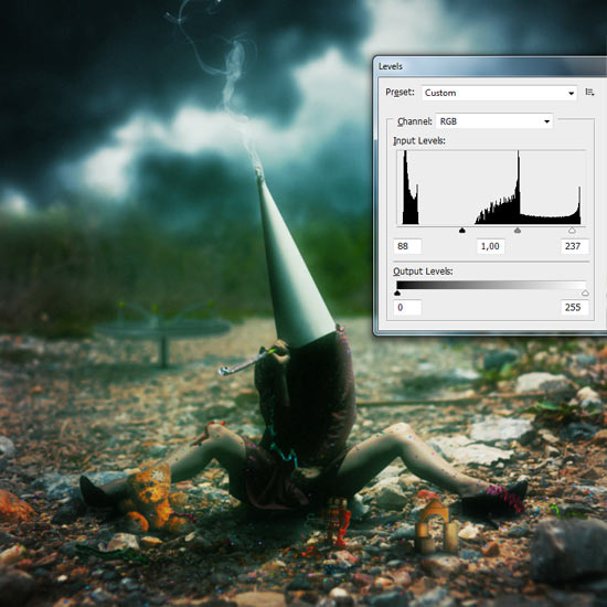

Step 48

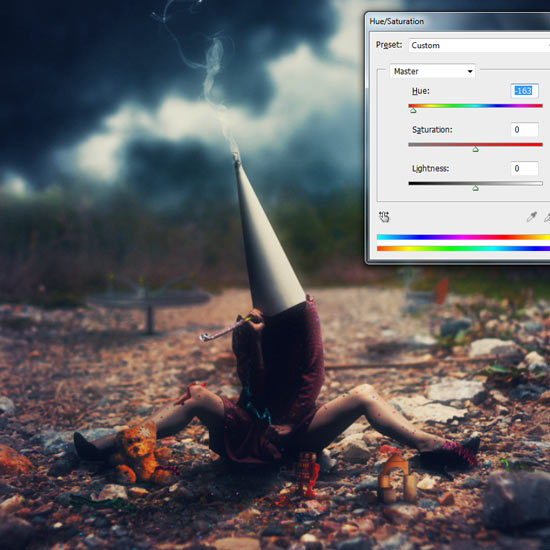
Create a new layer (Layer > New > Layer or Command/Ctrl + Shift + N) and fill it with any color you want with the Paint Bucket Tool (G). Set the Blending Mode to Difference and lower the Opacity to 13%. Name it "Difference".

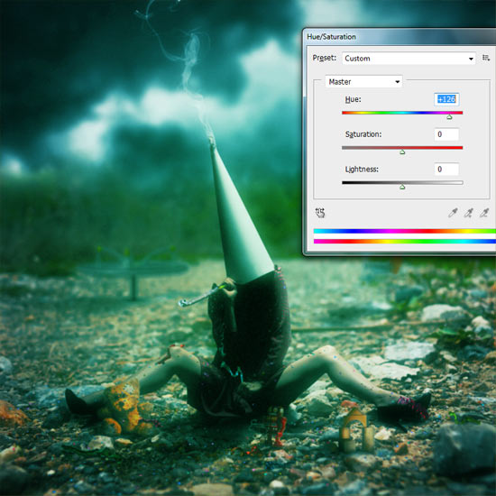
Go to Image > Adjustments > Hue/Saturation or Command/Ctrl + U. What we want is to tint highlights and shadows. I recommend to find a color that gives the highest contrast (in this case, deep blue or -163 in the Hue bar). Otherwise we will lose some contrast in the levels range.


Step 49

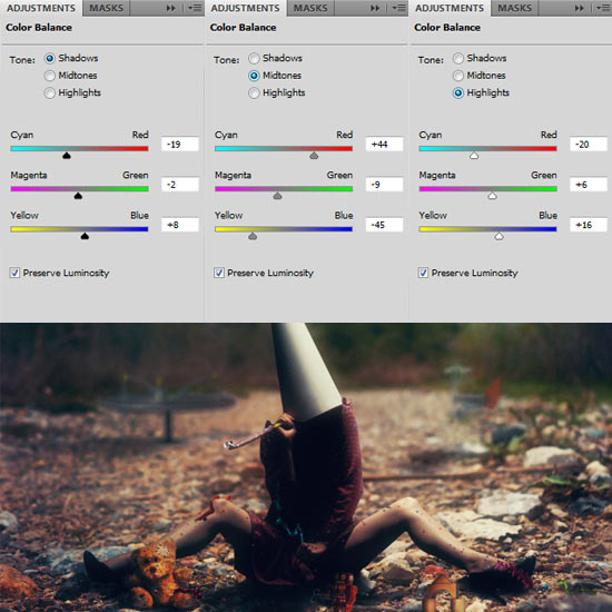
Go to Layer > New Adjustment Layer > Color Balance. We are going to give the final color touches to our photo manipulation. I recommend warming a bit the Midtones and set colder Highlights and Shadows:


Step 50

Create a new layer (Layer > New > Layer or Command/Ctrl + Shift + N), name it "Fog", place it above everything, select the Brush Tool (B) and press F5 to display the Brushes Panel. We want to create a new brush to add some subtle fog to the scene. Use the following settings to achieve that effect:

Start painting from where the ground starts (not the bushes) to the bottom of the canvas to create a dreamy effect. Lower the layer Opacity to 25%.

It might happen that some shadows might get lost during this proccess. If that is your case, create a New Mask, pick a soft black brush and with an Opacity lower than 50%, start erasing parts that might look annoying, like deepest shadows (legs, chest, plushie, shoes).


Step 51

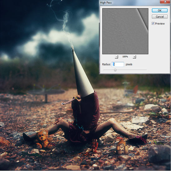
We are almost there! To give the final touch, we are going to sharpen up the image. Since it is very big, we cannot use the Sharpen Tool or the Sharpen Filters. So Stamp Visible Layers by pressing Command/Ctrl + Shift + Alt + E, set the Blending Mode to Overlay, and go to Filter > Other > High Pass. Set a Radius of 5 pixels and press OK. Name it "Sharpening".
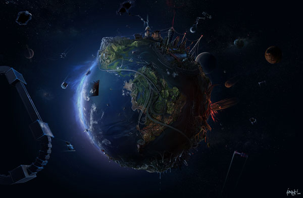
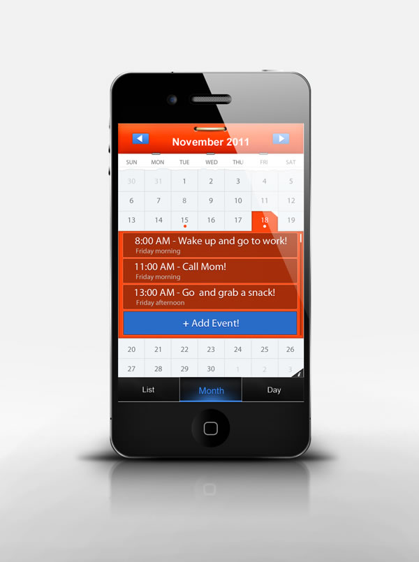
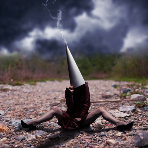
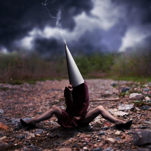
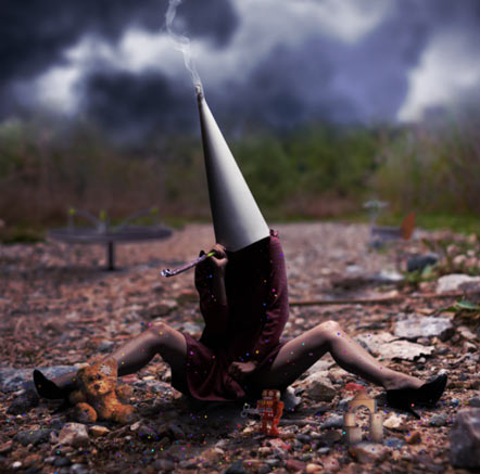
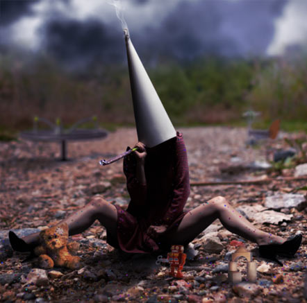
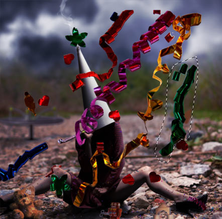
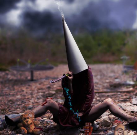
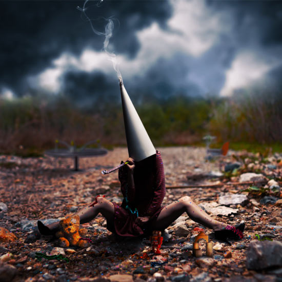
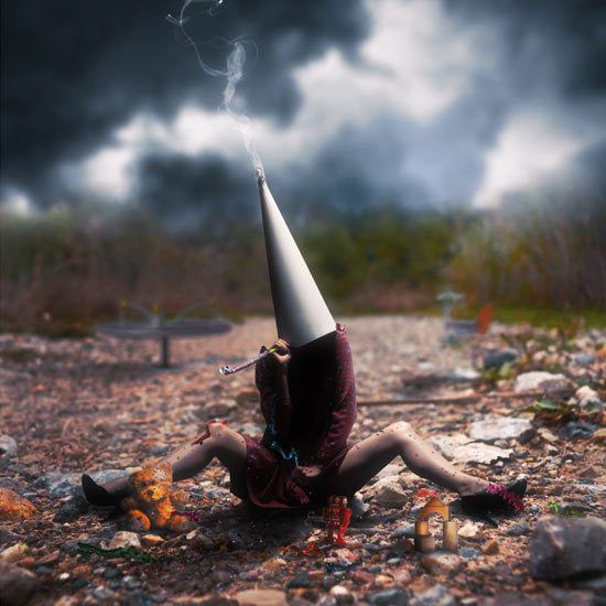
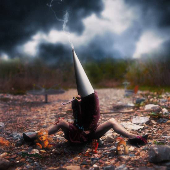
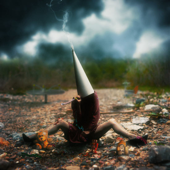
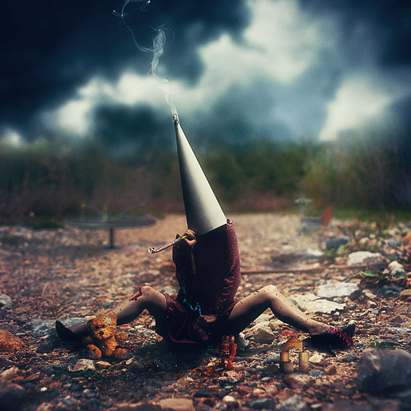

Final Image


Win a Free Copy of Filter Forge 3.0

$
0
0

Let’s be honest, most of Photoshop’s default filters and effects don’t give you much flexibility and don’t always look very realistic. Filter Forge is a powerful third-party plugin for Photoshop that allows you to do some pretty amazing things with filters, and even create your own. Today, our friends at Filter Forge are giving away a copy of Filter Forge 3.0 to 3 lucky Psdtuts+ readers.

Version 3.0 features support for multiple source images, improved preview interactivity, new amazing filters, and much more.

On the surface, Filter Forge is just a Photoshop plugin, a pack of filters that create visual effects, enhance photos, generate textures, and process images. However, there are some things that make Filter Forge unique:

1. All users get free access to thousands of filters. Anyone can contribute their textures and effects to the online filter collection so it grows with every submitted filter.

2. You can create your own filters. If you cannot find an appropriate filter in the library you’ll love the Filter Editor – a visual node-based tool for creating custom-tailored textures and effects. All filters are constructed by connecting components that represent basic operations such as blurs, gradients, color adjustments, noises, distortions, or blends – without writing a single line of code.

To win a free copy of Filter Forge, all you need to do is enter using the form below.


Up For Grabs

  • 1 copy of Filter Forge Basic to 3 readers

Rules

  • To enter, submit your entry using the form above.
  • You may only enter once.
  • Make sure to enter a valid email address so that we can contact you.
  • Entries will be accepted until Friday, December 23, 2011 at 11:59 PM, EST.

To learn more about Filter Forge, visit their website, download the demo version of the software, and check out their gallery.

Editor’s note: This post was sponsored by Filter Forge.


A Look at Depthcore’s Latest Chapter: Time

$
0
0

Yesterday, our friends from Depthcore released their latest chapter. Time, their 43rd themed exhibition marks nearly 10 years since the collective’s founding in 2002 and features some truly amazing works of art. In this article, we have decided to feature a few of their works for you to enjoy. Please take a moment to review some of their latest designs.


Karma


The Traveler


Ambition


Winter


Time is Gone


Siccero


Forgotten


Looking Back


Habit Walk


Naked City


Quetzalcoatl


Draw a Character Concept Using Drapery in Photoshop

$
0
0

Photoshop is an excellent tool for manipulating photographs but it can also be used as a means to create stunning digital art. This tutorial is part of a 25-part video tutorial series demonstrating everything you will need to know to start producing digital art in Photoshop. Digital Art for Beginners, by Adobe Certified Expert and Instructor, Martin Perhiniak will begin by teaching you how to draw in Photoshop. At the conclusion of this series you will know all you need to produce your own concept art and matte paintings in Photoshop.

Today’s tutorial Part 17: Draw a Character Concept Using Drapery in Photoshop will build on the techniques we learned in the last lesson to create a character concept in Photoshop. The final result will depict a skeleton in a red cloak, holding a staff. Let’s get started!


Create Promotional Rendering for High-End Action Figure Packaging – Tuts+ Premium Tutorial

$
0
0

Creating artwork for package designs can be challenging because the artwork that you create doesn’t look the same on your screen as it does on the shelf. This can cause confusion when presenting a design to a client because the client will want to know what it looks like on the shelf, not on your screen. In this Tuts+ Premium tutorial, author Tim Kyde will explain how to turn a design we created in a previous tutorial into a 3D render of a package design for a high-end action figure. If you are looking to take your package design skills to the next level then Log in or Join Now to get started!

Tuts+ Premium Members can login now for instant access to this tutorial. Membership to Tuts+ Premium gets you access to hundreds of exclusive premium tutorials, top selling ebooks, in-depth courses, member forums, and much more. To learn more about Tuts+ Premium, Take the Tour or Join Today.


Take a Look at Part 1

Don’t forget to take a look at Part 1 of this tutorial Create High-End Action Figure Packaging. In Part 1 you will learn how to shoot your own photography and create a print-ready outer sleeve and inner packaging for this action figure.


Presentation: Making Selections in Photoshop

$
0
0

Workshops, presentations, and conferences are excellent places to learn Photoshop. These types of events occur every day, all over the world. We understand that you can’t attend every event, everywhere. That is why each month; we display some of our favorite presentations here for you to enjoy. Today, our friend Martin Perhiniak explains selections in this roughly 90-minute presentation that he did for Academy Class.


Viewing all 6352 articles
Browse latest View live