![]()
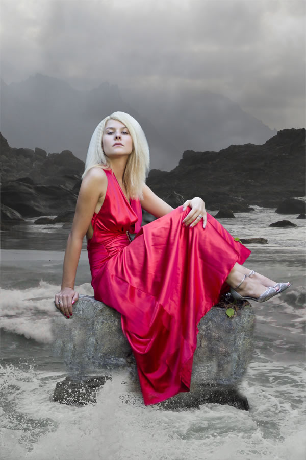
In this tutorial you’ll learn how to compose magical scene from different stock images, how to create strong atmosphere and add interesting lights and shadows. You’ll also learn many different ways of color adjustments to get the exact images you’ve always wished. Let’s get started!
Tutorial Assets
The following assets were used during the production of this tutorial.
Step 1 – Preparing the Upper Part of the Background
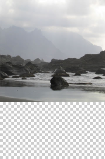
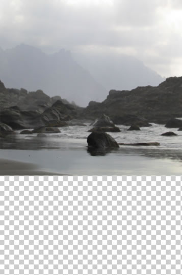
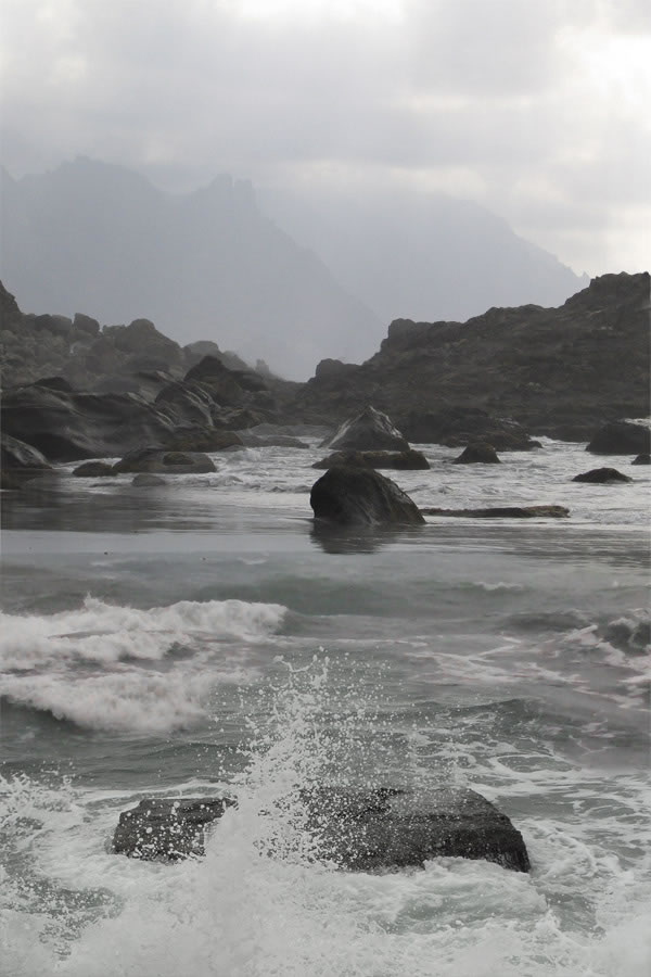
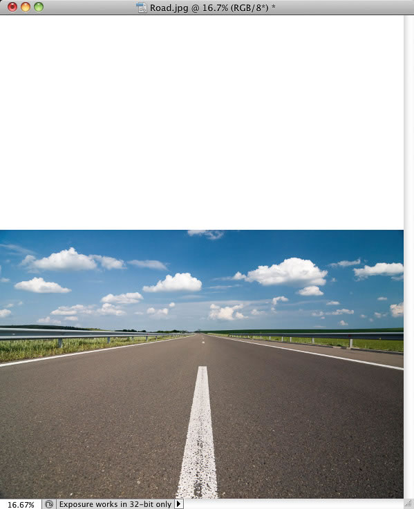
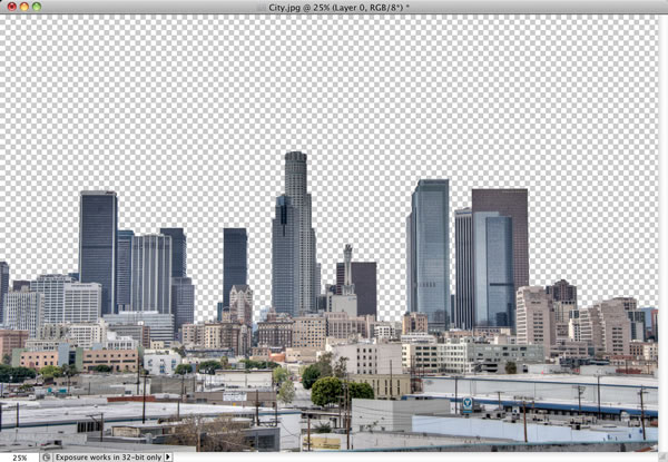
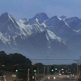
Create a new file in Photoshop. Set the dimensions on 600px (wide) and 900px (height). Download the picture of the background and drag it into the just created file. Name this new layer e.g. UPPER BACKGROUND. To set the proper size of this layer press Command/Ctrl + T on your keyboard (or go to Edit > Free Transform) and resize it on proper size. Hold Shift while doing it to remain the same proportions. To apply changes press Enter on your keyboard.
Place the layer UPPER BACKGROUND to the upper part of the image.
I like the overall serene atmosphere of the stock photo. It has an enigmatic, foggy mood which I find to be especially attractive. But I also like drama in my images. To bring some drama here you’ll create higher mountains on the left and right side.
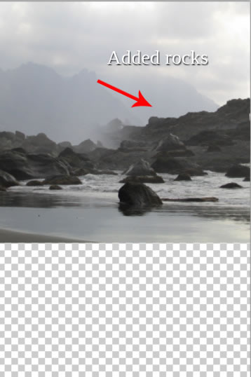
Grab the Lasso Tool (L) and select the right part of the rocks. Press Command/Ctrl + C to copy this selection and then Command/Ctrl + V to paste it. Name the new layer RIGHT ROCKS and place it above the original rocks. Below you can see an example of what I mean.
As you can see it looks very unrealistic right now. To make it better looking you need to blend it with the rest of the image.
You could do it with the Eraser Tool (E) but I have a better idea for you – using layer mask. When using the Eraser Tool (E) the erased parts are lost for good and it’s very hard to reappear them if you realize you want to do something differently. If you work with layer masks the parts are just hidden (not erased) and you can easily make them reappear.
The principle is simple: if you want to hide something, paint on the layer mask with black over that part, if you want to have something visible, paint over it with white.
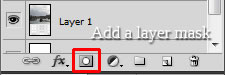
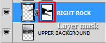
Make sure you’re on the RIGHT ROCKS layer. Click on the button Add layer mask. You can find this button in the bottom part of the palette Layers. If you don’t see this palette press F7 on your keyboard or go to Window > Layers and it appears.
Grab the Brush Tool (B), select some soft round brush and set the Master Diameter on about 70 px. Lower the Opacity on 40% and pick black color. Make sure that the layer mask is active (just click on it) and start blending RIGHT ROCKS with the background.
Now do the exact same process with the left part of the rocks. On the picture below you can see how your manipulation should look like after this step.
Step 2 – The Bottom Part of the Background
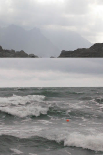
Download the stock photo of sea listed in the beginning of the tutorial and drag it into your manipulation. Name this new layer SEA. Press Command/Ctrl + T and change its size to fit the rest of the manipulation. Press enter to apply the changes.
You need to blend the SEA with the rest of the image. You’ll do it same as you’ve blended rocks in the previous step. Add a layer mask and paint with the Brush Tool (B) over the transition between see and rocks. Use the same brush settings as in the previous step. Paint till you create nice soft transition. On the photo below you can see how the blending should look.
Another element, which needs to be added, is the stone in the foreground on which the woman sits in the preview picture. Download the stone photo listed in the beginning of the tutorial. Drag it into your manipulation, place it on the top of all layers, resize it and name it STONE.
As with previous parts of the background you need to blend the stone with the rest of the picture properly. To do this, add a layer mask to the STONE. Grab the Brush Tool (B), pick some soft round brush, set the Master Diameter on about 150 pixels, lower the Opacity on 50% and pick black color. Paint over the areas of the STONE you want to hide. On the picture below you can get the inspiration how the layer looks with the layer mask.
And there is shown how the overall manipulation looks so far.
Step 3 – Darkening the Sky
In this step you’ll focus on adjusting the sky. Right now it’s too bright, which doesn’t fit to the mood you want to achieve with this work. In this step you’ll darker it little bit and then you’ll make some more adjustments in following steps.
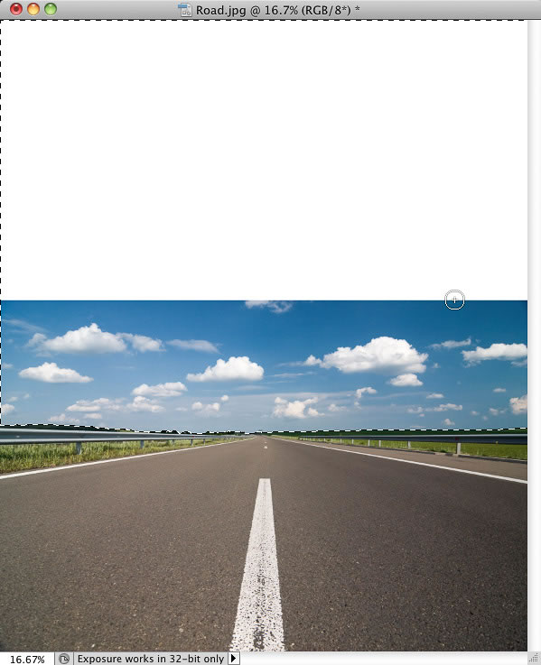
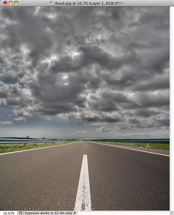
Download the stock photo of the sky listed in the beginning of the tutorial and drag it into your photo manipulation. Place it on the top of the layers and name it SKY. Press Command/Ctrl + T or got to Edit > Free Transform and resize it on proper size. Press Enter to apply the changes.
You need to do two things to blend this layer properly with the rest of the image – to change its Blending Mode and to blend it with the help of layer mask.
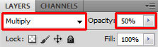
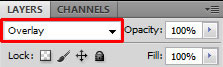
Let’s start with the changing of the Blending Mode. You can find it in the upper part of the palette layers. Change it from the mode Normal to Multiply and then lower the Opacity on 50% to get more gentle effect.
Add the layer mask to the SKY and blend it the same way you did it in previous steps.
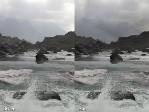
On the following photo you can compare how the sky looks before and after this step.
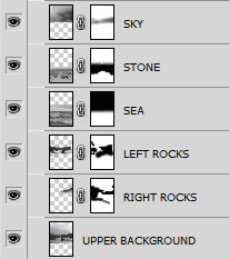
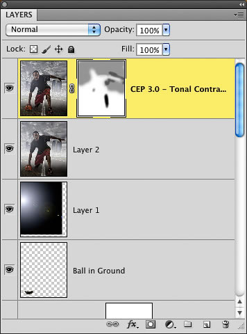
Let’s take a look at how the layer order should look like:
Step 4 – Adding the Woman
This is very quick step. Download the stock photo of the woman and drag it into your photo manipulation. Place it on the top of all layers and name it WOMAN. Press Command/Ctrl + T on your keyboard and resize it on proper size. After you’re done press Enter on your keyboard to apply the changes.
On the photo below you can see how the photo manipulation should look like so far.
Step 5 – Adding Faces
As you can see the side parts of the stone, on which the woman sits, looks really weird because of the very soft edges. But don’t worry in this step you’ll add stone faces on each side to fix it.
Download the stock photo of the face and open it in Photoshop. Cut out the background. You can you the Lasso Tool (L) or the Pen Tool (P) or any other method you are comfortable with to do it. After that drag the face into your photo manipulation. Name it RIGHT FACE and place it on the top of all layers. Press Command/Ctrl + T on your keyboard and resize it on proper size.
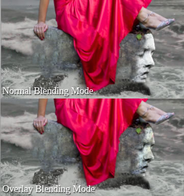
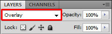
To blend the face better with the rest of the image change its Blending Mode from Normal to Overlay.
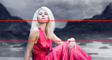
On the following picture you can compare how the face looks when it’s set on Normal and on Overlay Mode.
You want to have the face also on the left part of the stone. Right click on the layer RIGHT FACE and choose the option Duplicate layer. Name the new layer LEFT FACE. You need to flip it so go to Edit > Transform > Flip Horizontal. Grab the Move Tool (V) and place it on the left side of the image.
Step 6 – Adjusting the Faces
If you look at your picture right now you see that both faces are too bright and because of that doesn’t fit to the rest of the photo manipulation. You’ll make them darker in this step.
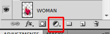
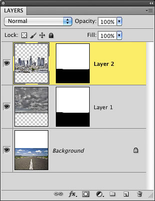
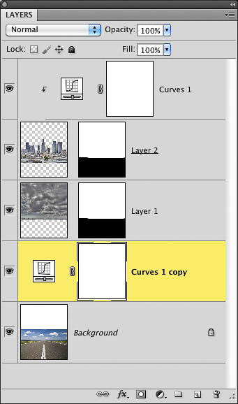
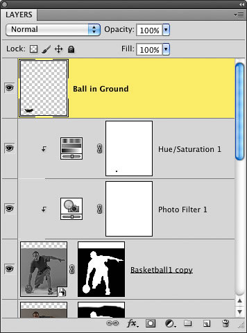
Add new adjustment layer Levels above the RIGHT FACE but under the LEFT FACE. You can find the button Add new fill or adjustment layer in the bottom part of the palette Layers right from the button Layer mask you’ve used in previous steps.
I strongly recommend you to use adjustment layers instead of direct adjustments you get from Image > Adjustments > … path. If you use adjustment layer you can always go back and tweak the adjustment or you can simply delete it or do just only local changes.
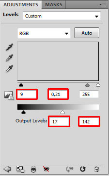
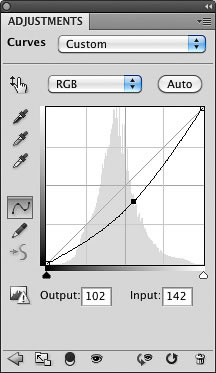
So, add new adjustment layer Levels above the RIGHT FACE, set the Input Levels on 9; 0,21; 255 and the Output Levels on 17; 142.
As you can see, all layers under the adjustment layer (in this case it means all layers except LEFT FACE which is above) are adjusted. And you don’t want that, you want to adjust only RIGHT FACE. Luckily there is really quick solution for you! Right click on the adjustment layer you’ve just added and choose the option Create Clipping Mask. And only the RIGHT FACE is darker.
Let’s move on the LEFT FACE. Add new adjustment layer Levels on the top of all layers and set it the same as you set Levels for RIGHT FACE (see picture above). To adjust only LEFT FACE and not the whole image right click on the adjustment layer and select the option Create Clipping Mask again.
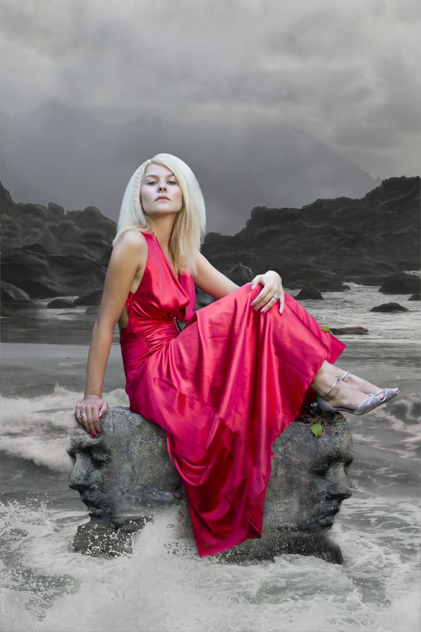
On the picture below you can take a look at how the photo manipulation looks so far.
Step 7 – Adjusting Highlights
Most of the main elements are already placed in the image. So from now on you’ll focus on creating the atmosphere of the picture. If you look at the manipulation right now you see it’s pretty boring – there is no interesting light neither some movement, two elements which are really helpful while adding drama to your manipulation.
In this step let’s start with creating more interesting highlights.
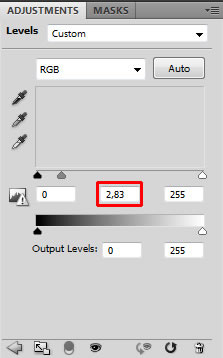
Add new adjustment layer Levels on the top of all layers and set the Input Levels on 0; 2.83; 255.
Now you’ll see another great reason why to use layer masks instead of direct adjustments – the local changes.
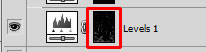
Grab the Paint Bucket Tool (G) and pick black color. Click on the Layer mask of the adjustment layer Levels and fill it with this black color. The adjustment disappears.
It’s the same principle you used while blending background photos in the beginning of the tutorial. Back then you used black brush to hide unwanted part. This time you’ll use white brush to reappear the adjustment on the parts, which should be lighter than they are right now.
Grab the Brush Tool (B), pick some soft round brush, set the Master Diameter on 10px – 20 px. Lower the Opacity on 5% and pick pure white color. Start painting over areas you want to have lighter. This would be easier and quicker if you have tablet but with little practice you can get great results with your mouse too.
You should focus on woman’s cheek and arms, waves, mountain in the background and faces while you paint. On the picture below I highlighted with red the areas where I painted to give you an example.
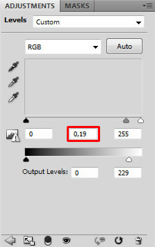
Step 8 – Adjusting Shadows
Logical step after adjusting highlights is adjusting shadows so let’s do it!
Add new adjustment layer Levels on the top of all layers and this time set the Input Levels on 0; 0.19; 255.
Grab the Paint Bucket Tool (G), pick black color and fill the layer mask with it. Then grab the Brush Tool (B), use the same settings as in the previous step (don’t forget to pick white color) and paint over the areas where deeper shadow should be – lower part of woman’s dress, upper part of sky, opposite side of mountains and faces.
As in the previous step I highlighted the areas where I painted to give you better idea of where you should do it.
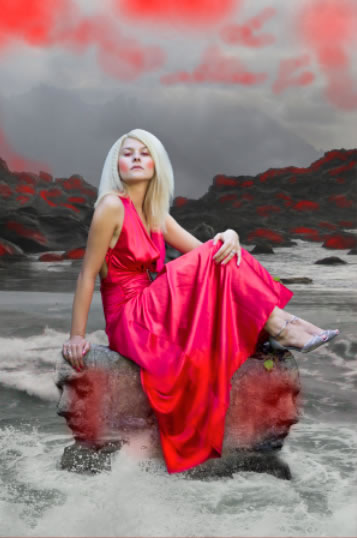
After these two last steps your photo manipulation should look like the one shown below.
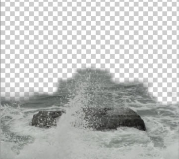
Step 9 – Adding Waves
In previous steps you’ve created bit more drama by adjusting the light scene of the photo manipulation. Now let’s focus on some movement.
If you look at the sea it’s very calm and peaceful. Wouldn’t it be more dramatic if there were more waves? You’ll add them in this step.
Download the waves brushes listed in the beginning of the tutorial and install them into Photoshop. If you don’t know how to install custom brushes, you can take a look at this tutorial.
Add new layer on the top of all layers and name it WAVES. Grab the Brush Tool (B) and select one of the wave brushes you’ve just installed. Press Alt on your keyboard to activate the Eye Dropper Tool (I) and select some very light color from the picture. Try to avoid using pure white and pure black colors (not just only in this one but in all your photo manipulations). Both are very harsh colors and rarely look realistic. If you look around you, you will notice there are very few examples of both of these colors. Most likely they’re variation of e.g. light yellow, light blue… instead of white and dark green, grey or brown instead of pure black.
Now simply paint some waves around the stone on which the woman sits. Let’s see where you should add them.
Step 10 – Adding Mist
If you’ve read more of my tutorials you probably already know that I really like adding fog into my photo manipulations. The reason is that according to me fog can add very nice touch of magical or enigmatic atmosphere and that’s what I really like in images.
Add new layer on the top of all layers and name it FOG. Download the mist brushes listed in the beginning of the tutorial (or feel free to use any other which are for free) and install them into Photoshop.
Grab the Brush Tool (B), select some of the fog brushes you’ve just installed, press Alt on your keyboard to activate the Eye Dropper Tool (I) and pick some very light color from the picture. Now simply paint some mist around the mountains in the background.
Be careful to not to paint on the woman. It wouldn’t look realistic because she is in the foreground where is no fog.
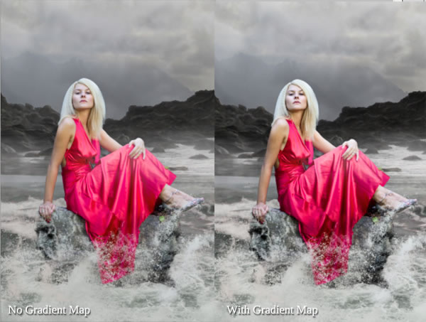
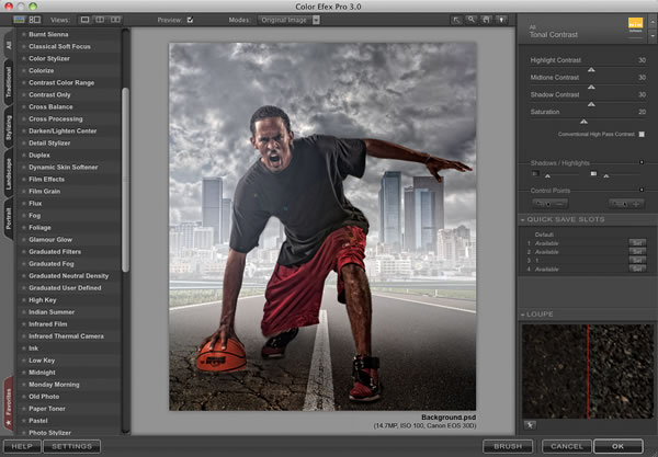
Step 11 – First Global Adjustments
In this step you’ll do three things – increase the contrast with use of Gradient Map, add bluish tones with Levels and desaturate woman’s skin a little with Vibrance adjustment layer. Let’s start with increasing contrast.
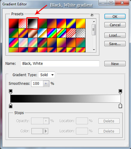
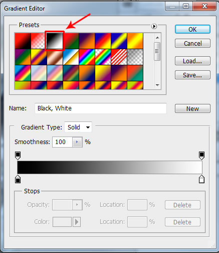
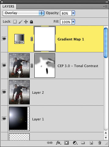
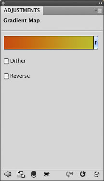
Add new adjustment layer Gradient Map of the top of all layers. Choose the Black, White Gradient.
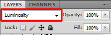
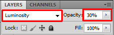
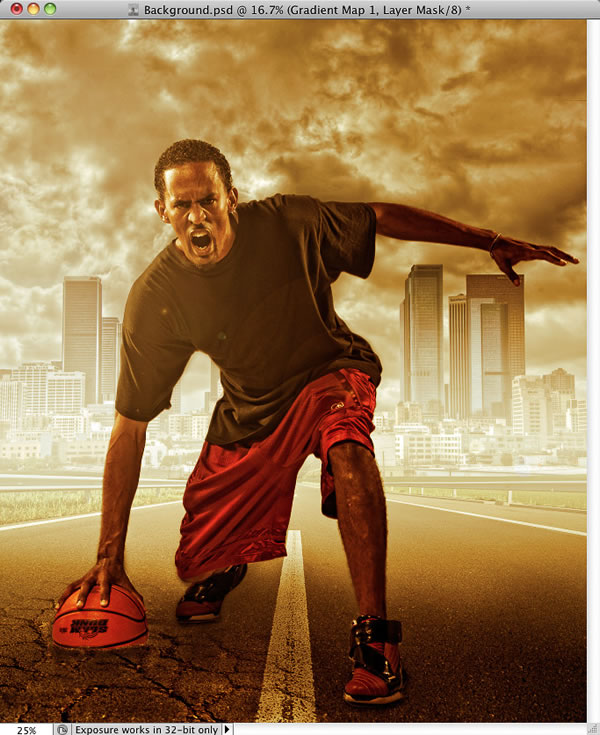
The only thing the gradient did so far is that the picture is black and white. But you want higher contrast, don’t you? To achieve that simply change the Blending Mode of this layer from Normal to Luminosity.
Here you can see how the Gradient Map adjustment layer affects the photo manipulation.
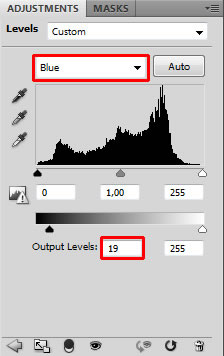
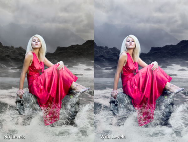
The second thing which you will do in this step is to add blue tones. To do that add new adjustment layer Levels on the top of all layers. Choose Blue channels and set the Output Levels on 19; 255.
Let’s take a look at how this adjustment changes the picture.
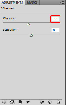
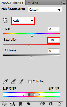
And the last thing – desaturate woman’s skin a little. Add new adjustment layer Vibrance on the top of all layers and set the value Vibrance on -10.
(If you have some older version of Photoshop (I think CS2 or lower) the adjustment Vibrance is not available there. But you can achieve pretty same effect by adding the adjustment layer Hue/Saturation, as color choose Red and set the value Saturation on -10.)
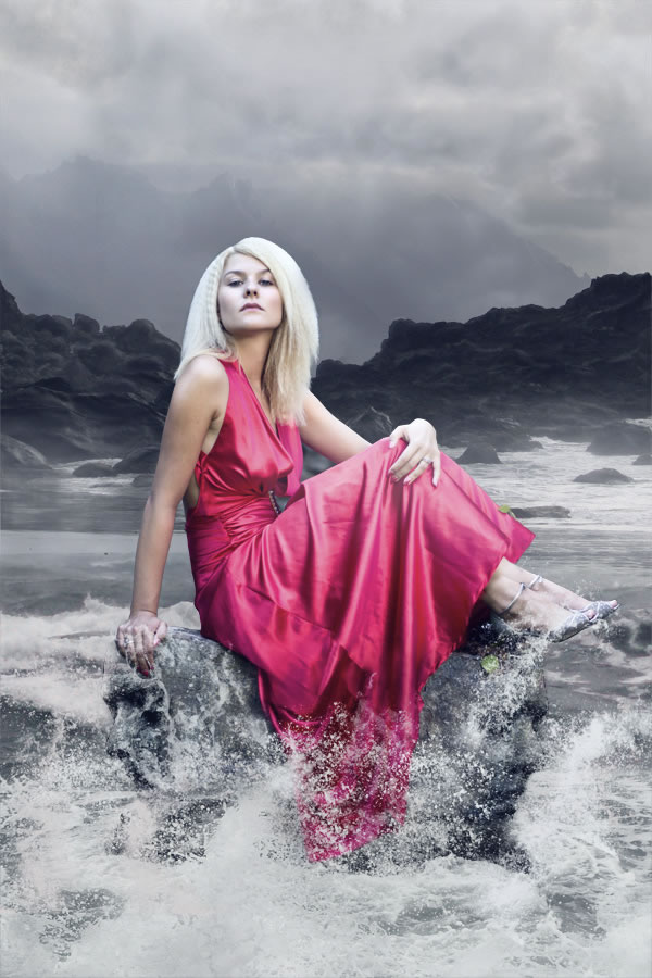
Let’s take a look at how your photo manipulation looks like after all these steps and adjustments.
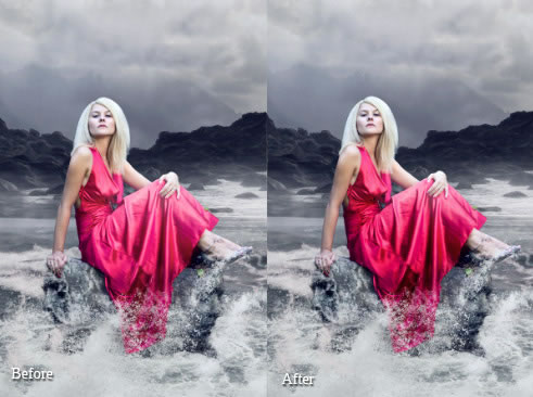
Step 12 – Darkening the Dress
Because of the previous adjustments the woman’s dress is too bright which doesn’t create interesting contrast between the clothes and the rest of the image. You’ll fix it in this step.
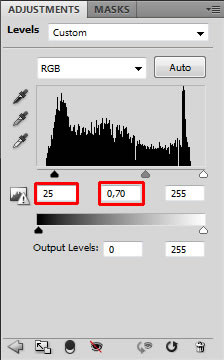
Add new adjustment layer Levels on the top of all layers and set the Input Levels on 25; 0.70; 255.
You want to adjust only the woman’s dress and not the rest of the picture. Because of that you need to fill the layer mask of this layer with black color and then paint over the areas which you want to have darker.
Grab the Paint Bucket Tool (G), pick black color, make sure the layer mask is active (just click on the layer mask thumbnail) and fill it. Then grab the Brush Tool (B), select some soft round brush, set Master Diameter on about 50 pixels and set the Opacity on 100%. Pick white color and paint over the dress to make it darker.
On the following photo you can compare how the picture looks before and after this step.
It’s quite subtle change but I strongly believe that while doing photo manipulations you should make more decent adjustments instead of one radical. Because of that you get more natural looking and more interesting images.
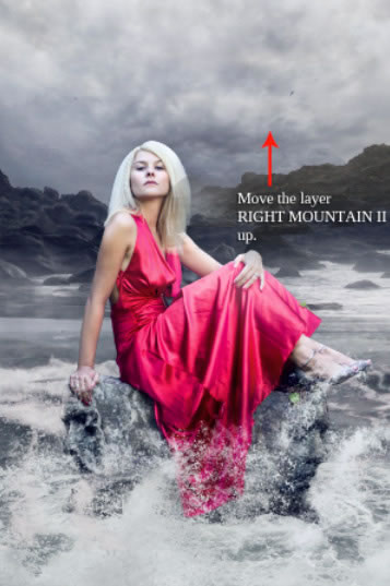
Step 13 – Higher Mountains
According to me the composition right now still lacks drama I want to achieve. It would help if you make the mountains in the background even little bit higher. To do that right click on the layer RIGHT ROCK and select the option Duplicate layer. Name this new layer for instance RIGHT ROCK II and place it on the top of all layers. Grab the Move Tool (V) and move the mountain up so it looks it’s higher.
To blend the layer properly with the rest of the image add layer mask to it. Grab the Brush Tool (B), set the Master Diameter on about 30 pixels and lower the Opacity on 50%. Pick white color and paint over the edges of the mountain to blend it.
Then do the exactly same process with the left side of the mountain.
On the picture below you can see how the manipulation looks so far.
Step 14 – Changing the Sky
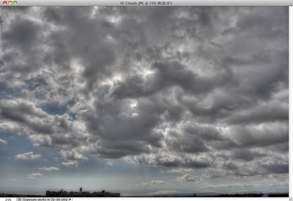
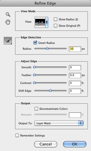
I think the sky right now has lack of the details and looks boring because of that. In this step you’ll add stormy, more dramatic clouds. Download the picture of clouds listed in the beginning of the tutorial. Place it on the top of all layers and name it CLOUDS. Press Command/Ctrl + T on your keyboard and resize it on proper size. Then press Enter to apply the changes.
To blend the clouds well with the rest of the image change its Blending Mode from Normal to Overlay.
If you look at the image below you may notice that there is harsh transition between just added clouds and the rest of the image.
You want to blend it. To do that add layer mask to CLOUDS. Grab the Brush Tool (B), select some soft round brush, set the Master Diameter on about 100 pixels and lower the Opacity on 50%. Pick black color and paint over the transition to get nice, soft one.
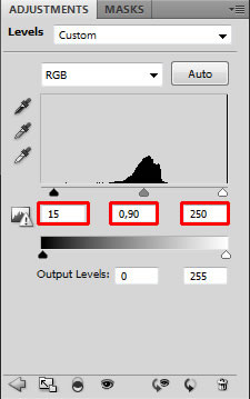
Step 15 – Adjusting the Sky
The overall picture would look better if the sky is bit darker. You’ll do it on this step. Add new adjustment layer Levels on the top of all layers and set the Input Levels on 15; 0.90; 250.
You want to adjust only the one layer below (CLOUDS) and not the rest of the image. To achieve that right click on Levels adjustment layer and select the option Create Clipping Mask.
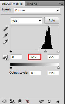
To add even bit more depth to the sky, darken the upper part a little. Add another adjustment layer Levels on the top of all layers and this time set the Input Levels on 0; 0.45; 255.
You want to adjust only the upper part of the sky. Because of that grab the Paint Bucket Tool (G), pick black color and fill the layer mask of this adjustment layer. Then grab the Brush Tool (B). Use the same size and type of the brush as in the previous step. Set the Opacity on about 30% and pick white color. Now paint over the upper part of the sky. On the picture below you can get the ideas where, it’s highlighted with red color.
Your image should be similar to the one below.
Step 16 – Adding Birds
This will be really quick step. I’ve already mentioned that I like using mist in my images because of the enigmatic atmosphere it creates. Another favorite element is flying birds because of the movement they add to the image. You’ll add some them in this step.
Download the bird brushes listed in the beginning of the tutorial and install them into Photoshop. Add new layer on the top of all layers and name it BIRDS. Grab the Brush Tool (B) and select some of the brushes you’ve just installed. Hold Alt on your keyboard to activate the Eyedropper Tool (I) and select some dark blue color from the picture. Paint some birds! Don’t paint too many of them because it won’t look realistic.
Step 17 – Darkening and lightening
Let’s move on another step. In this final part you’ll focus on creating more interesting atmosphere by adding multiple color adjustment layers.
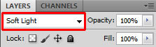
Let’s start with darkening of some parts of the image. Add new layer on the top of all layers and name it e.g. DARKENING. Change its Blending Mode from Normal to Soft Light.
Grab the Brush Tool (B), select some soft round brush and set the Master Diameter on about 30 pixels. Lower the Opacity on 10% and pick black color. Paint over some parts of clouds to make it bit darker and dramatic.
Then change the color from black to white and paint over the top of the mountains to create more interesting lighting effect. On the picture below you can see where to paint.
Step 18 – Adding More Cyan Tones
According to me to better evoke the whole "sea like" atmosphere the overall picture should have more cyan/blue tones. You’ll add them in this step.
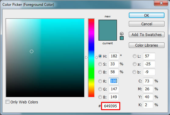
Add new layer on the top of all layers and name it MORE CYAN. Grab the Paint Bucket Tool (G) and pick some cyan or blue color. If you want to use the exact same color as I did type #649395 into the highlighted square.
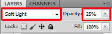
To use this layer for color adjustments change its Blending Mode from Normal to Soft Light and to get smoother, gentler effect lower its Opacity on 25%.
Let’s take a look at how your photo manipulation should look like so far.
Step 19 – Darkening and More Contrast
In this step you’ll make two gentle adjustments. You’ll make the picture bit darker and bit more contrasted.
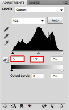
Let’s start with darkening. Add new adjustment layer Levels on the top of all layers and set the Input Levels on 5; 0.95; 255.
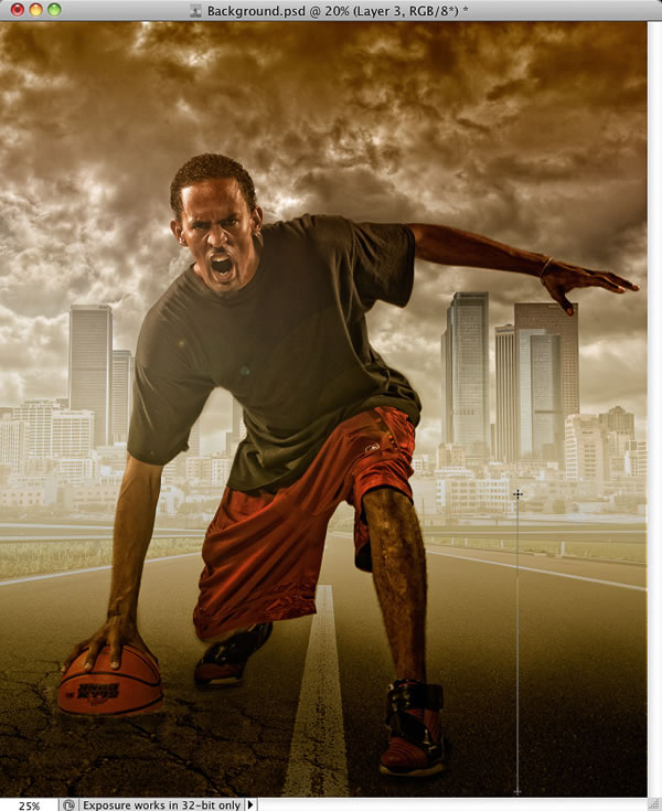
To increase the contrast add new adjustment layer Gradient Map on the top of all layers. Choose Black, White gradient.
Change its Blending Mode from Normal to Luminosity. To get a more gentle and realistic effect lower the Opacity on 30%.
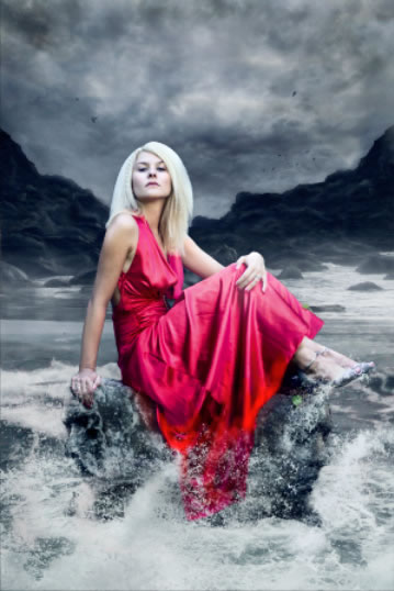
Step 20 – Darkening Dress and Rock
Let’s focus on the bottom part of the image because it lacks contrast. Right now the stone in the foreground is as light as the sea, which doesn’t look interesting. Also the bottom part of the dress should be bit darker – it’s wet and clothes usually tend to be darker.
Add new adjustment layer Levels on the top of all layers and set the Input Levels on 0; 0.5; 255.
You want to make only local adjustments. Because of that grab the Paint Bucket Tool (G), pick black color and fill the layer mask. Then grab the Brush Tool (B), pick white color and start painting over the areas you want to have darker.
On the following picture you can get inspiration where to paint. Those areas are highlighted with red color.
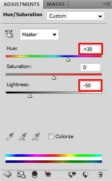
The dress should be even darker. To do that add a new adjustment layer Hue/Saturation on the top of all layers and set it as shown below.
As before you want to make only local adjustments. Fill the layer mask of this new adjustment layer with black color. Than grab the Brush Tool (B), pick white color and paint over the areas, which are highlighted with red color on the following picture.
Step 21 – Darker Highlights
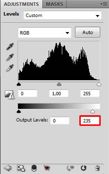
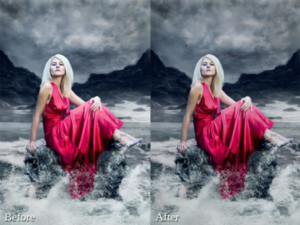
This is another really quick step in which you’ll make highlights little bit darker. Add new adjustment layer Levels on the top of all layers and set the Output Levels on 0; 235.
On the following picture you can compare how the manipulation looks before and after this adjustment.
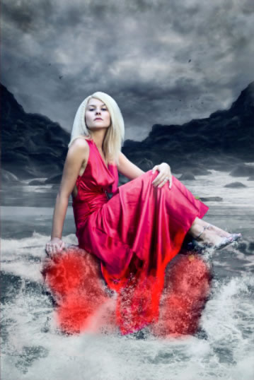
Step 22 – Adjusting Color of the Dress
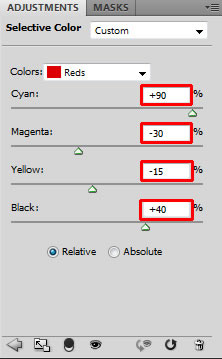
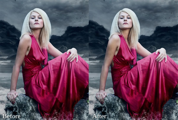
I’m still not satisfied with the color of the dress. It’s too bright and too red. You’ll change it in this step.
Add new adjustment layer Selective Color on the top of all layers. From the Color palette choose Red and set the same values as shown on the picture below.
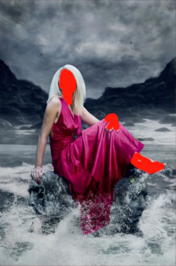
Woman’s hand and face is now adjusted too but it doesn’t look nice – it’s too cyan. To hide the adjustment on that areas grab the Brush Tool (B), pick black color, click on the thumbnail of layer mask and simply paint over her hands and face.
On the following picture you can compare how the image looks when woman’s skin is adjusted by Selective Color (before) and after hiding it with layer mask (after).
Step 23 – Darkening the Skin
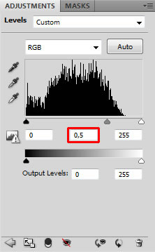
This is the last local adjustment you need to do before you finish this tutorial. Woman’s skin seems to be too bright. To fix it add new adjustment layer Levels on the top of all layers and set the Input Levels on 0; 0.8; 255 and the Output Levels on 25; 255.
To only adjust the woman’s skin fill the layer mask of this layer with black color. Then grab the Brush Tool (B), pick white color and paint over the areas you want to darken. You can get inspiration on the picture below. Areas where I painted are highlighted with red color.
Step 24 – Lighter Image
This is the very last step and it’s very quick and easy. You’ll make the image little bit lighter.
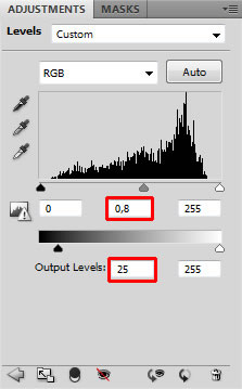
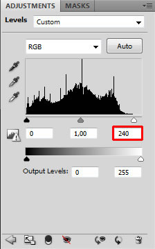
Add new adjustment layer Levels on the very top of all layers and set the Input Levels on 0; 1.00; 240. And that’s it!
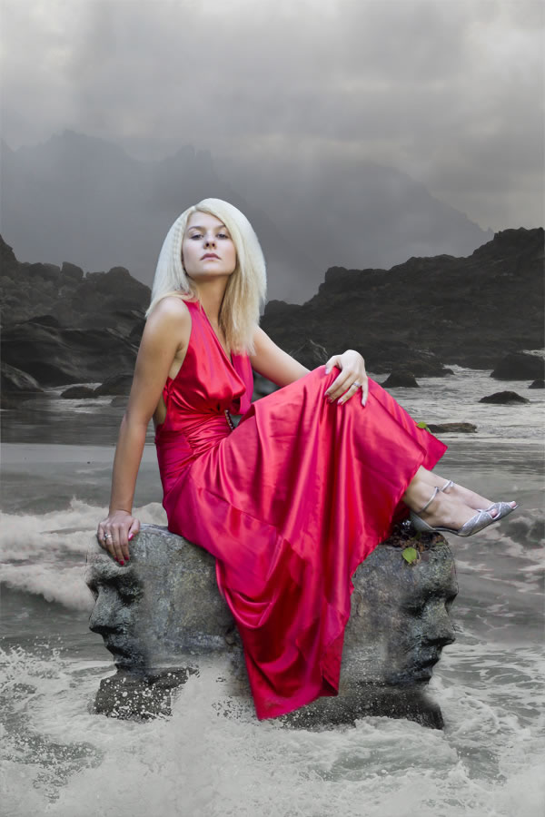
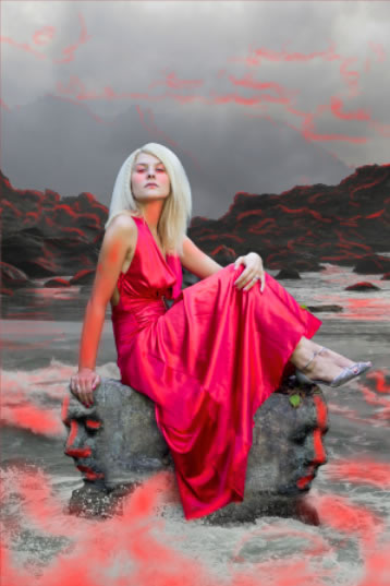
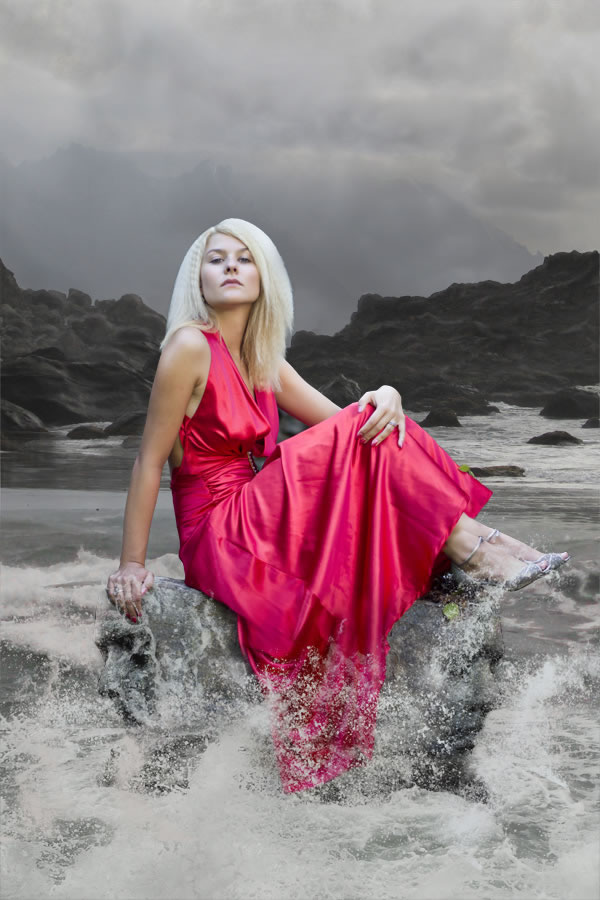
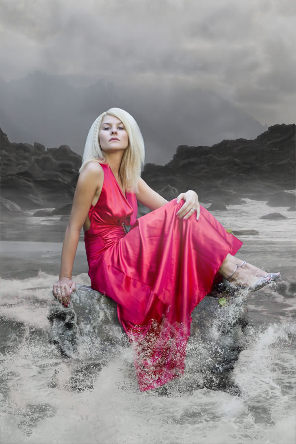
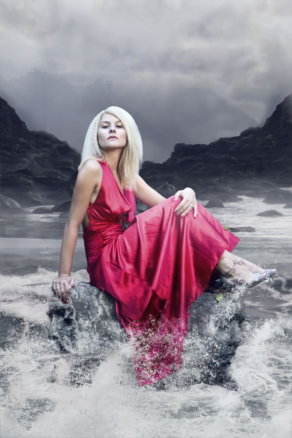
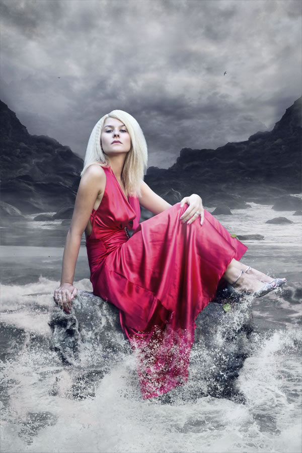
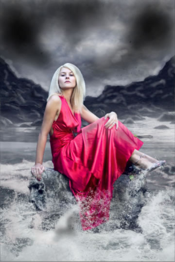
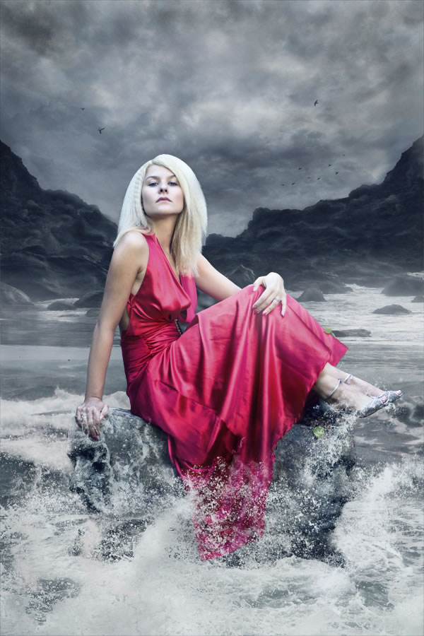
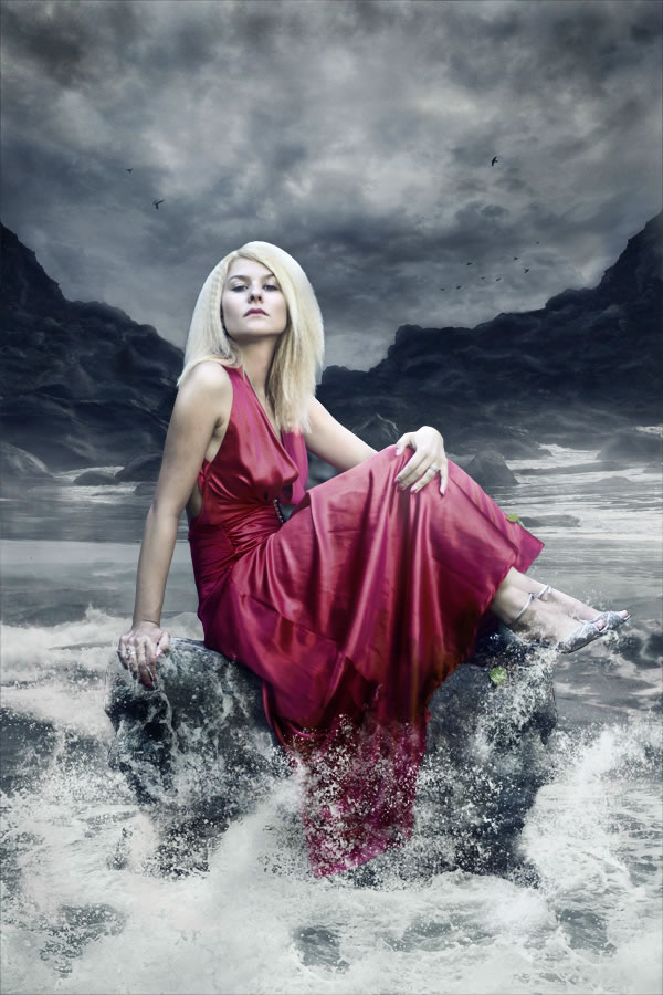
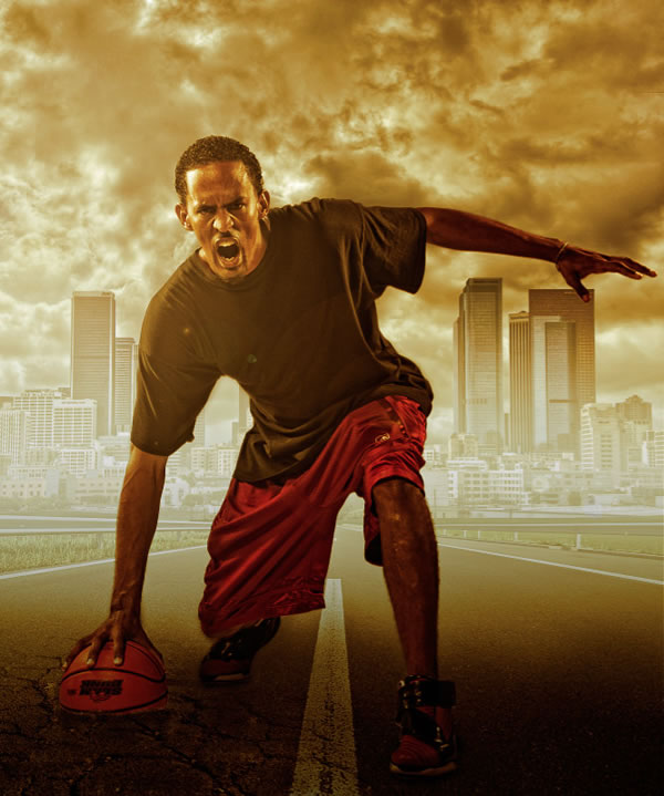
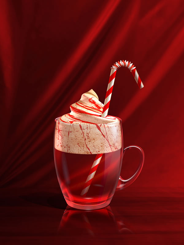
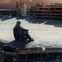
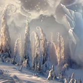
Final Image
![]()
![]()
![]()


 Wondering what to buy your fellow geek this Christmas? Never fear! You may have left it it a little late, but our holiday gift guides can still come in handy. Here are a few great places to start:


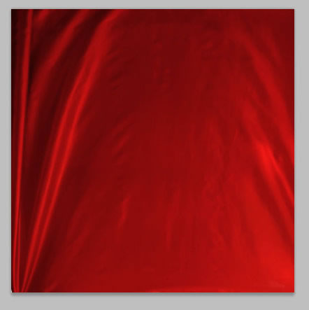
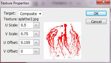
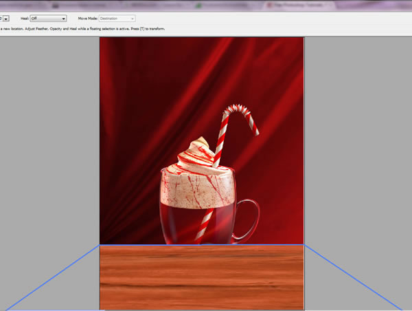
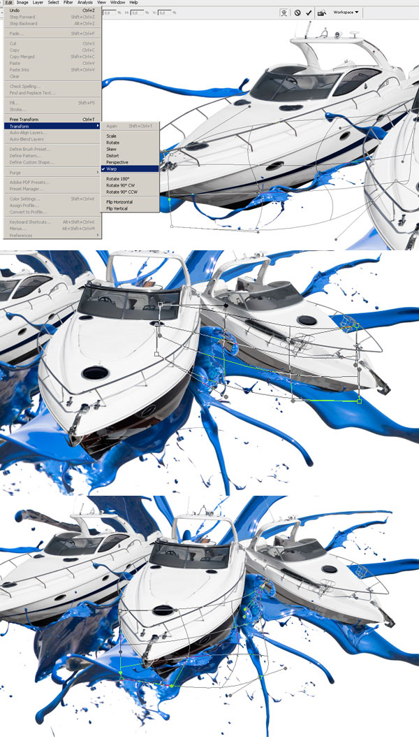
 . Copy and paste it into a new layer. Then go to Edit > Transform > Perspective. Drag one of the bottom corners handles to apply perspective transformation. Then choose Free Transformation and move bottom edge of fabric shape to the bottom edge of Photoshop document. You should completely cover the white background space.

 in the Shape Layer Mode
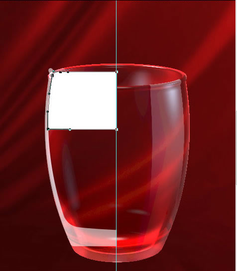
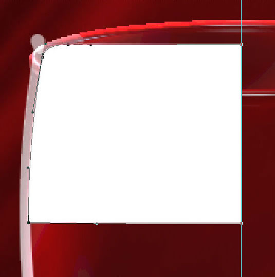
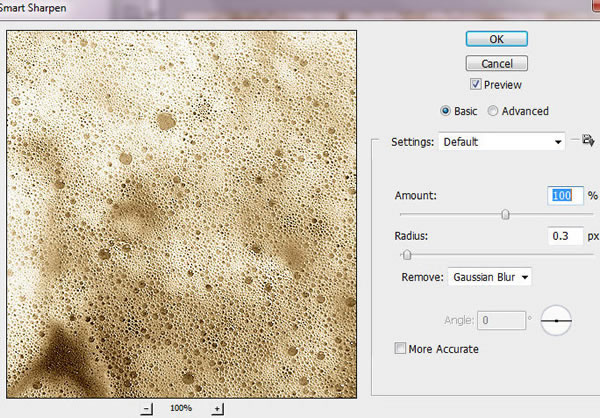
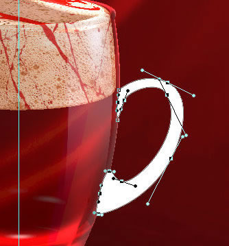
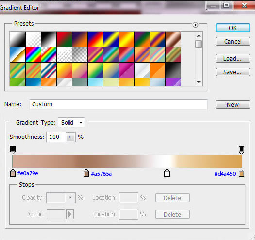
  .The size is 145x359px. It should be a half of full glass shape silhouette. You may create you own shape, but keep right cross edge vertical and bottom line horizontal – check out the guides on the screen shot. Do not rasterize created shape.
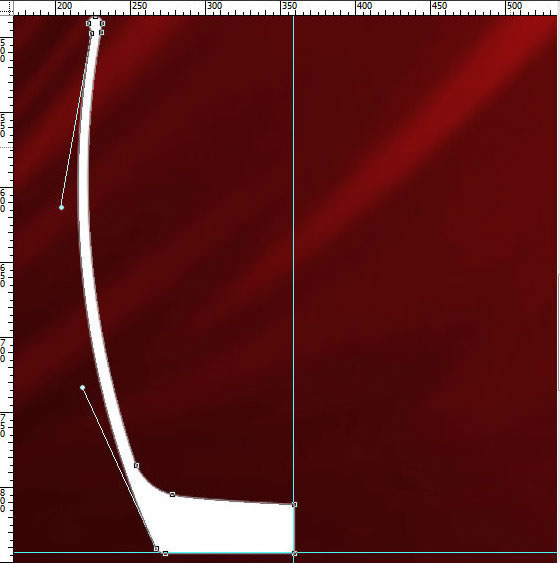

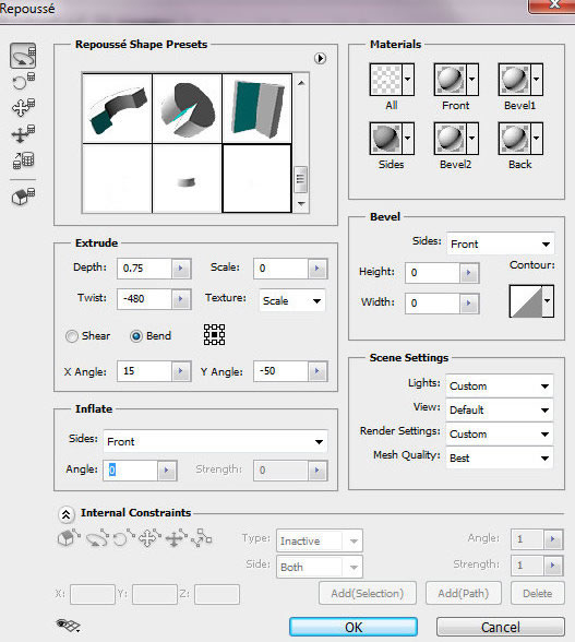
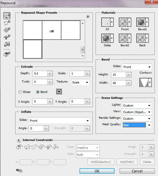
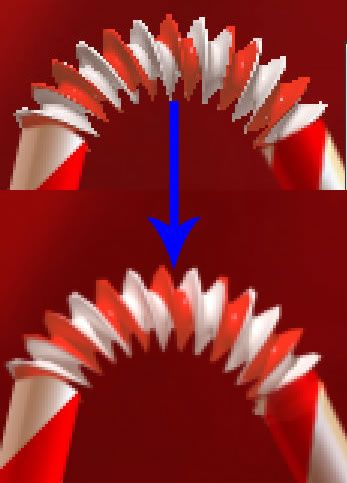
 click on right point to choose right spinning axis. Our shape should spin around inside edge with Angle 360° . Choose Best Mesh Quality. Click "Ok".
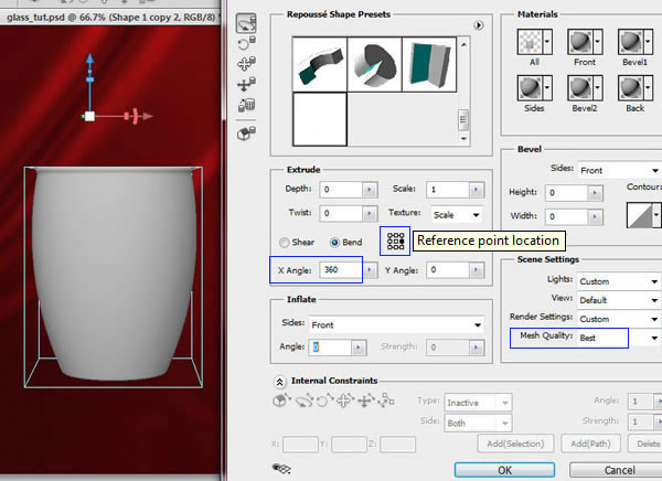
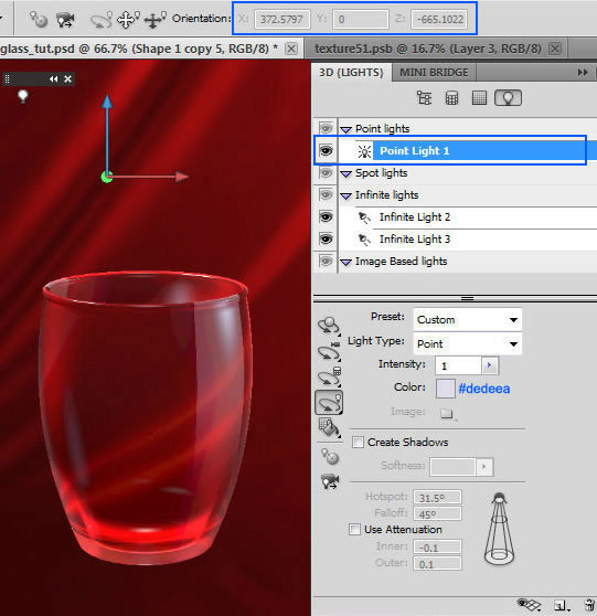
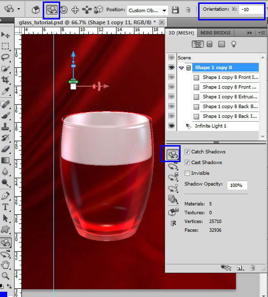
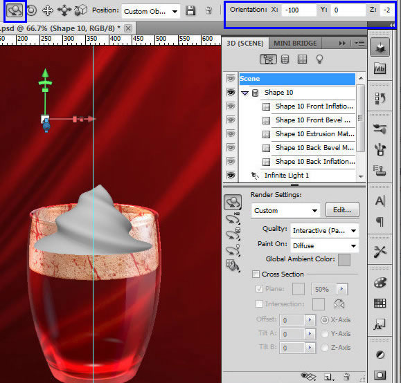
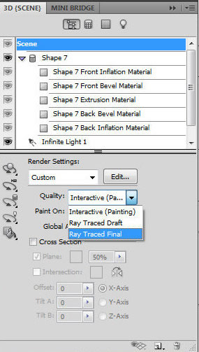
 and adjust only "X" Orientation setting (-10). Keep "Scene" Render Settings like on the screen shot.
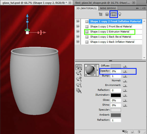


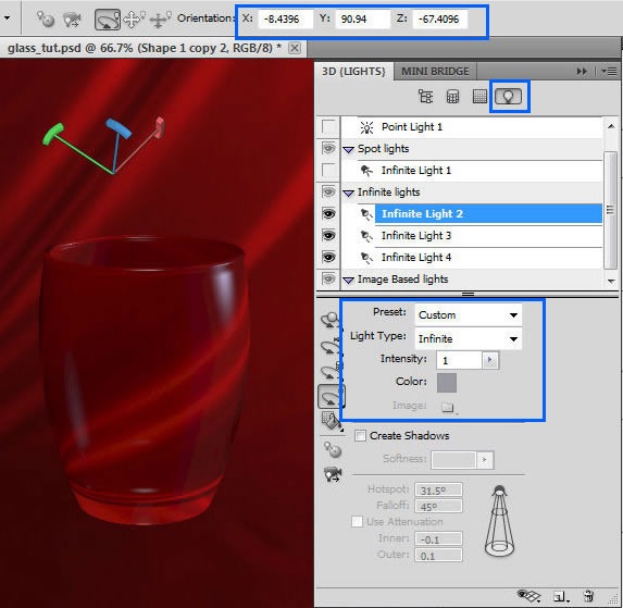
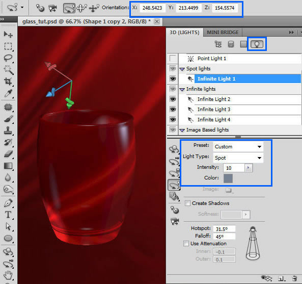
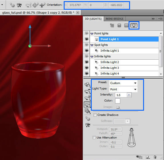
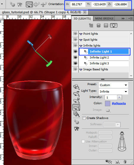
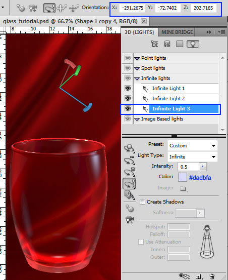
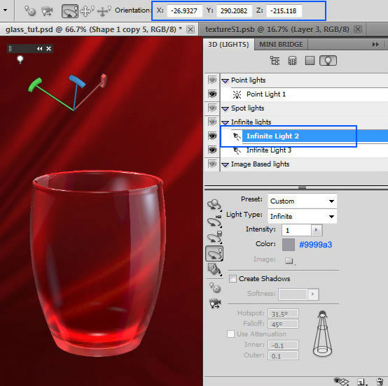
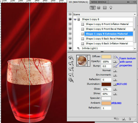
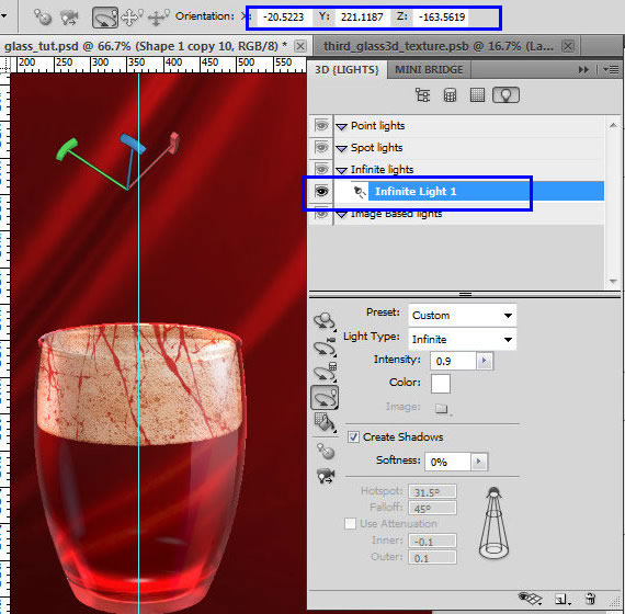
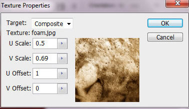
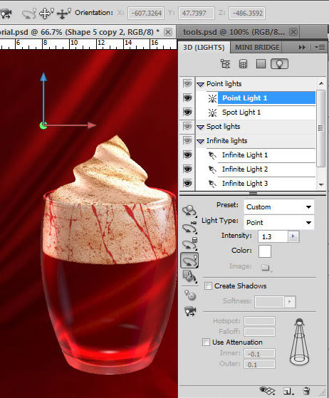
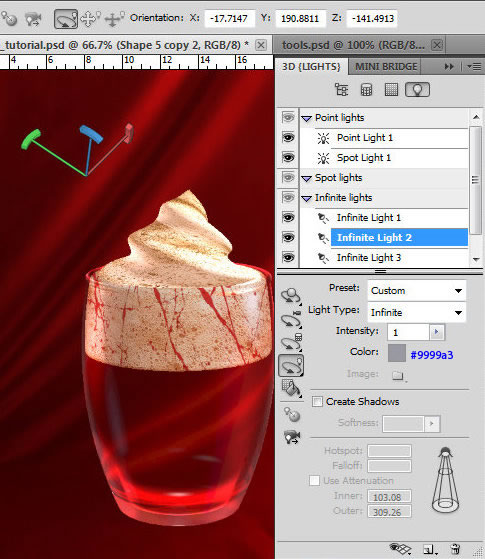
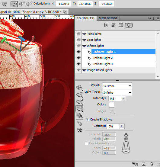
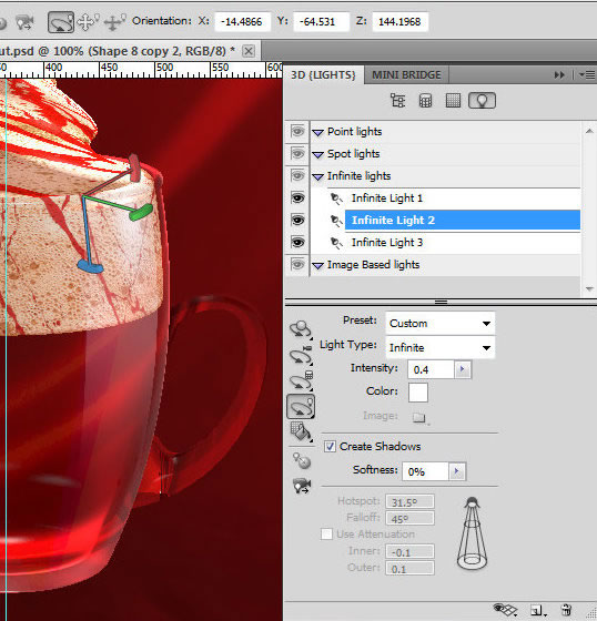
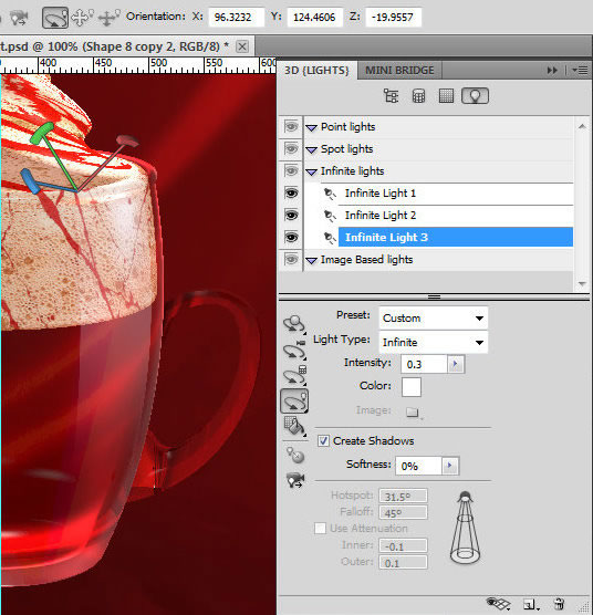
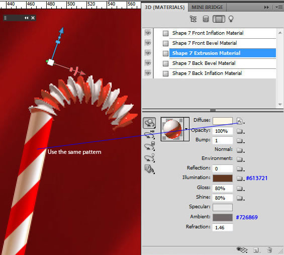
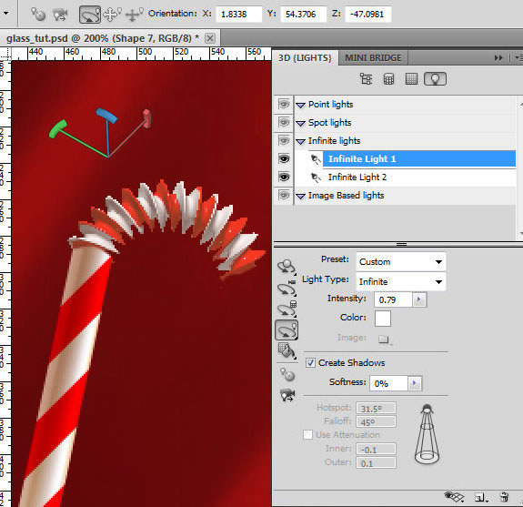
 , and choose the light type from the drop down menu. You may start from "Infinite light" with adjustments like on the screen shot. Find Light position settings in the top part of screen shot or apply your own by rotating 3D Axis guide. To view Axis guide click the Toggle icon
  and select 3D Axis.
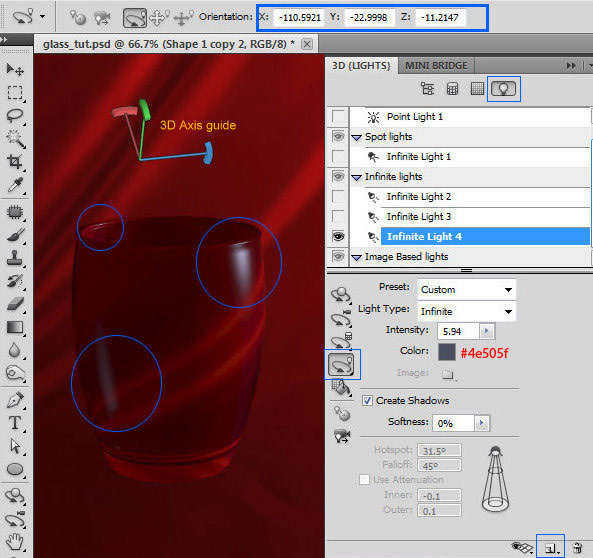


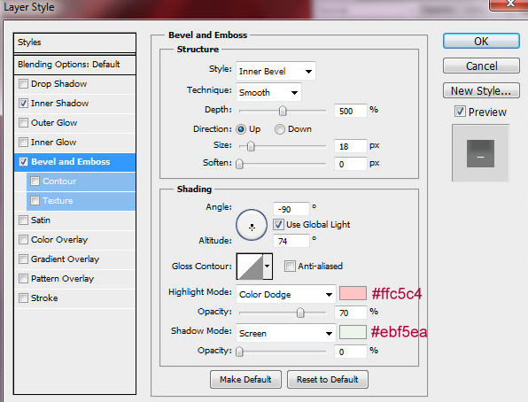


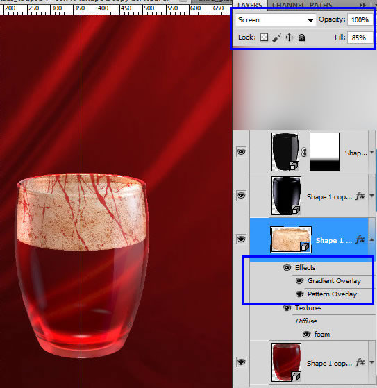
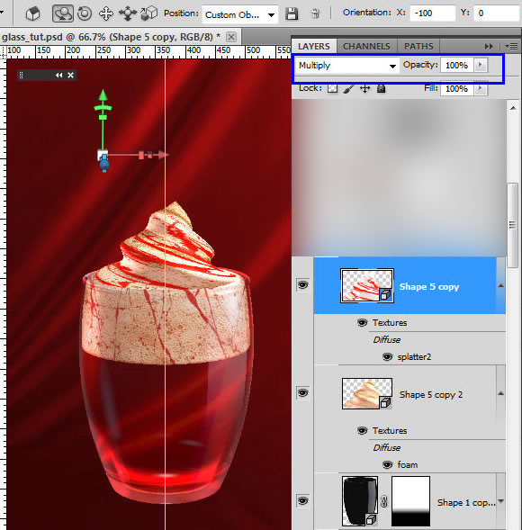
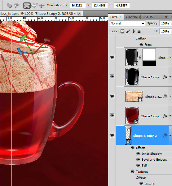
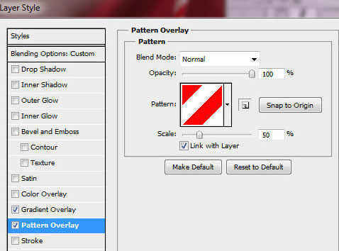
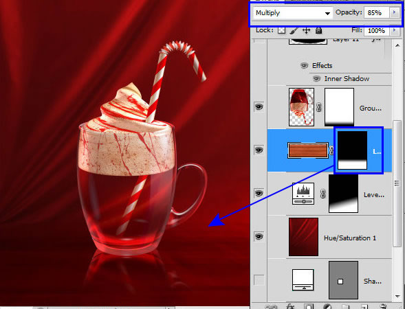
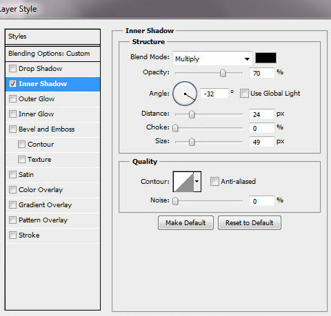
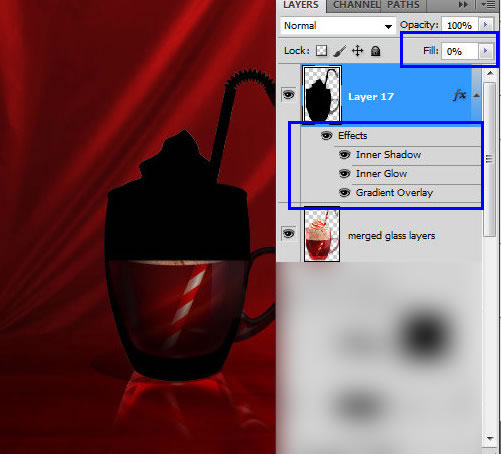
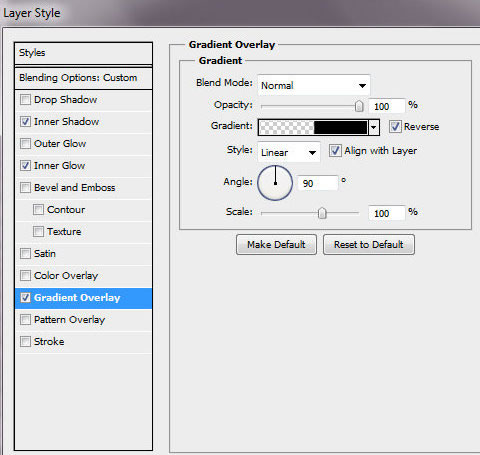
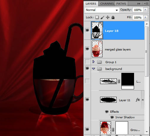
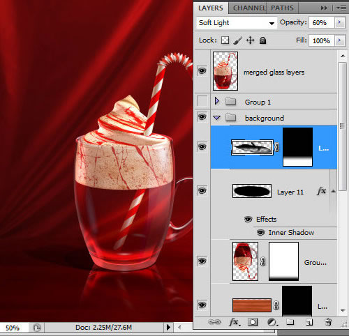
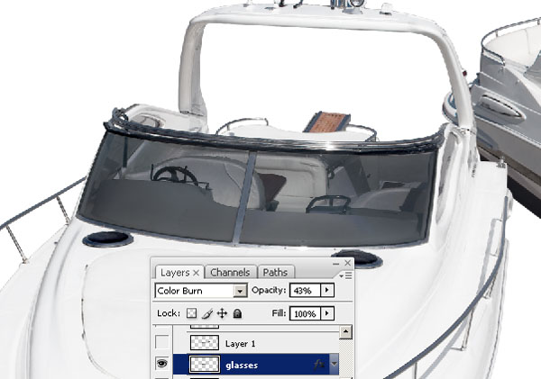
 icon in the bottom of Layers palette. Fill Layer Mask in the bottom part of the glass with Black and White gradient.


 Ellipse Tool in Shape Layers Mode
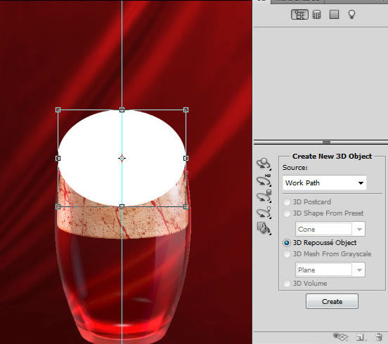
 .
.


 .
.


 Veteran icon designer Kate McInnes introduces you to the wonderful world of icon design, so you too can become a Rockstar Icon Designer! In this book Kate shares with you her experience and expertise by covering everything from the history and theory of icon design, to best practices and methods. She’ll also take you through the whole process of creating your own icon set, and walk you through actual tutorial exercises where you’ll design icons from scratch.