![]()
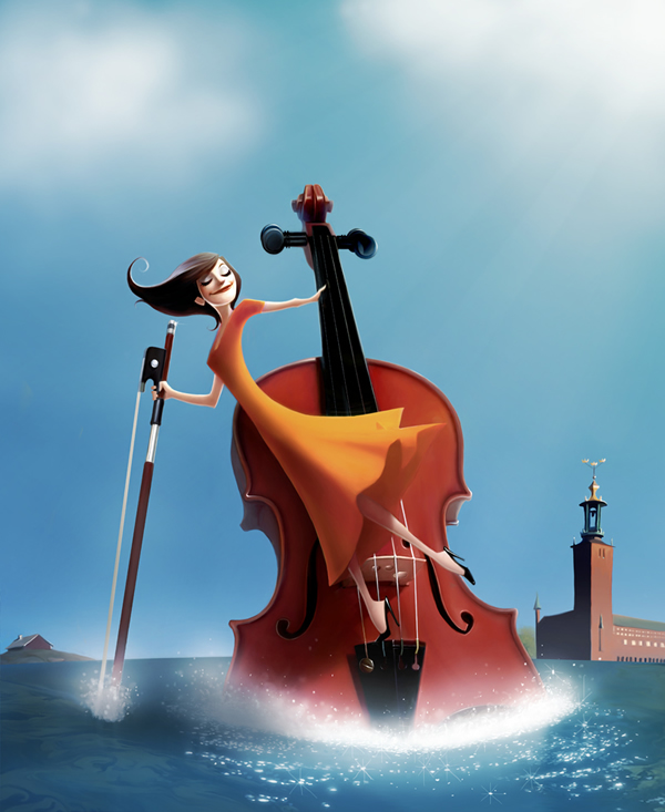
In this tutorial we will show you how to design a detailed user interface for an audio-themed iPad application. We will design this application using a retina display resolution and will make use of Photoshop’s shape layers and layer styles. Let’s get started!
Tutorial Assets
Step 1
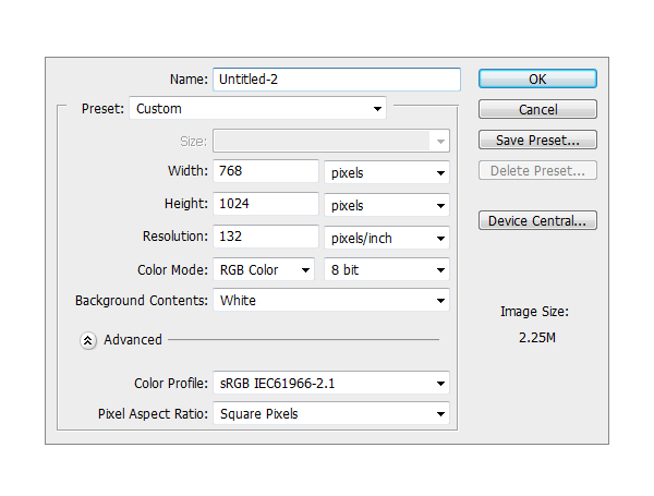
Create a new file. Set Width to 768 and Height to 1024 and the resolution to 133 PPI.
Step 2
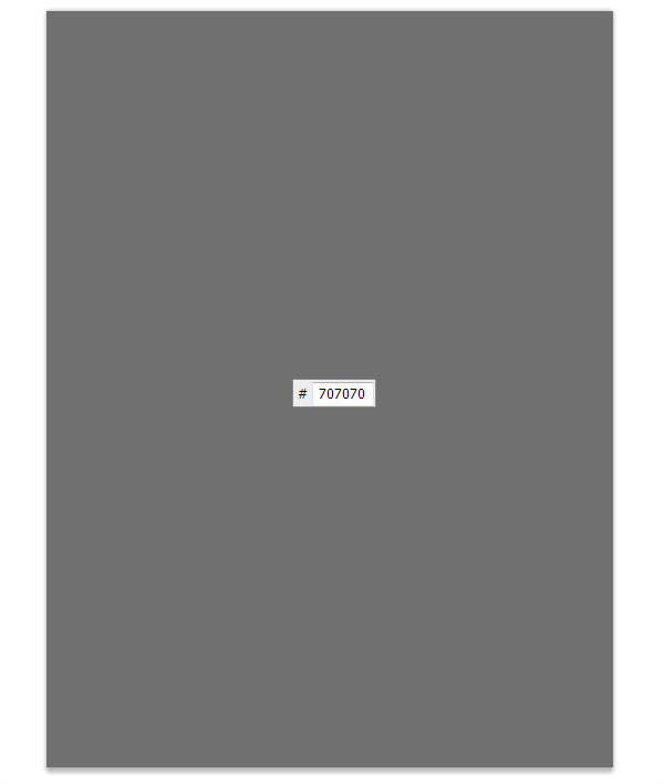
Make a new Group and name it Background. Inside that group, create a new layer and fill it with #707070.
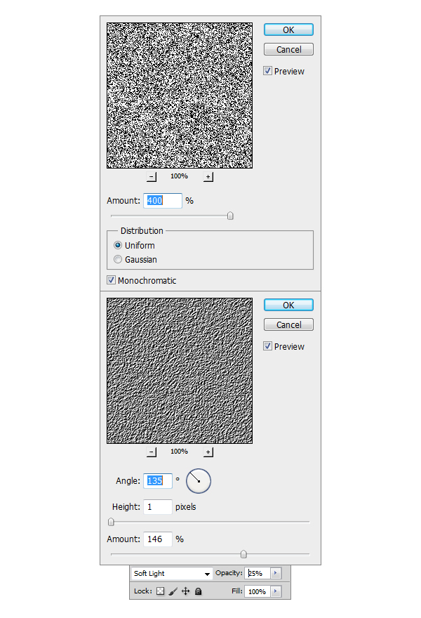
Step 3
Now make another layer on top of the previous one, fill it with any color you want, I prefer to use White #ffffff. After doing this go to Filter > Noise > Add noise and se the Amount to 400%, Distribution to Uniform and check the Monochromatic box. Next step is to go to Filter > Stylize > Emboss and set the Angle to 135, Height to 1 and Amount to 146. Set the Opacity of the layer to 25%.
Step 4
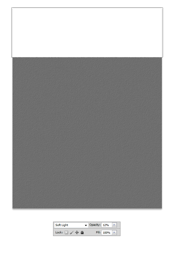
Select Rectangle tool (U) and make a white #ffffff shape like the one in the example. Set the blending mode for the layer to Soft Light and the Opacity to 12% and our
Background is done.
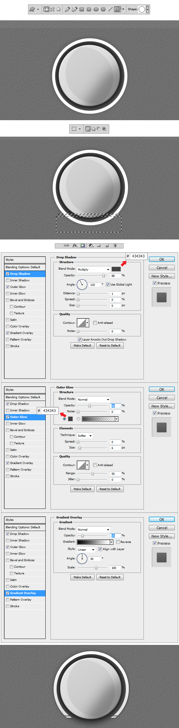
Step 5
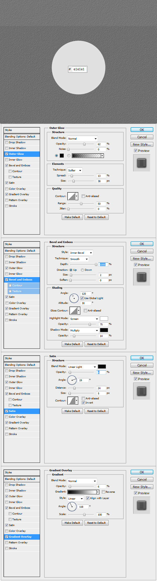
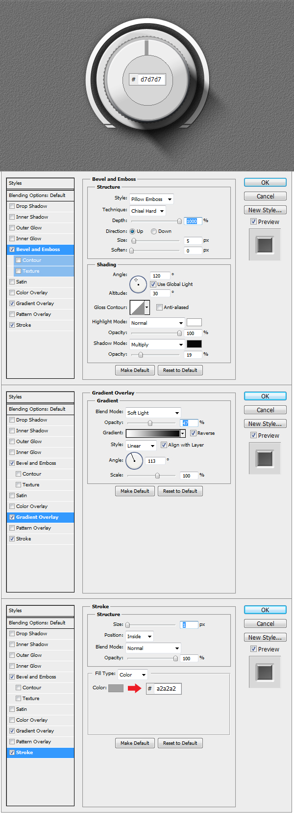
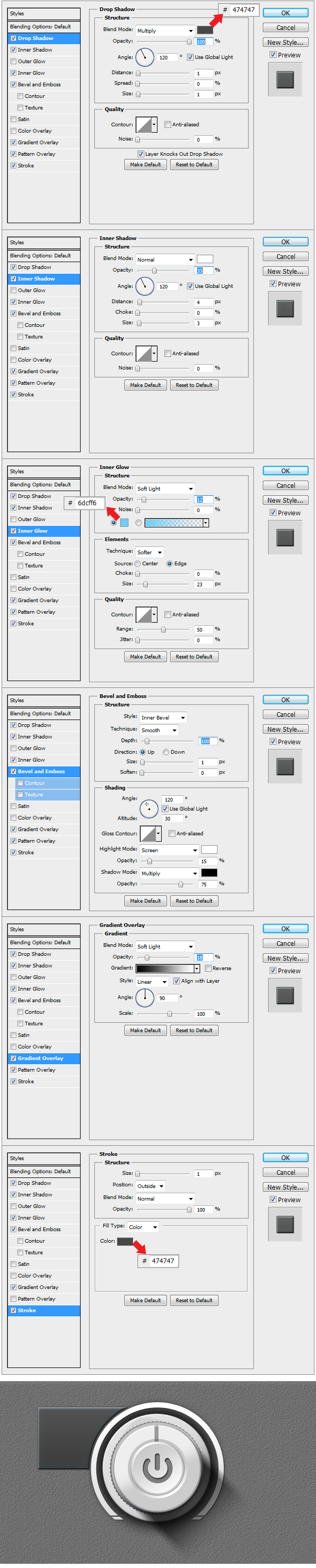
Now to get started on the elements. Create a new Group and name it Main Knob. Using Ellipse Tool (U) make a circle like the one in the example and fill it with #e1e1e1. Apply the Layer Styles to get the base of the Knob done.
Step 6
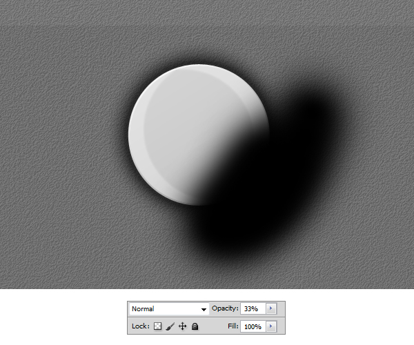
Using Brush Tool (B), pick a medium size brush and set the Hardness to 0. Make a black stroke like in the example and set the Opacity to 33%. Right click on the layer
in the Layers panel and select Create Clipping Mask.
Step 7
Select Custom Shape Tool (U) and from there select the Circle Thin Frame shape that is in the library. Make a shape like the one in the example. Now using
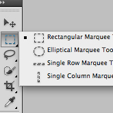
Rectangular Marquee Tool (M) make two selections like the ones in the example, than right click on the image and Select Inverse so that you can add a Layer Mask to the shape.
Once everything is done apply the Layer Styles that follow in the example.
Step 8
Make a new layer on top of the previous one and using a black #000000 medium brush make a stroke like the one in the example. Reduce the Opacity to 22 % and transform
the layer in a Clipping Mask.
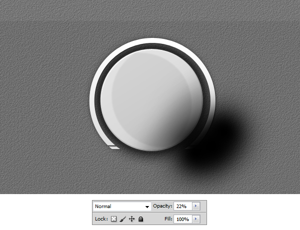
Step 9
Select Custom Shape Tool (U) and load the Tutorial Custom Shape.
Make a shape like in the example using the Custom Shape added. Set the color to #707070 and apply the Layer Style.
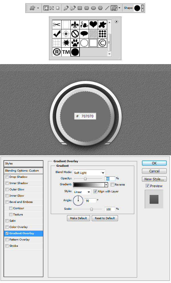
Step 10
Using Pen Tool (P) draw a shape like the one in the example. Afterwards go to Filter > Blur > Motion Blur and set the Angle to 40 and Distance to 15 px. Add a layer mask and using
a black #000000 Linear Gradient set to Foreground to Transparent make a stroke from the bottom up. Set the Opacity of the layer to 80 %.
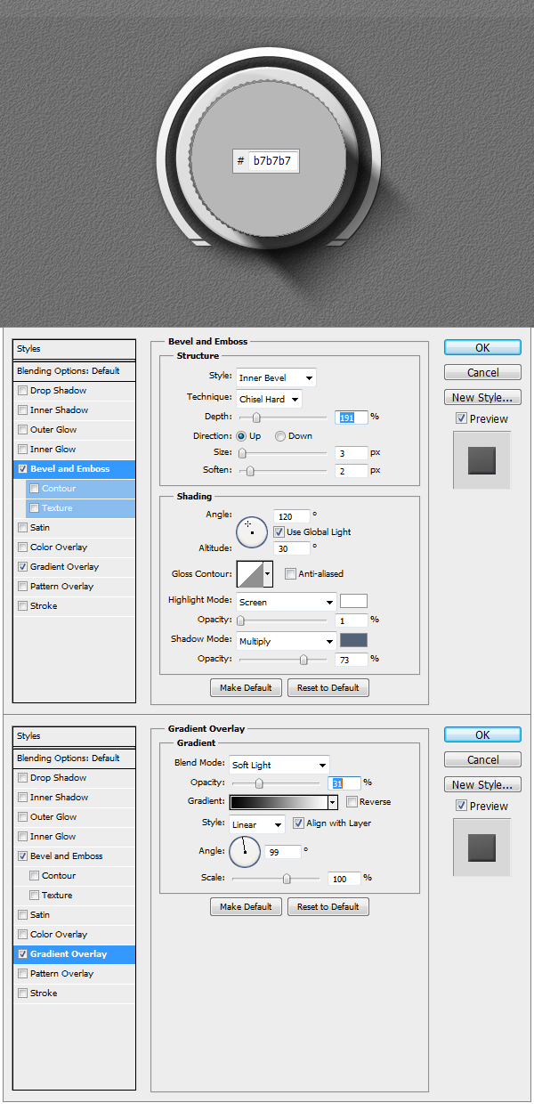
Step 11
Make a circle using Ellipse Tool (U), set the color to #b7b7b7 and apply the Layer Styles.
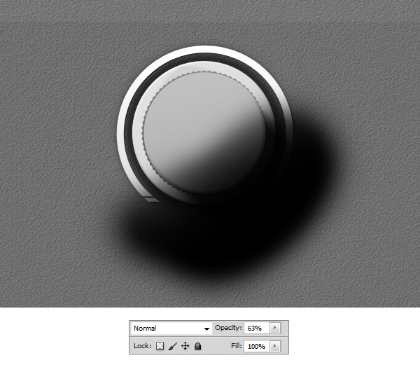
Step 12
Using Brush Tool make a black #000000 stroke like shown in the example, set the Opacity of the layer to 63 % and make the layer a Clipping Mask.
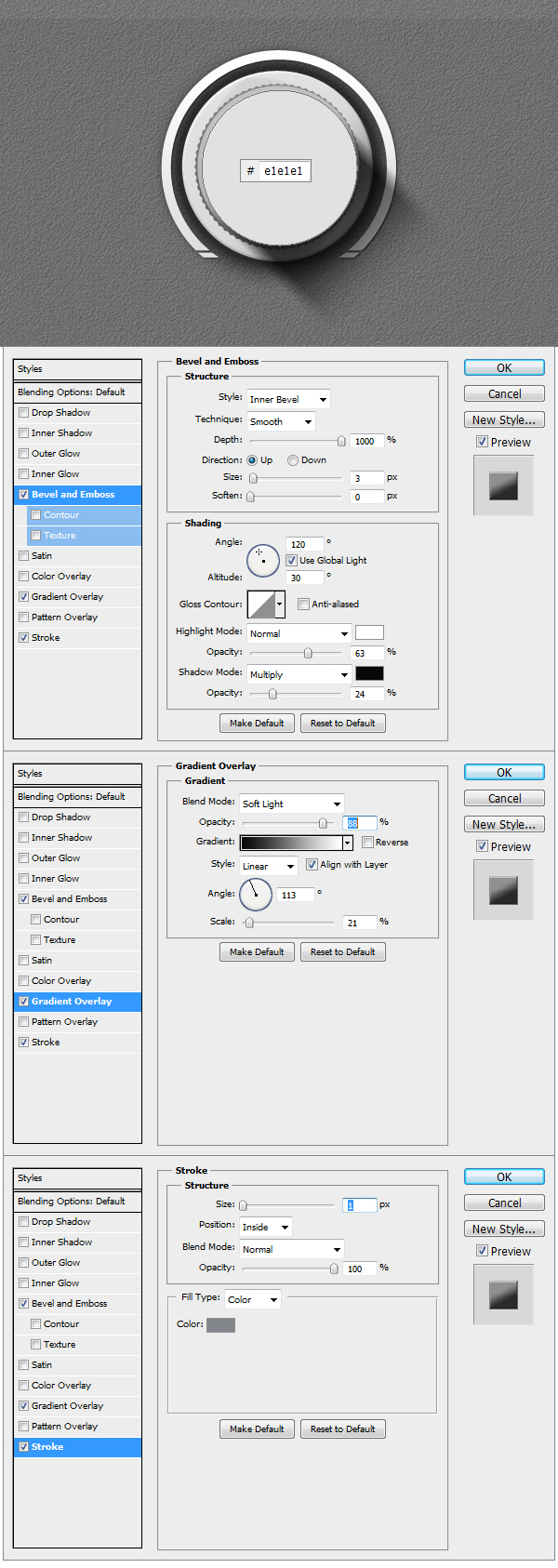
Step 13
Make a new circle using Ellipse Tool (U), set the color to #e1e1e1 and apply the Layer Styles.
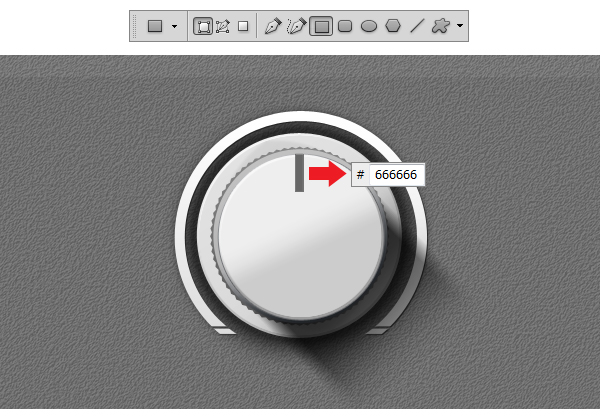
Step 14
Using Rectangular Tool (U) make a rectangle like the one in the example, set the color to #666666 and transform the layer into a Clipping Mask.
Step 15
Make another circle using Ellipse Tool (U), set the color to #d7d7d7 and apply the Layer Styles.
Step 16
Using Brush Tool (B) make a white #ffffff stroke like in the example and transform the layer into a Clipping Mask.
Step 17
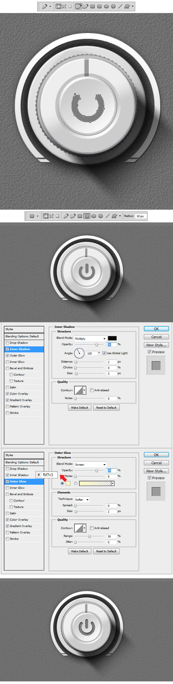
In this step we will make the power symbol. Using Pen Tool (P) draw a grey #7c7c7a shape like the one in the example. Now using Rounded Rectangle Tool (U)
set the Radius to 10 px and make a shape similar to the one in the example. Apply Layer Styles to both shapes. Our Knob is done.
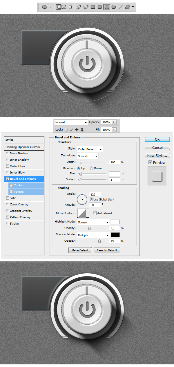
Step 18
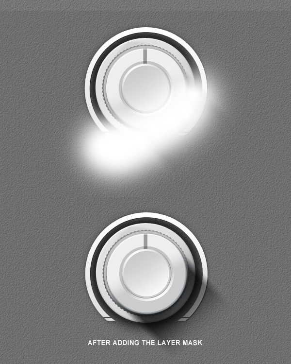
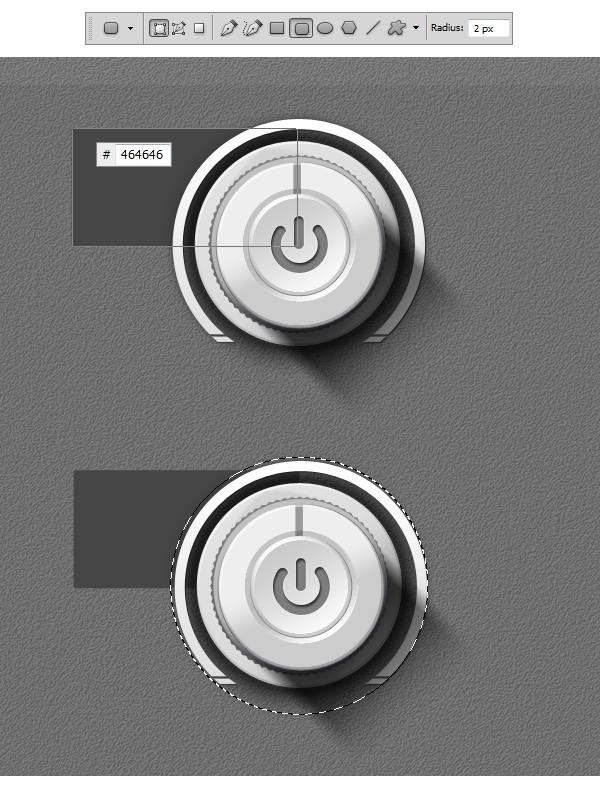
Close the Main Knob Group and create another one under it. Name it Top Left Button. Inside using Rounded Rectangle Tool (U) set the Radius to 2 px and make a shape similar to the one in the example. Using Elliptical Marquee Tool (M) make a selection, 2-3 px bigger than the Knob, Right Click to Select Inverse. Add a layer mask to the button shape and our base is done.
Step 19
Apply the following Layer Styles to the Button shape.
Step 20
Using Ellipse Tool (U) make a circle like the one in the example. Apply the Layer Style and transform the layer into a Clipping Mask. This way the bevel will be shown inside the Button shape.
Step 21
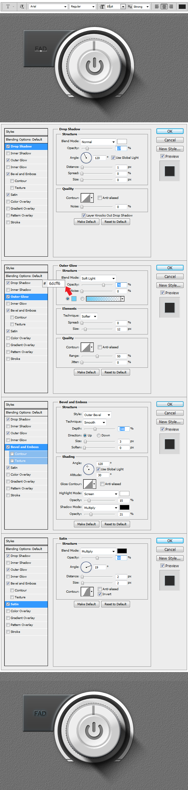
Now to add some text. Using Horizontal Type Tool (T) set the size to 10 px, font to Arial and write down a word. Apply the layer styles and we have our first button ready.
Step 22
In order to make the other 3 buttons you will have to re-make the previous 4 steps.
Step 23
Now we will make 4 smaller Knobs. The easy way is to simply duplicate the Main Knob Group. After we’ve made a copy of the group we’ll make another group and name
this one Small Knobs. You will have to insert the Main Knob Copy into the Small Knobs group. Once you’ve done this select the Main Knob Copy and rename it Small Knob.
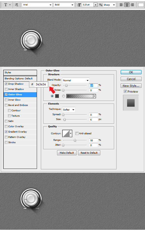
Now resize the whole group to 33 % like shown in the example. Delete the last two shapes inside the Small Knob, representing the power symbol, and open the Layer Styles of
first layer shape in the group. Reduce the size of the Outer Glow to 13%.
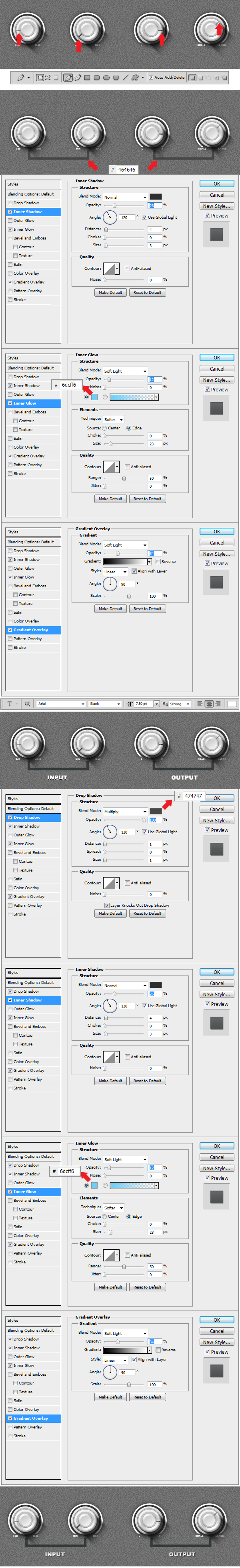
Step 24
Using Horizontal Type Tool (T) we will insert a few intensity indicators. On the left site we will write using a 3. 23 pt Arial-Black Font 0 db and on the right side 40 db.
Apply the layer Style to both text layers.
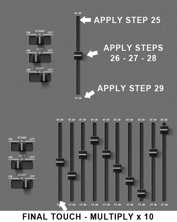
Step 25
Duplicate the Small Knob group four times, and move the rectangular indicator as you wish, giving a more dynamical aspect to the knobs. Using Pen Tool (P) draw two shapes like the ones in the example. Color both of them with #464646 and apply the Layer Styles. After with the help of Horizontal Type Tool (T) write under each previous shape using a 7. 50 pt Arial – Black Font the words INPUT (on the left side) and OUTPUT (on the right side). Apply the layer styles and everything is done.
Step 26
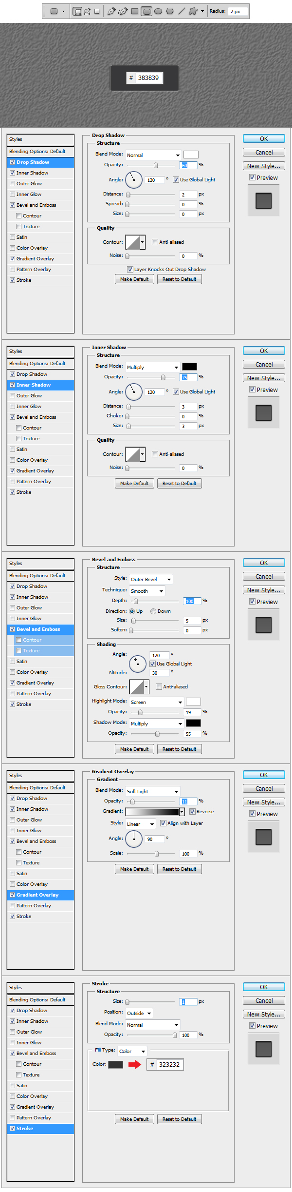
Make a new Group and name this one Switch. Now using Rounded Rectangular Tool (U) set the Radius to 2 px and make a shape like the one in the example. Set the color to
#383839 and apply the Layer Styles.
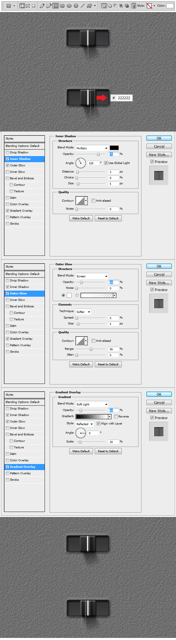
Step 27
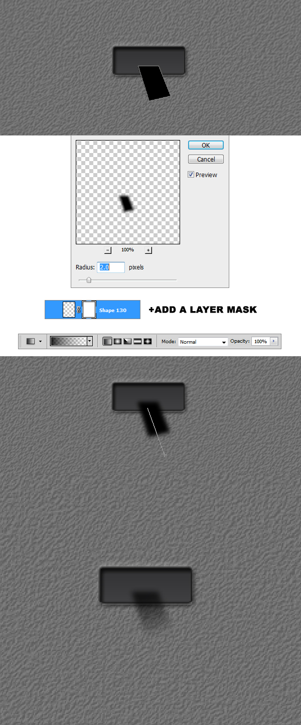
After creating the basic shape of the switch we are going to build the shadow. Using Pen Tool (P) draw a black #000000 shape like the one in the example. Afterward
go to Filter > Blur > Gaussian Blur, set the Radius to 2 px and apply the filter. Add a layer mask to the shadow layer and using a black #000000 Linear Gradient set to
Foreground to Transparent make a stroke from the bottom up like in the example.
Step 28
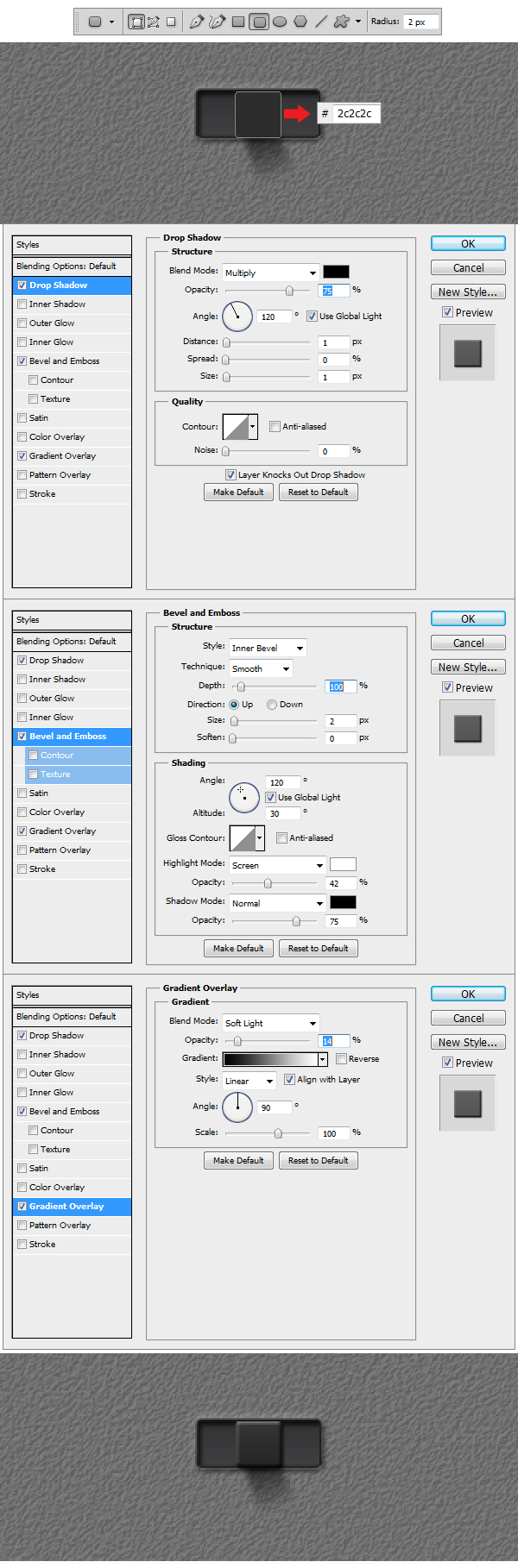
Using Rounded Rectangular Tool (U) with the Radius set to 2 px, make a shape like the one in the example. Set the color to #2c2c2c and apply the Layer Styles.
Step 29
Add a new layer and make it a Clipping Mask. Using Rectangular Tool (U) make a white shape like the one in the example. Now make another shape, which also has to be a Clipping Mask and color it with #222222 and apply the Layer Styles. Duplicate this last layer on the left side of the switch.
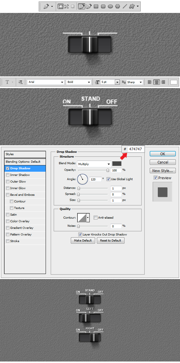
Step 30
Using Pen Tool (P) draw 3 white #ffffff shapes like the ones in the example. After using Horizontal Type Tool (T) set the size to 5pt, font to Arial and above the 3 elements ON, STAND and OFF and apply the Layer Style. Duplicate Switch group 3 times and we’re done.
Step 31
Make a new Group and name it EQ. Now to build the Equalizer bend follow the steps indicated in the example. After you are done creating the bend, duplicate it 10 times
to get number of bends needed.
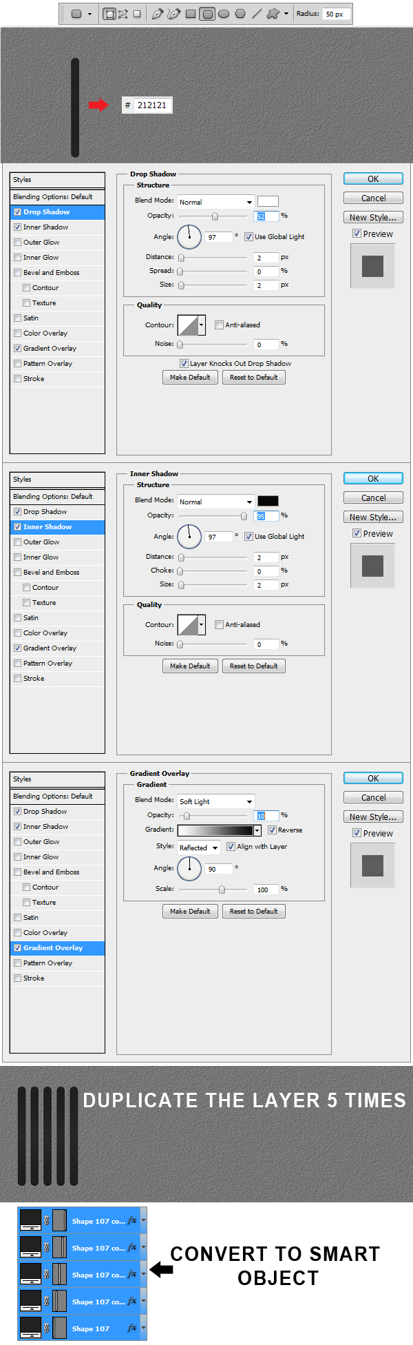
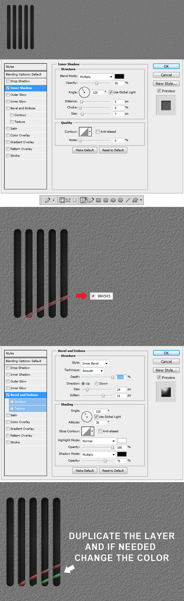
Step 32
Create a new Group and name it Grill. Using Rounded Rectangular Tool (U) set the Radius to 50 and make a shape like the one in the example. Set the shape color to #212121 and apply Layer Styles. Duplicate the layer 5 times, afterwards select all 5 layers and Convert to Smart Object.
Step 33
After you’ve made the conversion, apply the Layer Style. Using Pen Tool (P) make a shape like the one in the example, set color to #984545 and apply the
Layer Style. Duplicate the layer and change color if needed.
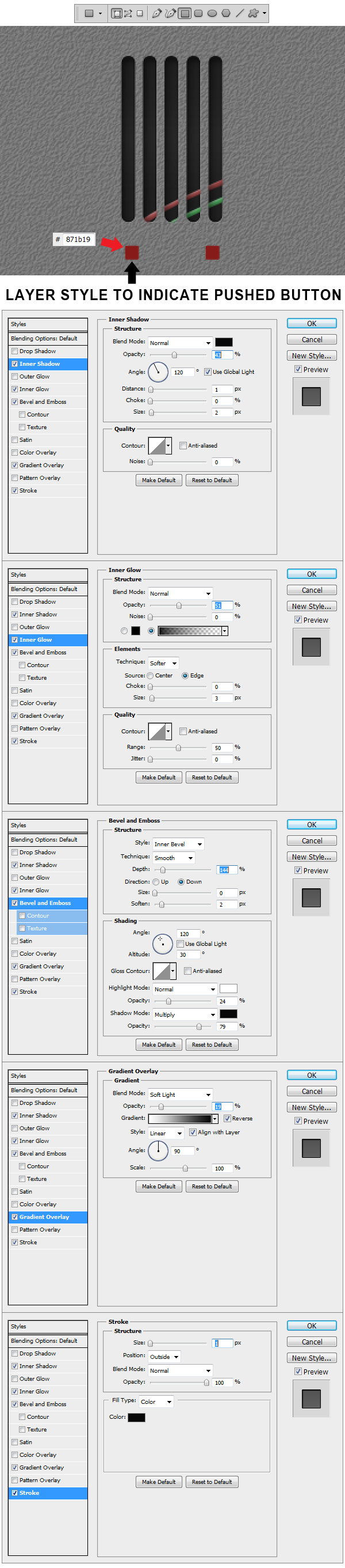
Step 34
Using Rectangular Tool (U) make to red #871b19 squares like the ones in the example. To the left one (indicating the pushed version of the button) apply the
Layer Styles shown in the example.
Step 35
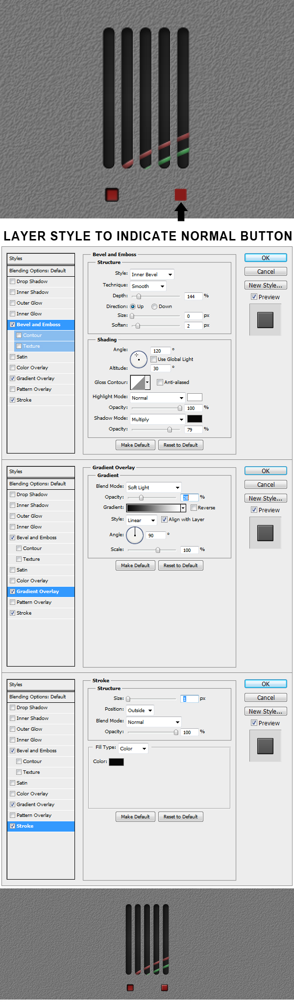
Now we are going to make the normal mode button. Apply to the right square the Layer Styles indicated in the example.
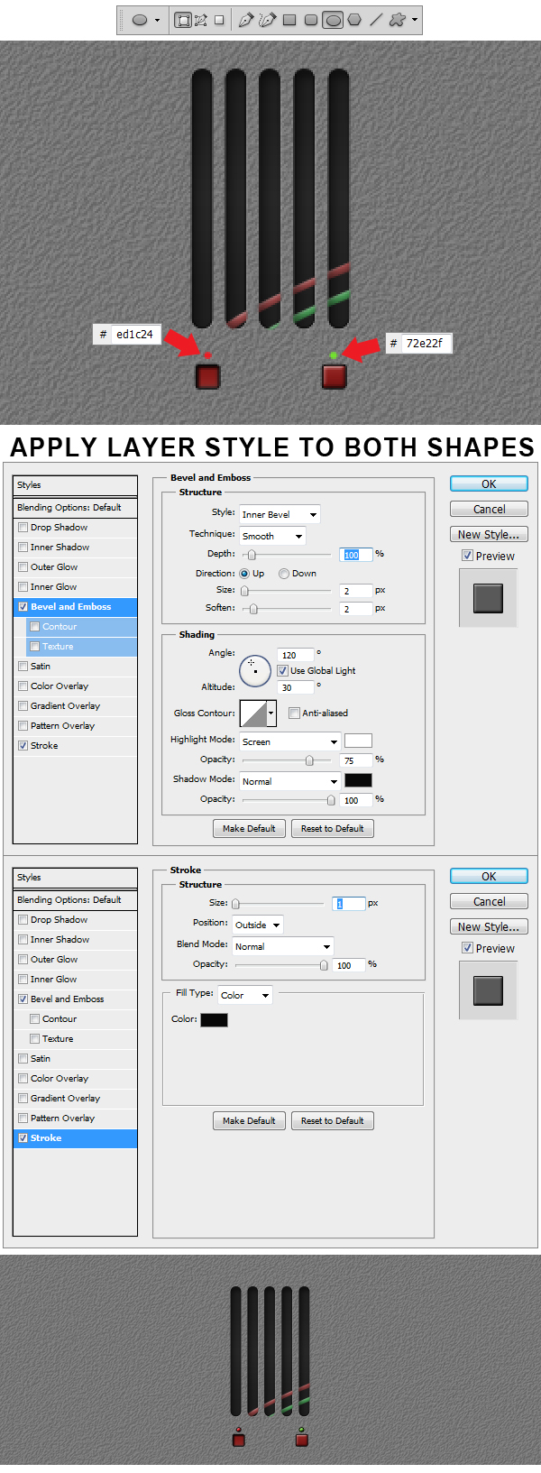
Step 36
Using Ellipse Tool (U) make 2 shapes above the previous buttons like the ones in the example. Color the left one #ed1c24 and the right one #72e22f. Afterwards apply the Layer Styles to both circles.
Step 37
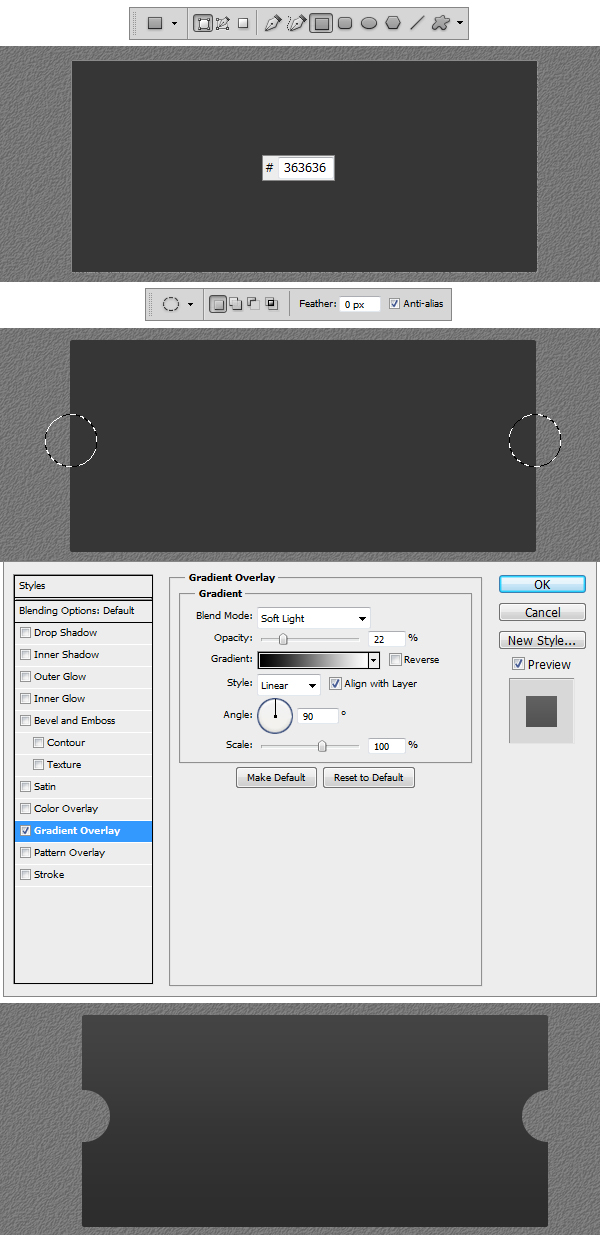
Make a new Group and name it Display. Using Rectangular Tool make a shape like the one in the example. Set the color to #363636. Now using Elliptical Marquee Tool (M) make to perfect selection circles like the ones in the example. Right click and Select Inverse and apply the Layer Style.
Step 38
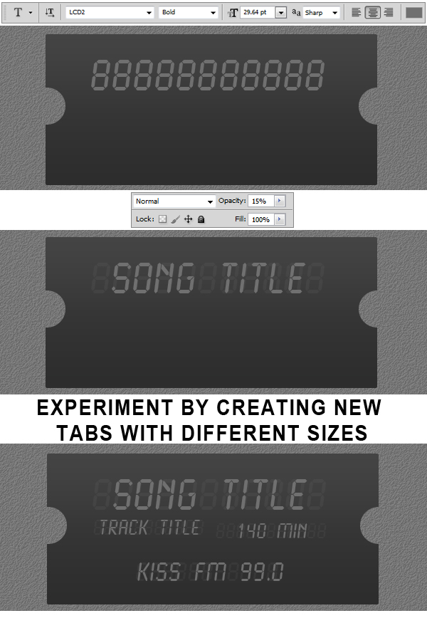
Using Horizontal Type Tool (T) set the size to 29. 64 pt and Font to LCD and type 11 eights. Reduce the Opacity
of the layer to 15%. Make another type layer and write Song Title but keep the Opacity to 100% this time. Now try to make some more text layers, experimenting with font size
and with color.
Step 39
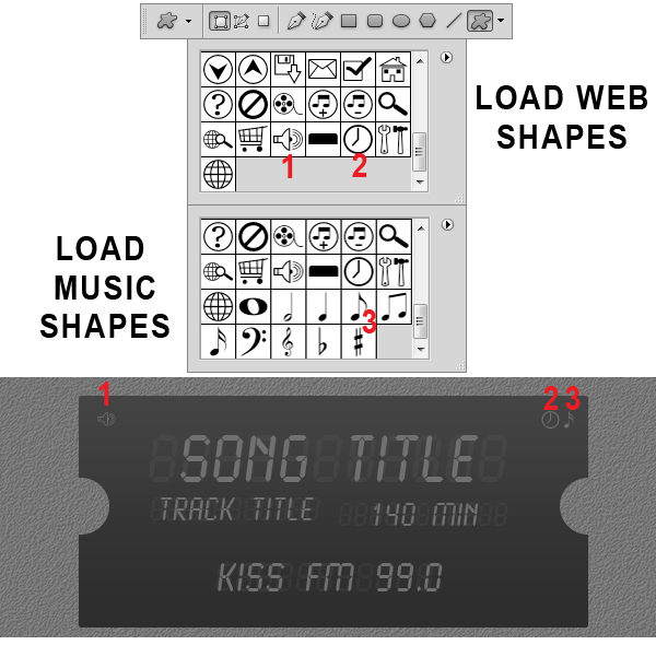
Using Custom Shape Tool (U) Load Web Shapes and Music Shapes from the shape library and insert the 3 elements showed in the example.
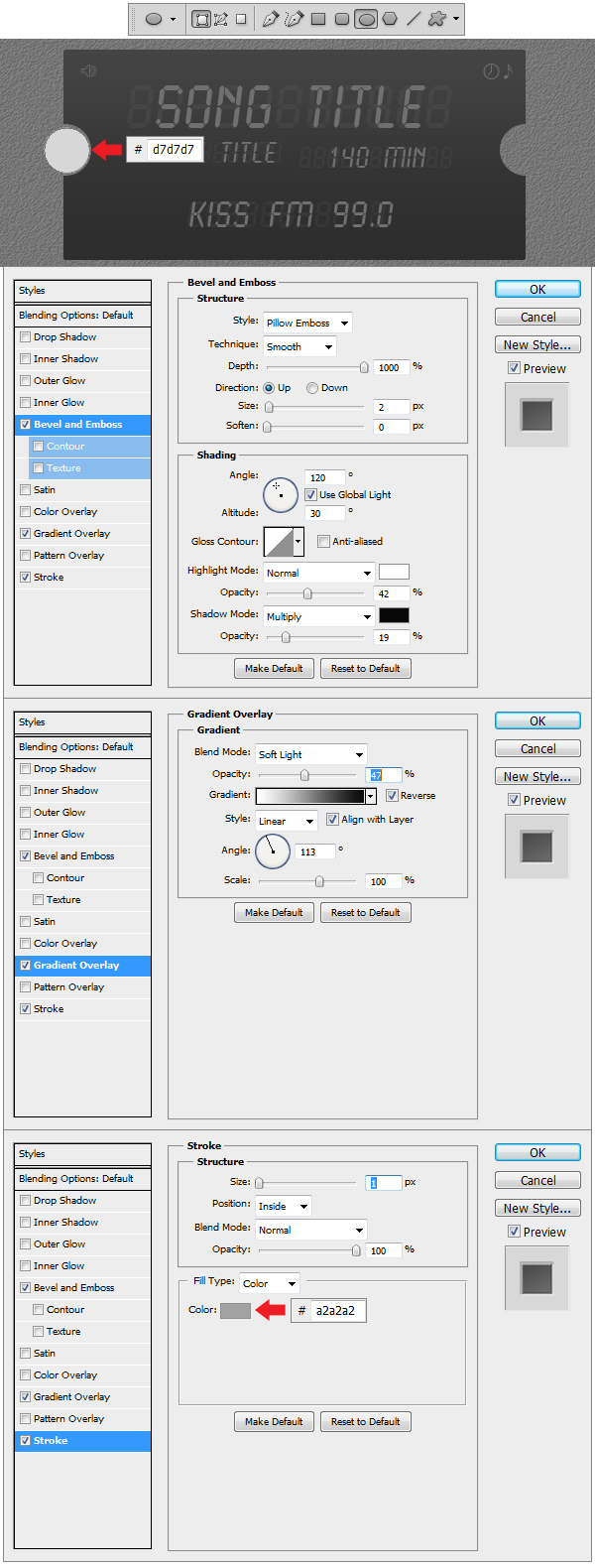
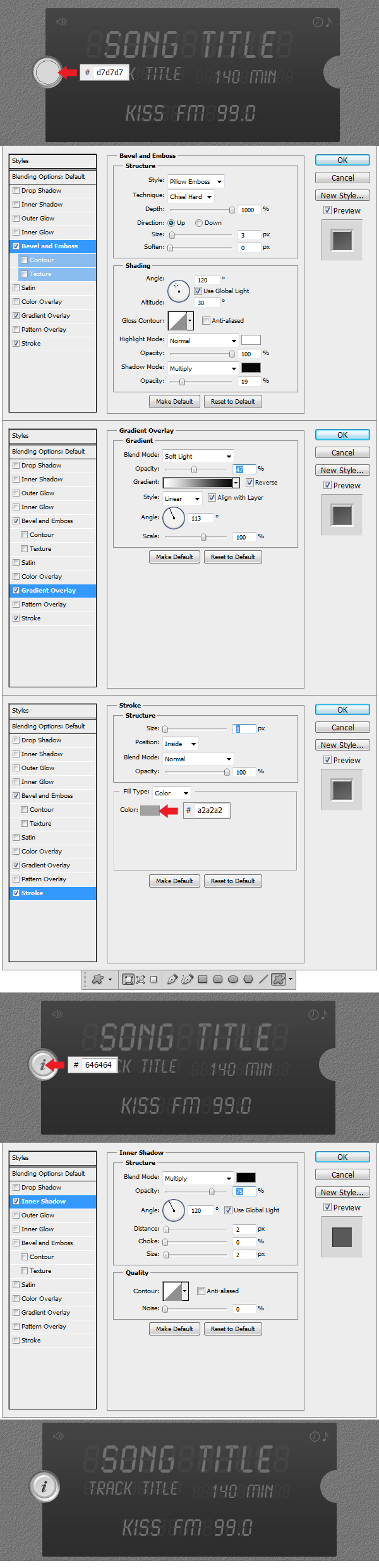
Step 40
Make a new Group and name this one Info Button. Now using Ellipse Tool (U) make a grey #d7d7d7 circle like the one in the example and apply the Layer Styles.
Step 41
Make another circle using Ellipse Tool (U) using the same fill color #d7d7d7 and apply the Layer Styles. Using Custom Shape Tool (U) load Symbols from the library and insert the Information Custom Shape and apply the Layer Style.
Step 42
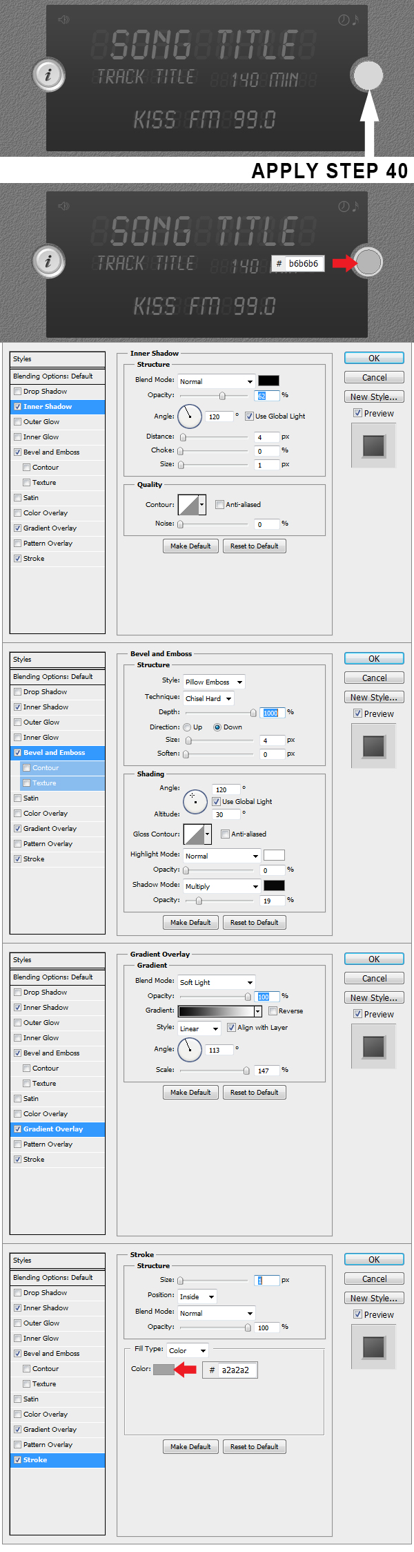
Make a new Group and name it Music Button. Now using Ellipse Tool (U) make a gray #d7d7d7 circle like in the example and apply the Layer Styles from Step 40. Using Ellipse Tool (U) make a new circle and color it #b6b6b6 and apply the Layer Style. This will be the pushed version of the 2 buttons.
Step 43
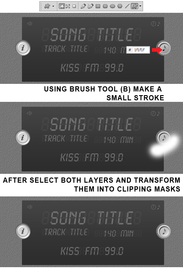
Using Custom Shape Tool (U) insert the Sixteenth Note Shape and color it #1f1f1f. Make a new layer on top and using Brush Tool (B) select a medium white #ffffff
brush and stroke at the top end of the circle. Transform this layer in a Clipping Mask and Voila! Everything is ready now.
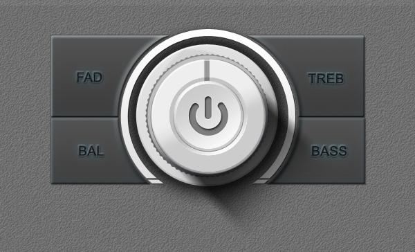
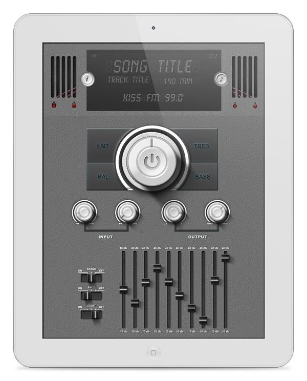
Final Image
![]()
![]()
![]()