![]()
Advertise here
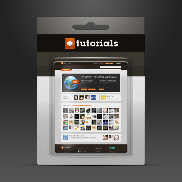
Designers and clients often have different ideas about how a finished product should be presented. Designers want to show the finished artwork, clients want to know exactly how their design will look on the shelves. In this tutorial, we will demonstrate how to create a mockup for some blister packaging so that you can present your design to your clients. Let’s get started!
Tutorial Assets
The following assets were used during the production of this tutorial.
Before You Begin
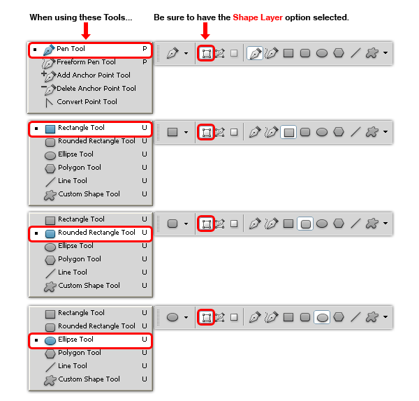
In order to make the file scalable and easy to edit, we will work always with shape layers, so please be sure to select the Shape Layer option in every single shape we make, doesn´t matter if is a circle, rectangle or even the Pen Tool (P) always have it selected from the tool menu.
Document Set-Up
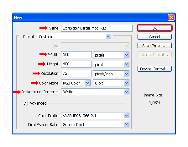
Start with a RGB Document with a 600 x 600 px canvas size at 72dpi, with the Background Contents set to White and name the file as Exhibition Blister Mock-up.
Step 1 – Setting up the Background.
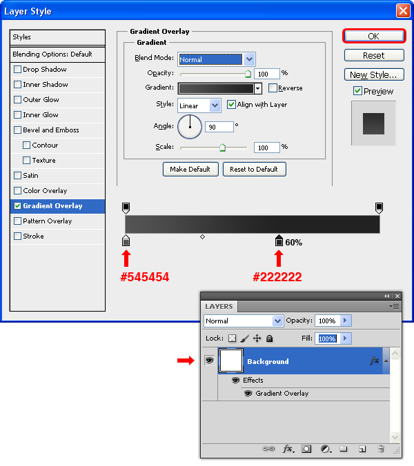
Double-click the Background layer in the Layers window to make it editable and set the name as "Background". Go to Layer > Layer Styles > Blending Options and aplly a Gradient Overlay as shown.
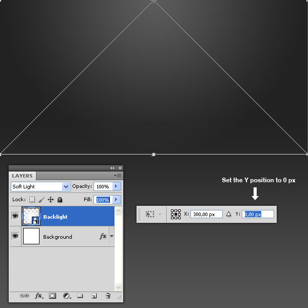
Select the Ellipse Tool (U) and draw a circle of 600 px diameter. Name the new layer as "Backlight" and set the Fill to 0% in the Layers window. Go to Layer > Layer Styles > Blending Options and aplly a Gradient Overlay as shown.
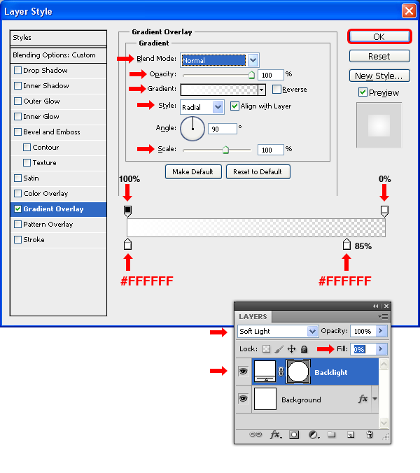
Select the Ellipse Tool (U) and draw a circle of 600 px diameter. Name the new layer as "Backlight", set the Fill to 0% and the mode to Soft Light in the Layers window. Go to Layer > Layer Styles > Blending Options and aplly a Gradient Overlay as shown.
Press Command/Ctrl + T and in the Tool window set the Y position to 0 px and apply the changes. Go to Layer > Smart Objects > Convert to Smart Object.
Note: This action will set the Fill of the "Backlight" layer to 100%.
Step 2 – Drawing the Blister Board.
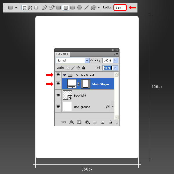
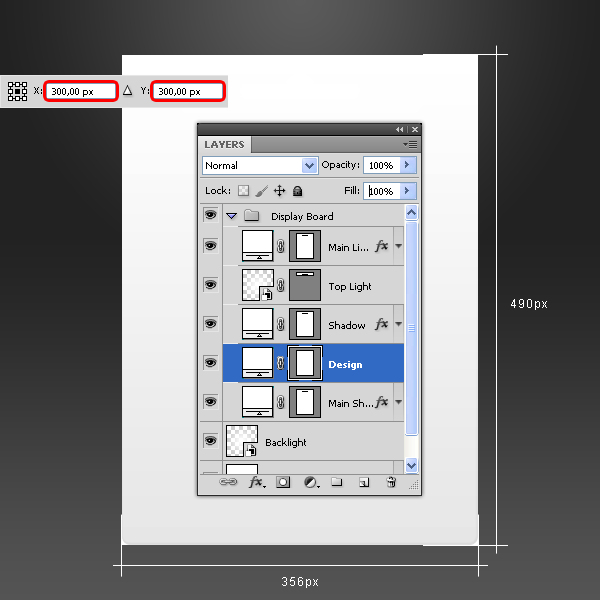
Go to Layer > New > Group and name it Display Board. Set your Foreground color to white (#000000). Select the Rounded Rectangle Tool (U), set the Radius to 8 px and draw a rectangle as shown. Name the new layer "Main Shape."
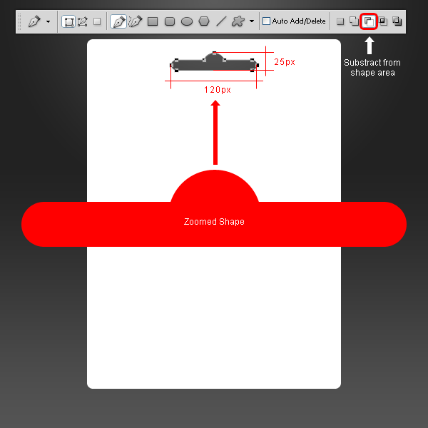
Select the Pen Tool (P), select the Subtract From Shape Area option in the Tool window and draw a shape as shown.
Step 3 – Saving for the future.
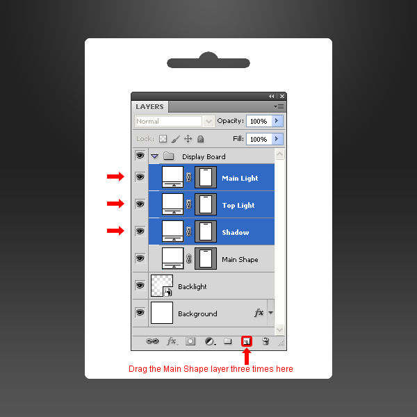
Drag the "Main Shape" layer to the New Layer icon three times in the Layers window and name these new three layers as "Main Light", "Top Light", and "Shadow."
Step 4
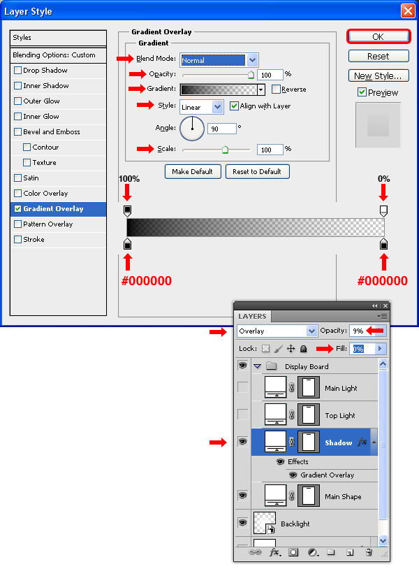
Select the "Shadow" layer, set the Mode to Overlay with an Opacity of 9%, the Fill at 0% and go to Layer > Layer Styles > Blending Options and apply a Gradient Overlay with the following settings.
Step 5
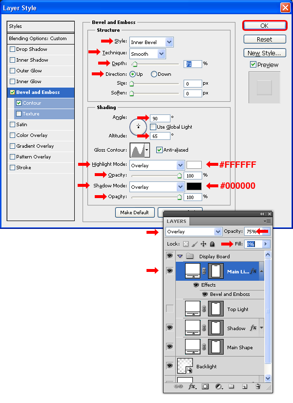
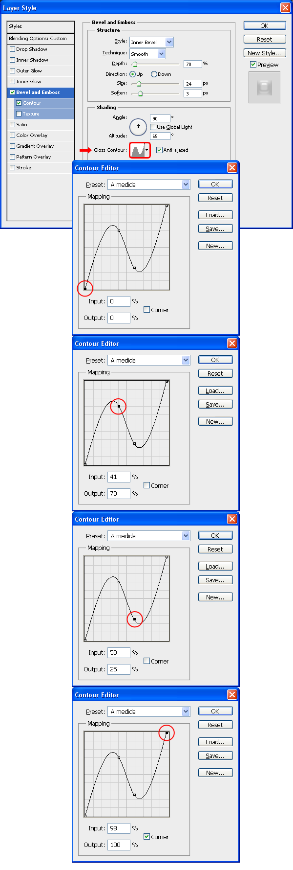
Select the "Main Light" layer, set the Mode to Overlay with an Opacity of 75%, the Fill at 0% and go to Layer > Layer Styles > Blending Options and apply a Bevel and Emboss with the following settings.
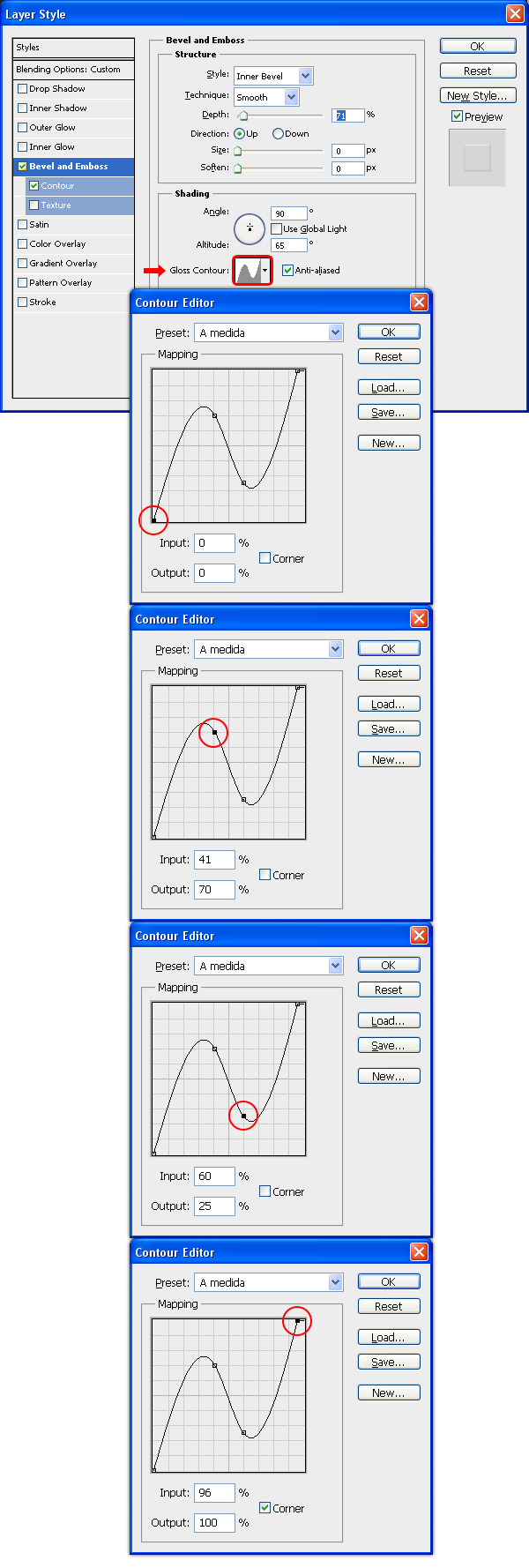
Still in the Bevel and Emboss window, click on the Gloss Contour thumbnail and in the Contour Editor set the Mapping as follows. Click OK.
Click on the Contour tab in the layer Style window, set the Range to 55%, click on the Contour thumbnail and in the Contour Editor window set the Mapping as shown. Click OK. Again, click OK in the Layer Style window to apply the settings.
Step 6
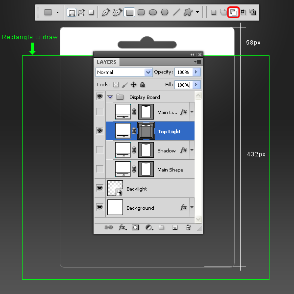
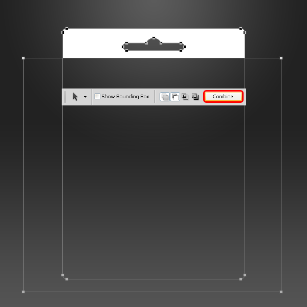
Click on the "Top Light" layer, select the Direct Selection Tool (A) and then select the Rectangle Tool (U); click on the Subtract From Shape Area icon and draw a rectangle as shown.
Select the Path Selection Tool (A), make a selection around the entire canvas and click the Combine button in the tool window.
Step 7
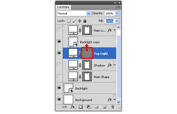
Duplicate the "Backlight" layer by dragging the layer to the New Layer icon in the Layer window and place it above the "Top Light" layer. Now click and drag the "Top Light" layer Vector Mask thumbnail to the "Backlight copy" layer and release it over it. Delete the "Top Light" layer and rename the "Backlight Copy" layer to "Top Light", set the Opacity at 55% and the Mode to Normal.
Step 8
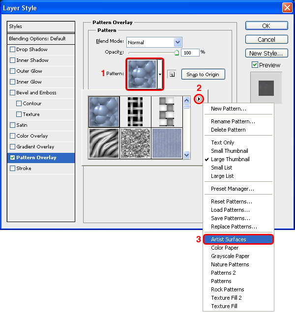
Select the "Main Shape" layer and go to Layer > Layer Styles > Blending Options. Click on the Pattern thumbnail and from the thumbnail list click on the arrow at top right, select from the dropdown menu Artist Surfaces and click on Append.
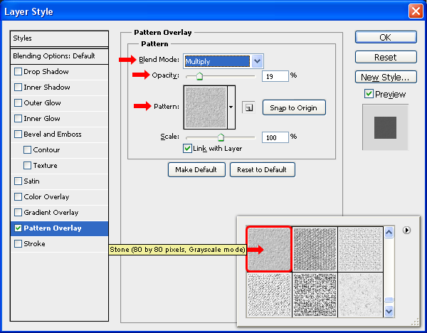
Select the patter Stone (80 by 80 pixels, Grayscale mode) and aplly a Pattern Overlay with the following settings. Click OK.
Step 9
Select the Rectangle Tool (U), and draw a rectangle as shown. Name the new layer "Design" and place it above the "Main Shape" layer.
Go to Layer > Smart Objects > Convert to Smart Object and then go to Layer > Create Clipping Mask.
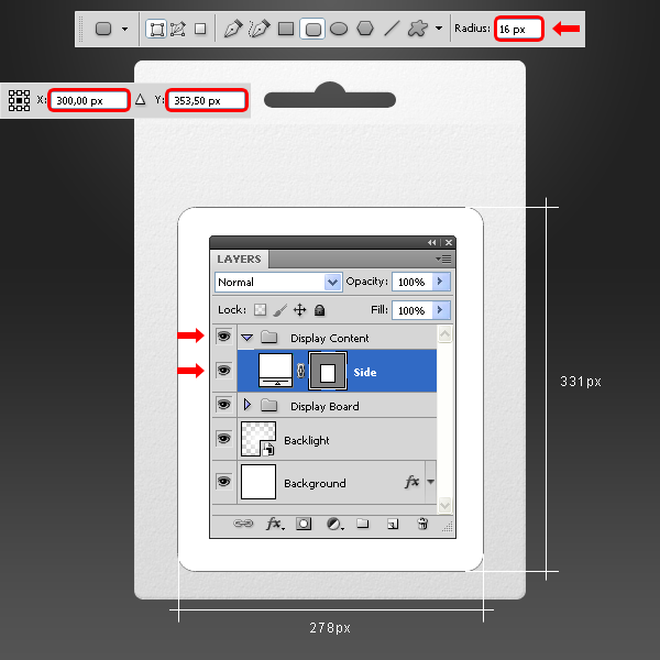
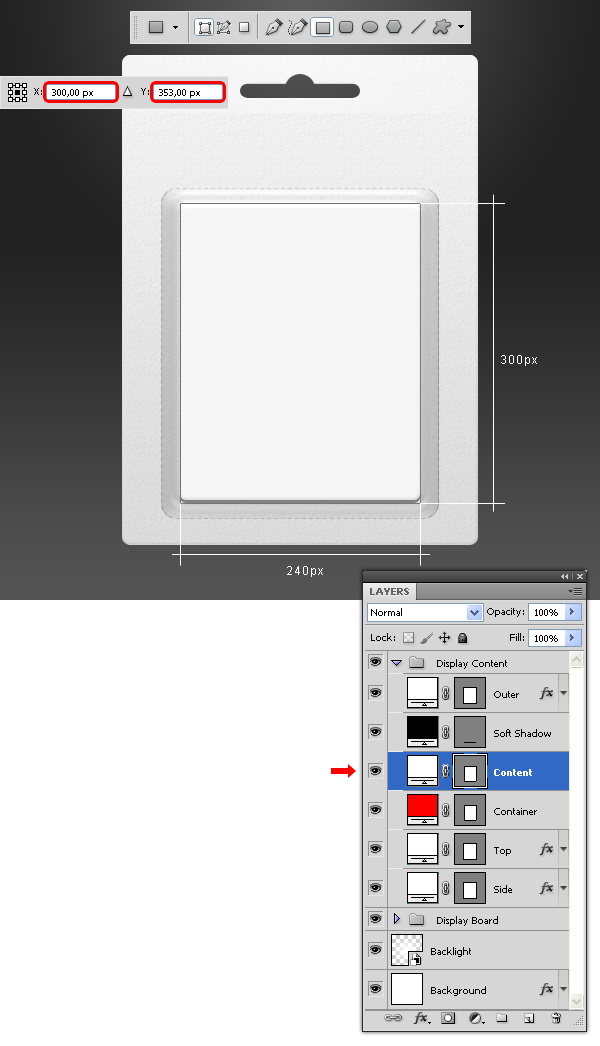
Step 10 – Setting up the Content.
Go to Layer > New > Group and name it Display Content. Set your Foreground color to white (#000000). Select the Rounded Rectangle Tool (U), set the Radius to 16 px and draw a rectangle as shown. Name the new layer "Side."
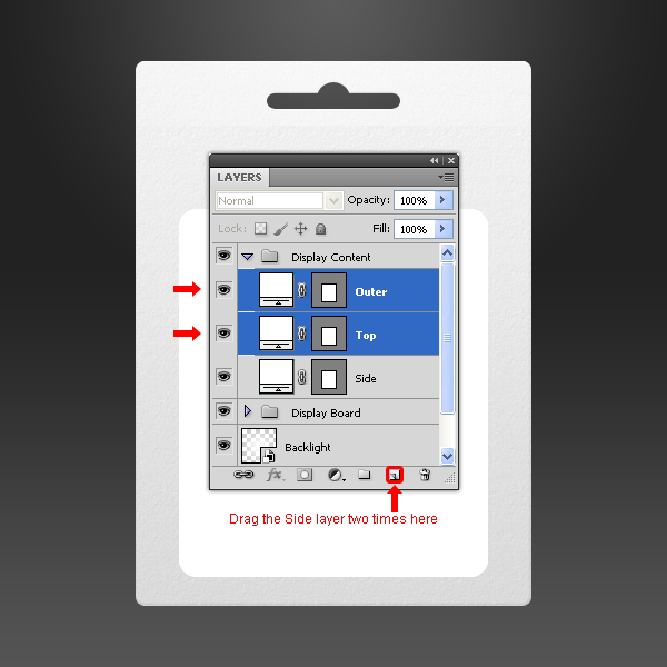
Step 11
Drag the "Side" layer to the New Layer icon in the Layers window two times and name these new two layers as "Top" and "Outer."
Step 12
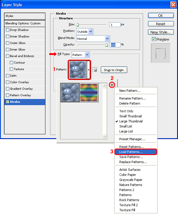
Select the "Side" layer, set the Fill to 0% and go to Layer > Layer Styles > Blending Options, select the Stroke tab and from the Fill Type dropdown menu select Pattern. Click on the Pattern thumbnail and from the thumbnail list click on the arrow at top right, select from the dropdown menu Load Patterns, search for the "Side_Dot" pattern file and click on Load.
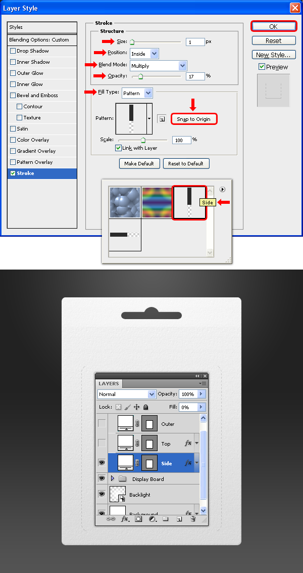
Select the pattern Side and apply a Stroke with the following settings. Click OK.
Step 13
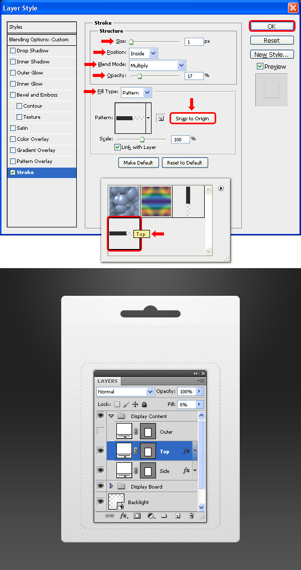
Select the "Top" layer, set the Fill to 0% and go to Layer > Layer Styles > Blending Options, select the Stroke tab and apply the following settings. Click OK.
Step 14
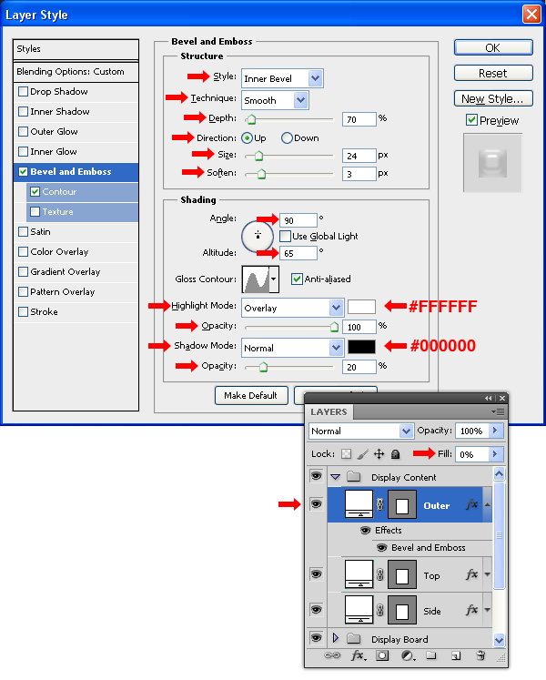
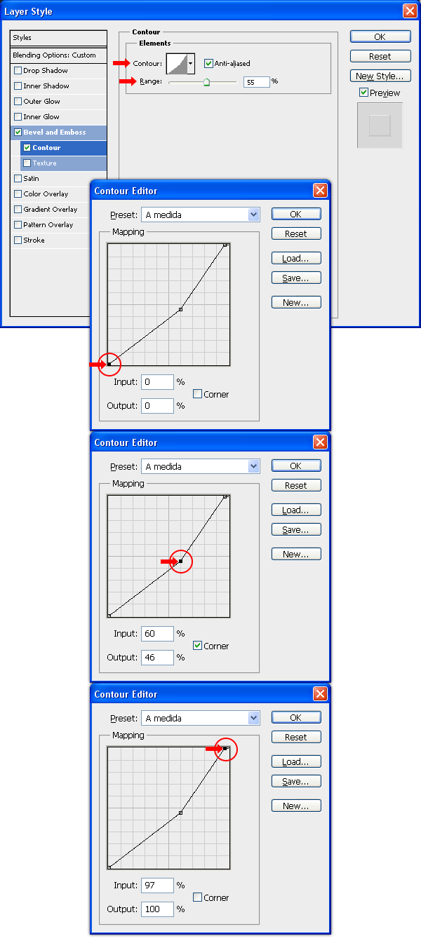
Select the "Outer" layer, set the Fill to 0% and go to Layer > Layer Styles > Blending Options, and aplly a Bevel and Emboss with the following settings.
Still in the Bevel and Emboss window, click on the Gloss Contour thumbnail and in the Contour Editor set the Mapping as follows. Click OK.
Click on the Contour tab in the layer Style window, set the Range to 55%, click on the Contour thumbnail and in the Contour Editor window set the Mapping as shown. Click OK. Again, click OK in the Layer Style window to apply the settings.
Step 15
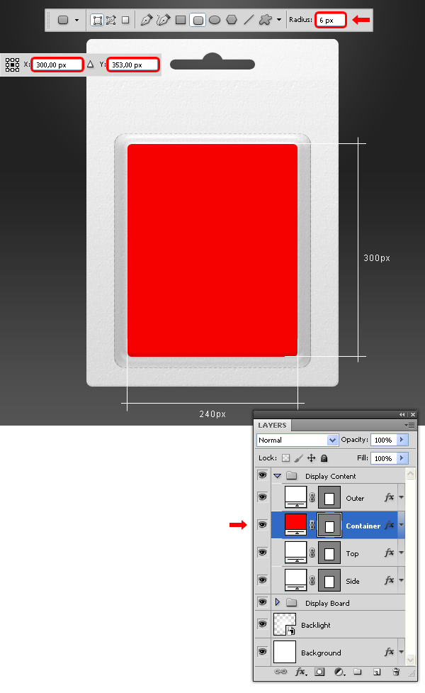
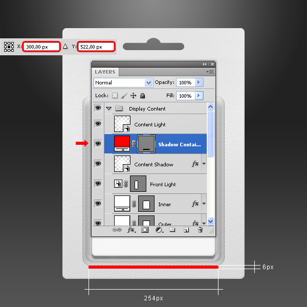
Set your Foreground color to red (#ff0000). Select the Rounded Rectangle Tool (U), set the Radius to 6 px and draw a rectangle as shown. Name the new layer "Container" and place it below the "Outer" layer.
Step 16
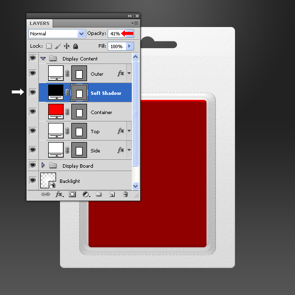
Drag the "Container" layer to the New Layer icon in the Layers window and name the new layer as "Soft Shadow." Set the layer Opacity to 41% in the Layers window and double-click the red thumbnail of the "Soft Shadow" layer; pick a black color (#000000) and click OK.
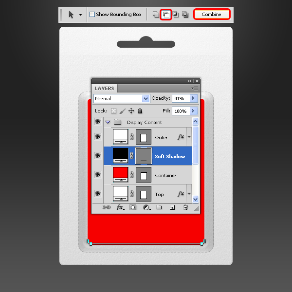
Select the Path Selection Tool (A) and drag a selection around the entire "Soft Shadow" layer. Go to Edit > Copy and the go to Edit > Paste. Using the arrow key, move the pasted selection 3 px by pressing the up arrow three times; select the Subtract From Shape Area option in the Tool window and click on the Combine button.
Step 17
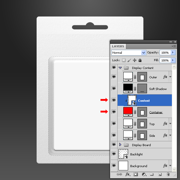
Set your foreground color to white (#ffffff). Select the Rectangle Tool (U), and draw a rectangle as shown. Name the new layer "Content" and place it above the "Container" layer.
Go to Layer > Smart Objects > Convert to Smart Object. Go to Layer > Create Clipping Mask.
Step 18
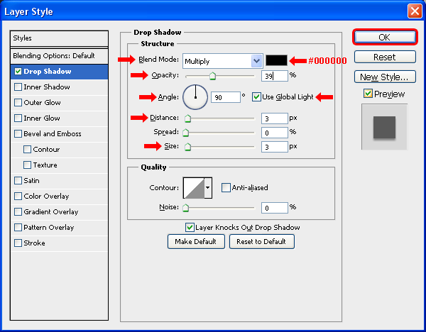
Select the "Container" layer, go to Layer > Layer Style > Blending Options and apply a Drop Shadow with the following settings.
Step 19
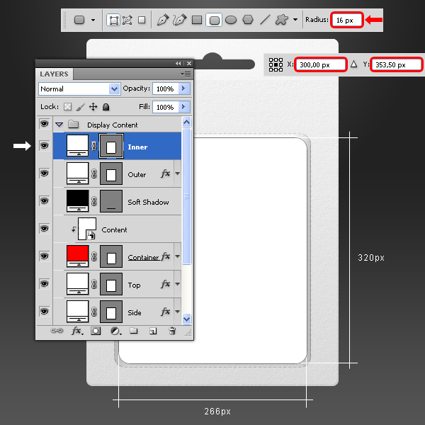
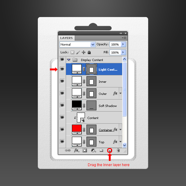
Select the Rounded Rectangle Tool (U), set a Radius of 16 px and draw a rectangle as shown. Name the new layer "Inner" and place it above the "Outer" layer.
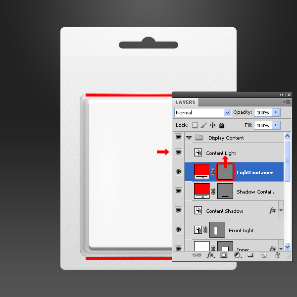
Drag the "Inner" layer to the New Layer icon in the Layers window and name the new layer as "Light Container."
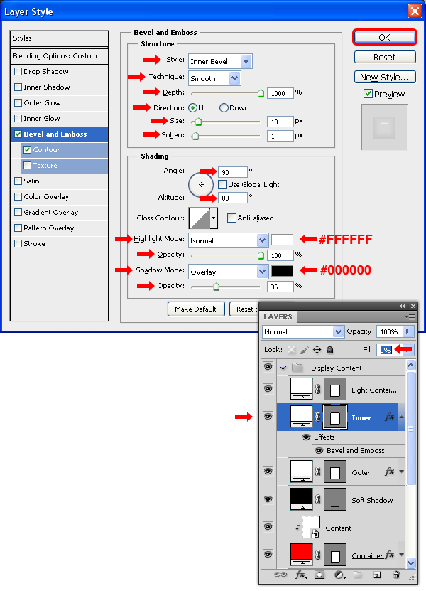
Step 20
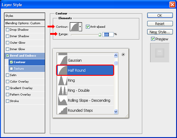
Select the "Inner" layer and set the Fill to 0%. Go to Layer > Layer Styles > Blending Options, and aplly a Bevel and Emboss with the following settings.
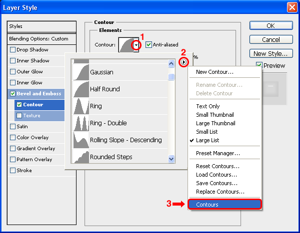
Click on the Contour tab and in the arrow next to the Contour thumbnail; from the thumbnail list click on the arrow at top right, select from the dropdown menu Contours and click Append.Contour tab in the layer Style window, set the Range to 100%, click on the Contour thumbnail arrow and from the Contour thumbnail list select the Half Rounded contour. Click OK. Again, click OK in the Layer Style window to apply the settings.
Select the Half Rounded contour from the dropdown list and set the Range to 100%. Click OK. Again, click OK in the Layer Style window to apply the settings.
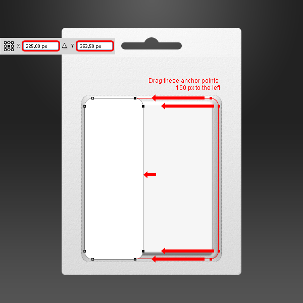
Step 21
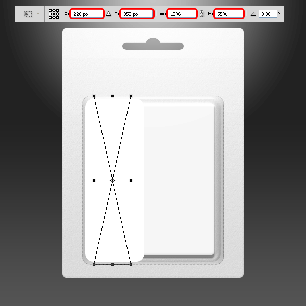
Click on the "Light Container" layer, select the Direct Selection Tool (A) and drag all the right anchor points 150 px to the left. Do this by holding Shift + pressing 15 times the left arrow on your keyboard.
Step 22
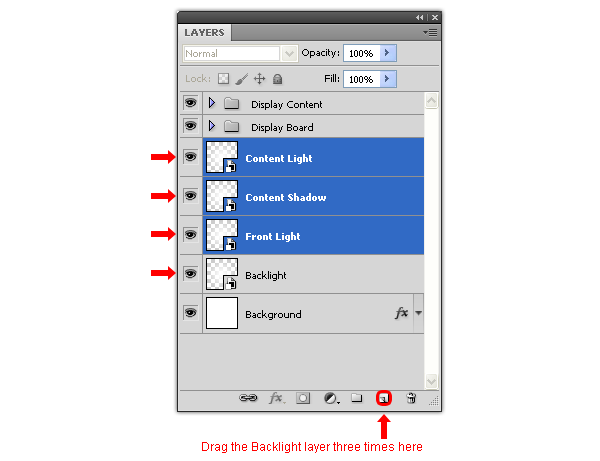
Drag the "Backlight" layer to the New Layer icon in the Layers window three times and name these new layers as "Front Light", "Content Shadow" and "Content Light."
Place the "Front Light", "Content Shadow" and "Content Light" layer above the "Light Container" layer in the "Display Content" layer group.
Step 23
Select the "Front Light" layer, go to Edit > Free Transform and apply the following settings.
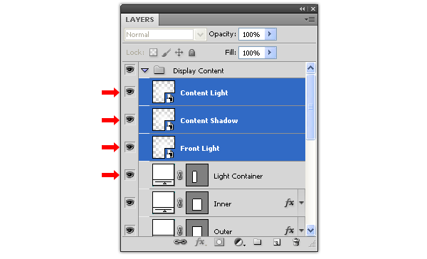
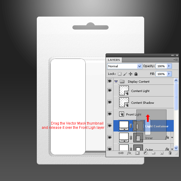
Select the "Light Container" layer, drag the Vector Mask thumbnail to the "Front Light" layer and release it on it. Delete the "Light Container" layer.
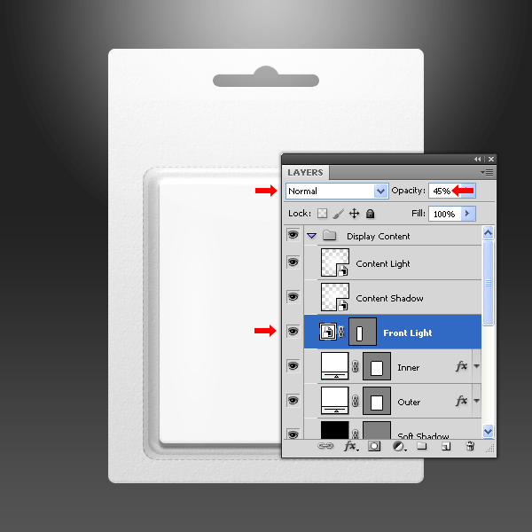
Set the "Front Light" layer to Normal and change the Opacity to 45%.
Step 24
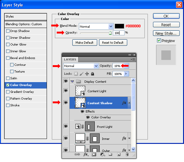
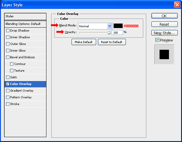
Select the "Content Shadow" layer, go to Layer > Layer Styles > Blending Options and apply a Color Overlay with the Blend Mode set to Normal an Opacity of 100% and a black color (#000000). Click OK. Set the layer mode to Normal and change the Opacity to 18%.
Step 25
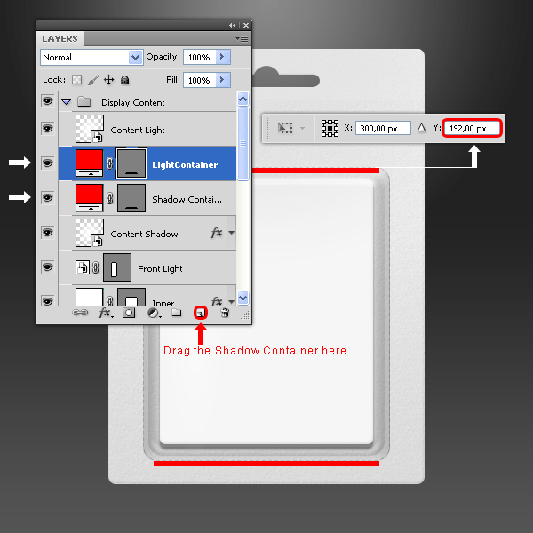
Set the foreground color to red (#ff0000) and select the Rectangle Tool (U) then draw a rectangle as shown. Name the new layer as "Shadow Container."
Drag the "Shadow Container" layer to the New Layer icon in the Layers window and name the new layer as "Light Container." Go to Edit > Free Transform and set the Y value to 192 px and apply the changes.
Step 26
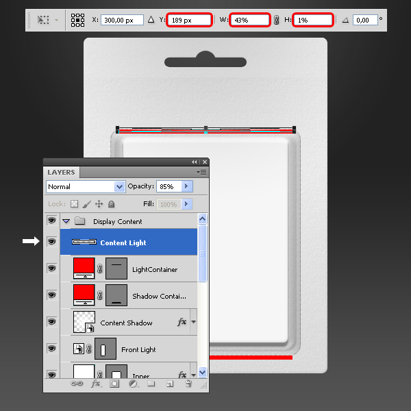
Select the "Content Light" layer, go to Edit > Free Transform and set the following values. Apply the changes.
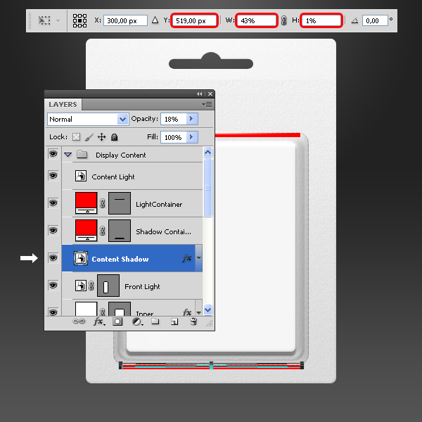
Now select the "Content Shadow" layer, go to Edit > Free Transform and set the following values. Apply the changes.
Step 27
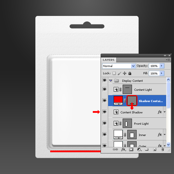
Drag the "Light Container" layer Vector Mask thumbnail to the "Content Light" layer and release it over it. Delete the "Light Container" layer.
Drag the "Shadow Container" layer Vector Mask thumbnail to the "Content Shadow" layer and release it over it. Delete the "Shadow Container" layer.
Step 28
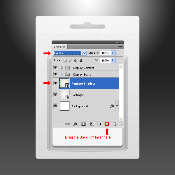
Drag and drop the "Backlight" layer to the New Layer icon in the Layers window and name the new layer as "Fantasy Shadow", set the Mode to Normal.
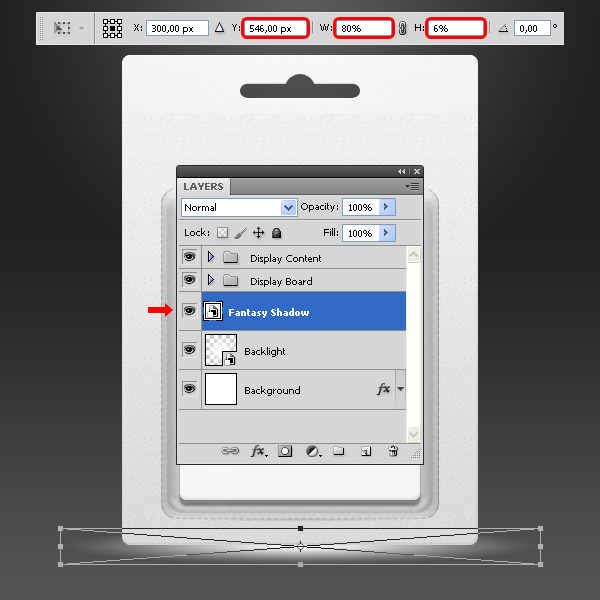
Go to Edit > Free Transform and apply the following values.
Go to Layer > Layer Style > Blending Options and apply a Color Overlay as shown.
Step 29
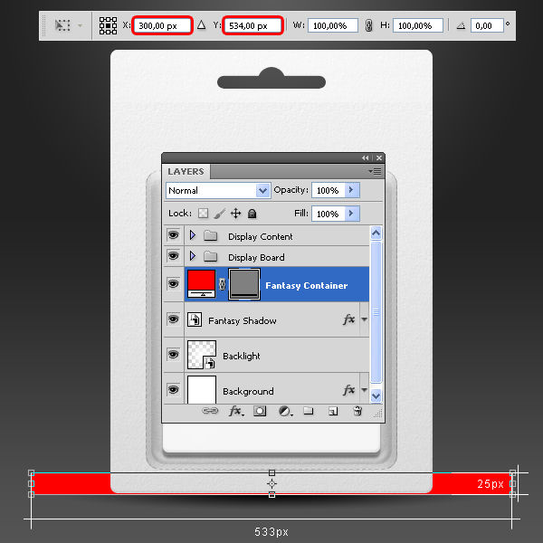
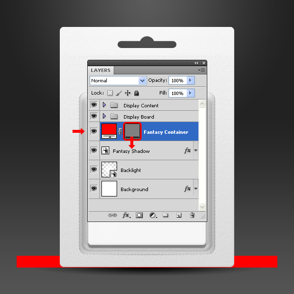
Select the Rectangle Tool (U) and draw a rectangle as shown. Name the new layer as "Fantasy Container".
Drag the "Fantasy Container" layer Vector Mask thumbnail to the "Fantasy Shadow" layer and release it over it. Delete the "Fantasy Container" layer.
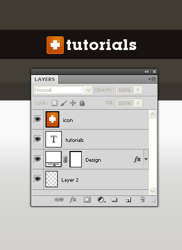
Step 30 – Putting some design on it.
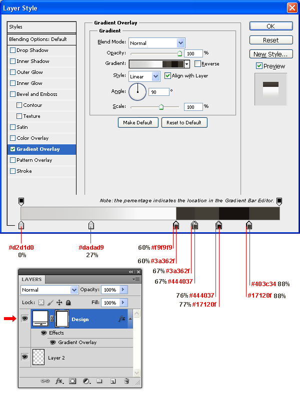
Into the "Display Board" group, select the "Design" layer and double-click on the smart object thumbnail. In the new document window select the "Design" layer and go to Layer > Layer Style > Blending Options and apply a Gradient Overlay with the following settings.
Select the Horizontal Type Tool (T) and write "tutorials". Get some nice icon and place it into the design. Save the file and close it.
Note: I have used the Lubalin typeface and the tutorials website icon, but you can use any typeface you like as well any image, it does not have to be necessarily an icon.
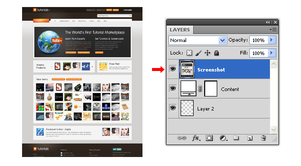
Step 31
Into the "Display Content" group, select the "Content" layer and double-click on the smart object thumbnail. In the new document window paste an screenshot (or any design you like) of the tutorials marketplace. If necessary, adjust the screenshot to the canvas size, do this by going to Edit > Free Transfom. Save the document and close it.
Final Image
![]()