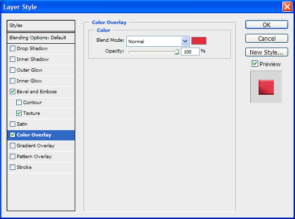
Quantcast
Channel: Envato Tuts+ Design & Illustration
Viewing all 6352 articles
Browse latest View live

Create a Glowing, Sci-Fi, Line Art Collage – Psd Premium Tutorial

$
0
0


When you’re creating a composition, often you will need to combine stock images with vector line art. In this Psd Premium tutorial, author Kervin Brisseaux will juxtapose various resources using straightforward techniques and subtle photo manipulation to create a dense sci-fi image. If you are looking to take your illustration skills to the next level then Log in or Join Now to get started!


Professional and Detailed Instructions Inside

Premium members can Log in and Download! Otherwise, Join Now! Below are some sample images from this tutorial.


Psd Premium Membership

As you know, we run a premium membership system here that costs $9 a month (or $22 for 3 months!) which gives members access to the Source files for tutorials as well as periodic extra tutorials, like this one! You’ll also get access to Net Premium and Vector Premium, too. If you’re a Premium member, you can Log in and Download the Tutorial. If you’re not a member, you can of course Join Today!


Create a Download Folder Icon in Photoshop

$
0
0


Icons are an important part of most interactive and web design. While icons are small, they can often be challenging to create. In today’s tutorial we will demonstrate how to create a download folder icon using different shapes and reflections in Photoshop. Let’s get started!


Step 1 – New File/Pen Tool Technique

Open Photoshop and set up a new document (Command/Ctrl + N). Use the following settings:

  • Resolution: 72dpi
  • Color Mode RGB color
  • Dimensions: 600×600 px

Create the following shape using the Pen tool (P).


Step 2 – Creating Shapes Using Pen Tool

Draw the back part of the folder using the Pen Tool using the same drawing technique. Then draw the stripe as shown.


Step 3 – Finishing the Shapes

Once you have finished drawing your folder, go ahead and add the paper and arrow as shown. You should now have the following 5 layers. Each shape will be in its own layer. Be sure to give each layer a unique name.


Step 4 – Adding Colour Effects

Add the following layer styles to the front part of the folder. Lower opacity to 90%.

Add the following layer styles to the Paper. Lower the opacity of the layer to around 90-95%.

Add the following layer styles to the Stripe.

Add the following layer styles to the rear part of the folder.

Add the following layer styles to the arrow.

Your icon should now look like this.


Step 5 – Adding Reflections

Add a new group named "refs." Use the pen tool to draw reflections as shown. Make sure you draw your shapes as paths instead of shape layers (see arrow). After you have closed the path, right-click on the workspace and choose "make selection" (feather 0). Pick up a big brush (master diameter around 470, hardness 0) and brush round the right part of the selection as I did creating a white reflection. Change the blending mode to Overlay and reduce the opacity to 63%.


Step 6 – Margins

Create a new group named "margins," create a new layer in it (Command/Ctrl + Shift + N). Adding highlights on the margins emphasizes the effect of the 3d icon. Use the pen tool to create the stroke lines around the corners and all the margins of the folder, paper and arrow. Then, right-click on the workspace and choose stroke path – brush. The brush settings must be changed to 8 px master diameter, hardness 0.


Step 7 – Shadows

Create a new layer (Command/Ctrl + Shift + N) for shadows and place it into a new group (Command/Ctrl + G). Make selection as you did in step 5 for creating reflections. Fill the selections with black and then blur the margins using the blur tool. If the shadows look too strong, it means that you must lower the opacity of the layer to 40%.


Step 8 – Adding Text

Add text using whichever font you like. In this case, I chose "Agency FB." Font size: 40, Layer Opacity: 75%.


Step 9 – Add the Final Reflections and Shadows

Add some more reflections to the paper using the same techniques we demonstrated in Step 5.

Add a shadow using the ellipse tool (E). Draw an ellipse as shown and add a slight motion blur. Reduce the opacity to your liking.


Final Preview

I hope you enjoyed this tutorial. I added some additional icons that I created using the same techniques below.

Create a Sleek and Clean MP3 Player Interface

$
0
0


In this tutorial, we will design a sleek and clean MP3 player interface. The process involves a lot of manual drawing and lots of layer styles. Let’s get started!


Tutorial Assets

The following assets were used during the production of this tutorial.


Step 1: Background

Let’s start by creating a background for our mp3 player. Draw a radial gradient from white to gray.


Step 2

Darken the gradient by adding Adjustment Layer Hue/Saturation. Reduce the Lightness setting.


Step 3

Create a new layer and fill it with white. Make sure you have white and black as foreground and background by pressing D. Click Filter > Noise > Add Noise. Set Distribution to Uniform and select Monochromatic.


Step 4

Change the blending mode of the layer to Multiply.


Step 5

Duplicate layer by pressing Command/Ctrl + J. Move layer 1 px left and 1 px down by activating tool move then press left arrow then down arrow. Change blend mode to Screen.


Step 6

Put both noise layers into a group folder and reduce its Opacity to 50%.


Step 7: MP3 Basic Shape

Create a rounded rectangle on the canvas. Use #3b484f as its color. Add following layer styles.


Step 8: Screen

Draw a smaller rounded rectangle. Add following layer styles.


Step 9: Album Info

Add a small rounded rectangle. We’ll use it as a container for album cover. Add following layer styles.


Step 10

Paste a picture on top of the rounded rectangle. Hit Command/Ctrl + Alt + G to convert it to clipping mask and put it inside the rounded rectangle.


Step 11:

Add artist info, album’s name, and its year underneath the album cover.


Step 12

From the option bar, you need to select the best Anti-aliasing methods to prevent blurry appearance. I can’t say which one is better because it’s different for each font type and size. You need to experiment with each setting. As you can see below, in this case None works best.


Step 13: Equalizer

Draw a rounded rectangle. Add following layer styles.


Step 14

Create new layer. Paint white using using a soft brush (Hardness: 0%) with low Opacity (10-15%). This will add a subtle light source under the equalizer.


Step 15

Select line tool and set its weight to 1 px.


Step 16

Draw a white line inside the equalizer. Activate zoom tool and click few times to zoom in to maximum view. We need to make sure that the line is not blurry. As you can see below, there is blurry spot on both ends of the line.


Step 17

There are two ways to fix this blurriness. First we need to round up the size. Second is fixing its placement.

Hit Command/Ctrl + T to transform the line. Right click Width (W) box and select pixels. Do the same to Height (H) box.


Step 18

We need to round up the size. In this case we will need to change 11,97 px to 12 px.


Step 19

Next, let’s fix its position. Select line shape with tool Path. Hit arrow key to fix its position. Do this until we have no blurry spot.


Step 20

Duplicate and transform the line by pressing Command/Ctrl + Alt + T. Move it upward 3 px..


Step 21

Repeat the duplication and transformation process by pressing Command/Ctrl + Shift + Alt + T.


Step 22

Select all lines, duplicate it and place it to the right. Remember to keep it sharp. Make sure the position is perfect to avoid blurry spot.


Step 23

Repeat this process until we have some columns of 1 px height lines.


Step 24

Delete some of the lines until we get a natural shape of equalizer. Add following layer styles. Set Fill to 0%.


Step 25: Song Info

Add artist name, song title, and total track time on top of the equalizer. I’m using font type LCD Phone here. The Anti-aliased Method used here is None.


Step 26

Below, you can see the result with each Anti-aliased method.


Step 27

Add more text for more info on top of the LCD. Use Pencil tool to draw a small black 1 px line separating each text. Erase both ends of these lines.


Step 28

Hit Command/Ctrl + 1. Let’s step back and see the result we have so far in 100% view. This is important to make there’s no blurry spots in our design.


Step 29: Main Buttons

Draw a small rounded rectangle for the button.


Step 30

Again, we need to check its size and position to avoid blurry spots. Hit Command/Ctrl + T and make sure to round up its size.


Step 31

Make sure to check its position, we don’t want to see blurry edges.


Step 32

Add following layer styles.


Step 33

Draw a black triangle on top of the button. Add Drop Shadow with following settings.


Step 34

Repeat the process to create more buttons.


Step 35

Create button background made from two overlapping rounded rectangle. Add following layer styles.


Step 36

Let’s step back again and take a look at the design in 100% view. We need to make sure that there is no blurry spots.


Step 37: Total Time Track

Create a long rounded rectangle. Add this following layer styles.


Step 38

Duplicate layer shape we have just created and add these layer styles.


Step 39

Add layer mask. Select half of the shape and fill it with black.


Step 39

Currently, layer styles are applied to the layer mask and they are adding a rounded shape on right end of the shape. To remove this, activate Layer Mask Hides Effects from layer style dialog box.


Step 40

You can see the difference below. The effect from layer style is now hidden by the layer mask.


Step 41

Create bigger rounded rectangle behind the time indicator for its background. Add this layer style.


Step 42

Create new layer on top of the time indicator background. Paint some highlight and shadow. You can see the progress I made below.


Step 43: Right Window – Playlist

Create a rounded rectangle and place it on right side behind the main shape. Add following layer styles.


Step 44

Create new layer on top of the rounded rectangle shape. Paint some highlight and shadows.


Step 45

Create some triangles and place them on right side of the shape. Add following layer style.


Step 46

Use pencil tool to draw two 1 px line, black and white. Set its opacity to 10%.


Step 47

Add layer mask and paint some parts of the line with black. Below you can see the mask used here.


Step 48

Draw a rounded rectangle and add following layer styles. Set Fill layer to 0%.


Step 49

Add song titles. Set one of the songs to bold to indicate it as an active song.


Step 50

Add Drop Shadow to give it inset effect.


Step 51

Draw a rounded rectangle. Add following layer styles and set its Fill layer to 0%.


Step 52

Create a plus sign made from two overlapping line shape. Set Fill to 0% and add these layer styles.


Step 53

Repeat the process to create other buttons.


Step 54: Left Window – Player Settings

Duplicate playlist basic shape. Hit Command/Ctrl + T, right click and choose Flip Horizontal. Move it to left side.


Step 55

Draw a thin rounded rectangle and add these layer styles.


Step 56

Create a small rounded rectangle for the slider. Add following layer styles.


Step 57

These layer styles is still not enough to get a convincing 3D appearance. Using pencil tool, we need to add some 1 px line detail on the slider. See picture below for reference.


Step 58

Let’s step back and see the result in 100% view.


Step 59

Paint some black stripes behind the slider.


Step 60

Let’s add label "VOLUME" for the slider. The font used is Digital-7. Add Drop Shadow.


Step 61

Create another slider by duplicating previous slider and change its label.


Step 62

Now let’s focus on creating balance slider since this is a bit different. Add more space between the slider and its label. Delete stripes behind the slider. Use pencil to draw alternating 1 px black and white line. Set the layer’s Opacity to 10%.


Step 63

Add plus (+) and minus (-) character on both ends and add Drop Shadow.


Step 64

Hit Command/Ctrl + 1 to see the result at 100% view.


Step 65: Highlight

Our design is simply too clean and unnatural. To fix this let’s add some highlights. Draw a white 1 px line using pencil tool. Delete both ends.


Step 66

Repeat this process to create another highlights.


Step 67: Shadow

Hold Command/Ctrl and click basic shape, playlist shape, and player settings shape to create a new selection based on the mp3 player’s shape. Press down arrow a few times to nudge the selection down.


Step 68

Create new layer underneath all other layers. Fill selection with black. Presst Command/Ctrl +Shift + I to deselect. Soften the shadow by adding Gaussian Blur filter.


Step 69: Reflection

Let’s add reflection onto the surface of the mp3 player. Copy screen path (1). Click Adjustment Layer icon and select Solid Color. You can use any color here. Create another path covering top part of the screen and set it to Intersect (2). Change Opacity to 2% and Fill to 0%.


Step 70

Now we’ll create another reflection on outter side of the main window. Create new path covering top part of the main window (1). Click Adjustment Layer icon and select Solid Color. Subtract it with screen shape path (2). Intersect it with main window shape path (3).


Step 71

Set Opacity to 23% and Fill to 0%. Add following layer styles.


Step 72

Below, you can see the difference with and without reflection.


Step 73

Next we will add reflection on left and right window. Copy left and right window path, set their mode to Add (1). Click Adjustment layer icon and select Solid Color. Subtract path with the main window path (2). Create new path covering top part of the interface and set it to Intersect (3).


Step 74

Set Opacity to 10% and Fill 0%.


Step 75

Below, you can the difference with and without reflection. Very subtle but it gives more depth onto the shape.


Step 76: Interface with Closed Playlist and Settings

Put all shapes and layer that create the mp3 player into a group folder. Duplicate the group and move the left and right window until they are closed.


Step 77: Sharpening

We have tried to sharpen every pixel on the interface, we still need to sharpen it again. Create new layer on top of all layer. Hit Command/Ctrl + Shift + Alt + E to merge all visible layers. Now, we have exact duplicate of the image in one single layer.


Step 78

Click Filter > Sharpen > Unsharp Mask. This filter will sharpen all the pixels on the layer.


Final Image

Win a Free HP EliteBook 8740w Laptop

$
0
0


A couple months back I had the opportunity to review an HP EliteBook 8740w Workstation laptop for HP. HP sent me this computer for free and asked me to unbox it, use it, and then give my honest opinion of it in a review. If you follow my personal account on Twitter, you may have seen some of my tweets about it. I put my computer through the ringer. Played a lot of video games and really pushed this laptop to its limits. I had a lot of fun doing this and overall, really liked this machine, even though it was a PC and not a Mac. With that said, after I finished reviewing the machine, HP agreed to give another one of these machines away to one lucky reader of my website.

Instead of giving this machine away on my Colorburned site, I decided to instead, give it away here on Psdtuts. I decided to do this, mostly because Psdtuts is a much bigger site than my Colorburned site and I wanted to give as many people the opportunity to win a new computer as possible.

Before I tell you how you can win this computer. First, you should probably know a little about it. The computer that you may win is exactly like the one that I reviewed. It’s a beast! It has an Intel Core i7-740QM (1.73ghz, 6mb L3 Cache) processor, 8gb DDR3-1333 memory, 17 inch WUXGA (1920×1200) LED-backlight DREAMCOLOR display, an NVIDIA Quadro 5000m with dedicated 2gb DDR5 workstation-class GPU, 500gb 7200RPM HD, Full-sized backlit keyboard, 230w external power adapter, it also includes a fingerprint scanner, ambient light sensor, dual microphones, a three button trackpad mouse as well as a three button point stick mouse, touch-sensitive media keys, a 2.0mp integrated webcam, and a LightScribe DVD +- RW burner. It’s also got a Bluetooth module and an Intel Centrino Ultimate N Wireless Adapter.

So HP isn’t messing around here. It’s their top of the top of the line laptop. If you were to buy this computer on your own, you’d spend about $5,000 USD.

Now that you know a little about this machine, it’s time to tell you how it can become yours. First of all, we can only ship this machine within the U.S. If you don’t live in the U.S., sorry :-( . For those of you who do, to win, all you have to do is answer the following question correctly and submit it using this form.

What video game did I play while I reviewed this machine?

Submit your answer here by Friday, March 11, 2011 at 11:59 PM EST. I will select the winner at random from those of you who answer correctly. You can find the answer in a number of ways. Read my review, Google it, or take a look through my Tweets. It doesn’t matter how you find the answer; only that you submit the correct one. You may only enter once. Entering more than once will disqualify your entry. Also make sure that you leave a valid email and shipping address. Otherwise, I can’t send you the machine. Good luck everyone!

20 Outstanding GraphicRiver Flyers and Posters

$
0
0


Putting together a party or an event can be stressful enough without having to worry about the invitations or promotional material. Recently, GraphicRiver has been collecting a ton of really cool flyer/leaflet templates that are ready for print. We wanted to highlight some the variety of templates that are available for your next business or personal shindig.


1.Legacy Poster/Flyer Template

Legacy Poster/Flyer Template

Legacy Poster/Flyer Template

This sexy event poster comes packed with 7 different styles to try out. There are many layers to move around/change blend mode etc. to create unique looks.


2.Full Page Magazine Ad or Flyer Templates

Full Page Magazine Ad or Flyer Templates

Full Page Magazine Ad or Flyer Templates

This high resolution magazine or flyer ad is ready for print and includes all the bleed, cut and text safe guides you’ll need.


3.Flashy Nightclub / Event Poster-Flyer

Flashy Nightclub / Event Poster-Flyer

Flashy Nightclub / Event Poster-Flyer

If you like the night life as much as you like to boogie, you’ll love this retro nightclub event poster/flyer. Includes several variations.


4.myFlyer – Party Celebration Flyer

myFlyer - Party Celebration Flyer

myFlyer – Party Celebration Flyer

This colorful party flyer really pops off the page. Also, there’s no rasterized layers to worry about; all the text is fully editable!


5.Get Minimal – Flyer 02

Get Minimal - Flyer 02

Get Minimal – Flyer 02

If you love the classic style of strong typography mixed with minimalist design, you’re going to love this flyer. Feel free to change colors, positions and typefaces.


6.Club Flyer Template

Club Flyer Template

Club Flyer Template

Grab their attention with this flyer/poster for your next club event. The photoshop document is well organised and super easy to edit.


7.Business Flyer Template With 4 Color Schemes

Business Flyer Template With 4 Color Schemes

Business Flyer Template With 4 Color Schemes

When the party is over, it’s time to get back to business. This attractive business flyer comes with 4 different color schemes.


8.Business Sale Postcard Mailer

Business Sale Postcard Mailer

Business Sale Postcard Mailer

Mailouts can get pretty expensive, so don’t waste your money on a blah looking one. This 8.5 x 5.5 postcard template is ready to send!


9.Indie Flyer

Indie Flyer

Indie Flyer

Be sure to wear your flannel for this Alternative inspired party flyer. Suitable for a festival, concerts, special evening in a club, concerts or parties.


10.Wavy Style Flyer Template

Wavy Style Flyer Template

Wavy Style Flyer Template

This clean and professional flyer template is perfect for a business flyer or mailout. Print bleed lines included.


11.Music Festival Poster & Flyer

Music Festival Poster & Flyer

Music Festival Poster & Flyer

A touch of grunge and eye-catching colors will make this poster/flyer stand out. Also included is a smaller version for mailouts.


12.Green Valley Poster Template

Green Valley Poster Template

Green Valley Poster Template

Got a summer blockbuster in the works? This poster template would go well with your next indie movie screening or off-broadway play.


13.Contemporary Flyer Template

Contemporary Flyer Template

Contemporary Flyer Template

Bold typography and images make this flyer jump out at you. Comes with several different styles and sizes.


14.Typographic Poster Template

Typographic Poster Template

Typographic Poster Template

Who says text-only can’t be beautiful? This poster template combines texture, light and typography to deliver a high quality product.


15.Business Flyer Template

Business Flyer Template

Business Flyer Template

This flyer template is perfect for a business that wants a clean, modern look. 3 color schemes are included.


16.Clean Simple A3 Poster and A6 Flyer

Clean Simple A3 Poster and A6 Flyer

Clean Simple A3 Poster and A6 Flyer

If you’re looking for a flyer or mailout with tons of breathing room, this is your template. Every layer is vector based, no pixel layers, patterns, or smart layers so it is completely editable and scalable.


17.Sensation Flyer

Sensation Flyer

Sensation Flyer

As sexy as it is sensational, this flyer template really grabs you. Ultra easy to modify, change colors, dimensions and place your own photos.


18.Elegant Product Flyer

Elegant Product Flyer

Elegant Product Flyer

If you’re looking to announce your newest product, you can’t go wrong with this clean, elegant flyer template. Super simple to change text and images of your own.


19.Poster Template

Poster Template

Poster Template

Stars, grunge, bold typography – what’s not to love? This poster template is quick to adapt and edit.


20.Outline – Business Flyers

Outline - Business Flyers

Outline – Business Flyers

Keep things professional with this cool business flyer template. Three different versions are included along with video instructions on how to edit and use the files.

Sell Your Own Design Templates?

GraphicRiver has been growing very fast and top authors there earn thousands of dollars a month these days. If you’ve got the skills, you should consider uploading your files for sale! Anyone can join and become an author, and with a bit of work you’ll get to enjoy a nice, steady income stream.

Learn more about selling on GraphicRiver

What is a Clipping Mask Then?

$
0
0


Are you new to Photoshop? Have you been trying to teach yourself the basics of Photoshop but have found the amount of educational material available on the net a bit overwhelming? As the world’s #1 Photoshop site, we’ve published a lot of tutorials. So many, in fact, that we understand how overwhelming our site may be to those of you who may be brand new to Photoshop. This tutorial is part of a 25-part video series demonstrating everything you will need to know to start working in Photoshop.

Photoshop Basix, by Adobe Certified Expert and Instructor, Martin Perhiniak includes 25 short video tutorials, around 5 – 10 minutes in length that will teach you all the fundamentals of working with Photoshop. Today’s tutorial, Part 13: What is a Clipping Mask Then will explain clipping masks, the advantages of clipped adjustments, and how they compare to layer masks. Let’s get started!


Create a Retro Electronic Safe Lock Interface – Psd Premium Tutorial

$
0
0


Photoshop can be used to create interfaces for all sorts of applications in addition to websites. In this Psd Premium tutorial, author Diego Monzon will demonstrate how to create a retro style electronic safe lock interface using both Photoshop and Illustrator. This tutorial is available exclusively to Premium Members. If you are looking to take your interface design skills to the next level then Log in or Join Now to get started!


Professional and Detailed Instructions Inside

Premium members can Log in and Download! Otherwise, Join Now! Below are some sample images from this tutorial.


Psd Premium Membership

As you know, we run a premium membership system here that costs $9 a month (or $22 for 3 months!) which gives members access to the Source files for tutorials as well as periodic extra tutorials, like this one! You’ll also get access to Net Premium and Vector Premium, too. If you’re a Premium member, you can Log in and Download the Tutorial. If you’re not a member, you can of course Join Today!

Create a Post-Apocalyptic Matte Painting

$
0
0


In the movies, we often see images of ruined landscapes or apocalyptic cities. What many of us don’t know however is that much of this imagery was produced not with complicated CG software but instead, using Photoshop. In today’s tutorial we will demonstrate how to create a post-apocalyptic matte painting of an old cathedral. Let’s get started!


Tutorial Assets


Step 1

Create a new document. Use any size you want but for this scene I recommend using a 2:1 ratio, meaning that you can use resolutions like 2000×1000 and 1000×500. For this tutorial, I will be using the 1000×500 resolution. The color mode and bit depth do not matter for now.

First, let’s import the Cathedral image. You can see that it is a very large image. This is a good thing because it will downscale quite nicely. To resize and position the image, hit Command/Ctrl + T on your keyboard or go to Edit > Free transform. To scale an image while maintaining its proportions, hold the Shift key while resizing it. When you’re satisfied with the result, you’ve now got the base of the whole composition.

Go to Image > Adjustments > Levels. As you can see in the histogram, a lot of data is being stored in the black area which means that we’ve got an under exposured image. To get some more data out of the high and mid tones, change the value of the mid tones from 1.00 to about 1.20. Now we’re ready to go.


Step 2

As you can see we’ve got a problem. At the moment this photograph was made, two people who probably wanted to ruin our image, took a seat in the wooden seats on the bottom of the image. Obviously, we want to remove the people. To do this, we are going to use one of Photoshop’s amazing features, the content aware fill option.

To do this, use the lasso tool or hit L on your keyboard and draw a circle around the subject. Be sure to also integrate some pieces of the environment into it so that Photoshop knows what to erase. Once selected, click with the right mouse button on the selection and under the Use: tab select Content-Aware. Unfortunately, this feature is only available in Photoshop CS5 so I would recommend people who use older versions of the software to play around with the clone stamp tool. Anyway, once the content-aware fill is applied you are probably going to have some problems. This, however, can easily be solved by using the Spot Healing Brush Tool. Ultimately you want to have a result that looks good, so some cheating is okay.


Step 3

Create a new layer called ”Fog” and set the blending mode to Soft Light. Now use a big round soft brush and paint over the dark middle area of the image covering all the stuff in the back of the scene like a part of the roof and the windows. Then reduce the opacity of the layer a little bit. This will create a natural effect, because also in real life this rule generally applies: the further away you are from an object the less contrast your eyes can detect. See the comparison image below to see the effect.


Step 4

Now we’ve got to start adding elements into the scene. Let’s start by modifying some big elements in the scene by adding some vines onto the main pillars of the cathedral.

Load the vines image and position and scale it properly, so that the vines look like they actually grow around the pillars. Due to the fact that the vine image is pretty small compared to the first image you need to duplicate and rotate it some times. A helpful thing is to duplicate the image and then rotate it 180°. Then, when you’ve finished positioning the vines it’s time to apply some color correction to make them blend properly.

A handy tip is to look at the brightest areas of the image you want to blend your element with, in this case the cathedral image. Now, the area in the front covering the pillars is quite dark so you should decrease the high tones by taking the second point on the curve and moving it down as shown in the image after opening the Curves windows by going to Image > Adjustments > Curves. Also, you need to take a look at the color tone of the cathedral ruins, which suggests a slight increase in the red channel. Also, add a slight contrast and play around with the curves in order to make the perfect blending.


Step 5

Once you’ve repeated the process and attached the vines to multiple pillars it’s time to add the other elements. Import the image of the rocks. First of all, we’ve got to isolate the rocks from the sky and from the sand. To do this, select the sky and the sand and then go to Refine Edge. This opens a window which is pretty much the key to advanced selections. Particularly the first option is really handy in Photoshop CS5, called the Edge Detection parameter. This will automatically detect the edges of the object you want to isolate and like magic, it makes a perfect selection.

You should also play around with the other parameters like Shift Edge and Smooth. When you’ve got your selection, inverse it and delete the edges like shown in the animation below. Now you can place the rocks and repeat the color correction process from the third step. The same applies to the foreground dirt pile.


Step 6

With the basic setup done, we can now add smaller details like the tombstone in the middle. To do this, extract the stone from the image just like you extracted the stones and the vines. Then place it in the middle of the image and scale it down until it matches the perspective. Now, duplicate the image and rotate it 180° and place it directly below the original one, creating a reflection. Load a big soft brush and erase the top of the stone. Also, lower the opacity to make the reflection complete. You want to apply some color correction as well to blend the stone in. For reference you can check the image below.


Step 7

Right now I’m happy with the details, although you can add more if you like. The next thing that we will do, is add the foreground vegetation. You can download the brushes and then import then into your brushes palette to use them.

Once you’ve downloaded them, you’ll find that they don’t contain any color, they are just shapes. This, however, doesn’t really matter in this case because the light comes from behind so the things on the foreground can be very dark. Pick a dark grey color to make the composition and start playing around. In Photoshop CS5, when you hold the alt key and you hold the right mouse button you can interactively scale your brushes.

Anyway, the nice thing about layers is that you can add grass on top of things, but as you can see at the rocks I’ve placed the grass underneath them. This provided much creative freedom. Also, I’ve placed some grass in front of the tombstone to make the transition from the stone to the ground a little bit smoother. This is a helpful little trick to blend things.


Step 8

Once, you’ve finished adding some final touches to the image blending you can start working on the last details. The first detail concerns the ground cracks. For these cracks, I’ve used an image from Videocopilot’s Action Essentials 2 product. You can use other images as well as long as you’ve downloaded them from a stock photography site or you’ve made them your own. The image was originally in grayscale so I used the blending mode Overlay to delete the grey but maintain the texture. Things like cracks, holes and burn marks are always nice things to play around with so be sure to take a look at the foreground pillars to see if you can add some nice texture and damage.


Step 9

Now we’ve added all the objects into the scene and we’re ready to do some other stuff. First of all, we can add a grunge texture on top of our cathedral image to spice the image up a little bit. Just look for a grunge texture and play around with the blending mode. You can just grab the eraser and erase the parts you don’t want to be textured like the roof and the middle area of the images. Mostly the outer regions of the image need to be textured, like the pillars. You can see the difference on the image below.


Step 10

Another element you can see in the final image is the broken roof with light rays coming out of it. Let’s start by duplicating the original cathedral image in case anything goes wrong when trying to delete some parts of the roof. To actually delete the parts of the roof you can play around with different selection tools but to make nice and accurate edges you just need to do it manually.

This is probably the most labor-intensive part of the composition. The reason why is simple: you’ve got to make nice edges without any aliasing and, you must delete the right parts of the roof. For example, you can’t remove one of those big mainstays while maintaining the part of the roof it supports. I prefer working with the lasso tool and then refining the selections with the Refine Edge tool as shown in the animation above. Once you’re done you should have something like the image below.


Step 11

Obviously we can’t leave the background empty so we’ve got to download or shoot a picture of a sky. In this case I’ve used a clouded sky to give the scene a more intense effect.

A very important thing is to match the sky color with the interior color but a part of that will be done later with the final color correction. Simply place the sky image below the cathedral image and make some adjustments considering color, contrast etc..

Now, the cool thing is the light rays. To make the light rays, we need to extract the brightest parts of the clouds. To do this, duplicate the cloud layer and go to Image > Adjustments > Levels. Now Move the white slider to a lower value and make sure you can only see the bright parts of the image. Click the OK button and go to Filter > Blur > Radial Blur. Set the amount to 100 and the Blur Method to Zoom.

Also, set the quality to best and move the center of the blur to where the light comes from: the middle top of the image. Then move the layer on top of the cathedral ruins and set the transfer mode to Screen. This is how to make the light rays.

A good tip is to make some duplicates of the rays and stretch them so that you are really getting the feeling of a volumetric lightning. Also, you can adjust other things like maybe a small glow or exposure increase and some color correction. Also, you can add more details like the hanging chains to the image like I did using the techniques discussed above. A good tip by the way is to use the Liquify Tool to make the vines and chain more random looking. The image below shows what I did using the Levels and the Radial Blur.


Step 12

Now the composition is pretty much done. To spice the image up a little bit you can add one or more grunge texture layers and some more destructive elements like burning marks and cracks. To do this, just paste a grunge texture over the image and set the blending mode to what looks good (this varies with every image). Just erase the parts that you don’t want to be textures like the roof etc..


Step 13

This step considers the relighting of the scene. Obviously, all the images contain different light sources and are therefore lighted differently. The nice part of this scene is that the light source mainly comes from one place making the relighting easier. Let’s start by relighting the foreground rocks. To do this, select the appropriate layer and take the Dodge Tool (or press O on your keyboard to switch between the Dodge, Burn and Sponge Tool). Now, for the Range, select the midtones and paint over the where the light comes from, so paint the top of the rocks. The dodge tool works very well together with the Burn Tool, so I recommend using the Burn Tool and make the shadows even darker by painting the dark areas of the rocks.


Conclusion

The final thing we are going to do now is the color correction. To do this, go to Layer > New Adjustment Layer > Curves and place it on top of all the layers. First of all, add some contrast. Secondly, add some red in the midtones and remove some blue, also in the midtones. This will create a kind of ancient yellow effect.

Once you’re completely satisfied with your image it’s time for the final crucial steps. Before doing this, however, you should save the project file as it is now under a different name because we are going to merge all the layers together now. So first save your project so that you’ll keep a project file with the layers. After that, merge all the layers. Then go to Filter > Noise > Add Noise.

This is a classical trick is matte painting composing because is blends everything together really well and it gives a more natural feeling because the same amount of noise is applied to everything. Another thing you can do is apply a sharpen filter to make the final integration. Only sharpen it a bit and watch out for aliasing like effects. The final image is below. Thanks for reading and I hope you learned something new!


The Cosmos: Create a Spiral Galaxy

$
0
0


This entry is part 3 of 3 in the series The Cosmos

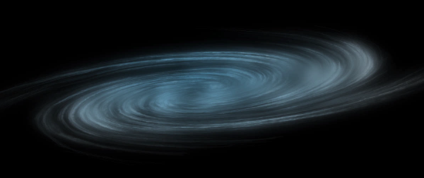
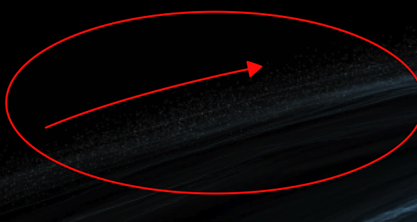
A galaxy is a massive collection of stars, stellar remains, gas, dust, and planets. Galaxies can contain as few as 10 million stars, or as many as 100 trillion. Astronomers believe that there are about 170 billion galaxies in our universe, each varying in shape from spiral, elliptical, to irregular. In today’s tutorial, we will demonstrate how to create a spiral galaxy of your own and will depict a fleet of ships making its way through the universe to find a new home.

Today’s tutorial is part of a 4-part series depicting the journey of the inhabitance of a dying world that must travel into the unknown to find a new world to call home. In this series, we will explore the cosmos from the perspective of this fictional civilization making their way through the universe and will demonstrate the techniques that you can use in Photoshop to depict your own cosmic scenery. In addition to written content, this tutorial also includes about 90 minutes of video instruction to help you along the way. So what are you waiting for? Let’s get started!


Step 1 – The Galaxy

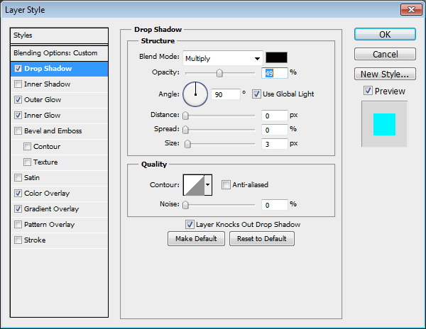
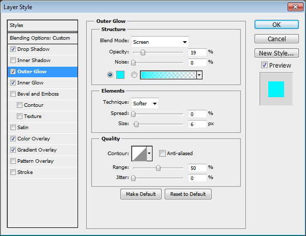
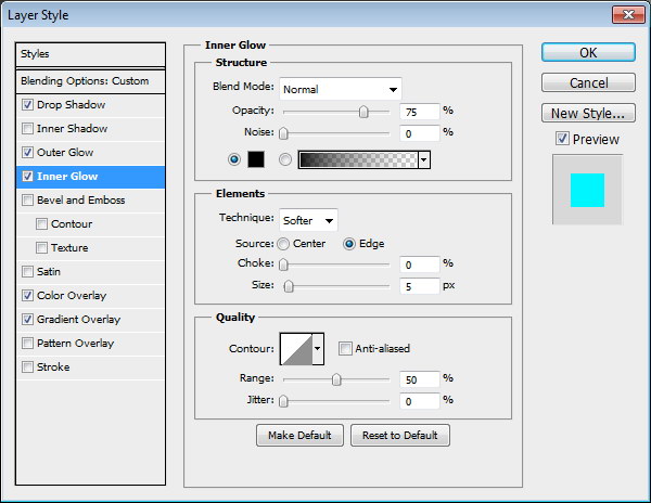
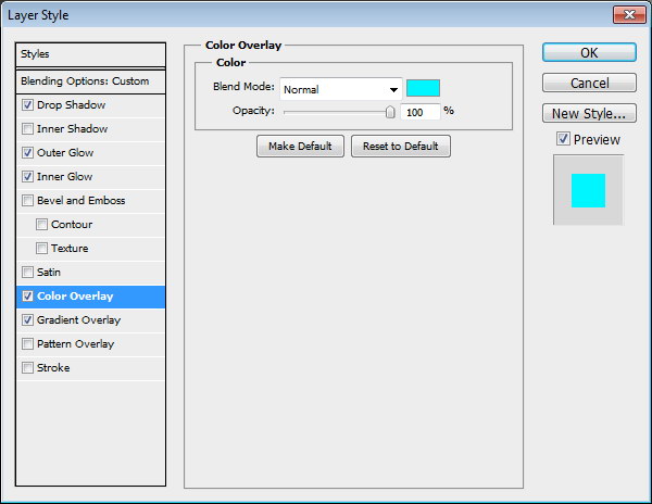
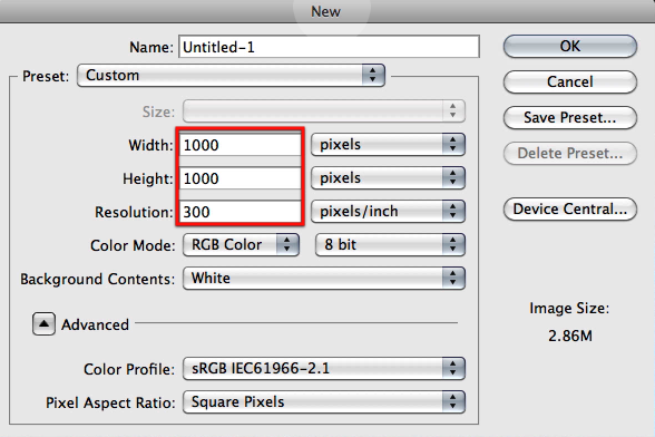
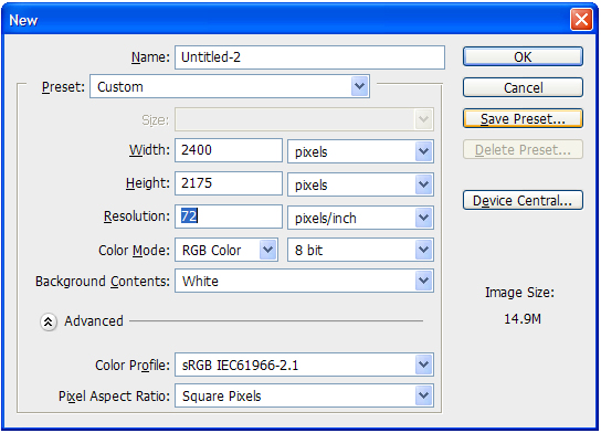
We will begin with the main feature of this image and the most important. This is a very long step because of all the settings and clicks you have to go through, but its not complicated its just a matter of following it and you will see soon enough how we will progress through it and how each steps provides us with valuable content. Let’s begin by creating a document where we will be generating the base for the galaxy not the main image document; so go ahead and create a new document with the settings as shown here.

Now select black and fill in your canvas.

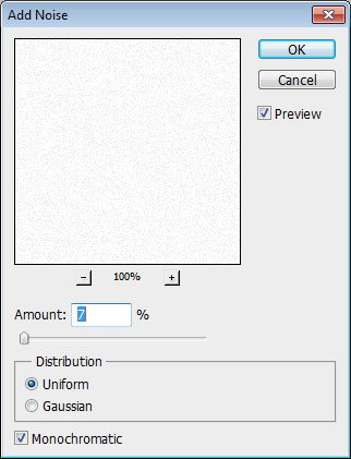
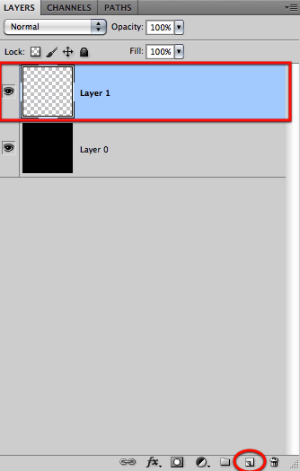
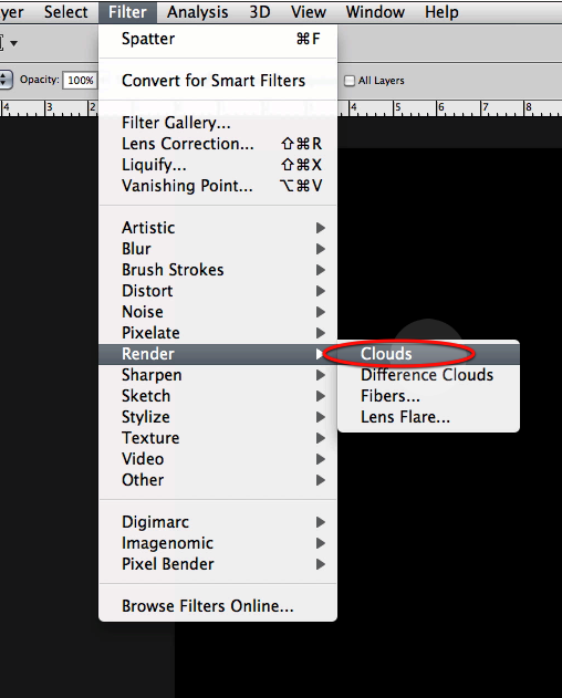
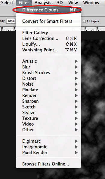
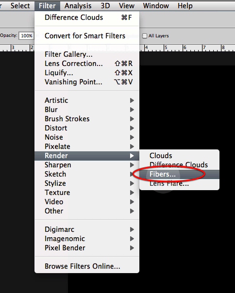
OK next create a new layer on top and go to the clouds filter and generate some.

Then you will go to difference clouds and generate some on the same layer twice.

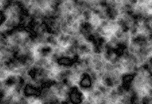
This is what you should get after these steps.

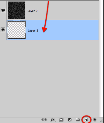
OK now let’s create another layer and fill it up with black.

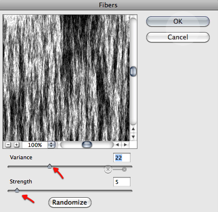
This time we will be using the fibers filter with the settings shown below.

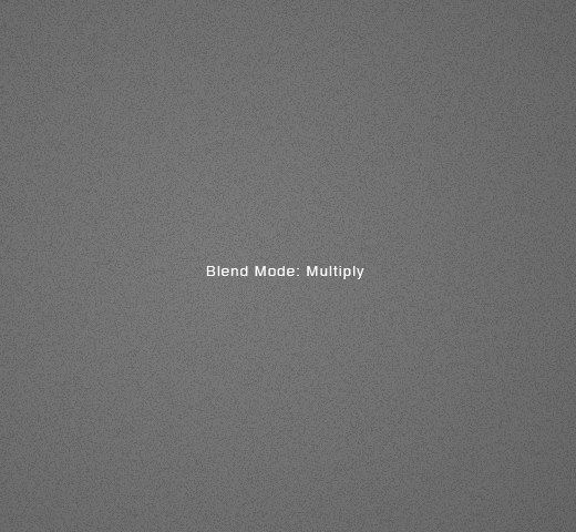
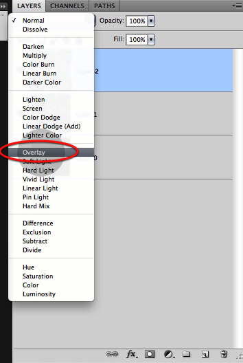
Now just setup this new layer to overlay so it mixes nicely with the clouds we did before.

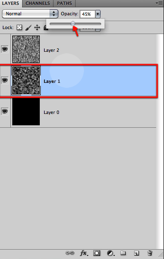
Next we will reduce the opacity of the cloud layer as shown to make the two blend even further, and then just flatten all the layers.

Now we will create a new layer, drag it to the bottom and fill it up with black.

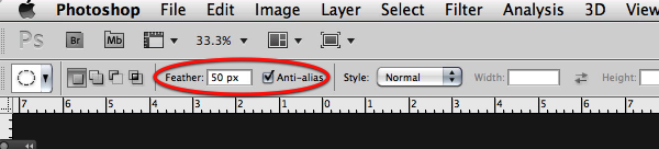
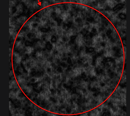
OK perfect, now we will have to define a big circular selection with a feather of about 50px over our texture.

Then you can either copy and paste it to a new layer or inverse it and delete what its outside to end up with a big soft circle of the texture we created.

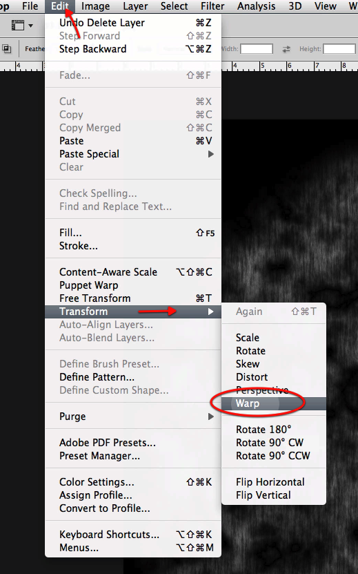
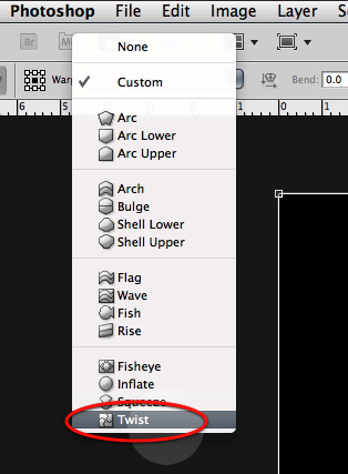
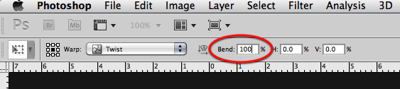
OK next up to give some twist and form to this we will apply the warp filter a couple of times with the twist option as shown below.

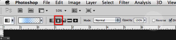
As soon as you select the twist option you will get its options in the top bar so let’s type 100 for the bend setting.

This is what you will see in your Photoshop screen, so hit apply and repeat the process once more.

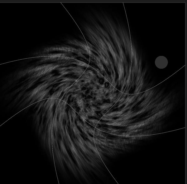
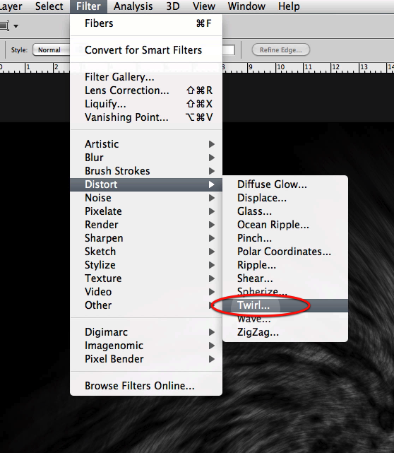
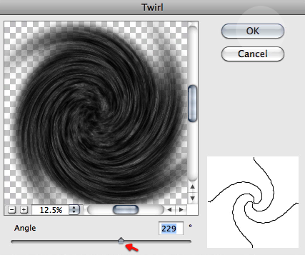
Once both warp distortions have been applied let’s use yet another filter; this time the twirl and use the settings shown below.

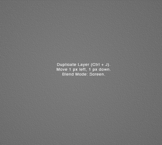
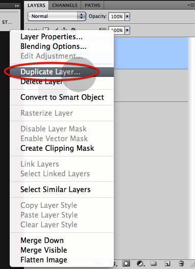
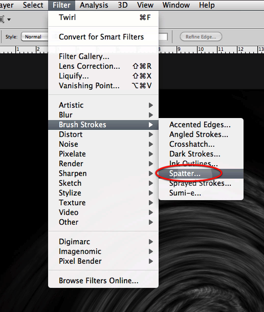
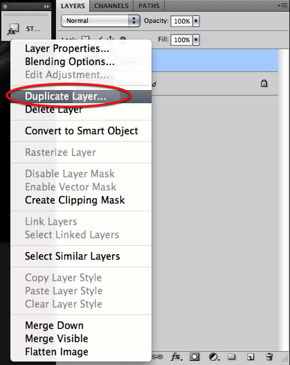
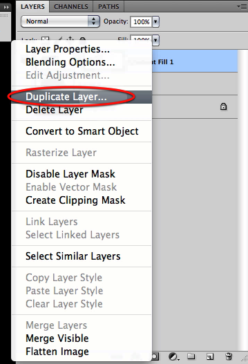
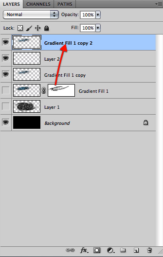
OK great now let’s duplicate the layer so we can add some more detail.

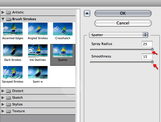
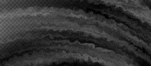
And in this new layer let’s apply a spatter filter with the settings shown here.

Here is what you will get from this last filter.

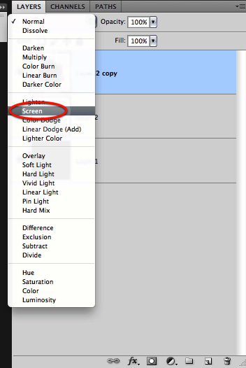
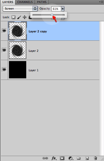
Now set this new effect to screen and reduce the opacity a bit to about 61%

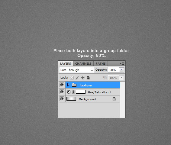
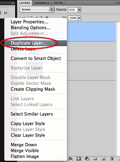
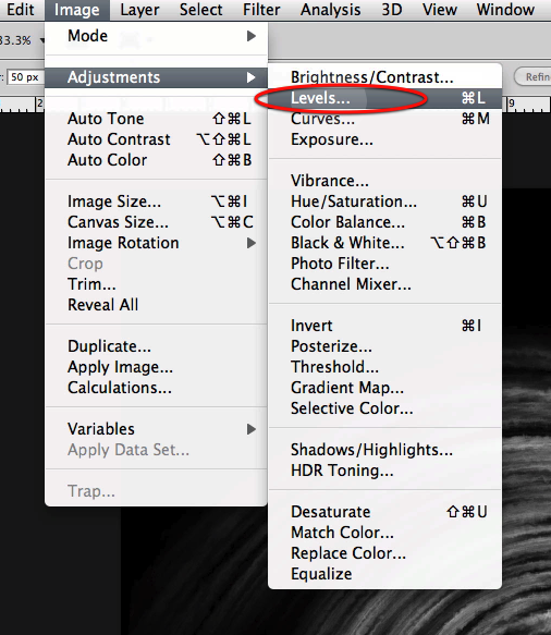
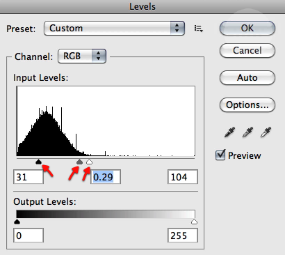
Very good now make a duplicate of this last layer and apply some levels to it as shown below, so we get nice intensified highlights.

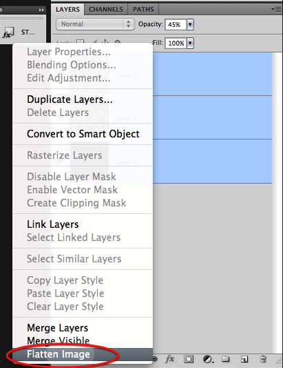
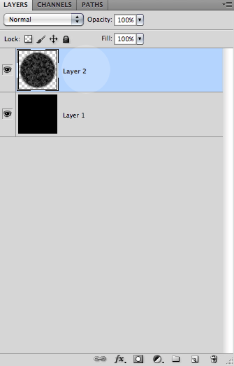
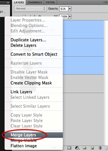
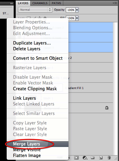
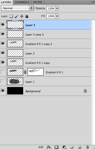
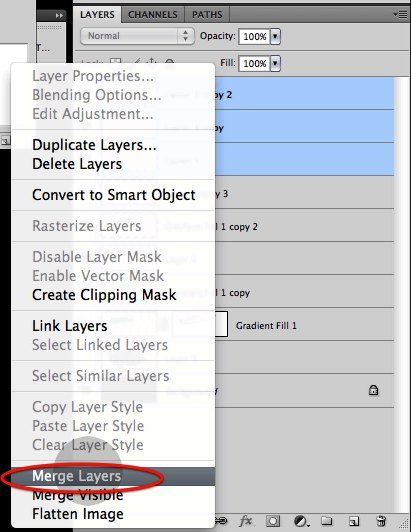
Perfect we are done with this filter bonanza, now select all the layers excluding the black background and merge them together.

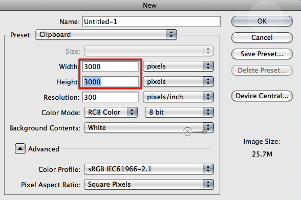
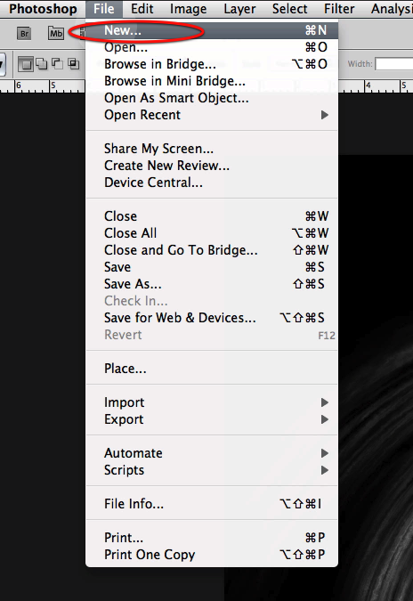
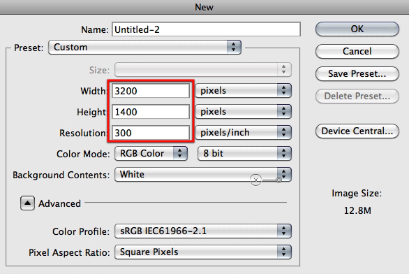
OK now we are ready to create the document for the image we will be working on, so select new file and create it with the settings below.

Now fill the canvas with black.

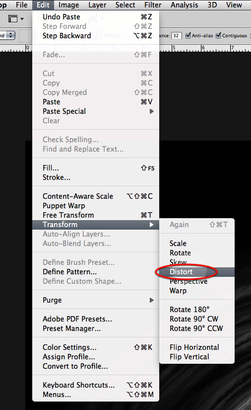
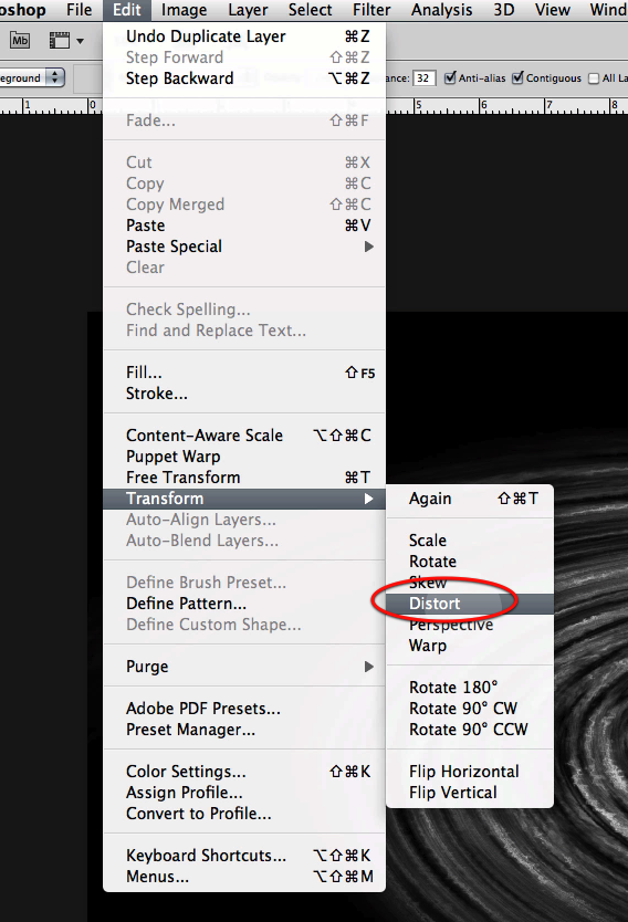
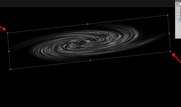
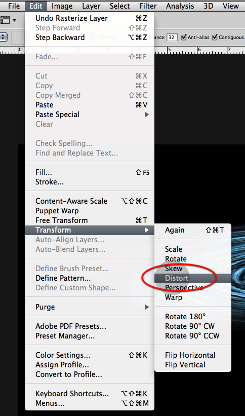
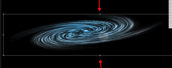
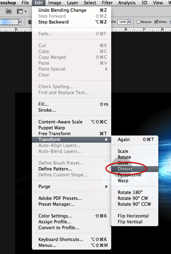
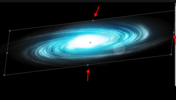
Next we will copy and paste our galaxy work on to this new document and in a new layer, then we will use the distort command so it fits inside the top and bottom boundaries of the new document as shown below.

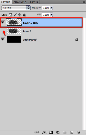
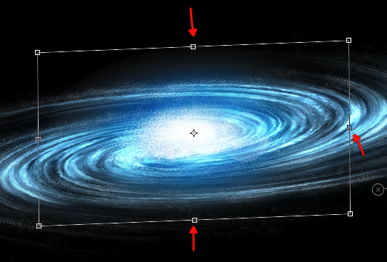
Before going any further let’s duplicate the layer and hide one of them by clicking on the visibility icon.

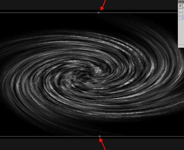
Then let’s distort the layer further as shown here so we get the appearance of perspective and also to adjust its size to what we want.

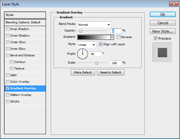
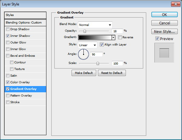
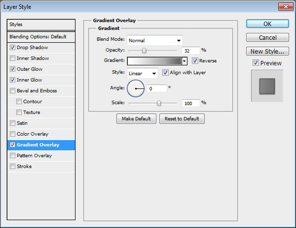
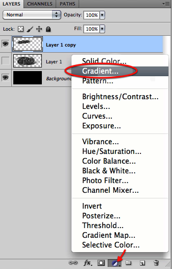
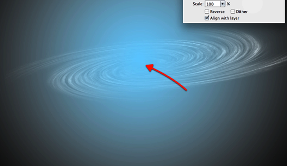
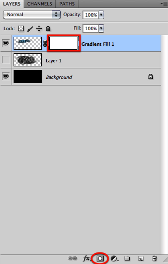
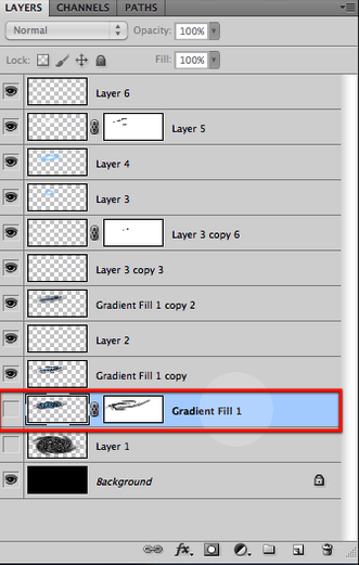
Once we have the image of the galaxy base setup let’s create on top of it a new gradient layer.

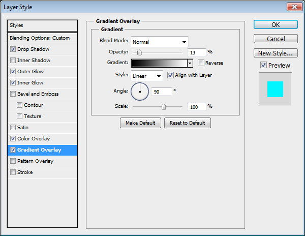
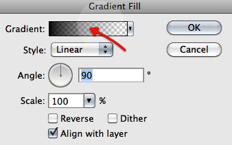
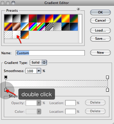
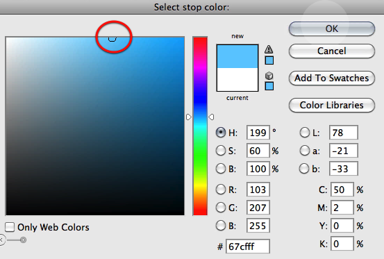
Let’s choose for the gradient a standard white to transparent gradient, and for the first color to the left let’s double click on it and select a blue color as shown below.

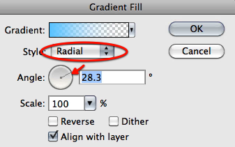
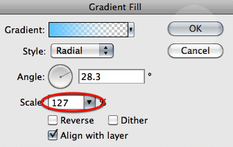
Now let’s setup the gradient to radial with an angle as shown here and while this dialog its open drag the center of the gradient to the center of the galaxy base.

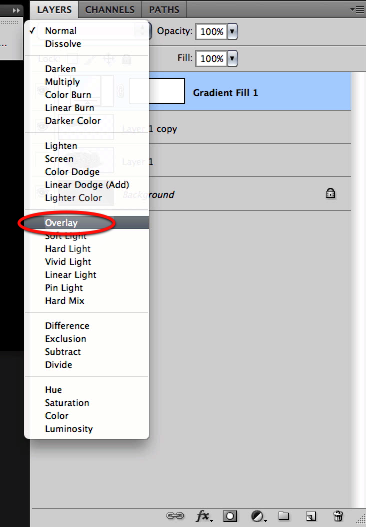
Then set the scale to 127 and click OK. And now set this layer mode to overlay.

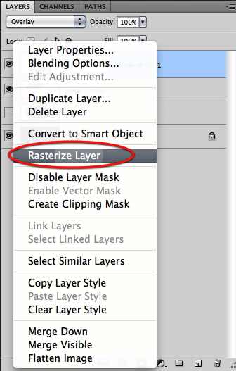
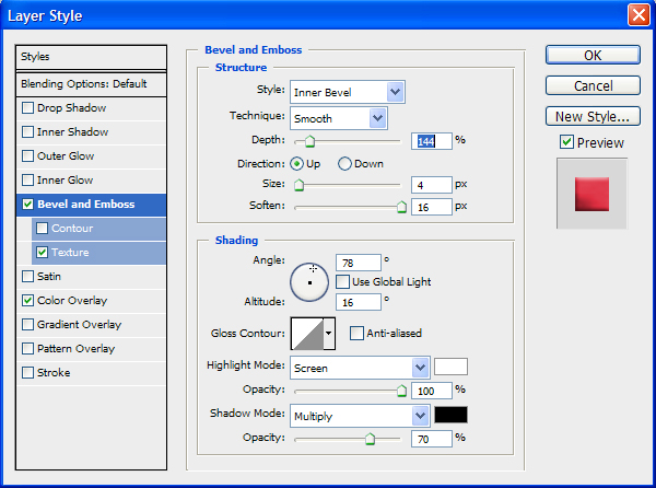
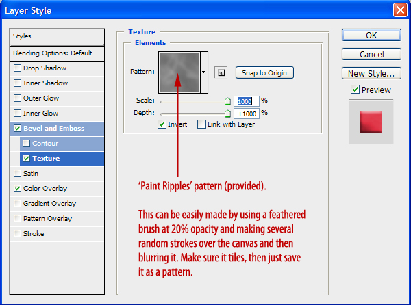
And now let’s distort the gradient layer itself to adjust its shape to our galaxy, so rasterize the layer and distort it as shown below.

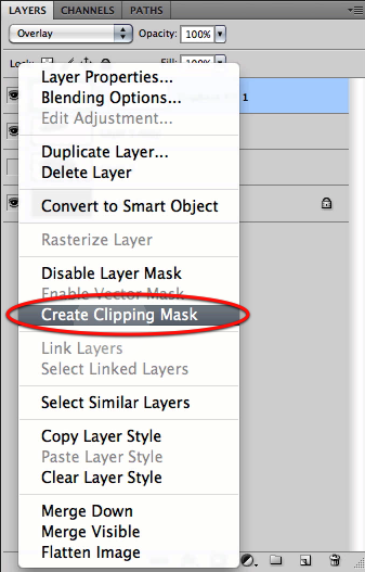
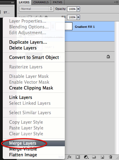
Next just create a clipping mask so the gradient affects only the galaxy base and then merge the two layers together.

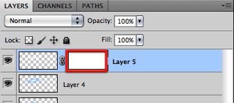
Now create a layer mask for the resulting layer.

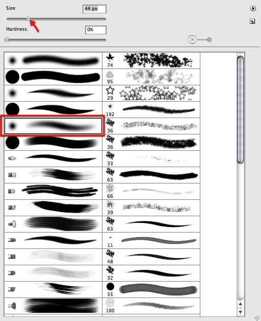
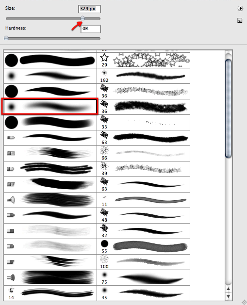
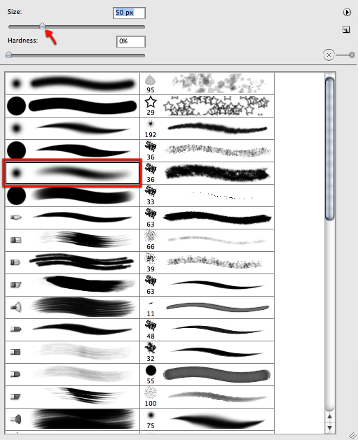
And to proceed we will select a soft brush as shown below.

Then we will mask off sections of the galaxy as shown here to make it more dynamic and less disk like.

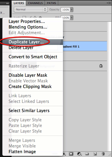
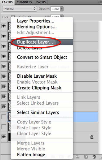
Now before we move on we will duplicate the galaxy layer once we are happy with the mask and hide the original for safe keeping.

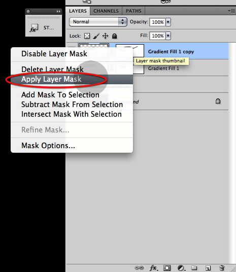
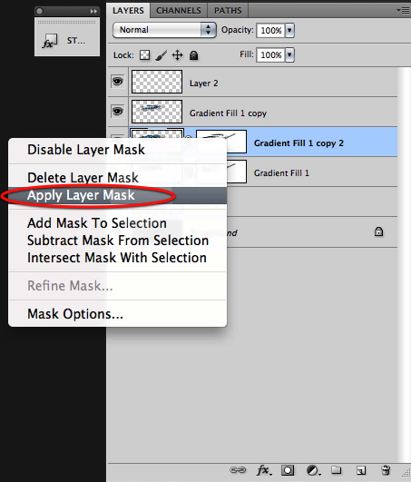
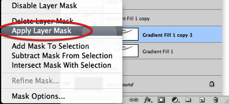
Then on the visible galaxy layer right click on the mask thumbnail and select apply layer mask.

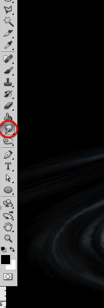
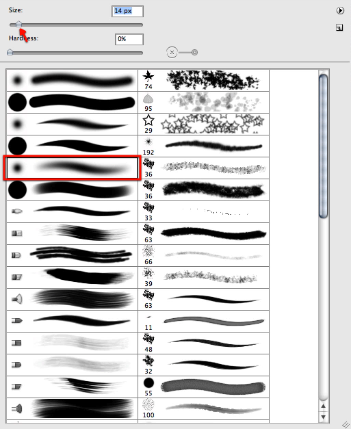
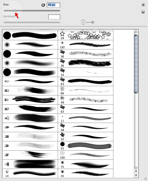
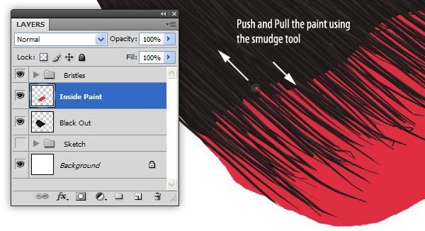
Now its time to start making this galaxy our own and unique at the same time so let’s go to our smudge tool and set the brush size as shown below.

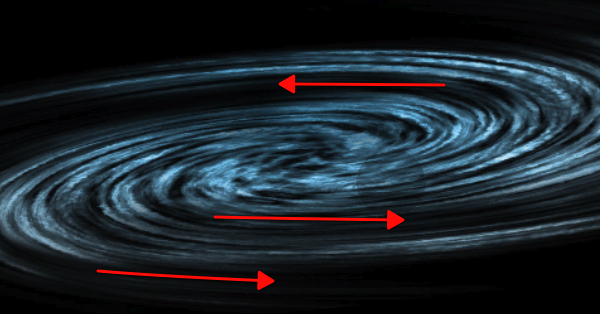
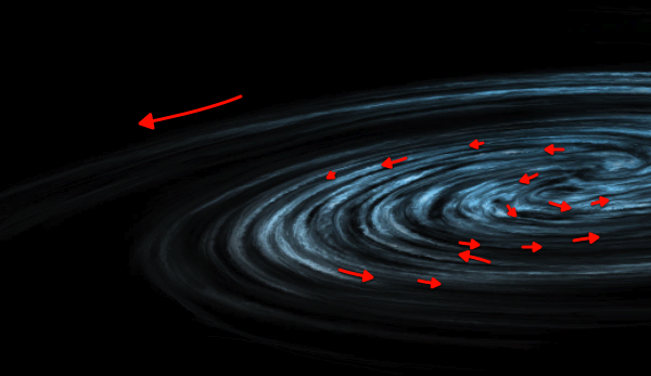
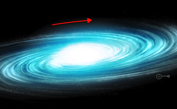
We will start smudging some new flow and features to it as shown here.

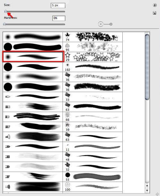
Then let’s reduce the size of the brush quite a bit and start working on more tiny detail all around the galaxy introducing new features and detail, but at the same time following the established flow.

Here you can see what we are after by smudging our way through it, yet this is quite personal and its up to you how far we want to go here.

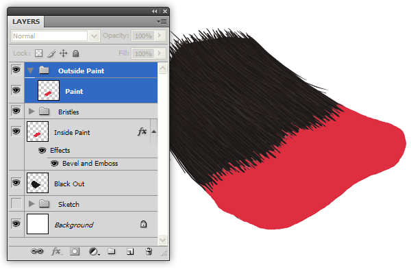
Next up let’s make a copy of our "safe" hidden layer, and once again apply the layer mask.

Now let’s bring this new layer copy all the way to the top.

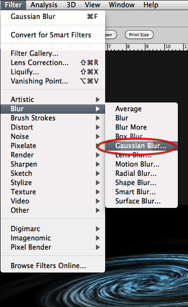
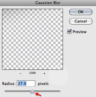
Then apply a Gaussian blur filter to this layer with the settings shown here so we get the results below.

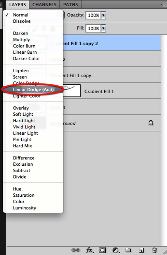
Also set this top layer to linear dodge.

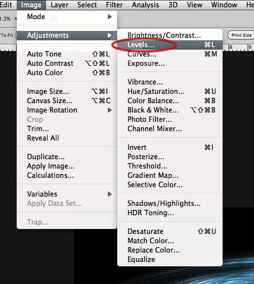
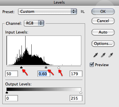
And let’s adjust the levels directly for this layer as shown here

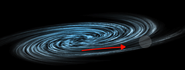
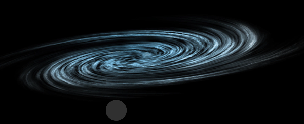
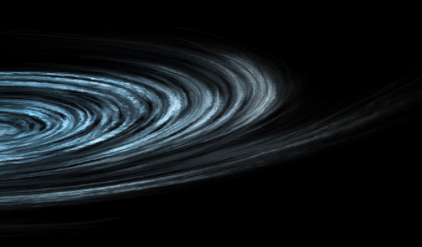
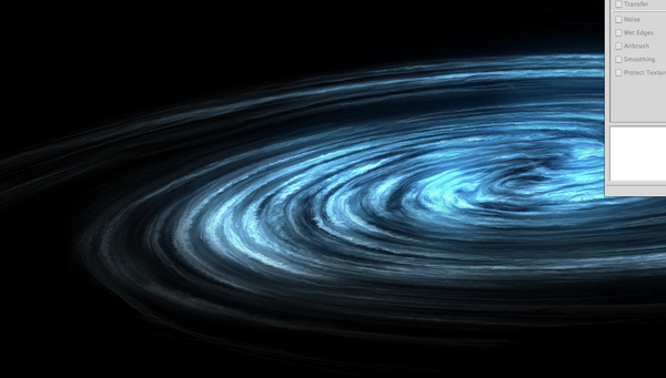
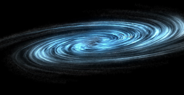
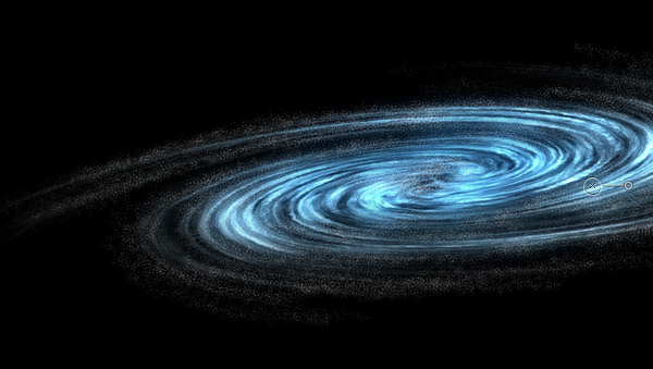
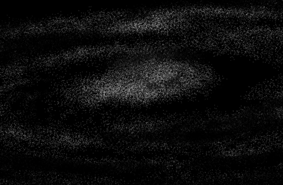
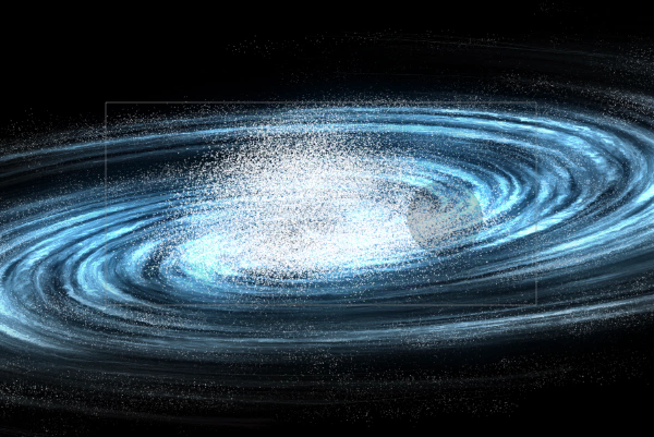
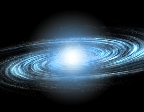
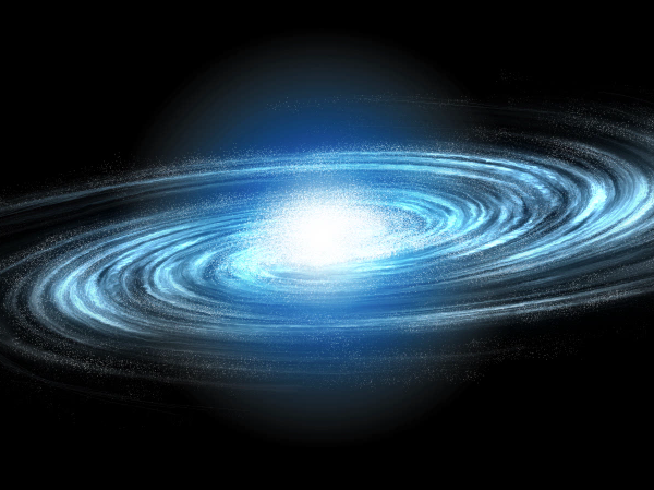
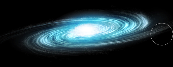
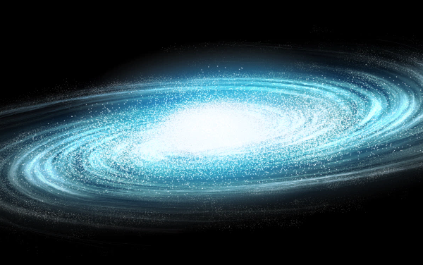
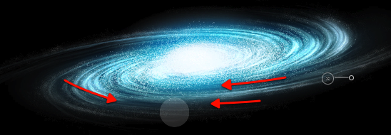
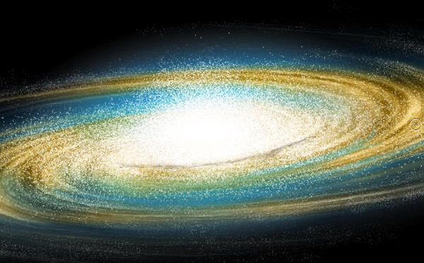
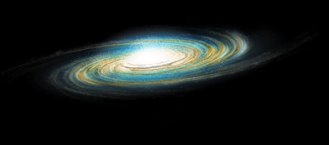
Here you can see the results of the process we have followed, looking quite nicely so far we have a detailed good looking galaxy base to work on.


Step 2 – Stars and Glow

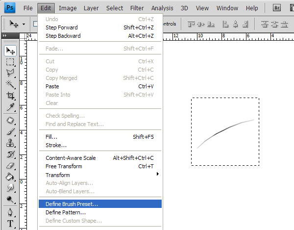
Now all galaxies are made up mostly of stars, of course every star has planets, yet what we visually see is the stars, hundreds of billions of stars. So to try and illustrate this we will need a special brush just for it that will help us paint all these stars without spending the rest of the decade making them. Let’s make a new document as shown here, and fill it with black.

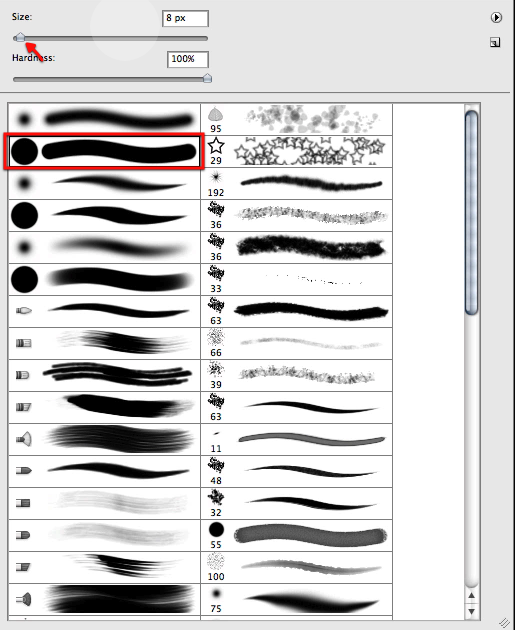
Now with this brush here and with 100% white we will click some defined dots randomly spread like shown below.

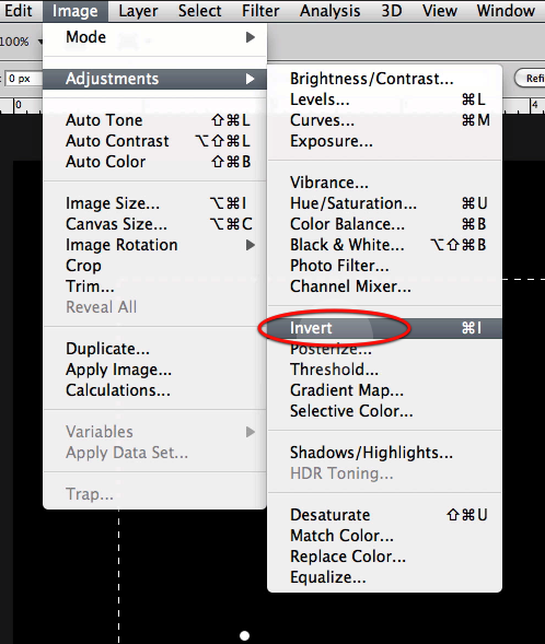
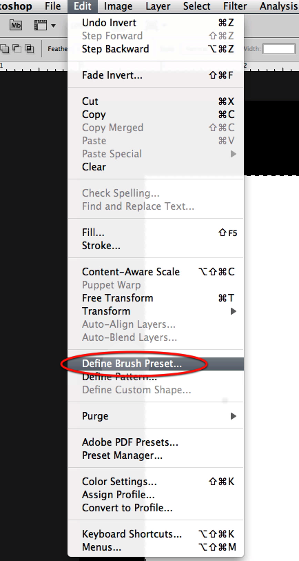
Now let’s drag a selection around these and invert the image so we get black dots on a white background.

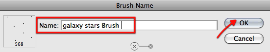
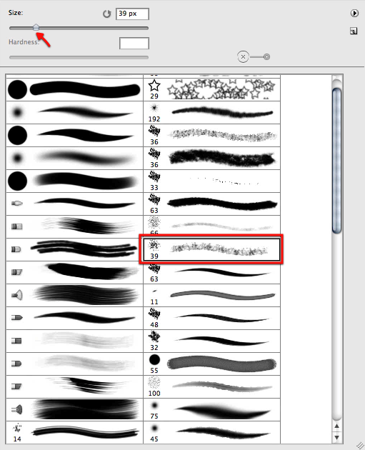
Now just define the brush preset as shown here.

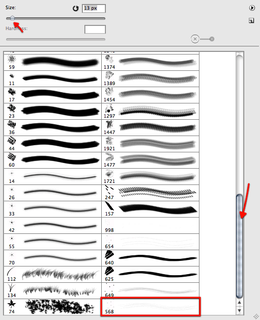
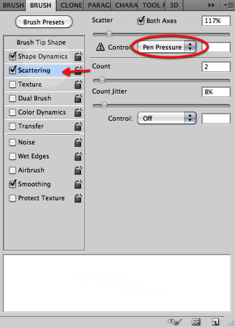
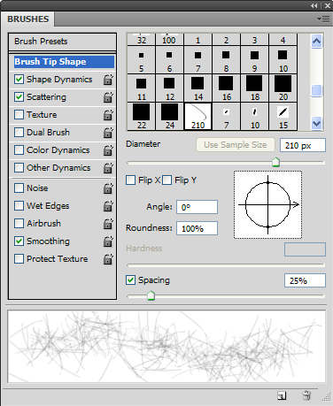
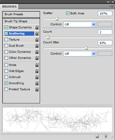
Now let’s go back to our image and scroll down the brush list to find the new brush. Now let’s setup the brush palette, first enabling scattering with the settings below.

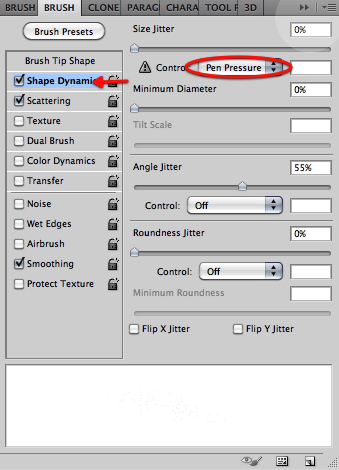
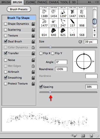
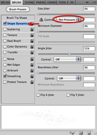
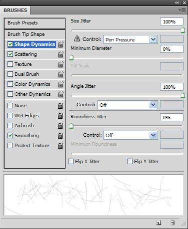
Then enable shape dynamics with the pen pressure option and in the brush tip shape section let’s adjust the settings as shown.

Now let’s reduce the size of the brush a bit and start painting some stars in a new layer as shown below, that follow the flow of our galaxy. Don’t mind the fait look they have now we will fix that in a second.

Once we have covered the galaxy let’s select the layer and duplicate it twice.

You can see here the look of the stars gets intensified, now grab all the layer copies and merge them together.

Now we will randomly erase some of our stars by using the eraser and selecting for it a brush as shown below.

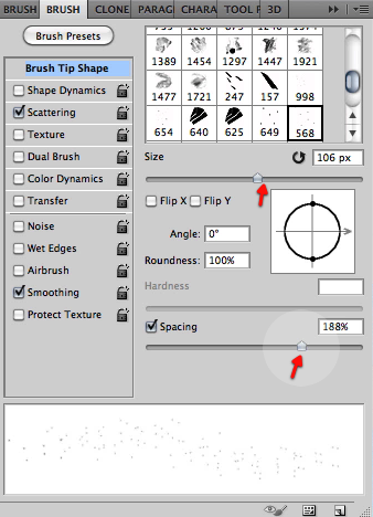
Now just adjust the settings below in the brush tip shape section.

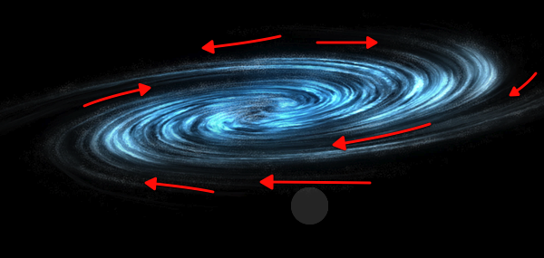
Once we are happy and made the stars randomly distributed, let’s duplicate the layer once more and merge them. My results are shown below, at this point you can erase a bit more if you like or if you see any patterns that never look good.

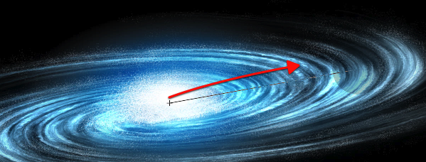
In this image you can see the flow we are trying to enhance and accentuate by eliminating some of the stars.

Now we will start working on the central nucleus of stars. Every galaxy has its most accumulated stars in the center so for this let’s make a new layer.

We will now increase the brush a bit to make the stars more evident, and start working on the center of the galaxy building up the nucleus. You can disable the rest of the galaxy layer so you can see more clearly what are you adding.

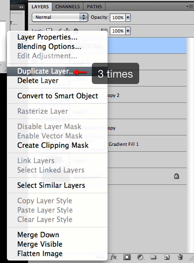
Once satisfied with what we have we will duplicate the layer 3 times and of course then merge them all.

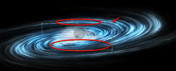
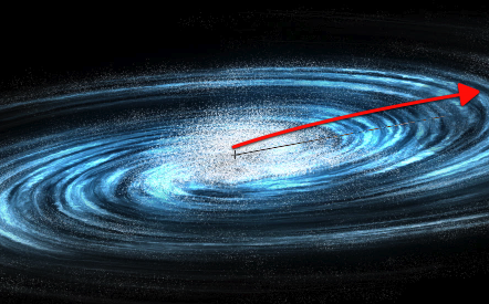
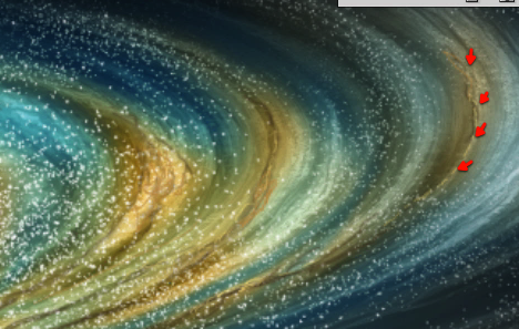
Now we can move scale and distort this layer in place plus I also erased some of it shown in red below.

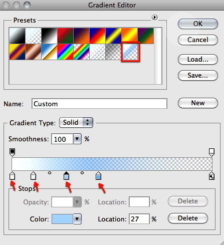
Next up we will use the gradient tool and select the gradient I have included below and set it up to circular.

Now let’s drag this from the center of the galaxy as shown here.

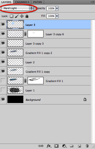
Now setup this layer mode to hard light and you can see the results below.

Now let’s distort this gradient a bit so it fits nicely in our galaxy center.

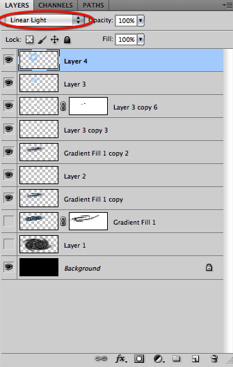
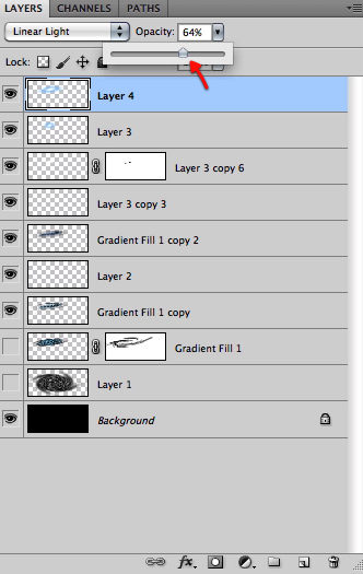
Now in a new layer let’s make another gradient, this time set the layer to linear light.

And also distort it into place.

Now if needed just soft erase any hard edges that the gradient gets.

Next just reduce this layer opacity to around 64%

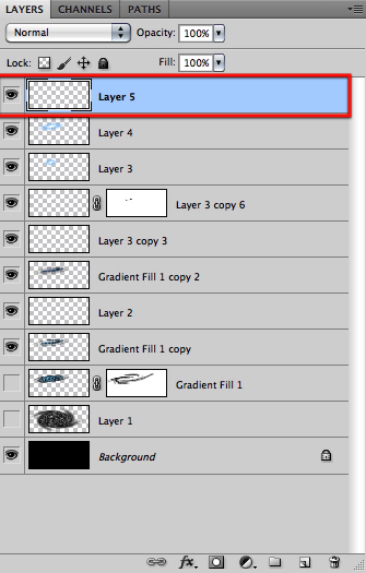
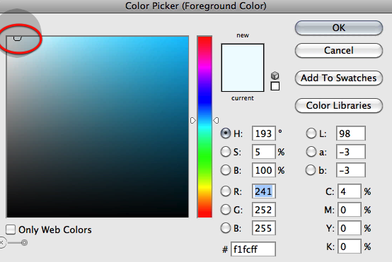
OK then we will create a new layer on top and select an almost white blue color.

Select our custom star brush again and enable shape dynamics with the pen pressure setting enabled. Then paint a bunch of new stars to add to the center of the galaxy.

Now grab a soft brush of about 50px and create a layer mask on this latest layer.

Now with black selected just mask off this layer as shown here, again following the flow of our spiral galaxy.

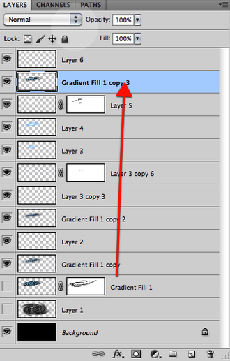
Great, now let’s make a duplicate of our original galaxy shape we have hidden

Right click on the layer mask and select "apply layer mask" then drag it all the way up below our last layer.

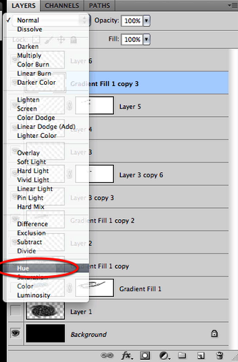
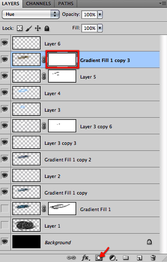
And set this layer mode to hue.

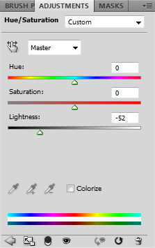
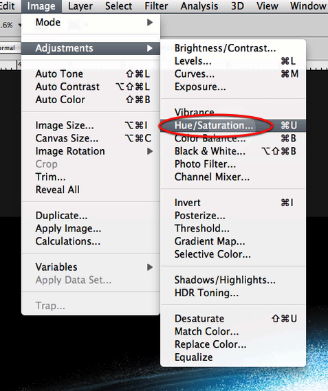
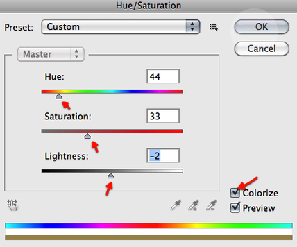
Now we will alter this layer color by setting up the hue saturation as shown below.

This is the result we get so far.

We will then add a layer mask here and make sure we have our soft brush still selected and at about 50px

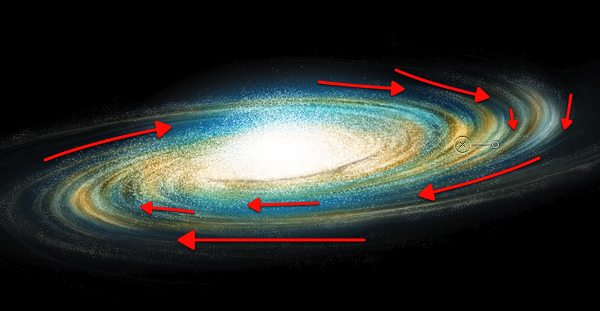
Now mask off this layer influence as shown just leaving some streams of this golden yellow hue. Adapt the brush size if you need.

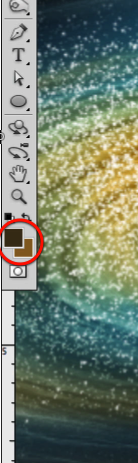
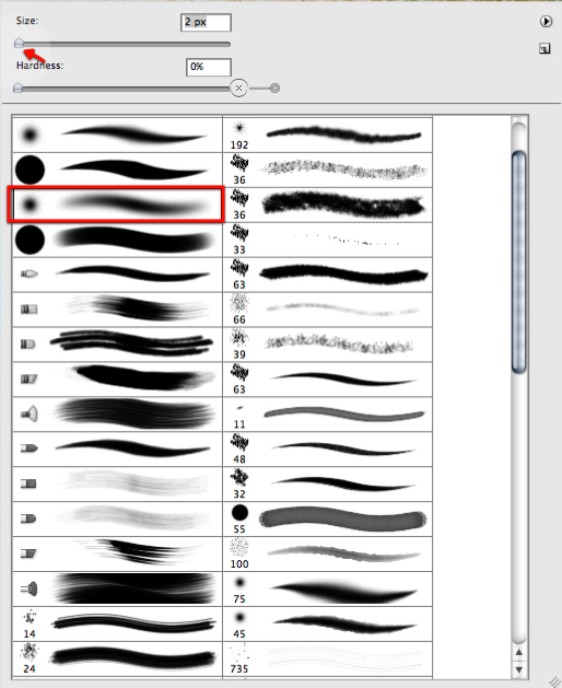
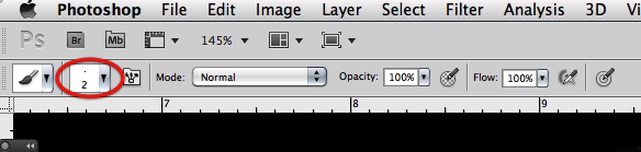
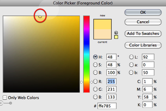
Now let’s select a dark brown as shown here, and make our brush very small about 2 or 1 px.

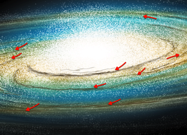
And then in a new layer let’s paint some dark matter streams as shown here.

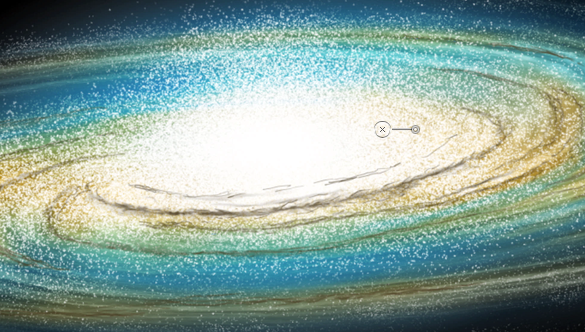
Now let’s grab the smudge tool, also with a very tiny brush as shown.

Let’s go around smudging our dark streams a bit, to eliminate the stroke look they have.

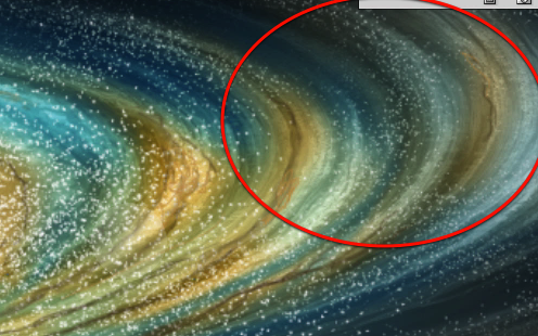
Next with our tiny brush still selected we will choose a bright yellow color as shown here and add a bit of highlights to the strokes we have been working on as shown below.

Perfect, we have reached the end of this step and these are the results we have so far.

Take Your Design Skills to the Next Level With Psd Premium

$
0
0


Are you looking to take your design skills to the next level and land the design job of your dreams? At Psdtuts we understand the importance of continuously improving your skills. We know that designers who consistently work on their technique are far more likely to land the best jobs and to hang on to the ones that they’ve got. Our premium program was designed with that in mind and only includes our best and most advanced content. Over the last few years our premium program has grown like crazy with tons of exclusive content from some of the best professional and amateur designers. Please take a moment to view some of our premium content below. If you like what you see and want to take your design skills to the next level, you can Join Our Premium Program for just $9/month, probably less than your weekly budget for coffee.


Create a Gritty, Action-Packed Movie Poster

In this tutorial, author Mark Mayers walk you through the process of creating a visually striking design using a limited color palette. First, you’ll assemble a collage from various source files, then use some grungy, real-world ink stains and brushes for added grit. Next, you’ll work in tandem with Illustrator – using a combination of Live Trace and Pathfinder commands to create the distressed movie title. Join Now or Log In to get started!


The Making of Rapture

In this premium tutorial, author Wojciech Pijecki will demonstrate how to successfully create this epic scene in Photoshop. This piece involved the use of several stock images and is loaded with useful tips and tricks. It took several days to complete. To learn more Join Now or Log In to get started!


Create an Exploding Moon Orbiting a Gas Giant in Photoshop

Exploding planets are a staple of just about every popular science fiction television show or movie, but did you know that you don’t need your own special effects department to create these types of effects on your own? In fact, all you need is Photoshop. In this premium tutorial, author Ed Lopez will demonstrate several techniques including how to break apart a planetary object, create a star field, dust and clouds, and even how to create a gas giant from scratch. This is a written tutorial but it also includes over 800 MB of video instruction. This tutorial is available exclusively to Premium Members. If you are looking for some "out of this world" instruction and would like to learn how to create your own planets and then blow them up, Join Now or Log In to get started!


Create a Print-Ready Blu-ray Packaging Design

Creating excellent product packaging is more than just producing a great design. To make great packaging you’ll also need to produce printer-friendly artwork that your printer can use to easily apply your design to print. In this premium tutorial, author Mark Mayers will demonstrate how to create a Blu-ray in-lay card for a fictional zombie movie and mock it up as an impressive 3-D Blu-ray case that you can present to your clients. This tutorial will walk you through the entire process and will use Photoshop as well as Illustrator to create error free, printer-friendly artwork. To learn more Join Now or Log In to get started!


Render a Stunning Space Cadet Illustration in Photoshop

This tutorial will focus on the capabilities of Photoshop as a rendering tool to bring your vector illustrations to life utilizing raster effects. With just a few coloring techniques, namely adjustment layers, layer masks, and layer styles; you’ll notice that the process can become quite repetitive thus making it a fairly intuitive and efficient workflow. To learn more Join Now or Log In to get started!


Paint a Professional Caricature Portrait in Photoshop

Having a caricature painted of yourself can be a fun and exciting experience. That’s because just about everyone has wondered, at some point, what they would look like as a cartoon or as an illustration on the cover of a magazine. In this premium tutorial, veteran illustrator, Jason Seiler will demonstrate how to create a professional caricature portrait using Psdtuts Editor, Grant Friedman as an example. Jason Seiler’s illustrations have been featured as covers and interior pieces for TIME, Business Week, The New York Times, The Wall Street Journal, The Weekly Standard, MAD magazine, and many others. Jason has also worked as a character designer on Tim Burton’s Alice In Wonderland, helping to create such characters as the Red Queen, the Tweedles, the Bandersnatch and more. So what are you waiting for? If you are looking to take your character illustration skills to the next level then Join Now or Log In to get started!


Paint a Planetary Typhoon With Default Photoshop Brushes

Digital painting has been called the last frontier of graphic design. This is because digital painting requires advanced knowledge Photoshop, drawing, and traditional painting techniques. In this premium tutorial, author Ed Lopez will demonstrate how to paint an epic planetary typhoon using only a default set of Photoshop brushes. Once learned, this technique is quite easy but it requires a lot of time and patience to create to complete the process. This tutorial is also unique because it contains 20 videos embedded in the text that demonstrate this process in detail. So in addition to a written tutorial, you will also receive over 700 MB worth of video instruction. This tutorial is available exclusively to premium members. If you want to take your digital painting skills to the next level, then Join Now or Log In to get started!


Advanced Mascot Design in Photoshop

Have you ever wanted to create a kick ass mascot for your website or company? In this premium tutorial, Sergio Ordóñez, the self-proclaimed genius behind SOS Factory will demonstrate how to create a killer mascot for your product. To learn more, Join Now or Log In to get started!


Create a Realistic Energy Drink Can to Present to Clients

We have all been there before; how can we make our artwork look great when we are presenting to clients? The single easiest way to show something to a client is to show them in a way that they can understand. This tutorial will show you how to create a realistic energy drink in a way that you can demonstrate to your clients. To learn more, Join Now or Log In to get started!


How to Create a Retro Metal 3D Design

The retro design style has been popular for quite some time now. In this premium tutorial we will demonstrate how to create some hot 3D artwork with skinny retro text using Photoshop and a dash of Illustrator. To learn more, Join Now or Log In to get started!


Conclusion

We hope that you have enjoyed this introduction to Psd Premium. If you liked what you saw and want to take your design skills to the next level, Join Our Premium Program for just $9/month.

Clever Conceptual Photo Manipulations That Tell a Story

$
0
0


Conceptual photo manipulations are all about depicting an idea, message, or story that a digital artist wants to convey to their viewers. In a conceptual photo manipulation the idea is the primary motive for the piece, not the materials, tools, or techniques that were used during its creation. These works are truly inspirational and tell a story through the characters, landscape, emotions, or through political or social commentary. In this collection you will find a mixed bag of clever conceptual photo manipulations, some of which include a bit of fantasy, surrealism, or humor.


Australia Post: Hug

E-mail and texting have made communication instantaneous and easy. But a hand-written letter has a personal touch to it. There is something about ink and paper that an email will simply never replace. This print advertisement for the Australia Post successfully conveys that message.


Liquid Fire

An excellent example depicting the metaphorical concept of liquid fire. It shows how fire would look if it was made of water.


Olympus: Eagle

This print advertisement by Olympus has a great concept and visual. It uses the frozen ice to symbolize that the action has been frozen in time by the camera.


Wakes You up With Every Bite

This amusing print advertisement cleverly uses Photoshop to convey its USP.


Falling Letters

Have you ever been so tired while reading that you felt the words are falling from the book? Here is a cool visual example of the same.


Creating My Own World

Creating My Own World in an impressive artistic concept. The ink represents the fluidity of imagination and creativity through which the artist creates fish, birds, butterflies and the world of his own. It has beautiful color, texture and a poetic touch.


Lens Coffee Mug

It’s hard not to like this cool coffee mug. It is made from the lens of a camera that has been fashioned into a mug. I think the image is the Photoshopped prototype (of the initial concept) of Canon mugs.


The King

The King has an interesting and thought provoking concept drawing parallel between king and pawn. The artist philosophically states that when the game is over, the king and the pawn go into the same box.


Skinbonsai

Skinbonsai is a well executed but creepy photo manipulation of bonsai created from body parts.


Help

Poor grapes are looking really scared! This fantastic photo manipulation is humorous and heartwarming at the same time. The attention to the detail is mindboggling and the concept is skillfully executed.


Go Your Own Road

Go Your Own Road has a great concept. It advises you to follow your heart.


International Handshake

It would be cool if you could shake hands with your friend in another country without a long journey or jetlag. International Handshake is an awesome example of an Out of Bounds photo manipulation concept.


Apple or Kiwifruit

This advertisement for Polident Denture Care uses fruit as an object of focus. It shows fruits like apple, pear, sugarcane each with unexpectedly soft interiors. Here it refers to the softness of kiwi fruit when you bite an apple wearing their dentures.


Love is a Learning Process

Human emotions are complex. Love is the best/worst feeling to ever have, it can be so diverse at times that you can never be sure that you know all. Though I wonder if you could learn all about love or intricacies of human feelings from books. Simplicity, colors and subject of this photo manipulation is eye-catching.


Eat Me!

What would you call them? Eggheads? And are you ready to eat them! It has the wonderful humorous concept. The expression on each of the face and eyes can surely make you laugh.


Choose Your Face

Choose Your Face has a novel concept and the attention to the details is beyond words, it almost looks real.


Toyo Tires: Octopus

This print advertisement for Toyo tires cleverly uses octopus to go with their slogan "Griping Performance".


Perception

Sometimes you might have the wrong perception about yourself and that might stress you out. This is a great example that shows how you can use perfectly ordinary objects to make a powerful message.


Wild Horses

A fascinating photo manipulation where the woman’s flowing hairs are shown as horses. The peace and calmness on woman’s face and the running wild horses on the other hand symbolizes the constant thought process going on in our mind. Although outwardly we might seem to be calm and relaxed. A very original idea..


Listen

An unusual concept showing hands morphed into a mouth and ear. It depicts that everyone wants an ear to voice their opinion.


Lion show

Lion Show is a print advertisement for Zoo Safari. It has an outstanding concept backed by wonderfully executed visuals to match its slogan "blend in".


Don’t Get Drawn In

An excellent photo manipulation of an artist hand drawing himself.


Spiritual Milk

This is an amazing idea personifying the milk into spirit.


Strength in Every Pour

A similar concept as the one shown above but with the positive message. In this print advertisement the milk is personified to symbolize that it helps to support your heart and body.


Verbal Abuse

This powerful Public Interest advertisement campaign successfully illustrates how verbal abuse can be just as horrific as physical violence. It raises awareness of issue of vicious domestic verbal abuse.


Love Story

This is really a sad love story. It is amazing how you can tell a story with just one object. The old and faded effect gives it an interesting feel. The idea of using fruit to make something that seems so simple and yet universally recognizable is very clever.


Cigar City

A delightful and detailed imagination of city built from a cigarette’s ashes.


Life is Heavy

Another witty and brilliant piece of conceptual photo manipulation. It says something so philosophical in such a minimal and simple way.


Time Goes By

Time Goes By has creative concept of depicting fleeting time.


Reduce the Effects of A Disaster

A public interest advertisement by FEMA for Disaster Management and taking timely actions to reduce the effects of disaster. The concept is very clear and the brick typography is exceptional.


The Monster In The Mirror

The Monster In The Mirror symbolizes the hidden fear within us. The beautiful girl and the pastel colors makes the artwork more attractive.


How does This Make Your Tongue Feel?

This is how a tongue would look if it had a life of it’s own. A creepy and funny concept that can make you chuckle.


The Insight Story

An excellent campaign for the Swiss newspaper SonntagsZeitung with visuals depicting political figures and characters. The general idea is that the newspaper digs down through the layers to bring the news and the image accurately brings forth the concept.


Elements – Fire

An amazing Photoshop work showing woman dressed in fire and solidified lava. The concept is beautifully executed with great attention to details like the clouds, the lava, the debris etc. The color scheme and the firey glow which reflects on the model’s body makes it an outstanding piece of work.


The Poisoned Smoke

A great piece depicting the harmful health effects of smoking cigarettes and tobacco. It is simple and powerful which makes the message very clear.


Surgeon Changes

An amazing poster illustrating plastic surgery and botox that goes behind a beautiful model’s face.


What More Can I Say

How to Make Fast but Precise Selections – Basix

$
0
0


Are you new to Photoshop? Have you been trying to teach yourself the basics of Photoshop but have found the amount of educational material available on the net a bit overwhelming? As the world’s #1 Photoshop site, we’ve published a lot of tutorials. So many, in fact, that we understand how overwhelming our site may be to those of you who may be brand new to Photoshop. This tutorial is part of a 25-part video series demonstrating everything you will need to know to start working in Photoshop.

Photoshop Basix, by Adobe Certified Expert and Instructor, Martin Perhiniak includes 25 short video tutorials, around 5 – 10 minutes in length that will teach you all the fundamentals of working with Photoshop. Today’s tutorial, Part 14: How to Make Fast but Precise Selections will explain the quick selection tool, the quick mask, and the pixel mask. Let’s get started!


Create a Snow Covered, Coastal, Mountain Town Matte Painting – Psd Premium Tutorial

$
0
0


A matte painting is a backdrop that filmmakers use when the scene they need doesn’t or can’t exist in real life. In the past, they were created by actually painting a scene on a canvas. Today, they are created digitally by combining photographs to produce the scene that they need. In this Psd Premium tutorial, author Ed Lopez will demonstrate how to create a snow-covered, coastal, mountain town scene using Photoshop. This is a written tutorial but it also includes about 2 hours of video instruction. This tutorial is available exclusively to Premium Members. If you are looking to take your matte painting skills to the next level then Log in or Join Now to get started!


Detailed Video Instruction

This tutorial includes 9 videos that demonstrate the process of creating this project in detail so that you can better understand the techniques that were used in each step. Below is a clip from one of those videos. To view more clips you can Log in or Join Now!


Professional and Detailed Instructions Inside

This tutorial also includes full text and screenshots of each step. Premium members can Log in and Download! Otherwise, Join Now! Below are some sample images from this tutorial.


Final Image


Psd Premium Membership

As you know, we run a premium membership system here that costs $9 a month (or $22 for 3 months!) which gives members access to the Source files for tutorials as well as periodic extra tutorials, like this one! You’ll also get access to Net Premium and Vector Premium, too. If you’re a Premium member, you can Log in and Download the Tutorial. If you’re not a member, you can of course Join Today!

How to Apply Textures to Uneven Surfaces

$
0
0


Applying texture to a flat surface, or flatly applying a texture across a whole image (as a means to age it or degrade it) is simple stuff. Realistically applying a texture to an uneven surface is much more hands-on (more so than simply overlaying a texture and changing the Blending mode).

Video Tutorial

Our video editor Gavin Steele has created this video tutorial to compliment this text + image tutorial.


Step 1

Job number one, as ever, is pooling your assets together. I got the man from iStockphoto here and the tree bark (courtesy of K. Tuck) from stock.xchng here.


Step 2

Cut out the face using the Pen tool (set to Paths not Shape Layers). Cut and paste it into your blank canvas (1562 pixels by 1172 pixels at 300dpi). Open up the bark image, and import it into your working document. Resize and rotate the document as in the screengrab.


Step 3

Use the Clone Stamp tool to fill in the rest of the texture. Avoid easily recognizable repetitions in the texture like the ones circled. Clone them out. I used a 200 pixel, soft-edged brush to do this


Step 4

Turn the visibility of the “Bark” layer off (clicking the eye icon next to the layer thumbnail will do this). Go to the Channels palette, select the channel with the best contrast, and duplicate this channel into a new document.


Step 5

Apply a 2 pixel Gaussian Blur to your new document and then adjust the Levels as in the screengrab below. Save as “Displace.psd.”


Step 6

Reselect the “RGB” channel (so all channels are selected and the image is now back in color) and return to the Layers palette. Make the “Bark” layer visible and select it. Go to Filter > Distort > Displace. Set the Horizontal and Vertical scale to 1 (or try other values), select Stretch To Fit and Repeat Edge Pixels. Set the Layer Blending Mode to Multiply. You can see how it’s distorted over parts of the face.

It hasn’t quite put it in the right place so move the “Bark” down the face until the distortions match the face. Use this wrinkle (circled) as a guide as to where to put it.


Step 7

Duplicate the “Bark” layer twice. Set one to Multiply with an Opacity of 100%. Set the other to Normal at 40% Opacity. Position in the Layer hierarchy as in the image below.


Step 8

Command-click on the “Face” Layer to create a selection. Select the “Bark Normal 40% Layer” and go to Layer > Layer Mask > Reveal selection. Repeat this for the “Bark Multiply” Layer. Zoom into 300% and use the Pen tool to draw around the eyes and the mouth. Add a rough edge to the top of the mouth. Press Commmand-click on the Path thumbnail to create a selection.


Step 9

Select the “Bark Normal 40%” Layer Mask thumbnail to work directly on the Mask. Select black as the background color and then delete the selection from the Layer Mask. Repeat this process for the “Bark Multiply” Layer.


Step 10

Go to Layer > New Adjustment Layer > Curves and set up as shown below. Then fill the Adjustment Layer Mask with black so the effects aren’t visible.


Step 11

Turn off the visibility of the “Bark” Layers and use the Pen tool to draw a paths around the hard edges we need to mask. The bottom of the nose and cheek lines are good examples. Command-click on the Path thumbnail to create a selection from it.


Step 12

Select a soft-edged (0% Hardness) brush, loaded with white (as the foreground color) and set to 16% Opacity. Paint directly on the Layer Mask. Press Command + H to hide selection the, if it helps. Draw over several times, applying more at the shadow source and less as you get further from the harsher shadows.


Step 13

Draw around other features which produce hard lines such as the bottom lip. Draw the Shadows in the same manner.


Step 14

Create a selection from the “Face” layer by Command-clicking the layer thumbnail. Draw all the shadows in…


Step 15

…Changing the Brush size to suit size of the area you’re treating. Around the lip for example, use a small brush.


Step 16

Turn the “Bark” layers off to see the key areas of shadow. You can still work on the Mask with the face showing. I flick between working with the “Bark” visible and invisible.


Step 17

In order to soften or erase any shadows that you’re not happy with, change the brush color to black and draw on the mask in the same way as before. Keep working on the Mask until you get it right.


Step 18

Whilst drawing on the Mask, you should be changing your brush size and the opacity to suit the shadow. For a big gradual shadow you’ll want around a 300 pixel brush set to 16% Opacity, all the way down to 18 pixels and increasing the opacity to suit. Finally, apply a 0.6 pixel Gaussian Blur to the Adjustment Curve Layer Mask to soften the hard edges.


Step 19

Duplicate the “Bark” Layer that sits beneath the “Face” Layer. Set them up so they are the same as the top Bark layers, one Normal at 40% opacity, one Multiply at 100%. Then under those two layers create a new layer and fill it with C=61%, M=66%, Y=66%, and K=62%.


Step 20

Create a selection from the “Face” Layer (Command-click the Layer thumbnail) and go to Select > Inverse. Then go to Select > Modify > Expand. Give it a 1 pixel expansion. Select the Curves Adjustment Layer Mask and Fill the selection with 20% black.


Step 21

Create a selection from the Eyes/Mouth Path you made earlier. Add some shadows by drawing on the Curves Adjustment Layer Mask.


Step 22

To further fuse the elements together, and to grade the image, add a Curves and a Hue/Saturation Adjustment Layer to the top of the Layers hierarchy.


Step 23

Flatten the image and go to Filter > Liquify. Select the Bloat tool and set up roughly how it is in the image below. We want to add a 3D quality to the areas such as cheeks, nose, and forehead. Select an appropriate Brush size for each of these areas and click on each a few times rather than dragging the brush around.


Conclusion

You can always add some real world effects such as leaves and bugs to the final image – go nuts. This technique works for applying any texture to any surface, for example you could make a brand new Mercedes SLK rusty and riveted, or make a house out of skin. Go have fun whilst you perfect your craft. You can view the final image below or view a larger version here.

The #BucketFail: Allan Chochinov Discusses Design at Creative Mornings

$
0
0


Clients often approach designers with a problem that they would like us to help them solve. Often, they ask us to build them a website or produce a special graphic or illustration. The purpose of these projects is typically to help them sell a product or service, or reach out to a particular audience. Designers, look at these sorts project through a special lens. We ask questions like “Who is the user?” “What is the best design for this project?” “What is the proper context for this project?” This lecture from Allan Chochinov at a Creative Mornings event in New York City talks about some of the questions that go through a designers mind when speaking to clients about a particular project.>


Create a Paint Brush in Photoshop

$
0
0


Creating still-life objects in Photoshop is often great practice for learning how to create other objects. In today’s tutorial we will demonstrate how to create a realistic-looking paint brush using layer styles, clipping masks, and the not-so-commonly-used blend if sliders. Let’s get started!


Tutorial Assets

This tutorial uses a custom created pattern. Download here:


Step 1

Create a new document (2400px x 2175 px). Sketch out a scene of a paintbrush.


Step 2

This step is optional, but I’ve added some additional visual guides to help me draw the bristles.


Step 3

Before we start drawing bristles, create a New Group called “Bristles.” Inside this group, create a layer called “Bristles” and add the following Layer Style.


Step 4

Duplicate the empty layer 5 times. Since we are making a lot of bristles, we are going to be drawing them on five separate layers. If we tried to draw them all on one layer, the strokes would blend together and ruin the layer style that’s applied. Select the bottom-most layer in the “Bristles” group and, with a small brush, start drawing lines using the guides and sketch as references.


Step 5

Continue drawing bristles on the remaining four layers, adding some variation and stray bristles as you go. Feel free to add more layers as you see necessary.


Step 6

When you’re done, you’ll notice there are still several gaps in the brush. To fix this, create a new layer called “Black out” below the “Bristles” group and paint in a dark gray color (#1B1919) to fill all gaps.


Step 7

Next, we want to add some paint to the bristles. Before we add the obvious paint to the tip of the brush, we want to make it appear that bristles have ‘absorbed’ some of the paint. To do this, create a New Layer called “Inside Paint” below the “Bristles” group. Next, use the Brush Tool to add a blob of color as shown.


Step 8

To create the effect that the bristles have ‘taken’ the paint, use the Smudge Tool, set to 100%, to push the paint on to random bristles.


Step 9

Now, we can add the paint on top of the bristles. Create a New Group called “Outside Paint” above the “Bristles” group and use the brush tool to add another blob of the same color to the tip of the brush. Use the same technique with the Smudge Tool to push the color on to random bristles.


Step 10

To give the paint some variation, add the following Layer Styles. As an optional step, you can use the Eraser Tool (E) set to 1 px to erase lines from the paint. This will give the illusion that some bristles are showing through the paint.


Step 11

Next, we want to merge the layer effects to that layer. To do this, Right + Click on the “Paint” layer and choose “Create Layers” (this will convert the layer styles in to their own layers). Now, just select all the new “Paint” layers and merge (Command/Ctrl + E).


Step 12

Use the Dodge and Burn Tools to add some more variation to the paint. Make sure to dodge and burn in the direction of the bristles.


Step 13

Next we are going to add the streak of paint. Create a New Layer called “Streak.” Use the Brush Tool to add a streak of paint using the same color of paint that is on the bristles.


Step 14

Use the Dodge and Burn Tools to add some subtle variation to the streak. When you’re done, merge this layer with the “Paint” layer. Rename the layer to “Paint.”


Step 15

Now, we are going to give the paint that wet look. To start, create a New Layer called “Highlights 1″ and make this a clipping layer (use Alt + Click on the Layers Panel).


Step 16

Now, draw in some white highlights as shown. Set this layer’s opacity to 11%


Step 17

Open the layer’s Layer Styles and adjust the “Blend If: Underlying Layer” sliders as shown.


Step 18

Next, we are going to do the same with a darker color. Create a new clipping layer called “Lowlights” and use a darker red to paint in some lowlights.


Step 19

Set the “Lowlights” layer’s opacity to 72% and open the Layer Styles to adjust the Blend If sliders as shown.


Step 20

We can keep using this technique of adding highlights and adjusting its Blend If sliders to complete the ‘wet’ look of paint (I used this technique to add 3 more highlights).


Step 21

Now that the bristles and paint are done, we can create the rest of the brush. Hide all layers associated with the paint and bristles. Next, create a New Group called “Handle”. Inside that group, create 2 new groups called “Metal” and “Grip”.


Step 22

In the “Metal” group, create a New Layer called “Metal Band.” Using the sketch as a guide, create the shape of the metal band that holds the bristles in place. I found it easier to create the brush’s handle upright. It may help to go back to the sketch and create a copy to rotate it so that the brush is standing up.


Step 23

Create a New Layer called “Bevels” and draw in some bevels. You can use the Pen Tool if you wish, but I just used the Brush Tool.


Step 24

Use the “Bevels” layer to make a selection (Command/Ctrl + Click the thumbnail). Use this selection to Cut (Command/Ctrl + X) the “Metal Band” layer. Also cut out some holes for rivets. All of these cuts will give us more edges for the Bevel and Emboss effect in the next step.


Step 25

Add the following Layer Styles to the “Metal Band” layer

Next, add the following layer styles to the “Bevels” layer.

The result should resemble the image below.


Step 26

Next, create a New Layer called “Rivets.” Add a small circle at each opening on the metal band and add the following layer styles.

The image should resemble the following


Step 27

Now, to make the next few steps easier, merge the “Rivets” and “Bevel” layers together. Next, merge the layer styles to the “Metal Band” layer.


Step 28

Create a New Layer called “Reflections” and make this a clipping layer to the “Metal Band” layer. Use a dark color to draw in several lines to create the illusion of a reflection.


Step 29

Create another clipping layer called “Highlights 1.” Using a lighter color, draw in some highlights as shown. Use the Burn Tool to give the color some variation and the Blur Tool to soften some of the highlights.


Step 30

Create another clipping layer called “Highlights 2″ and using the same techniques from the previous step, add some additional highlights.

Your image should resemble the following


Step 31

Now that we’ve added reflections and highlights as clipping layers to the “Metal Band” layer, we will use the same techniques to add reflections and highlights to the bevels. After this is done, add any additional details as you see fit.


Step 32

Create a New Layer called “Grip” inside the previously created “Grip” group. Draw the shape of a brush handle and fill with black. Give this some noise (Filter > Noise > Add Noise) with a setting of 10%.


Step 33

Before we finish the grip, rotate and skew the “Handle” group in to position in our scene. Unhide the “Sketch” and “Bristles” group to help with the positioning.


Step 34

Now, we are going to start texturing the grip. We will do this with a series of clipping layers. Create a new clipping layer to the “Grip” layer and, using a soft brush, paint a portion of it white (see image below). Set this layer’s opacity to 3%.


Step 35

On a new clipping layer, draw a thinner highlight on the grip. Change the opacity to 23%. Open the Layer Styles and adjust the layer’s Blend If sliders as shown (this will break up the highlight so it doesn’t appear unnaturally smooth).


Step 36

I want to add some scratches to the bush’s handle for some added realism. To do this, open a new document and make a thin brush stoke. Select the stroke and go to Edit > Define Brush Preset to make it into a brush.


Step 37

Open your Brush Panel and adjust the settings to give the new brush variable size and scatter.


Step 38

Back to the main document, on an new clipping layer, use the scratches brush we just created to draw black scratches on the grip.


Step 39

Create another clipping layer and add a few more scratches, this time in white. Adjust the opacity of both layers so the scratches are barely visible (darker monitors might have trouble picking this up). Your image should resemble the following:


Step 40

As an optional step, you can go in to the “Metal Band” layer and use the same scratches brush to add scratches to the metal.


Step 41

Back in the “Handle” group, on a new clipping layer, use the Brush Tool to paint a soft highlight as shown (make sure you are not using the Scratches brush). Change the Blend If settings as shown and change its opacity to 80%.


Step 42

On an new clipping layer, create another, thinner highlight on top of the last one. Adjust the Blend If settings similar to the last layer we did and change the Opacity to 12%.


Step 43

On a new clipping layer, create an oval and fill it with white. Rotate it in to perspective and add a layer mask to erase part of the bottom of the oval. Adjust the Blend If slider and set its Blending Mode to Overlay.


Step 44

Use a Brush Tool to add a bit of a highlight on the bevel. Use the Blur Tool to soften the highlight.


Step 45

Lastly, we can go back through the image to add some detail or make minor adjustments.


Step 46

Unhide all the working layers and you’re finished. If you want to, you can use the original “Grip” layer to add different textures. In this case, I’ve added a faux wood finish using a texture I’ve already created using Photoshop.


Final Image

More Big Time Eye Candy From Creattica

$
0
0


It’s been over a year since we did our eye candy rundown from Creattica. I’d say it’s about time to do another!

Creattica is a great source for some Photoshop inspiration or to just browse through some awesome work. We hope you enjoy the site and find the inspiration to make some brilliant work of your own. And when you do, don’t forget to submit it to Creattica!


1.Summoning the Life


2.Desire


3.Endless Journey


4.Singing Frogs


5.Another Little Mermaid


6.Nevermore


7.Tiger Painting


8.The Myth – Act 2


9.Fear


10.New York Seaty


11.Circo de la Luna


12.Act


13.Black Orchid


14.NATURAL ANSWER


15.Imagination


16.9 Destinations


17.The Flight


18.Imagination


19.Roses bouquet splash effect


20.Archway into the Ice


21.Slash


22.FLOW


23.Corrida in flames


24.Broken Dreams


25.Glass tomatoes with liquid and splashing effect.


26.Abbey Toad


27.Field


28.In the dark


29.Criminal minded


30.Girl Drawing

Giveaway: Deck Your Walls With Some Free Posters From UPrinting (x5)

$
0
0


Hello everyone! Today, our friends from UPrinting are sponsoring yet another giveaway on our site. This time, by offering 2 free 24 x 36 posters to 5 lucky Psdtuts readers, with a twist. One of the posters that they will be giving away will be artwork provided by Psdtuts author, Ed Lopez from his latest premium tutorial, Glacialis. The second poster can printed with any artwork of your choosing. UPrinting is an online printer that offers all sorts of online printing services. They do everything from business cards, to, of course, poster printing. To enter, all you have to do is answer the following question correctly:

What is the largest standard size available for large format posters?

To find the answer, simply browse to UPrinting’s website where you can discover the answer. Once you have discovered the answer, submit it using this form. The winners will be chosen at random from those of you who answered correctly.


Ed Lopez’s Glacialis

Below is a sample of the 24 x 36 inch print that you can win.


Up for Grabs

  • A free 24 x 36 print of Ed Lopez’s Glacialis poster (x5)
  • A free 24 x 36 custom poster print (x5)

Rules

  • To enter, fill out this form and enter the correct answer. The answer can be found on UPrinting’s website.
  • Only enter once. If you enter more than once, you will be disqualified.
  • Follow UPrinting on Twitter of Facebook (Optional)
  • Make sure to enter a valid email address so that we can contact you.
  • Entries will be accepted until Friday, March 25, 2011 at 11:59 PM, EST.
  • Open to U.S. and International residents.
  • Free shipping.

Thanks everyone and good luck!

Clarifying Our Discount Membership Promotion

$
0
0


Hi everyone,

I’m sure you would have noticed the $0.99 membership promotion we ran yesterday.

Tuts+ has never tried Promotion of a membership in this way before. Ever. We are not internet marketers so we are still learning and still make mistakes. We didn’t know what would be received poorly and what would be taken positively.

In proofing the post I wasn’t as thorough as I should have been. I wasn’t clear that it would default to a regular $9 membership after the first month. Naturally, this caused anger. To make sure nobody is adversely impacted from this I will be individually emailing those who were fortunate enough to get the offer. If they don’t get the email then we’ll happily refund them.

There was some confusion around the discount code. There was only the one code for all of the sites, but it had many uses. It ran out very quickly, in 3.5 hours. Again, this was the first time we’ve ever done something like this, and there was no way to tell how popular it would or wouldn’t be. There’s a high likelihood that we’ll do this or something similar to it again, but we can be confident in saying the same mistakes wont be made again.

I’m sorry for any confusion or disappointment that was caused by this, we’ll know how to better handle it next time.

What Do I Need to Retouch Portraits?

$
0
0


Are you new to Photoshop? Have you been trying to teach yourself the basics of Photoshop but have found the amount of educational material available on the net a bit overwhelming? As the world’s #1 Photoshop site, we’ve published a lot of tutorials. So many, in fact, that we understand how overwhelming our site may be to those of you who may be brand new to Photoshop. This tutorial is part of a 25-part video series demonstrating everything you will need to know to start working in Photoshop.

Photoshop Basix, by Adobe Certified Expert and Instructor, Martin Perhiniak includes 25 short video tutorials, around 5 – 10 minutes in length that will teach you all the fundamentals of working with Photoshop. Today’s tutorial, Part 17: What Do I Need to Retouch Portraits? will explain a little about the Red-eye removal tool, Healing brushes, the Mixer Brush tool, and how to use them to retouch your photographs. Let’s get started!


Viewing all 6352 articles
Browse latest View live