Quantcast
Channel: Envato Tuts+ Design & Illustration
Viewing all 6352 articles
Browse latest View live

Test Your Photoshop Knowledge #10

$
0
0

We know how much you guys like to test your knowledge of Photoshop so today we are giving you an opportunity to do so with another quiz from Martin Perhiniak. Please take a moment to complete this 10-question quiz and see if you’re prepared to pass our test! Good luck!

Editor’s note: this quiz is for Photoshop CS5.


Get $50 Cash by Joining Tuts+ Premium with PayPal

$
0
0

It’s been about 6 months since we launched our much improved New Tuts+ Premium complete with courses and eBooks. In that time we’ve added 97 hours of video training, 36 eBooks and of course our premium tutorial library has continued to grow and is rapidly apporaching 1000 tutorials, including lots of fantastic Psdtuts+ content. Now, for a limited time only, thanks to PayPal we’re offering anyone who joins Tuts+ Premium with a yearly membership via the PayPal service, a $50 cash back to their PayPal account. It’s a good way to get an even better deal on Tuts+ Premium yearly subscriptions!

Join Tuts+ Premium

If you’re serious about skilling up, head over to Tuts+ Premium and invest in yourself and your development! We’re constantly adding more content and it’s only getting better and better, so buying a yearly subscription is worth it. Plus we have a money back guarantee in the first month, so if you discover it’s not for you, you can always bail out without charge (and of course without the $50 cash!) If you enjoy our free Tuts+, you’ll definitely find Tuts+ Premium a valuable edition.

Read the terms below and Join Tuts+ Premium today!


Terms – read these!

Disclaimer:PayPal is not responsible for the promotion offered by Envato and you should read the Terms & Conditions below. The PayPal service is provided by PayPal Australia Pty Limited (ABN 93 111 195 389) which holds an Australian Financial Services Licence, number 304962. Before deciding to sign-up for or use the PayPal service you should consider the Combined Financial Services Guide and Product Disclosure Statement, available at www.paypal.com.au.

  • The promotion is run by Envato Pty Ltd and the promotion period runs from 12.00 noon on 12 June (Australian Eastern Standard Time – AEST) until 11.59am on 19 June (AEST).
  • If you purchase a yearly $180 USD Tuts+ Premium subscription using a PayPal account during the promotion period, you will receive a $50 USD credit to that PayPal account.
  • Sorry, but existing Tuts+ Premium yearly members are not eligible for the promotion. Existing Tuts+ Premium monthly members who upgrade to a yearly subscription are eligible.
  • Payment must be made through PayPal for the promotion to apply.
  • Your PayPal account must be in good standing at time of purchase (e.g. not limited, closed or otherwise restricted).
  • The credit will be applied to the PayPal account used to purchase the yearly subscription, and will be made 45 days after the promotion period ends.
  • The credit will not be given if you exercise the Tuts+ Premium 30 day money back guarantee.
  • You may only take advantage of this promotion for one time, meaning one $50 credit per person.
  • The credit will not be given if there is a reversal, chargeback or fraudulent transaction on the subscription payment.
  • Play fair! Any attempt to defraud Envato may result in immediate disablement of your Tuts+ Premium subscription accounts. And there will be no refund on the Tuts+ Premium subscription. We will have the final say on whether there has been an attempt to defraud Envato.
  • This promotion cannot be used in conjunction with any other promotional offer or coupon.

Upgrades

If you are an existing monthly Tuts+ Premium member, and interested in upgrading to a yearly membership to take advantage of this offer, be sure to cancel your existing monthly subscription via PayPal. Also, thank you for being a member!!


Intrinsic Nature’s 12th Experiment

$
0
0

Art Collectives are a great way for designers to gain experience and learn new techniques. Intrinsic Nature’s 12 Experiment includes 73 works of art from 46 talented and diverse international artists. In this article, we’ll give you a quick preview of some of the work you can expect to see in their latest release. Let’s take a look!


Techer by Falk


Nomadic by Ecstatic


Warmth by Macabre


Veneficiis by Vz


Introduction to the Blur Gallery in Photoshop CS6

$
0
0

In this episode of our Introduction to Photoshop CS6 series we will talk about the new Blur Gallery. The Blur Gallery includes 3 types of blurs that you can use to add special effects to your photos. These 3 blurs are: Field Blur, Iris Blur, and Tilt-Shift. Let’s take a look!


The Photo Manipulations of Garrigosa Studio

$
0
0

In this article we will feature the work of Garrigosa Studio an award winning commercial photography and post-production studio based in Barcelona, Spain. Their work includes some of the most detailed and high quality photo manipulations that you will see in advertising. Let’s take a look!


Create a Parallax Shift Effect Using Timeline and 3D Features of Photoshop CS6 – Tuts+ Premium Tutorial

$
0
0

Photoshop CS6 includes several new features that you can use to create 3D and video effects. In this Tuts+ Premium tutorial, author Stephen Petrany will combine these new tools to simulate 3D depth in a 2D photograph using the new 3D and video timeline features available in Photoshop CS6 Extended. This tutorial is available exclusively to Tuts+ Premium Members. If you are looking to take your Photoshop CS6 skills to the next level then Log in or Join Now to get started!

Tuts+ Premium Members can login now for instant access to this tutorial. Membership to Tuts+ Premium gets you access to hundreds of exclusive premium tutorials, top selling ebooks, in-depth courses, member forums, and much more. To learn more about Tuts+ Premium, Take the Tour or Join Today.


Create an Automobile Illustration From Scratch in Photoshop

$
0
0

In this tutorial we will explain how to draw a car from scratch using basic drawing tools in Photoshop. Let’s get started!

This tutorial was a collaboration with a good friend of mine, Ardhy Moelya Zam-zam.
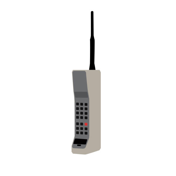
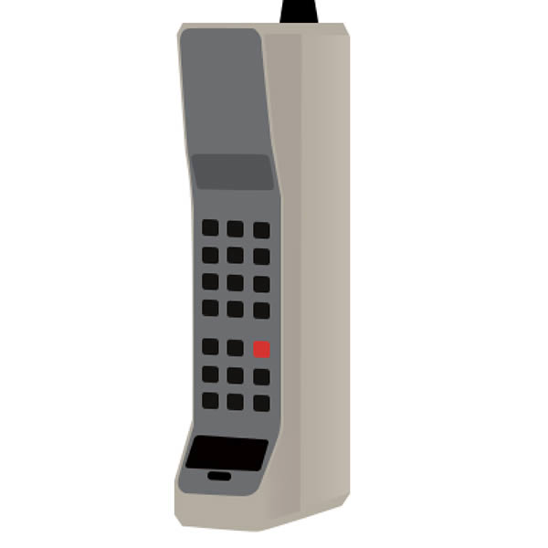

Tutorial Assets

The following asset was used during the production of this tutorial.


Before You Begin

If you are not already familiar with the basics of digital art, take a look at this series by Martin Perhiniak.


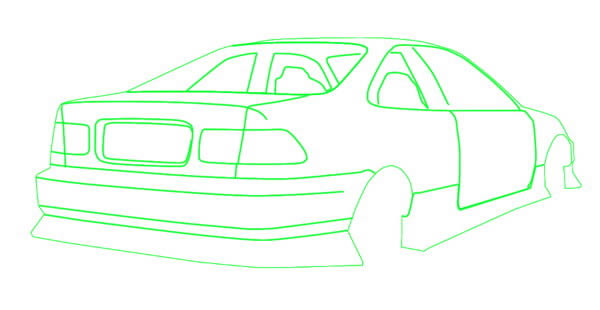
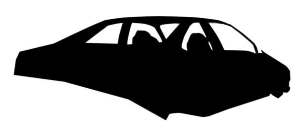
Step 1: Sketch and Perspective

Start by working on its wireframe. You don’t have to be very precise. Just make sure that the perspective is correct. We can add more details later.
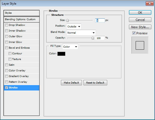
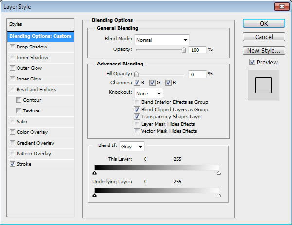
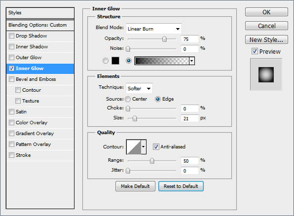
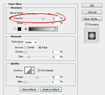
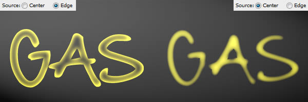

Step 2

We will need perspective lines to help us draw the car. To make it, start by making a triangle shape, add Layer Style Stroke, and set its Fill to 0%.
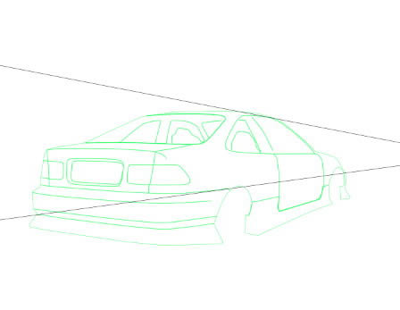
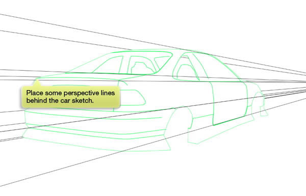

Step 3

Duplicate the line and move the points until it matches the sketch perspective. Place some perspective line behind the car sketch.


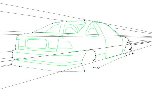
Step 4: Tracing Shapes

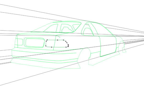
Activate Pen tool and set its mode to Path to draw new path. Draw new path by following the sketch. Keep repeating this step to every part of the car.
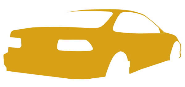

Step 5

Activate the main body path and Command/Ctrl-click to convert the path to selection. Fill the selection with #d8a015. Feel free to use other color if you want to.
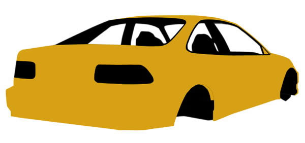

Step 6

Repeat the same process to inner body, this time use black for its color.


Step 7

Together we have this result.
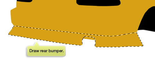
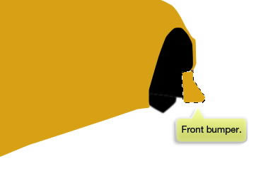

Step 8

Draw rear and front bumper.
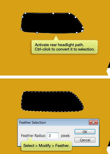
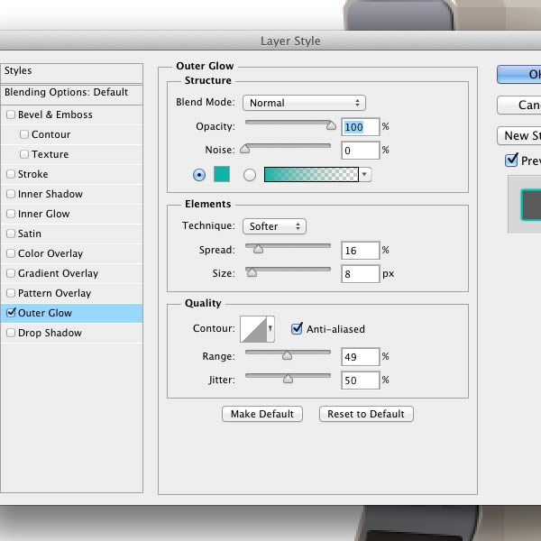
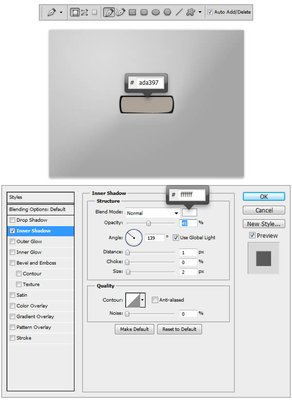

Step 9: Headlight

Activate rear headlight path and Command/Ctrl-click to convert it to selection. Soften the selection by applying Feather (Select > Modify > Feather).
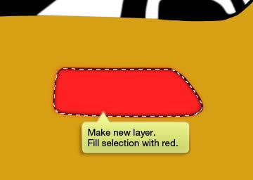

Step 10

Make new layer and fill the selection with red.
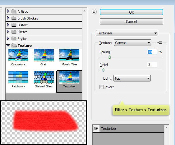

Step 11

Click Filter > Texture > Texturizer and select Texture: Canvas.
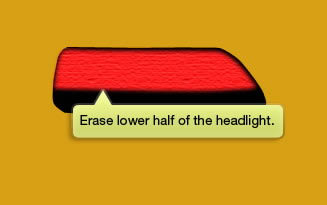

Step 12

Erase lower half of the headlight.
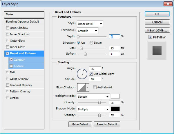

Step 13

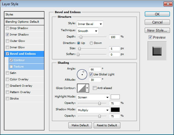
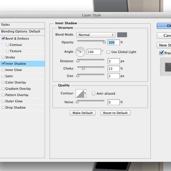
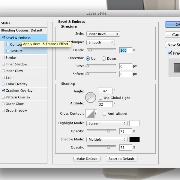
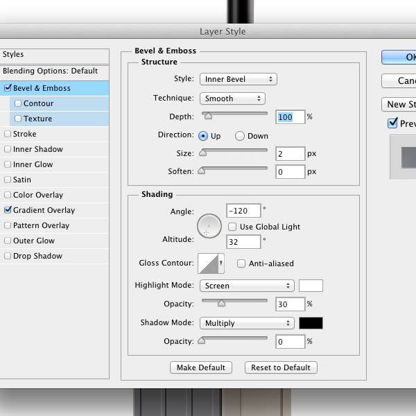
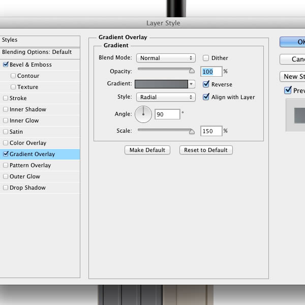
Add lighting by applying Bevel and Emboss.
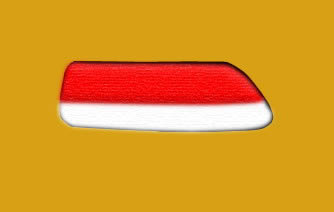

Step 14

Repeat previous steps to add white shape on lower part of the headlight.


Step 15

Select right side of the shape and delete it.
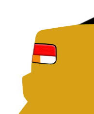

Step 16

Add same shapes to left headlight.
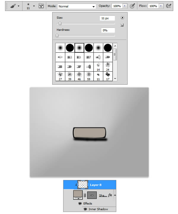

Step 17

Add new layer and paint subtle shadow on top of the headlights.


Step 18

Use small brush to draw headlight outline.


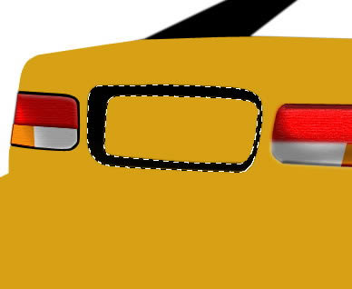
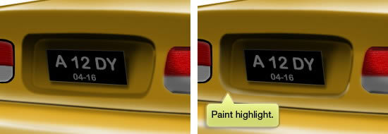
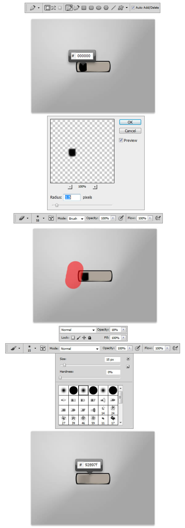
Step 19: Vehicle Registration Plate

Let’s add space for the car registration plate. Start by drawing black shape as seen below.
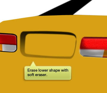

Step 20

Use soft Eraser tool to erase its lower part. Make sure to reduce the eraser Opacity to 30%. We don’t it to be completely disappeared.
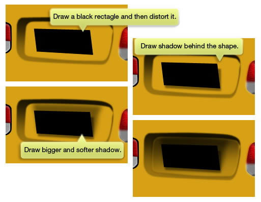

Step 21

Draw a black rectangle and then distort it. We will use this shape for the number plate. Use soft brush to paint black shadow behind the shape. Again, draw bigger and softer shadow the shape.
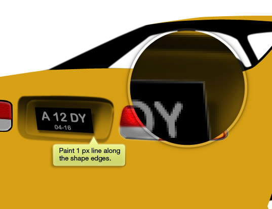

Step 22

Paint 1 px line along the shape edges. To do this, simply Command/Ctrl-click the shape then click Edit > Stroke. Use Width 1 px and white for its color. Don’t forget to add the number there. You may need to distort the text to match the plate perspective. To do that, click Edit > Transform > Distort.


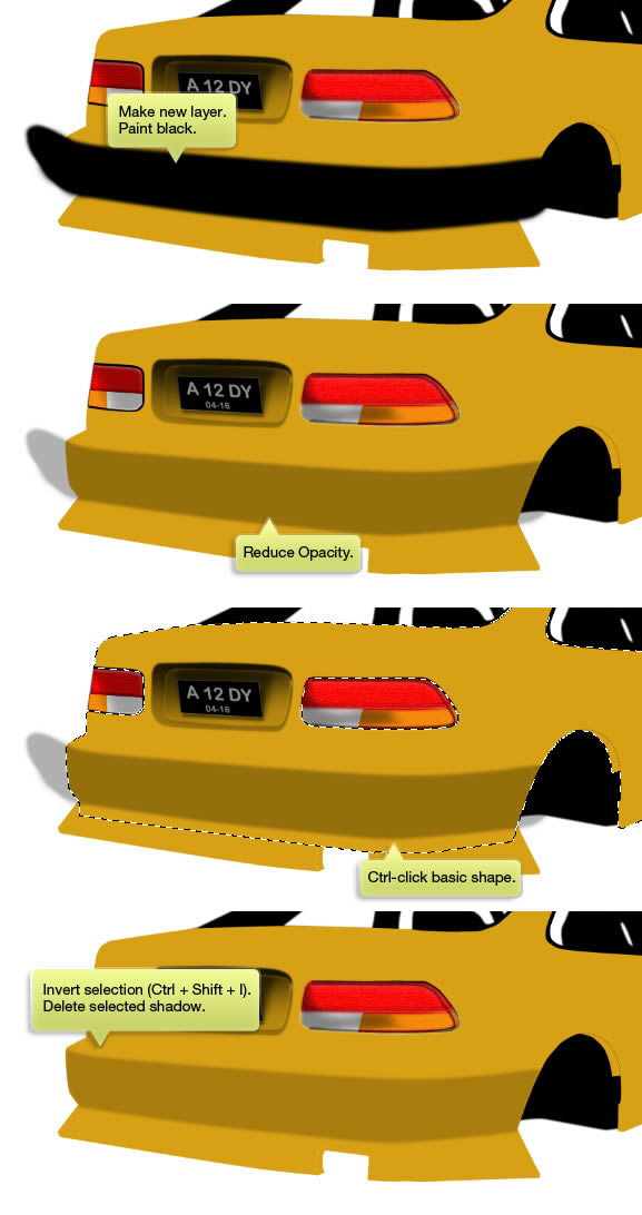
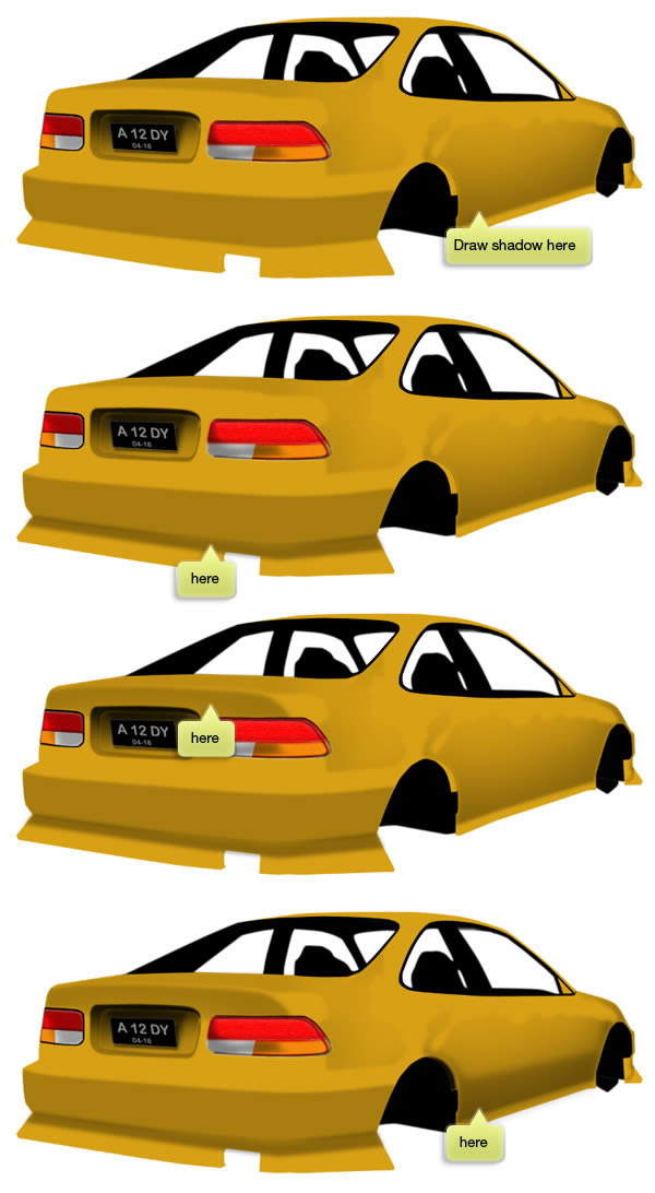
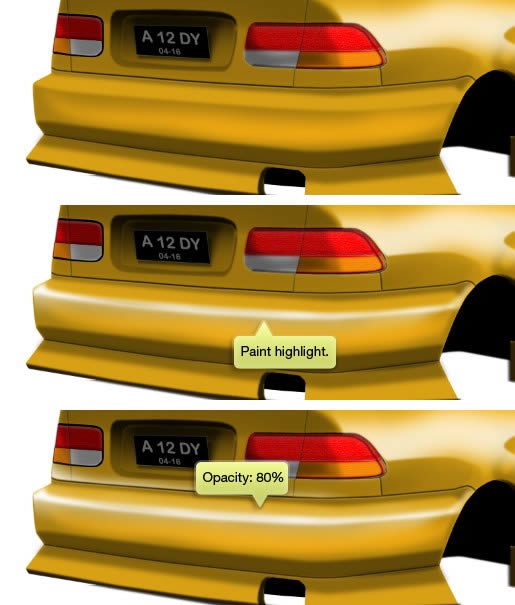
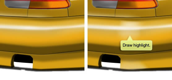
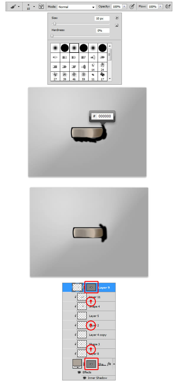
Step 23: Paint Shadows

Make new layer and paint black on top of the rear bumper. Reduce its layer Opacity to about 80%. Command/Ctrl-click the car shape and invert its selection (Command/Ctrl + Shift + I). Hit Delete key to erase all shadow outside the shape. We are going to use these steps on every process of drawing shadows and highlights.


Step 24

Draw another shadow on another part of the car.
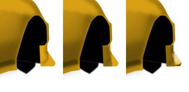

Step 25

Add darker shadow on lower part of the rear bumper. We want it to be darker because this surface is facing down. Also, make sure to draw its lower part to give it 3D appearance.


Step 26

Add another shadow and highlight onto its front bumper.
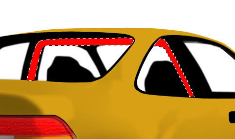
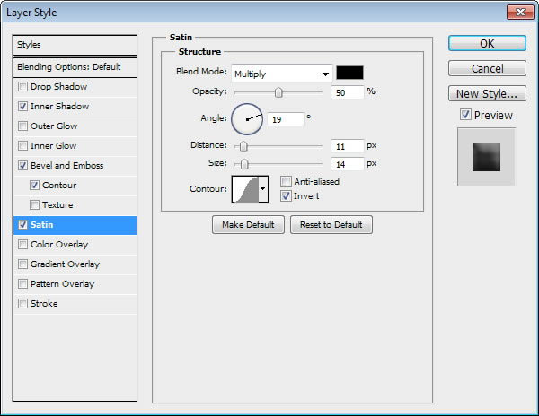
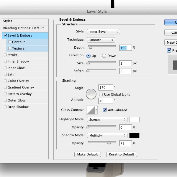
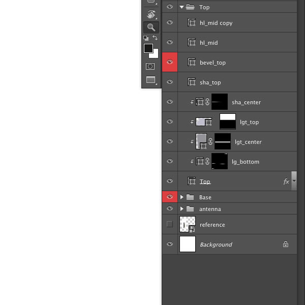

Step 27: Roll Bar

Draw roll bar and place it between the outside and inside of the car picture. Add following Layer Styles.


Step 28

Repeat this step to add another roll bar.


Step 29: Auto Glass

Make new layer and paint black to be used for the car auto glass. Reduce its Opacity to 80% to make it see through.


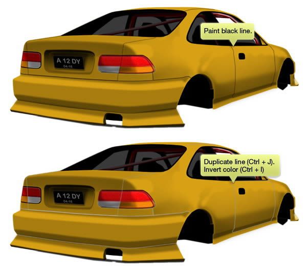
Step 30: Inset Lines

Paint thin black lines separating each part of the car. Hit Command/Ctrl + J to duplicate it and Command/Ctrl + I to turn it to white.


Step 31

Activate Move tool and hit Down Arrow once to move the line 1 px down. Reduce its layer Opacity.


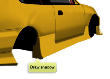
Step 32: Side Body Kit

Draw side body kit. Make sure to match it with the perspective guide lines we have made earlier.


Step 33

Paint shadow on rear part of the shape.
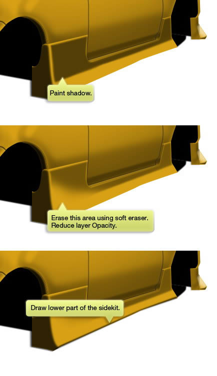

Step 34

Paint another shadow on its side. Erase its lower left corner using soft Eraser tool with low Opacity. Don’t forget to draw its lower part of the sidekit.
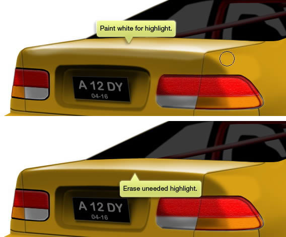
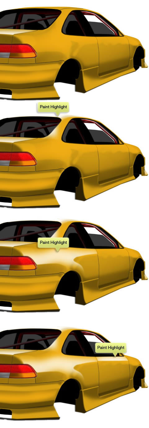
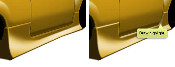

Step 35: Highlights

The process of painting highlight is very similar to painting shadow. The only differences is –of course– we use white or other lighter color.


Step 36

Keep adding highlights on other part of the car.


Step 37

To add realism onto the surface. You need to shift the highlight a bit. Just a subtle touch but it looks nice.


Step 38

Keep adding more highlights.
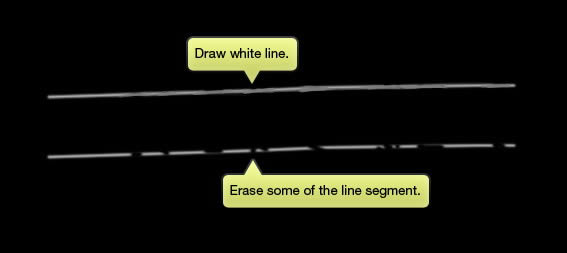

Step 39

To make it appears realistic, we should some imperfection onto its lighting. Let’s do this here too. Use soft Brush tool to draw a white line. Erase some of the line segment.
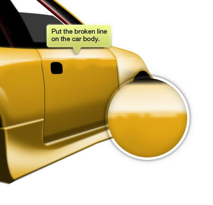

Step 40

Place the line on the car body.


Step 41

Just keep on going. Add more highlights onto the car body.


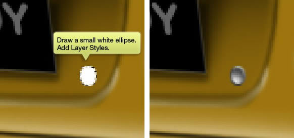
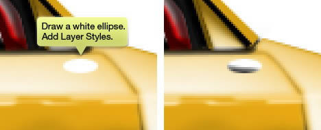
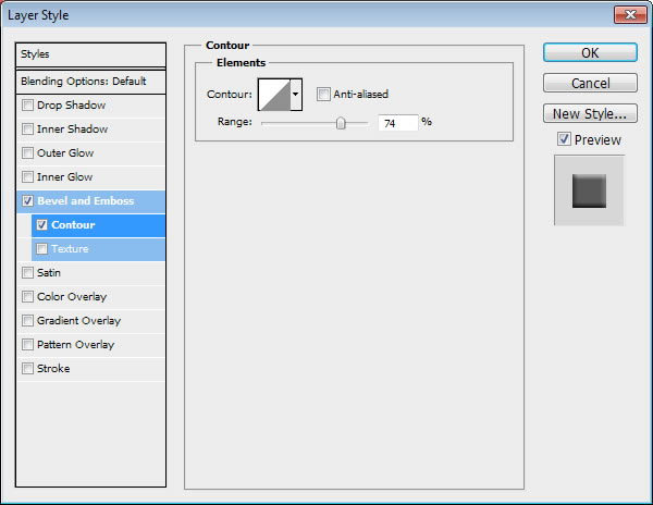
Step 42: Trunk Keyhole

Draw a white small ellipse next to the number plate. Add following Layer Styles.
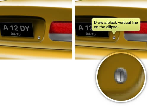
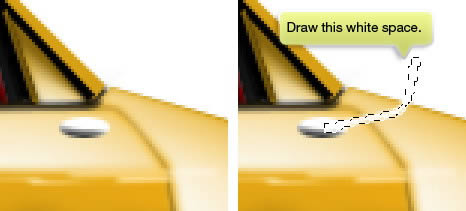
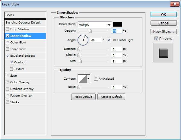

Step 43

Draw a small black vertical line for its keyhole.


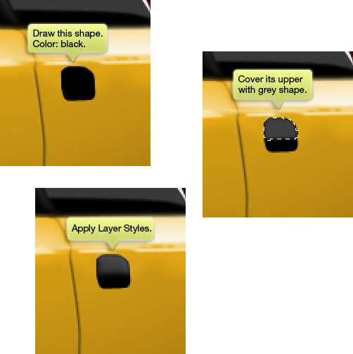
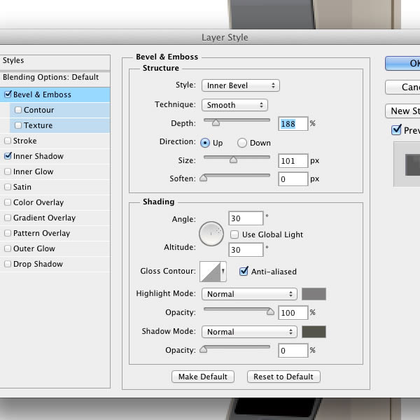
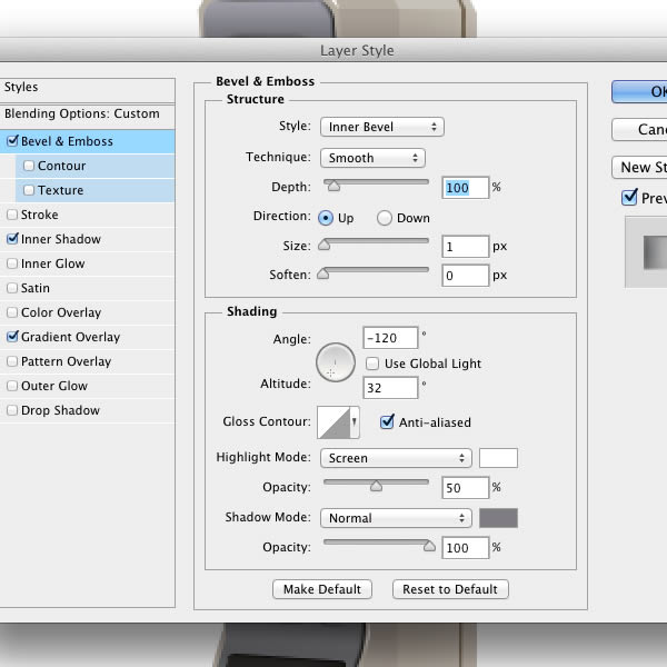
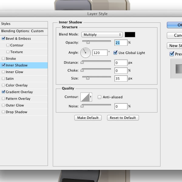
Step 44: Door Handle

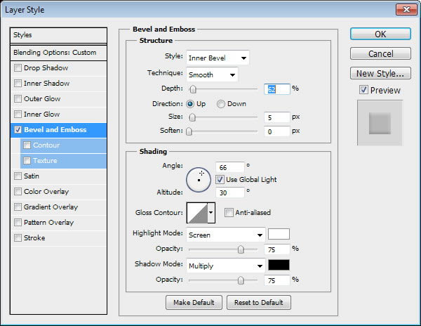
Draw a black rounded rectangle like shape and cover its upper half with grey. Apply Bevel and Emboss to the grey shape to give it subtle lighting.


Step 45

Draw keyhole. Use Brush tool to draw some subtle highlights on top of the shape.
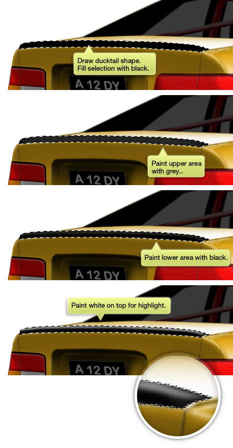

Step 46: Ducktail

Start by drawing ducktail basic shape in black. Command/Ctrl-click the shape to select it. Make new layer and draw some highlights and shadows on the ducktail.
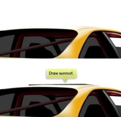

Step 47: Sunroof

Draw sunroof by simply painting a line behind the roof.


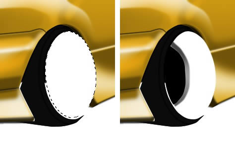
Step 48: Tire and Rim

Draw tire basic shape with color almost black. We don’t want it to be pure black because we need to add more details on the tire. Draw black curve on the surface.


Step 49

Draw a white ellipse and paint black inside it. Add some gradient on its inner edge.
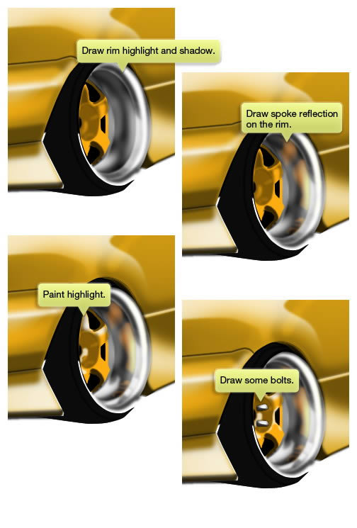

Step 50

Draw its spoke and paint shadow on top of it.


Step 51

Paint more highlights and shadows on the rim. Paint spoke reflection on the rim. Draw some bolts on the spoke.


Step 52

Finish tire and rim by adding more highlight and shadow. We also want the rim to appears thicker by drawing its outer edge.
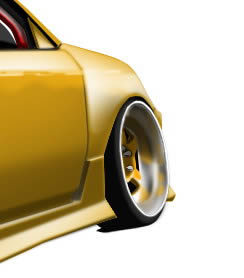

Step 53

Don’t forget drawing front tire and its rim.


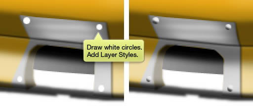
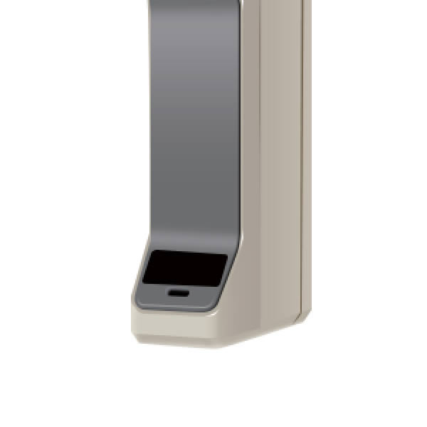
Step 54: Exhaust System

Start by drawing a grey shape for the exhaust pipe base. Don’t forget to add sharp highlight to turn it into a metal.


Step 55

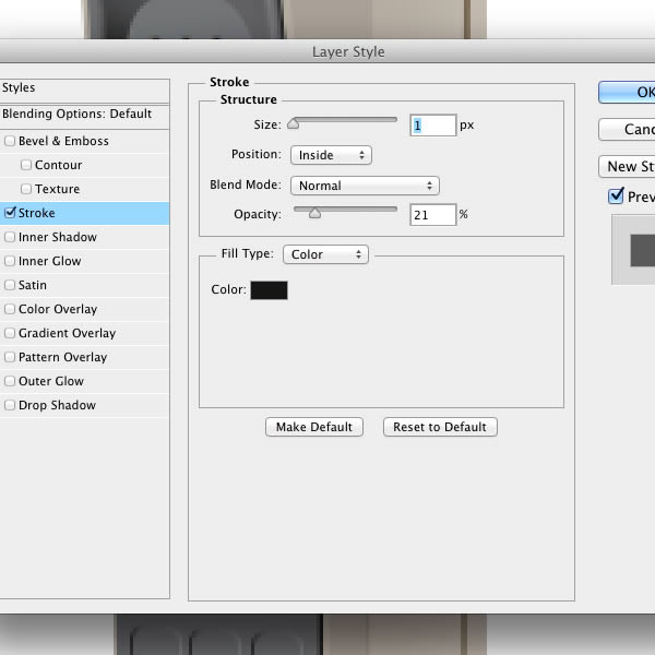
Draw white circles on its four corner. We will use it as bolt. Apply following Layer Styles.
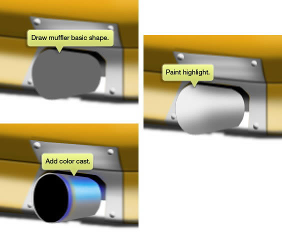

Step 56

Draw basic shape and paint highlight on top of it. Add black ellipse as its hole and turn the shape into a pipe. Paint blue color cast to turn it to metallic.
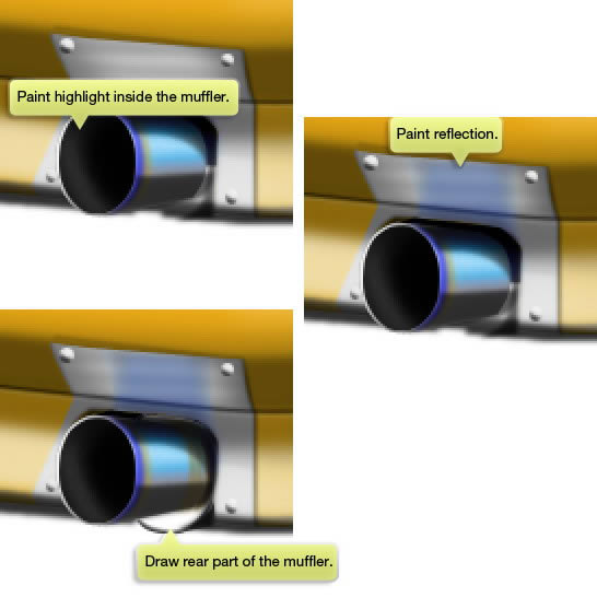

Step 57

Paint some highlight inside the pipe hole. Draw pipe reflection on surrounding metal. Draw muffler behind the pipe.

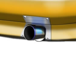
Below is the result in 100% magnification.


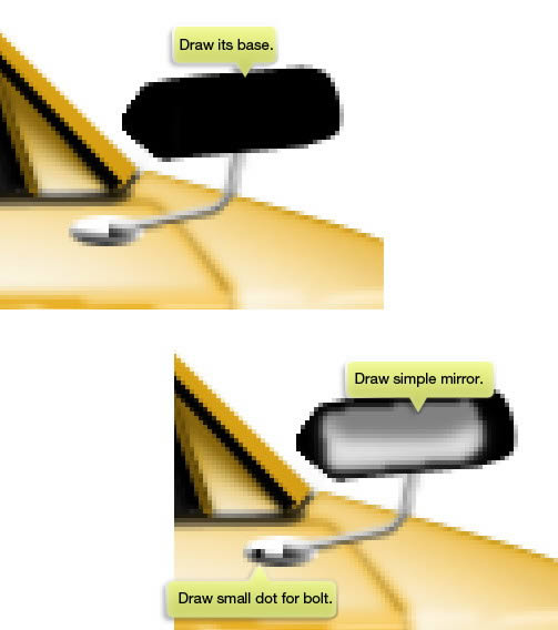
Step 58: Rear View Mirror

Draw white ellipse and add Layer Styles.


Step 59

Draw a long thin white shape extruding from the previous ellipse. Add following Layer Styles.


Step 60

Draw base for the mirror, the mirror itself, and bolt attaches it to the car. You can see that the mirror is very simple, this is not a problem because our final image is not very big.
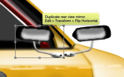

Step 61

We want to add the mirror reflection. Duplicate the rear view mirror. Click Edit > Transform > Flip Horizontal.
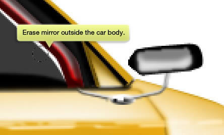

Step 62

Erase the duplicated mirror outside the car body.


Step 63

Repeat this process. But, this time place the reflection on the window.


Step 64: Reflections

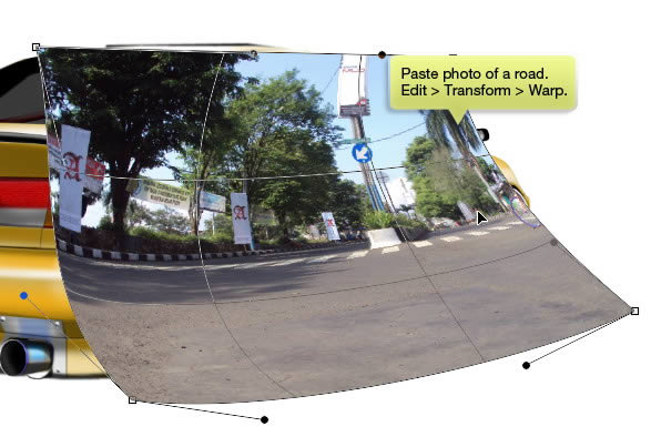
Grab photo of a road. You can use any road image actually. Click Edit > Transform > Warp. Move warp handle until the photo fit onto the car body.
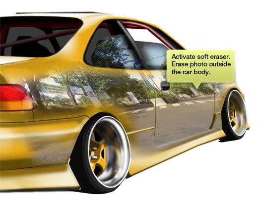

Step 65

Activate soft Eraser tool and erase photo outside the car body. Make sure to erase areas that do not need reflection. For example is lower sidekit body. That surface is facing up and there will be no reflection there.
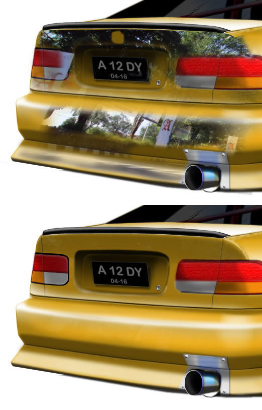

Step 66

Change its layer blend mode to Screen and reduce its Opacity.


Step 67

Do the same to its rear.


Step 68

Activate Brush tool with low Opacity and 0% Hardness. Paint subtle highlights on the glass.
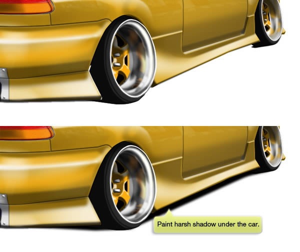

Step 69: Shadow

Use Brush tool to paint dark and harsh shadow right under the car.


Step 70

Next, draw another shadow. This time bigger and softer. We want it placed further under the car. This gives us impressions on the car height from the ground. If you want the car to be low rider, you may want to place the shadow closer.


Step 71

Finally, duplicate the last shadow and apply very big Gaussian Blur (Filter > Blur > Gaussian Blur). Reduce its Opacity if needed.
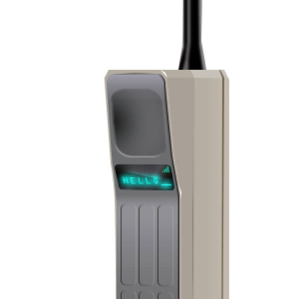
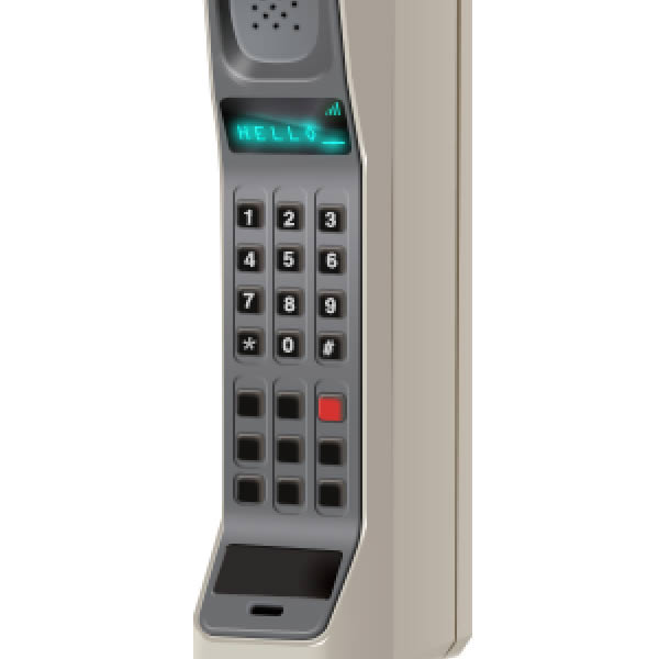
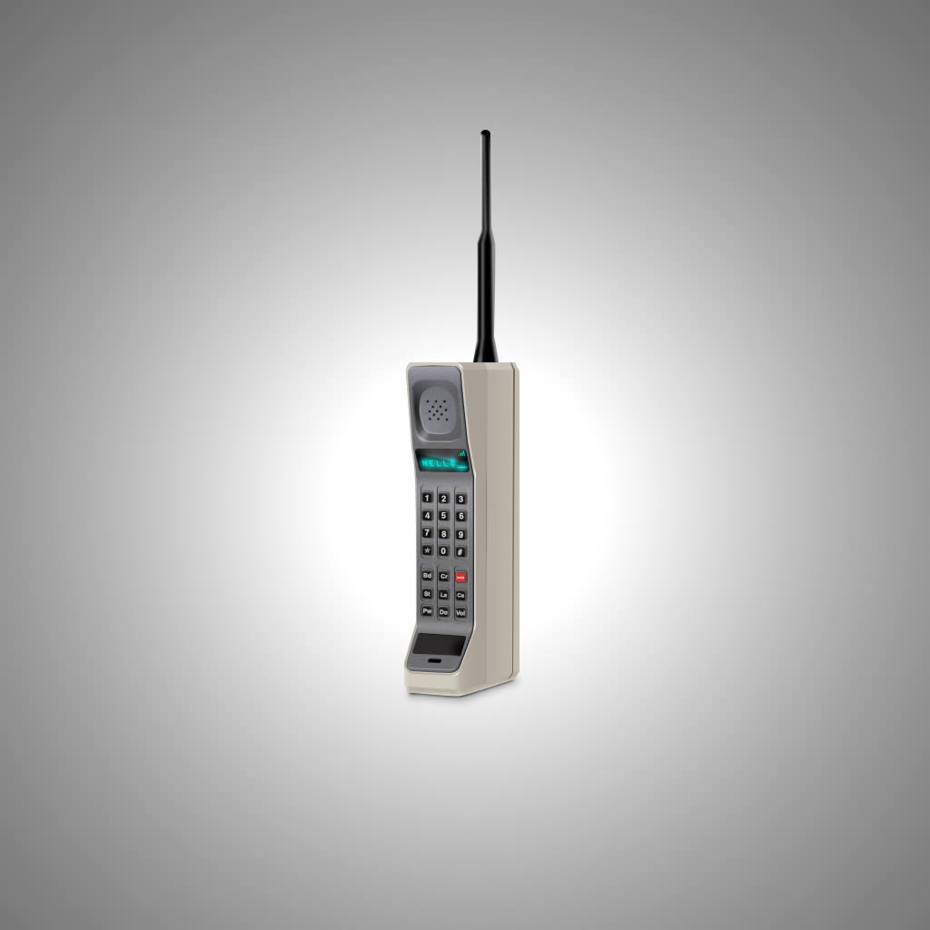
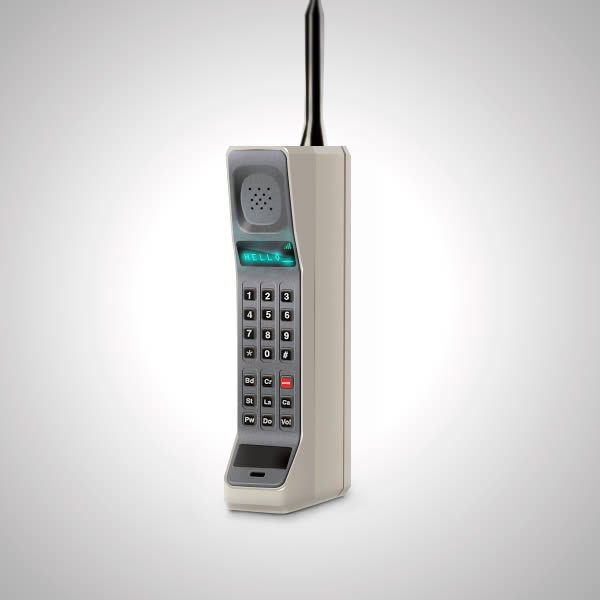

Final Image

Here’s our final image. I hope you enjoy the tutorial and learn something new.


Create a Cinemagraph (or Cinegraph) Using Photoshop CS6

$
0
0

Cinemagraphs or Cinegraphs are photos that also include movement. They are hybrid images that are eye-catching and unique. Thanks to the new Timeline features in Photoshop CS6, it is really easy to create your own cinemagraphs. In this tutorial, we will show you how. Let’s get started!


Create a “Parry Hotter” Text Effect in Photoshop

$
0
0

In this quick tip tutorial we will demonstrate how to create a cinematic “Parry Hotter” Text Effect using the layer styles. Let’s get started!


Tutorial Assets

The following assets were used during the production of this tutorial.


Step 1

Make a new .PSD document, size 1000 x 500 pixels, RGB color, 72 dpi. Create a new layer and fill it with a grunge metal texture and colorize this with the color that you desire. Now create the text using this font: Parry Hotter. Use the settings shown in the following pictures. Now rename this text: “Base”. Then go in the menu Layer > Layer Styles > Blending Options and use these settings:


Step 2

Duplicate the text and rename it “False 3D”. Right click on his layer and click to “Clear Layer Style” or in the Styles Palette click on the first style “Default style (None)” (It’s the same thing). Move this layer slightly to left in order to create a false 3D effect. Then go in the menu Layer > Layer Style > Blending Options and use these settings:


Step 3

Duplicate the text “base” and rename it “Bevel”. Right click on his layer and click to “Clear Layer Style” or in the Styles Palette click on the first style “Default style (None)” (It’s the same thing). Now put this layer above the other layers. In the Blending Options menu on the right set the fill to 0%. Then go in the menu Layer > Layer Style > Blending Options and use these settings:


Step 5

Your text effect is almost completed. Now you have to create "Gradient Map" layer in order to colorize the entire work of the color that you desire. For example, I’ve chosen the color blue. Finally to make it nicer, I’ve added some sparkles with simple brushes.


Conclusion


Quick Tip: Create a Round Switch Button in Photoshop

$
0
0

In this quick tip tutorial we will create a round switch button that you can use in your interface designs. Let’s get started!


Tutorial Assets


Creating the Background

Create a new file. Set Width to 1000 and Height to 1000 and the resolution to 72 PPI.


Applying the background pattern

Make a new Group and name it Background. Now go to this link Vertical cloth Pattern and download this pattern and load it. Using Rectangle Tool (U) draw a rectangle shape a little bigger than the canvas, and apply the pattern as a style to the shape layer.


Creating the button – Step 1

Create a new Group and name it Button. Using Elipse Tool (U) draw a perfect circle like the one in the example. Set the color to #0e0f0f and apply the layer styles. After you are done with the layer styles, reduce the Opacity to 20%.


Step 2

Now make another circle, this time a little smaller, set the color to #222429 and apply the layer styles.


Step 3 – Locating and applying the texture

Navigate to Pixeden site and download the Old School Retro PSD Text Effect inside wich we will find the texture that we need. After you’ve downloaded the file, open it with Photoshop and locate the layer called Grunge Texture. Import that layer in your PSD and set the blending mode to Pin Light and the Opacity level to 10%. Make this layer a Clipping Mask.


  • Step 4

    Using Elipse Tool (U) make another perfect circle also smaller than the one before him, set the color to #0d0d0e and apply the layer styles. Using Brush Tool (B) set the size of the brush to 200px and the Hardness to 0% and make a white #ffffff dot like the one in our example. Set the blending mode to Soft Light, and the Opacity level to 80% and transform this layer into a Clipping Mask. Now make another layer, change the color to black #000000 and brush around the lower part of the circle like seen in the example. Transform this layer into a Clipping Mask also.


    Step 5

    Again using Elipse Tool (U) make another perfect circle but make this one a few px smaller than the previous one. Set the color to #1a1a1b, and using Direct Selection Tool (A) move the lower anchor a few pixels to the top. Now apply the layer styles, import the Grunge texture again, set the blending mode to Linear Dodge and the Opacity level to 10%. Make a new layer, and using Brush Tool (B) keep the same settings that we used on our previous step, pick white #ffffff as our color, and brush away at the bottom part of our shape. Set the blending mode for this layer to Soft Light, and transform the layer into a Clipping Mask.


    Step 6

    Using Horizontal Type Tool (T), set the Font to Myriad Pro (standard font), Bold and the size to 48pt and write down the letter “I”. Set the color to #969696 and apply the layer style. Make another type, this one will say “O”, set the color to #fefefe. Right click on the layer, and select Rasterize Type. Now pres CTRL/CMD + T and holding CTRL/CMD + SHIFT + ALT drag the lower left corner to the left a few pixels. Apply the layer style and we’re done.


    Final Image


  • Submit Your Own Remix on Run Your Jewels

    $
    0
    0

    Hello everyone, we wanted to let you know about a project called Run Your Jewels. Run Your Jewels is a digital media remix competition that is curated by Depthcore’s Justin Maller. Every two weeks, a different artist uploads high resolution files of an original piece that you can remix and submit as an entry. Round Three of Run Your Jewels is now live featuring source artwork from Matei Apostolescu. If you’re interested, head over to the site to get started on your own remix for a chance to win a limited edition print! Have fun!


    The Photo Manipulations of LSD Photography

    $
    0
    0

    LSD Photography is an award-winning photography studio based in Italy. In this article we will showcase some of our favorite work from their portfolio. Let’s take a look!


    Create a 1990′s Era Mobile Phone Icon in Photoshop

    $
    0
    0

    In this tutorial we will explain how to create a 1990′s era mobile phone icon in Photoshop using a photo as a reference. Let’s get started!


    Tutorial Assets

    The following assets were used during the production of this tutorial.


    Step 1

    Let’s start with a new document in Photoshop with the following settings. I used a 1024×1024 pixel canvas.


    Step 2

    The first thing to do is to drag and drop the image reference inside the canvas. We’ll use it to draw the basic shapes of the icon.


    Step 3

    Select the Pen Tool (P), start to draw the pieces of the phone in separate shape layers. Tip: Stay organized by adding the shape layers in groups.


    Step 4

    Add highlights and shadows to the right side of the icon. Draw two rectangular shapes with the Pen Tool (P). Apply the shapes as clipping masks by clicking on the thin divider line between the two layers in Layers Palette while pressing Alt on the keyboard. Use #c6beb2 and #a9a096 colors. Tip: use a layer masks in this way you can hide unwanted shape parts.


    Step 5

    Repeat Step 4 method and add two shapes on top and bottom of the phone. Use lighter colors than the base shape layer.


    Step 6

    Add more details to the phone. Create new shape layers inside the base layer, and apply layer masks to smooth the final effects. As you can see I added two tiny highlights with the Pen Tool on top and bottom corners.


    Step 7

    With the Pen Tool, add two thin lines using a dark brown color. Add a layer mask to refine the divider on the left side.


    Step 8

    Same process for the top part. (I disabled the visibility of the key layers). Select a lighter color than the base, add the shapes with the Pen Tool (P) and finally refine the shapes edges with a Layer Mask. Use the screenshot below as a reference. I also added some small details like highlights in new shape layers as before. Finally apply this Layer Style to Top layer.


    Step 9

    Add this Layer Style to the microphone shape layer.


    Step 10 – 100% View

    Quick Before/After preview


    Step 11

    Add this Layer Style to the Inset shape layer. Set the fill to 0%


    Step 12

    Draw the key’s emboss by adding new rectangular shapes with the Rounded Rectangular Shape Tool (U) with a 2px radius, then Skew them with Cmd/Ctrl + T. Apply this Layer Style and set the fill to 0%.


    Step 13

    The lighting process of the Antenna consist in a series of new shape layers draw with the Pen Tool and applied as clipping masks. Then you have to convert the shapes into a Smart Object, and add a small Gaussian Blur Filter.


    Step 14

    Display Time. First add this Layer Style to the display shape layer.


    Step 15

    Then in a new layer, draw a white rectangle shape with Rectangular Shape Tool (U), and apply a layer mask to it. With a hard brush, set at low opacity, hide some parts of the layer to obtain the display reflection. I also added a Welcome Text and the Signal Bar shapes with this Layer Style.


    Step 16

    Our phone is beginning to take shape. Let’s do the speaker now. Use the Rectangular Shape Tool (U) to draw a shape like below. Alter the shape with Cmd/Ctrl + T. Finally add this Layer Style.


    Step 17

    Add a new shape layer to boost the bottom-left light of the speaker by drawing a white shape inside the layer with the Pen Tool (B). Refine the edge with a layer mask.


    Step 18

    Add a new rounded shape with this Layer Style.


    Step 19

    Select the Ellipse Shape Tool (U) and add some small holes inside the speaker with the following Layer Style. You have to Skew the holes just a little with Cmd/Ctrl + T to better match the phone’s perspective.

    >


    Step 20

    Reactivate the keys visibility and add this Layer Style to each key. Tip: Remember to replace the Fill Color for the Red key shape.


    Step 21

    Almost done. Add the numbers inside the keys. I used the Helvetica Bold font. Skew the Type Layer with Cmd/Ctrl + T to match key’s perspective.


    Step 22

    Do the same for the function keys.


    Step 23

    Create a new blank layer and fill it with 50% Gray. Then apply Filter > Noise > Add Noise with value of 2-3%. Set the layer blending mode to Overlay and 60% Opacity. Place the new layer above the Top layer.


    Step 24

    I added a simple gray background behind the phone icon layers. Simply adding a Gradient Fill Layer Adjustment set in Radial Mode will do the task.


    Step 25

    Draw the cast shadow by painting some black color into a new blank layer with the Brush Tool (B). Use a Layer mask to smooth the transitions.


    Step 26

    Refine the sides of the icon by painting some light gray inside a new layer. This will blend better the icon with the surrounding space.


    Step 27

    Paint some colors inside a new layer and set the blending mode to Overlay or Color Dodge. As you can see in the display (light blue) or antenna (dark yellow), these techniques can achieve interesting results. Tip: Use the Eyedropper Tool to sample the right color.


    Step 28

    Final Step: Apply an Unsharp Mask Filter with low radius (0,3-1) into a composite layer and you’re done! Tip: Press Cmd/Ctrl + Alt + Shift + E to create a composite layer.


    Final Image


    Transfer Artwork to a Wooden iPhone 4 Cover Using Photoshop and Filter Forge

    $
    0
    0

    Photoshop is a fantastic tool for helping users creates images that can’t or don’t exist in real life. It is also a great tool for helping users create items that do exist in real life. In this tutorial, we will explain how you can use Filter Forge and Photoshop to create artwork that we will transfer to a wooden iPhone 4 cover. This technique involves applying an effect to an image in Filter Forge and then applying that image to a laser printout. We will then transfer that image to a wooden iPhone 4 cover. This technique is cheap, easy, and a lot of fun. Let’s get started!


    Filter Forge is a powerful third-party plugin that allows you to apply over 4,000 amazing effects to your images, and even create your own. To learn more about Filter Forge, you can visit their website, download the trial version of the software, or check out their filter gallery.

    Editor’s note: This tutorial was sponsored by Filter Forge.


    Improvements to Layer Style Feature in Photoshop CS6

    $
    0
    0

    Photoshop layer styles are a popular way to add effects, such as drops shadows and strokes to layers in a non-destructive way. Layer styles were first introduced in version 6 of Photoshop, but since then, there have not been many significant updates. The new changes in Photoshop CS6 are the most drastic, and useful, since their inception over 10 years ago. In this article we will explain how Adobe has improved this popular feature. Let’s take a look!


    Effect Layer Order Changes

    This is probably one of the most exciting new features regarding layer styles in Photoshop CS6. The layer order of the effects was changed to display the order in which the effects are actually applied, from top to bottom. Previously, you couldn’t tell which effects would be applied above or below each other because their order within the dialog box was random.

    This simple change makes it much easier to visualize your changes before you even make them, thus speeding up your workflow.

    By looking at the screenshot below, you can tell that the Outer Glow effect will be applied above the Drop Shadow effect without having to turn both of them on to check or memorize it all in your head.


    Layer Styles Applied to Groups

    Another great new feature in Photoshop CS6 is that you can now apply layer styles to groups. This makes it so that you don’t have to merge layers or create complex clipping masks in order to create certain shapes.

    It can be really helpful because it provides another avenue for non-destructive editing, allowing you to go back and change something without having to recreate it from scratch.

    In the following example, the shape on the right is created with individual elements that are grouped together so you can still move each shape separately, but Photoshop layer styles treat them as if they are one.


    Opening and Closing Effects for Multiple Layers

    One of the most annoying things about working with a lot of layer styles is that you used to have to expand and contract the effects list for each layer individually. Not anymore!

    You can now Alt + Click (Windows) or Option + Click (Mac) the disclosure triangle to the right of each layer in the layers palette to open and close the effects list for every item in your document.


    Dithering

    Dithering has been added to both the Gradient Overlay and Stroke effects. If you have ever noticed color banding in your gradients, you can now eliminate it complete by simply checking this box. It has quick solution that has been a long time coming to an annoying problem that used to take a lot longer to fix.


    Rasterizing Layer Styles

    It used to be a hassle to rasterize layer styles. You would have to first right click the layer and convert it to a smart object, then right click it again and rasterize it. Either that or create a new blank layer, select both layers, and then merge them together. It was not very intuitive.

    Photoshop CS6 allows you to simply right click any layer with effects applied and click Rasterize Layer Style. A quick and easy one step process. You can also achieve the same thing in Photoshop CS6 by clicking Layer > Rasterize > Layer Style.


    Advanced Blending Options Icon

    The last, and probably least useful, but much appreciated feature is a new icon for when you make changes to the layer styles Advanced Blending options.

    If you make any changes under the Advanced Blending area, an icon appears next to the usual "fx" icon in the layers palette.


    Conclusion

    Photoshop CS6 has provided us with a ton of great new enhancements, and for those of you who love delving into the layer style options, they have done a fantastic job of helping us out.

    The new tools and options make creating great looking styles faster, easier, and even more fun. What are you waiting for? Get out there and create some new styles!


    Quick Tip: Create a Plastic Switch in Photoshop

    $
    0
    0

    In this quick tip tutorial we will explain how to create a plastic switch in Photoshop that you can use in your interface designs. Let’s get started!


    Creating the Background

    Create a new file. Set Width to 400 and Height to 300 and the resolution to 72 PPI.

    Now make a new Group and name it Background. Using Rectangle Tool (U) draw a shape bigger than the canvas, just like the one in the example. Set the color to white #ffffff and apply the layer styles.


    Creating the Button

    Create a new Group and name it Base. Using Pen Tool (P) draw a shape just like the one in the example. Set the color to a dark grey #242424 and apply the layer styles. Now our base shape is done.

    Create a new Group and name it Button. Using Pen Tool (P) draw a shape like the one in the example. Set the color to #ada397 and apply the layer style.

    Now to add some volume and detail to the button. Inside the Button Group create a new layer above the button shape and using Brush tool (B), set the foreground color to black #000000, the size of the brush to 11px, and the hardness to 0 and draw a short line at the bottom part of the button, like seen in the example. Transform that layer into a Clipping Mask by holding down the ALT key and pressing between the two layers, or simply right click on the last layer and select Create Clipping Mask.

    Create a new layer, and using Pen Tool (P) draw a black #000000 shape just like the one in the example. Go to Filter > Blur > Gaussian Blur, set the Radius to 1.5 px and apply the filter. Using the Eraser Tool (E) set the Size to 58 and the Hardness to 0, and brush away the left side of the blurred shape (the red shape in the example marks the spot). Set the Opacity of the layer to 18% and make this layer a Clipping Mask. Now make a new layer, select Brush Tool (B), set the size to 15px and the Hardness to 0, set the color to #92897f and draw a straight line just like the one in the example. When you’re done, transform this layer into a Clipping mask as well.

    Make a new layer, select Pen Tool (P), set the color to #c8b7a5 and draw a shape like the one in the example. Go to Filter > Blur > Gaussian Blur, set the Radius to 1.5 px and apply the filter. Using the Eraser Tool (E) set the Size to 58 and the Hardness to 0, and brush away the left side of the blurred shape (the red shape in the example marks the spot). Now select Brush Tool (B), set the size to 13px and the Hardness to 0, set the color to #c8b7a5 and draw a straight line just like the one in the example. Make this layer a Clipping Mask.

    Create a new layer, and using Pen tool (P), set the color to black #000000 and draw a shape like the one in the example. Go to Filter > Blur > Gaussian Blur, set the Radius to 1.5 px and apply the filter. Using the Eraser Tool (E) set the Size to 58 and the Hardness to 0, and brush away the left side of the blurred shape (the red shape in the example marks the spot). Now set the Blending mode for the layer to Overlay, and the Opacity to 80% and transform the layer into a Clipping Mask.

    Make a new layer, and using Brush Tool (B), set the Size to 10px, the Hardness to 0%, the color to black #000000 and draw a few line around the bottom and right part of the button as seen in the example. Transform that layer in a Clipping mask, and create a new one. Use Brush tool (B) with the same settings as before, and draw a few more lines on the right side of the button. Now we have to copy the Vector Mask thumbnail of the Button shape to our layer. Holding down the ALT key, click and drag the Vector Mask thumbnail from our Button Shape to this layer exactly like seen in the example. We will not make this layer or any future layers Clipping Masks.

    We will make a new layer. Using Pen Tool (P) draw another black #000000 shape just like the one in the example. Go to Filter > Blur > Gaussian Blur, set the Radius to 1.5 px and apply the filter. Set the Opacity of the layer to 20%. Make a new layer, and Using Brush Tool (B) we will add some highlights. Set the Size to 2px, and the Hardness to 0%, set the color to #d5c8b5 and make a small dot near the left top corner of the button. Make another layer, and using Pen Tool (P) we will add some more details. Set the color to #dbcebe and draw three more shapes like the one seen in the example. These highlights will help give more volume and realism to our button.

    Create a new Group and place it under Base Group. Name it Shadow. Using Pen Tool (P) set the color to #000000 and draw a shape like the one in the example. Go to Filter > Blur > Gaussian Blur, set the Radius to 1.5 px and apply the filter. Set the Opacity of the layer to 20% and using the Eraser Tool (E), set the size to 58px and the Hardness to 0% and brush away the bottom right part of our shape (red circle indicate the area in the example).


    Final Image


    Understanding the Inner Glow Setting in Photoshop

    $
    0
    0

    Photoshop layer styles are a popular way to add effects, such as drop shadows and strokes, to layers in a non-destructive way. With the right knowledge and experience, any effect can be achieved. To achieve these effects, however, you need to understand what each setting does and how they can be combined to achieve a certain look. In this series by John Shaver from Design Panoply, we will explain every aspect of Photoshop’s layer styles feature and show you how to unlock their potential.

    In this article, Part 5: Photoshop Layer Styles Inner Glow, we will explain the settings behind the Inner Glow and how it can be used. Let’s take a look!


    The Uses For An Inner Glow

    Inner Glow is one of the lesser-used effects within Photoshop layer styles, but that doesn’t mean it isn’t as useful.

    On top of creating a glowing effect, Inner Glow can also be used to simulate an embossed or cut out effect, create some depth within your styles, as well as add an inner stroke to your design.

    Below you will see an example of how an Inner Glow can be used to simulate a shadow behind a cut out shape, and create an icy type effect. One tool, two very different uses.


    The Layer Styles Inner Glow Dialog Box

    The Inner Glow dialog box is shown below. Not much different than Outer Glow, but you will notice a new Source radio button selection area with Center and Edge as the options.


    Blend Mode

    The Blend Mode dropdown allows you to set the blending mode for your Inner Glow. If you are looking to create a glowing affect, Linear Dodge (Add) or Screen are good modes to use, if you want to create an "inner shadow" type effect, Linear Burn or Multiply work well, and if you are trying to create an inner stroke (which we will get into in more detail below) then Normal is fine.

    If you are unfamiliar with how all the different Blending Modes work, I highly recommend checking out the Blending Is Fun Basix tutorial.

    In the following example, you can see that Screen, on the left, will add the green Inner Glow in a more subtle way when compared to Linear Dodge (Add), on the right.


    Opacity

    The Opacity slider allows you to specify how transparent your Inner Glow will be. A setting of 0% is completely transparent while 100% is completely opaque.

    In the following example, you can see that text on the left has a more subtle burned effect, while the one on the right is more dramatic.


    Noise

    By now you should be familiar with the Noise slider. Increasing the Noise slider will add a bit of noise to your Inner Glow, allowing you to add some grit to your styles.

    In the following example, you can see that adding a small amount of noise can go a long way in changing the overall look of our style.


    Color and Gradient

    When the corresponding radio button is selected, the Color block allows us to change the color of the Inner Glow, while the same goes for the Gradient radio button. With Gradient selected, you are not limited to a single color, which can help you create very intricate and abstract glowing effects.

    In the following example, setting a single color will give a predictable Inner Glow, while experimenting with different gradients can help us achieve more unique effects, like the psychedelic slime effect below.


    Technique

    The Technique dropdown box gives us two different options for rendering our Inner Glow, Softer and Precise. Softer gives us an Inner Glow that is more organic and natural looking, while Precise fits the shape of the glow tighter to the original shape of the layer.

    In the following example, you can see the difference between the more organic looking Softer setting, and the harder edges of the Precise technique on the right.


    Source

    The Source radio buttons allow you to specify whether you want to Inner Glow to eliminate from the edges of your shape, or from the center of your shape.

    In the following example, you can clearly see the difference in where the Inner Glow originates.


    Choke

    The Choke slider changes the falloff of the Inner Glow in a linear fashion, or in other words, how gradually it fades out at the edges.

    For a typical Inner Glow, you will normally want to leave this at 0%, but for more intense glows you should increase it, and for inner strokes with hard edges you can set it all the way to 100%.

    In the following example, increasing the spread percentage from 0% to 100% turns the Inner Glow into a hard-edged stroke.


    Size

    The Size slider is pretty self-explanatory. It allows you to increase the size of the Inner Glow in 1px increments. The higher the Size value is, the bigger the Inner Glow becomes.

    In the following example, the Inner Glow on the left is less prominent while the one on the right stands out more and gives us a more velvety look.


    Contour

    The Contour shapes allow you to change the falloff of the Inner Glow in a non-linear fashion. By choosing different curve profiles, you can get the glow to fade out in different ways.

    This is really useful is when you are trying to achieve special glow or abstract effects.

    In addition, the "Anti-aliased" checkbox allows you to improve the quality of the shadow with a very slight drop in performance. The performance hit is negligible, so we recommend always keeping the box checked.

    In the following example, changing the Contour to a "sine wave" shape results in an Inner Glow with a ripple-type effect, which is perfect for our wet style.


    Range

    Adjusting the Range is similar to changing the Choke. It allows you to control the falloff of your Inner Glow in almost the same way.

    A lower setting gives us a harder glow while a higher setting gives us a softer one.

    In the following example you can see how changing the Range affects the softness of the Inner Glow.


    Jitter

    You need to choose a gradient for Jitter to have any effect. The option adds color and transparency noise across the gradient to produce an effect similar to Noise. The higher the Jitter value, the more pronounced the effect becomes. This option is useful to reduce gradient banding..


    Saving and Loading Default Settings

    You can save and load default settings for each effect in the Layer Styles dialog box. By clicking "Make Default", Photoshop will store whatever settings are currently active as the new default settings for that effect.

    By clicking "Reset to Default", Photoshop will then load whatever settings were last saved. This allows you to experiment and simply reload custom default settings if you want to start over.


    One for the Road

    Until next time, this free, exclusive layer style and accompanying .PSD will help you see how different glows can be used in conjunction with each other to achieve some beautiful subtle effects.


    The Photo Manipulations of Christophe Gilbert

    The Making of “Everything Dies” – Tuts+ Premium Tutorial

    $
    0
    0

    Everything dies. It’s the one thing that we all know for certain about life. We may not know how or when, but eventually it will happen to all of us. This Tuts+ Premium tutorial by author Liran Szeiman is an interpretation of the song "Everything Dies" by Type O Negative and will explain how to create a dark and emotional digital painting in Photoshop. This tutorial is available exclusively to Tuts+ Premium Members. If you are looking to take your digital painting skills to the next level then Log in or Join Now to get started!


    Tutorial Details

    • Program: Adobe Photoshop CS5
    • Difficulty: Advanced
    • Estimated Completion Time: 30 Hours

    Tuts+ Premium Members can login now for instant access to this tutorial. Membership to Tuts+ Premium gets you access to hundreds of exclusive premium tutorials, top selling ebooks, in-depth courses, member forums, and much more. To learn more about Tuts+ Premium, Take the Tour or Join Today.


    Tuts+ Community Meetup in New York!

    $
    0
    0

    We’re excited to announce that we will be holding a Tuts+ community meetup on the 19th of July in New York City! Are you interested in meeting your fellow Tuts+ fans as well as some of the staff who make the sites tick? This is your chance!


    The New York Meetup

    We’re looking to hold a small, informal meetup in an easily accessible location in Manhattan, New York on the evening of the 19th of July.

    Staff attendees will include:

    • Jeffrey Way
    • Mark Hammonds
    • Sean Hodge
    • Cameron Knight
    • Josh Johnson
    • Adam E. Miller
    • Grant Friedman
    • David Appleyard and
    • Mark Brodhuber (from the Envato Marketplaces)

    This will be a great chance to meet some of the team behind the Tuts+ sites and other members of the community in an informal environment. There should be some Tuts+ t-shirts there too along with some limited food and drink!


    We’d Love to See You There!

    We’re still figuring out the specifics, including venue and capacity but are looking to get expressions of interest now.

    If you can or would like to attend, please let us know by filling out this form to register your interest!

    We will provide more information as it becomes available, but do let us know if you have any questions!


    Viewing all 6352 articles
    Browse latest View live