Quantcast
Channel: Envato Tuts+ Design & Illustration
Viewing all 6352 articles
Browse latest View live

Create Glossy, Plastic, 3D Text in Photoshop CS5 Extended

$
0
0

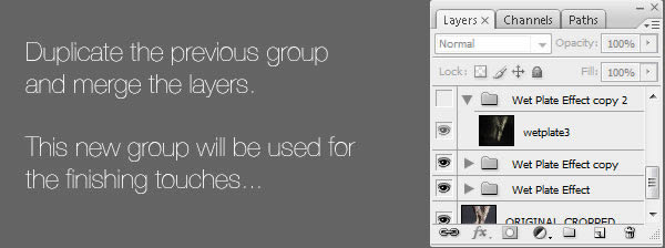
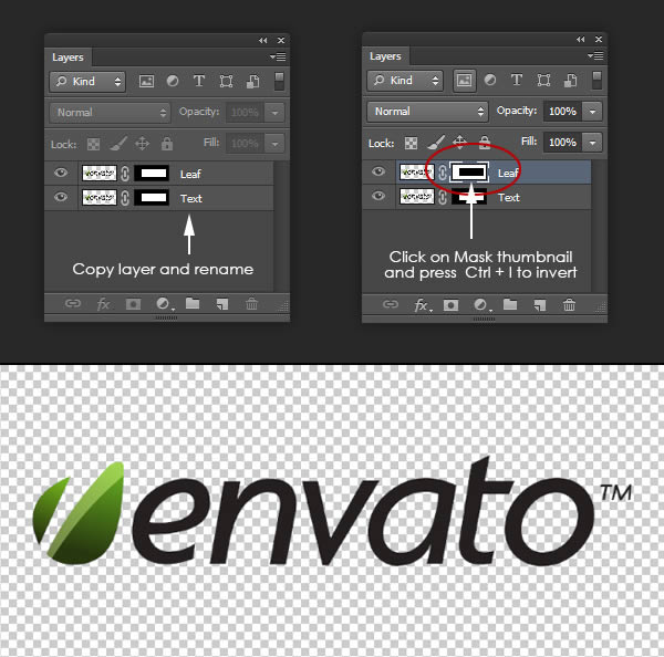
This tutorial will explain how to use Repoussé inside Photoshop CS5 to create an amazing 3D text effect, without the need for any other 3D software. Many different material values will be modified to accomplish the final result, and some adjustment layers will be used to enhance the outcome as well. Let’s get started!


Tutorial Assets

The following assets were used during the production of this tutorial.


Enabling OpenGL

The Repoussé will not work unless OpenGL is enabled. So go to Edit > Preferences > Performance, and make sure Enable OpenGL Drawing (under GPU Settings) is checked.

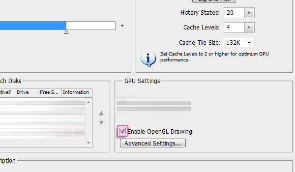
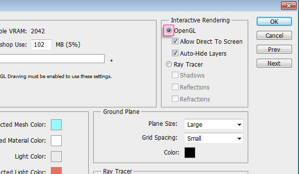
Also, go to Edit > Preferences > 3D, and make sure OpenGL (under Interactive Rendering) is enabled.


Step 1

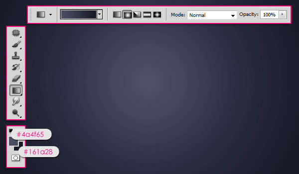
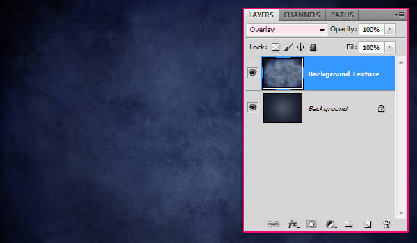
Create a new 1024 x 768 px document, or whatever size you need depending on the text you’ll be creating. Then, set the Foreground color to #4a4f65 and the Background color to #161a28, and fill the Background with a Radial Gradient (from the center to one of the corners).

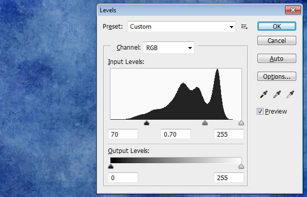
Open the More Grunge vi texture then go to Image > Adjustments > Levels, and change the Shadows value to 70 and the Gamma value to 0.70.

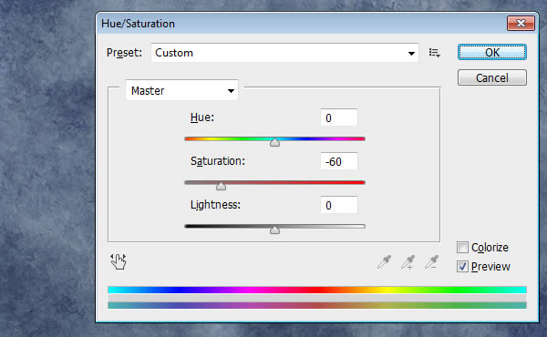
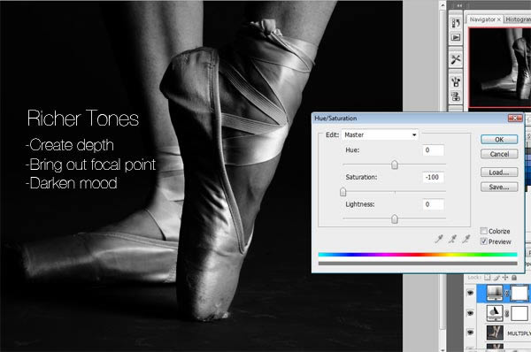
Go to Image > Adjustments > Hue/Saturation and change the Saturation value to -60.


Step 2

Place the texture on top of the gradient background layer and change its Blend Mode to Overlay, then resize it as needed.

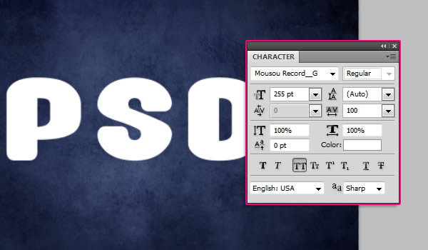
Create the text in All Caps using the font Mousou Record G and the color white. The size is 255 pt, and the Tracking value is set to 100 to create more space between the letters.


Step 3

Go to 3D > Repoussé > Text Layer. A dialog box will appear telling you that this will rasterize the type layer, and you will no longer be able to modify your text. So if you are sure you don’t need to modify your text, click yes and continue.

Under the Repoussé Shape Presets, choose Inflate Sides. Then, under Extrude change the Depth to 0.1, under Inflate change the Angle to 100 and the Strength to 0.05, and under Bevel, choose Front from the Sides drop down menu, set the Height to 30, the Width to 6, and choose the Cove – Deep Contour.

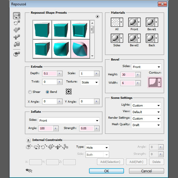
This will create the basic 3D shape of the text.

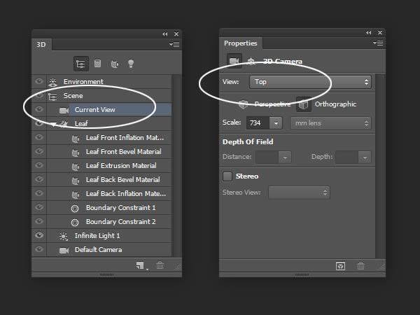
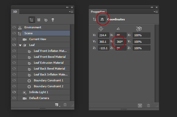
From the Toolbox, use the Camera Tools to change the camera (view) angle, as we don’t want to change the mesh’s position. Once you select the Camera Tool, you can click and drag to change the values, or you can simply use the 3D Axis to do so. And if you want you can enter some exact values in the Options bar Orientation fields.

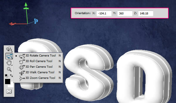
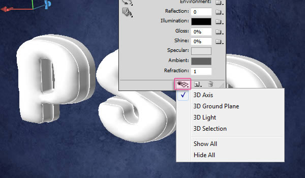
If you don’t see the 3D Axis you can get them by clicking the “Toggle misc 3D extras” icon down the 3D panel, then check the 3D Light option.

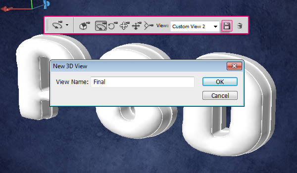
You can save the camera position as well, by clicking the “Save the current view” icon in the Options bar then entering a name for the view. The saved view will appear down the View drop down menu in the Options bar.


Step 4

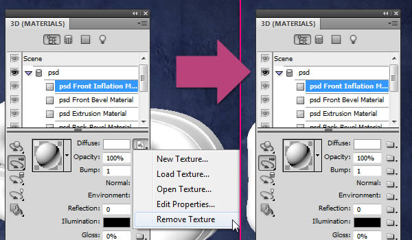
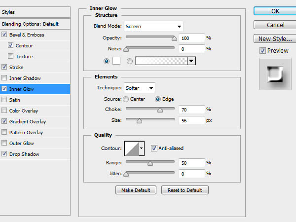
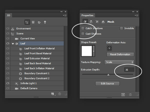
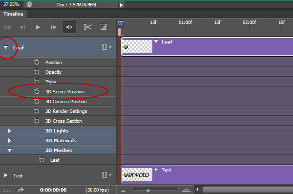
Now its time to apply the materials for each side of the mesh. First, you need to open the 3D panel (Window > 3D), then click the little arrow to the left of the mesh’s name to expand the materials list.

Select the Front Inflation Material to start modifying its values. First you need to get rid of the Diffuse texture if there is one. To do so, click the Diffuse texture icon, then choose Remove Texture. You’ll need to do the same thing for the other materials as well, as the texture might hide any applied colors.

Once you remove the texture, change the Reflection value to 25, the Illumination color to #323232, the Gloss to 80%, the Shine to 80%, the Specular color to #e7e7e7, and the Refraction value to 1.46.

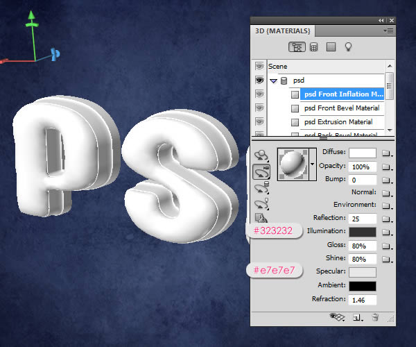
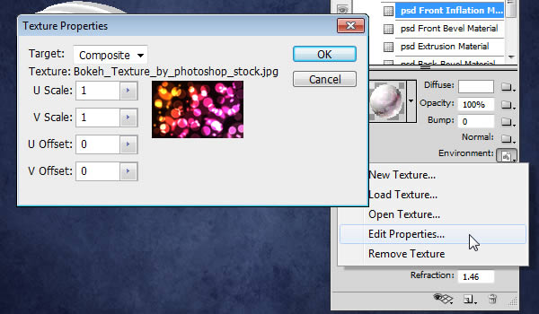
Click the folder icon next to Environment then choose Load Texture and add the Bokeh Texture. This texture will appear in the reflective areas of the material.

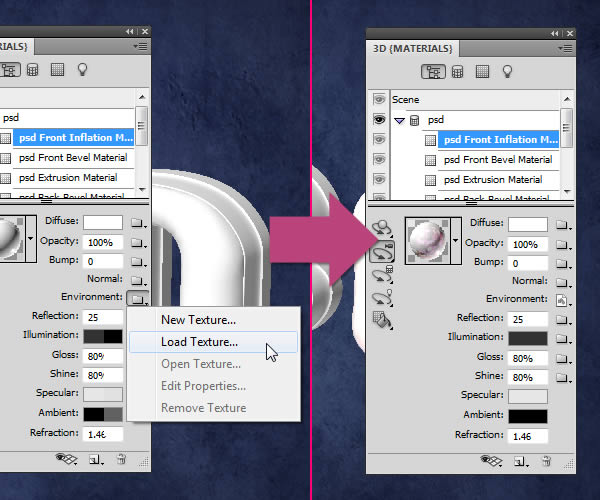
Click the Environment texture icon then choose Edit Properties, and make sure that the U Scale and V Scale are set to 1, and the U Offset and V Offset are set to 0.


Step 5

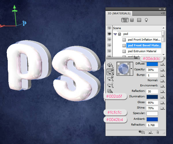
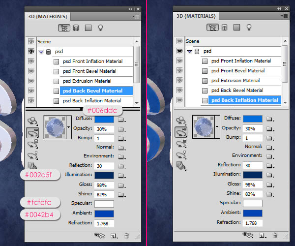
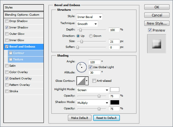
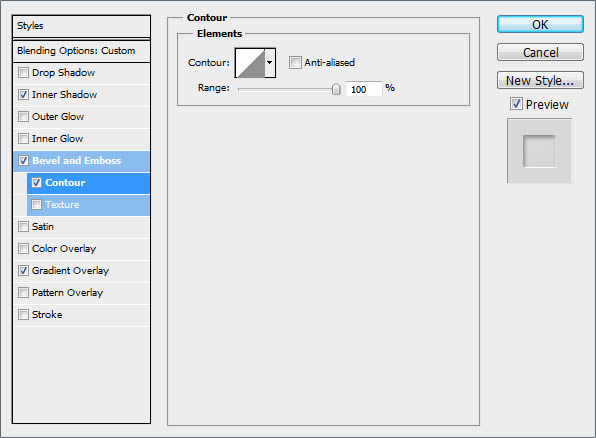
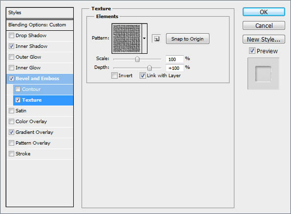
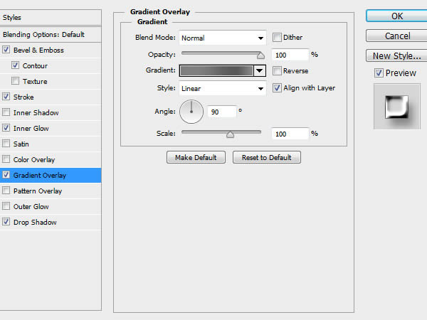
Select the Front Bevel Material, then change the Diffuse color to #006ddc, the Opacity to 30%, the Reflection to 30, the Illumination color to #002a5f, the Glow to 95%, the Shine to 70%, the Specular color to #fcfcfc, the Ambient color to #0042b4, and the Refraction to 1.768.

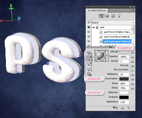
Select the Extrusion Material, then change the Diffuse color to #d4d3d2, use the Bokeh texture for the Environment, change the Reflection to 10, the Illumination color to #323232, the Glow to 80%, the Shine to 70%, the Specular color to #e7e7e7, and the Refraction to 1.25.

As for the Back Bevel Material, we will use the same colors used in the Front Bevel Material, and the same Opacity and Refraction values as well, then change the Glow to 98% and the Shine to 82%. Apply the exact same values for the Back Inflation Material too.


Step 6

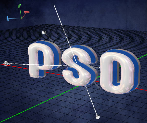
Click the “Toggle the misc 3D extras” icon down the 3D panel and check the “3D Light” option, and you can check the “3D Ground Plane” as well. This way you can see how the 3D lights are positioned in the scene.

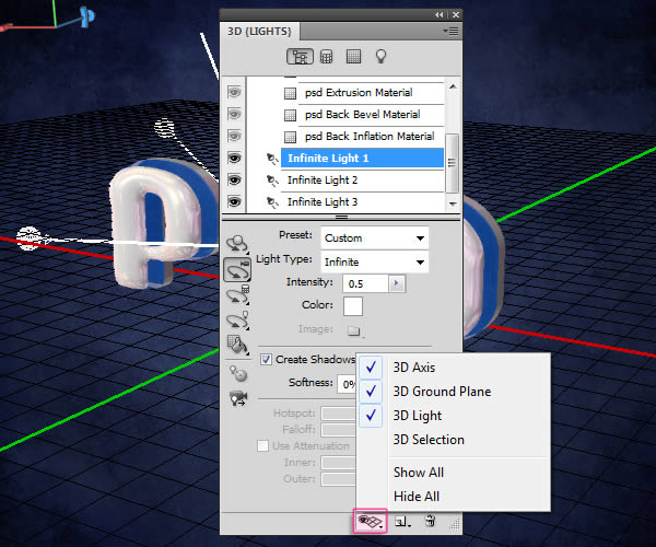
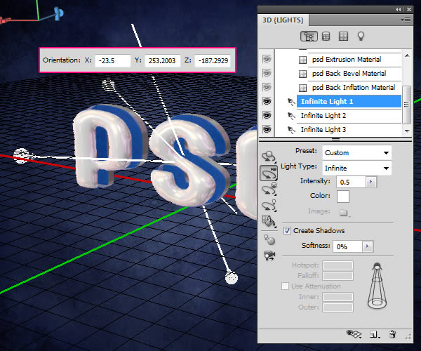
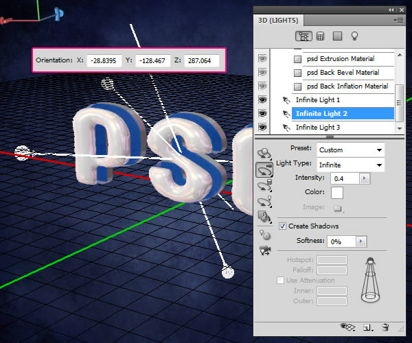
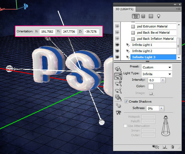
Scroll down under the Materials to select the lights. Use the Light Tools to move the lights around if you want, again, by clicking and dragging, using the 3D Axis, or just typing in the values in the Options bar.

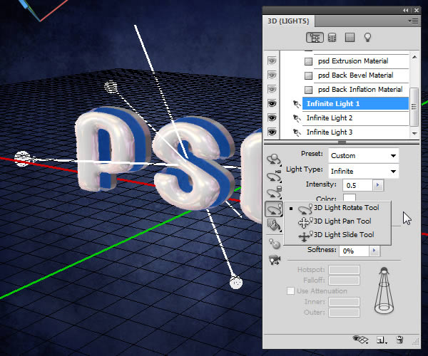
- Infinite Light 1: Make sure that the Intensity is 0.5.

- Infinite Light 2: Make sure that the Intensity is 0.4.

- Infinite Light 3: Make sure that the Intensity is 0.3.

You should get a result similar to this. Make sure that the lights are not super bright or too low.


Step 7

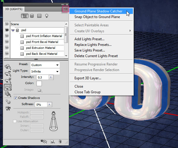
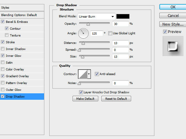
Click the pop-up menu arrow in the top right corner of the 3D Panel, then click the Ground Plane Shadow Catcher option, so that the shadows will be rendered without the need to create a surface to catch them.

Click Scene at the top of the 3D Panel, then choose Ray Traced Final from the Quality drop down menu.

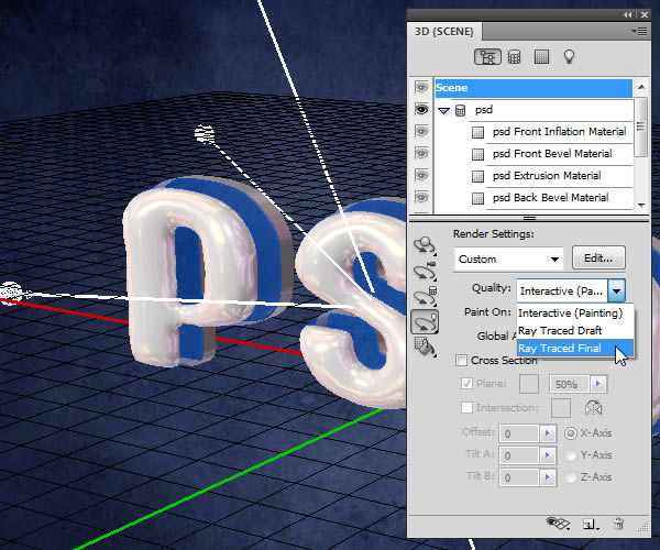
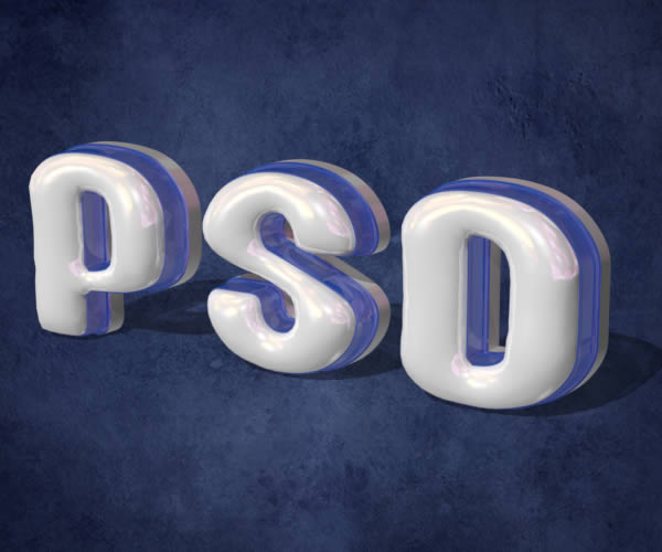
This might take a couple of hours, but this is what the rendered scene should look like.
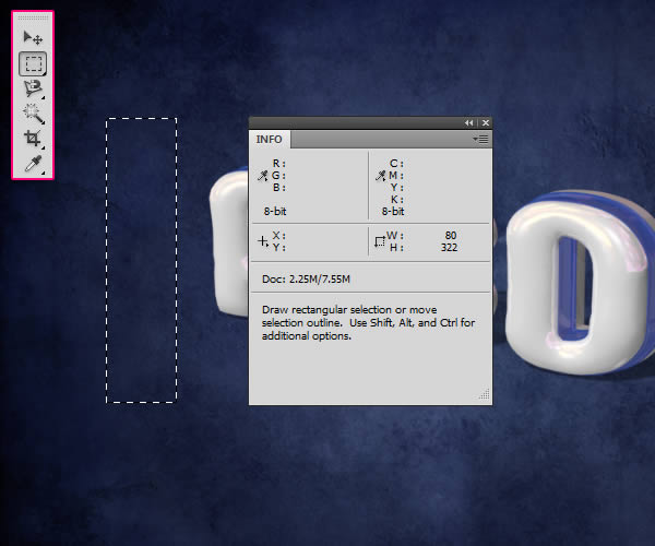

Step 8

Once the rendering is finished, pick the Rectangular Marquee Tool and draw a 80 x 322 px rectangle in any empty area, but try to keep the selection centered vertically. You can check the measurements in the Info panel (Window > Info), or you can create a Fixed Size selection.

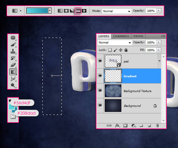
Create a new layer below the 3D layer and call it “Gradient”. Set the foreground color to #56d4df and the Background color to #208dad, pick the Gradient Tool, choose the Foreground to Background gradient, and click the Reflected Gradient icon in the Options bar. Then, click in the center of the selection and drag to one of the sides.

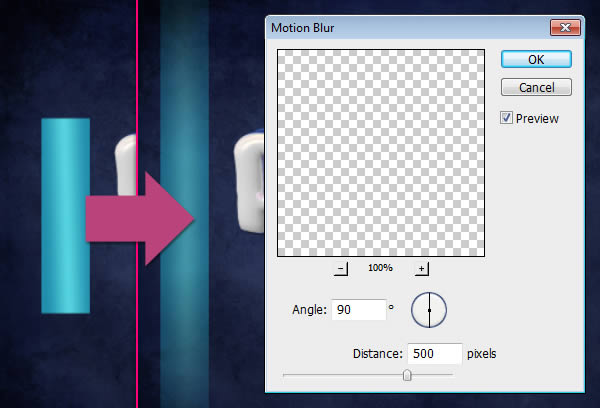
Go to Select > Deselect to get rid of the selection. Then go to Filter > Blur > Motion Blur, set the Angle to 90 and the Distance to 500.

Duplicate the Gradient layer then move the copy a bit to the right.
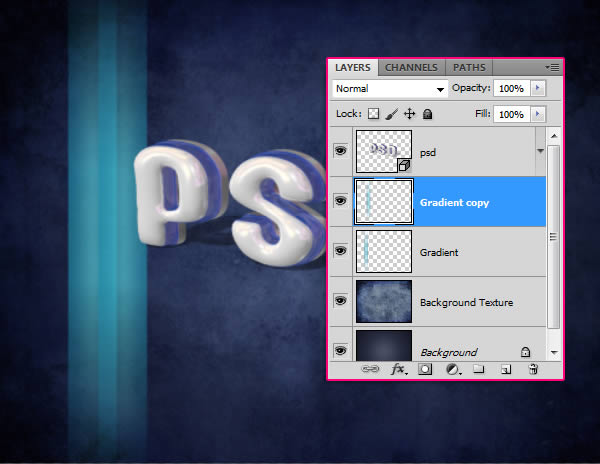

Step 9

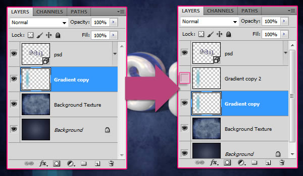
Select both Gradient layers, go to Layer > Merge Layers, then duplicate the new merged layer. Make the copy merged layer invisible by clicking the eye icon next to it.

Make sure that the visible Gradient layer is selected (active). Press Ctrl/Cmd + T to enter the Free Transform Mode, then press the Ctrl/Cmd key and move the corners of the gradient to create an illusion of a 3D background for the text.

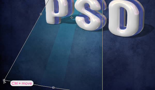
You might need to move the four corners to get the result you want. Once you’re done hit Enter/Return to get out of the Free Transform Mode. Make the copy Gradient layer visible again.

Do the same thing for the copy Gradient layer, except this time you’ll need to adjust it vertically so that it is perpendicular to the original Gradient. After that, merge the two gradient layers, and rename the merged layer to “Gradient Background”.


Step 10

Click the Create new fill or adjustment layer icon down the Layers panel and choose Hue/Saturation, and change the Hue value to 19 and the Saturation value to -50.

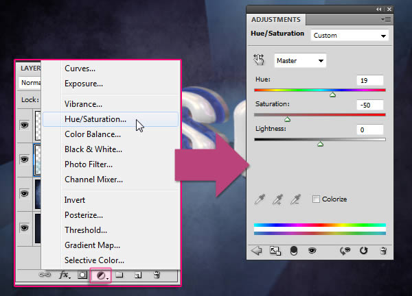
Make sure that the adjustment layer is below the 3D layer so that it affects all the layers except for the 3D text layer.


Step 11

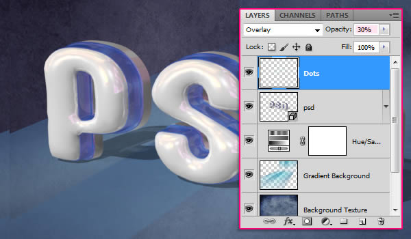
Set the Foreground color to #cbf6f4 and pick a 30 px soft round brush, then create a new layer on top of all layers, call it “Dots”, and change its Blend Mode to Overlay.

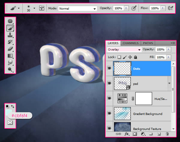
Start adding the bright dots along the blue part of the text.

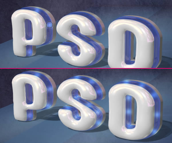
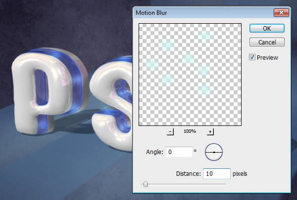
Go to Filter > Blur > Motion Blur, set the angle to 0 and the Distance to 10.

Change the “Dots” layer’s Opacity to 30%, or any other value you like depending on how bright you want the dots to be.
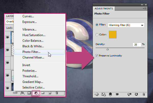
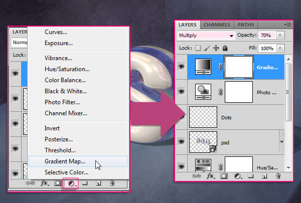

Step 12

Click the Create new fill or adjustment layer icon and choose Photo Filter, then select the Warming Filter (81).

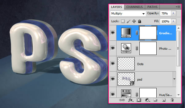
Click the Create new fill or adjustment layer icon once again and this time choose Gradient Map. Then change the adjustment layer’s Blend Mode to Multiply and the Opacity to 70%.

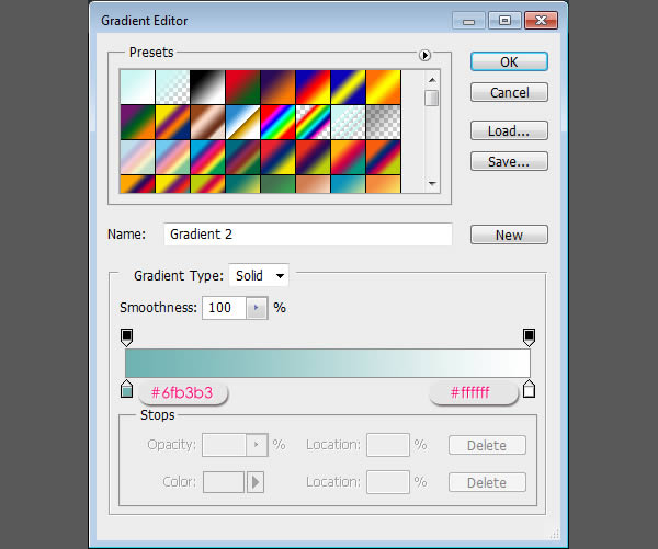
Click the Gradient box to assign the gradient colors.

Only two colors are used, the color #6fb3b3 to the left, and white (#ffffff) to the right.

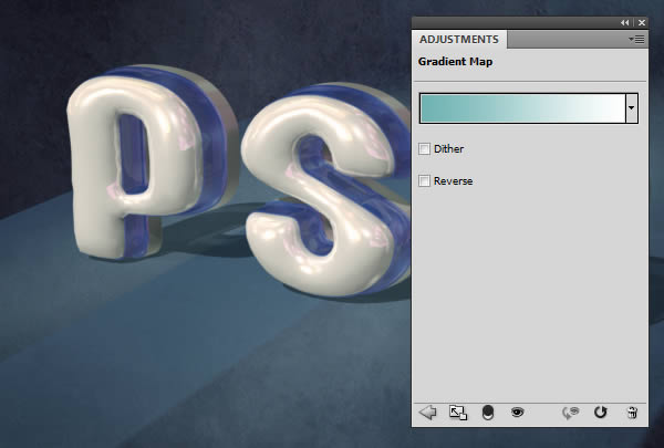
Make sure that the adjustment layers are on top of all layers. They will intensify the final effect colors and make them more vivid.
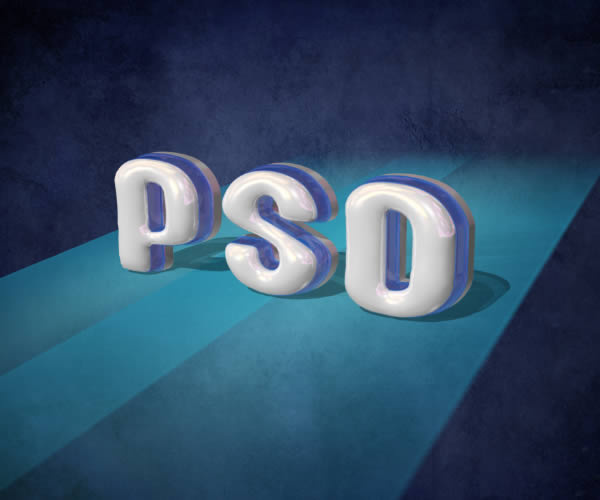
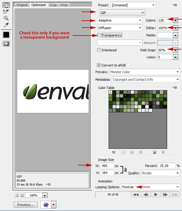

Final Image


Best of Tuts+ in June 2012

$
0
0

Each month, we bring together a selection of the best tutorials and articles from across the whole Tuts+ network. Whether you’d like to read the top posts from your favourite site, or would like to start learning something completely new, this is the best place to start!


Psdtuts+ — Photoshop Tutorials


Nettuts+ — Web Development Tutorials

  • Easy Package Management With Composer

    Easy Package Management With Composer

    Let’s face it: PHP has had a rocky history with package management, and as a result, it is pretty rare to find a developer who actively uses systems like PEAR. Instead, most developers have chosen their favorite framework, which has code specifically written for it to handle various things, like DB interaction, ORM's, OAuth, Amazon S3 integration, etc.

    Visit Article

  • Building Web Applications from Scratch with Laravel

    Building Web Applications from Scratch with Laravel

    In this Nettuts+ mini-series, we’ll build a web application from scratch, while diving into a great new PHP framework that’s rapidly picking up steam, called Laravel — a simple and elegant PHP 5.3 framework.

    Visit Article

  • So You Want to Accept Credit Cards Online?

    So You Want to Accept Credit Cards Online?

    Until recently, accepting credit cards on a website was expensive and complicated. But that was before Stripe: a radically different and insanely awesome credit card processing company. Today, I’ll show you how to start accepting cards in 30 minutes or less – without spending a dime.

    Visit Article


Vectortuts+ — Illustrator Tutorials


Webdesigntuts+ — Web Design Tutorials

  • A Beginner’s Guide to Wireframing

    A Beginner’s Guide to Wireframing

    Wireframing is an important step in any screen design process. It primarily allows you to define the information hierarchy of your design, making it easier for you to plan the layout according to how you want your user to process the information. If you’ve yet to use wireframing, it’s time to get your feet wet..

    Visit Article

  • Life Beyond 960px: Designing for Large Screens

    Life Beyond 960px: Designing for Large Screens

    The premise behind a responsive web isn’t purely that websites be built in a mobile-friendly way. It’s about setting our content free so that it can be experienced by whatever means necessary – and that includes at large scale. Let’s take a look at the design considerations behind the often neglected huge desktop screen.

    Visit Article

  • Create a Parallax Scrolling Website Using Stellar.js

    Create a Parallax Scrolling Website Using Stellar.js

    One of the biggest trends in recent modern web design is use of parallax scrolling effects. In this tutorial I’m going to show you how you can create the effect on your own website, with a bit of imagination and a little help from Stellar.js.

    Visit Article


Phototuts+ — Photography Tutorials


Cgtuts+ — Computer Graphics Tutorials

  • Modeling Tips & Tricks For New Artists

    Modeling Tips & Tricks For New Artists

    Today we’re bringing you something a little different. Rather then a tutorial covering a specific topic, we have a series of short videos covering various modeling tips from author Shaun Keenan. These videos are aimed at users who are relatively new to modeling or CG in general, and cover a wide range of topics ranging from breaking down facial geometry and cutting holes in meshes, to the importance of reference, and the benefits of developing your own asset library. If you’re new to CG or just want to improve your personal workflow, this is a great opportunity to get valuable tips from a CG professional!

    Visit Article

  • Sculpt, Pose and PolyPaint a Cartoon Squid in ZBrush

    Sculpt, Pose and PolyPaint a Cartoon Squid in ZBrush

    We’re kicking the week off with a great new ZBrush tutorial from Shaun Keenan. This tutorial will show you how to create a toon style Squid character from scratch in ZBrush. You’ll learn how to quickly block out the character’s base mesh using the awesomeness that is ZSpheres, and further refine and detail the character using various brushes and alphas. Finally you’ll paint everything up and make it look sexy with ZBrush’s polypainting tools!

    Visit Article

  • Create A Cool Animated Disco Ball with Cinema 4D & After Effects

    Create A Cool Animated Disco Ball with Cinema 4D & After Effects

    In this tutorial we are going to create a disco ball inside cinema 4D with a few clicks using simple yet powerful tools. After that we are going to render out the disco ball and look at how to composite it in After Effects, add some nice light rays and glows to make it look really great.

    Visit Article


Aetuts+ — After Effects Tutorials

  • Crash Dummy Character Rigging Using Newton

    Crash Dummy Character Rigging Using Newton

    In this tutorial, we’re going to take the Newton plugin created by Motion Boutique and use it to create a rigid body character in After Effects. Newton is a 2D physics simulator that allows users to apply various simulations like gravity, collision, and bounce to their layers in After Effects.

    We’ll start with the basic principles of how Newton works and how to setup a character rig using it, then dive into various case studies demonstrating ways to use the character rig.

    Visit Article

  • How To Create An Artistic Time Offset Effect

    How To Create An Artistic Time Offset Effect

    In this tutorial we will have a look at offsetting a video in time through a grid. To achieve this we will use an expression controlled by a slider. I used this technique on the music video “Big Pink – Hit the ground” Directed by Tim Brown, Post-Production by Mainframe. Hope you enjoy it.

    Visit Article

  • A Focused Look Motion Blur In After Effects

    A Focused Look Motion Blur In After Effects

    In this tutorial we will be discussing ways to fake motion blur using After Effects’ default Motion Blur feature, Force Motion Blur plug-ins, Radial Blurs, and Motion Vectors. We’re going to move quickly so hopefully everything stays clear. :)

    Visit Article


Audiotuts+ — Audio & Production Tutorials

  • Reverb For A Better Tomorrow

    Reverb For A Better Tomorrow

    Here is something to try if you want to spice up your reverb. I’ve become very interested recently in finding ways to make computer/MIDI based productions sound organic and create some of the nonlinear feel that live recordings and real instruments have. Whether you feel this is a worthwhile detail to add is up to you, but it only takes a few minutes to set up and is a good example of ‘thinking outside the box’ that will hopefully promote your having some creative ideas of your own.

    Visit Article

  • How To Produce Dynamic Top Loops

    How To Produce Dynamic Top Loops

    Sometimes your basic drum pattern just needs some extra spice to bring it up to speed. Adding programmed percussion, or even percussion loops can often be a great solution. Personally I like to mix contrasting drum loops and patterns to get interesting cross rhythms.

    Visit Article

  • Critique: Green’s the Color of Winter

    Critique: Green’s the Color of Winter

    Here in the United States, this song would fall under the category of Americana/folk and it fits well into the category. It is the kind of song that lends itself to a simple and acoustic production. I enjoyed the evocative and wintery feeling of the piece. My opinions are based on countless meetings with music publishers, A and R people, co-writing experiences, and just a lot of years writing professionally in Nashville.

    Visit Article


Activetuts+ — Flash, Flex & ActionScript Tutorials

  • Using the Kongregate API in Your Flash Games

    Using the Kongregate API in Your Flash Games

    Kongregate is one of the largest Flash game portals on the net, and has its own API that can be integrated into your games (for which Kongregate even rewards you financially). In this tutorial, I’ll show you how to implement the Kongregate API into your games, and also go into detail about what the API is capable of and why you should use it.

    Visit Article

  • Getting Started With Unity – Finishing Our Game With a Menu

    Getting Started With Unity – Finishing Our Game With a Menu

    There are several methods used to produce menus within Unity, the main two being the built in GUI system and using GameObjects with Colliders that respond to interactions with the mouse. Unity’s GUI system can be tricky to work with so we’re going to use the GameObject approach which I think is also a bit more fun for what we’re trying to achieve here.

    Visit Article

  • Drawing Activetuts+ to a Close

    Drawing Activetuts+ to a Close

    Activetuts+ launched in 2009 with the aim of teaching how to build websites, apps, animations, and interfaces in Flash. Much has changed in the industry over the past few years, and Activetuts+ has evolved several times to continue teaching relevant content.

    Visit Article


Wptuts+ — WordPress Tutorials


Mobiletuts+ — Mobile Development Tutorials

  • Build an Exercise Tracking App: Geolocation & Tracking

    Build an Exercise Tracking App: Geolocation & Tracking

    Want to learn how to write a complete mobile application using PhoneGap, but don’t know how to get started? Follow this two-part tutorial series and I’ll show you how to build a mobile app that tracks, records, and maps your exercise route using the GPS features on your phone!

    Visit Article

  • Reading & Displaying PDF Documents

    Reading & Displaying PDF Documents

    Working with raw PDF documents can be a time consuming and frustrating task. This tutorial will teach you how to use the VFR Library to quickly access, display, and browse PDF documents within your own applications!

    Visit Article

  • Android SDK: Build a Speak and Repeat App

    Android SDK: Build a Speak and Repeat App

    The Android platform provides support for both speech recognition and speech synthesis. In this tutorial, we will create a simple Android app which allows the user to speak, attempts to recognize what they say, and then repeats what was recognized back to them using the Text To Speech engine.

    Visit Article


Ready, Set, Actions

$
0
0

Actions save you time by automating tasks that you perform often. This tutorial is the first part in a new mini-series that will explain Photoshop actions and automation techniques. In this video we will introduce you to actions and explain how they work. Let’s get started!


The Comprehensive Guide to Bevel and Emboss

$
0
0

Photoshop layer styles are a popular way to add effects, such as drop shadows and strokes, to layers in a non-destructive way. With the right knowledge and experience, any effect can be achieved. To achieve these effects, however, you need to understand what each setting does and how they can be combined to achieve a certain look. In this series by John Shaver from Design Panoply, we will explain every aspect of Photoshop’s layer styles feature and show you how to unlock their potential.

In this article, Part 6: The Comprehensive Guide to Bevel and Emboss, we will explain the settings behind Bevel and Emboss, including Contour and Texture, and how they can be used. Let’s take a look!


The Uses For Bevel and Emboss

Bevel and Emboss is often considered the most powerful and adaptable tools within Photoshop Layer Styles.

The traditional use for Bevel and Emboss is to make something look more 3-dimensional by adding highlights and shadows to different parts of your layer, but it doesn’t stop there.

With some special consideration and careful tweaks, you can create styles ranging from reflective chrome and refractive glass to chiseled stone and subtle letterpress graphics.


The Layer Styles Bevel and Emboss Dialog Boxes

The Bevel and Emboss dialog boxes are shown below, giving us a slew of new options. These will allow to set things like bevel height, lighting direction, texture map, and more.


Style

The Style dropdown is where you set the style/location of your bevel and includes the following options:

  • Outer Bevel: This applies the bevel to the outside of the shape you are applying it to
  • Inner Bevel: This applies the bevel to the inside of the shape you are applying it to
  • Emboss: This applies the bevel to both the outside, and the inside of the shape you are applying it to
  • Pillow Emboss: This applies the bevel to both the outside and inside of the shape you are applying it to, but in opposite directions
  • Stroke Emboss: This only works when you also have a stroke effect applied to your layer, and applies the bevel only to the stroke

It may seem confusing, but simply scrolling through the different Style settings with the Preview box checked will quickly show you how they each work.

In the following example, you can see that with Inner Bevel applied, it only affects the inside of the shape. With the Emboss style applied, the Bevel and Emboss affects both the inside and outside of the shape.


Technique

The Technique dropdown menu allows you to set the overall shape of the Bevel and Emboss and includes the following options:

  • Smooth: This setting creates a smooth, rounded edge bevel
  • Chisel Hard: This setting creates a hard, chiseled edge bevel
  • Chisel Soft: This setting creates a rougher, chiseled edge bevel

Again, the best way to see the difference is to scroll through the settings with the Preview box checked.

In the following example, you can see that text on the left is more smooth while the text on the right looks like it has been chiseled out of stone.


Depth

The depth slider increases or decreases the apparent depth of the Bevel and Emboss. A lower number creates a less visible 3D effect while a higher number makes it more dramatic.

In the following example, you can see how increasing the Depth makes the text look more 3-dimensional.


Direction

The Direction radio buttons simply let you choose whether you want your Bevel and Emboss to appear to be extruded towards you, or away from you.

In the following example, you can see how the "up" text appear to come out of the page, while the "down" text appears to sink into the page.


Size

The Size slider sets the overall size of the Bevel and Emboss. A lower number creates a smaller effect that stays closer to the edges of your shape, while a larger number increases the Bevel and Emboss coverage to a bigger area of your shape.

In the following example, the text on the left has a smaller bevel while the one on the right covers much more of the text.


Soften

The Soften slider allows you to soften any hard edges created by your Bevel and Emboss. It can be helpful in creating soft and squishy looking styles.

In the following example, you can see that increasing the Soften parameter helps us to create a much softer looking surface.


Angle and Altitude

The Angle and Altitude area is where you set the position of your light. The Angle sets the horizontal position of your light source, and the Altitude sets the vertical position, or apparent height of your light source. You can also drag the small crosshair around to edit your light source without having to use numeric values.

Checking the "Use Global Light" checkbox will sync these settings with any other lighting related settings in your document like Inner and Outer Shadow.

In the following example, you can see how changing the Angle and Altitude settings affects the perceived location of our light source.


Gloss Contour

Gloss contour is the secret to creating great glass and metal effects.

The Gloss Contour sets the falloff of the shadows and highlights within our Bevel and Emboss. A linear contour creates a natural looking falloff, while choosing something like a "sine wave" style contour can create cool, reflective effects.

In addition, the Anti-aliased checkbox will smooth out any jagged edges within your gloss if it is desired.

In the following example, you can see how the text on the left looks nothing like metal, but by changing the Gloss Contour, it begins to look more realistic.


Highlight Mode and Opacity

There are two parts to lighting, highlights and shadows.

The Highlight Mode dropdown is where you set the blend mode for your highlights. Screen is the default setting, but you can also try Linear Dodge (Add), and Color Dodge for more dramatic effects.

This is also where you set your highlight color. Most of the time you will leave it at white, but if you want to simulate different color light sources, you can change the highlight to have a tint of color.

The Opacity slider adjusts the intensity of your highlight edges.

In the following example you can see how changing the Highlight Mode, Color, and Opacity gives our style a slightly different, warmer look.


Shadow Mode and Opacity

The Shadow Mode dropdown is where you set the blend mode for your shadows. Multiply is the default setting, but you can also try Linear Burn or Color Burn for more dramatic effects.

This is also where you set your shadow color. Most of the time you will leave it at black, but you can also achieve other subtle effects by using different tints of color.

The Opacity slider adjusts the intensity of your shadows.

In the following example you can see how changing the Shadow Color and Opacity gives our wood style a subtle "mossy" look.


Saving And Loading Default Settings

You can save and load default settings for each effect in the Layer Styles dialog box. By clicking "Make Default", Photoshop will store whatever settings are currently active as the new default settings for that effect.

By clicking "Reset to Default", Photoshop will then load whatever settings were last saved. This allows you to experiment and simply reload custom default settings if you want to start over.


Contour

The Contour sub-section under Bevel and Emboss allows you to set the overall shape of your bevel. Checking the Anti-aliased checkbox smooths out your Contour, and the Range slider allows you to set the overall coverage of your bevel that you want your chosen contour to apply to.

This is another setting that is easier seen than said.

In the following example you can see how changing the Contour to aninverted "U" shape gives our text an indented type of bevel.


Texture

The Texture sub-section under Bevel and Emboss allows you to add a bump map to your style. A bump map makes the surface of your layer to appear higher or lower, giving us the ability to create special effects.

The Pattern area allows us to choose a pattern from Photoshop’s Patterns Palette to use as a bump map. Click the Snap to Origin button to align the Pattern to the origin of your document. You can also click the small "New" icon to create a new preset from your currently select Pattern.

The Scale slider lets you increase or decrease the size of your pattern, and the Depth slider changes the apparent depth of your bump map.

You can check the Invert checkbox to invert your pattern, make white areas black and black areas white.

Lastly, the Link with Layer checkbox locks the Pattern to your layer, so that if you move your layer around after closing the Layer Styles dialog box, the Pattern moves with it.

When the Layer Styles dialog box is open to the Contour sub-section, you can also drag the Pattern around on your canvas to position it manually.

In the following example you can see how adding a Pattern to our style can create a dramatically different looking effect. Since the Depth is set to "0" for the text on the left, the Pattern does not affect our style.


One For The Road

Until next time, this free, exclusive layer style and accompanying .PSD will help you dissect how all the different Bevel and Emboss settings can change the look of your images.


Quick Tip: Create a Wet Plate Photo Effect in Photoshop

$
0
0

Recently we showed you how to replicate quick tintype photos. In this tutorial, you’ll learn how to recreate its sister technique, wet plate photography, for an intriguing yet timeless photo effect.


Tutorial Assets

The following assets were used during the production of this tutorial.


Wet Plate History

Collodion wet plate photography is an extensive process where a glass plate is prepared with several chemical solutions, transferred to a camera to expose, and then developed quickly all before it dries. This technique was used in the early 19th century to produce exquisite black and white photos with incredible detail.

Research

Wet plate photos vary in composition and detail according to the photographer’s preferences and its overall exposure time. Because each photo is unique, it’s important to treat each photo individually by applying only the attributes of the technique in Photoshop. Study the history, process, as well as dozens of examples before attempting digitally to avoid copying the effect of just one photo reference.

Attributes of Wet Plate Photos

Here are some characteristics of wet plate photography to keep in mind:

  • Wet plates are generally gray scale (no pure whites).
  • Chemicals may produce tinted photo with red, yellow, or blue undertones.
  • Streaks where the chemicals drip off are common.
  • The imperfections in each photo caused by debris, scratches, and changes in chemical reaction are what make them unique.

Step 1

Open the stock photo of the ballet shoes in Photoshop. Since the collodion technique is often used to produce haunting photos I chose this stock because I thought it would be great for creating a similar mood. Think about a possible story behind your photo, and how it will affect the overall composition as you work on it. Feel free to add notes beforehand to remind yourself which qualities of wet plate will work best for your particular reference.


Step 2

Let’s focus more on the tension and elegance of the ballet shoes by cropping the photo. Grab the crop tool and crop it so that there is roughly an equal amount of space from the top of the shoe to the bottom. Never be afraid to crop or alter a stock photo to better suit the desired composition.


Step 3

I always like to keep a copy of the original to flip back to every now and then. Duplicate the original photo, place it into a group, and name the group” Wet Plate Effect.” This will be the new group where the effects take place.


Step 4

Under the new group, right-click the copy of the original layer and duplicate it twice. Keep the bottom layer normal while you set the second layer to Hard Light, and the top layer to Multiply. The original photo is too light to work in grayscale just yet, so we want to make the tones of the photo richer before applying the black and white effect.


Step 5

Changing the color balance also helps us get more of the tonal quality we want. Go to Layer > New Adjustment Layer > Color balance and add the following properties to the Midtones, Shadows, and Highlights options. The colors are saturated in blues for now, but this option will help us later by improving tonal value.


Step 6

Now it’s time to work in grayscale. Add a new adjustment layer for Hue/Saturation and bring the saturation down to -100.


Step 7

Add a new layer above the Hue/Saturation layer. Using a low opacity, large round brush with a hardness of 0%, apply soft black shadows to the scene to emphasize the front foot. This also creates a softer transition of tones between the feet. Adjust the layer opacity by bringing it down to 92%.


Step 8

Add a new transparent layer. Using the same brush settings, select the color #939393 and build soft strokes of gray to the back foot and leg. Bring the opacity of the layer down to 50%. This technique in combination with the previous step will help to create the soft muted tones often associated with wet plate photography. Feel free to either use the Eraser Tool (E) or the layer opacity to create the desired effect for both layers.


Step 9

Add a new transparent layer. This will be used in experimenting with the smudges caused by the collodion chemical reaction. Using the same gray color (#939393) as before, apply the color to the lower right corner using a round brush with a 70px diameter, 75% hardness, and 60% opacity. Consider this the start of experimentation with the border of your “wet plate” photo. By setting the layer to Linear Light and lowering the opacity to 84%, we’ve created a soft “wet” look.


Step 10

Not all wet plates are black and white. Sometimes the chemicals create red, blue, or yellow undertones. For this tinted effect, add a new layer and fill it with the color #938e5a. Bring the opacity of the layer down to 70% and set it to Multiply. Now let’s add some texture to the photo. Create another layer and fill it with the same gray color used previously. Go to Filter > Noise > Add Noise and add an amount of 200% to the layer. Drag the Noise layer underneath the Hue/Saturation adjustment layer so that the color doesn’t show through. Set the layer to darken and bring down the opacity to 18%.


Step 11

Now let’s work on the contrast between the front and back shoe. Select the “Original copy” layer and use the Polygonal Lasso Tool (L) to trace around the entire back leg. Copy and paste the leg onto a new layer and set it to Linear Dodge. This effect makes the back leg look a little overexposed while the front leg retains its clarity.


Step 12

Right-click the “Wet Plate Effect” group and duplicate it. Now in the “Wet Plate Effect copy” group, select all the layers and merge them together. Rename the merged layer to “wetplate2.” In wet plate photography there is often a blur that moves outward from the focal point. In this case the front ballet shoe is our focal point. So right-click the “wetplate2” layer and duplicate it. Go to Filter > Blur > Motion Blur and set the angle to -90 degrees and the distance to 16 pixels. Using a large, high opacity eraser brush with a hardness of 0%, erase along the side of the ballet shoe where the bands and skin meet. This allows the layer underneath to show through to retain enough detail.


Step 13

Add a new adjustment layer for Brightness and Contrast. Set the Brightness to +91. Use a large, soft eraser brush and erase over the two large pockets of shadow on either side of the front shoe.


Step 14

Select the “Wet Plate Effect copy” group and right-click to duplicate. Just as before, select all the layers now in the “Wet Plate Effect copy 2” group and merge them together. Rename the merged layer “wetplate3.” This group will be used for the finishing touches to the photo.


Step 15

As we finish the photo we’ll continue tweaking the composition to fit the mood. Currently there is too much rich shadow to the right of the focal point. Add a new layer above “wetplate3” and fill it with the color #1d1d16. Bring the layer opacity down to 35% and use a large soft eraser brush to erase towards the left of the front ballet shoe.


Step 16

As mentioned before, one of the characteristics of wet plate photography is the streaks from where the chemicals run off. To achieve this look, paste the “MetalLeaking0033” texture from CG Textures onto a new layer. Use the Free Transform tool to adjust the texture so that the leaking effect stretches across the canvas. To achieve a subtle effect, set the layer to Linear Dodge and bring down the opacity to 2%.


Step 17

Since the overall composition is a little on the dark side, add a new layer above the texture and fill it with white. Set the layer to Overlay and bring down the opacity to 30% to brighten the photo. Notice how the mood is dramatically different from our first steps.


Step 18

These last steps will add character to our piece. Though the front ballet shoe stands out well, the tone is just a tad off from where it needs to be. Add a new layer and use a soft round brush to apply a gray color to the shoe. Set the layer to Luminosity and bring down the layer opacity to 18%.


Step 19

The imperfections during the exposure and developing process are what make each wet plate photo unique. Set the foreground color to #f4f4c9. Take a hard round brush and set it to Pen Pressure for use with your tablet. Begin building organic, low opacity shapes, by swiping the brush across the screen. Create specs and scratches by varying your pen pressure. Utilize the Eraser Tool (E) to soften or omit shapes as you see fit. Experiment until you find what works. After, bring the layer opacity down to 14%.


Step 20

To finish this effect, let’s add a hint of a border. Add a new layer and use the same brush settings to apply black strokes along the left, right, and bottom edges of the photo. Use a soft eraser brush to soften the edges for a smooth transition.


Conclusion

You can now create your own timeless photo without all the mess or smelly chemicals. Allow yourself room for experimentation and the time to study the true characteristics of this historic technique.


The Commercial Artwork and Photo Manipulations of Andric

$
0
0

Each week, we feature the work of some of our favorite artists and designers for you to enjoy. In this article, we will showcase the work of Andric, an artist with a talent for producing excellent commercial artwork and photo manipulations. Let’s take a look!


Create Stunning "Iron Man" Fan Art From Scratch in Photoshop – Tuts+ Premium Tutorial

$
0
0

In this Tuts+ Premium tutorial by author, Sheridan Johns we will explain how to create stunning "Iron Man" fan art in Photoshop using digital painting techniques. This tutorial will begin as a sketch and then show how to slowly build up your artwork to create realistic metallic objects. We will then incorporate some photographic elements such as smoke and sparks to enhance the overall realism of the piece. This tutorial is available exclusively to Tuts+ Premium Members. If you are looking to take your photo manipulation skills to the next level then Log in or Join Now to get started!

Tuts+ Premium Members can login now for instant access to this tutorial. Membership to Tuts+ Premium gets you access to hundreds of exclusive premium tutorials, top selling ebooks, in-depth courses, member forums, and much more. To learn more about Tuts+ Premium, Take the Tour or Join Today.


Announcing Mactuts+ — Mac & OS X Tutorials, Guides & How To’s!

$
0
0

We’re excited to let you know about the latest addition to the Tuts+ family — Mactuts+!

Mactuts+ is focused on teaching you how to use your Mac more effectively, efficiently, and powerfully. You’ll learn about the basics of OS X, how to switch, how to use accessories and time-saving software, work with your Mac in an enterprise setting, and how to save time with advanced productive tips and tricks.

Read on to find out more, and learn about our $1,000 competition!


What to Expect on Mactuts+

Mactuts+ is focused on teaching you how to use your Mac more effectively, efficiently, and powerfully. We’ll be covering a wide range of different techniques, and offering advice on everything from customising your desktop and using OS X, to automating complex tasks and delving into Terminal. So whether you’re completely new to OS X or you’re a seasoned pro, we’ve got you covered!

We’ll be publishing a combination of step-by-step written tutorials and screencasts/video lessons. In most weeks we’ll be publishing 4-5 high quality tutorials, so make sure to subscribe to the Mactuts+ RSS feed so you don’t miss a thing.

If you think you have the skills to create a screencast or text and image tutorial for Mactuts+, it’s easy to familiarize yourself with the guidelines and pitch your idea. We’re hungry for user contributions and pay great money for tutorials.


Win $1,000 — Submit Your Tips & Tricks!

We’re excited to let you know about our Mactuts+ launch competition, giving you the chance to win $1,000 to put towards a new Mac! You just need to submit a short screencast that showcases your favourite OS X tip, trick, or shortcut.

We’d love to find out more about how you use your Mac productively, and discover the tips and tricks that help to speed up your workflow. These might be related to a particular app, something built into OS X, an automator action, terminal command, or anything else!

Find out how to enter


Subscribe, Follow & Stay Up To Date

Don’t forget to follow Mactuts+ on Twitter, Facebook, and everywhere else! Here’s how to keep up to date with what’s going on:


Our First Few Posts…

If you’d like to delve straight into the content, here are a few quick links to our first handful of posts on Mactuts+. We hope you find them useful — it’s a good taster of what’s to come!

  • Preparing Your Mac for Mountain Lion

    Preparing Your Mac for Mountain Lion

    Apples next big operating system is set to release in the middle of this month and its likely that youll be one of the many users who are upgrading from Snow Leopard or Lion. Its not surprising, either, because there are a lot of great features in this update and its going to be the same price for users of either of the aforementioned versions. In light of that, why not update to version 10.8, Mountain Lion?

    Visit Article

  • 4 Easy Ways to Automate Your Mac’s Schedule

    Easy Ways to Automate Your Mac’s Schedule

    Your Mac comes with lots of ways to schedule tasks, but not all of it’s ready to go out of the box. Beyond automated maintenance, OS X has a lot going for it, but you have to put in a bit of elbow grease to get everything working how you want it and on your schedule.

    Visit Article

  • How To Migrate All of Your Important Data To Your New Mac

    How To Migrate All of Your Important Data To Your New Mac

    We recently saw another WWDC come and go and despite little to no progress in the desktop area, the MacBooks all received nice upgrades. This means there’s a fresh crop of users transitioning to a brand new machine, a task which always brings with it a decent number of questions.

    Visit Article


How to Save and Edit an Action in Photoshop

$
0
0

Actions may be able to records a complicated series of steps but that doesn’t mean that they are complicated to use. In fact, actions are quite easy to use. In this tutorial we will explain how to save, and then edit a long series of steps using actions. Let’s get started!


Create a Retro Chrome Automobile Emblem in Photoshop

$
0
0

By combining certain fonts and styles, you can create graphics reminiscent of the automobile emblems of the 1950′s, also known as Brightwork. In this tutorial we will show you how to create a reflective, retro chrome emblem using Photoshop layer styles and a few selection tricks. Let’s get started.

This tutorial was sponsored by our friends at Fontbros.


Tutorial Assets

The following assets were used during the production of this tutorial.


Step 1

The first thing we’re going to do is create our background. Create a new document, ours is 1920 x 1280, and unlock the background layer.

It doesn’t matter what color it is, because we are going to override that color using layer styles.

Double click the name of your background layer in the Layers palette to open the layer styles dialog box. Apply the following layer styles settings, using a medium red to dark red gradient for the Gradient Overlay.

You should end up with something similar to the image below.


Step 2

Using the pen tool, draw a black shape with a jagged line across the top as a new layer. This shape is going to be used to simulate the reflection of mountains in the distance.


Step 3

Change the Fill to 0% in the Layers palette, and apply the following layer style settings.

You should end up with an image similar to the one below.


Step 4

Create a new layer and fill it with white. With your new layer selected, Command/Ctrl + Click the vector mask icon for your mountain reflection shape in the Layers palette to make a selection of your shape.

Press Delete to delete that portion from your new white layer, leaving you with the image below.

Set the fill to 0% in the Layers palette and apply the following layer style settings to achieve the result below.


Step 5

Now that we have a nice reflective, red car paint effect, it’s time to create our emblem.

Draw an oval shape using the Ellipse tool, set the Fill to 0% in the Layers palette, and apply the following layer style settings to achieve the result below. The Inner Shadow effect will be used to simulate the shadow of our chrome border when we create it later.


Step 6

Duplicate your oval layer, clear the layer style settings, set the Fill to 0% in the Layers palette, and apply a black outer stroke of 25px.

Right click the layer in the Layer palette and click Convert to Smart Object. This will allow us to style the stroke as a shape, while giving us the ability to edit the thickness later on.


Step 7

Apply the following layer style settings to your newly created Smart Object to give it a chrome effect.


Step 8

Next we will create a mountain shape to reflect within our oval.

Create a new layer without anything in it. With your new layer still selected, Command/Ctrl + Click the thumbnail of your Oval shape in the Layers palette to make an oval selection. Next, Command/Ctrl + ALT + Click the white layer you created as a negative of your original mountain shape. This will subtract that shape from your selection.

Fill your selection with black and apply the following layer style settings to achieve the result below.


Step 9

Duplicate your oval shape, clear the layer styles, and move it above all the rest.

Set the Fill to 0% in the Layers palette and apply the following layer style settings for some subtle lighting effects.


Step 10

Duplicate your top oval shape and clear the layer styles.

Set the Fill to 0% in the Layers palette and apply the following layer style settings for one last shadow effect.


Step 11

Now for the star of our show.

In order for this retro effect to work, you need a retro style typeface.

We are using the beautifully designed "Cocktail Shaker", which you can get at Font Bros.

Create your text and apply the following layer style settings for a chrome look.


Step 12

Next we will create our checkerboard pattern.

Create a new document that is 200 square pixels with a white background. Draw two, 100 pixel black boxes and place them in the upper left corner, and lower right corner.

Press Command/Ctrl + A to select your entire canvas and click Edit > Define Pattern. Name your checkerboard pattern and click OK.


Step 13

Switch back over to your main document.

Draw two, 100 pixel tall strips across the top and bottom of your canvas.

Apply the following layer style settings, using our checkboard pattern for the Pattern Overlay.


Final Image

That’s it! Using some simple selection tools and Photoshop layer styles, you now have your very own retro chrome emblem.


The Digital Illustrations of Liran Szeiman

How to Apply the Satin Setting to Layer Style Effects

$
0
0

Photoshop layer styles are a popular way to add effects, such as drop shadows and strokes, to layers in a non-destructive way. With the right knowledge and experience, any effect can be achieved. To achieve these effects, however, you need to understand what each setting does and how they can be combined to create a certain look. In this series by John Shaver from Design Panoply, we will explain every aspect of Photoshop’s layer styles feature and show you how to unlock their potential.

In this article, Part 7: How to Apply the Satin Setting to Layer Style Effects, we will explain the settings behind Satin and the ways it can be used to create different effects. Let’s get started.


The Uses For Satin

Satin is one of the more obscure settings within Photoshop Layer Styles, but if you know how to use it, you can create a few different effects.

In addition to creating a silk or satin look, it can also be used to add additional depth and even more realistic detail to glass and metal effects.


The Layer Styles Satin Dialog Box

Satin creates two copies of your layer, then offsets and blurs them to produce the final result. You may not be able to picture it, but it is easy to understand once you see it in action.

There isn’t much to the Satin dialog box, and we have seen most of these settings before. All that’s left to do is jump in and see how they interact with each other.


Blend Mode

The Blend Mode allows you to set the blending mode for your Satin, while the color box, expectedly, allows you to choose the color.

A good place to start is Linear Burn using the color black, or Linear Dodge (Add) using the color white. This will allow you to see how Satin works, while at the same time applying the most realistic looking effect.

If you are unfamiliar with how all the different Blending Modes work, I highly recommend checking out the Blending Is Fun Basix tutorial.

In the following example, using a white color with Linear Dodge (Add) as the blending mode lightens our text while using black with Linear Burn as the blending mode darkens it.


Opacity

Our good old friend Opacity. A smaller number here makes for a more subtle effect and increasing the Opacity makes it more pronounced.

In the following example, you can see that a lower Opacity has a predictably more subtle impact on our final effect.


Angle

The Angle spinner sets the angle at which our Satin effect is offset from the original shape. You can enter a number in the box, or drag the line around using your mouse.

The following example may not be the prettiest, but it clearly shows how adjusting the Angle can change the look of your style. Used in conjunction with other effects, changing the Satin Angle can help you get more realistic looking lighting.


Distance

The Distance slider changes the distance that the Satin gets offset from our original shape. This is extra helpful when you are trying to create reflections for glass styles.

In the following example, you can see how slightly increasing the Distance of our white Satin effect gives us bigger reflections on our glass text.


Size

The Size slider sets the blur size of the Satin. The larger the value is, the blurrier it gets. A modest Size value will typically yield the most realistic results.

In the following example, the lower Size setting gives the lighting on our cookie style a harder edge.


Contour

Contour curves change the falloff of the Satin effect. A linear or slight "S-curve" are the best to begin with. More dynamic Contour shapes can help you get more interesting reflective effects.

The Anti-aliased checkbox will smooth out any hard edges when checked, and the Invert checkbox will flip your Contour upside down.

In the following example, you can see how changing our Contour gives us a more reflective looking double highlight on our text.


Saving and Loading Default Settings

You can save and load default settings for each effect in the Layer Styles dialog box. By clicking "Make Default", Photoshop will store whatever settings are currently active as the new default settings for that effect.

By clicking "Reset to Default", Photoshop will then load whatever settings were last saved. This allows you to experiment and simply reload custom default settings if you want to start over.


One For The Road

Until next time, this free, exclusive layer style and accompanying .PSD will show you some clever usage of the Satin effect.


Interview With Digital Artist Nicolas Monin-Baroille

$
0
0

We recently had the chance to sit down with young digital artist Nicolas Monin-Baroille to discuss starting young in the field of digital art, working within art collectives, and his out-of-the-box artistic style. Take a moment to read this interview, and take a peek into the mind of this young dynamo.


Q Welcome to Psdtuts+, please introduce yourself. Could you tell us where you’re from and how you got started in the field?

Hey guys! My name is Nicolas Monin-Baroille and I’m a 19 year old Digital Artist and Illustrator from Offenburg, Germany. I’ve started around 4 years ago (probably 5 but I’m only counting in the parts where I was seriously interested in doing it and knew it’s going to be more than just a hobby) browsing a few graphics forums doing signature pictures for a while and eventually got on to a larger format and audience. Since that I’ve seen a lot and went through many changes, fun times for sure.

ONE

Q You’ve been creating art for online audiences since you were quite young. How has that experience shaped you as an artist?

Yes indeed I have, I think this experience has influenced and shaped me in many ways, being young and naive I wasn’t aware of dealing with critique, guidelines and rules. Being thrown into a whole different area – considering I’ve only did some small sized pictures for a handful of people before, knowing the program just enough to get results which were okay for being free – was a very different feeling than just a forum. The quality standards for those audiences have been high at their time (a bar which is put higher by every new release), especially in a year such as 2008, where a lot of trends were created and digital art thrived with ideas and inspiration. It has been a breakthrough year for most people as well. Meeting these standards was hard, for my younger me at least. But it helped me lots in the end. My work and knowledge has grown, my awareness for little things and composition got much better. Lastly, I can only say it’s been difficult but one hell of a great experience I can only recommend those who are curious to try.

Q Outside of creating art, what are your other hobbies or passions and how, if at all, do you think they have influenced your art (or vice versa)?

My hobbies and interests vary a lot. I’ve been doodling and drawing since I was quite young, I absolutely love watching good movies and TV series, listening to music, getting outside, going out and partying with friends and family and some sports. First off I can say that the last few things, like going out and sports, do not directly influence me, they motivate me. Motivation is one of the keys to success and satisfaction, so I think it’s safe to say that the motivation of doing these things does influence me. Music and good plots in movies or series, even books play a good part in this as well. If it wasn’t for those – I always wanted to do a tribute for things I liked, doing abstract work this didn’t seem too easy, you know – I wouldn’t know if I had done a portrait in my whole life. But Drawing is probably one of the greater ones, using other media and styles for completely new things, especially in this new year.

Q You’re a part of both Slashthree and Intrinsic Nature, actively submitting to both collectives. Just how much has being in these international, online art collectives helped you grow as an artist?

Like I said, joining early has definitely changed things quite a lot, meeting new people with different styles, opinions and attitudes. Being part of a collective helps a lot, you get feedback from people that usually are better than you and have got more years of experience in general. One major thing that helped me was to work with themes, ideas and briefs, they think of something cool and then everyone’s working on it, with their own interpretation. It’s a professional but fun atmosphere and I’ve been keep topping my own work by miles every single exhibition/experiment.

Q Even though you’re studying Graphic Design, a lot – if not all – of the styles you have experimented with have been highly innovative and outside-the-box. Where do your ideas come from?

Thank you! Yes that’s right, but only for roughly less than a year. Still, I’m looking forward to those 3 years of Graphic Design. My ideas, it’s hard to explain. Unlike most people would, I start straight with a blank canvas and a metaphorical brush in my hand. I create by instinct and looks, what works stays, what doesn’t goes. The ideas just keep flowing in like "I can do this and that and oh this could be nice." It’s a pleasure for me to start something and show it to fellow artists, friends and my family when it’s done. And it’s simple, really. An idea can evolve out of anything you want, whenever you want. Draw inspiration from your daily life, music or any other media. Once an idea hits you hard enough, you can create something stunning entirely from a blank space.

Q "Marley” is a fantastic portrait of the great Bob Marley, created with an outstanding, innovative style. Could you walk us through the creation of the piece, and just where you came up with the painting style?

Oh yes, Marley was a special one. The portrait of Bob was the initial start of a total of 3 portraits I’ve done for Slashthree’s Quote/Unquote. The idea was there way before but without the skillset to execute it. To get it similar I’ve taken a popular image of Bob Marley as a reference, drawing shapes on top of him to get everything right. Sadly his right eye was covered in black so I had to freestyle on that part. When I got a raw version of him I started adding various smaller shapes to the inside, all of them being patterns, colors or gradients. I was going for a funky feel in the whole piece so the more colors I added, the better it got. I also used a lot of adjustment layers to correct colors, bring them out much more and to help the background a bit being less boring. I’m not exactly sure how I came up with the stylistic approach of it but I was upset at that time that I couldn’t do portrait work like other artists do and had enough ideas but no motivation to try it out. One day I just did and the results are pretty impressive, to me at least. I was really surprised that it turned out like I wanted it to be. I must also credit the help I received from my friends at Slashthree.

Q Thank you for a fantastic interview, Nicolas. Do you have any final thoughts or reflections for our readers?

Thanks for the opportunity! Don’t give up too easily, experiment and do what you want!


Where to find Nicolas Monin-Baroille on the Web


Create Cosmic Lighting Effects Using Photoshop CS6 – Tuts+ Premium Tutorial

$
0
0

In this Tuts+ Premium tutorial by author Mario Sanchez Nevado, we will explain how to create cosmic light effect using several stock photos, custom brushes, masks, and a bit of digital painting. This tutorial is available exclusively to Tuts+ Premium Members. If you are looking to take your photo manipulation skills to the next level then Log in or Join Now to get started!

Tuts+ Premium Members can login now for instant access to this tutorial. Membership to Tuts+ Premium gets you access to hundreds of exclusive premium tutorials, top selling ebooks, in-depth courses, member forums, and much more. To learn more about Tuts+ Premium, Take the Tour or Join Today.


Quick Tip: Create an Animated 3D GIF in Photoshop CS6

$
0
0

In this tutorial, we will explain how to take a flat logo and animate it using Photoshop’s new 3D and Timeline features. Let’s get started!


Tutorial Assets

The following assets were used during the production of this tutorial.


Step 1

Open the logo in Photoshop. Note that the PNG file contains transparency—this is important when we convert to 3D. There’s no need to adjust the image size since we will change it at the end when we save it as an animation.


Step 2

Select the Crop Tool and extend the top and bottom to give our scene more space. Hit Enter to commit to the changes.

Use the Rectangular Marquee Tool to select just the ‘envato’ text (the leaf is excluded) and click on the “Add Layer Mask” icon in the Layers Panel. This will isolate just the text.


Step 3

To make things easier, I’ve renamed the only layer to “Text.” Go ahead and make a copy of this layer, rename if “Leaf,” and click on the Layer Mask (this targets the mask, making it editable). Press Command/Ctrl + I to invert the selection and thus, isolating the leaf. The result should look identical to the original image that we opened. The only difference is that the text and leaf icon are now on separate layers.

With the “Leaf” layer still active, go to Layer > Layer Mask > Apply. This will remove all delete all pixels that were hidden by the mask.

Next, go to 3D > New 3D Extrusion From Selected Layer. This will automatically bring up the panels we need to work in our 3D scene.. If not, you can always go to Window > Workspace > 3D to force those panels open. Notice that the “Leaf” layer now appears as a 3D object llayer.


Step 4

In the 3D panel, select the “Leaf” object (denoted by the extruded star icon) and go to the Properties Panel and set the Extrusion Depth to 35. Also, deselect Catch Shadows and Cast Shadows.

We now need to move the “Leaf” object to the exact center of our scene. Before we do this, it will help to change our camera to a better view. Select the “Current View” layer in the 3D panel, then select the “Top” preset in the View setting .

On the canvas, use the onscreen widget to position the leaf in the exact center of our scene (denoted by the intersection of the red and blue lines).


Step 5

Currently, our canvas is showing the Top View. Select “Default Camera” in the 3D panel to reset the camera. Notice that the leaf object does not appear to be in its proper position. We will fix this in the next step.

Currently, the leaf appears out of position. To fix this, use the camera tools in the top menu to move the camera until the logo is properly placed. By moving just the camera, we can make the leaf object appear to be back in it’s proper position. It is important that we do not actually move the leaf object like we did in Step 4.


Step 6

Now, we’re ready to animate—click Create Video Timeline in the Timeline Panel. If you don’t see the timeline panel, then go to Window > Timeline.

When you do this, you will see all the layers displayed as separate video layers in the timeline. In this case, we will have two video layers.


Step 7

Since we want to animate the “Leaf” object, we need to access its properties in the timeline. Twirl-down the “Leaf” layer to show all properties that can be animated. For this aniamtion, we will focus on the “3D Scene Position.”

Click the stopwatch icon to Enable Keyframe Animation. This will add our first keyframe to our timeline (denoted by the yellow diamond).

Since Keyframe Animation is enabled, Photoshop will automatically add a keyframe when we make changes to the scene’s position (or rotation). Before we start rotating our scene, we need to indicate how long it will animate for. Do this by dragging the Current Time Indicator (denoted by the blue slider) to another point in the time bar.


Step 8

Back in the 3D Panel, select the “Scene” layer and go to the Properties Panel. In the Properties Panel, select the Coordinate icon and change the “Y Angle” value to 360. This will rotate the scene around its Y-axis 360 degrees.

Notice that a new keyframe has been added to our timeline. Using the Current Time Indicator, you can scrub back and forth to see how our 3D object animates. Since our “Leaf” object was placed in the exact center of our scene, we should see the leaf spinning in place.


Step 9

Our goal is to have the “Leaf” object appear to continually rotate around its axis while only showing the front face of the object. To do this, we first need to make a copy of our “Leaf” layer. In the Layers Panel go ahead and copy this layer. Notice that a copy of this layer also appears in our timeline.

Next, scrub through the timeline until the “Leaf” object makes three-quarters of a turn.

Grab the beginning of the “Leaf copy” video layer and drag it to the red line. This video layer is now cropped and will start animating right after the three-quarter turn.

Now, scrub over the first part of our animation and find the point at which the object makes its first quarter turn. This time, drag the ending of the “Leaf” video layer so it stops at the red line.

Finally, slide the “Leaf copy” video layer over to the red line. Scrub through the timeline to check that the animation is smooth.


Step 10

Before we render any frames, we have to tell Photoshop which frames we want rendered. Use the Current Time Indicator to scrub through our animation to locate the point where our object appears to make a full rotation. Use the slider immediately below the timebar to set the end of the work area. Now, only these frames will render.


Step 11

With our scene complete we can set up the final animated GIF. We will cover two options to save out our animation: Option 1 will quickly save out a low-quality GIF; Option 2 will take more time, but allow us to produce a high-quality GIF.

The first option is to go to File > Save for Web. This option skips the rendering process and will save out the frames as they appear on our canvas. Go ahead and change the settings as you see fit. Click Save when done.

Here is an example of the final animation using Option 1. Notice that the edges of the leaf appear jagged.


Step 12

The second option will require our scene to be rendered first. It is highly recommended to save at this point. Now, go to File > Export > Render Video and make the changes as shown. Make sure to select “Photoshop Image Sequence” as the output. This will render our scene as individual frames.

After all the frames have rendered, we can open them as an animation. Go to File > Open As and navigate to the folder we just created with all of our rendered frames. Select the first frame and click “Image Sequence” at the bottom of the window. Click Open. You will also see a dialogue box for the Frame Rate, just click OK.

The rendered images should automatically appear in a new timeline as a new animation.


Final Rendering

The last step is to save out the animation as a GIF. Just repeat Step 11 and you’re done!.


Hysterical Minds Presents “Symphony”

$
0
0

Hysterical Minds is an international artistic collective composed only of Spanish-speaking artists from all over the world. In its three years of existence, they have released ten on-line exhibitions focused mainly in digital media, but also including photography, traditional painting, music, and motion graphics. In this article we will take a look at their latest exhibition, "Symphony."

After months of hard and creative work, the collective is proud to announce their tenth exhibition coinciding with their third birthday, and just right after their international exhibition debut and the introduction of their book "Retrospectiva" at the Parallax Art Fair in London.

After two powerful releases such as "Shadowness" and "Twisted Essence", this time the collective shows us a collection of pieces inspired in music, of which you can discover a small selection here.


We have entitled this release as “Symphony” because we want to bring a visual concert to your house, generated from a common passion that unites us as artists: Music. We have given room for expression and creation, reinterpreting our favorite tracks, genres and authors, from classical music to industrial tunes, from black metal to dance pop, traveling through a wide spectrum of shades to bring you a diverse but coherent collection.

We are sure that you will find some of your favorite music themes visually re-created in this exhibition from the personal visions of the collective’s artists, since we have material for everyone’s tastes. Plus! Don’t miss out the tracks that our musicians have created for this release, getting inspired by classical works of art and moreover, from the very visual pieces of this art-pack!

We offer you a moment to get delighted, relaxed and to let yourself go. We hope you enjoy it and don’t forget to turn the volume up!


The collective is preparing a series of events (exhibition at the Bilbao Exhibition Center, with live demonstrations and lectures) and editorial releases (such as "Mirage" and "Mirrors") that will see the light during this year. Meanwhile they are starting to produce what will be their next exhibition, in which, judging by the raise of quality level of their latest releases, promises to mark a turning point on their career.


Martín de Diego Sádaba and Ramsés Melendez – Blessed Curse

This work was created in Adobe Photoshop collaborating in a sort of "tennis" mode between both of us, making the sketch, sending it to the other one, starting to paint it, and so on, repeating this process until the conclusion of the image using great coordination. The main used tools were Smudge, custom brushes and pencil.

The file transfers were made using flattened documents, so the only way to work was by adding, so we put a challenge to ourselves. The estimated creation time was between 4 and 8 hours. Inspired by "Blessed curse" – Funeral mist.


Mario S. Nevado – Deep

This mixed media piece was inspired by Anathema’s "Deep", especially on the quote "I feel my heart burning, deep inside yearning" that opens a highly emotional song. The concept for the image came by itself while listening to the song. At the beginning it started as a photo manipulation, but I though that something as rough and emotional as this song should be depicted with a more organic look and feel, something you can almost touch, so when I had my composition completed, I painted everything over with several custom brushes to achieve this analogic painting effect.


Liran Szeiman – The Trip

This piece was based on the quote by Desmond Morris: "Life is like a very short visit to a toy shop between birth and death." The idea was mainly to give the piece a childish look without losing the dark feel. I also took the opportunity to try different methods of painting using custom brushes and textures to enhance the work. You can find a song inspired by this image, done by one of the collective musicians, Jorge Gallego Lorén, featured in the exhibition!


Help me I’m in Hell – Daniel Torres Storni

"Help me I’m in Hell" is a photograph edited using Adobe Photoshop, using only Curve tools to get a flat image without contrast, with predominant tones, blended with the white body-painting on the model. Inspired by “Help me I am in Hell (Ramage remix)" – Nine Inch Nails.


Dumaker Martín Navas – Inhabitant of the Cemetery

"Inhabitant of the cemetery" was inspired by the song "Mina’s Photo" by Wojciech Kila from the O.S.T. of the film "Dracula" by Bram Stoker (1992). The main character would be, at first, a vampire, being an homage to Nosferatu, although conceptually it started to change as the illustration evolved, with a being less defined but creepier. I started the image using the free software Alchemy, with which I defined the basic shapes. Then it was exported to Adobe Photoshop CS5 in grayscale mode, enhancing details and adding the background, using also custom brushes to add textures. At the end, I worked the colors creating overlayed layers and selectively adjusting certain areas of the scene.


Marcela Bolívar – Written in Waters

"Written in waters" is a photo manipulation in which I aimed to achieve a dreamy atmosphere with a dark edge. As all the photography was taken by me I focused on having a zenithal lighting over all the elements. I decided to transform radically the color scheme of the original pictures, desaturating them and giving them more lightness so the textures could be more visible and merge better specially over the skin of the man and on the background. The water ripples were done with several pictures of an aquarium with colorized water and pictures were taken with the same light as the body. Reflections were later pasted over it. Then I made the depth of field more powerful by blurring the background and some elements behind the body. Some other elements on the foreground were blurred too to enhance this effect. Inspired by “Coiled In Wings” – Ved Buens Ende.


Liran Szeiman and Martín de Diego Sádaba – Melancholy

We started this collaboration using an abstract creation done by Liran, which we sent to each other until it was completed by Martín, without having a concrete idea about were the image was going to. When we had the background we saw were we wanted the image to go, so we started to develop the cyborg figure, sharing the areas of detail enhancement between us both.

The image is about the relationship dialogue between the most materialistic techniques and mechanisms with the most ethereal natures and feelings. Inspired by Autechre – "Cliper".


Martín Thompson – Trust Embedded

While the time passes, I keep developing in my mind that the society, capitalism and technology are, in someway, related and growing at big steps, but at the same time, in a dissimulating way so the normal people get used to it, and either if they are positive or negative, they accept them.

In this capture I wanted to show this kind of connection and the big human necessity of power and to control as most as he can, and this is how the whole concept is viewed, in my opinion, in the song I’ve been inspired from ("Newlands" by Justice).


F. Javier Fernández – Closer Than it Seems

From the song "Fascinado" by the band Sidonie, I wanted to interpret a fragment of the song that depicts a car trip in which the main character observes a girl on the backseat through the wing mirror. To compose the scene I was clear about putting the main focus inside a wing mirror. At first I though about putting it in the rear-view mirror, but after that I though that it would be better to place it on the wing one so I would be able to depict the street lights and the nocturnal atmosphere of the city. Once I picked up the definitive sketch, I added the basic colors using big strokes, always having in mind that the main lighting would be a yellow-ish one, that would influence the rest of the palette. I defined the background and car with basic shading, meanwhile I was adding some details to the girl. At the end I added tiny details, highlights and some post-processing effects such as Levels adjustments and color.


Laura Wätcher – Unkontrollierbar

This piece was conceived in an blocked emotional state, trapped by certain circumstances. In that state, everything is increased, and my senses became overwhelmed by intensity. Even when life is not very generous, beauty can’t be denied.
I tried to create an intimate ambient using a pale colour palette and soft lighting. That intimate feeling is also supported by the composition, close to the character and focused on her face and chest, that talks about the main subject. Inspired by “Chimeras” – Tim Hecker.


Yasmina Moya – Leaving Hope

"Leaving hope" is a moving, atmospherical piece, surrounded by soft piano touches, but also a fight between light and dark, loneliness and existence. This was not the first time I created a conceptual work based on a Nine Inch Nails piece, trying to develop a concept without missing any of the details that music makes me feel.  I always found in Leaving hope the feel of loneliness somebody has when, tired of everything, needs to give up. I tried to take it to my field of work, fantastic dreamlike places where in soft ways the most painful feelings are expressed.   Impersonating human challenges and vital goals into folded paper birds, I’ve worked in an installation of 2×3 metres where birds hung from ceiling, surrounding an individual who holds a melting black bird: a hope that is becoming darker for moments. Working with digital photography helped to work in different exposures which were assembled in post processing, as color and focus adjustments.


Juan Carlos Barquet – Odile and Odette

“Odile and Odette" was the result of technical experimentation and a slight departure from my usual works. I was playing around with a Photoshop brush I’d just created using the lasso tool- a brush which would later be used to paint around 80% of the piece-, creating shapes and applying color in different blending modes, including the volatile color dodge. I vaguely recognized the silhouette of a swan amongst the chaos and that’s how the concept of the piece started taking shape. The composition changed drastically throughout the process, something that probably wouldn’t have happened had I planned it more carefully from the start. The painting is based on Tchaikovsky’s “Swan Lake” and it revolves around the idea of duality, between the enchanted princess Odette and her dark counterpart, Odile or the Black Swan, present in her own reflection.


Diego de Jesús Romero Camarena – Rythm to the Rebels

I created this work while having in mind the political problems that Mexico is passing by nowadays. I used Adobe Photoshop CS5 and a Wacom tablet to add details to the entire piece. I was inspired by the song "Riot" by Three Days Grace.


Beñat Olea Irureta – Sisters of Sorrow

First of all I decided that the illustration would center around siamese twins, so I started drawing the sketch with my tablet. Since I started using Photoshop, I’ve carried out the whole creative process digitally as it gave me more freedom and I can get some new effects that I could never get with traditional techniques. I work in different layers (flat colors, shadows, lights…) and some of those effects that I like most are textures. In this illustration I used them overlayed and mixed, adding the final touches to the piece. Inspired by "H.I.P. (Enough)" – Fightstars.


Andrea Meléndez – Melancholy

To create this piece I started with the musical inspiration by Nox Arcana, the melancholy as a feeling, and the photo I used as a starting point.

I took several pictures of the legs holding the central object, then I chose one of them. I turned the photo vertically, to give the sensation of being suspended, and I modified the anatomy of the model to make the composition stronger. I added elements from other photographs, like the trees in the lower part, small birds flying around and butterflies. Then I started to create an atmosphere keeping what the music inspired me, and I applied a series of overlapping textures without saturating the image and keeping it relatively clean. I chose to keep the gray tones in this, because I think it will be easily related to the melancholic feeling 


Matías S. González – Inside the Music

"Inside the music" was done respecting the music flow, which surrounds us and takes part in our lives. It’s able to make us forget our routines and changes our mood. This works has a game of textures, colours and abstract lightings to simulate different volumes of music (high and low pitched). I though the best way to portray music would be doing it in an abstract way, and the song I chose, "Take me over (Mylo Remix)" by Cut Copy, is one of my all time favorites.


Luis Moreno – Symphony

The challenge was to create a piece that would sum up the musical spirit of this new release. First step: take your pencil, write "symphony" down on a paper sheet, and see if every letter has any resemblances with musical instruments. At first it seems to be an easy cake, but not all the letters that compose this word have a direct appeal to musical instruments, so, new step! Let your imagination flow and discover how to make that letter fit with an instrument. When it was done, it was drawn in Adobe Illustrator, choosing a beautiful color palette that would be later enhanced with Photoshop, adding some textures as well! Inspired by "Cursive" – Retreat.


Conclusion

After this showcase, we are sure that you are eager to view the full exhibition accompanied by its suggestive soundtrack, mostly inspired by the very own pieces of the exhibition! The collective is already working on their 11th exhibition, which, as of now, its theme, remains a secret. In the meantime, turn the volume up and enjoy "Symphony!"


Tool Recording Using Actions in Photoshop CS6

$
0
0

Photoshop CS6 includes new features that will allow you to include brush strokes, and various other tools in your action. In this tutorial we will explain what you can achieve using this new feature. Let’s get started!


Test Your Photoshop CS6 Knowledge #1

$
0
0

In recognition of Adobe’s recent release of Photoshop CS6, we decided to publish a series of quizzes to help you make the transition to the newest version of Photoshop. In this quiz we included a few questions that require a bit of Photoshop CS6 knowledge to answer correctly. Please take a moment to complete this 10-question quiz and see if you have what it takes to pass our test! Good luck!


Terrifying Illustrations of Martin de Diego Sádaba

$
0
0

Each week, we feature the work of some of our favorite artists and designers for you to enjoy. In this article, we will showcase the work of Martin de Diego Sádaba, otherwise known as Almanegra. Martin is a member of both Slashthree and Hysterical Minds. His work features terrifiying monsters, demons, aliens, and other creatures you wouldn’t want to run in to in a dark alley. So what are you waiting for? Let’s take a look!


Trust in Me


Storytelling


Really Very Very Far West


Psychic Decay Portrait


Technification


Impact


Queen Pets


Nidium


Alien Sketch 1


Factory 2.0


The Challenger of Death


Anti Glam


Pumpk-IN


Create a Realistic Chrome Hood Ornament in Photoshop CS6 – Tuts+ Premium Tutorial

$
0
0

Photoshop CS6 is packed with new and powerful features. In this Tuts+ Premium tutorial by author Stephen Petrany, we will explore some of Photoshop CS6 Extended’s enhanced 3D features by showing how to create a realistic 3D hood ornament. This tutorial is available exclusively to Tuts+ Premium Members. If you are looking to take your Photoshop CS6 Extended and 3D skills to the next level then Log in or Join Now to get started!

Tuts+ Premium Members can login now for instant access to this tutorial. Membership to Tuts+ Premium gets you access to hundreds of exclusive premium tutorials, top selling ebooks, in-depth courses, member forums, and much more. To learn more about Tuts+ Premium, Take the Tour or Join Today.


Viewing all 6352 articles
Browse latest View live


Latest Images