![]()
In this tutorial we will explain how to create a car steering wheel and dashboard in Photoshop using vector shapes, layer styles, and a bit of painting. Let’s get started!
Tutorial Assets
The following asset was used during the production of this tutorial.
Step 1: Preparing Canvas
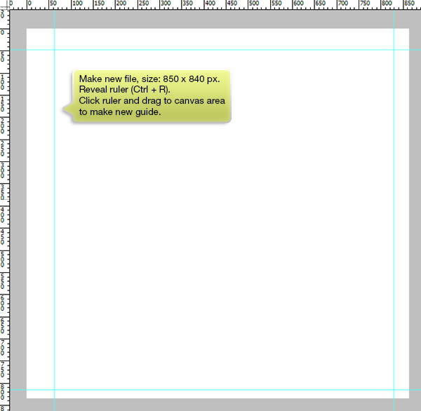
Start by drawing new file with size 850 px × 840 px. Hit Command/Ctrl + R to reveal ruler. Click vertical ruler and drag onto canvas area to make a new vertical guide. Repeat same process to horizontal ruler to draw a horizontal guide. Boundary made from these guides will help us in drawing the steering wheel shape.
Step 2: Drawing Basic Shape
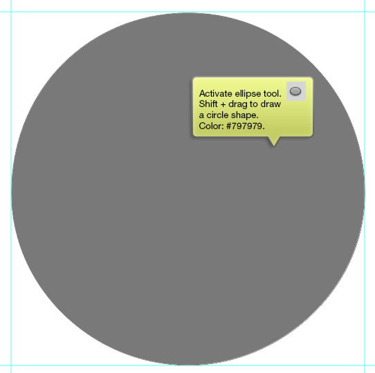
Start by activating Ellipse tool. Shift-drag to draw a perfect circle shape. Set its color to #797979.
Step 3
Duplicate the path b selecting it and then hit Command/Ctrl + C, Command/Ctrl + V. Resize to smaller shape and set its mode to Subtract. In this step, we are going to get a ring shape.
Step 4
Use Pen tool to draw inner part of the steering wheel. Set its path mode to Add to Shape area.
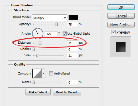
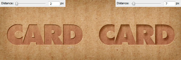
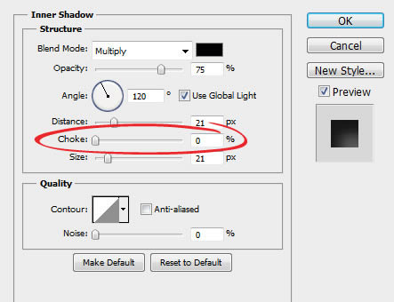
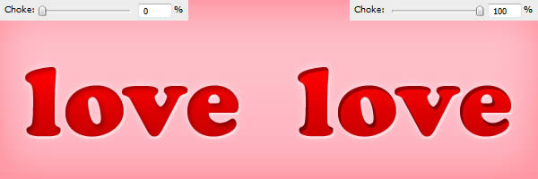
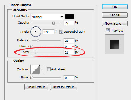
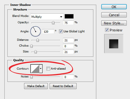
Step 5
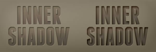
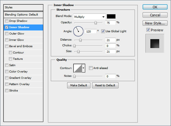
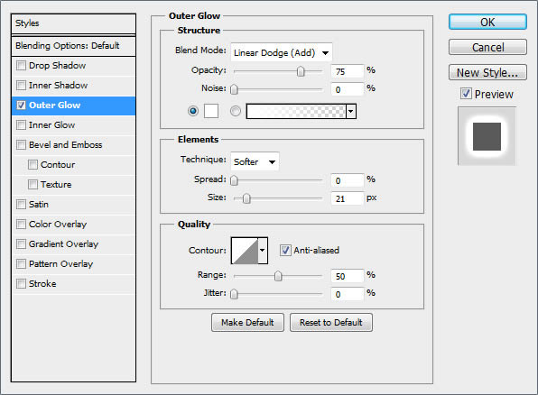
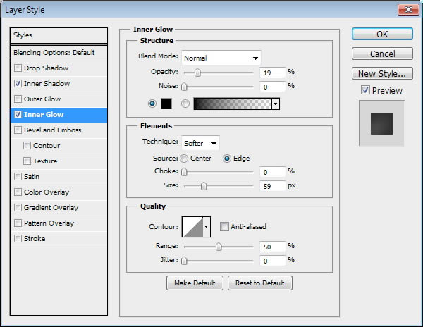
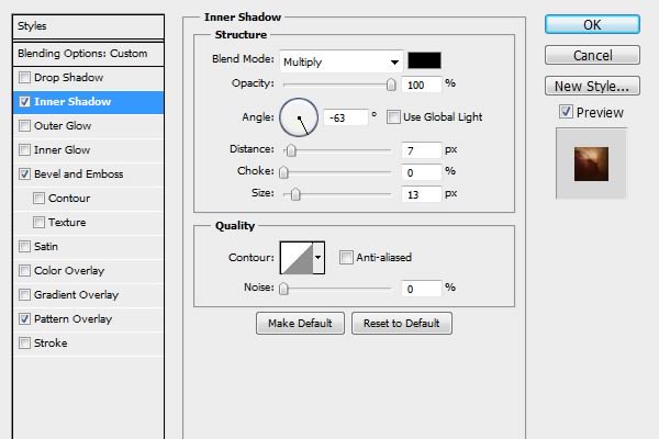
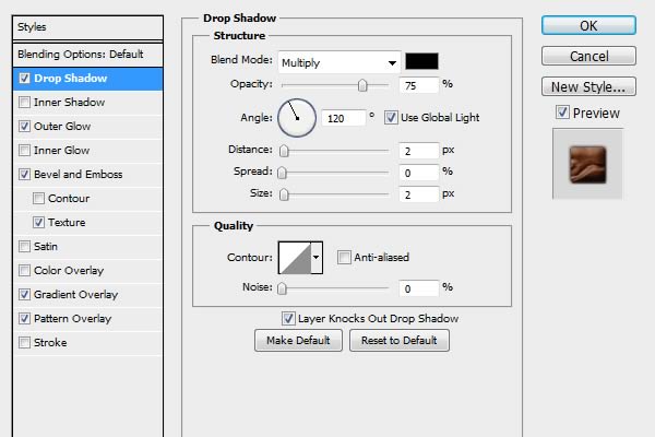
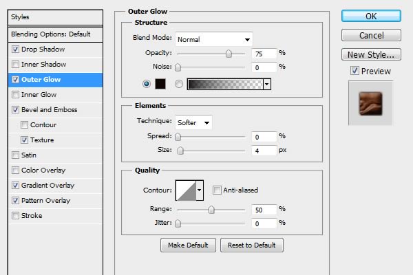
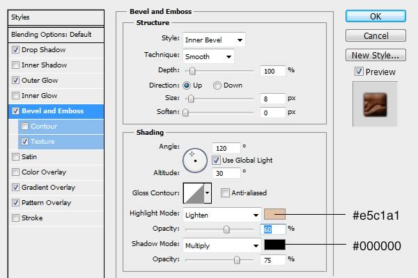
Apply basic lighting using Layer Style Inner Shadow and Inner Glow.
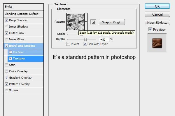
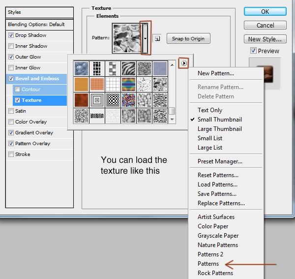
Step 6: Add Skin Texture
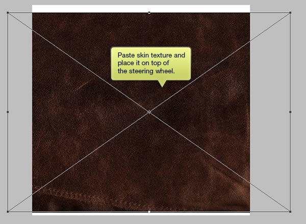
Grab a skin texture from WeGraphic (skin_6.jpg). Place it on top of the steering wheel.
Step 7
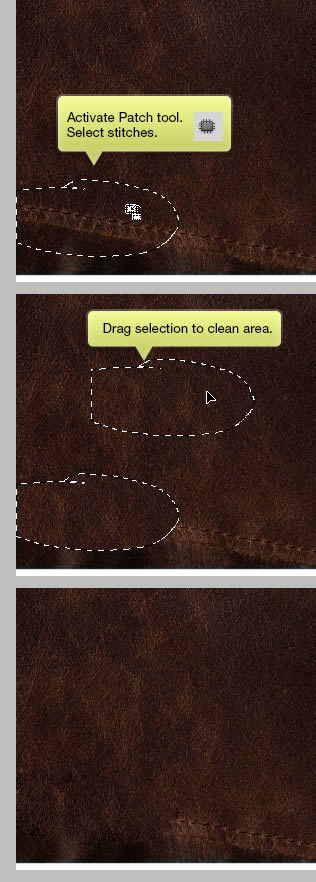
We want to make sure that there are no stitches inside the steering wheel. Activate Patch tool, select stitches and drag it to clean area.
Step 8
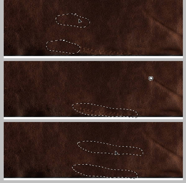
Repeat this to remaining part of the stitches.
Step 9
Click Image > Adjustments > Hue/Saturation. Reduce Saturation to -100 and Lightness to -47 to make the texture a lot darker.
Step 10
Change Blend Mode layer to Multiply.
Step 11
Alt-drag vector mask from wheel shape to the texture layer. At this point, the texture goes inside the texture.
Tone down its Opacity to 50%.
Step 12
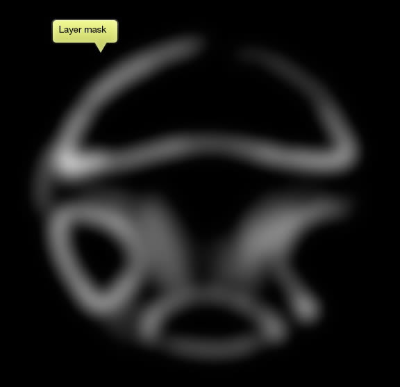
Duplicate the skin texture (Command/Ctrl + J). Set its Blend mode to Multiply and reduce its Opacity to 30%. Alt-click Add New Layer Mask icon. Paint some part of the mask with white to reveal more texture on the steering wheel.
Below, you can see layer mask I made.
Here’s the difference before and after adding more texture.
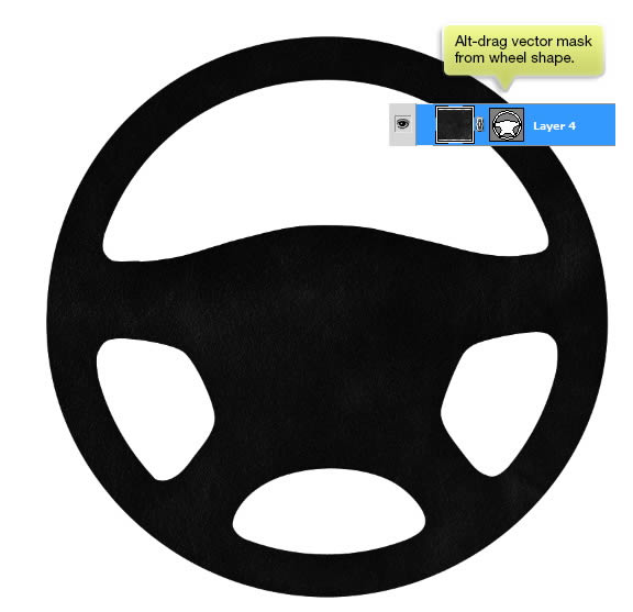
Step 13: Add Shadows and Highlights
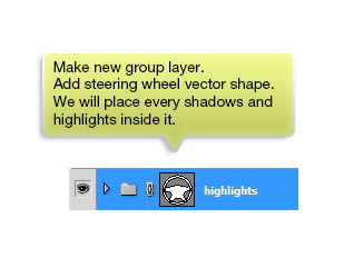
Make new layer and alt-drag steering wheel vector mask. From now on, everything we place or draw inside this group layer will stay inside the steering wheel.
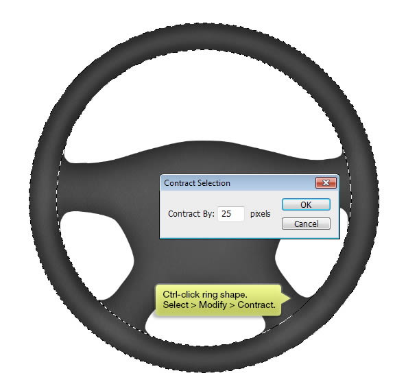
Step 14
Command/Ctrl-click ring shape from the steering wheel. Click Select> Modify > Contract, use 15 pixels.
Step 15
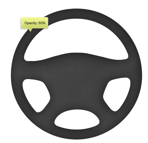
Make new layer and fill selection with white. Deselect (Command/Ctrl + D). Soften the highlight by applying gilter Gaussian Blur, Filter > Blur > Gaussian Blur.
Reduce its Opacity to 10%.
Step 16
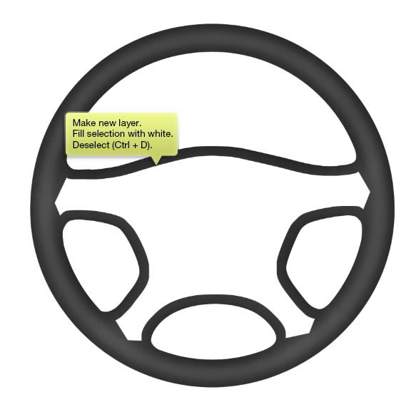
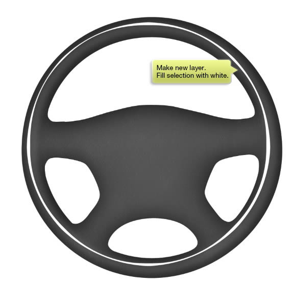
Command/Ctrl-click center of the steering wheel to make new selection based on its shape. Select > Modify > Contract by 20 pixels.
Step 17
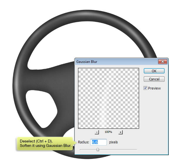
Make new layer and then fill the selection with white. Deselect (Ctr + D).
Soften the highlight by applying Gaussian Blur. Filter > Blur > Gaussian Blur.
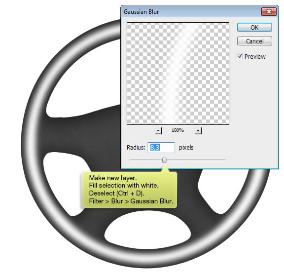
Step 18
Once again, select ring shape on the steering wheel. Click Select > Modify > Contract to reduce the selection size by 25 pixels. Activate one of the selection tool and hit up and left arrow a few times to move it. Make new layer and fill the selection with white.
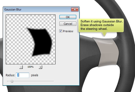
Step 19
Soften it using Gaussian Blur.
Step 20
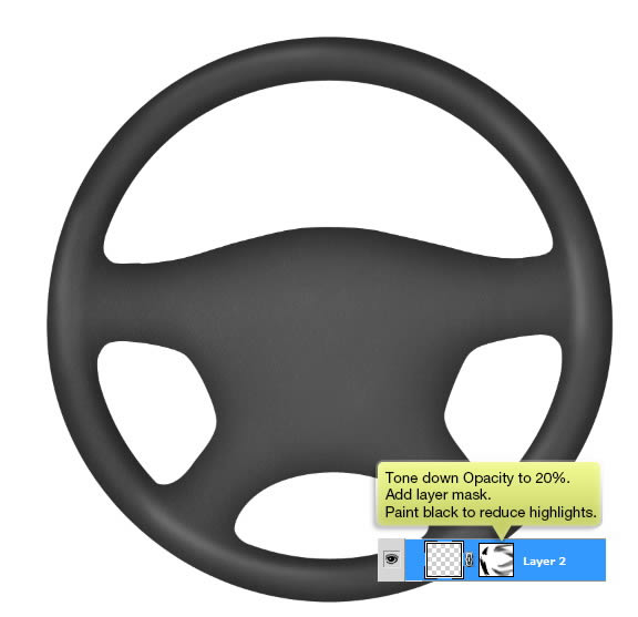
Tone down its Opacity to 20%. Add layer mask and then paint some of the highlight to hide it. We want to make it as natural as possible.
Step 21
Repeat previous steps, but this time use black to add highlights.
Step 22
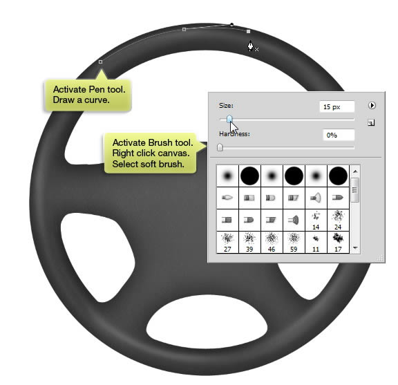
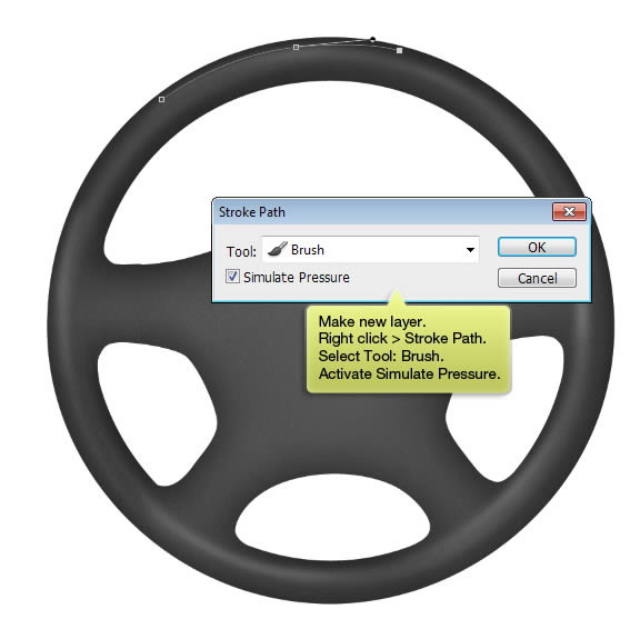
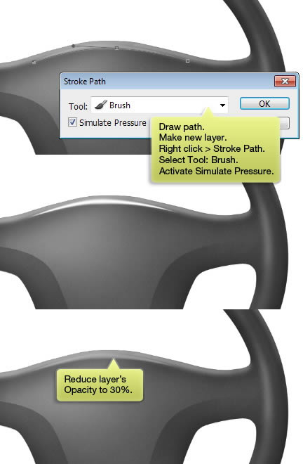
Let’s add stronger highlight on the steering wheel. Activate Brush tool, right click on canvas to open brush setting. Select soft brush (Hardness: 0%).
Make a new layer. Activate Pen tool and draw a curve. Right click and choose Stroke Path. In the next dialog box, select Tool: Brush. Make sure to select Simulate Pressure.
Below is the result we have. You can get same result by using a Wacom pen and with Pressure setting activated. I also use Wacom, but I always prefer to use this technique –pen and brush tool– because the result is more accurate.
Step 23
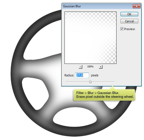
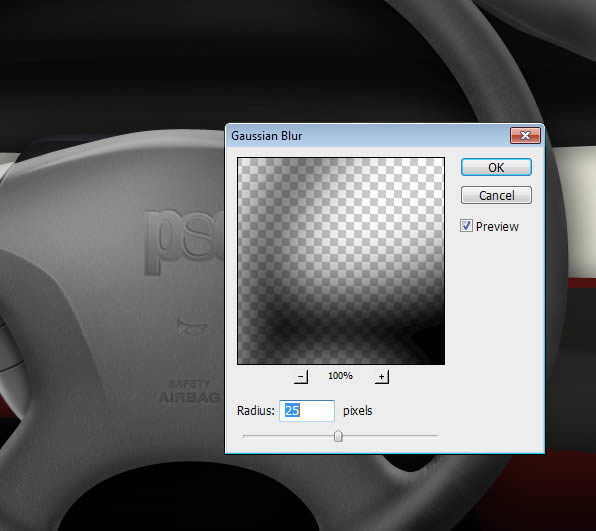
Apply Gaussian Blur if you feel that the highlight is too harsh. Filter > Blur > Gaussian Blur.
Step 24
Repeat previous step, but this time use smaller brush size to add stronger highlight.
Step 25
Make new layer again. It’s a good habit to put each brush stroke in a separate layer. This way, you can easily edit it if you don’t like the result. Paint subtle shadow on lower right corner.
Step 26
Make new layer. Paint white on center of the steering wheel. Don’t worry if the result is seems harsh.
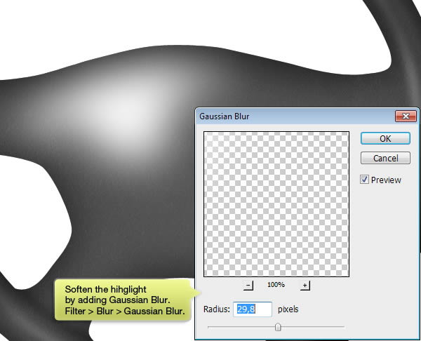
Step 27
Soften the highlight by applying a very big Gaussuan Blur filter.
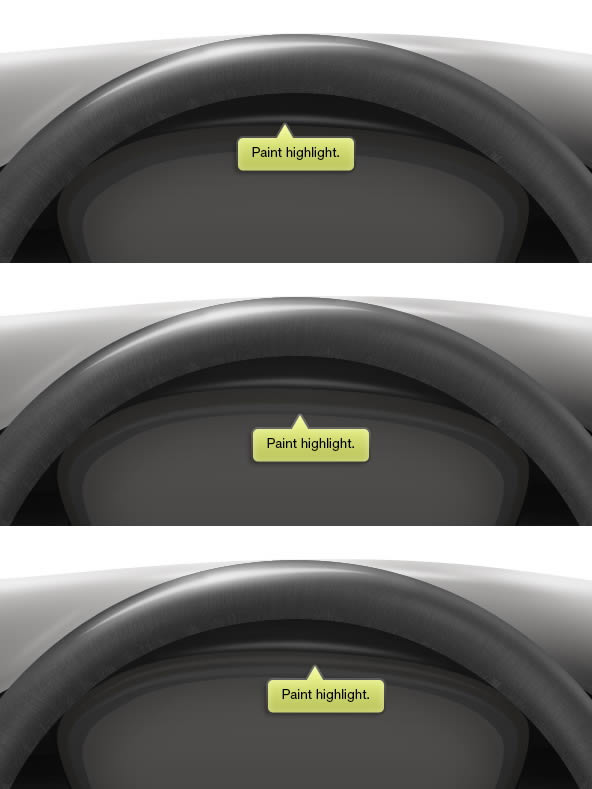
Step 28
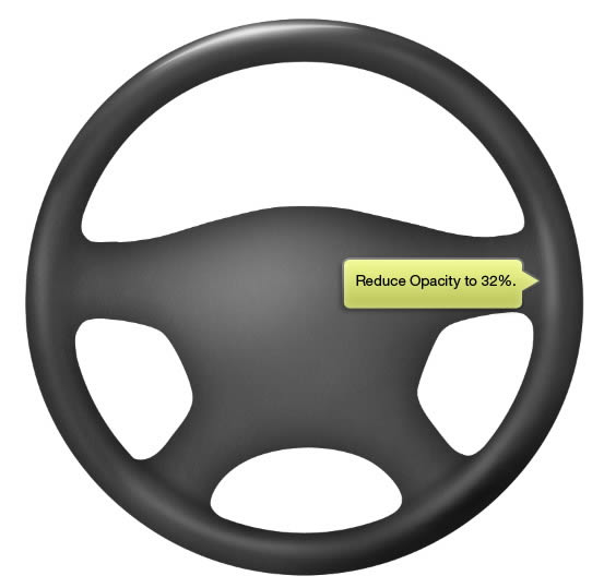
Reduce its layer Opacity to 32%.
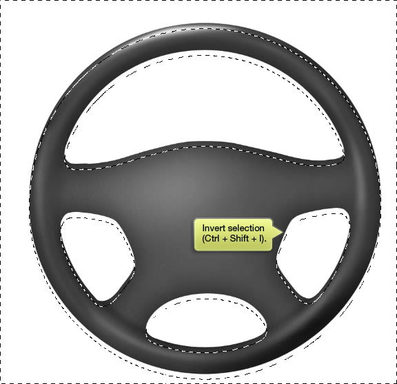
Step 33
Command/Ctrl-click sttering wheel shape to make a new selection based on its shape. Activate selection tool and hit Down Arrow a few times to move it down.
Step 34
Invert selection (Command/Ctrl + Shift + I).
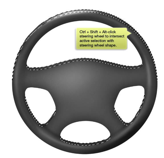
Step 35
Command/Ctrl + Shift + Alt-click the steering wheel shape to intersect active selection with its shape. At this point, we will have have selected upper of the steering wheel.
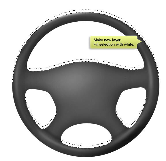
Step 36
Make new layer. Fill selection with white.
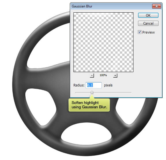
Step 37
Deselect (Command/Ctrl + D). Soften highlight using Gaussian Blur.
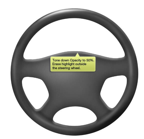
Step 38
Tone down highlight Opacity to 50%. Erase highlight outside the steering wheel.
Step 39
Paint more highlight on center of the steering wheel using previous technique. Add Layer Mask onto its layer.
Step 40
Draw a path selecting upper part of the steering wheel center.
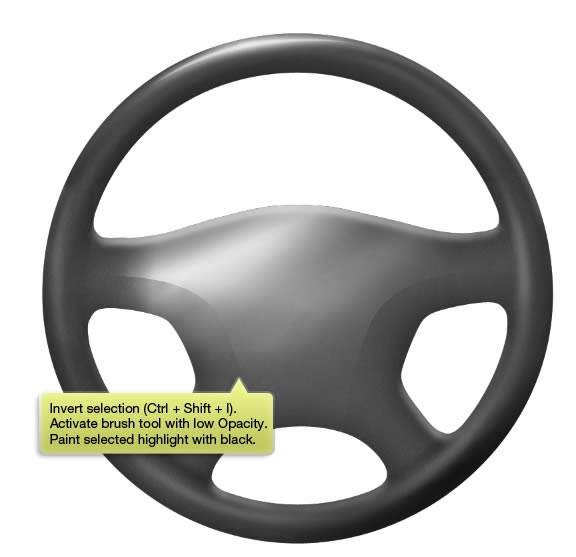
Step 41
Command/Ctrl-click path to convert it to selection. hit Command/Ctrl + Shift + I to invert selection. Activate Brush tool and reduce its Opacity to 30%. Paint selected mask with black.
Step 42
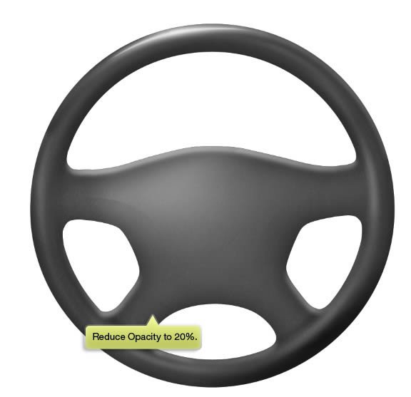
Reduce highlight layer Opacity to 20%. If you think the highlight is too harsh, deselect (Command/Ctrl + D) and then apply Gaussian Blur.
Step 43
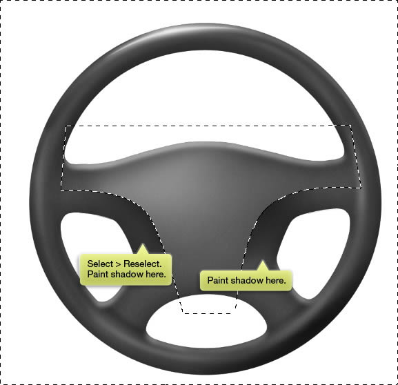
In case you deselect, click Select > Reselect to bring back previous selection. Paint shadow on areas indicated below.
Step 44
Reduce layer’s Opacity to 35%.
Step 45
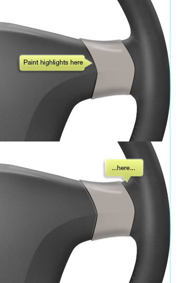
Let’s draw stronger highlight on top of the steering wheel. Draw path, make new layer, right click and select Stroke Path. Select Tool: Brush and make sure to activate Simulate Pressure. Reduce its Opacity if needed.
Step 46
Make a new layer and draw another highlight shadow on other part of the steering wheel.
Step 47
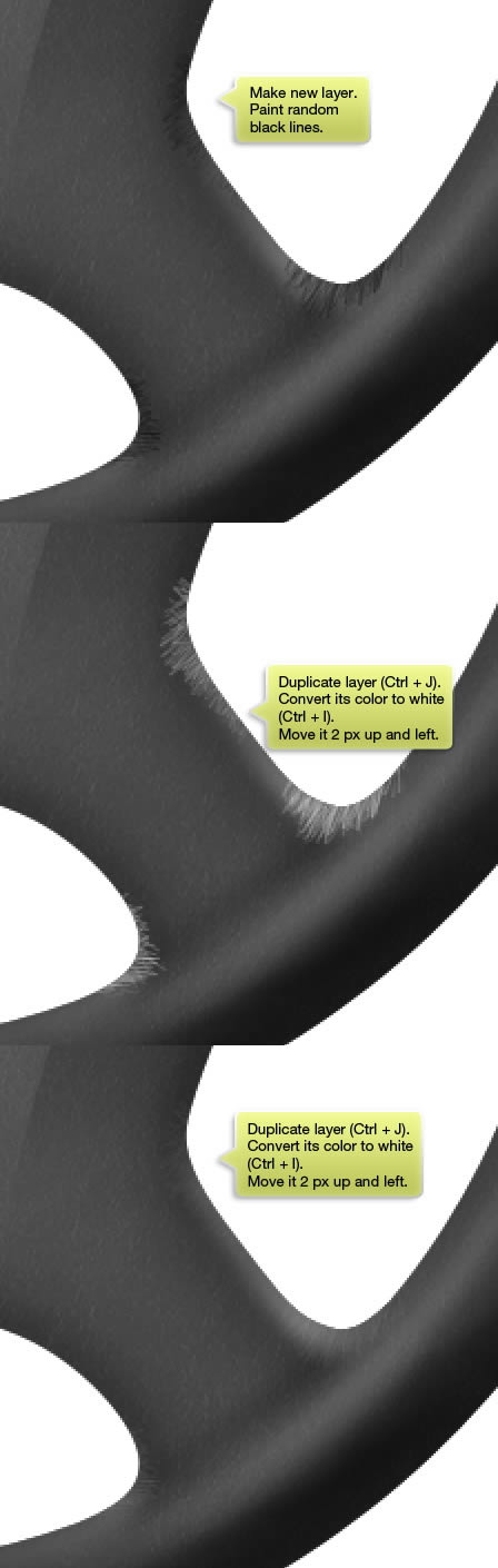
To draw a realistic object, we need to add imperfection in it. In real life, there is no perfect lighting, perfect texture, perfect shape, or perfect color. First, let’s add some wrinkles onto the steering wheel.
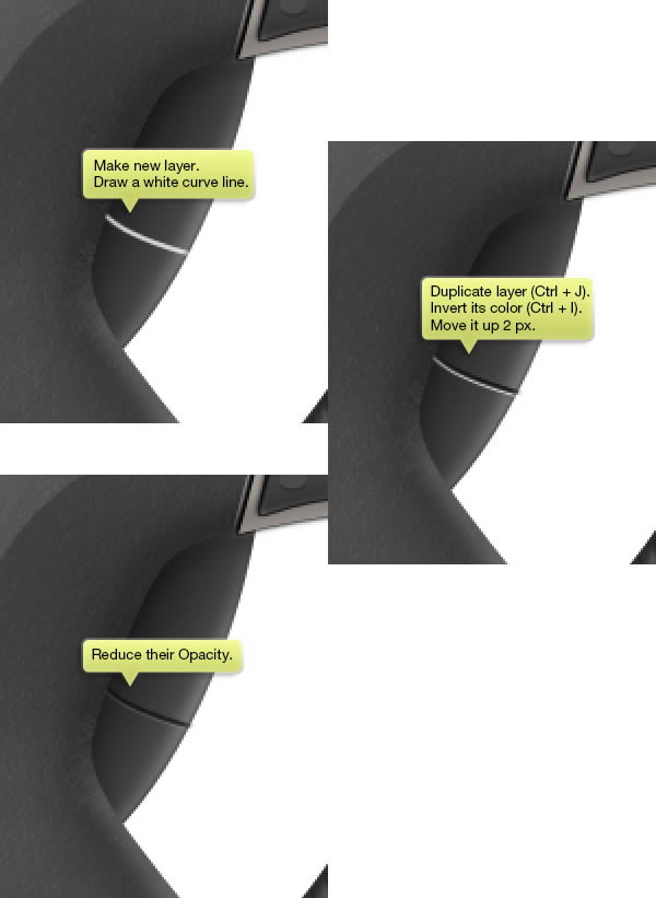
Make new layer and activate Brush tool. Select small brush size, 1 px or 2 px. Paint a random black lines on corner of the steering wheel. For now, no need to worry about its result. Duplicate the layer (Command/Ctrl + J). Activate move tool and hit up and left arrow twice to move it up and right 2 px. Invert its color to white by pressing Command/Ctrl + I. Reduce Opacity of both layers.
Step 48
Repeat previous steps to draw more wrinkles on other corner of the steering wheel.
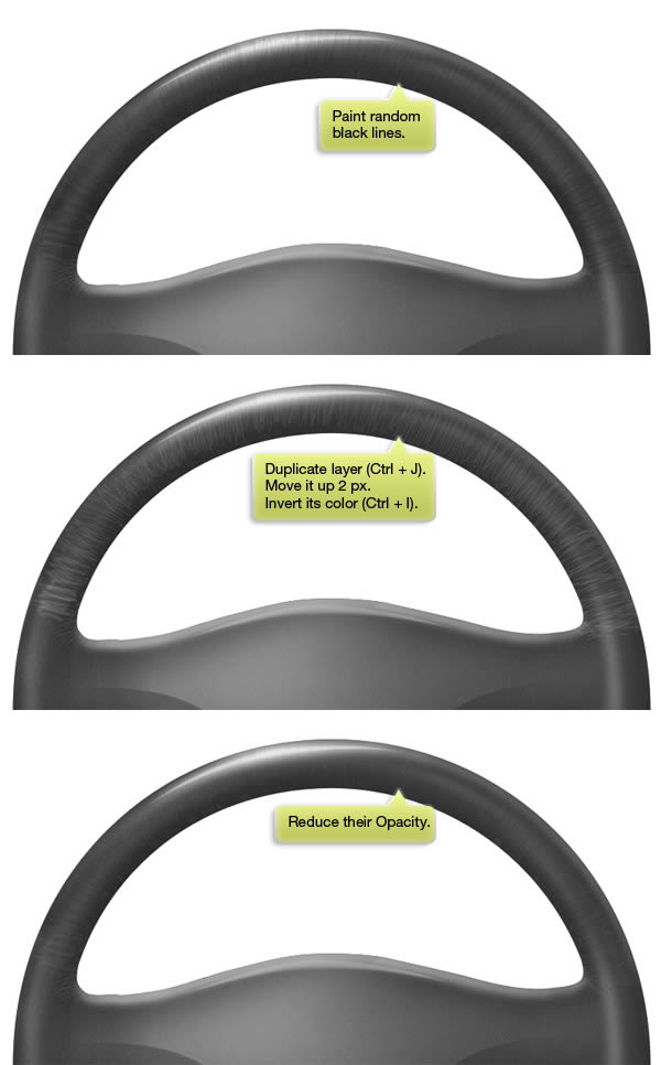
Step 49
Repeat same step but this on upper of the steering wheel. Make new layer and paint random lines on upper of the steering wheel. Duplicate the layer, move it 2 px up, invert its color, then reduce Opacity of both layers.
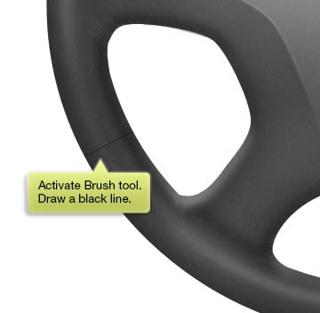
Step 50
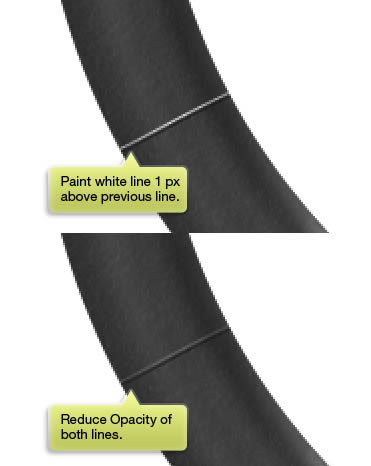
Make new layer. Use Brush tool to draw a line on one part of the steering wheel. Draw a black line.
Step 51
Make new layer. Draw a white line, next to the previous black line. Reduce Opacity of both lines.
Step 52
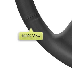
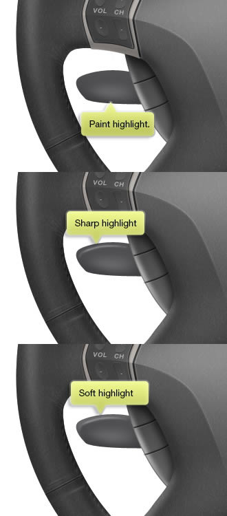
Draw subtle highlight and shadow using soft bigger Brush tool. make sure to add another imperfection by paint some random lines next to it.
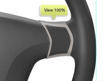
Here’s the result viewed at 100%.
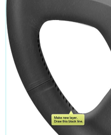
Step 53: Stitches
Let’s add another imperfection, this time stitches curling out on some part of the steering wheel.
Make sure Brush tool is active and open Brush panels (F5). Click and drag inside the brush appearance to turn it into an ellipse. Increase its Spacing to about 400%.
Step 54
Make new layer and draw a black line as seen below.
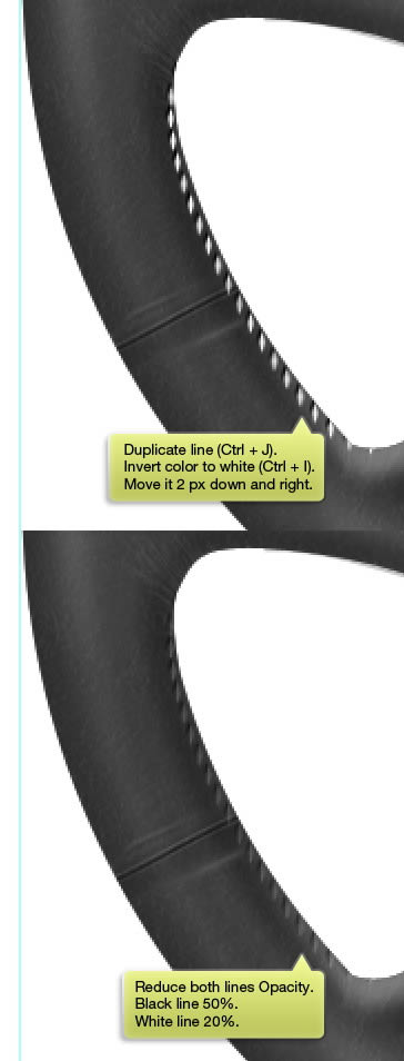
Step 55
Duplicate the line layer using Command/Ctrl + J. Invert its color to white (Command/Ctrl + I). Activate Move tool and hit Up and Right arrow twice to move the new layer 2 px up and right. Reduce black line layer Opacity to 50% and white line to 20%.
Step 56
Make new layer and paint dark shadow near the stitches.
Step 57
Repeat same step to draw other stitches on other side of the steering wheel..
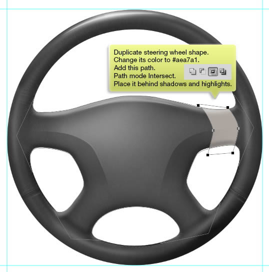
Step 58: Button
Duplicate steering wheel shape and change its color to #aea7a1. Add another path to place some buttons and set its mode to Intersect. Make sure to place it behind shadows and highlights group we have worked on earlier.
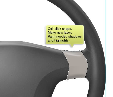
Step 59
Command/Ctrl-click shape. Make new layer. Paint needed shadows and highlights.
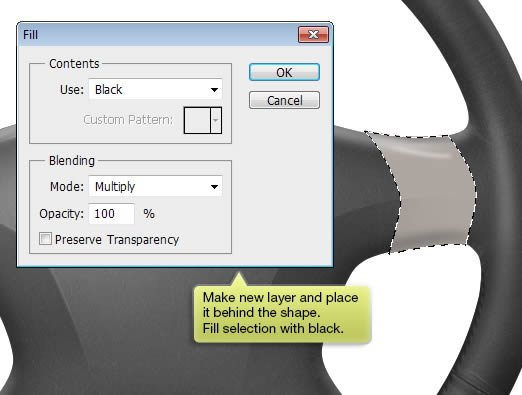
Step 60
Make new layer and place it behind the shape. Fill selection with black.
Step 61
Soften it using Gaussian Blue. Erase the shadow outside the steering wheel.
Step 62
Paint another subtle highlight next to the shadow. Use soft brush with size 1 px.
Step 63
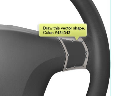
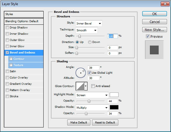
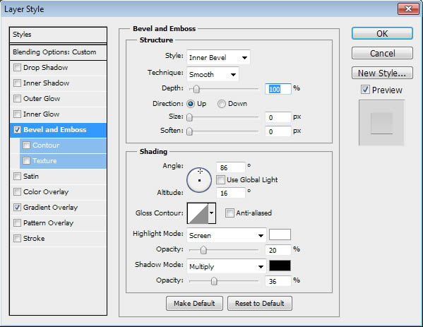
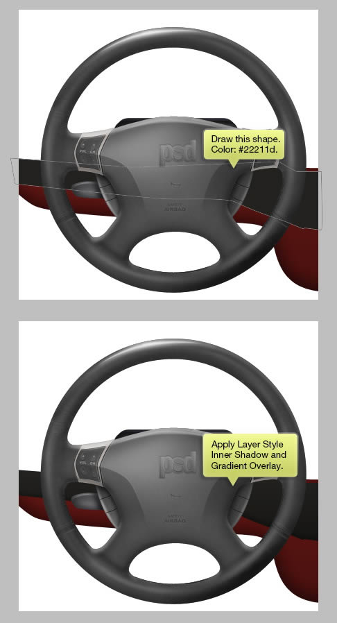
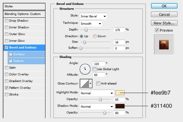
Draw another vector shape with color #434343 inside previous shape. Add Layer STyle Bevel and Emboss.
Below is the result shown at 100%.
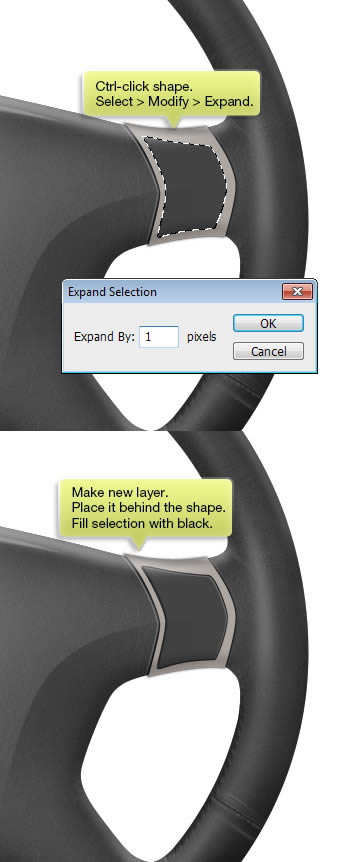
Step 64
Command/Ctrl-click shape we have just made. Expand the selection 1 px by clicking on Select > Modify > Expand. Make new layer and place it behind the shape. Fill selection with black.
Step 65
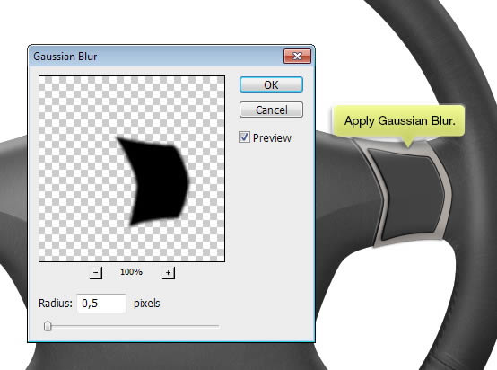
Apply Gaussian Blur to soften it.
Step 66
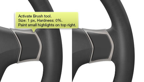
Activate Brush tool and paint small highlights on top right of the shape.
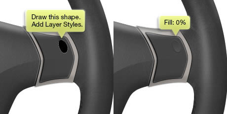
Step 67
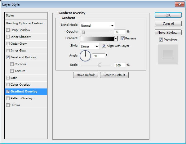
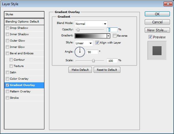
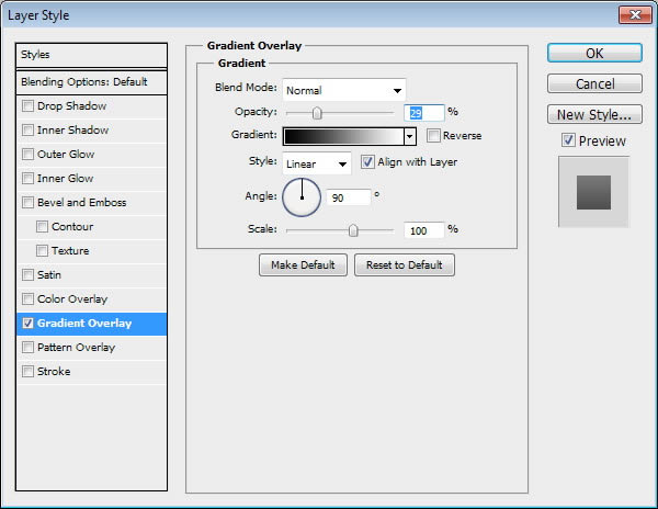
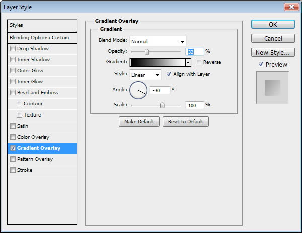
Draw this shape, made from an ellipse and then transformed. Add Layer Styles Bevel and Gradient Overlay and reduce its Fill to 0%.
Step 68
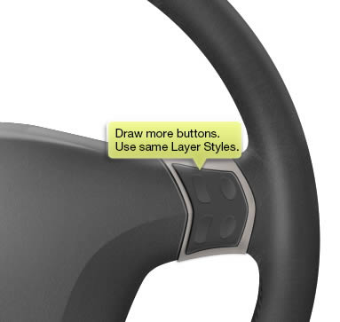
Draw another button and apply same Layer Styles.
Step 69
Use Type tool to add label on top of the button. You can always apply transformation (Command/Ctrl + T) to make sure the text match with the button perspective.
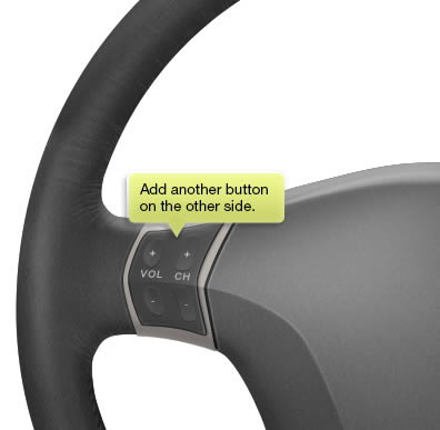
Step 70
Add another button on other side. You can see clearly that I’m too lazy to use different label. So, be creative!
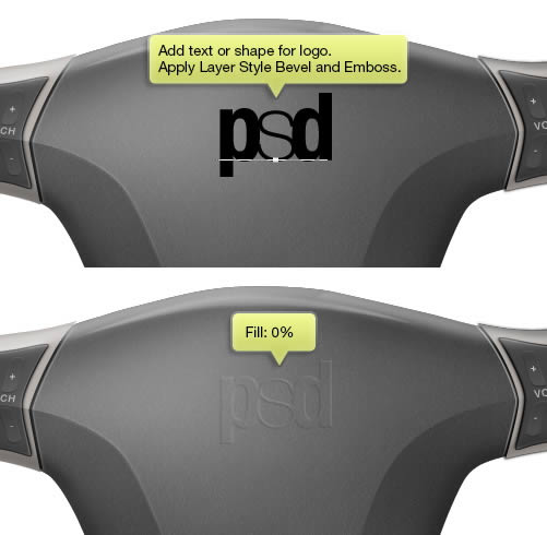
Step 71: Logo
Add text or logo on center of the steering wheel. You can use your own car logo, if you want to. Here, I’m using a combination of character in different font style. Apply Layer Style Bevel and Emboss and set its Fill to 0%.
Step 72
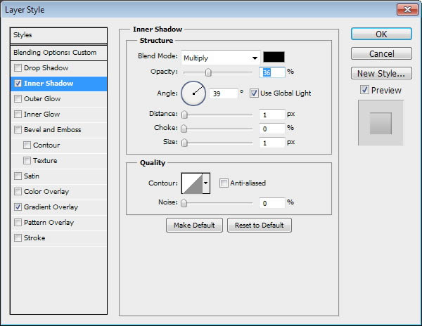
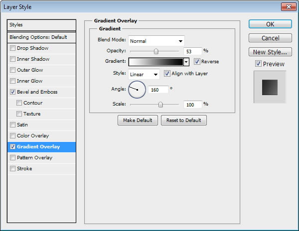
Command/Ctrl-click logo and click Select > Modify> Expand. Make new layer and fill selection with any color. Apply Layer Style Inner Shadow and Gradient Overlay. Reduce its Fill to 0%.
Step 73
Add more logos if you think its needed.
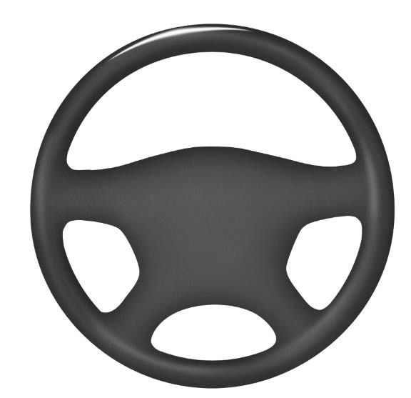
So far, here’s our result.
Step 74: Side Buttons
Draw an ellipse shape with color: #181817 behind the steering wheel. Hit Command/Ctrl + T and then rotate it. Hit Enter once you are satisfied with the transformation result. Apply Layer Style Bevel and Emboss and Gradient Overlay.
Step 75
Add new layer and convert it to Clipping Mask. This way, everything we paint here will goes inside the shape. paint some shadows behind the main steering wheel shape. On its opposite side, paint some highlights.
Step 76
Make a new layer and then draw a white curve. Duplicate the layer (Command/Ctrl + J). Activate Move tool and hit Up Arrow twice to move it up 2 px. Reduce Opacity of both lines, black to 50% and white to 20%.
Step 77
Duplicate the lines and place them a few pixels above.
Step 78
Make new layer and paint subtle highlights on center of the button.
Step 79
Duplicate the button and place it on its opposite side. We don’t want both buttons to be 100% identical. So, I sugest you to manually draw different highlights and shadows. As you can see below, the left button is a lot brighter than the right one.
Step 80
Draw shape shown below on left side of the steering wheel with color #434346. Add Layer Style Gradient Overlay.
Step 81
Paint big and subtle highlight on center of the shape and sharp highlight on upper of the shape.
Step 82
Paint shadow right behind the previous buttons.
So far, here’s our result.
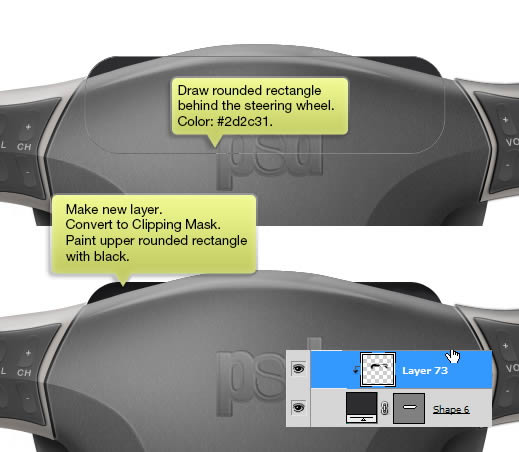
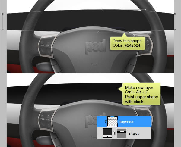
Step 83: Rear Part
Draw a rounded rectangle behind the steering wheel with color #2d2c31. Make new layer and convert it to Clipping Mask. Paint upper shape with black.
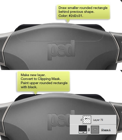
Step 84
Draw smaller rounded rectangle shape at same position. Repeat previous step, paint its top with black.
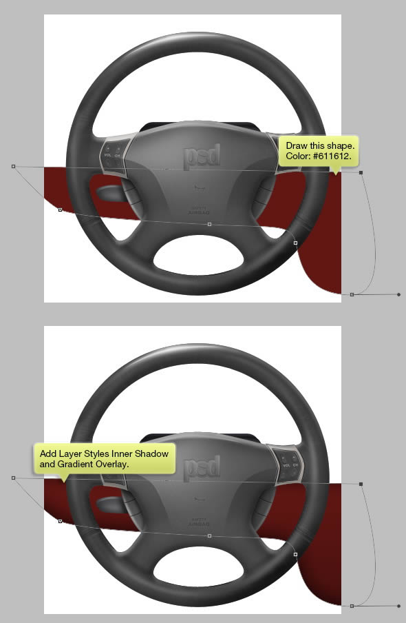
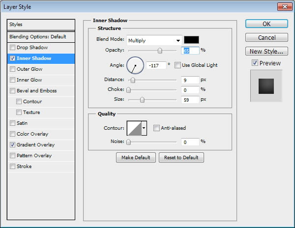
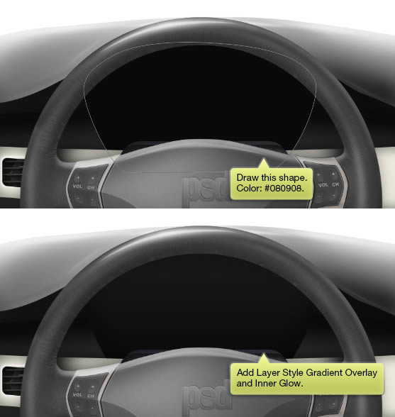
Step 85: Dashboard
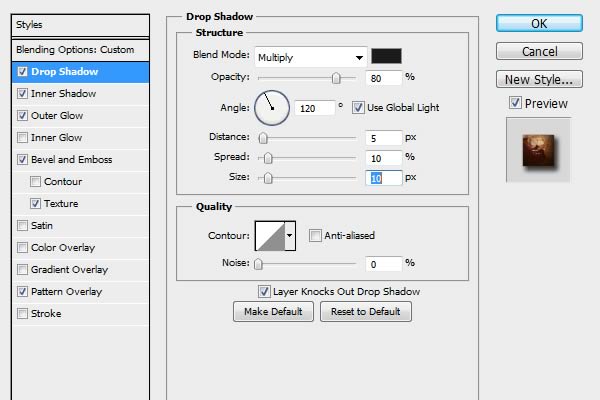
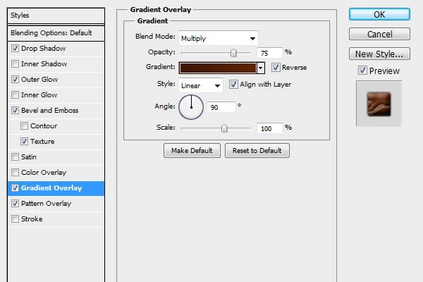
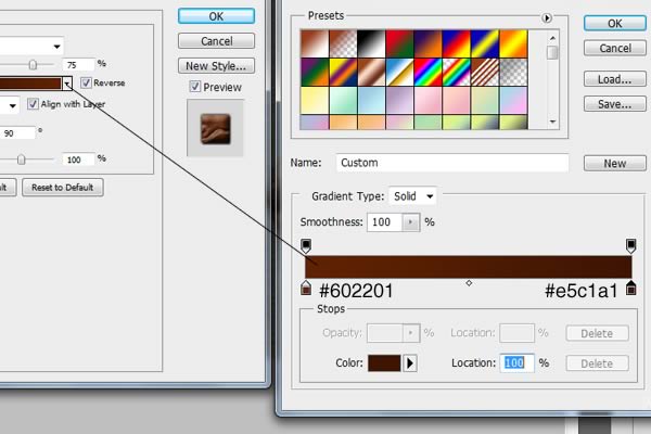
Draw a red shape behind the steering wheel. Add Layer Style Inner Shadow and Gradient Overlay.
Step 86
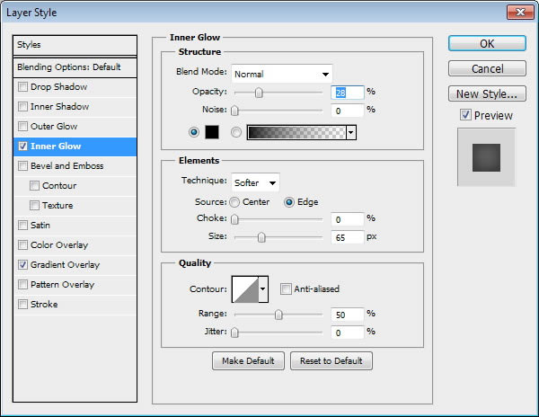
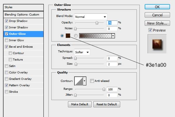
Manually, draw another shape above the previous shape with dark grey color. Apply Layer Style Inner Glow and Gradient Overlay.
Step 87
Paint highlight on indicated area below.
Step 88
Command/Ctrl-click the steering wheel shape. Make sure selection tool is active and hit Down Arrow a few times. Fill selection with black.
Step 89
Click Filter > Blur > Gaussian Blur to soften the shadow.
Step 90
Add Layer Mask and paint upper shadow with black to hide it.
Step 91
Reduce its Opacity to 20%.
Step 92
Paint lower area with black to everything there.
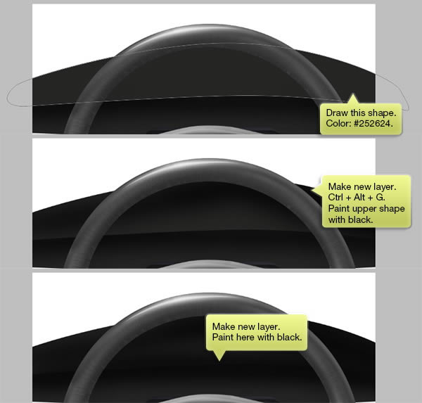
Step 93
Draw shape shown below with color #242524. Make new layer and convert it to Clipping Mask (Command/Ctrl + Alt + G). Paint upper shape with black.
Step 94
Repeat previous step. Draw another shape above the previous shape and paint its upper area with black. Make new layer and then paint intersection between the two shapes with black.
Step 95
Draw upper dashboard with gray as its color. Add Layer Style Gradient Overlay.
Step 96
Make new layer and convert it to Clipping Mask (Command/Ctrl + Alt + G). Paint shadow and highlight on the shape.
So far, this is our dashboard. Next, we are going to draw the middle dashboard. To help us doing this, let’s hide the steering wheel.
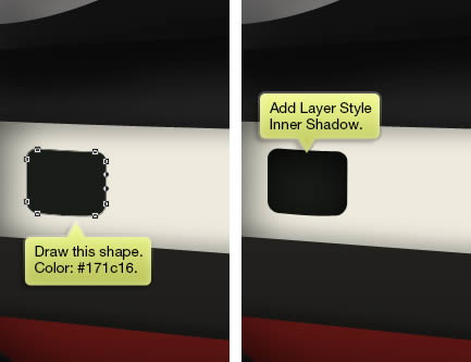
Step 97
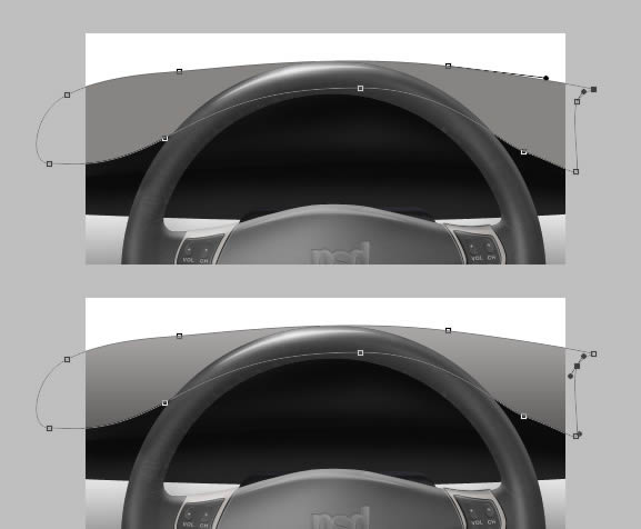
Dtart by drawing shape shown below, use #eeebdc as its color. Make new layer. Hit Command/Ctrl + Alt + G to convert it to Clipping Mask. Paint its edges with black. You can reduce its Opacity if you think the shadow is too harsh.
Below, is the result when the steering wheel is revealed.
Step 98
Draw a rounded rectangle and modify some of its points until we have following shape. Add Layer Style Inner Shadow. This is going to be the air ventilation hole.
Below is the result when the steering wheel is revealed.
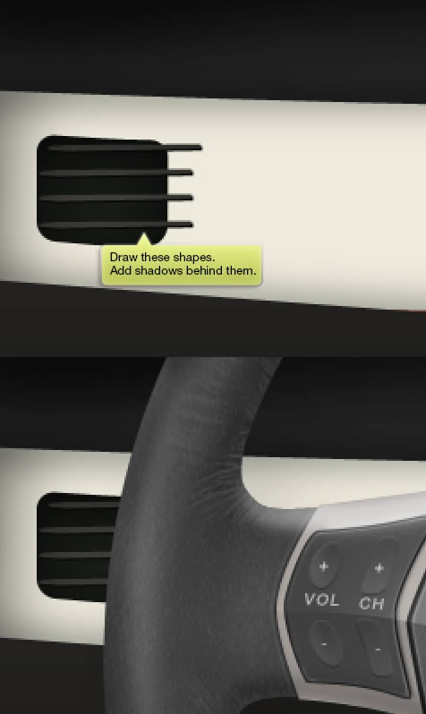
Step 99
Use pen tool to Draw these shapes on top of the air ventilation. Make sure to draw some shadows behind it. You may notice that shapes I made goes outside the hole. It doesn’t matter because the steering wheel will keep it hidden.
Step 100
Add another rounded rectangle shape for its handle. Paint more shadow and draw some shapes inside the hole.
Step 101
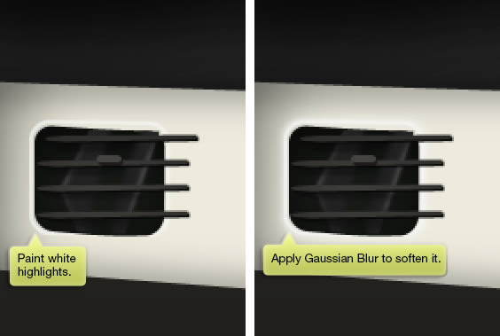
Add white stroke surrounding the air ventilation hole. Apply Gaussian Blur to soften it.
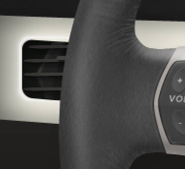
Here’s the result with steering wheel revealed.
Step 102
We’re almost done. Let’s reveal the steering wheel back.
Step 103
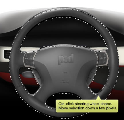
The middle dashboard seems too light. We need add more shadows there. Command/Ctrl-click the steering wheel shape. Move selection down a few pixels.
Step 104
Make new layer behind the steering wheel. Fill selection with black and soften it using Gaussian Blur filter.
Step 105: Speedometer
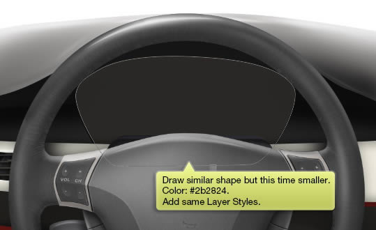
Draw shape shown below. Add Layer Style gradient Overlay and Inner Glow.
Step 106
Repeat previous step, draw similar shape but this time smaller with lighter color. Add same Layer Styles.
Step 107
Add one more shape.
Step 108
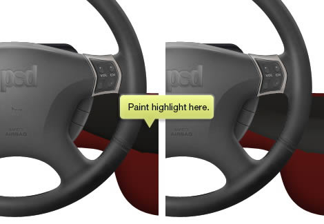
Paint some highlight on indicated areas below. We’ve seen it done on Step 22.
Step 109
Draw a white circle shape. Paint subtle highlight surrounding the circle.
Step 110
Command/Ctrl-click the circle shape. Click Select > Modify > Contract, Select > Modify > Border. Make new layer and fill the selection with white. Add Layer Style Gradient Overlay.
Step 111
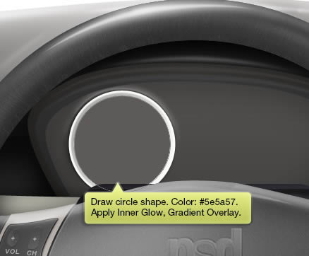
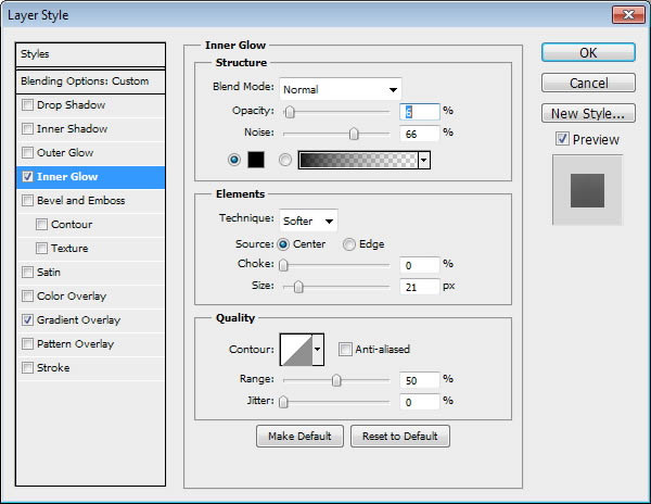
Draw gray circle inside the previous shape. Apply Layer Style Inner Glow and Gradient Overlay.
Step 112
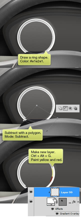
Draw a ring shape with color #e1e2e1. Subtract its lower part with a polygon shape. Make a new layer. Convert it to Clipping Mask (Command/Ctrl + Alt + G) and paint its right end with yellow and black.
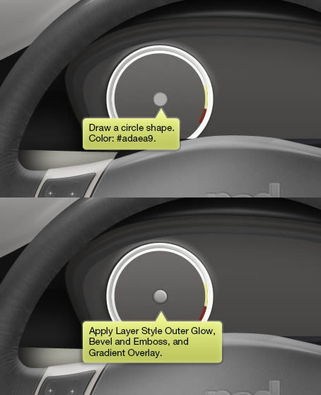
Step 113
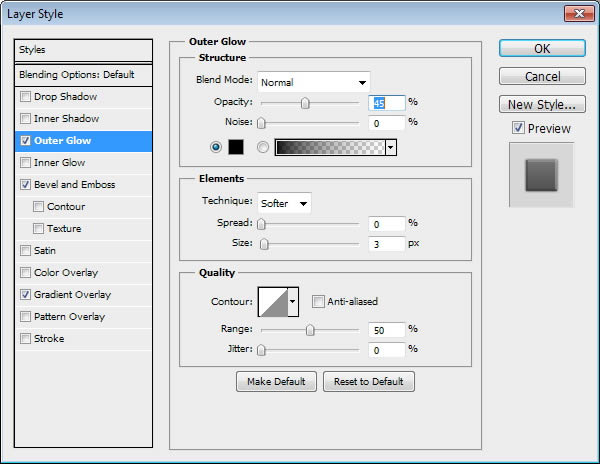
Draw a circle shape and apply following Layer Styles.
Step 114
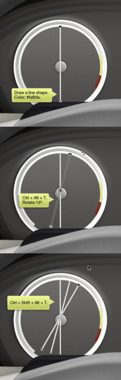
Draw a tall line shape on center of the speedometer.Make sure the line path is selected, hit Command/Ctrl + Alt + T to duplicate and transform the path. Rotate it 15°. hit Command/Ctrl + Shift + Alt + T a few times until we have a full set of line in 360°.
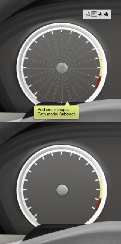
Step 115
Add a circle shape on its center. Set its mode to Subtract.
Step 116
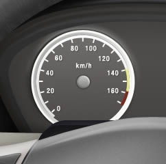
Add some numbers on each line.
Step 117
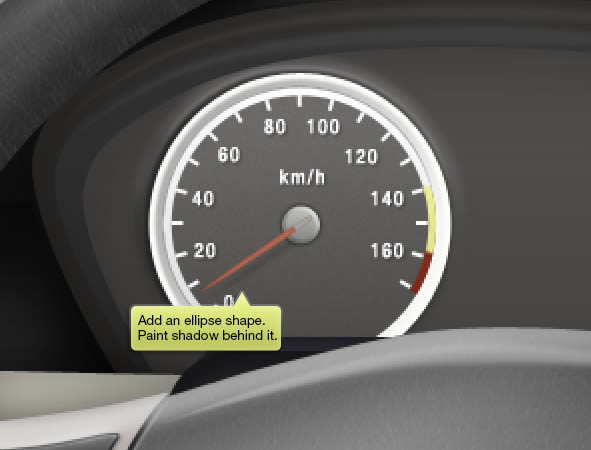
Add an ellipse shape and rotate it. Place it on top of the circle. Don’t forget to paint some shadows behind it..
Step 118
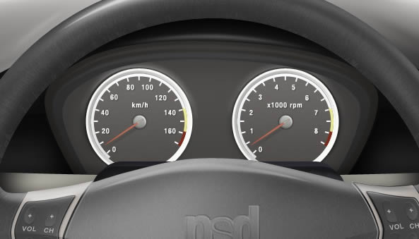
Duplicate the dpeedometer. Change its number to convert it into an rpm meter.
Step 119
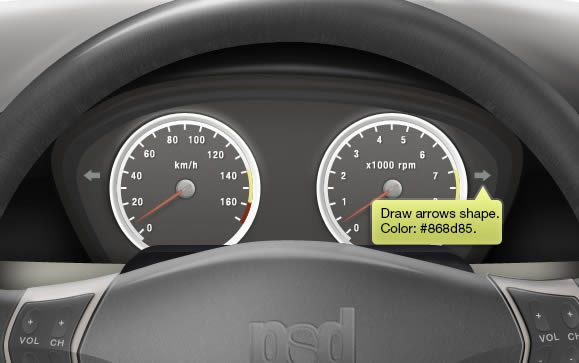
Draw an arrow on each direction for turning signal.
Step 120
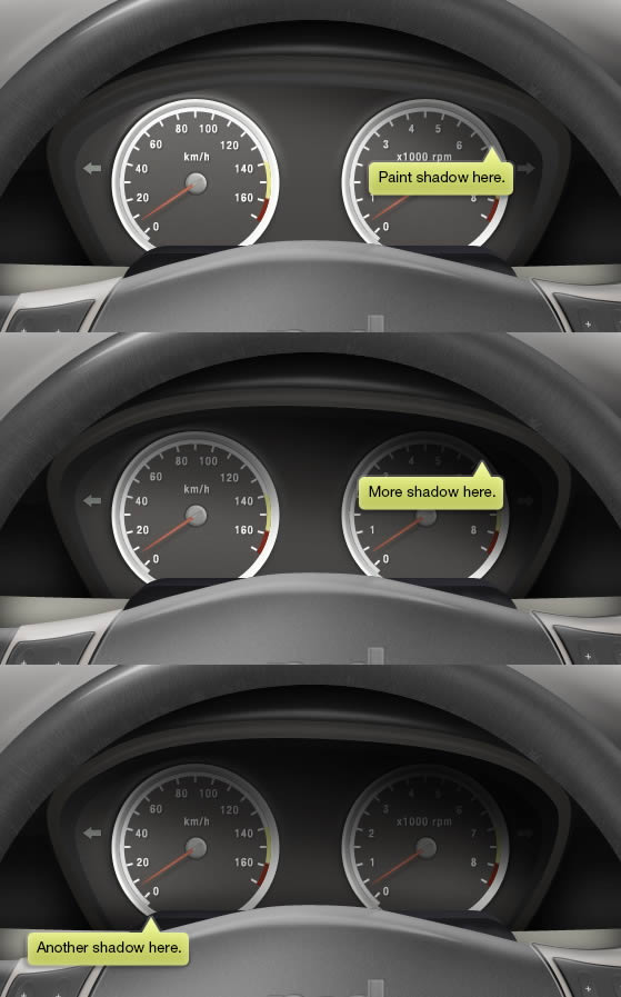
Make new layer and place it on top of the speedometer. Use soft and big Brush tool to paint some shadows.
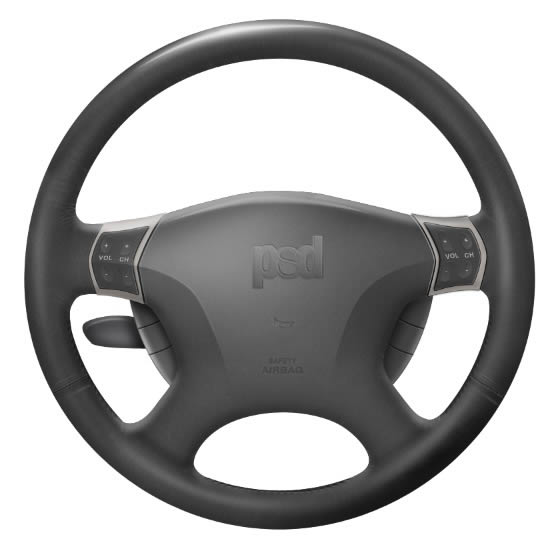
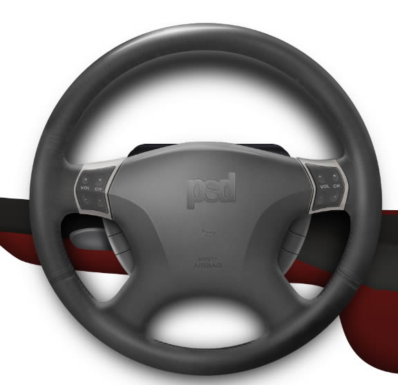
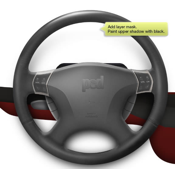
Final Image
So, here is our final result. I hope you enjoyed the tutorial. Thank you for reading.
![]()
![]()
![]()