Sometimes it's not zombies and vampires that scare us, but characters from childhood stories. Even though objectively they're not that scary, there's something in them that brings us chills even in our adult lives. The Winged Monkeys from "The Wizard of Oz" are certainly that type of character. Let's learn how to draw one!
1. Prepare for Drawing
This is the most overlooked part of drawing projects. Beginners often "strongly wish" they could draw something, so they just try to do it. Professionals, on the other hand, practice before drawing something new. You can't draw something well if you've never drawn it before!
Step 1
Find a lot of references of jumping monkeys and sketch them quickly. Try to capture the main rhythm of the movement, avoiding details. Use a small scale.
Step 2
Now switch to a variety of references of monkeys. Practice the details, but keep sketching quickly, without hesitation.
Step 3
Time for wings. Draw flying birds, paying special attention to the placement of feathers. Try to find a way to simplify it; understand how it works. If you need some help, try my complex tutorial about drawing wings.
Step 4
Finally, you can sketch a few poses of the flying monkey. Draw only the rhythm of the body, nothing else.
2. Plan the Skeleton
Step 1
Choose one pose from your practice sketches. Now:
If you're drawing digitally, copy it to a new file, resize to your preferred size, and lower the opacity. Keep drawing on a new layer.
If you're drawing traditionally, redraw the pose on a new sheet of paper on a bigger scale. Make the drawing subtle—these are just guide lines, not a part of the final picture.
Step 2
Build a simplified skeleton of the monkey out of sticks. It's similar to a human skeleton, so you can learn a bit about it in my other tutorial—how to draw a human in a simple way.
Don't forget about the wings!
Warning: you can draw freely and even sloppily until I tell you to stop. Don't be afraid of mistakes, crooked lines, or a general mess—we'll fix it later, I promise!
Draw the hands and feet. Even though monkeys have hand-like feet, they're not 100% hands.
Step 6
Add the fingers and "toes".
3. Build the Body
Step 1
Have you ever seen a drawing dummy? Their "joints" are spherical, and they don't only allow rotation—they also define the width of the part. We can use them here, too.
Hips are very complicated, so you can use two or even one sphere in their place.
Use directing lines to understand the 3D form of the creature.
Step 2
Draw the open jaw. It can be made of two halves of a sphere!
Step 3
Add some details on the face.
Step 4
Take a closer look at the hands and feet, and draw spherical joints for every finger.
Step 5
Once the whole shape is established, you can emphasize it with outlines:
4. Draw the Wings
Step 1
Start with the marginal coverts, or "wing arms", as I like to call them.
Step 2
Add another row of coverts.
Step 3
One more...
Step 4
Now draw a place for the main feathers: secondaries and primaries.
Step 5
Time to draw the actual feathers. Start with very simple, round, symbolic ones...
... then switch to more elongated feathers.
Step 6
Big birds often have slotted primaries. Here's how to draw them:
5. Finish the Drawing
Step 1
If you're a traditional artist, you probably have a mess of lines on your sheet right now. Don't worry, that was the plan! To continue, take something making dark lines and emphasize the parts of the sketch that are important to you. Then place a new sheet of paper at the top. Can you see the lines below? If not, use thinner paper or make the lines even darker.
If you're drawing digitally, simply merge all the previous layers and make that new layer almost transparent.
Step 2
Using the lines below as a base, draw all the details. Be careful and slow now—this is the final version.
Step 3
When you're done, you can stress some of the more important lines to make the drawing more interesting.
Good Job!
That was a lot of work, wasn't it? If you enjoyed it, try some more of my tutorials. And if you had problems at any point, you can solve them by going through my How to Learn to Draw series. See you next time!
In celebration of our Wizard of Oz week here at Envato Tuts+, I wanted to create a vibrant and colorful scene of the Great and Powerful Wizard's entrance into the land of Oz.
This tutorial features work with Photoshop's 3D tools to create the balloon, a highly useful technique for masking cloud images, and other methods for creating a soft, dream-like appearance. Follow along and get lost in our magical world of layers, and masks and filters... Oh My!
1. Gather Resources
Before getting started, be sure to download the attached file WizardofOzBalloonTutorial.zip containing four custom files to be used for this project:
BalloonDecal.jpg
CityOutline.png
OzLandscape.jpg
Tornado.psd
The following stock resources are also used to complete the project:
Now that we have all the elements ready, let's set the wizard's hot air balloon in flight.
Step 1
Open the OzLandscape.jpg file in Photoshop. This will serve as the setting for our magical, technicolor, airborne adventure.
Step 2
Go to 3D > New 3D Layer From File and select the balloon.obj file. When prompted for a size, just accept the default values. Photoshop imports the 3D model and switches to the 3D workspace.
Step 3
The ropes of the balloon are very distracting, so hide them by finding the mesh in the 3D panel called Kanapi and toggling the visibility eyeball next to it.
Step 4
Select the Scene layer in the 3D panel and use the MoveTool to position the scene view so the balloon is at the top right of the composition. Rotate the view so the balloon appears to be at a lower elevation than the camera.
Step 5
In the 3D panel, switch to the Materials tab and select the second material in the list, which should be the main balloon material. In the Properties panel, click on the document icon next to the Diffuse color and select Replace Texture. Direct Photoshop to the BalloonDecal.jpg file to map the illustration onto the balloon.
Step 6
Click on the same document icon again and select Edit UV Properties. These settings will adjust how the texture is stretched over the balloon surface. In the tile section, change the U/X to 2 and the V/Y to 1.3. This should set the texture at the appropriate size. Then use the Offset values to slide the texture around on the surface to place it in a location that looks good.
The texture placement on the balloon should look similar to this.
Step 7
Go back into the Materials. The first material in the list should be the base of the balloon and the majority of the basket surface. Change the Diffuse color to #8a504b.
Step 8
Click on the Lights tab of the 3D panel and select Infinite Light 1. Use the Move Tool (V) to adjust the light indicator so the light is coming from behind the balloon. The goal is to match the light direction in the scene. Set the light Intensity to 144% and the Shadow Softness to 25%.
Step 9
Use the Rectangular Marquee Tool (M) to create a selection completely around the balloon. Then press the Render button at the base of the 3D panel. Be patient while Photoshop renders the balloon—it could take some time!
Step 10
When the render is finished, copy the rendered pixels to a new layer with Layer > New > Layer Via Copy (Control-J). Then hide the original 3D layer. This makes sure the rendered pixels are preserved while still maintaining an editable 3D layer.
Step 11
Enhance the colors of the rendered balloon by adding a Vibrance adjustment layer. Clip the adjustment layer to the rendered layer with Layer > Create Clipping Mask (Alt-Control-G). Then set the Vibrance to +21 and the Saturation to +39.
3. The Emerald City
With the wizard making his grand entrance, we need to see his destination, the Emerald City! I've already prepared a city image for you to use. It's part of the original attachment downloaded at the beginning of the tutorial.
Step 1
Go to File > Place Embedded and select the CityOutline.png file from the set of files in the attached zip folder. The city image is imported as a Smart Object. Scale the image down and position it in the background of the scene.
Step 2
We can't have an Emerald City that's blue can we? Change the color of the city by going to Image > Adjustments > Hue/Saturation. Check the Colorize box and set the Hue to 116, Saturation to 41, and Lightness to +24.
Step 3
Add a Layer Mask to the city layer and use a Soft RoundBrush with black paint to mask out the bottom edge of the city so it blends more evenly into the landscape.
Step 4
Add a Hue/Saturation adjustment layer and clip it to the city layer with Layer > Add Clipping Mask (Alt-Control-G). Set the Saturation to -56 and fill the adjustment layer's mask with black. Then use the brush with white paint to apply the desaturated effect to the sides of buildings so the city isn't all the exact same tone of green.
Step 5
Add a new layer for City Gleams and set the blending mode to Screen. Then use a soft brush at 40% Opacity with a pale yellow tone of #eaf669 to add some strokes of glowing light around some of the city spires.
Step 6
Go to Filter > Blur > Gaussian Blur and set the blur Radius to 3 pixels. This gives the city a soft, glowing light effect over the buildings.
Step 7
Add a City Glow layer beneath the city layer and set the blending mode to Screen. Use the Gradient Tool (G) with the Foreground to Transparent preset, the Radial shape and Opacity at 60%. Start the gradient directly behind the city and pull it out to be about three times the size of the city layer.
Step 8
Add a new layer over the City Gleams layer for the Color Wash effect. Set the blending mode to Color Dodge and use a Soft Round Brush (B) with 20% Opacity. Set the paint color to a bright green hue, #a7e31d. Softly build up the color glow effect on the city and the tops of the surrounding hills.
Step 9
Add a new layer for the City Clouds and set the blending mode to Screen. Use the Brush Tool (B) with the Chalk 36 pixels brush preset. Use a tan hue of #aea058 and build up a layer of clouds around the base of the city. With this brush, don't click and drag, but rather use several clicks to "dab" with the brush.
4. Twister!
Step 1
Open the Tornado.psd document from the attached files. This file contains a folder that includes three layers for the tornado. Use the Move Tool (V) to drag the entire folder over onto the main project document and position it in the top right corner of the composition.
Step 2
Open the fantasy-220092.jpg file and use the Rectangular Marquee Tool (M) to select the sky area of the image. Then go to Edit > Copy (Control-C).
Switch over to the main project file and go to Edit > Paste to deposit the copied clouds as a layer. Drag this layer beneath the balloon layer. Then change the blending mode to Multiply and use Edit > Free Transform (Control-T) to scale the layer up and position it so the brightest spot aligns with the city.
Step 3
It's time to start building up some serious clouds! Go to File > Place Embedded and select the thunderstorm-567678.jpg file. Photoshop places the image as a Smart Object. Turn it around with Edit > Transform > Rotate 180. Then use Edit > Transform > Warp to get the warp cage. Use the warp handles to wrap the cloud layer around the bottom portion of the image.
Step 4
To get the clouds to look right, here's a really useful masking trick that uses the layer's own brightness to define the transparency. Go to Select > Select All (Control-A) and then Edit > Copy (Control-C). Use the Add Layer Mask button at the bottom of the Layers panel to create a mask for the thunderstorm layer.
Step 5
Alt-click on the mask thumbnail to view it directly. Then go to Edit > Paste (Control-V) to paste the copied pixels into the mask. Use the Move Tool (V) to snap the copied pixels to the bottom edge of the mask. Then go to Select > Deselect (Control-D) to cancel the selection.
Step 6
Alt-click on the mask thumbnail again to see how the mask is affecting the layer. Go to Image > Adjustments > Invert (Control-I) to swap the lights and darks of the mask. Then use a large Soft Round Brushon the mask to adjust the appearance by painting out the edges with black paint and making the corners more opaque with white paint.
Step 7
The clouds are a bit too dark, and should appear more grayish. Add a Curves adjustment layer and clipit to the thunderstorm layer with Layer > Create Clipping Mask (Alt-Control-G). Grab the left-most control point of the curve and slide it upwards about two-thirds of a grid space. The black areas of the clouds should lighten.
Step 8
Place the sunset-383072 file and use Edit > Transform > Warp to wrap it around the bottom right corner of the image just in front of the balloon.
Step 9
Then use the same masking technique as before by copying the layer pixels and pasting them directly into the layer mask. Invert the mask and touch up by hand to achieve the soft cloud effect.
Step 10
Open the vermont-482945.jpg image and use the Rectangular Marquee Tool (M) to create a selection of the sky area. Then copy those pixels with Edit > Copy.
Paste those pixels into the main project with Edit > Paste, and position the clouds in the foreground of the image. Then use the same copy/paste masking technique used on the previous cloud layers. Set the blending mode to Screen and enjoy the amazing clouds we've added to our fantasy scene!
5. Extra Effects
The major parts of our image are done now, so all that's left to do is create some final effects to add a bit of finishing polish to it.
Step 1
The balloon render could benefit from some accentuated shading on the shadow side. Add a new layer for Shading Gradient and clip it to the balloon render layer with Layer > Add Clipping mask (Alt-Control-G).
Set the foreground color to black and use the Gradient Tool (G) to with a Foreground to Transparent preset and the Radial shape. Add the gradient over the dark side of the balloon and set the blending mode to Multiply.
Step 2
We need a wizard to ride in the balloon. While the basket is mostly concealed by clouds, there needs to be some shape there to indicate that it isn't empty. Open the horse-411644.jpg image and use the Quick Selection Tool (Q) to select the driver of the carriage. Then go to Edit > Copy (Control-C) to copy the selected pixels.
Step 3
Switch back to the main project file and paste the pixels in as a new layer with Edit > Paste (Control-V), and then use Edit > Transform > Flip Horizontal to turn the wizard to be facing to the left. Use Edit > Free Transform (Control-T) to scale and position the wizard into the basket. Use the Eraser (E) to remove areas that shouldn't overlap the balloon pixels.
Step 4
To help enhance the dreamlike quality of the image, we will use a few color wash layers. Start with a new layer at the top of the stack for Color Wash Warm and the blending mode set to Screen. Use a Soft Round brush with Opacity at 20%. Sample a yellow/green color from the city area, or use #cfe472. Then gently build up a back lighting effect on the balloon edge, the side of the tornado, and a few scattered hilltops.
Step 5
Add a new layer for Color Wash Cool and use a bluish grey color, #414754, with the same brush settings to add a cooler hue to the darker clouds, balloon shadow, and valley areas. If the effect is too strong, reduce the layer Opacity to 50%.
Step 6
Add a bit of contrastwith a Curves adjustment layer. Create a very subtle S-shape to the curve by adding two points and moving them slightly as shown here.
Step 7
Create a Merged layer at the top of the layer stack by holding down the Alt key while going to Layer > Merge Visible. Convert the layer to a Smart Object with Layer > Smart Objects > Convert to Smart Object.
Step 8
Go to Filter > Camera Raw Filter. In the Basic tab, set the Temperature to -10 to add a bit of cool hues to the predominantly warm image. Then increase the Clarity to +33 and the Vibrance to +24. This enhances the colors and adds a touch of sharpening to the image.
Switch to the Effects tab of the Camera Raw Filter, and go down to the Post Crop Vignette section and set the Amount to -33 to add a darkening effect to the image corners. Then click OK to apply the filter.
Step 9
This next step is completely optional, but does add a subtle finished effect. Add a new layer for Dodge/Burn and go to Edit > Fill and fill choose 50% Gray for the fill Content. Then set the layer blending mode to Overlay to render the grey invisible.
Use the Dodge Tool (O) with a small soft round brush and Exposure at 10% to enhance the highlight areas. Likewise use the Burn Tool (O) with the same settings to deepen the shadow areas.
You Did It!
Great work! Our fantasy Oz piece is now done.
I hope you picked up a few new techniques that will be helpful in some of your own work. I'd love to see your final pieces, so post them in the comments below!
Want More?
Want to learn even more about what you can do with Photoshop? I've got several other Photoshop oriented tutorials and courses here at Envato Tuts+. Be sure to check out my profile to see more!
Once the prized jewel in the evil crown of the Wicked Witch of the East, a pair of magical Ruby Slippers now belong to humble Dorothy Gale. The Ruby Slippers give great power to whoever possesses them, and in this tutorial I am going to show you how you can create your own version of these striking shoes.
What You Will Need
In order to complete this tutorial, you'll need the following equipment and stock image:
For this tutorial we will be working on A3 size paper (11¾ x
8¼ inches). If you have a drawing board to hand, secure your paper onto it with
tape so that it does not slide around as you are drawing. Personally I find a
standard smooth Bristol board is best for this type of drawing.
2. Draw Your Image
Step 1
Start
by measuring out how big you want this drawing to be. You can either work to
the exact size of the paper or, as I will be doing for this tutorial, you can
work slightly smaller. With your steel ruler, measure out a box whose width is half a centimetre smaller than the size of the paper.
Step 2
We shall be using a reference photo
for our drawing, which is shown in the picture below. More experienced artists
may not need to use this, and if you feel confident enough you do not have to
either. But for less experienced artists you may find it very worth your while
to use this reference as you work.
Step 3
Using the reference if you prefer, we shall start by drawing a
simple curved line. Use a moderate to light touch with your pencil when drawing, as you may need to erase some lines later on.
Step 4
Next, draw two little circles at the top and the bottom of
the curve; these will act as guidelines for the ankle and the ball of the foot.
Step 5
Using simple triangles, draw one at the bottom of the foot
pointing upward and another at the heel of the foot pointing downward, and you should
now start to see a rough layout of a foot emerging. For the bottom of the legs,
simple cylinders will work best to begin to make these up.
Step 6
We now need to draw in the second foot behind the one we
have been working on. To do this you need to follow the same process as for the foreground foot.
Step 7
Now we have two basic sketched feet and legs. You can make up the
smaller parts such as the toes and ankles by using simple
circles.
Step 8
Once you have all the basic shapes in place, we now begin to
fill in the details. At this point, take care when drawing and be sure to go
back to your reference regularly, as a poor drawing at this stage will reflect when
we come to rendering. Clean up any loose lines with your putty eraser and make sure you have a clean image to work with for
the next stage.
Step 9
Now that we have a clean image of the feet and lower legs, we need
to draw in the ruby slippers, which are fairly simple to construct. Firstly, we will
draw another simple triangle with its base connected to the heel of our foot.
Step 10
We then need to construct where the foot goes into the
slipper, and this is made up with a simple downward line with a curve at the
end going to the left.
Step 11
For the slipper on the background foot, I am going to follow the same process I have used for the foreground one.
To complete the heel of our slippers, draw in lines that curve to make up the
“bridge” of the shoe and will eventually lead up to the back of the
slipper too. Don't forget to draw in the little bows that go on the front of each slipper!
Step 12
Now to give our slippers some real sense of power, I believe
nothing will produce this effect better than some shocking lightning bolts
coming off them. To create these, we are looking to draw some simple crooked
lines that are coming off the slippers—these will act as a guideline.
To add
more interest for our viewers, having the bolts overlapping both on the front
and background slippers will make a big difference. For added impetus, you can
add a “halo” effect to the slippers to show the build-up of electrical charge
on them.
Step 13
Once you are happy with your lightning bolts, take your putty eraser and remove any guidelines you
have drawn. Remember the overlapping we did in the previous step and erase any
unwanted lines that will get in the way.
If you are feeling adventurous, you can
adjust the size of your bolt to give the impression that the bolt
is coming towards the viewer. I would only suggest attempting this if you
already have a grasp of basic perspective drawing. For erasing harder lines, you need to use your gum eraser and if any lines are accidentally erased, you can redraw these in.
3. Render Your Image
Now we have the outline of the image, we can begin to fill
in the details and create our effects. If you are right-handed, work from left
to right on the paper to avoid smudging your image. If you are left-handed you can do the opposite to this.
My best advice to you at this point is to
only work a section at a time and avoid working on too much of the image. If
you do work on too much of the image at one time, you will find smudging becomes
more of a hazard as you fill in the details.
We will be using the following methods of applying graphite to the
paper with pencils and graphite powder:
Circulism
Cross hatching
Overlaying
Circulism
Circulism
involves rotating your pencil with moderate pressure in a circular motion
whilst moving the pencil across the page as shown below. Like hatching, this can
be used to build up tone depending on pressure applied to the paper and how
many times you repeat the motions. I use circulism for working with our pastel pencil, colour pencils and also when
rendering dark tones. It is this method we shall be using most in this tutorial.
Cross Hatching
Cross
hatching is applied by a series of strokes in a diagonal direction going one
way, then repeating the motion in the opposite direction. Levels of tone can be
built up in this method by bringing hatchings closer together or repeating the
motions time and again. You can also choose to blend the area you have shaded
afterwards with a cotton bud or tissue paper if you so wish.
Overlaying
Overlaying involves first putting down a layer of either graphite powder or pastel pencil on the paper and then blending it with either a cotton bud or piece of tissue paper. Then you take one of your red colour pencils (which tone of colour is up to you) and carefully draw in very small circles that will indicate the type of reflective surface that make up the ruby slippers. Drawing these circles over the top of each other creates a better effect than just drawing them side by side, which would look very plain. A word of caution, though! As in the example shown, only use measured amounts of this technique, as an overuse of it may end up leaving you with a bad image that no one will treasure. Be sure to take note of your shadows too, because odd lighting may confuse viewers.
Step 1
We start by using a small amount of graphite powder on your soft
paint brush to lay down a light base tone on the paper on the forward leg
and top of the feet. Apply using the circulism method described earlier.
Continue reloading your brush with powder and working into the paper.
Remember to only cover a limited area of the drawing.
Step 2
Once the first layer is put down on the paper, take a cotton bud and work over the top of
this layer using the circulism method, again using graphite powder to pick out darker tones. Be sure to follow your
reference at this stage to check where these are. Continue applying more graphite powder where needed to
build up tone.
Step 3
At this point check your reference and, if your image is not
quite matching the reference, additional tone may need to be added. For this I
would use a soft lead (either a 4B
or a 5B) and use a light circulism
technique. Additional blending with yourtissue paper may be needed here.
Step 4
To create pores on the skin, firstly take your putty eraser and using a light tapping
carefully remove areas of tone where our light sources will fall and where
pores might be most visible.
For more detailed work, take your circular tombow eraser and, using the
same tapping method, create more fine pores. For darker spots, take your mechanical 2B pencil and carefully draw
in little lines to indicate small shadows that will give the impression of
pores on the skin as we build up.
Step 5
For the leg in the background, follow the same process I used to render the foreground leg, but you may want to darken this leg a little more so as to focus the viewer’s
eye more on the leg in the foreground. Also, keeping in mind where our
light sources are, this could leave our background leg in shadow, so be mindful
of that as you work.
4. Work in Colour
Step 1
Now we have our grey tones rendered in our picture, we will
now move on to working in colour. I have found it best to work with pastel pencils, as you can blend the
colour to create effects, and if you do make a mistake with these pencils you
can still erase them.
To find what colour might work best for you, it will be very
useful for you to start by taking a blank sheet of A4 printer paper and testing out a few colours on this paper. If
you are using a varied pencil set as I am, there are so many different colours
and shades to choose from, and you can get a bit confused as to which pencil
might be the right one to use. For this first round of tones we are looking for
a standard red colour.
Step 2
Once you have found a suitable colour, take your red pastel pencil and, using a light cross hatching method, carefully build up a section of coloured tone on
a section of the slipper. As with the legs, only keep the tones light at this
stage, and we shall work more into them as we proceed.
Step 3
Take a piece of tissue
paper or a cotton bud and, using
the circulism method, carefully blend out the red colour you have laid down. Remember
at this stage to only cover a measured section of the image.
Step 4
Next, take a darker tone pastel pencil or a regular
coloured pencil and go over our base colour layer, still using cross hatching.
At this stage you might
want to pick out areas of highlight that we will work into later. If you
mark them out early, they will help you in the long run.
Step 5
With this step, you can now go in one of two ways. You
can either choose to continue using a darker pastel pencil to build up your tones or, as I am going to do, you can take a sharpcoloured pencil and begin working in more fine details
that will define the slippers that bit more. To build these details up, you can use either the tight cross hatching or circulism methods.
Step 6
For shaded areas of the slipper, you may find the colours
turn to black as the colour ruby is a dark shade of red in its normal state, so
for these shaded areas use either a black
pastel pencil or a charcoal
stick.
Because our slippers are surrounded by lightning, our
shadows will not be too great. Remember to keep this in mind as you work, otherwise you will be left with a very unconvincing image at the end of
the tutorial.
Eventually, after continued rendering, you should be left
with a result like the sample below. Remember to work only in measured sections
of the paper, and carefully work across canvas until you have filled the area
required.
Step 7
As we started on the slipper in the background, we shall now
move on to the slipper in the foreground. As with the previous slipper, follow the same methods we have been using to create the effects we are after, but with this slipper we do not want it to be as dark as the slipper in the background due to there
being a lot of focus on this part of the image.
5. Add Bright Highlights
Step 1
Now that we have our colours laid down, we need to focus on
bright highlights, which are a main feature of this image.
To make these we are
going to use a little titanium white
paint and our regular and fine paintbrushes. You will require a
steady hand for this next set of steps so, as we did with our colours, it might
be well worth your while practicing your painting on a separate piece of A4
paper before continuing.
Once you feel you are confident enough, take your regular paintbrush and with a measured
amount of white paint carefully “dot
in” our white specular highlights around the slippers.
Be sure to vary the size
of these, as we want to keep viewers interested, and varying our specular
highlights is a good way to do this. I find that it is better to have the
larger highlights around the toes and ball of the foreground slipper and the lesser
ones on the heel of the slipper and in the background.
Step 2
Now that we have our larger highlights established, we shall now
go and take our fine paintbrush and
dot in smaller highlights. For additional glare in the highlights, again using your fine paintbrush carefully paint in fine lines like the ones shown in the image below to give the impression of the shiny, reflective surface of the slippers.
6. Make a Background and Fix Your Image
Step 1
You should now have a semi-rendered image.
One of the final stages is to fill in the pure blacks and put a base down for
our background.
To do this step, take your compressed
charcoal stick (remember to use an extra soft one as it gives better
coverage and is easier to blend with) and simply begin drawing in your black
areas, going from left to right and in measured sections. Left-handers may want to go right to left.
Step 2
For the tight areas around the lightning bolts and the corners of the canvas, it is best to use a charcoal pencil to work on these sections. It will also require a steady hand.
Step 3
Now that you have worked your first section, continue
moving around the image, filling the black areas that need doing. You may find
that in tight areas you need to break out your charcoal pencil to cover these sections. However, for really fine
details and really tight corners, use one of your sharp black colour pencils to fill these little sections in.
Once you feel you have completed your background, take your artists fixative and spray this onto the image to prevent any smudging as we proceed to the next section.
7. Add Finishing Touches
Step 1
Now we have an almost complete image. Take your fine paintbrush and titanium white paint and carefully paint in very fine lightning bolts that extend off the main bolts around the image.
If you have ever studied photographs of real lightning, you may have also seen that these bolts contain so much energy that thousands if not millions of very fine charges extend from the main bolts as this energy is expelled, and this is what we are trying to replicate here.
Step 2
Once you have finished your painting, take your white colour pencil and continue drawing in a few more fine bolts. You will notice that the lines you draw will be very fine, but this is the effect we want, so don't think you are getting it wrong!
There's No Place Like Home
Finally, we have a
complete work of art!
Working in colour is always difficult, especially if you are not familiar with the media and the processes involved, but I hope I have shown you don’t have to go straight for the paints. By using coloured pencils you can build up colours and textures in very much the same way you would work with charcoal and graphite.
With a lot of practice with these techniques, it will help you create stunning Ruby Slippers that Dorothy Gale would be proud to wear and the Wicked Witch would want to steal!
“There’s no place like home…”
Dorothy whispered those words, and with three clicks of her sparkly ruby
slippers, she was back in Kansas again. It’s an iconic movie moment, one we
couldn’t neglect in our series of Wizard
of Oz-themed tutorials.
So in this tutorial, we’ll walk through creating a typographic
illustration using the “No Place Like Home” quote. Since The Wizard of Oz film is set in the early 1900s (and L. Frank
Baum’s The Wonderful Wizard of Oz, the
novel it’s based on, was published in 1900), we’ll be using a vintage style inspired
by typography from that era.
1. Get Inspired
Check out these typographic
pieces from the late 1800s and early 1900s. Vintage Me Oh My, a
blog that curates examples of vintage graphic design, is a great resource if
you’re looking for authentic inspiration.
I know some of these look pretty
ornate and complicated, but rest assured—we won’t be using pen-and-ink or
paints to craft our design by hand like they did back then. However, we will
borrow some simplified shapes and styles, and apply some neat tricks and
textures to give our final result an antique, hand-drawn look.
2. Set Up
Step 1
Before we get started, you might
want to download the resources we’ll be using to complete the tutorial. They’re
all free, and you can download them at the links below:
Also, don’t forget to download
the graphics that go with this tutorial (see the Download Attachment button
to the right). Inside the file, you’ll find several decorative elements that I’ve
created to expedite the process, since we’ll be focusing mainly on the
typography for this particular project.
Step 2
Open up an 8 x 10 in. document in Adobe Illustrator.
It’s always a good idea to create your project in a size that’s easy to print
and frame, in case you end up wanting to hang it up yourself, give it as a gift,
or even sell it as an art print.
Next, we’ll set up the background in preparation
for arranging our typography. We’ll place all our elements in black to start
out, and add color later.
Step 3
Place the ruby slipper graphic
(from the attached file) and size it (proportionally, holding down Shift) to
fill most of the bottom corner of the page. Use the Ellipse Tool to draw a
circle to fill most of the width of the page (mine is 530 px in diameter).
Position it to overlap with the slipper just below the ribbon.
Step 4
Adjust the stroke on the circle to 10 pt. See
where the circle overlaps with the shoe, cutting through the white space around
the ribbon? Select the Path Eraser Tool (you’ll find it under the Pencil Tool;click-hold, and a secondary menu will pop up) and, making sure the circle
is still selected, erase the part of the circle that overlaps.
3. Arrange the Typography
Before we begin this section,
make sure you’ve downloaded and installed all the fonts we’ll be using (linked above under
“Set Up”).
Since “home” is the focus of this
quote, we’re going to make it the focal point of our illustration. It will be
the biggest word in our layout, and we’ll place it first, then arrange the rest
of the words around it.
Step 1
First, type a capital 'H' by itself, since it will be
in a different typeface than the rest of the word. We’re using Harrington as our font,
at a size of about 305 pt. Place it in the bottom left of the circle. Then type out 'OME' in all capital
letters—this time, using akaPosse
at a smaller size, 128 pt.
Step 2
Next, we’re going to add a warp effect to'OME' so its shape matches the slant of the slipper. Go to Effect >
Warp > Rise and set Bend to 36%.
Step 3
Open the Character menu and change the Tracking
setting to 75 to make the spacing between the letters a little wider. After you
do this, 'HOME' probably won’t look centered within the circle anymore, but
that’s all right, because we still have a couple of adjustments to make.
Step 4
The 'H' seems a little lightweight next to the bold
letters of 'OME', so fatten it up a bit by adding a 7 pt stroke, the same way we
adjusted the stroke on the circle earlier.
Now, to me, the 'H' looks too wide, so I clicked
on it and pulled in one of the middle handles on the side to make it a little
skinnier. That way, I was able to move the 'H' down to fill the bottom corner of
the circle a little better. As a last small adjustment, I clicked on 'OME' and,
using one of the corner handles, rotated it slightly counter-clockwise so the 'O'
dips down and fills that angle created by the 'H' and slipper. After you’re done,
you should end up with something like this:
Step 5
Type out 'like' in lower case
letters, choosing the font Smythe
at 110 pt.
Now, warp the text like we did for 'OME', going toEffect > Warp > Rise and setting Bend to 30%.
Position it down in the corner
created by'HOME', leaving about as much vertical space between 'like' and 'OME' as there
is between 'OME' and the slipper.
Step 6
Type out a capital 'P' using the font Fletcher Gothic
at 200 pt. Add an 8 pt stroke. Position the'P' so its stem lines up diagonally with the 'H' as shown below.
Type out 'LACE' in capital letters,
using akaPosse at 110 pt.
Apply a warp effect to 'LACE' (again using Effect> Warp > Rise), setting the Bend to 57%. Don't click OK yet... this time, we’ll also adjust
another warp setting, the Horizontal Distortion. This makes the letters get
slightly larger as you move left to right. Set that to 25%.
Step 7
Type out 'no' in lowercase
letters, using Smythe at 75 pt.
This time, instead of warping the
word, we’re going to rotate it and shear it, which will make it look italicized.
First, rotate 'no' counter-clockwise so it’s at
approximately the same slant as LACE. Then, select Object >
Transform > Shear and type 20 into the Shear Angle box.
Position 'no' approximately in
the center of the white space remaining at the top of the circle. We’ll be adding
embellishments around it later.
Step 8
We’re going to place 'There’s' in
the top corner of the page, using more shearing and warping effects, so it
wraps around the curve of the circle.
Type out a capital 'T' usingFletcher Gothic at 205 pt.
Notice how the 'T' has a little curved piece on the end? We want that curve to match the curve of the
circle, so we’re going to shear it, just like we did with 'no'.
First, rotate the 'T' counter-clockwise, so that curve
on the bottom aligns with the slope of the circle. Now select Object >
Transform > Shear and type 30 into the Shear Angle box. This will straighten
the 'T'back out, while keeping that curve at the bottom.
Step 9
Move the 'T' to a place where the bottom curve fits
the edge of the circle nicely. Rotate slightly or adjust the length to improve
the fit if you like.
Type out 'here’s' using Smythe at 110 pt. Rotate
counter-clockwise to fit in the space between the 'T' and the circle.
Step 10
Select Object > Transform > Shear and type 15
into the Shear Angle box.
Step 11
Select Effect > Warp > Arc
Lower and change the Bend to -30%.
And here's what we've got so far:
4. Add Color
Now we’re at the point where we
get to add some finishing touches that really pull the design together—first,
color. Our color palette is inspired by a vintage poster from 1893 by French
painter Jules Chéret.
I think it will work nicely for this project, with a combination of the red (We
have to have “ruby” for that slipper, right?) and muted colors that will help
create an antique look. You could also try any other color scheme that strikes
your fancy, if you’re so inclined.
If you’d like to try this one,
below you’ll find the hex codes for each color that you can plug into
Illustrator’s Color Picker window (just select the object you want to apply a color
to; double-click on the Fill square at the bottom of your toolbar; and in the
new window that opens, type the code into the box that has a number sign in
front of it). Once added, you can drag a color from the Fill square into yourSwatches menu for easier access.
Step 1
First, select everything you have on the page so
far (Command/Control-A) and select Type > Create Outlines. With everything still selected, go to Object >
Expand Appearance.
Because the circle, the 'H', and
the 'P' all have strokes, we have to do a little extra to get them ready for a
color change. Select all three (you can hold down Shift as you click to select
more than one object at once), and then go to Object > Expand. Making sure
the boxes labeled Fill and Stroke are both checked, click OK.
Step 2
Now go to Window > Pathfinder, and in the window
that pops up, select Unite (the first button in the top row). This will put all
three items in a group, which we don’t want, so go to Object > Ungroup.
Step 3
First, we’ll add a neutral background. Create a
new layer and drag it down to be the first/bottom layer. In this layer, using the
Rectangle Tool, draw a rectangle the same size as the page using the beige color, #EFEAD9. Lock
the layer so it doesn’t move around on you (in the Layers panel, click the
empty box next to the eye icon).
Now, select the slipper and click Object > Arrange> Bring to Front. Then change the color to the red, #E8412F.
Select 'HOME', 'PLACE', and 'There’s'.
Change the color to the navy blue, #213552.
Select the circle, 'no', and 'like'. Change the color
to the lavender-gray shade, #8A6E78.
5. Apply the Finishing Touches: Textures & Other Embellishments
We’re going to be adding a few
different types of texture to give our design a vintage, inky, printed look.
Step 1
Illustrator’s Roughen tool is one
of my favorites. You can use it to give the objects or text in your design some
roughness around the edges—from subtle to dramatic. Let’s try it:
Select everything on the page. Go to Effect >
Distort & Transform > Roughen. Play around with the settings until you
like the amount of roughness it creates. After clicking OK, if you want to try
different settings, you can adjust them by going to Window > Appearance and
clicking Roughen, which will re-open the window. You can see the settings I
chose in the screenshot below:
Step 2
You probably noticed that I
included several decorative elements in the same file where you got the ruby
slipper illustration. Now we get to use those. Place them in the positions
indicated below; they're already the right size for the layout, so you just have to copy and paste them over. Change the color to lavender-gray / #8A6E78.
If you’d like to draw your own
embellishments instead to fill up some of those blank spaces, go for it!
Step 3
If you haven’t already, download
this free vector texture pack. Inside, there will be three Adobe Illustrator (AI)
files. We’ll be using the ones labeled 'texture 1' and 'texture 2'.
Open a new layer and place one of the textures
(File > Place and find the file on your computer). A window will pop up
displaying the texture; click OK.
The texture will be black. Click theEdit Contents button, which will select all the individual pieces of the
texture. Change the color to beige / #EFEAD9.
Step 4
Now rotate the texture 90 degrees. (Object >
Transform > Rotate; Type in 90 and hit Enter / Return.) The texture is about the same
size as our document, so just center it over the page.
Repeat the same process for the
second texture. When you’re done, lock the layer that has the textures. You’ll
have some nice grittiness that looks like this:
Step 5
Now, we’re going to add some
structure back in where the textures are the heaviest, placing an inner stroke
on 'PLACE' and 'HOME' to tone done the graininess.
Select 'PLACE' and 'HOME' and copy them (Command/Control-C).
Paste them in a new layer using Edit > Paste in Front (Command/Control-F). It
will temporarily look as if you’ve covered up the texture.
With the words still selected, click
the Swap Fill and Stroke arrow (Shift-X).
Step 6
Open the Stroke panel (Window > Stroke orCommand/Control-F10). Under the Align Stroke option, click the middle button, Align
Stroke to Inside. Adjust the stroke weight until you’re happy with how it
looks; I like 7 pt.
Step 7
We’re going to re-create the
offset text effect that we see in our first inspiration picture (Lion Coffee).
See how there’s a cool combination of negative space and shadow that's offset
from the main letters of 'Lion'? That’s the effect we’re after.
Create a new layer, and drag it down to be your second layer (right above the beige background layer).
Copy 'HOME' and Paste in Back (Command/Control-B) of your
new layer. Change the color to lavender-gray / #8A6E78 and use your arrow keys to move it
down and to the right of the main letters, so it looks like a shadow.
Copy this shadow and Paste in Front on the same
layer. Change the color to beige / #EFEAD9. This time, shift it up (to be about even
with the navy blue 'HOME') and slightly left with your arrow keys.
Step 8
We’re almost done! The final
finishing touch to give our design an authentically vintage look is to overlay
an old paper texture. Illustrator actually has options similar to Photoshop's blending modes, so we don’t even have to switch design programs.
If you haven’t already, download this paper texture.
Place it in a new layer (make sure this layer is the topmost one), and size it to cover the whole page.
With this texture selected, open
the Transparency panel (Window > Transparency). Select Soft Light from the
drop-down menu, and keep the opacity at 100%.
Duplicate the paper texture, copying and pasting it right on top of what
you’ve already done. This time, change the transparency settings to Darken at25% opacity.
And that’s it! (P.S. You’ll
notice that I changed 'There’s' from blue to red—last minute, I decided that
balanced out the ruby slipper better. Feel free to do the same or keep it blue; as artists and designers, that’s our
prerogative!)
Click Your Heels Together
I hope this tutorial helped you
learn some techniques and tricks that that will be helpful for future design and illustration
projects. Adobe Illustrator is packed with tools you can use to customize your
typography, like the Warp and Roughen effects we used for this project, and experimenting
with them can produce some great results. Feel free to share how your project
turned out or ask questions in the comments section. Happy designing!
Day of the Dead is very beautiful and inspiring Mexican holiday. We’ll create a female portrait using different methods and techniques for a great result. You can use this tutorial as a reference for your own picture.
1. Make a Sketch
Step 1
At the beginning
let's draw a schematic sketch, and we’ll add the details later. We’ll use the attributes
inherent to this holiday: we’ll decorate the hairstyle with Mexican
marigolds, we’ll use traditional jewelry and ornaments, and we’ll create the
Calavera's makeup.
Step 2
Create a New document, 600 x 850 px, RGB.
Then File > Place your sketch in
Adobe Illustrator. Change the
layer name to
"sketch". In the Layer Options
choose Template, and change Dim Images to 50%.
2. Create a Brush for the Contour
Step 1
Create a New Layer for the lines. For a
convenient work process, we’ll use two types of layers for each group of
objects: line and shape.
Step 2
Let’s create a New
Art Brush. Make a black ellipse 100 x 2 px using the Ellipse
Tool (L) with 100% fill and without stroke. Drag it to the Brushes panel and go to New Brush > New Art Brush. Press OK, and choose the Tints method.
Step 3
Start drawing the contour of the eyes. Draw smooth lines following the sketch. Change the Weight
of the stroke to 0.25 pt for the eyelashes
and folds of skin under the eyes.
Step 4
Select the eye using the Selection Tool (V), and press Control-C
and Control-F. Then choose Flip Horizontal on the Transform panel. Drag this reflected
eye using the Selection Tool (V), pressing
the Shift button.
Step 5
At this stage, the eyes look crossed. Select and
align the iris with the pupil of the eyes using the left-right buttons. Also change the order of the eyelashes and add
some folds of skin under the eyes.
Step 6
Draw the nose and lips, the line of the face and neck
this way. First draw the right part, then flip it horizontally. Don’t draw the eyebrows; they will be hidden by the Calavera's makeup.
Step 7
Add a New Layer
for the flowers. Start drawing the petals from the flower’s middle to the edge.
In the end diversify them with the buds and leaves.
Step 8
Next let’s start to design the earrings. Draw two
ellipse shapes, and then cut unnecessary pieces using the Scissors Tool (C) and delete them.
We’ll draw the shape of the crescent with the holes
for the beads this way. Add additional lines for the thickness of the earring.
Now draw the beads and attach them to the crescent.
Select the entire earring, copy and flip it
horizontally. Place it in the appropriate position on the right side, and change the
beads' positions.
Step 9
Let’s start forming the hairstyle. Create a New Layer between the “face_line” and
“earring_line” layers. For convenience, we’ll change the color of the brush. So
we'll distinguish the hair lines and other objects.
Start drawing from the top part bit by bit moving
down. First make just the main lines, and then add the details.
Step 10
Here’s how the picture looks now.
3. Create the Main Shapes
Step 1
Now we need to create the swatch of the main colors. Basically
we’ll choose bright colors for all shapes and a pale color for the skin.
Step 2
Start painting the main shapes following the brush
contour. You can use the Pencil Tool (N)
or the Pen Tool (P) for your convenience.
Organize
the layers as shown in the screenshot below.
Step 3
Now we need to
repaint the contours for each of the objects in the appropriate colors. Choose a
darker shade for the lines compared to the main color of the shapes. The exceptions are the flowers and hair. Fill the outer edge of the petals with orange color and the
lower lashes with red. Delete the stroke from the pupil of the eye.
Let’s repaint the
contours of the hair. Select one of the lines and go to Select > Same > Stroke Color, and then to Object >Expand Appearance.
Open the Pathfinder panel and click Unite, holding the Alt button. Then press
Expand.
Now fill the hair with the linear gradient from navy
blue to bordeaux.
And
here's what we've got at this stage.
4. Create the Calavera's Makeup
Step 1
Create a New Layer for the makeup’s contour over
the layer “face_line”. Make the following layers with shapes invisible: eyes
and lips, face and neck, background.
Choose your Art Brush and change its Weight to 0.75 pt on the Stroke
panel. Now start to draw the contour of the makeup following the sketch. During
the process we can add additional details. First draw one side of the makeup, and then flip it horizontally for the other side.
Step 2
Create a New Layer for the makeup’s shapes over
the layer “eyes-lips_shape”. Choose the colors and create the main shapes
following the brush contour.
Now go to the layer
“face_line” and delete the lines of the nose and the middle part of the lips.
Let’s repaint the
contours of the makeup. Select the lines and go to Object > Expand Appearance. Fill them with darker shades compared
to the main colors of the shapes.
Expand and color the
rest of the lines in conformity with the makeup. You can see the final result
on the right side of the face in the screenshot.
Step 3
Finalize the left side
of the makeup.
The main part of the drawing is
done. Here is how the image looks now.
5. Add Shadows and Highlights
Step 1
First let’s add some volume to the eyes. Start with
the white of the eye, filling it with a light blue tint. Draw some dark blue
shapes under the eyelashes
and lay them one on top of the other, reducing the Opacity to 10-20%.
Next draw a pink strip on the eyelid margin, and add
some shadows and highlights. Add some gloss to the white of the eye too.
Now we get to the iris of the eye.
Create two ellipses behind the pupil of the eye, and fill them with brown and
orange color. Choose the darker color for the top of the iris and lighter for
the underside. Add some bright twinkles.
Let’s add a bright
highlight to the black area and red line. Add volume to the eyelashes too.
Now copy these new details and flip them horizontally. The exceptions are the iris and the pupil with twinkles—just copy and move them
holding the Alt button.
Step 2
Now we'll get to work
on the lips. The upper part of the lips is
shaded, so make it darker. Add some shadows and highlights as shown below. Use Opacity to make the surface smoother.
Step 3
It’s time to add some volume to the
face and neck. We'll draw the blush first. Choose a pink color and add the
shapes of the blush to the cheeks and neck. Select them and go to Effect > Blur > Gaussian Blur.
On the Transparencypanel, reduce the Opacityto 40%.
Step 4
Now
add some shadows. Choose the color of the face’s contour, and reduce the Opacity to 15%. We'll draw the basic shapes on the
area where shadows usually appear.
Then
we’ll draw the volume following these basic shapes. Lay the shapes one on top of the other till you get the desired result.
Change the Opacity of
the shapes during
the process. Draw the same shadows on the neck too.
Choose a darker color
and draw the falling shadows, using 14%
Opacity.
Step 5
Now add reflections from the
background. Select the background blue color, reduce the Opacity to 5%. Draw some
shapes on the cheekbones and neck. Add some reflections under the nose too.
Then choose a darker blue color and
draw falling shadows from the hairs, leaves and earrings. Vary the Opacity from 10%to 30%.
Choose the red-brown color and draw the shadows on the
bottom part of the neck.
Step 6
Let’s add some
highlights to the face. Starting from the base skin color, select the lighter
tint, and reduce the Opacity to 20%. Draw the shapes on the forehead,
nose and chin, and over the lips too.
Now choose the cyan color and draw
highlights on the cheekbones and the corners of the lips. Reduce the Opacity to 20% too.
In the end let’s add some bright
twinkles to the bottom part of the nose and the area over the lips. To make the skin look more natural,
add some light moles.
Here
is how it all looks now.
Step 7
It’s time to add some volume to the
Calavera's makeup. We'll work on the "makeup_shape" layer. Let’s start
from the darkest parts of the makeup. Choose the dark blue color of the
contour, and reduce the Opacity to 30%. We'll draw the shapes on the area where shadows usually
appear.
Draw the shadows following these
base shapes, changing the Opacity during the process.
Now choose the black color with 30-40% Opacity and draw some falling
shadows. Change the contour color of the nostrils to black.
Step 8
Let’s add some
highlights to the lightest area. Choose the blue color from the background, and add shapes with 3% Opacity.
Now draw some cyan reflections on
the inner corners of the eyes and around the nostrils, varying the Opacity from 10% to 20%. Add the
bright hotspot on the tip of the nose. Also draw the dark red shape on the area
around the nostrils.
Step 9
We’ll draw the volume of the rest of the makeup using the same principles. You can see the result below.
Step 10
Let’s add some cyan reflections on the iris and the white of the eye.
Add a little of them to the lips too.
Create a New Layer over the layer “makeup_line”.
Draw the shapes of the highlights on the lightest area. Take an almost white color
with 10% Opacity, Blending Mode: Overlay.
Let’s draw the final
touches on the makeup. Add some highlights and shadows to the black pattern on
the lips.
Step 11
Well, let’s draw the flowers. First add the base
color, then draw the dark shadows and fallen shadows, highlights and gloss. Use
the same principles as shown in the screenshot.
Create a New Layer over the layer
“flowers_line”. Add some highlights to the petals near the face, and draw the
shadows on the outside petals. Use an almost white color for the highlights and
dark blue for the shadows. Reduce the Opacity to 10% and
change the Blending Mode to Overlay too.
Step 12
Draw the volume on
the leaves and buds in the same way.
We should get this result.
Step 13
It’s time to add some
highlights and shadows to the earrings. Let’s start with the golden part of
them.
Now add some volume to the beads. Try to draw each of
the beads separately, paying attention to the reflections between them.
In
the end, add some gloss to the lightest area using the yellow brush.
Step 14
Let's add some volume to the ribbon
of the hairstyle. The method of painting is the same: dark shades, fallen
shadows, highlights and gloss.
Step 15
Now let’s draw some
shadows on the shawl. Make a smooth transition from the red color to the dark, playing around with the Opacity. The darkest shade will be on
the bottom of the image. We don’t need highlights there, so just draw someblue
reflections from the background.
Step 16
Finally, it’s time to
improve the hairstyle. Don’t draw the volume thoroughly, because most objects
are very bright on the image. Just make the hairs neutral.
Let’s draw shapes on
the lightest area, then select them and press Unite on the Pathfinder panel.
Now fill this shape with the linear gradient from the hair
contour, and reduce the Opacity to 40%. Repeat this process, drawing smaller shapes with 60% Opacity.
Open the layer “hair_back”. Select the main shapes, and press Control-C and Control-F. Fill them with the same linear gradient from the hair contour, and reduce the Opacity to 60%. Also add
some black falling shadows from the flowers.
Let’s draw someblue shapes on the back part of the hairstyle. Choose
the background color, reduce the Opacity
to 40% and draw the reflections.
Then add some cyan shapes with 20%
Opacity.
Draw the blue reflections on the
front part of the hairstyle the same way. The brighter color should be on the edges
of the image, so reduce the Opacity
bit by bit going to the middle.
6. It's Time for the Final Touches
Step 1
Let’s add some
necessary details. Start with the background. Choose the dark blue color with 20% Opacity, and lay
them one on top of the other around the hairstyle. Then choose a color darker than
previous and draw some shapes on the edge of the hair. In the end, use the darkest
color for the shadows and a bright blue for the highlights. Reduce the Opacity to 20% too.
Step 2
Let’s create a pattern brush for the decoration of the
shawl. Draw a shape and create a New
Pattern Brush as shown below.
Now choose the brush
and draw lines to decorate our shawl. Then select these lines and go to Object > Expand Appearance. Delete
unnecessary elements using the Eraser
Tool (Shift-E). Then move this pattern behind all the shadows by pressing Control-Shift-[. In the end, add some blue
reflections to the pattern.
Step 3
Let’s add a few thin hairs to the
hairstyle. First, create a New
Layer over the layer “earrings_line”. This will make it look more natural.
Draw some hairs on the edge of the hairstyle, and reduce the Weight of the stroke from 0.75 pt to 0.25 pt. Then select these hairs, expand and unite them. Fill the shape
you’ve got with the gradient from the base lines.
Step 4
Let’s add some
falling petals to the foreground to make our portrait more special and lively.
Draw various sizes of petals randomly, and then add volume
to them using the same steps as on the flowers.
In the end, add some shadows to the
lower petals and some blue highlights to the upper.
Step 5
Let’s take a fresh look at our work and make some edits if needed. In my case, I noticed
that the shadows on the eyes and neck were too light. So I drew some shapes with
the dark blue color, 10% Opacity and Overlay blending mode until I got the desired result.
Great Job! We’re Done!
Our
portrait for the Day of the Dead is ready! It was a complicated process, but I hope
the final result meets your expectations. Thank you for creating with me!
Day of the Dead (Día de Muertos) is a Mexican holiday that celebrates the spirit and honors the memory of the friends and family members who have died. Marigold is the traditional flower used in the celebration of the Day of the Dead, as well as in the decoration of the Sugar Skulls, which are the most popular symbol of that day.
This tutorial will show you how to create simple marigold flowers, and use them with a couple of brushes, textures, layer styles, and shape settings, in order to create a Day of the Dead sugar skull-inspired text effect. Let's get started!
Tutorial Assets
The following assets were used during the production of this tutorial.
Create a new 500 x 500px document, and pick the Line Tool.
Set the Foreground color to Red, and in the Options bar, set the Weight to 1.
Create a vertical line in the center of the document, and extend it a little bit outside.
Step 2
Duplicate the line shape layer, and rotate the copy line 60° counter-clockwise.
Step 3
Duplicate the copy line and rotate the second copy another 60° counter-clockwise.
Step 4
Select all the line shape layers, go to Layer > Merge Shapes, and rotate the merged shapes 30° clockwise. You can lock that layer if you like once you're done.
Step 5
Pick the Ellipse Tool and create a 366 x 373 px ellipse in the center of the document.
In the Options bar, change the Fill Color to White, the Stroke Color to Black, and click the Set shape stroke type icon to change Align to Outside.
2. Create the Petals
Step 1
Pick the Pen Tool, choose the Shape option in the Options bar, and set the Fill Color to White, the Stroke Color to Black, and its Size to 7.
What you'll need to do next is create the basic petal shape.
You can click once to add points, and click and drag to create curves. Use the shape below as a guide to how many anchor points you need and where they should be placed.
Don't worry about making the shape perfect, as we'll work on that in the next step.
Step 2
Once you create the basic shape, you can pick the Direct Selection Tool, and click-drag the anchor points to change their position.
Step 3
You can also click and move the handles at both ends of the anchor point to change the curve's shape.
Take some time to work on the petal shape until you like the result you get.
Step 4
Pick the Add Anchor Point Tool, and add four anchor points as shown below.
Step 5
Pick the Direct Selection Tool, and click and drag each of the second and fourth anchor points down, changing their shape as you like to create the jagged edges of the petal.
Step 6
Once you're done with the first petal, you can duplicate, rotate, and modify it to make the rest of the petals.
When you have all the petals ready, select all their layers, and go to Layer > Merge Shapes to place them all in one shape layer. Call it Petals.
3. Create the Inner Lines
Step 1
Pick the Pen Tool again, and set the Fill Color to Black and the Stroke to None.
Create the lines using simple two-point curves. So click once where you want the line to begin, and then click-drag where you want it to end. The more curved the line is, the thicker it will appear.
Press the Esc key after creating each line to create another new separate one.
Step 2
Merge all the line shape layers in one layer and call it Lines.
4. Color and Style the Flower
Step 1
Double-click the petals shape layer's thumbnail to fill it with any color you like. Here, the color used is #fa387f.
Step 2
Double-click the Lines shape layer to apply a Drop Shadow effect using the following settings:
Opacity: 100%
Distance: 0
Size: 7
This will feather out the lines a little bit.
Step 3
Double-click the center ellipse shape layer to apply a Gradient Overlay effect using the following settings:
Style: Radial
Scale: 110%
Click the Gradient box to create the gradient using the colors #ff9b2c to the left and #ffe64a to the right.
This will style the center.
5. Create the Raster Layers
Step 1
Group all the flower shape layers you have, and rename the group to the flower's color (Pink).
Duplicate the group and rename it to the other color you want to use (Purple), and then fill the Petals shape layer with that color. Here, the purple color used is #a63a9d.
Step 2
Duplicate the groups you have, and then, for each of them, right-click it and choose Merge Group. These are the layers that we will use to create the text effect later on.
6. Style the Leaves
Step 1
Create a new 1000 x 1000px document, and choose a leaves brush from the Floral Brushes 2 pack.
Set the Foreground color to #41a340, create a new layer on top of the Background layer, and click to add the brush.
Step 2
Double-click the brush layer to apply a Stroke effect using the following settings:
Size: 5
Color: #000000
Step 3
Right-click the styled layer and choose Rasterize Layer Style.
7. Create the Text
Step 1
Create a new 1024 x 845px document, and fill the Background with the color #372535.
Step 2
Create the Text in All Caps using the font Aka Posse and the Color #f2d27f.
The Size of the first line of text is 150 pt. For the second line, you will need to choose a slightly bigger Size—here it is 170pt—and set the Tracking value to something around 50.
Step 3
Duplicate the text layer, drag the copy below the original, and then right-click it and choose Convert to Shape.
Step 4
Double-click the original text layer to apply a Stroke effect using the following settings:
Size: 5
Color: #000000
You might not see the stroke clearly now, but it will define the text when we apply the other strokes later on.
8. Create the Shape Layer's Stroke
Step 1
Select the text shape layer and pick the Direct Selection Tool.
In the Options bar, change the Fill to None, the Stroke Color to #b77113, and its Size to 6. Then click the Set shape stroke type icon and click the More Options button.
Step 2
Change Align to Center, Caps to Round, Corners to Miter, and check the Dashed Line box. Change the first Dash value to 0, and the first Gap value to 2.
Step 3
This will create a dotted stroke. Use the Move Tool to nudge the dotted stroke a little bit down to the left side.
Step 4
Duplicate the dotted stroke layer, place the copy below it, and then change the copy's Stroke Color to Black and its Size to 7.
9. Add the Flowers and the Leaves
Step 1
Duplicate the purple flower's layer to the text's document, and resize it as needed.
Step 2
Right-click the flower's layer and choose Create Clipping Mask.
Step 3
What you'll need to do next is select the Move Tool, press and hold the Option key, click-drag the flower and then release, to duplicate and move it over the text.
Keep in mind that you can only duplicate the flower in the selected layer, and that you need to leave some space for the pink flowers and the leaves.
Step 4
Follow the same steps to add in the pink flowers.
Step 5
Then follow the same steps again to add in the leaves. Make sure to place the leaf layers below the flower layers.
If you like, you can resize and rotate the added elements to make the outcome more dynamic.
10. Add the Grunge Texture
Step 1
Place the Grunge image on top of all layers, resize it as needed, change its layer's Blend Mode to Multiply, and set its Opacity to 65%.
Step 2
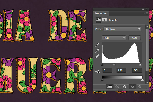
Click the Create new fill or adjustment layer icon at the bottom of the Layers panel and choose Levels.
Step 3
Click the Clip to layer icon, and change the Highlights value to 245 and the Gamma value to 1.70. This will brighten up the texture a little bit.
You can play around with the shapes, colors, and sizes to create many different outcomes.
Congratulations! You're Done
In this tutorial, we used a couple of shape tools to create a simple marigold flower, and we colored and styled it.
Then we styled a simple leaf brush, and rasterized the layers to use them on top of the text.
After that, we created the text, made shape copies of it, and styled those layers with different strokes to create the outer edges.
Finally, we filled the text with the flower and leaf layers, and added a simple grunge texture to finish the effect off.
Please feel free to leave your comments, suggestions, and outcomes below.
Today we will create an adorable raccoon. We'll use basic shapes and warp effects,
as usual—nothing new if you are already my follower. You will learn how
to create part of the raccoon’s body by moving the handles of the anchor
points and then combining them into a final creation.
1. Create the Shape of the Raccoon
Step 1
I hope you’ve already opened Adobe Illustrator and created a New
document. Let’s start by creating the head of our raccoon. Hit the
Ellipse Tool (L) and make an ellipse. Using the Convert Anchor Point
Tool (Shift-C), make sharp corners on the ellipse; while keeping the
ellipse selected, click on the left and right anchor points—these two
points should be sharp now.
Keep the sharp anchor points selected and press the down arrow button on your keyboard a few times.
Wait—we’re not quite done yet. Select this shape and go to Effect >
Warp > Bulge. Enter the following settings in the new dialogue
window. Then expand the shape (Object > Expand Appearance).
Step 2
Let’s add some depth to the head. Create a copy of this shape, in front
of the original one (Control-C, Control-F), shift it down a little bit, and then
make this copy slightly bigger. Select the original shape again and
make another copy in the front (Control-C, Control-F). Keeping these two
upper copies selected, go to the Pathfinder panel and press the Minus Front
button. You will get a moon-like shape. Change the fill color as you see
in the image below.
Step 3
For the eyes, create an ellipse and slightly tilt it to the left. Add a
dark circle, followed by a small white circle as a highlight. Keep the
whole eye selected and take the Reflect Tool (O). Holding down the
Alt key, click on the right side of the eye. In the new dialogue window,
enter Vertical and press Copy. You should have two eyes now.
Position them as you wish, on the previous head shape. The lower you
position the eyes, the more the raccoon will have a baby-animal look.
Step 4
On to the nose. Now that you know how to create a sharp anchor point
(remember how you created the head?), let’s create a dark ellipse and
make the bottom point sharp. Add a tiny white ellipse as a highlight.
Step 5
Now for the mouth. Draw two ellipses using the Ellipse Tool (L) with no fill and
with the stroke color noted below. On the Stroke panel, check Round Cap.
After that, grab the Scissors Tool (C) and click on the left and right
anchor points of the first and then the second ellipse. Delete the upper
parts of the two ellipses. Take the Line Segment Tool (\) and add a
tiny line in the middle—we just created a cute mouth for our raccoon!
Step 6
Combine the nose and mouth together. Add a small ellipse behind them (Control-X, Control-B).
Place everything from the previous steps on the head of our raccoon.
Step 7
Let’s add some details which are usual for raccoons. Draw an ellipse
on the left side of the head, behind the left eye. Take the Direct
Selection Tool (A) and move the handles of the anchor points to achieve
the result which you see in the second image.
Step 8
Make a new copy of the head in front (Control-C, Control-F), and select
the dark shape from the previous step together. Press the Intersect
button in Pathfinder.
Keep the resulting shape selected. Take the Reflect Tool (O) and press
the Enter button. Check Vertical in the new dialogue window and press Copy. You've just made the reflection of this dark shape. Keep this
shape still selected, and now select the head too. Go to the Align panel and
press the Horizontal Align Right button. Be careful—it’s very important
that you have checked Align To: Align to Selection (see image below).
Step 9
Let’s add some details. Select the two dark shapes behind the eyes and
make a copy in the front. The copies are marked with yellow strokes in
the image below, but you don't need to change the fill color. Move them
down a little bit.
Create two copies again in front of the dark shapes. In total, you
should have six dark shapes: two under the left eye, two under the right eye, one under the left eye, marked with a yellow stroke, and one under the right
eye, also marked in the image with a yellow stroke.
Let’s first concentrate on the left eye. Select the two upper dark gray
shapes and press Minus Front in Pathfinder. Change the fill color of
the resulting shape (as noted below). Now concentrate on the right eye.
Select the two upper shapes and press Minus Front in Pathfinder. Again,
change the fill color of the resulting shape.
2. Create the Ears
Step 1
Using the Eye Dropper Tool (I), take the fill color from the head of the
raccoon. We will create an ear from an ellipse—using warp will help us
get what we need. Go to Effect > Warp > Arc. In the new window,
adjust the options as shown in the image below; expand the resulting shape
(Object > Expand Appearance). Create another copy in the front, making it darker and smaller.
Step 2
Let’s add some depth to the ear. Create two copies of the ear in the
front. Shift down the upper copy diagonally. Select the two upper copies
and press Minus Front in Pathfinder. Change the fill color.
Step 3
Using the Reflect Tool (O), create another ear.
Place them on the top of the head, but behind it.
3. Create the Body
For the body, create an ellipse (the same fill color as
the head) and place it behind the whole head. Using the Direct
Selection Tool (A), select the left and right anchor points and then move them down. Create a
new copy in front of the body, and make it lighter and smaller.
4. Create the Arms
Step 1
First, we need to create the hand. Shift down the left and right anchor points of a newly created ellipse.
Step 2
Create a copy in the front, and make it darker and narrower. Shift the new
copy down, just slightly. Create a copy of this darker shape in the
front and using the Eye Dropper Tool (I), take the color from the first
shape you created at the beginning of this step. Make this smallest
shape narrower and shift it up a little.
Step 3
Place the hand on the left side of the body. Slightly tilt the hand to
the left. Using the Reflect Tool (O) make a reflection of the hand, so
you will get the right hand. Create another ellipse behind the whole
body—this will finish off the arms. Don't forget to shift down the left
and right anchor points of this ellipse.
5. Create the Legs
Step 1
We won't create the whole leg, just the visible parts—the feet. Create
an ellipse and move the left and right anchor points upwards.
Step 2
As you did for the head and the ear, use the same method to add some depth to the foot. One smaller and lighter copy of the foot along with the three tiny copies will finish the foot.
Step 3
Put the foot under the left hand. Slightly tilt the foot to the left.
Then make a reflection of this, which creates the right foot. Don't
forget to put the right foot under the right hand.
6. Create the Tail
Step 1
We’re almost there! Let’s move along to the tail. Draw an ellipse and make its left and right anchor points sharp.
Step 2
During this step, we will add stripes to the tail. Draw a rectangle
using the Rectangle Tool (M). While keeping it selected, hold down the Alt key and move the rectangle to the right. You will see that you just
created a copy of the rectangle. Then press Control-D a few times to
repeat your last action.
Group all the stripes together (right-click > Group) and go to Effect> Warp > Arc. Enter the options you see in the image below.
Expand the stripes (Object > Expand Appearance). Create a copy of the
tail in the front (the light gray ellipse with sharp edges) and select
the stripes together with it. Press Crop in Pathfinder.
Step 3
Warp it.
Expand the tail (Object > Expand Appearance) and place it behind the whole body.
7. Create the Background
Step 1
Let’s wrap up our illustration. Create a light pink square behind the
raccoon, 600 px width and height, by using the Rectangle Tool (M).
Step 2
Place the raccoon on the background.
Step 3
Here’s one last little tip for you: take this illustration to the next
level by combining two tutorials—today's and a previous one on creating autumn leaves, berries and chestnut icons. Look how adorable it is! It makes a perfect seasonal illustration!
Conclusion
That's it for now! I hope you've enjoyed this tutorial. You can use your
raccoon with colorful autumn leaves to create a fall greeting card, a seamless pattern, or even other animals. Use your imagination, and never
stop drawing!
If you have used Photoshop for any extensive creative projects, you know that there are certain steps that you tend to do over and over again. This can be a tedious and time-consuming process, so what if you could train Photoshop to do it all for you?
Well, you can! Actions let you record the steps you take in Photoshop so that you can perform them again at the press of a button. Our new course, Building Your Own Actions in Adobe Photoshop, gives you a comprehensive look at creating and using Actions to speed up your workflow.
What You’ll Learn
Once you finish this course, you will know how to create Actions yourself. With Envato Tuts+ instructor Kirk Nelson, you'll start with the very basics of recording Actions. You will take a look at the Actions panel, and discuss what types of Photoshop features can and cannot be used in Actions.
Then you will dig into some more advanced techniques like conditional statements and what to do when a particular tool or feature doesn’t record. You’ll finish by creating an intricate Star Dust effect that is completely automated.
This course is intended for intermediate users of Photoshop who already know how to use the program and are familiar with its major features and interface.
Watch the Introduction
Start Learning for Just $15
You can take our new course straight away by subscribing to Envato Tuts+. For just $15 a month, you get access to this course and hundreds of others, with new ones added every week.
This is part of a new series of
quick video tutorials on Tuts+. We’re aiming to introduce a range of
subjects, all in 60 seconds—just enough to whet your appetite. Let us
know in the comments what you thought of this video and what else you’d
like to see explained in 60 seconds!
If you're new to the world of logo design, one of the most important decisions for you to make is which software you should use for the job.
In this series of Quick Tips we're looking at a couple of common design scenarios and how you can find the best-suited software program to tackle your project.
Have a logo to create? Read on to discover some of the best tools in the business...
Which Software Should I Use to Design a Logo?
Logos may look simple enough, but your creative ideas can be really let down if you don’t pick the best software for the job.
Logo designers will all have their own preferred design process. Many prefer to work from hand-drawn designs, scanning them into the computer and digitising them from there. To make a logo flexible to work with and edit—as well as easy to scale—you’re always going to have a happier client if you create a vectorized logo. These are the best software options for creating that vector design:
Option 1: Adobe Illustrator
No stranger to the Design & Illustration team here at Tuts+, Illustrator is a firm favorite with vector artists, and it also happens to be a really versatile, intuitive program for creating graphic-based logos.
A vector art and illustration program, Illustrator is perfect for creating logo designs from scratch, or you can work with scanned designs by placing them on an artboard and using the Image Trace panel.
The main advantage? Illustrator is an advanced vector program that also feels easy and intuitive to use. From creating simple one-color designs to more complex 3D-style logos, Illustrator handles both with equal ease. The program’s color management capabilities are also fantastic.
The disadvantage? Working from scanned artwork that’s been traced can lose some of the qualities of the original design. But this can result in a more polished logo design, so can be seen as an advantage as well as a disadvantage.
Option 2: CorelDRAW
A mainstream competitor to Illustrator, CorelDRAW is a great alternative. It generally feels easier to get started with, and lacks the bells and whistles that come with Illustrator CC, which makes it a solid choice for those who are new to vector or logo design.
A huge number of logo designers are still faithful to Corel, and love the ease of use and no-fuss attitude that it brings to the vector market.
The main advantage? CorelDRAW is a more budget-friendly alternative to Illustrator, and you’ll have no problems with creating most logo designs.
The disadvantage? Some Illustrator fans would argue that CorelDRAW lacks sophistication and advanced features, and you’ll find that most design and branding agencies are loyal to Adobe products.
Option 3 (The Curveball): Adobe InDesign
InDesign? For logos?
It may not be the conventional choice for designing logos, but if your logo is more type-based than graphic-based, InDesign is perfectly suited for manipulating typography at an advanced level.
Take a look at this tutorial on designing type logos to get your creative juices flowing!
The Verdict?
There are really two parts to the logo design process.
Firstly you need to get creative and draft your logo, and this part of the process is really dependent on personal preference—do you prefer to hand-draw and then trace your logo (Illustrator's a great pick for this), or would you rather create your type logo from scratch and have more flexibility with typographic effects (look to InDesign to help you out here).
The final part of the process is where the software choice becomes really important. This is when you create a final version of the logo that's in an easy-to-use format. No client wants an inflexible JPEG logo; they're going to want to be able to edit and scale a vector version. With that in mind, you're best turning to a vector program like Illustrator or CorelDRAW for finalising and exporting your logo.
As long as you're able to gravitate your draft designs into a vector program, there really is no right or wrong way to design a logo! And if you're in need of some inspiration, there's a huge collection of logo designs on Envato Market.
We'd love to hear what you think, and to find out your personal software preferences for logo design. Are you a lover of all things Adobe, or do you prefer the ease of use of CorelDRAW? Are you an advocate of hand-drawing logos before digitising? Share your opinions in the comments below!
Do you understand Affinity Designer? Take our quiz and find out!
Affinity Designer Quick Start
Affinity Designer is an amazing new app for Mac which is taking the design world by storm. Designers everywhere are reporting that they’re dropping their old graphics software and switching entirely over to using Affinity instead.
Taking our free course, Affinity Designer Quick Start, will give you all the right shortcuts and tricks you need, and make you fully familiar with the app’s interface and tools. You'll go from laying down curves, all the way through to exporting a design in no time.
Everything we’ll cover can be done in the free trial of Affinity Designer, so even if you don’t yet have the app you’ll still be able to take this course. Let’s begin!
Comics as a medium are more than just the combination of text and pictures. A comic is a communication tool all of its own, and comes with specific languages and dialects.
Depending on culture, genre or style, there may be differences, but comics generally adhere to some common rules, which we will explore in this tutorial.
You will learn how to communicate with your comic readers through text, motion and atmosphere, and when it's best to use words or let pictures to do the talking.
1. Make a Simple Speech-Bubble Art Brush
Step 1
A common speech bubble is usually made up of a oval shape, with a tail at the bottom, indicating which person is the speaker.
To make a brush we can use for making these tails, start by drawing a triangle similar to the one below. While having the triangle selected, press New Brush from the Brushes panel and choose Art Brush.
Step 2
Now we can draw the tail in one stroke.
2. Use Zig Zag to Convey Shouting
Step 1
To indicate someone shouting, make the oval part of the speech bubble a zig zag shape. While having the oval selected, go to the Effect menu, choose Distort & Transform, then Zig Zag...
Step 2
Play around with the settings until you get the desired amount of jaggedness.
Step 3
Now we just add the tail with the brush from before. The same brush can make more jagged shapes as well, just by drawing in a more angular way.
3. Create Thought Bubbles With the Pattern Brush
Step 1
Another common type of bubble is used to convey not speech, but thought. Usually the oval shape has a bubbly, cloudlike shape to it. Creating a brush to achieve that effect is easy. Just make a Pattern Brush from a circle object.
Apply it to an oval shape, and there you have it! Well, almost. We also need a tail.
Step 2
The tail for a thought bubble is usually not the same as for speech bubbles. Instead it is made up of small bubbly shapes. This time I make a slightly oval shape, and use it as the base for a Scatter Brush.
In the Scatter Brush Options I lower the Spacing a bit, with a fixed value of 70%. I also set the Size to be indicated by Pressure, and have the range be from 30% up to 100%. This means that the more pressure I apply, the larger the stroke will be, and if I draw more loosely, the stroke will shrink in size.
So I start the tail by pressing down harder, then let loose at the end of it to get a tapering effect.
Step 3
With the speech, shout, and thought bubble mostly done, there is just one thing missing. I want a black outline for them as well.
I start by selecting them all, and go to Object >Expand Appearance, to turn the brush paths into objects. From here I select all the white objects which make up the bubbles, then go to the Pathfinder panel and select Merge.
Now that all parts are merged, I select a black stroke with a Weight of 2 pt.
4. Text Tips
Step 1
Now that we've gotten the hang of how to make speech bubbles, let's take some time to think about the text inside as well.
First off, you want to have some space between the edges of the text and the edges of the speech bubble. Of course you don't want the bubble to look empty if you don't have much text in it either. I usually envision a border around the whole text, about as thick as one letter of the text, give or take.
Step 2
Another thing to watch out for is canals within the text. You can see in the left speech bubble below how the spaces between the words align in a straight row, which can be a bit distracting.
This is the way the font naturally lays out the text, so to change how the spaces overlap, I can either type each row on its own, or I can Make Outlines by selecting the text and pressing Command-Shift-O. This will turn the font into objects. While you lost the ability to re-type, moving the words how you want them is much less hassle.
Step 3
Which font is used can determine the impact of the text. Comic Sans, for example, is an almost universally disliked font, while some others are well-liked but maybe less suited for comics. There are a lot of good resources out there for comic fonts, like Blambot for instance, where you can purchase fonts for about every type of comic out there, including sound effects.
There are also fonts which can be downloaded and used for free. For example, the font I use for my examples in this tutorial is called Nina and can be found at the Internet Archive. It uses a Creative Commons license called Attribution ShareAlike, which means that you are free to use and modify the font however you want, as long as you provide links to the license, and distribute any changes you've made to it under the same license.
For some choice words you might want to create a bigger impact. Using the Warp tool on the text can create some great effects. One of my favorites is the BulgeStyle, which can be chosen from the drop-down menu.
5. Motion Lines
Communication can of course also be without words. There are several ways of conveying motion within a comic, but a common way is with so called motion lines.
A object being moved can be shown by having it appear in more than one place along the path it is moving in. Adding some motion lines to show the path it is moving along can help create the effect of an object moving, as in the example below.
To indicate small movement, like someone shuddering, the motion lines need to become small as well. While drawing these lines I almost mimic shuddering myself, which gets nice jittery lines.
For long, fast-paced movement, the lines become drawn out as well. In the example below I also add some motion lines along the feet and elbow. I think this adds to the feeling that not only is the person moving forward, but the limbs are moving as well.
The lines need not be straight either. Mimicking the path an object is moving on will help bring the comic panel some speed.
In the example below I add motion lines not only to the arm of the boxer, but also to the sack which receives the punch. Where the glove hits the sack, I draw some focus lines to show the impact, but also some smaller motion lines at the edges of the sack, showing how it is set in motion by the punch.
6. Emotion Symbols
Aside from motions, there are of course emotions. While we as humans have our own well established language of emotions—smile = happy, frown = angry, etc.—comics have an additional symbol language to indicate emotions as well.
You may be familiar with heart-shaped eyes showing a character in love, dollar signs (or another currency) as eyes indicating greed, and the large sweat drop (often used in manga).
Summary
In this tutorial we have gone over some common visual effects in comics.
We have learned how to create time-saving assets for making speech, shout and thought bubbles, and some things to look out for when it's time to type the text in them.
We've also gone over how to express movement in comics, from small motions like shuddering to explosive ones like punching.
Lastly we've talked about how symbols can be combined into facial expressions, adding yet another layer to the visual language of comics.
In this tutorial I'll show you how to create a moonlight scene with a woman watching the flowers.
We'll start this tutorial by adding the sky and landscape, and then add the moon and its reflection using adjustment layers, masking and brushes. After that we'll add other elements, such as the floor, balcony, model and flowers, and blend them together using the same techniques. We'll finish it up with several adjustment layers.
During this tutorial you'll also learn how to work with light, enhance the depth of field and more.
Tutorial Assets
The following assets were used during the production of this tutorial:
Create a new 1500 x 1500 px document in Photoshop with the given settings:
Step 2
Open the sky image. Drag it into the main document using the Move Tool (V), and place it in the upper half of the canvas.
Go to Filter > Blur > Gaussian Blur and set the Radius to 8 px:
Step 3
Use an adjustment layer to darken the sky a bit. Go to Layer > New Adjustment Layer > Curves:
On this layer mask, activate the Brush Tool (B) with a soft round one
and black color (soft black brush) to reduce the effect on the left side
where we're aiming to add the moon.
Step 4
Use another Curves adjustment layer to brighten the sky, especially the left.
Take a soft black brush and hide the effect on the right side where we've aimed to make it darker.
Step 5
Open the landscape image. Place it in the lower half of the canvas.
Add a mask to this layer and use a soft black brush to remove the hard
edge and blend its sky with the existing one. Leave some smoky edges
around the mountain tops. Lower the brush opacity where painting on the
top of the left mountain to make it fade into the sky.
Step 6
There
are some unwanted details on the lake. Create a new
layer and set it as Clipping Mask. Select the Clone Tool (S) to remove the indicated details.
Step 7
Add a Curves adjustment layer (set as Clipping Mask) to darken the
landscape. Use a soft black brush on its layer mask to remove the dark
effect on the part which is illuminated by the moonlight.
Step 8
Use a Hue/Saturation adjustment layer to match the landscape saturation with the sky:
2. Add the Moon
Step 1
Isolate the moon from the original image using the Elliptical Marquee Tool (M) and place it in the top left of the main scene.
Step 2
To match its depth and softness with the sky, apply a Gaussian Blur of 8px to the moon layer:
Step 3
Double click the moon layer, choose Inner Glow, and set the color of glow to #ededed:
Step 4
To make the moon reflection on the lake surface, use the same method as in my fantasy lake scene tutorial.
You should have a similar result to this:
Step 5
Create a new layer and use a soft brush with the color #ededed to paint
on the lake area to reflect the moon glow. Change
this layer mode to Soft Light 100%.
3. Add the Floor
Step 1
Open the floor image. Place it in the foreground and make it narrower using the Free Transform Tool (Control-T).
Step 2
Create a Hue/Saturation adjustment layer (set as Clipping Mask) to desaturate the floor. Bring the Saturation value down to -85:
Step 3
The floor looks too bright, so use a Curves adjustment layer to darken it completely:
4. Add the Balcony
Step 1
Open the balcony image and isolate it from the background using the Polygonal Lasso Tool (L). Select the lower part to place above the floor, on the right side.
Step 2
Duplicate this layer and flip it horizontally by choosing Edit > Transform > Flip Horizontal. Place it on the left:
Step 3
Select two columns and position them above the balcony, remembering not to hide the moon.
Step 4
Select these four layers and press Control-G to make a group for them.
Change the mode of this group from Pass Through to Normal 100%. Use a Hue/Saturation adjustment layer and decrease the Saturation value of Master to -86:
Step 5
Make a Curves adjustment layer to darken the balcony.
Use a soft black brush to reveal the light on the contouring areas (they're
illuminated by the moonlight) and keep the others in shadow.
Step 6
There are still some details that need to be retouched, starting with the balcony
part on the lower right. Make a new layer above this one (set as Clipping Mask), change the mode to Overlay 100% and fill with 50% gray:
Select the Dodge and Burn Tool (O) with Midtones Range, Exposure about 20-30%, to bring more light to the front contour of this part, and also
strengthen the shadow in the back. You can see how I did it with Normal
mode, and the result with Overlay mode.
Step 7
Do the same with the other parts
of the balcony, and you should make the right column much brighter than
the rest as it's illuminated more than the others.
Step 8
To create a shadow of the balcony
on the floor, make a new layer under the balcony layers. Hold down Control-Shift while clicking their thumbnail layers to load their
selection.
Fill this selection with black and lower the Opacity to 60%. Use Control-T to change its perspective:
Apply a Gaussian Blur of 4 px to this shadow:
On its filter mask, use a soft black brush to erase the softness of the
bottom as it needs to be harder and more solid.
Add a mask to this shadow layer and reduce the shadow opacity a bit on the top area:
5. Add the Mist
To create some mist on the lake, go to Layer > New Fill Layer > Solid Color and pick the color #2d2d2d.
On the mask of this layer, use a soft black brush to make the misty effect subtly visible on the lake only.
6. Add the Model
Step 1
Cut out the model from the original background using the Polygonal Lasso Tool. Place her on the right side, on the floor.
Step 2
Make a shadow for her as we did with the balcony.
Step 3
Create a new layer above the shadow layer and under the model one. Use a
soft brush with the color #ededed to paint the moonlight reflection on
the floor. Change this layer mode to Soft Light 100%:
Step 4
Use a new layer (set as Clipping Mask) and select the Clone Tool to remove the tattoo on her back:
Step 5
Make a Hue/Saturation adjustment layer to reduce the model saturation:
Step 6
Use a Photo Filter adjustment layer and pick the color #87d5f9:
Step 7
Add a Curves adjustment layer to darken the model, especially the back and dress.
Paint on the front, face and shoulder contour to maintain the lightness
there.
Step 8
Create a new layer, change the mode to Overlay and fill with 50% gray.
Use the Dodge and Burn Tool to bring more light to the model front and
strengthen the shadow on her back, especially the dress details.
7. Add the Flowers
Step 1
Open the flowers 1 image. Isolate the flowers using the Magic Wand Tool
(W). Place it in the right corner, behind the right column. Set this
layer under the balcony group.
Step 2
Reduce the flowers' saturation using a Hue/Saturation adjustment layer:
Step 3
Make a Curves adjustment layer to darken the flowers. Keep the brightness of the part towards the light using its layer mask:
Step 4
Add flowers 2 to the top right of the scene, and arrange this layer above the balcony group.
Step 5
Apply a Hue/Saturation adjustment layer to this flowers layer:
Step 6
Darken the flowers using a Curves adjustment layer. The selected parts show the masked areas:
Step 7
Use the Burn Tool on a separate layer to correct the shadow on some
leaves and petals, especially the ones hidden in the column corner:
Step 8
Place flowers 3 on the left side of the balcony:
Step 9
Create several adjustment layers and repeat the same techniques as done with the other flowers:
8. The Final Adjustment
Step 1
Create a Color Balance adjustment layer on top of the layers and change the Midtones and Highlights settings:
Step 2
Make two Curves adjustment layers to change the light focus and contrast
of the whole picture. The selected areas show where to mask off.
Step 3
Add a Gradient Map adjustment layer and pick the colors #766f64 and #fde9ae. Change this layer mode to Soft Light 100%.
Step 4
Make a Color Fill layer and pick the color #230000. Set this layer mode to Exclusion 100%:
Step 5
Use another Color Balance adjustment layer and change the Midtones settings:
Step 6
Create a Photo Filter adjustment layer and pick the color #abccf8:
Step 7
Make a Vibrance adjustment layer to enhance the final effect:
Congratulations, You're Done!
I hope that you've learned something new from my tutorial. Feel free to leave your comments in the box below. Enjoy Photoshopping!
Follow
this tutorial and learn how to create a bagel sandwich icon in Adobe
Illustrator. At the beginning you will create the two bagel pieces, and then you will draw all the ingredients for the sandwich: pieces
of lettuce, a slice of cheese and a slice of ham.
The most fun part
is to compose the bagel sandwich, because you can get creative here.
The final thing is to sprinkle some sesame seeds on top with the help
of a scatter brush. If you love food-related tutorials as much as I
do, let's
start the fun!
1.
Start a New Project
LaunchIllustrator and then go to File > New in order to open a blank
document. Type a name for your file and set up the dimensions, selecting Pixels as Units and RGB as Color Mode.
Next, go to Edit >
Preferences > General and set the Keyboard Increment to 1 px and
while there, also go to Units to make sure they are set as in the
following image. I usually work with these settings, and they will
help you throughout the drawing process.
2.
Create the Bagel
Step
1
Grab
the Ellipse Tool(L) and draw two circles with the dimensions
indicated. While having them selected, press Horizontal Align Center
and Vertical Align Center in the Align panel.
Step
2
With
the circles still selected, go to Object > Compound Path > Make
(Control-8) and then fill the resulting shape with light brown. I
will name it “bagel-top”, and you will need extra copies of this
shape throughout the tutorial.
Step
3
With
“bagel-top” still selected, add a New Fill in the Appearance
panel above the first. Use the radial gradient shown, and then go toEffect > Sketch > Bas Relief and apply the settings from the
next image. Set the Blending Mode to Soft Light.
Step
4
Add
a New Fill in the Appearance panel and use the color brown; then set
the Blending Mode to Soft Light.
Step
5
Add
a New Fill again and use the color indicated, and then go to Effect >
Sketch > Note Paper and apply the settings from the next image.
Set this Fill attribute to Blending Mode Overlay and 15% Opacity.
Step
6
To
get rid of the pixelated edge that is generated
by the Note Paper effect, we will create a mask. Select “bagel-top”,
Copy and Paste in Front (Control-F) to make a copy, and then remove
all existing appearances. Now, select both shapes and go to Object >
Clipping Mask > Make (Control-7). Name the resulting group “Bagel
Top”.
Step
7
Let's
create the bottom piece of the bagel. Make another copy of
“bagel-top” on your Artboard and use the radial gradient shown to
fill it. We don't need to add more details because most of it will be
covered by the ingredients in the sandwich.
3.
Create a Piece of Lettuce
Step
1
Grab
the Pencil Tool (N) and draw a similar shape, filling it with the
radial gradient shown. Use the Gradient Tool (G) to adjust the
direction if necessary.
Step
2
With
the lettuce-shape still selected, go to Object > Path > Offset
Path and apply a 1.2 px Offset in order to get a slightly bigger
shape. Fill this new shape with the linear gradient shown and make
sure it's behind the first one.
Step
3
Now,
grab the Pen Tool (P) and draw some shapes like below on the lettuce.
Fill them with different shades of green (1). To add some dimension,
draw a few small shapes between the “waves” of the lettuce, but
make sure you send them in back. Use a darker shade of green as the
fill color (2).
4.
Create a Slice of Cheese
Step
1
Use
the Rectangle Tool (M) to draw a 73 x 150 px rectangle, and use yellow
as the fill color. Next, draw some circles with the Ellipse Tool (L)
and Group (Control-G) them.
Before you continue, make a copy of this
group, because you will need it in the next step. Now, select the
rectangle along with the group of circles, and press Minus Front in
the Pathfinder panel to obtain the holes in the cheese.
Step
2
Now,
you will need the copy of the group of circles from the previous step
(1). Select it and Copy and Paste in Front (Control-F) to get
another group of circles (the green ones). Move them a little
down and to the right (2).
Next, select both groups and press Exclude
in the Pathfinder panel, and then Ungroup (Shift-Control-G) from theObject menu (3). Delete all the resulting shapes from the
bottom-right side of the holes because we don't need them. If some of
the shapes go over the edge, just take the Delete Anchor Point Tool
(-) and delete the anchor points at the end that are unnecessary, and
make
small adjustments if needed (4). Fill these shapes with the color
indicated (5).
5.
Create a Slice of Ham
Step
1
Use
the Pencil Tool (N) to draw a shape like the one in the following image, and
use the linear gradient shown to fill it. Move some of the anchor
points towards the inside with the Direct Selection Tool (A) to
create a more realistic look.
Step
2
Use
the Pencil Tool (N) again to draw a shape at the bottom. Next, select
the ham shape and Copy and Paste in Front (Control-F); then select
this copy along with the black shape and press Intersect in the
Pathfinder panel. Fill the resulting shape with the linear gradient
shown.
Step
3
As
explained in the previous step, create two new shapes and fill them
with the linear gradient shown in the next image.
Step
4
Grab
the Pen Tool (P) or the Pencil Tool (N) and draw a few random shapes
on the ham in
order to add more details. Fill them with the linear gradient shown
below.
6.
Compose the Bagel Sandwich
Step
1
At
this point all the elements are ready. Before you continue, Group
(Control-G) all the shapes that compose the lettuce and name the
group “Lettuce”; Group (Control-G) all the shapes that compose
the slice of cheese and name the group “Cheese”, and you guessed it... do the same for the “Ham”. Since they are in vector form, you can also scale them if you want.
Step
2
On
top of the “bagel-bottom”, start to arrange the pieces of lettuce.
Multiply the “Lettuce” group as many times as you want, and
arrange them as you desire. You can be creative here. Also add the
first slice of cheese.
Step
3
Let's
add some shadows as we go, because it will be more difficult to add
all the shadows at the end. It's better to work in layers.
Use
the Pen Tool (P) or the Pencil Tool (N) to draw two paths along the
outer edge of the cheese, but don't go over the edge of the
“bagel-bottom”. Give them a 2 pt Stroke using the color
indicated, and then go to Effect > Blur > Gaussian Blur and apply aRadius of 2 px. Send these two paths behind the “Cheese” group.
While
the paths are still selected, press New Graphic Style at the bottom
of the Graphic Styles panel in order to save it for later use. Name
it Brown Shadow Graphic Style.
Step
4
Now,
make a copy of the “Ham” group and arrange it over the bagel.
With the Pen Tool (P) or the Pencil Tool (N), draw a path in the top
corner and then simply select the Brown Shadow Graphic Style from theGraphic Styles panel
to add the shadow. Move this path behind the “Ham” group but in
front of the “Cheese” group.
Step
5
Draw
another path in the bottom corner, give it a 2 pt black Stroke, and
then apply a 2 px Gaussian Blur. Move this path behind the “Ham”
but in front of the “Lettuce”.
Save
this style in the Graphic Styles panel and name it Black Shadow
Graphic Style.
Step
6
Arrange
a second slice of ham over the bagel, draw two paths as in the
following image, and select the Black Shadow Graphic Style from theGraphic Styles panel to add the shadows. Move these two paths behind “Ham”.
Step
7
Arrange
the third slice of ham and draw the two paths like below. For the
black path, select the Brown Shadow Graphic Style, and for the blue
path select the Black Shadow Graphic Style. Don't forget to send them
behind “Ham” but in front of the first slice (1).
Add
another slice of cheese, draw the green path and select the Brown
Shadow Graphic Style for it. Send this path behind "Cheese" (2).
Step
8
Now,
grab the “Bagel Top” group and arrange it over the ingredients.
Do not place it directly over “bagel-bottom” but a little
down and to the right.
7.
Add Shadow Under the Bagel Top
Step
1
Select
“bagel-top” and Copy and Paste in place (Shift-Control-V).
Remove all existing appearances and just give it a white fill; then
go to Effect > Stylize > Drop Shadow and apply the settings
shown below. Move this copy behind the “Bagel Top” group.
As
indicated by the arrows, there are areas where we don't have any
lettuce, ham or cheese
sticking out from the bagel, so there is no need for shadow there. To make the shadow not visible
in those specific areas, we will create a mask in the next step.
Step
2
First
lock the “Bagel Top” group in the Layers panel, or hide it for the
moment. Now, select all the ingredients in your bagel (in my case: 3
x “Lettuce”, 3 x “Ham” and 2 x “Cheese”) but without the
shadow-paths and then press Unite in the Pathfinder panel (1). As a
result you will get a compound path (2).
Next, select the white shape
from the previous step along with this compound path (which must be
in front) and go to Object > Clipping Mask > Make (Control-7)
(3). You can see the end result in the following image (4).
Step
3
Use
the Ellipse Tool (L) to draw a 57 x 57 px circle and then place it in
the center of the bagel. Select white as the fill color; then go toEffect > Stylize > Inner Glow and apply the settings shown
below. In the Appearance panel, change the Blending Mode for the
white Fill to Multiply to make it transparent. We only want the
shadow to be visible.
8.
Add the Sesame Seeds on the Bagel
Step
1
Grab
the Pen Tool (P) and draw a sesame-like shape followed by a smaller
shape on top. Use the colors indicated to fill these shapes and
create the white and black sesame seeds. At 100% View the seeds are
very small, so take this fact into consideration.
Drag the white
sesame into the Brushes panel and choose New Scatter Brush. Type a
name for your brush and set the Rotation relative to Path. Leave the
rest of the settings as they are and hit OK. Repeat the same thing
with the black sesame.
Step
2
Take
the Pencil Tool (N) and draw a random path over the “Bagel-Top”
and stroke it with the Sesame Scatter Brush saved earlier. The Stroke
Weight is set at 1 pt but the stroke color is not important. Open theStroke Options window from the Appearance panel and change the
settings in order to scatter the seeds as much as possible. Play with
the settings until you like the end result.
Step
3
With
the path still selected, press Add New Stroke in the Appearance
panel. Use the same Sesame Scatter Brush but open the Stroke Options
window and choose different settings. This will add more sesame seeds
on the bagel.
Step
4
Let's
add a few black sesame seeds. In the Appearance panel, press Add New
Stroke and this time use the Black Sesame Scatter Brush that you saved earlier. Open the Stroke Options window and play with the
settings.
Step
5
With
the path still selected, choose Expand Appearance from the Object
menu. As a result, the three strokes will turn into three groups of
seeds. Double click on one of the seeds a few times to enter theIsolation Mode until you are able to select the individual seeds and
delete the ones that go over the edge of the bagel.
When you are
done, exit Isolation Mode by pressing the Back one level arrow in
the top-left corner of your Artboard.
Step
6
Next,
select the entire group of sesame seeds and go to Effect > Stylize> Drop Shadow. Apply the settings from the image below and hit OK.
9.
Add Shadow Under the Bagel Sandwich
Step
1
Select
the compound path that you made earlier in the tutorial using all the
ingredients in the sandwich, and then Copy and Paste in place
(Shift-Control-V). Send the new copy behind everything by going toObject > Arrange > Send to Back (Shift-Control-[) (1).
Now,
select “bagel-bottom” and then Copy and Paste in Back (Control-B)
(2). While these two copies are selected, press Unite in thePathfinder panel to get a new compound path (3).
Step
2
Select
“bagel-top” and then Copy and Paste in place (Shift-Control-V).
Send the new copy behind everything by going to Object > Arrange >
Send to Back (Shift-Control-[) (1). Now, select the compound path
from the previous step along with the copy of “bagel-top” and
press Unite in the Pathfinder panel again (3).
Step
3
The
shape is now ready. Select black as the fill color and then go toEffect > Stylize > Drop Shadow. Apply this effect two times
using the settings shown below. In the Appearance panel, set theOpacity for the black Fill to 0%.
Step
4
Draw
a rectangle in a new layer behind the bagel and use the radial
gradient shown to fill it in order to create the background (1). You
can, of course, add another background if you prefer.
Use
the Ellipse Tool (L) to draw a new 57 x 57 px circle, and place
it in the center of the bagel. Send the circle behind everything by
going to Object > Arrange > Send to Back (Shift-Control-[).
Select black as the fill color and set it to Blending Mode Overlay
(2). This will darken the area in the center of the bagel a little
more (3).
Congratulations!
You're Done
The
bagel sandwich icon is complete. I hope this was fun for you to
create, and don't forget to share an image with us. I would love to
see your re-creations. Also, let me know if you want more food-related
tutorials in the future.
High-quality textures are an integral part of creating digital artwork with depth, realism and visual interest. One of the best ways of creating good textures is to develop them yourself.
But once you've created a hand-crafted texture, how do you best digitize it? In this short video tutorial from my recent course on texture crafting in Adobe Photoshop, I'll show you the best way to scan your textures for later digital use. We'll discuss the software to use, scanner settings, and more.
Note that this is only for textures that can safely and easily be placed onto a scanner bed.
Watch the Tutorial
Watch the Full Course
In the full course, Texture Crafting in Adobe Photoshop, I'll take you step by step through the process of creating your own textures. We’ll look at photographing textures out in the “wild” or in a studio setting, crafting your own textures with real media, and creating digital textures with the tools in Photoshop.
This course will spark your interest in texture crafting and start you on your way to creating your own library of digital textures.
Recently we learned how to draw a pony, but it was only one, boring pose. Horses are famous for their speed, so we'll make our pony run in its full glory. This tutorial will be a bit different than the last one. You won't only repeat the steps—you'll also learn how to draw any running pose you like!
1. How a Pony Runs
Before we start drawing, you need to understand how a pony runs.
This is the "skeleton" of our pony. Do you remember what's there in the legs?
It's the best to compare the legs of a pony to your own legs and arms:
The hoof is like the tip of your finger (horses step on one finger only!).
Since the hoof is the tip of the finger, here is where the finger bends.
This is the wrist at the top of very long hand.
The back hoof is like the tip of your toe.
This is where the toe bends.
And this is the heel, at the top of very long foot.
Let's simplify the skeleton for a while to understand it better.
Now, this is how running works for almost every animal:
The animal bends the leg to lift it.
Then it brings it as far ahead as possible.
When the animal can't reach any farther, it hits the ground...
... and pushes it strongly behind.
Then the cycle goes on.
When you push something, it pushes you back!
This will make it clearer:
See how the arrow makes a circle during the cycle
You can guess where the hoof will be by drawing an arc from the first position. The more bent the leg, the higher the arc.
Legs are one thing, but they're attached to a body, and the body changes during a run, too. This is how our pony's body looks when it's standing:
When the legs move, the body moves, too:
2. Prepare the Running Pose
All right, enough theory! Time to have some fun. I'm going to assume you've already done the previous part of this tutorial, but if you haven't, feel free to go back there any time you want.
Step 1
Draw a line showing the rhythm of the run. It can be straight or bent in any direction.
Step 2
Now adjust the body and the hips to this line.
Step 3
Draw the ground level.
3. Draw the First Pair of Legs
Step 1
Go back to the first section and check which position of legs fits the body you've sketched. Use the arcs to get the right length.
Step 2
Now we're going to divide the legs in a normal way. First, find the halfway point...
Step 3
... then the halfway point of each half.
Step 4
Now you can define the widths of the parts:
Step 5
Draw circles/ovals to define the parts of each leg.
Step 6
Now you can simply outline the legs.
4. Draw the Other Pair of Legs
Step 1
The other pair can be drawn in a similar way. This time we're going to draw bent ones, so the lines will be shorter.
Step 2
Again, divide the lines into halves and more halves.
Step 3
Now bend the lines. You can bend them in each of the spots that we've described before. If you don't know how, look at your own body. How does your wrist bend? Or your toes?
Step 4
Just like before, define the widths...
Step 5
... and outline them.
Step 6
Last, outline the legs.
5. Finish the Drawing
Step 1
Once the legs are done, you can add the other parts of the body. Remember to make it fit the rhythm of running you have chosen.
Step 2
Just like the last time, outline the finished sketch with a dark ball-point pen or marker.
Step 3
Put the sketch under a new sheet of paper and finish the drawing. Last thing: you can choose which leg should be closer to us by trying to do the same pose on all fours.
Congratulations!
You can use this instruction to draw running ponies in a lot of different poses. If you need ideas, check out the animations from my tutorial on drawing horses. There are so many poses to choose from!
Traditionally, females didn't take a big part in medieval wars. They could be mothers, cooks, nurses, but as members of the "weaker sex" they wouldn't even think of fighting. Today, when those times are brought back to life in video role-playing games, the player can become whoever he or she wants to—a member of a different species, race, or sex.
However, this choice has little to do with equality. While male characters are pictured as the strongest members of their sex (which makes sense, since they're trained warriors), females seem to be chosen for their attractiveness, not their usefulness in a fight. The armor they wear confirms this view.
Even though initially most of the players were male and they liked it this way, it's no longer the case. It's time to change this ridiculous view of a female warrior, and you—a future concept artist, maybe—can be a part of this revolution. Follow me in this tutorial to learn how to design a realistic female fighter, as deadly on the battlefield as any male.
What's the Problem?
Someone could say: "It's fantasy, it's not supposed to be realistic! In these worlds everyone is attractive, both males and females, because it's our dream." The problem is that most games are about fighting, and while traditional male attractiveness is about his ability to fight (originally, to protect his family), female attractiveness just doesn't have anything to do with it. A "traditionally attractive" female looks ridiculous on a battlefield!
"But females are not made for fighting anyway, so it's impossible to design a realistic female warrior," one could say. It's true that males are on average stronger than females, but as with any average measurement, some females are stronger than some males. How many of you would stand a chance against a female boxer?
Weak females wouldn't go into military training any more than weak males. As a result, a female training to be a warrior was probably born with certain
male-associated traits, like a strongly built body. It would give her an advantage in fighting, but, according to a common belief, a disadvantage in
searching for a husband. But why would it mean anything in a game about killing each other...?
Being a male doesn't make one automatically stronger than every female
In the Middle Ages, females weren't warriors not because they were weak, but because they had other roles to do, irreplaceable by males. In a fantasy setting—where dreams come true—we can assume that females are more free to choose their path in life, not defined by their sex. Some may devote their life to their family, but others can train all day to be as strong as males. If it were any different, why would you even choose to play as a "weak, family-oriented" female?
Considering all this, let's try to design a female character that looks like a warrior without losing her femininity.
1. Draw the Upper Body
Step 1
Start by sketching a simplified skeleton of the warrior. You can use the method from my complex tutorial about drawing a human figure. While wide shoulders are traditionally associated with a male figure, they're also associated with strength, and that's what our warrior needs. If you need inspiration, check what the best female athletes look like.
Make the pose relaxed and open, to present the armor clearly.
Draw on a New Layer (or a new sheet of paper). Start with the torso. Don't make the waist ridiculously narrow—females don't have fewer internal organs than males!
Step 4
Add the abdomen. It doesn't need to be detailed; your role here is to figure out where the torso bends.
Step 5
Put the shoulder muscles on the shoulders.
Step 6
Connect them to the chest. Don't draw breasts yet.
Step 7
Add the neck.
Step 8
Now the arms...
Step 9
... and the forearms. Again, details aren't necessary, but make sure you're creating the right silhouette.
2. Draw the Lower Body and the Details
Step 1
We're going to draw the thighs with a simple method, defining only these muscles that are important to the final shape:
Step 2
Draw the shins...
... and the calves.
Step 3
Add the hands and feet.
Step 4
When it comes to the breasts, imagine them in a sports bra. Warriors aren't that different from athletes—they value efficiency over look. The more flattened the breasts, the less they'll get in the way during a fight. A sports bra (or simply wrapping) also stops uncomfortable movement.
3. Draw the Basic Armor
Because I'm not an armor expert, I strongly recommend that you do your own research on every part of the armor we're creating here, using the names I give you. Try to understand its function before you draw it—if you really pay attention to it, you'll be able to create an innovative but functional piece of armor.
Step 1
Clean up the overlapping lines of the body and fix anything that feels wrong. Lower the Opacity of the layer and create a new one. We're going to create the armor now!
Step 2
Draw the cuirass first. It's like a vest, except it's hard, padded, and ends below the ribcage level (where the torso bends). Don't create separate "cups" for the breasts—it would be best to ignore them completely for full realism, but you can also try a compromise with a slightly bent front.
Armor doesn't adhere right to the skin—there must be some kind of padding in between. Therefore the cuirass can't look like a tight corset—every female will look a bit bigger in it.
Step 3
To elongate the cuirass without stiffening the torso, we can add a kind of "flange". It creates room in the waist area without revealing it.
Step 4
We're going to create a metal "skirt" on the hips. This area needs flexibility, so we can't put solid plates here. Draw small plates connected to each other like scales. If you want to do some research about this part of the armor, try keywords like faulds and tassets.
Step 5
Add a small, flexible set of plates to protect the crotch area.
Step 6
Protect the forearm and arms with simple guards. I decided the make the vambraces (forearm guards) out of leather to make the overall weight smaller, and to spice up the design.
Step 7
The elbows need protection, too, but they also require flexibility. There's a special part of the armor, called couter, that you can use here. It protects the elbow and creates some space to let the arm bend.
Step 8
Draw the greaves (lower leg guards) and cuisses (upper leg guards).
Step 9
Just like with the elbows, the knees need flexibility and protection at the same time. Use poleyns to cover them.
Step 10
Let's return to the torso. You can protect the shoulders with pauldrons or spaulders. In fantasy designs they're often huge and impractical; try to avoid it.
Step 11
There can be a space between the cuirass and the shoulder armor, leaving the armpit uncovered. This is a vital place to protect, so we can cover them with besagews. In my case I had to make them pretty small because of the frontal bending of the cuirass.
Step 12
The neck can be protected with chainmail, or with a metal collar (gorget).
Step 13
Put a helmet on the head. Don't make it too complicated—just make sure it does protect the skull.
Step 14
Finish the details. Because the armor is already very heavy, I made the other components out of leather. The feet, for example, are not a common target, and they're much more flexible in light armor.
4. Customize the Armor
This is a very basic, vanilla set of armor. Let's work on it some more to make it fit a fantasy universe. Obviously, there's no perfect recipe, so I can only give you some pieces of advice.
It's best when the helmet is smooth and round, so that the attacking sword slides off. It looks pretty boring, though, so additions like horns are often added. This is a very impractical decoration, easy to hit (to knock the helmet/head off with the impact) or to catch (to break the neck). In my case I've used thin plates that don't have any influence on the protection, but they break the dull roundness of the helmet.
I've also added chainmail to protect the neck. This piece imitates long hair, which makes the armor slightly more feminine.
I've covered the "cleavage" and shoulders with ornaments, which makes it look like decorated sleeves of a plain short (cuirass), or naked, tattooed skin. This trick will work even better if you give this part of armor a different shade.
The front of the cuirass tempts us to decorate it heavily, but be careful here: the attacking sword will likely get stuck between protruding elements, instead of sliding off.
Notice the rivets on the vambraces (imitating bracelets) and the harmless decoration of the gauntlets.
The "metal skirt" gives us the opportunity to make the armor more feminine. Just make sure you don't make it less flexible in the process.
To continue the trick from the shoulders, I've decorated the "naked" thighs, too.
When you're done, remove the previous layer and clean it up.
Ready to Fight?
Our warrior is ready to take a sword in her hand and join the fight. In next part of this tutorial we're going to paint her in Adobe Photoshop. We're going to learn how to color and shade metal, so stay tuned!
In this tutorial I will
show you, step by step, how to create a circular grid, align it perfectly and
design a cute owl character. Hopefully, you’ll learn how to use circles to
create other characters on your own.
1. Create Circles
Step 1
Go to View > Show Grid.
Using the Ellipse Tool
(L), create a 165 x 165 px circle. This will be the head. Then, create another147 x 147 px circle for the body. Select both circles, click twice on the first
one to make it active and, using the Align panel, click on Horizontal align
center and Vertical align center.
Step 2
For an eye, create a 45
x 45 px circle. This time, align it with Vertical distribute center, placing
it to the left like this:
Create
a 173 x 173 px circle and a 147 x 147 px circle and align them as before. Hit Control-R to bring up the ruler. Then click on the ruler and use the mouse to place it in the center. Position both circles as shown
in the picture.
The
overlap between the two large circles gives your owl a beak.
Step 3
Create three circles
(red): 293 x 293 px, 208 x 208 px and 173 x 173 px. Position them as
shown in the picture below. All the circles must be centered.
Create
the final three circles (purple): 237 x 237 px, 293 x 293 px and 117 x 117 px.
Place them as shown in the picture below. The small circles are shown for
guidance only.
Step 4
Now
select all circles, except for the first two we created. Press Control-G to
group them. Right click on the mouse, and choose Transform, then Reflect.
Select Vertically and click on Copy.
Use the red circles and guide to align the group in the middle.
Select everything, Control-C, lock the layer and create a new one. Shift-Control-V to copy circles in place.
With everything selected, delete the stroke and fill with any color. Using the Pathfinder panel, click on Divide.
Step 5
Delete the shapes you
no longer need. Now you can add strokes so you can see it better.
2. Coloring
Step 1
Using the Direct
Selection Tool (A), select shapes and color them one by one.
Blue shades: #577895, #BBC6CF, #365775
Orange shades: #D17028, #E18E4A
Brown shades: #555557, #797B7C, #8C8C8C
Step 2
For the eyes, create a 35 x 35 px (#848484) and a 28 x 28 px (#444444) circle.
For the reflection,
create two 10 x 10 px circles (I used the same light blue color as for the
owl). Overlap them and, using the Pathfinder panel, click on Minus Front.
Create a 3 x 3 px
circle and place it at the bottom of the pupil. Group the eye and duplicate it
by holding down the Alt key and dragging the mouse.
3. Cleaning Up
Using the Direct
Selection Tool (A), select everythingin one color and click Unite in the Pathfinder panel.
Repeat for all colors.
Awesome
Work—You’re Done!
This technique is all
about accuracy and detail. The more accurately you align the circles, the less
work you’ll have to do in the end. I hope you enjoyed this tutorial and will be
able to create something different on your own!
Last time we were drawing a realistic female warrior in a beautiful suit of armor. Today we're going to turn these lines into real, shiny metal. It's quite a complicated issue, but I'll show you a simplified method to achieve great results. You just need Adobe Photoshop and some free time.
Create a New File and paste your line art into it. Lower its Opacity to 20 and lock the layer.
Step 2
Create a New Layer. Use a hard brush (if you use my set: Ink) to draw the outline of the warrior. Don't leave any gaps!
Step 3
Use the Magic Wand Tool (W) to select the area outside the body. Invert the selection (Control-Shift-I), create a New Layer, and fill it with the Paint Bucket Tool (G). You can now remove the lower layer.
Step 4
This layer defines the borders of the character. We don't want anything crossing these lines. To do it we need to clip a layer to the base.
Use vivid, bright colors to paint different areas of the armor, with a separate layer for every color. You need to plan it to use as few layers as possible, without making the areas of one color touch each other.
Step 5
Even though we don't see what's outside the Clipping Mask, these parts are still there. Let's remove them! Use the Magic Wand Tool (W) to select the area outside the mask, and then use that selection to cut parts from every clipped layer.
Step 6
This isn't the end. If you Control-click a clipped layer, you'll see each of them has some parts covered by another. Let's clean it by selecting an area of one layer and cutting the selection from every other layer, step by step.
Control-click one layer to select it... ... then Control-X the selection on every other clipped layer
It may take some time, but in the end all the colors should cover only the areas they're supposed to.
2. Paint the Armor
Step 1
The Clipping Mask with all its clipped layers will be our guides, but they won't be a part of the final picture. Create a New Layer and use the selection of the Clipping Mask to fill it with dark blue (but not black). Fill the background with 50% gray to see the lighting better.
Step 2
We did cover the guide layers, but we can hide/show that upper layer whenever we want to see them. Each of the clipped layers creates some borders—we need to use them.
The whole suit of armor isn't made of a single material. To color a part:
Hide the coloring layer.
Pick the Move Tool (V) and Control-click the part you want to color.
The layer of that area will be selected; Control-click its thumbnail to make a selection.
Show the coloring layer.
Fill the selection with chosen color.
Use only dark shades of the colors! Tip: if the selection distracts you, use Control-H to hide it.
Step 3
Time to add some shine. Create a New Layer. Grab a brush with variable Flow (like my Sketch Detail), pick a very bright color (e.g. low-saturated yellow, but not white), and paint the shine on all the metal parts. Still use the previous method to constrain your painting!
Step 4
Use the same method to add shine to the golden parts. Again, don't use white, but a very bright version of the base color.
Step 5
Add light to the non-metal parts, too. This time use only a slightly brighter shade, and cover a bigger area with it.
Step 6
Use a dark, low-saturated green to paint reflected light on the opposite side of the armor.
Do the same with the golden parts, this time using a yellowish shade.
Non-metal parts have reflected light, too, but weaker and less spectacular.
Step 7
Create a New Layer between the coloring layer and the lighting layer. Use a soft brush (like my Soft) and bright, low-saturated blue to give a kind of glow under the shiny stripes.
For golden parts use orange.
3. Finish the Armor
Step 1
Non-metal parts require a softer blending, according to their texture. Take some time to make the light distorted by the surface of the leather.
Step 2
Create a New Layer and paint a small golden rivet on it. It will work best if you create a subtle shadow under it.
Step 3
If you have Photoshop CS4 or lower, you need to copy and paste the rivet to decorate the armor. If your software is CS5 or higher, try the trick described in my Mixer Brush Tool tutorial (section 2, steps 1 to 3).
Step 4
You may need to adjust the rivets to the perspective. Select the area with the Lasso Tool (L) and use the Free Transform Tool (Control-T) to fix it.
Step 5
To adjust the rivets to the lighting without working too much, we can use a trick. Doubleclick the layer with all the rivets and play with the blending options as described in my tutorial about Blend If.
Step 6
Use the same trick to add other rivets.
Step 7
I've chosen a trendy blackened metal for the armor, but if you want a more traditional steel-gray, just add more reflected shades. You can add stripes of low saturated red.
Step 8
To create the chainmail, we can use the Mixer Brush trick.
Use the Free Transform Tool (Control-T) in Warp Mode to adjust the "texture" to the proper shape.
You can use the Blend If trick to automatically adjust the lighting.
Step 9
To show that the armor isn't made of paper-thin plates, add subtle lighting to its edges.
Step 10
At this point it's up to you what you do with the armor to make it look better. You can break the shiny strokes with our Scratched Metal Brushes, or you can add colorful reflected light here and there... Just have fun!
The Armor Is Done!
Isn't that one beautiful suit of armor? As you can see, painting metal isn't as hard as you might expect. I hope you found this tutorial useful.
In this
tutorial we’ll go through the process of drawing a simple autumn scene with a cartoon-style hunting dog. We’ll be using the versatile drawing tools of Adobe
Illustrator and custom artistic brushes to create a subtle textured effect on
the fur of our spaniel, making it look more interesting and realistic. Let’s
get started!
1. Draw the
Basic Parts of the Dog
Step 1
Let’s start
from the head of our dog by making an 80 x 80
px circle using the Ellipse Tool
(L). Fill the circle with a bright beige color.
Next we need to form the
nose part. For this purpose, let’s use the Pencil
Tool (N) to draw a simple arched shape, reminding us of a duck's beak.
The Pencil Tool (N) is a very powerful
drawing tool of Adobe Illustrator, with flexible settings.
You can open the Options window by double-clicking the Pencil Tool (N) in the Tools
panel. Here you can change the Fidelity,
moving the slider either to the Accurate
side if you wish the line to be more detailed and contain more anchor points, or
to the Smooth side, which makes the
line more flowing and smooth.
The Pencil
Tool (N) is very convenient to use for drawing, so you don’t necessarily
need a graphics tablet—you may use your mouse instead.
Step 2
Select both
shapes and use the Unite function of
the Pathfinder panel to merge them
into a single object.
Select the
bottom anchor point and use the Convert
selected anchor points to smooth function in the upper control panel to make
the bottom part of the shape rounded. You can edit the position of the point
and its anchor handles with the help of the Anchor
Point Tool (Shift-C).
Step 3
Select the
upper anchor point with the Direct
Selection Tool (A) and move it down a bit, making the top part of the head
flat.
Step 4
Take the Ellipse Tool (L) and attach a
dark-brown circle to the head, forming the base of the ear. Use the Pencil Tool (N) to make a wavy shape,
depicting a curled spaniel’s ear.
Step 5
Unite both ear shapes in Pathfinder, forming a single shape.
Step 6
Let’s make
the ear more detailed. First of all, take the Polygon Tool and make a three-sided shape. Then squash the shape,
making a narrow, sharp triangle.
Step 7
Keeping the
triangle selected, go to Effect >
Warp > Arc and set the Vertical
Bend value to about 25%, moving
the slider to the right. Object >
Expand Appearance to apply the effect.
Keep an extra copy of the arched shape, as we’ll be using it several times during our tutorial.
Step 8
Now let’s
place the arched triangle in the bottom part of the ear, making a
notch. Make several copies (hold Alt and drag to copy the selected shape), placing them along the bottom part of the ear.
Select all the triangle shapes, click the right mouse button and Make Compound Path, or press Control-8 to unite the separate parts into
a single object.
Finally,
select both the ear and the triangles, and click Minus Front in the Pathfinder
panel to cut out the notches.
Here is
what you get after applying the Minus
Front function.
Step 9
Let’s move
on and form our pet's body. Start by making a 190 x 95 px ellipse and go to Effect> Warp > Arc, setting the Vertical
Bend value to 15%, making the
shape look bulging.
Step 10
Now we need
to apply another warp effect, but keeping the first one applied as well. And
here is the trick. Go to the Appearancepanel (Window > Appearance). From here, select the Warp Arc effect that we’ve already applied, and click the Duplicate Selected Item button in the
bottom of the Appearance panel to
apply another Warp effect, without
replacing the first one.
Click the duplicated effect in the Appearance panel, and in the pop-up Options window change the settings to -30% Horizontal Bend, making the shape slightly
arched.
Step 11
Object > Expand Appearance to apply both effects to the shape
and squash the shape a bit, making it thinner. Attach the created element to
the dog’s head, right click and Send
to Back, or press Shift-Control-[
to move the body shape beneath all other elements.
Step 12
Let’s move
on and add paws to our dog. Arm yourself with the Pencil Tool (N) and draw a thin, stylized leg. Add some fur to the
upper part of the leg, making it thicker.
Step 13
Now let’s
form the notches in the furry part of the leg in the same way as we did with the
dog’s ear. Place several copies of the arched triangle above the fur, select
all these copies, and press Control-8
to make a Compound Path.
Select both
the fur shape and the notches and apply the Minus
Front function of Pathfinder to cut out the pieces.
Step 14
Form the back leg of our spaniel using the Pencil
Tool (N). Copy the created shape and Send
it to Back (Shift-Control-[). Make
the copy darker and move it to the left, forming the second back leg.
Step 15
Draw out
the second front leg with the Pencil Tool (N), making it bent and lifted. Place the leg beneath all
other elements, making it a bit darker than the body. Place several triangle
notches above the furry part of the leg and cut them out using the Minus Front function of Pathfinder.
Step 16
Add some
more fur to the chest, drawing a curved shape using the Pencil Tool (N) and cutting up a few notches.
Step 17
Now let’s
form a tail to give our pet’s body a finished look. Make a dark-brown squashed
ellipse with the Ellipse Tool (L). Go to Effect > Warp > Arc
and set the Horizontal Bend value to-50%, making the shape arched.
Step 18
Make the
tip of the tail pointed by moving the anchor handles with the Anchor Point Tool (Shift-C).
Step 19
Place the
triangle notches across the lower part of the tail, and cut them out using the Minus Front function of Pathfinder.
2. Add
Minor Details and Apply Textures
Step 1
Now let’s
move on to the facial details of our pet, starting with the nose.
Take the Pencil Tool (N) and draw out a dark-brown
nose with one nostril. If the created element overlaps the head shape,
that’s totally fine. To fix this, select both the head and the nose, take the Shape Builder Tool (Shift-M), hold downAlt and click the unneeded pieces
outside the head. This way you delete the unwanted part just in one click.
Step 2
Now let’s
try out another Adobe Illustrator drawing tool.
Select the Blob Brush Tool (Shift-B)—you can find it in the same drop-down
menu as the Paintbrush Tool (B) in
the Tools panel.
Double-click the Blob Brush Tool (Shift-B) to access theOptions window. Here you can vary
the Fidelity of your brush, making
the lines Accurate or Smooth. And you can change the
shape of your brush as well.
In our case, I leave the shape of the brush round, setting its
size to 3 pt. You can increase or
decrease the brush size, using the bracket keys ([ and ]) on your keyboard.
When you’ve
set up your Blob Brush Tool (Shift-B),
draw a wavy line, forming a smiling mouth. Delete the unwanted piece outside
the head, using the Shape Builder Tool
(Shift-M) while holding down Alt. Add a few round dots beneath the nose, making the face more
detailed.
Step 3
Add a spot of a lighter brown shade in the upper part of the head. Place a beige crescent-shaped
eye above the spot using either the Pencil
Tool (N) or the Blob Brush Tool
(Shift-B), forming a closed eyelid.
Step 4
Now let’s
make some elements of our pet textured, giving them a furry and fancy look!
Select the brown spot that we’ve created and head to the Brushes panel (Window > Brushes). Open the Brush Libraries Menu (a tiny bookshelf icon in the bottom left
corner of the Brushes panel) and select Artistic> Artistic_ChalkCharcoalPencil.
From here you can select any textured
brush to your liking, applying it to the spot as a Stroke. In our case, let’s select the Charcoal – Thin brush.
Step 5
As you may
notice, the stroke color seems to be a bit lighter than the color of the spot, even if we set one and the same color for both the Fill and the Stroke.
To
fix this, let’s Object > Expand
Appearance of the shape. Now we have the textured outline as a separate
object in the Layers panel. Select
it, and pick and apply the dark-brown color from the spot, using the Eyedropper Tool (I), making the shapes
fit each other seamlessly and look like a single shape.
Step 6
Let’s form
another spot on the back of the spaniel, filling it with the same color as the
tail.
Step 7
Add a few
more spots to the body and apply Pencil
– Thick Stroke from the same Artistic_ChalkCharcoalPencil
brush set.
To make the illustration even more interesting, you can apply a
different brush to every spot, making each one look unique. Object > Expand Appearance of the spots and make the colors
match.
Step 8
Select the
overlapping shapes and use the Shape
Builder Tool (Shift-M) while holding down Alt to cut off the unneeded pieces outside the body. You can Unite the texture and the spot in Pathfinder to make it more convenient to work with.
Step 9
Let’s
finish up our dog by adding a few more spots here and there to your
liking. For example, apart from the spots on the body, I place two more spots on
the legs, apply textures, and use the Shape
Builder Tool (Shift-M) to cut off the unwanted parts.
Great work!
Now we can move on and create a simple background.
3. Render a
Conceptual Background
Step 1
To make our
illustration look balanced and complete, let’s put our dog on some kind of ground, filling our image with autumn spirit. Use the Ellipse Tool (L) to place a greyish-brown shape beneath the dog.
Select both
side anchor points with the Direct
Selection Tool (A) and drag the points down, forming a kind of bump or small hill.
Step 2
Now arm
yourself with the Paintbrush Tool (B), select
one of the Artistic brushes from
the list that we’ve already used, for example Charcoal – Pencil, and make a few strokes on the ground, depicting the grass.
Vary the
brushes, the length of the grass blades and their colors to make the grass look
more realistic. A grungy pencil texture here helps to increase the fancy cartoon
effect of our illustration.
Step 3
Switch to
the Pencil Tool (N) and start
drawing a wavy surface beneath the hill. Fill the created shape with the same
color as the ground, using the Eyedropper
Tool (I), making the shapes merge with each other.
Step 4
Use the Direct Selection Tool (A) and the Anchor Point Tool (Shift-C) to move the
anchor points and their handles, making the shapes more rounded and smooth. You
may need to add some extra anchor points with the Add Anchor Point Tool (+) or, on the other hand, to delete the
unneeded points with the Delete Anchor Point Tool (-).
Step 5
Switch the Fill color to greyish-blue and start drawing
another wavy, curved shape, using the Pencil
Tool (N). Finish drawing the shape and Sendit to Back (Shift-Control-[),
beneath the ground, forming a stylized water surface.
Step 6
Edit the
curves of the water surface by moving the anchor points and their handles, as we
did previously. Add a few minor pieces of the ground and water, making the
illustration more detailed.
Step 7
Now let’s
make an 800 x 600 px rectangle using
the Rectangle Tool (M) and fill it
with a very light-yellow color, filling our image with autumn atmosphere. Place
the created shape in the background, so that the main elements of our
composition remain in the center.
Step 8
Let’s
finish up our illustration by adding a few minor details.
Take the Pencil Tool (N) and draw a fluffy curved shape, forming a cartoon
cloud. You don’t need to make the path closed—just start from the left and
move to the right, finishing at the right point. This way, after applying white Fill color, we will get a straight horizontal line in the bottom of our
cloud, just as we need.
Step 9
Draw some
more clouds of different shapes and spread them here and there on the sky,
above the dog’s head.
Woof! Our
Hunting Dog Illustration Is Finished!
Great job! We’ve filled our image with warm autumn spirit and successfully
finished our fancy cartoon character.
I hope you’ve enjoyed playing around with
those versatile drawing tools of Adobe Illustrator and learned some new tips
and tricks about applying textures and using brushes in your artwork.
Have fun, and don’t forget to share your art with us!