Halftones are dots of varying sizes and spacing, put together to simluate a tone or gradient. Though it is a method connected to print, the aesthetics of it have made it popular to use even for digital content.
Having read a lot of comics where halftones are used, I have a special love for it that I hope to share with you in this tutorial. You will find that it is not so hard to create this effect in Adobe Illustrator, and by using halftones instead of regular black and white, or grayscale gradients, you can give your comics and artwork a certain unique appeal.
1. Create the Line Art
Step 1
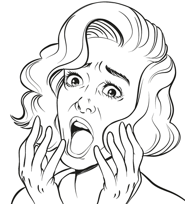
We first need to create the artwork which the halftones will be applied to. I've made a sketch of a shocked woman, as a reference to pop art, which many associate halftones with.
I open a new document in Adobe Illustrator and import the sketch by going to File > Place...
From there I double-click the current layer the sketch is placed on, check the Template box and press OK. I won't be working with many of them for this one, but naming your layers is always a good practice.
Step 2
Now I start inking the loose sketch with the Brush Tool. As usual, I like to use my comic style custom brush from a previous tutorial, but go with your own preference on what brush you use. You can find tips and tricks on creating various brush types here at Envato Tuts+, or you can check out some of the vector brush packs available on Envato Market.
Step 3
I like to make pretty loose sketches and do the real defining during the inking process. I find that a lot of the energy from the sketch can
get lost when inking it, so my method is to not put too much effort into
the sketch, and use it as more of a rough guide than a precise map to
follow.
I have differed from the sketch in a lot of places, but now I feel it has the energy behind the expression just right, and it is ready for the next step.
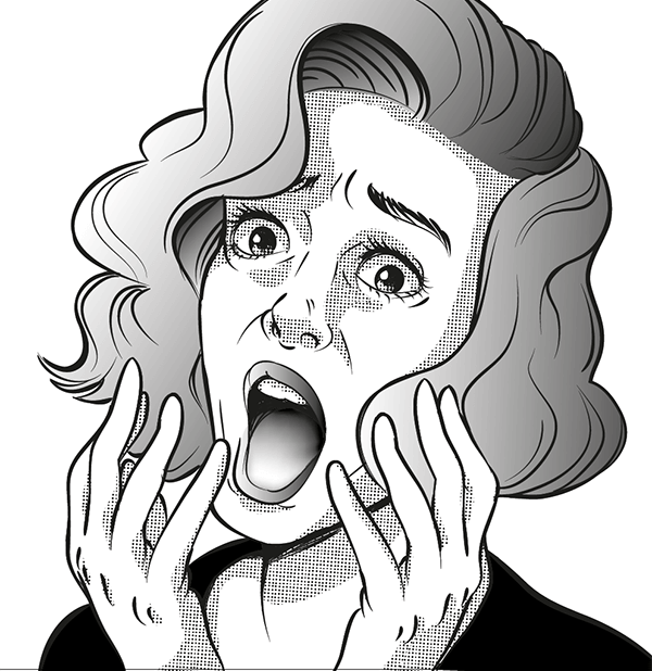
2. Adding Shades of Gray
Use the Pen Tool to create the shapes of the hair. Make two shapes, one for each of the sides the hair is parted into. To get a gradient in black and white, simply press the Period Key on your keyboard.
Once the hair is done, I add the shapes for the lips and irises as well. Since her hair is covering part of her face, I add a large shadow underneath the big lock of hair.
When shading the skin, I try to keep in mind where the light source is coming from in the picture—from the left in this case—and try to break the shapes down that way. To add to the shock of the expression, I add extra shadow underneath the eyes, which can have a scary effect.
When shading the tongue, I make a dark to medium gray object with the Pen Tool, and then I add points of lighter gray with the Mesh Tool.
A good way to keep control over the overall look of your image is to make a grayscale palette from which you pick your colors. By limiting yourself to just a few shades, you minimize the risk of having it look chaotic and overworked.
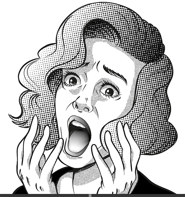
3. Time to Make Halftones!
Now we have a pretty decent grayscale image, but we want to have it in halftones. This part is easy, but a little demanding as well. While turning an object into grayscale is simply a push of a button, getting the desired look requires the right settings.
Which settings are best to use depends on what type of image you're after and what size and resolution you are working in. In other words, it requires some trial and error.
Skin
I start by selecting all the objects making up the skin shading. Having these selected, I go to the Effect menu and choose Pixelate, then Color Halftone. Even though it says "Color Halftone" I recommend starting out creating these in black and white, simply because it's easier to just keep track of how those two colors behave. Making halftones in color involves several colors blending, and the results can be trickier to manipulate.
My image is not very big, so the settings I decide to use have pretty low values, which creates a nice dense pattern for the skin.
Hair
For the hair I want something a bit bolder, and I turn the values up a bit.
Here you can really see how the dots work, becoming smaller the lighter the gradient becomes.
Mouth
Finally for the mouth I decide to experiment a bit more with the values, and have Channel 1 and 4 much higher than the other two.
4. Use Dot Swatches for the Background
Besides creating the halftone effect yourself, Illustrator also offers some ready swatches to use. You can find them by going to Windows > Open Swatch Library > Patterns > Basic Graphics > Basic Graphics_Dots.
This will provide you with a selection of plain grays and gradients in halftone. While they may not be as flexible as making your own, they are quick and easy to use, and will make a good background for our image.
Awesome Work, You're Done!
Creating halftones is not very hard in Illustrator, but they can be a bit fickle still. For example, you might notice their appearance can change unsatisfactorily when scaling. The best approach is to apply halftones to an image that is already in its final size. That way you won't have unpleasant surprises when you export the image.
You might spend some extra time tweaking the settings to get the perfect density of dots, but adding halftones can be a good way to shake up your grayscale artwork. Especially with all the resources available, there are several ways to approach this type of style as well. For example, you might feel more comfortable creating halftones with brushes. If so, then this Halftone Brush pack from Envato Market might be of interest to you.
Everything is hard when you're a beginner, but the problem with drawing is that everyone thinks they know how to do it. Drawings turn out well or they don't, but you can't blame the artist—it's talent that matters, right?
Absolutely... not! If you haven't seen any progress despite practicing a lot, it doesn't mean you don't have the talent necessary to be a good artist. It may mean you're just practicing wrong! If you don't believe me, let me show you common mistakes made by beginner artists. Simply avoid them to kick-start your improvement!
1. I Want to Draw It All
You draw because you have an urge to draw, it's that simple. Even though your skills limit you, you don't want to limit yourself—you have so many ideas to draw! One day you draw a dragon fighting a robot. Next day you work on a landscape. Later you decide to practice perspective to draw a whole city. You're constantly inspired, and it feels great. If only your hand would listen...
What's Bad About It?
Drawing isn't a single skill. Even though every drawing is made of lines, using similar hand movements, it's what happens in the brain that matters. And the processes in the brain are different for various types of drawing.
Think about it: what is the difference between drawing and writing, in a technical sense? Isn't the latter about drawing letters? Forget about the tool for a moment; you can draw with a ballpoint pen and you can write with a pencil. So, if you can write, you can already draw! What's more, you even have your own style!
The difference is in the intention, not the result. And different parts of the brain are used for different intentions—different purposes. A written word may be constructed of the same number of lines as a sketched horse, but for your brain they come from two very different processes.
For example, drawing an animal is usually about "feeling" the px of the body. Your job is only to wrap this feeling into lines. Drawing a city, on the other hand, requires mathematical thinking—make one line too short or at the wrong angle and everything will be ruined. Drawing a landscape may not be even about the lines themselves—you should rather focus on the light and shadow, and re-create it on paper with a series of sketchy lines.
By trying to draw every idea that comes to your mind, you unknowingly make it hard for yourself. You may draw a nice cat, but it doesn't mean you should also be able to draw a background for it without any problem. And constructing a human may be very different for your mind than constructing a spaceship!
How to Fix It?
By drawing many different topics you improve at your "general drawing
skill" (B). It's huge, because it includes all the topics you can draw, so
it grows very slowly. Instead of trying to take it to 100%, focus on maximising the smaller skills (A). For example, it's much easier to get close to 100% at drawing cats!
You need to decide what you want to be able to draw. Instead of trying to mix Latin and Chinese signs and wondering why they don't mean anything together, focus on one. Don't jump from one topic to another just because you feel like this.
Try to improve at one topic at a time, and most importantly, don't look at all your drawings as indicators of your "general drawing skill". If you were great at drawing cars, nobody would call you a bad artist only because you couldn't draw a lion!
2. I Know How to Draw It, Just Let Me Try
You have seen many dogs in your life, so of course you know what they look like! It's only that your hand doesn't understand what you tell it. You try to draw the paws, and they turn out very weird, not as they should. And you know how they should turn out, so why don't they?
You try once again, and again. You get a different version of paws every time, but none of them fits your vision. Ah, how nice it would be to have talent! You obviously don't, so your only chance is to try harder...
What's Bad About It?
You don't know how the paws should turn out. If you did, you'd draw them that way. Don't believe me? Come on, describe them in detail. No, don't draw them. I know the need is strong, but hold on. Imagine you've already drawn them. What do you see? Describe it!
In most cases you'll discover you can tell very little about the object you want to draw. You have this feeling you could draw it with all the details, but, surprisingly, you can't even tell where these details are. Yes, the head of a rhino is big, and it has a horn... or two horns? There's a little eye... somewhere in the face, and the mouth is... where?
The more questions you ask yourself about the object, the better you understand why you fail. You don't really know what you're trying to draw. You're just able to recognize if it is what you wanted when it's already drawn. That's why you try again, and again. Every time you give yourself something new to recognize, but it doesn't mean you are any closer to your vision. You're playing a guessing game!
You don't really know where the eyes should be exactly—you can only tell if it looks "good enough" when it's already drawn
How to Fix It?
Sure, there is a chance you'll guess the right combination of lines eventually, but for what? Just to prove to yourself you can draw it from imagination, without any help? If this is your goal, fine, pursue it, but don't blame lack of talent for your failures. You chose to play this game on the highest difficulty level, so don't cry that it's hard to beat.
To draw something from imagination, first you need to create a
mind-recipe for it. That memory of a dog isn't enough—you need a
different form of a memory to convert it into lines. It's like a photo of a dish and a recipe—it's almost impossible to re-create the recipe from the photo when you're just a beginner at cooking.
The mind-photo is something like this: "four legs attached to a body, long neck, long head, long, hairy tail, hooves". This is all the information you need to recognize a drawing of a horse, but it's not enough to draw it realistically. This is a description of a childish scribble!
The mind-recipe is much more detailed. It contains the proportions between legs and torso, defines where the leg bends exactly, and specifies the kind of joint there is in that point of bending. It doesn't just tell you that the body of a horse is covered with hair—it defines the direction of the hairs. So that information in your mind should look more like this:
There are three ways to obtain such a recipe:
Draw the same object many times using various references—your mind will look for shortcuts for you to draw it faster each time.
Analyze various references of the object, create an actual recipe (a reference sheet), and practice it until you remember it.
Find someone who's already created a neat reference sheet and practice it until you remember it (be careful here—you may repeat the mistakes of the author!).
Before you start drawing, make sure you know the recipe. If you don't, and you don't want to learn it, simply use a reference. It's not cheating! Sure, it's nice to draw something from memory, but first you need to put it there!
You can learn more about this topic from my articles:
Drawing isn't easy, you know it. You're sketching this dragon and every couple of minutes you stumble over some problem. These problems accumulate, but you keep going—when you add the colors, nobody will notice something's wrong. And you can't stop now, after all these hours!
What's Bad About It?
Basically, you're trying to decorate something broken. Even if it looked promising at the beginning, obviously you're doing something wrong now. Don't pretend it can be fixed by adding the colors—it's unlikely. If that leg bends wrong, and you can't erase it, why do you keep trying to finish the picture? Even if you covered it with gold, it would not fix that anatomical nightmare!
That pose was doomed from the start, but I refused to believe it. Art by me, 2010
How to Fix It?
If you can see your picture's going wrong, stop. No matter how much
time you've already invested into the creation of this piece, there's
still some time you can save if you stop now. It often takes less effort to
create something anew than to fix it over and over.
If you're afraid you won't be able to draw anything so cool ever again, it reveals a bigger problem than that wrongly bent leg. You're not confident about your skills, which means you should practice before investing hours into one picture. It's understandable that you want to show others how good you are, but the truth is, for now you aren't. Don't hide that truth by pretending you haven't made a mistake. Learn how to avoid it next time instead.
4. Every Drawing Is Sacred
You don't only finish every drawing you start. You also always remember to post it to social media, for your friends and fans to see. No matter what it is: a polished masterpiece, a sketch, or a study, you share everything. That's just how you roll.
What's Bad About It?
On the surface, it seems pretty harmless. The problem lies deeper. When you are aware that the drawing you're working on will be seen by someone, you automatically try to adjust it to their needs. That drawing must be perfect! And because you post every drawing, you're not even allowed to make a mistake—ever.
Mistakes are a natural side-effect of doing something new. If you want to avoid them, the best method is to avoid new things completely. That's what may happen to you if you share your every picture: even when filling a page in your sketchbook with studies of a hand, you'll only choose the easy poses you feel comfortable with. It just feels scary that your fans could see a bad drawing of yours!
Having the public observing your every step makes you less prone to risk. If there's a chance you may lose, it's better not to play at all and to pretend you could win, if you wanted. You miss an opportunity to learn something by losing, just because you don't want others to see you lose!
How to Fix It?
There are two ways. First, draw for yourself. Share only the pictures you like the most, and leave the sketches for yourself. When studying a topic, don't think how cool it would be to show others a full page of sketches ("Look how productive I was today!"). Subconsciously, it makes you try harder and be less eager to experiment. And studies aren't for you to boast over—they're to learn from!
If you really want to brag about your productivity, it's better to combine your studies into big batches, so that the failed experiments aren't really visible
The other way is to... relax. Learn to feel comfortable with the thought that others can see your mistakes. Embrace your imperfection and let yourself be bad. It's better to show others all your pictures, good and bad, than to draw only the things you are sure will look good.
When you're a beginner, every drawing seems sacred. You start something, then you must finish it and show it to others. It's not really the case! Go, try it—sketch something, then tear it apart, just like that. It's not the last drawing in your life, nor is it the best picture you'll ever draw. The more attached you are to your drawing, the harder it is for you to learn and change.
Mistakes are inevitable. Don't pretend you never draw anything bad. Let yourself be bad, and then find the mistakes and see what can you do to avoid them next time. Draw to be better, not to be praised.
5. I Draw Only What You Want to See
Maybe you're not the best artist, but there are some things you're quite good at. For example, people love your ponies. Every time you post a pony you get a lot of positive comments; it's very nice. You used to draw other things, too, but nobody reacted to them at all, so you stopped.
What's Bad About It?
Because you feel good when someone praises your artwork, it's natural you want to create what they want to see. The problem occurs when this need becomes pathological—you can't create anything new in fear it will not be received positively.
Additionally, you become a slave to your public. Your needs don't matter—your job is to please them. In return, you get praise, but wouldn't it be nicer to get praise for something you've chosen to draw yourself?
Follow your heart! If you like drawing ponies, fine, but don't do it just because you think it's the only thing they want to see. If you want to have fans of your art, not the style/topic you use, you must do your thing. Fan art may be a great method to bring attention, but it shouldn't be the only way to keep your public.
And sometimes it's better to have few real fans than to serve dozens of those who don't really care about you.
Here's something to read if you want to know more:
You have many ideas, but you find yourself unable to start a drawing. You bypass this problem by using line art and bases offered by other artists, and sometimes you use a photo to create your own line art by tracing its lines.
What's Bad About It?
It's OK if you draw only for fun, but if you want to be a good artist, this will not take you anywhere. Arranging your house isn't the same as building it, and you can't call yourself a builder just because you put a sofa in the living room. Similarly, you're not really an artist if you are only able to finish someone else's job.
And it's not only about the definitions. Starting a drawing is the hardest job—you'll never learn how to do it if you simply avoid that part. The people who created the line art for you had to learn it first. You can do it, too—if you only give up on easy solutions.
The worst version of this "sin" is when you trace and use bases, but you pretend you don't. That's like taking a bus to the finishing line of a race. Even when everyone praises you, the truth doesn't change—you can't draw, no matter how good your pictures seem to be.
It's not about the result, but about the process that leads to it
How to Fix It?
The solution is very simple: to improve, do what is hard. If it's hard, it means you can't do it yet, so if you manage to make it easy, it will mean you are better. Avoiding hard things does the opposite—it's very uncomfortable to come back to them once you learn how to bypass the difficulty.
You can fantasize about how talent makes everything easy and justify your cheating this way, but it's all about your laziness. People spend hours every day trying to learn how to draw, and you just say, "I don't have talent, so I must... help myself to create anything".
If you want to be a good artist, change your mindset and start working hard. If you only want to be praised, even due to false reasons, then... why are you even reading this?
7. It's My Style!
You know your drawings aren't perfect, but they're decent. You love it when people appreciate the time you spent to show them your art, but you seethe with resentment when someone does the opposite. How dare they tell you what's wrong with your picture?? It's your drawing, you know the best what it should look like!
What's Bad About It?
First, two definitions:
Fact—truth for everyone, based on objective attributes ("water is wet")
Opinion—truth for some people, based on subjective attributes ("roses are beautiful")
People commenting on your work are simply voicing their opinions. "It's so beautiful!" isn't a fact, because not everyone will agree. This statement doesn't "define" your artwork as beautiful, nor does it change its state somehow. All it means is that the person likes your picture.
Analogously, when someone says "You can't draw", it's their opinion. It doesn't mean you can't draw (according to some objective standard), only that this person doesn't think highly of your skills. Their opinion doesn't change the truth!
The problem is humans tend to simplify everything to think and react faster. Fact is something that everyone agrees on, but "everyone" may be simplified to "everyone I ask". Then, if you ask ten people, each of them has the power to create a "fact" by stating their opinion!
When you take it that way, every opinion you hear is very risky. Sometimes it's better to shut them off completely ("No comments please, I'm just learning"). But then you won't get any positive comments either, so you'll never know if your picture is good! You have two ways to solve it:
Draw something perfect to get positive opinions only.
Draw something imperfect, and then call every negative opinion false.
The first way is impossible—you'll never please everyone (but you can simulate this situation by showing your works to favorable viewers only). The other is simply dishonest—it's as if you said: "Only those who agree with me are right".
How to Fix It?
Let the opinions be what they really are—statements of personal feelings. If you don't like tomatoes, you don't need to explain it to anyone; they just taste bad to you. It's neither good nor bad, unless someone who loves their home-grown tomatoes asks you to judge their taste. Your dislike doesn't make them bad, but the farmer may feel disappointed.
Everyone has a right to not like your art, just as you don't have to admire Mona Lisa. Someone says your picture is bad? Fine! They're just as right as someone who says it's good. React to both the same way. However, there are objective standards you can use to state a fact.
We separate things from other things by creating definitions for them. If something doesn't meet its definition, it's either an abnormal version of this thing, or simply not this thing. If you encounter a bird that doesn't lay eggs, it means it's not a bird. If you see a horse with wings, it's not a horse. But a horse with its knees bent the other way is still a horse, just an abnormal one.
From left to right: a cat, an abnormal cat, and not-a-cat. You can't blame someone for noticing that in your style cats look abnormal!
It means that if someone says "Wolves have longer legs", they're stating a fact, not an opinion. Shouting "It's my style!" doesn't change the fact that "your" wolves have shorter legs than the real ones. They just do. People may not like it (opinion), but a person noticing the truth is simply right.
Facts can't be good or bad—only your opinion about them makes them so. Your anger at them simply means you'd like them to be different. For example, if someone says your bear doesn't look like a real bear (because it's digitigrade, like a dog), and you're angry, you're really angry at your inability to draw a realistic bear. And, again, you think that it's the person who states the fact who creates it, so you're directing your anger towards them.
If you want to be a better artist, you need to be more open to critique. These are only words about your artwork, nothing more. You can ignore them or use them to improve. Ask that commenter, why do they think it doesn't look like a real bear? What should you do to make it more realistic?
Your commenters often see more than you. Listen to the facts, learn from them, and apply their teaching to your pictures. With time you'll get fewer comments like this, because there will be little to improve! Don't pretend you're already good, or you'll never be.
Drawing is deceptively simple, and our misconceptions about it can easily become an obstacle for our improvement. I hope these seven sins will never stand in your way again!
If you're interested in the topic of improvement as an artist, you should also enjoy these articles:
Today we’re going to take a look at the different ways of exporting icons using a tool that is often feared, but will take your productivity to another level once you master it. That tool is none other than the Slice Tool, and believe me, if you’ve never used it before, you’ll
want to read this article, since I’ll explain all there is to know about it
when it comes to exporting icons.
Whether you choose to use a premade icon pack, or start from scratch, today we'll be teaching you some key considerations to think about when exporting your precious assets.
Before we get
all technical, I want to take a couple of seconds and explain the reason for
writing this particular piece.
So in a previous
tutorial, I talked about using Artboards
and Layers as methods for exporting our
precious icons, but to be honest those methods might slow you down when you
have a larger pack. The idea was that I wanted / needed to present a process suited
for beginners that would be easy to understand, assuming they knew how to use
the most basic of Illustrator’s tools.
Now, while those
methods might not have been the best of the best in terms of productivity, they
were pretty straightforward to follow and apply, giving you exactly the same
result.
Since some of
you thought that the process was way too slow and painful, I decided to up
my game and show you the fastest way of exporting an icon pack, using a
slightly more advanced method.
Well, I might
have said advanced, but to be honest, it’s not all that hard once you play
around with it a couple of times.
That being said,
let’s get back to our main topic and talk a little bit about slices and how
Illustrator uses them.
1. What Are “Slices”?
You can think of a “slice” as being a defined section of a piece of artwork
that you can create in order to individually export rather than exporting the
entire piece.
Initially slices were created for web designers,
but as with most of Illustrator’s tools, this one quickly found a new use: exporting icons.
2. How Do “Slices”
Work?
It’s quite
simple actually. First let’s think of the Artboard as being a piece of paper onto
which you lay down your artwork. Now, when you create a “slice” you’re actually
delimiting a segment of that paper, by creating a cutout which you can then
freely remove from the larger composition.
I like to
imagine that the process is similar to that of taking a cutter and slicing the traced
margins of that segment, separating it from the piece of paper.
With each
created slice, Illustrator assigns a number, starting from the top left corner
all the way to the bottom right one. At first you might not care too much about
this action, but in time you’ll come to appreciate it, since you’ll have a
better understanding of what’s going on with your artwork.
3. How Do You Create
“Slices”?
If you’ve never created a slice before, don’t worry because it’s pretty easy to do. There are three ways of creating
slices that you should be aware of:
using the selected object(s)
using guides
using the Slice
Tool
3.1. Creating
Slices Using the Selected Object(s)
This first
option is really easy to understand, since it allows you to create slices
around the boundaries of one or multiple objects.
So, let’s say that we have a couple of icons,
and we want to slice out the first one.
To do that, we will select the icon, and then go
to Object > Slice > Make.
This will immediately separate that icon from
the rest by creating a delimiting line around it.
Even though we’ve created a slice for just one
icon, Illustrator has divided the remaining sections of the Artboard into
larger slices, one for each side of the icon’s slice. We have a large one for
the top side, a narrower one for the left side, a pretty wide one for the
right side, and an even narrower one for the bottom side.
Now, if you take
a closer look at your Artboard, you might see that these slices are numbered,
in a pretty straightforward way, from the top left corner to the bottom right
one. Illustrator assigns numbers to its slices to let you select which of the slices you want to export, and which not.
I’ll talk more about this in the exporting process.
Quick tip: As you can see, the created slice
boundary has a rectangular form, since Illustrator creates the delimitation by
looking at the icon’s total width and height and not its shape. This is pretty
understandable since if you were designing a web page, it would be pretty hard
to break down your composition using more organic lines, and then put it back together
perfectly.
There are a
couple of things that you should be aware of when using this method. If you
open up the Object > Slice menu,
you’ll see that you have the Make option
that we’ve previously used and a Create
from Selection one a few rows lower down. While the two do the same thing
when you have just one object selected, they behave entirely differently when you
have multiple objects selected.
The key difference between the two is that with Make you can create slices around each
of the selected objects, while with the Create
from Selection option you will instruct Illustrator to create slices around
the total surface of all the selected objects.
Now, if you were
to create a web project (web page), the Create
from Selection option would be totally fine to use, but if you’re creating
an icon pack, you’ll always want to go with Make since you’ll want to individually export each and every one of
your icons.
3.2. Creating
Slices Using Guides
Compared to the
previous method, the Guides one is more
meticulous, since the process requires you to manually add vertical and
horizontal guides to each side of the section of the artwork that you want to delimit.
First you have to activate the rulers by
pressing Control-R (right click >
Show Rulers) and then drag your guides and position them where you want the
slice lines to fall. Once you’ve delimited your section using the guides,
you can go to Object > Slice >
Create from Guides to create the actual slices.
If you take a close look at the way Illustrator added
numbers to the slices, you’ll see that once a section is delimited and assigned, it will force the other ones to grab the following number value no matter the
size they have. Also, it’s pretty interesting to see that the slices are
created around the delimited surface of the objects and not the intersection of
the guides.
3.3. Creating
Slices Using the Slice Tool
This third
method is probably the “top dog” when it comes to accuracy, since it allows you
to click and drag in order to create a 100% manual slice selection. To be
honest, there will be situations when you’ll want to have more control over
your slices, but I don’t find it all that helpful when it comes to slicing a
large icon pack since it would take a long time to do it.
But, just in
case you ever need to use it, you should know how to do so. First you need
to grab the Slice Tool, which is by
default located on the left sidebar towards its bottom section, just above the Hand Tool. Once you have the tool
selected, you can position yourself over the section of your artwork that you
want to delimit, and then simply click and drag to create a selection which
will automatically turn into a slice once you release the mouse button.
Compared to a regular selection, the Slice Tool allows you to hold down the Space key in order to move / reposition
your selection, which is pretty helpful since sometimes you might find that you’ve
started on the wrong foot.
Now, the cool
thing about this method is that the slices are instantly created, without
the need of going over to the Object> Slice submenu in order to Make orCreate a slice from a Selection.
Its only
downside that I can think of is that you might not have 100% accuracy until
you turn on Pixel Preview mode (View > Pixel Preview or Alt-Control-Y), allowing you to
create pixel-perfect selections, which for today’s designers is a must.
4. The Exporting
Process
So up to this
point I’ve talked about the three different methods that you can use to create
slices. Now it’s time to see which method is the best when it comes to
exporting our precious little icons.
4.1. Exporting
Using the Selected Object(s) Method
Let’s start out
with the first method. As you recall, this one relies on using one or multiple
objects in order to create the slices.
Now, let’s say
that we have the same little icon pack as before, only this time we want to
slice and export all of the composing icons, not just one.
Well, normally
you would just select all the assets by pressing Control-A and then go to Object> Slice > Make.
Then you would go to File >Save for Web,
choose PNG as your desired format,set your Export option to Selected
Slices and finally hit Save.
The thing is
that at first you might think it all went well, but as soon as you take a
look at your icons (more precisely their size), you might find that something
went wrong.
That’s because
even if you used a custom Grid to
size your icons, the assets themselves might not go all the way in terms of width
and height, and since you used the icons as the selected objects and not the
actual grids, that shouldn’t be a surprise.
The trick is to
use the actual grids instead of the icons, and create the slices around them.
This way your exported icons will be exactly as you want them.
Now, in my case for example, I’m using a 48 x 48 px grid, but I have an all-around2 px padding added. Not to mention
that my icons are slightly shorter, having a height of just 40 px. That means that if I were to
create the slices using the icons themselves and then export them, my icons
would be slightly smaller (44 x 40 px),
since Illustrator used the Width andHeight of my assets instead of my
grids (48 x 48 px).
That being said, you should always have a second
layer with just your grids and use them to create the slices in order to
correctly export your assets.
Now, the cool
thing is that once you create the slices and go to File > Save for Web, Illustrator gives you the option to
manually select or remove which icons you export. So for example if I decide that
I don’t want to select the last icon, I can simply go over it and left-click
once while holding down Shift, and
thus remove it from my final export.
By default if you select all your icons, and
then go about saving them, Illustrator will keep all the slices selected. You can see whether a slice is selected by looking at its
delimitation. If the line around your asset is red (all but the first icon),
then your object is added to the final selection; if it’s blue and slightly faded
then it is not (the first icon).
You can deselect
parts of your icon pack by holding down the Shift key and left clicking on them. You might wonder why we use the Shift key. It's because since Illustrator
already has all of them selected, you need to keep the key pressed in order to
keep the rest of the assets selected, otherwise you will end up with just one
icon active.
Now to be honest
I don’t see why you would, since once you’ve finished your pack I’m pretty sure
you’ll want to export all the assets, not just some, but I thought it would be
nice to point that out.
As soon as you
hit the Save button, Illustrator
will ask you for a location to store your files, giving you the option of
naming your assets. This part is a little tricky since the name you assign will
be carried over to all of the icons, which is what we wanted, but the assets themselves will carry the number of their slices.
You could just export the files and then rename
them, or you can do it directly inside the Save
for Web popup by double clicking on each icon selection and giving
it the desired name.
No matter the
method you choose, you’ll still have to take your time and go through all of them in order to name them properly.
Now, to be
honest I find this option to be the best out of the three since it’s super-fast,
and it only exports your icons, so no empty Artboard slices that need to be
deleted afterwards.
4.2. Exporting
Using the Guides Method
As with the
previous method, things are pretty straightforward. First you create the
slices using the guides (Object > Slice> Create from Guides), and then you go to File > Save for Web.
Here there are a couple of things that you
should be aware of. If you leave the Exportoption set to Selected Slices as
we did for the first method, Illustrator will export your icons, but it will
also export the empty slices between them. Now, if you don’t have a large
set, then you could just deselect those slices, but if you have something
larger, then it can prove to be a really painful process.
On the other
hand, you could just export the icons and then delete the unwanted slices, but
again it might take you some time.
Now if you take
into consideration that you have to manually add the guides to each side of your
icons, it’s pretty obvious that the first method is more suitable, since
it’s hassle-free and a lot faster.
4.3. Exporting
Using the Slice Tool Method
If you
thought that the Guides method was slow and painful, then this one will put the
final nail in your coffin since it will take you ages to finish.
By now you probably know that you have to
manually create the slices for each and every one of your icons, and then go
directly to File > Save for Web.
Here you will be tempted to use the Selected
Slices Export option, but compared to the other two methods, this will only
export the last slice from your Artboard. That means you have to use the All Slices option, which of course will
export all slices whether they’re filled with icons or just empty space.
Finally you have
to go through the entire folder and delete all the unnecessary icons and rename
them as you need.
So do I
recommend this method at all? No. Then why did I even mention it? Well I like
to be as explicit as possible when talking about these sort of tools and methods.
Conclusion
So, at this
point, I’m really hoping that you know what slices are, and more importantly
how they are made, so that you can take advantage of this tool and make the process of exporting your icons fast and painless.
Now, I usually
tend to leave the decision making up to you, but this time, I’ll have to be
rough and tell you to go with the first method, the Object(s) one, since it’s
pretty obvious that it’s the only way to go.
That being said, I would like to thank you for your time and attention, and as always I’ll talk to you the next time.
Purchasing a template from Envato Market is an excellent strategy to produce high-quality materials without spending the time to design it yourself. But it may come as a surprise to learn that the photos seen in the previews of the template are often not included with the template itself.
In this Quick Tip you will learn how to insert a photo into a flyer template purchased form GraphicRiver.
1. Purchase and Download
Step 1
Start by browsing through the files available on Envato Market to find a template to purchase. In this example, we will use the Business Flyer Bundle.
Step 2
Once the files are purchased and downloaded, the contents need to be extracted from the zipped package. This particular template includes three Photoshop .psd files and one Read-Me.txt file.
Step 3
It's always a good idea to look through the Read-Me file before using the template. The author will include any important information there. Notice that this one includes a note that the preview image is not provided with the template.
Step 4
Open the one of the template files in Photoshop. Here I used the Flyer-01.psd file. Notice that the photo area is just a blank gray box.
Step 5
We will need a photo to go into the template. It should be a business-related photo with predominantly bright colors to match the template, and it also needs to be landscape orientation to fit the space designated for it. I chose to use this business stock image from PhotoDune.
2. Editing the Template
Step 1
In the template file, look through the Layer Groups to find the variation you prefer most. In this example, we will choose the blue group called Color-01. Hide the other two groups by clicking on the eyeball icons to toggle the visibility.
Step 2.
Open the Color-01 group folder, then the Main-image group folder, and then click on the Shape 1 copy layer. This is the gray box that is visible in the template.
Step 3
Go to File > Place Embedded and navigate to the photo to place it into the template. Photoshop inserts the photo as a Smart Object.
Step 4
Move the photo into place and drag on the corner handles to scale it appropriately. Hold down the Shift key while scaling to retain the same proportions and prevent unwanted stretching. When the photo is in the correct position, apply the transformation by pressing the Enter key.
Step 5
Go to Layer > Create Clipping Mask (Alt-Control-G) to clip the photo to the gray box shape. The Layers panel should show an indented thumbnail with a small arrow next to it. This ensures that the photo is only filling the space designated by the designer.
And That's It!
Congratulations! You've just updated the photo in a template of a professionally designed flyer. Nice work!
In this Quick Tip, we’ll look at how you can transform a minimal business card template, creating something that’s more unique and individual.
You don’t need to put in a huge amount of work to give your cards character; read on to discover three super-simple ways to give your design a cool makeover.
Now there’s nothing wrong with ultra-minimal layouts—I happen to be a big fan of fuss-free design—but sometimes you want to give your card that extra bit of personality to help it stand out from the crowd.
Rather than starting with something complex, and stripping it back, begin with a template that has few embellishments, but has a strong grid structure.
This one is perfect. The grid work is all done for you, and the simple tab running along the top of the design and line along the lower margin give us some elements to format.
Download the template, then open it in your software of choice. This template comes in Adobe Photoshop and Illustrator file formats, but I’ve moved the content over to Adobe InDesign, as I feel most comfortable with editing the card in here.
Choose whichever software you feel most comfortable with using; all the tips covered here can be applied in any program without a problem.
1. Big Up Your Background
If you want to keep the main elements of the minimal design intact, the simplest change you can make is to switch up the background of your card.
For an ultra-minimal design that packs a punch, experiment with bold color combinations. To imitate this color pairing, set the background of the card to a zesty orange CMYK swatch (C=0 M=57 Y=95 K=0) and the text color to a pale ice-blue swatch (C=36 M=0 Y=2 K=3).
If your printer can offer multiple designs in one print batch (online digital print services can often provide this), why not create five or so different color combinations?
To make more of a statement, and perhaps more a direct statement about the card owner’s occupation, consider swapping your color background for a photo.
Dramatic, sweeping photos which don’t have too much variation in color, like this photo of space, will work really well, as will super-close-up shots, like zoomed-in photos of flowers.
Maximise contrast by pulling out text in a contrasting light or dark color.
2. A Simple Alignment Switch
It’s amazing how simply adjusting the alignment of text can transform the look of your business card.
Flushing your text centrally (in InDesign, go to Window > Type & Tables > Paragraph, and choose Align Center from the options running along the top of the panel) instantly makes headings and body text appear more formal and elegant.
If you want to create a more formal or more corporate design, consider aligning your text in the dead-center of the card.
Divide up the name and occupation headings with a decorative divider, like this one taken from the glyphs available in Davys, to add an ornamental flourish.
On the reverse of the card, switch the left-hand text to align right, and the right-hand text to align left, and move them closer to each other, with a 5 mm gutter between them, down the center of the card. Frame with smaller dividers above and below the text.
A more formal design like this would suit a chic monochrome color scheme (use a Rich Black swatch to achieve a deep inky black), or consider letterpress or embossed print finishes instead to give the cards a subtly luxurious texture.
3. Personalise Your Card With a Signature
A truly personal touch you can give to your minimal card design is to replace the font used for the name on the card with your own handwriting. This instantly gives a unique character to your design, and makes the card appear instantly more ‘branded’.
Write your name on a piece of paper in a black ink pen and scan into your computer (or simply take a photo with your phone). Open in Adobe Illustrator and use the Image Trace window (Window > Image Trace) to create a vector version of your name. Then simply Copy and Paste directly into your business card layout.
If your handwriting’s illegible (like mine is), the neater alternative is to use a script font with a natural, handwritten style. Try out Alberts Script Land or Learning Curve Pro, which I’ve used in this example.
Learning Curve Pro also has a Dashed style, which looks great for craft occupations, like tailors, seamstresses and fashion designers. I also adjusted the Stroke Type (in InDesign, go to Window > Stroke) to Dashed (3 and 2) to give the line a thread-like design.
To mimic the colors used here, set the background to C=73 M=10 Y=23 K=0, and the text color to C=5 M=0 Y=14 K=3.
Conclusion
Minimal business cards don't need to be dull—we’ve looked at three easy-peasy ways to give your cards added character and a unique look without adding too much embellishment or fuss. When you come to edit a minimal template, you can now try to:
brighten the design with a bold color combination...
...or enliven your layout with a photo background
align text centrally on the front of the card and, on the reverse, pull in text towards the center by flushing right and left, to make the card appear more formal
personalise your card with a handwritten name, set in either your own handwriting or in a script font
Color can be powerful and evocative, but only if you know how to use it properly. In Working With Color in Adobe Photoshop, you will learn about the basics of color theory.
Envato Tuts+ instructor Kirk Nelson will show you the different ways Photoshop handles colors using color modes, and what the advantages and disadvantages are. After that you will use this knowledge to assemble a colorful and vibrant digital scene, using several different techniques for controlling color in Photoshop. If you want to use color wheel templates in your work, you can find some on Envato Market.
You can take our new course straight away by subscribing to Envato Tuts+. For just $15 a month, you get access to this course and hundreds of others, with new ones added every week.
In the following steps you will learn how to create a detailed winter house illustration in Adobe Illustrator.
For starters you will learn how to set up a simple grid, how to create a simple pattern and how to save and use graphic styles. Taking full advantage of the Snap to Grid feature and the Transform effect, you will learn how to create the windows.
Using the Brush Tool and basic vector shape and building techniques you will learn how to add snow, shading and highlights. Finally, you will learn how to spread some snowflakes using a simple scatter brush.
1. Create a New Document and Set Up a Grid
Hit Control-N to create a new document. Select Pixels from the Units drop-down menu, enter 600 in the width and height boxes and then click on the Advanced button. Select RGB, Screen (72ppi) and make sure that the Align New Objects to Pixel Grid box is unchecked before you click OK.
Enable the Grid (View > Show Grid) and the Snap to Grid (View > Snap to Grid). For starters, you will need a grid every 5 px, so simply go to Edit > Preferences > Guides > Grid, and enter 5 in the Gridline every box and 1 in the Subdivisions box. Try not to get discouraged by all that grid—it will make your work easier, and keep in mind that you can easily enable or disable it using the Control-" keyboard shortcut.
You should also open the Info panel (Window > Info) for a live preview with the size and position of your shapes. Don't forget to set the unit of measurement to pixels from Edit > Preferences > Units > General. All these options will significantly increase your work speed.
2. Create the First Wall
Step 1
Pick the Rectangle Tool (M) and focus on your Toolbar. Remove the color from the stroke and then select the fill and set its color to R=55 G=46 B=46. Move to your artboard, create a 150 x 20 px shape and place it exactly as shown in the following image—the grid and the Snap to Grid feature will make your work easier.
Step 2
Using the Rectangle Tool (M), create a 150 x 10 px shape and place it as shown in the following image. Make sure that this new rectangle stays selected and focus on the Appearance panel (Window > Appearance).
First, set the fill color to black (R=0 G=0 B=0) and then click that "Opacity" piece of text to open the Transparency fly-out panel. Change the Blending Mode to Soft Light and lower the Opacity to 10%.
Step 3
Using the Rectangle Tool (M), create two 5 px squares, fill both shapes with black, and place them one below the other as shown in the following image. Select the top square and lower its Opacity to 30%, and then select the bottom one and lower its Opacity to 10%.
Step 4
Reselect both squares made in the previous step and simply drag them inside the Swatches panel (Window > Swatches) to turn them into a pattern.
Once you can see this pattern inside your Swatches panel, remove the two tiny squares from your artboard.
Step 5
Using the Rectangle Tool (M), create a 150 x 170 px shape, place it exactly as shown in the following image and set the fill color to R=207 G=156 B=104.
Step 6
Make sure that your brown rectangle is still selected, focus on the Appearance panel and add a second fill using the Add New Fill button.
Select this new fill, make it black, lower its Opacity to 10%, change the Blending Mode to Soft Light and then go to Effect > Texture > Texturizer. Enter the attributes shown below and then click the OK button.
Step 7
Make sure that your brown rectangle is still selected, keep focusing on the Appearance panel, and add a third fill using that same Add New Fill button.
Select this new fill, make it black, lower its Opacity to 10%, change the Blending Mode to Soft Light and then go to Effect > Sketch > Graphic Pen. Enter the attributes shown below and then click the OK button.
Step 8
Reselect your brown rectangle, keep focusing on the Appearance panel and add a fourth fill using that same Add New Fill button. Select this new fill, change its Blending Mode to Overlay and simply add your pattern from the Swatches panel. Here's a more complex wooden pattern from Envato Market that can be used to achieve a somewhat similar effect.
Make sure that your brown rectangle stays still selected, open the Graphic Styles panel (Window > Graphic Styles) and simply click the New Graphic Style button.
3. Create the Small Window
Step 1
Now, you will need a grid every 1 px, so go to Edit > Preferences > Guides & Grid and enter 1 in the Gridline every box.
Using the Rectangle Tool (M), create a 36 x 50 px shape, fill it with R=151 G=99 B=66 and then go to Effect > Stylize > Inner Glow. Enter the attributes shown below and then click the OK button.
Step 2
Using the Rectangle Tool (M), create a 28 x 40 px shape, fill it with R=143 G=88 B=52 and place it exactly as shown in the following image.
Step 3
Using the Rectangle Tool (M), create a 26 x 40 px shape, fill it with R=96 G=73 B=65 and place it exactly as shown in the following image.
Step 4
Using the Rectangle Tool (M), create a 1 x 8 px shape, fill it with R=123 G=66 B=29 and place it exactly as shown in the following image.
Create a second, 1 x 8 px shape and fill it with black. Place it as shown below, lower its Opacity to 20% and don't forget to change the Blending Mode to Soft Light.
Step 5
Using the Rectangle Tool (M), create a 26 x 1 px shape, fill it with R=151 G=99 B=66 and place it exactly as shown in the following image. Focus on the left side of this new rectangle and switch to the Direct Selection Tool (A). Select the top anchor points an simply drag it 1 px to the right. In the end your shape should look like in the second image.
Make a copy of this new shape (Control-C > Control-F) and select it. Flip it horizontally using the Reflect Tool (O), replace the existing fill color with R=93 G=48 B=6 and then place it as shown in the third image.
Step 6
Using the Rectangle Tool (M), create a 10 x 8 px shape, make it white and place it as shown in the first image. Switch to the Direct Selection Tool (A), select the two anchor points that make up the bottom side of this new rectangle, and simply drag them 16 px to the right. In the end your white shape should look like in the second image.
Make sure that it stays selected and focus on the Appearance panel. Change the Blending Mode to Soft Light and lower the Opacity to 10%.
Step 7
Select all the shapes highlighted in the following image, Group them (Control-G) and then go to Effect > Distort & Transform > Transform. Drag the Move-Vertical slider to 10 px, enter 3 in that Copies box and then click the OK button.
Step 8
Using the Rectangle Tool (M), create an 18 x 50 px shape, fill it with R=188 G=112 B=76 and place it as shown in the following image.
Step 9
Using the Rectangle Tool (M), create the column of 14 x 1 px rectangles shown in the following image and then fill these shapes with the colors shown below.
Step 10
Duplicate the column of rectangles made in the previous step (Control-C > Control-V), select these copies and place them as shown in the following image.
Step 11
Using the Rectangle Tool (M), create a 2 x 46 px and a 1 x 46 px shape. Fill both rectangles with black, place them as shown in the following image and then focus on the Appearance panel. Lower the Opacity to 15% and change the Blending Mode to Soft Light.
Step 12
Using the Rectangle Tool (M), create a 14 x 2 px shape, fill it with R=188 G=112 B=76 and place it exactly as shown in the following image.
Step 13
Using the Rectangle Tool (M), create a 3 x 50 px and a 1 x 50 px shape. Fill both rectangles with black, place them as shown in the following image and then focus on the Appearance panel. Lower the Opacity to 10% and change the Blending Mode to Soft Light.
Step 14
Using the Rectangle Tool (M), create a 2 x 50 px and a 1 x 50 px shape. Fill both rectangles with black, place them as shown in the following image and then focus on the Appearance panel. Lower the Opacity to 10% and change the Blending Mode to Soft Light.
Step 15
Using the Rectangle Tool (M), create an 18 px square, place it as shown below and focus on the Appearance panel. Lower the Opacity to 50%, change the Blending Mode to Soft Light and then replace the existing fill color with the linear gradient shown in the following image. Keep in mind that the yellow numbers from the Gradient image stand for Opacity percentage.
Step 16
Select all the shapes highlighted in the following image, Group them (Control-G) and then go to Effect > Distort & Transform > Transform. Drag the Move-Horizontal slider to 55 px, check the Reflect X box, enter 1 in that Copies box and then click the OK button.
Step 17
Select all the shapes that make up your window and Group them (Control-G). Focus on your artboard and place this new group exactly as shown in the following image.
Move to the Layers panel (Window > Layers), open the existing layer, simply double click on the group made in this step and rename it "SmallWindow".
4. Create the Large Window
Step 1
Using the Rectangle Tool (M), create a 67 x 61 px shape, make it white and place it exactly as shown in the following image.
Step 2
Using the Rectangle Tool (M), create a 65 x 59 px shape, make it black and place it exactly as shown in the following image.
Step 3
Using the Rectangle Tool (M), create a 63 x 58 px shape and place it exactly as shown in the following image. Fill this new rectangle with R=151 G=99 B=66 and then go to Effect > Stylize > Inner Glow. Enter the attributes shown below and then click the OK button.
Step 4
Reselect that black rectangle, lower its Opacity to 50% and change the Blending Mode to Soft Light and then select that white rectangle, lower its Opacity to 20% and change the Blending Mode to Soft Light.
Step 5
Using the Rectangle Tool (M), add a 2 px, black margin along the left, right and top edges of your brown rectangle as shown in the first image. Select these three rectangles and unite them using the Unite button from the Pathfinder panel (Window > Pathfinder). Make sure that the resulting shape stays selected, lower its Opacity to 10% and change the Blending Mode to Soft Light.
Step 6
Using the Rectangle Tool (M), create a 24 x 48 px shape, fill it with R=143 G=88 B=52 and place it exactly as shown in the following image.
Step 7
Using the Rectangle Tool (M), create a 10 px square, fill it with R=96 G=73 B=65 and place it exactly as shown in the following image.
Step 8
Using the Rectangle Tool (M), create a 1 x 10 px shape, fill it with R=123 G=66 B=29 and place it exactly as shown in the first image.
Create a second, 1 x 10 px shape and fill it with black. Place it as shown below, lower its Opacity to 20% and don't forget to change the Blending Mode to Soft Light.
Using the Pen Tool (P), create the two shapes shown in the second image and fill them with the colors indicated.
Step 9
Using the Rectangle Tool (M), create a 3 x 10 px shape, make it white and place it as shown in the first image. Switch to the Direct Selection Tool (A), select the two anchor points that make up the bottom side of this new rectangle and simply drag them 7 px to the right.
Make sure that your white shape stays selected and focus on the Appearance panel. Change the Blending Mode to Soft Light and lower the Opacity to 10%.
Step 10
Select all the shapes highlighted in the following image, Group them (Control-G) and then go to Effect > Distort & Transform > Transform. Drag the Move-Horizontal slider to 12 px, enter 1 in that Copies box, click the OK button and then go again to Effect > Distort & Transform > Transform. This time drag the Move-Vertical slider to 12 px, enter 3 in that Copies box and then click the OK button.
Step 11
Select all the shapes highlighted in the following image, Group them (Control-G) and then go to Effect > Stylize > Drop Shadow. Enter the attributes shown below, click the OK button and then go to Effect > Distort & Transform > Transform. Drag the Move-Horizontal slider to 29 px, check the Reflect X box, enter 1 in that Copies box and then click the OK button.
Step 12
Select all the shapes that make up your new window and Group them (Control-G). Move to the Layers panel, find this new group and rename it "LargeWindow".
5. Create the Roof
Step 1
Return to gridline every 5 px, so simply go to Edit > Preferences > Guides & Grid and enter 5 in the Gridline every box.
Using the Rectangle Tool (M), create a 165 x 10 px shape and fill it with R=83 G=55 B=59. Place this new rectangle as shown in the following image and then go to Effect > Stylize > Drop Shadow. Enter the attributes shown in the following image and then click the OK button.
Step 2
Using the Rectangle Tool (M), create a 165 x 5 px shape, fill it with R=53 G=37 B=45 and place it exactly as shown in the following image.
Step 3
Switch to gridline every 1 px, so go to Edit > Preferences > Guides & Grid and enter 1 in the Gridline every box.
Using the Rectangle Tool (M), create a 165 x 2 px shape and place it exactly as shown in the following image. Fill this new rectangle with white, lower its Opacity to 25% and change the Blending Mode to Soft Light.
Step 4
Return to gridline every 5 px, so simply go to Edit > Preferences > Guides & Grid and enter 5 in the Gridline every box.
Using the Rectangle Tool (M), create a 165 x 10 px shape and pick a random pink for the fill color. Place this new rectangle as shown in the following image and then add the four Drop Shadow effects (Effect > Stylize > Drop Shadow) shown in the following image. Make sure that this pink rectangle stays selected, move to the Graphic Styles panel and click again that New Graphic Style button.
Step 5
Make a copy of that large, brown rectangle that makes up the wall (Control-C > Control-F), bring it to front (Shift-Control-]) and then simply hit the D button from your keyboard to replace the existing Appearance attributes with the default ones (white fill and black stroke).
Get rid of that black stroke and then select your white rectangle along with the pink one. Open the Transparency panel (Window > Transparency) and then click the Make Mask button. In the end your masked shape should look like in the second image.
Step 6
Using the Rectangle Tool (M), create a 295 x 65 px shape, fill it with a random blue and place it as shown in the first image. Switch to the Direct Selection Tool (A) and focus on the top side of this new rectangle. Select the left anchor point and drag it 50 px to the right and then select the right anchor point and drag it 25 px to the left.
Step 7
Make sure that your blue rectangle is still selected and go to Effect > Warp > Arc Upper. Enter the attributes shown in the following image, click the OK button and then go to Object > Expand Appearance. Select the resulting shape and replace the existing fill color with the linear gradient shown below.
6. Create the Second Wall
Step 1
Using the Rectangle Tool (M), create a 200 x 15 px shape, fill it with R=65 G=56 B=56 and place it exactly as shown in the first image.
Using the same tool, create a 200 x 5 px shape, fill it with black and place it exactly as shown in the second image, and then lower its Opacity to 10% and change the Blending Mode to Soft Light.
Step 2
Using the Rectangle Tool (M), create a 200 x 175 px shape, fill it with a random blue and place it as shown in the first image. Focus on the left side of this new rectangle, pick the Add Anchor Point Tool (+) and use the click button to easily add a new anchor point exactly as shown in the first image.
Keep focusing on this blue shape, switch to the Direct Selection Tool (A), select the top left anchor point and drag it 80 px up and 135 px to the right. In the end your blue shape should look like in the second image.
Step 3
Make sure that your blue shape is still selected, go to the Graphic Styles panel and simply add the first graphic style that you saved.
7. Add More Windows and a Second Roof
Step 1
Switch to gridline every 1 px, so go to Edit > Preferences > Guides & Grid and enter 1 in the Gridline every box.
Duplicate your "SmallWindow" group (Control-C > Control-V), select the copy and place it exactly as shown in the following image.
Step 2
Make two copies of your "LargeWindow" group and place them exactly as shown in the following image.
Step 3
Return to gridline every 5 px, so simply go to Edit > Preferences > Guides & Grid and enter 5 in the Gridline every box.
Using the Pen Tool (P), create the two shapes shown below and fill them both with R=83 G=55 B=59.
Step 4
Using the Pen Tool (P), create the two shapes shown below and fill them both with R=53 G=37 B=45.
Step 5
Duplicate the two shapes highlighted in the first image, bring the copies to front (Shift-Control-]) and then Unite them using that same Unite button from the Pathfinder panel.
Make sure that the resulting shape stays selected, move to the Graphic Styles panel and simply add your second graphic style.
Step 6
Make a copy of that new wall shape, bring it to front (Shift-Control-]) and replace the existing Appearance attributes with a simple white fill. Select this white shape along with the new, pink shape and simply click the Make Mask button from the Transparency panel. In the end things should look like in the second image.
8. Create the Ground and Some Snow
Step 1
Focus on the Layers panel, double click on the existing layer and rename it "house", and then add a second layer using the Add New Layer button.
Name this new layer "snow", make sure that it stays selected and don't forget to lock your "house" layer to be sure that you won't accidentally select/move its contents.
Using the Rectangle Tool (M), create a 610 x 165 px shape, fill it with R=210 G=230 B=244 and place it exactly as shown in the following image.
Step 2
Disable the grid (Control-') and the Snap to Grid (Shift-Control-').
Select your blue rectangle and make a copy in front (Control-C > Control-F). Using the Brush Tool (B) or the Pen Tool (P), create a new path roughly as shown in the first image.
Select this fresh path along with the copy of your blue rectangle and click the Intersect button from the Pathfinder panel. Make sure that the resulting shape stays selected and focus on the Appearance panel. Set the fill color to black, lower the Opacity to 25% and change the Blending Mode to Soft Light.
Step 3
Create a new copy of your blue rectangle (Control-C > Control-F) and then create a path roughly as shown in the first image. Select it along with the fresh copy of your blue shape and click the Intersect button from the Pathfinder panel. Fill the newly made shape with black, lower its Opacity to 20% and change the Blending Mode to Soft Light.
Step 4
Create a new copy of your blue rectangle (Control-C > Control-F) and then create a path roughly as shown in the first image. Select it along with the fresh copy of your blue shape and click the Intersect button from the Pathfinder panel. Fill the newly made shape with black, lower its Opacity to 15% and change the Blending Mode to Soft Light.
Step 5
Use the same techniques mentioned in the last three steps to create the four shapes shown in the following image.
Step 6
Using the Brush Tool (B), create a subtle, wavy path roughly as shown in the first image. Fill it with R=184 G=215 B=235.
Step 7
Using the Brush Tool (B), add some smooth shapes that will make up the snow lying on the roof and windows as shown in the following image. Fill these new shapes with R=184 G=215 B=235.
Step 8
Keep focusing on the snow added in the previous step and add some subtle white paths as shown in the following image.
9. Create the Background
Step 1
Focus on the Layers panel, lock your "snow" layer, and then add a third layer using that same Add New Layer button. Drag this new layer to the bottom of the panel, name it "bg" and make sure that it stays selected.
Using the Rectangle Tool (M), create a 610 px square, make sure that it covers your entire artboard and fill it with R=70 G=85 B=101.
Step 2
Reselect the rectangle that makes up the sky and make a copy in front (Control-C > Control-F). Using the Brush Tool (B), draw some simple paths that will make up the clouds, roughly as shown in the first image. Make sure that all these paths are selected and turn them into a simple compound path using the Control-8 keyboard shortcut. Select this compound path along with the copy made in the beginning of the step and click the Intersect button from the Pathfinder panel.
Turn the resulting group of shapes into a new compound path (Control-8) and then focus on the Appearance panel. Make sure that the fill color is set to white, lower the Opacity to 10% and change the Blending Mode to Overlay.
Step 3
Use that same Brush Tool and the Intersect option from the Pathfinder panel to add three new shapes roughly as shown in the following images. Fill all these shapes with white, lower their Opacity to 15% and change the Blending Mode to Overlay.
Step 4
Using the Brush Tool (B), create a new wavy path roughly as shown in the first image. Fill it with R=174 G=205 B=225.
10. Save a Scatter Brush and Use It to Add Snowflakes
Step 1
Enable the Grid (Control-') and the Snap to Grid (Shift-Control-') and then switch to gridline every 1 px, so go to Edit > Preferences > Guides & Grid and enter 1 in the Gridline every box.
Using the Ellipse Tool (L), create a 2 px circle and make it white. Make sure that this tiny new shape stays selected, open the Brushes panel (Window > Brushes) and click the New Brush button. Check the Scatter Brush button and click OK. Enter all the attributes shown in the following image and then click the OK button.
Step 2
Disable the Grid (Control-') and the Snap to Grid (Shift-Control-').
Pick the Brush Tool (B), select your scatter brush from the Brushes panel, and draw a bunch of horizontal paths as shown in the first image. Make sure that all these paths are selected, Group them (Control-G) and then change the Blending Mode to Overlay.
Step 3
Focus on the Layers panel, lock your "bg" layer and then add a fourth layer using that same Add New Layer button. Drag this new layer in the top of the panel, name it "snowflakes" and make sure that it stays selected.
Pick the Brush Tool (B), reselect your scatter brush from the Brushes panel and draw a new set of horizontal paths as shown in the first image. Make sure that all these paths are selected, Group them (Control-G) and then lower the Opacity to 60%.
Feel free to add some complex snowflakes once you're done spreading these tiny snowflakes. You'll find a lot of snowflake vectors on Envato Market.
Step 4
Using the Rectangle Tool (M), create a 610 px square and make sure that it covers your entire artboard. Fill it with R=28 G=64 B=116, lower its Opacity to 50% and change the Blending Mode to Soft Light.
Congratulations! You're Done!
Here is how it should look. Feel free to enrich your final illustration with a snowman, maybe a Christmas tree or a complex winter landscape from Envato Maket. I hope you've enjoyed this tutorial and can apply these techniques in your future projects.
This past August, my family and I moved to the US. We have lived in many
different countries in the past already—this time, we moved to the
agricultural state of Iowa. We live in a small city called Ames, where
many farmers and pigs hang out together. That's why I decided to show
you how to create a farmer and his pig in a countryside scene, splashed
with my love for the kawaii style.
You will use basic shapes and Warp Effects, and will cut out a few shapes
using the Pathfinder panel. In the end, you will have an adorable
illustration which will make you consider changing your career from a graphic
designer to a farmer.
If you want to go further, add more details or change the final illustration, to take it to another level, get inspiration with other character designs.
If you're wanting to skip ahead and download the final project, you can purchase it Envato Market.
1. Draw the Head
Step 1
After opening your Adobe Illustrator and creating a new document 600 x
600 px Width and Height, we will start to draw the head of the farmer.
Using the Ellipse Tool (L), draw an oval. In the image below, you can
see which fill color you need. To give the head an irregular shape,
go to Effect > Warp > Inflate. Enter the options you see below.
Step 2
On to the eye. To create an even circle, use the Ellipse Tool (L) while
holding down the Shift key. Then add a smaller, darker circle
inside (Control-C, Control-F) the first circle. Add two more tiny white
circles to brighten the eyes. For your convenience, group the eye
elements together (right-click> Group).
Step 3
Place the eye in its place. While holding the Shift and Alt keys, move
this eye to the right. You will get another copy of the eye to complete
the eyes.
Step 4
Now, the mouth. You need a completely white mouth, but in the image
below, I marked its boundaries with a black stroke so you can see better
(you don’t need the strokes in your actual drawing).
So, let’s create
a little white ellipse and using the Convert Anchor Point Tool
(Shift-C), make the left and right anchor points sharp by clicking on
them. After that, select those two anchor points again (with the Direct
Selection Tool (A)) and move them up by pressing the Up Arrow on your
keyboard.
Place the mouth almost between the eyes, but just a bit lower.
Step 5
Let’s add the eyebrows. We won't create the eyebrow from scratch—we will
use the mouth that we just created! Make a copy of the mouth, change
the fill color (see below) and rotate it, upside down. You can also move
the handles of the anchor points using the Direct
Selection Tool (A) to achieve a rounder shape. Place the
eyebrow over the left eye.
While keeping the left eyebrow selected,
take the Reflect Tool (O) and while holding down the Alt key, click the
forehead, right in the middle of the face. In the new dialogue window,
select Vertical, Angle 90 degrees and press Copy. Now we should have two
eyebrows.
Step 6
A tiny ellipse under the left eye will show the blush on the left cheek.
It has to be slightly rotated to the right. Using the Reflect Tool (O)
again, create the right cheek under the right eye.
Step 7
Create two more circles with the fill color of the cheeks, which overlap each other as in the image below. Go to the Pathfinder panel and press
the Minus Front button. Now, create a circle using the same fill color
as the face. Place the cheek-colored crescent moon shape on the circle
that you just created.
Step 8
This is the left ear. Create the right ear as you did for the right eye,
right eyebrow and the right cheek. The ears have to be placed slightly
lower than the eyes.
Step 9
Now for the hair. Select the face, make a copy in back (Control-C, Control-B),
change the fill color, and make it bigger. Add an ellipse in the
forehead area, and make sure it’s in the front.
Step 10
Let's create the side hair for the farmer. Start with the Ellipse Tool
(L) and draw an ellipse. While keeping it selected, take the Convert
Anchor Point Tool (Shift-C) and click on the bottom anchor point to make
it sharp. Then take the Direct Selection Tool (A), select the right and
left anchor points and slide them up.
Step 11
After slightly slanting the side hair to the right, place it on the left
side of the farmer's head, over the left ear. Then using the Reflect
Tool (O), make a vertical copy and move it to the right side, over the
right ear.
Let's align everything that we created to make a perfectly symmetrical face.
So, select two parts of the side hair, and group them together
(right-click > Group), and then group the two eyebrows, two eyes, two
cheeks, and the two ears. After that, select everything that we created
in the previous steps and in the Align panel (Window > Align), press Horizontal Align Center.
I also recommend that you group the head (right-click > Group).
2. Create the Hat
Step 1
We will now start forming the shape of the farmer's hat. Hit the Rectangle Tool (M) and draw a rectangle similar to the shape shown
below. While keeping it selected, go to Effect > Warp > Bulge. In
the new dialogue window, adjust the options as you see in the image
below.
After that, create another copy of it in back (Control-C, Control-B), shift down this copy down a bit and make it darker.
Step 2
Keep the same fill color and draw an ellipse on the top of the hat.
Change the fill color and draw one more ellipse on the bottom of the hat
and place it behind everything (Control-X, Control-B). Group the hat
(right-click > Group).
Put it on the farmer’s head.
3. Form the Body Shape
Step 1
Change the fill color and create two ellipses which are overlapping each
other. Notice that the top of the vertical ellipse is slightly behind
the head and the horizontal ellipse covers the upper part of the
vertical one.
In the Pathfinder panel, press the Intersect button. You
will get the shape which looks like just the upper body without the
legs—but no no no—we already have the whole body with the legs.
Step 2
Draw a small rounded rectangle using the Rounded Rectangle Tool as you see
in the image below, and then press the Minus Front button in Pathfinder. Doing this will divide the two legs.
Step 3
Before doing this next step, you will need to download the Round Any Corner script.
Once you’ve done that, then you'll be able to make the marked corners
in the image below round. If you don't want to do this, then just leave it as it is.
4. Create the Pants
Step 1
Select the body of the farmer and make a copy in the front (Control-C,
Control-F). Then take the Rounded Rectangle Tool again, to draw three
rounded rectangles (of course, you just need to draw one and make two
copies). Be sure to have the same distance between them. Select
those three rounded rectangles and the copy of the body, and press the Minus Front button in Pathfinder. Change the fill color of the resulted
shape.
Select the body (brown shape) and the pants (blue shape) and put them in the back (Control-X, Control-B).
Step 2
Now we need to divide the pants from the boots of the farmer. Draw an oval
which marks where the shoes will be. You can draw this oval in any fill
color, because you will delete it later.
Keep it selected and then
select the pants. In Pathfinder, press Divide. Ungroup the resulting
shape (right-click > Ungroup) and delete the unnecessary parts. Set
the appropriate fill colors.
Step 3
Let's create one more thing for the pants—the cuff. Start with blue
rectangle. Then go to Effect > Warp > Arc and enter the following
options:
Expand this shape (Object > Expand Appearance). Make two copies of it
and place them on the bottom of the pants. You might want to rotate
this cuff slightly—just find the position that fits well.
Step 4
Let’s add a pocket to the outfit. Draw a circle with the same fill
color as the pants (use the Eyedropper Tool (I) to take this color). Then
copy the shape we just created in the previous step (the cuff of the
pants) and place it on the blue circle. Select this circle again and
make a copy in back. Shift down the copy and make it darker. Group the
whole pocket.
Step 5
Place the pocket on the pants. You can also add two little buttons.
5. Create the Shirt and the Arms
Step 1
Now for the collar. To draw a triangle, you will use the Polygon Tool. After you
click on the art board, a new dialogue window will pop up. Enter 3
Sides and any Radius. Using the Direct Selection Tool (A), move the
anchor points to achieve the result you see below. Then create a
vertical copy of it using the Reflect Tool (O).
Place the collar under the head.
Step 2
With the help of the Eyedropper Tool (I), take the same fill color as
the face. Now we will create arms. Draw an oval behind the body and warp
it (go to Effect > Warp > Arc).
Don’t forget to expand the newly created shape.
Step 3
Now we want to show the shirt. You already have a part of it (the green
shape). Using the same green color, draw an oval. This oval has to
divide the sleeves and the hand. Select the arms (you expanded the shape,
right?), make a copy in the front and then select this green oval. Press Intersect in Pathfinder. Put everything behind the arms and
sleeves.
Step 4
You can roll up the sleeves as you did for the pants. Just take a copy
of the cuff from the pants, change the fill color and place it between
the hand and the sleeve. Then repeat for the other hand.
6. Create the Rake
Step 1
First, with the help of the Rounded Rectangle Tool, draw the handle of
the rake. Add a regular rectangle on top of it. Then again, take the Rounded Rectangle Tool and create a long, horizontal rectangle at the top
of the handle.
Step 2
Add a small rounded rectangle on top, from the left side. Move it to the
right, while holding the Shift and Alt buttons together. Then keep
pressing Control-D to repeat your last movement. Those are the prongs of
the rake. Select all the prongs and group them, because we want to align
everything. Select the whole rake (with the prongs) and press Horizontal Align Center on the Align panel (Window > Align).
Give the rake to the farmer.
7. Create the Pig
Step 1
Let’s begin the pig with the pink ellipse. Warp it (you already know how to do it, right?)
Step 2
Look at the Appearance panel (Window > Appearance). You should see
the text, Warp: Arc. You just need to grab it and move it to the trash
icon. Then draw another ellipse and place it as shown.
Step 3
For the eyes, use a dark brown circle and a tiny white circle for the highlight.
Select the whole eye and while holding down the Alt and Shift keys,
move it to the side. Now you've got a copy of the eye.
Make her see!
Step 4
In this step, we are going to create the snout. Draw a pink ellipse and
set up the warp options for it. After that, make a copy in back and make
this copy lighter. Add two tiny, dark circles to complete the snout.
Group the elements together.
And give it to the pig.
Step 5
The ear will be in the shape of a heart. Let’s create a small pink ellipse
again. Then make a sharp bottom anchor point, and move up the left and
right anchor points. Can you see the heart shape?
Create another copy of the ear and place the two on the pig's head.
Step 6
I decided to make the legs not very hard—just a simple pink ellipse where
you need to move anchor points. First, the left and right move down, and then the bottom anchor point moves to the right. That's it.
Step 7
Give it to the pig. Then make a copy and give her another leg. Then
create two copies—these should be darker and placed behind the whole
body. Notice that the legs in the back are slightly higher.
Step 8
For the tail, use almost the same method as you did for the first leg. Move the
anchor points that are marked in the image and you will get the tail.
Put the tail where it should be.
8. Create the Hay
Step 1
This is also very easy—in the newly created yellow ellipse, move down the left and right anchor points.
Step 2
Delete the fill color, and set the stroke color to the color you can see in
the image below. Take the Line Segment Tool (\) and draw the lines. If
you need a thicker stroke, you can increase it in the Stroke panel.
After you finish, group the whole pile.
9. Create the Apple
Step 1
Delete the stroke color and set the fill color to the color you see
below. We will add just a little cute detail to the scene—an apple. As
usual, start from ellipse. Rotate it to the left. Then make a vertical
copy using the Reflect Tool (O).
Step 2
Make the right and left anchor points of the green ellipse sharp. The leaf is ready.
Step 3
With the same fill color, create a rounded rectangle as the stem. Place
the stem on top of the apple and add the leaf. You can also make one
shape from the ellipses which we used for the apple. Select the two red
ellipses and press Unite in Pathfinder. The apple is now ready.
10. Place All the Elements Together
Combine all the elements together.
11. Create the Background
Step 1
Let's add some dimensions to the scene. Add a yellow ellipse behind everything.
Step 2
Then add a square. Hit the Rectangle Tool (M) and click on your art
board. Enter the Height and Width 600 px. You just completed the entire
scene!
Conclusion
My big congratulations to you as you finished such a long tutorial and
came up with such an adorable result! I hope you liked it and that
you’ve enjoyed creating this scene. If you don't understand
something, please tell me in the comments below.
You can also check out my final version over on Envato Market.
In this entry for our Photoshop in 60 Seconds series, I explore some of the amazing benefits of using Smart Objects in Photoshop.
The majority of product mock-ups available on Envato Market use Smart Objects to embed content so it can be easily updated without disrupting the layout or design. The best way to make the most use of such an excellent resource is to understand how to work with Smart Objects.
This is part of a new series
of quick video tutorials on Tuts+. We're aiming to introduce a range of
subjects, all in 60 seconds, just enough to whet your appetite. Let us
know in the comments what you thought of this video and what else you'd
like to see explained in 60 seconds!
Today’s tutorial is a little bit special since I’ll be showing you the process behind the icon pack that I had the honor to create for our awesome little team here at Envato Tuts+. So if you’re into icon design, or you just want to add to your bag of vector tricks and tips, then grab yourself a cup of coffee and buckle in, since this tutorial will show you all the steps that you need to consider when creating a new icon pack.
If you like these sorts of icons, you should check out Envato Market for icon design inspiration.
1. Set Up
the Document
As always, the
first thing you should do when creating anything, be it an icon pack or an
illustration, is to make sure that your document is properly set up. So,
assuming you already have Illustrator up and running, let’s do just that by
going to File > New or by
pressing the Control-N keyboard
shortcut.
As you can see, you are greeted by a little popup
windows that has a bunch of options, but we’re only interested in a few of them:
Number of Artboards: 1
Width:
800 px
Height:
600 px
Units:
Pixels
And from the Advanced tab:
Color Mode:
RGB
Raster Effects:
High (300 ppi)
Align New Objects to
Pixel Grid: checked
Quick tip:
you can leave the Raster Effects settings
to Screen (72 ppi) since this won’t
affect the look and overall quality of your design, as long as you’re not going
to print it out. If you do need to get it inked on paper, you might want
to use a higher value, but only if your design uses Stylize Effects such as Drop
Shadows, Inner/Outer Glow, etc., since these tend to look pixelated when printed using a lower ppi value.
For those who are wondering why I set mine to 300, well let’s just say that for me it
has become a reflex.
2. Set Up
the Layers
Once I have my
document properly set up, the next step I usually take involves the careful
process of creating and labelling my layers so that I can have everything
neatly organized and at hand.
So, let’s do just that by opening up the Layers panel, and creating five layers which we will name as follows:
base grids
medal
notebook
graduation
imac
3. Adjust the
Grid
Since
Illustrator allows the use of Grids, you should know that it gives you the
option to snap your design to its Pixel
Grid. That means that your shapes will look super crisp as long as you use the Snap to Grid / Pixel Grid options, since each anchor point will be positioned at the middle
intersection of four pixels, thus snapping to it.
Because there
are different situations that require different grid settings, sometimes you
might find yourself in the position to adjust the ones running on your version
of Adobe Illustrator.
I personally
have gone for the lowest and at the same time the most accurate settings,
because I feel I have more control over my designs.
To change these settings, you must go to Edit > Preferences > Guides &
Grid. From there, a little popup will appear, where we need to adjust the
following:
Gridline every: 1 px
Subdivisions: 1
Once you’ve
adjusted these settings, all you need to do in order to make everything pixel
crisp is enable the Snap to Grid option
located under the View menu.
Quick tip:
you should know that the Snap to Grid option
will transform into Snap to Pixel
every time you enter Pixel Preview Mode,
but that’s totally fine, as most of the time you will be going
back and forward with this display mode.
If you’re used to moving things around with the
help of the keyboard’s directional arrow keys, you might want to change the Keyboard Increment to 1 px to get it as precise as possible.
You can do this by going to Edit >
Preferences > General > Keyboard Increment.
If your version
of AI has the value set to pt, just go to Unitsand change the General and Stroke units to Pixels and you’re good to go.
You can read
more about the Grid and how to create pixel-perfect artwork here:
When creating
any icon, there are a couple of things that you should always take into consideration, since I’m pretty sure they’ll help make the creative process a
lot easier.
4.1. Choosing a Size
for Our Icons
Every time you
start a new project, you should take a couple of minutes to focus on the size
of your icons. This step is really important, since you will want to create and
use a Base Grid by choosing one of the default icon sizes available today (16 x
16 px, 32 x 32 px, 48 x 48 px, 64 x 64 px, 72 x 72 px, 96 x 96 px, 128 x 128
px, 256 x 256 px, etc.) which will help you create a consistent and cohesive
pack. Depending on your project’s needs, you might end up using larger sizes or
smaller ones, or even a combination of the two.
Now, for our
present example, I’ve decided to go with a fairly large size of 96 x 96 px, since this type of icon would be something that you would probably see on an online learning website,
such as Envato Tuts+.
4.2. Creating
the Base Grids
By definition, a
Base Grid is a precisely delimited reference surface that is constructed and
used in order to guide the designer through the process of creating the icon
pack’s assets. Usually the shape of the Base Grid is a perfect square, since it
allows for a better planning and structuring of the shapes and lines onto the
surface, compared to a circle giving us full control over the pixel count.
On the other
hand, the circle as a shape is more useful when used as a Reference Grid since
it allows the creation of detailed and intricate grids and reference lines that
you can take advantage of to create compositions that have a more “perfect-geometry”
feel to them.
I personally
prefer to limit my Grid shapes, and use only square shapes, since I can usually
build compositions that have a more organic feel to them, but that’s just me. I’ve
seen a lot of people that create incredible stuff using highly detailed Guides.
For our example,
we’re going to keep things simple, and build four base grids, one for each
icon.
First, make sure
that you position yourself onto the base grids layer, and then using the Rectangle Tool (M) let’s create a 96 x 96 px square, which we will color
using a relatively light shade of grey (#E6E6E6).
Now since I
usually like to give my icons a little padding, we will create a smaller 92 x 92 px square, which we will color
using #F2F2F2 and position over the previous one, making sure to align it to
its center.
Once you have both the base grid and padding,
group the two shapes using Control-G
and create three more copies, which we will position to their right side at a
distance of 60 px.
As soon as you have all the base grids in place,
you can lock the layer so that you won’t accidentally move them, and then we
can start working on the first icon.
5. Create the
Medal Icon
First, make sure
you’re on the right layer, and then zoom in so that you have a nice clear view
of the first base grid.
Step 1
We will start by
creating the round bottom section, which houses the little vector-powered
symbol.
First, grab the Ellipse Tool (L) and draw a 60
x 60 px shape, which we will color using a dark orange tint #D8532A, and
then position towards the bottom-centered side of the smaller 92 x 92 px square, leaving a gap of 4 px between the two.
Since we want everything to be as precise and
sharp as possible, I would recommend that you use the Pixel Preview mode (View> Pixel Preview or Alt-Control-Y),
since it will allow you to see the underlying pixel grid, giving
you full control over the positioning of your shapes.
Step 2
As soon as you have the shape in place, give it
an outline using the Offset Path tool.
First select the shape and then go to Object> Path > Offset Path.
Give it an offset of 4 px.
This will create
a new, larger shape that will be positioned underneath the one that we’ve used to create it.
Step 3
Now, as you can
see, the circle maintains the same color, which is something that we’re going to
want to change since the outline needs to be clearly visible.
So, let’s select the shape and change its color
to something darker (#232323).
Step 4
As soon as we
have the outline, we can start adding details to the medal’s coin, and we will
do so by first creating the ring highlight.
First, create a copy of the orange circle (Control-C > Control-F) and then
using the Ellipse Tool (L) draw a 56 x 56 px shape (in my example colored
using a darker orange) which we will position over the larger one.
Step 5
Now, with both shapes selected, use Pathfinder’s Minus Front option in order to create the cutout.
Step 6
Select the resulting shape, and adjust it by
changing its color to white (#ffffff) and setting its Blending Mode to Overlay while
lowering the Opacity to just 30%.
Step 7
Add two diagonal highlights, by creating one
wider and one narrower rectangle, which we will then rotate at a 45° angle and adjust using the same settings that we used for the ring-like highlight that we just
created.
Step 8
As you can
clearly see, the diagonal highlights go outside the surface of the coin, which
is something that we need to change.
We will do that
by creating a 56 x 56 px circle, which we will carefully align to the larger medal base, and then with both the
circle and the highlights selected we will right
click > Make Clipping Mask.
If you're wondering why I used a smaller
clipping mask, the answer is because I didn’t want the diagonal highlights to
overlap the ring one, which as you can see from the above image wouldn’t have
looked all that nice.
As you can see, this will automatically hide the
sections of the highlights that were going outside of the medal’s coin base,
which is exactly what we wanted.
Step 9
Next, we will be
adding some depth to the medal by creating a series of smaller circles to which
we will add a bunch of ring highlights and shadows.
First, let’s create a 52 x 52 px shape (#AD4222) to which we will add a ring-like shadow
following the same process as before, only this time we will use Darken as a Blending Mode and keep the Opacitylevel all the way down to 10%.
Step 10
Continue adding details by creating a 44 x 44 px circle (#D8532A) to which we
will be adding a ring-like highlight as we did with the larger section of the
medal’s coin.
Step 11
Add two diagonal highlights, making sure to mask
them so that they won’t overlap the circular one that we created in the
previous step.
Step 12
Create a 28 x 28 px circle (#D8532A) and
position it over the second pair of diagonal highlights, making sure to center
it to the rest of the coin’s shapes. Then add another ring-like highlight and a
pair of diagonal ones for some more depth.
As you can see, I’ve positioned each of the diagonal
highlight pairs differently so that they give the viewer the illusion of light
bouncing off the coin’s surface.
Step 13
Start working on
the inner vector symbol, by creating a 32
x 32 px circle (#AD4222) which we will transform by flipping its fill with
its stroke (Shift-X), and applying a2 px Stroke Weight which we will align
towards the outside. Once you’ve adjusted the shape, expand it by going to Object > Expand > Fill & Stroke.
Then start
adding the remaining details such as the anchor points and bottom handles,
using the Rounded Rectangle Tool in
combination with the Rectangle and Ellipse Tool.
Take your time, and once you’re done move on to
the next step.
Step 14
Finish off the
medal’s inner illustration, by adding the lightning strike. To do that, create
two 8 x 12 px rectangles and adjust
them by removing the first one’s top left anchor point and the second one’s
bottom right one by selecting them using the Direct Selection Tool and then pressing Delete.
Position the two resulting shapes so that they
overlap towards the center, forming a 4
px square where they intersect.
Step 15
Finish off this section of the icon by creating
two star-shaped highlights, which we will position towards the top right corner
of the medal’s coin. We will use slightly different settings compared to the
previous highlights, since we will go with Hard
Light as a Blending Mode while
keeping the Opacity level to a
higher value of 50%.
Step 16
Once you’ve
finished creating the bottom section of the medal, we can move on to building
the ribbon that normally keeps it in place.
Start by
creating a 38 x 47 px rounded
rectangle (#364A5B) with a 19 px Corner
Radius, which we will adjust by selecting and removing its top centered
anchor using the Direct Selection Tool
(A).
Once we’ve adjusted the shape, we need to make
sure that its path is closed by pressing Control-J
(unite), and then we can add a 4 px outline
(#232323) and position it towards the top side of the medal’s coin so that its
bottom section goes underneath it (right
click > Arrange > Send to Back).
Step 17
Start adding details to the ribbon band by
creating a couple of vertical and horizontal lines (#232323).
Step 18
Once you’ve added the decorative lines, start
adding some highlights and a shadow and you should be all done with this icon.
That means you can group all its composing shapes together using the Control-G keyboard shortcut, and then we
can move on to the next one.
6. Create the
Notebook Icon
Once you’ve finished
creating the first icon, we can start working on the second one by positioning
ourselves onto the appropriate layer.
Step 1
Start by creating the notebook itself, using a 68 x 76 px rounded rectangle with a 4 px Corner Radius. Color it using #364A5B, and then select its right anchor points with the Direct Selection Tool (A) and increase the roundness from 4 px to 8 px. Then add a 4 px outline (#232323) and make sure to position the two shapes
towards the top left corner of the grid.
Step 2
Add an all-around highlight to the inner section
of the notebook, using Overlay as
the Blending Mode and keeping the Opacity level to 40%.
Step 3
Continue adding details by creating two vertical
highlights and positioning them towards the right side of the notebook.
Step 4
Add a couple of line segments (#232323) towards the left
side of the notebook, so that it will give the impression that it was stitched.
Step 5
Create a little bookmark towards the bottom left
corner by drawing a 6 x 4 px rectangle
(#D8532A) to which we will add a 4 px outline
and a top shadow (Blending Mode set
to Darken, 20% Opacity) and two vertical highlights.
Step 6
Start working on the little cover illustration
by creating the little hat and the green checkmark (#7AAC41).
Step 7
Grab a copy (Control-C)of the two
star-shaped highlights and paste (Control-F)
them over the notebook’s right side.
Step 8
Using the Rounded
Rectangle Tool create a 4 x 16 px shape
with a Corner Radius of 1 px, color it using the same color
that we’ve used for the outline (#232323) and then position it to the right
side of the notebook’s outline. Make sure to vertically align the two using
the Align panel.
Step 9
Finish off the icon by creating a neat-looking
pen and positioning it to the right side of the icon. Then group all the
elements using the Control-G shortcut
so that things won’t end up being misplaced by accident.
7. Create the
Graduation Icon
As always, before
we begin, make sure that you’re on the correct layer, and then position
yourself over the base grid.
Step 1
We will start by creating the hat’s top section, and we will do so by drawing a 78 x 42
px rectangle, which we will color using #364A5B and then position towards the
top side of the base grid, leaving a gap of 5 px between the two.
Step 2
Now, let’s adjust the shape by adding one anchor
point to the middle of each side and then removing the corner anchor points by
selecting them using the Direct
Selection Tool (A) and then pressing Delete.
Then, add a 4 px outline to the
resulting shape using the Offset Path tool
(Object > Path > Offset Path).
Step 3
Create the bottom section of the hat and then
start adding highlights and shadows using the same Blending Mode and Opacity values
that we’ve used for the other icons.
Step 4
Once you have both the top and bottom sections
of the hat, you can start working on the little string, and we will do so by
creating a 12 x 6 px ellipse which
we will position towards the center of the diamond-like top.
Then, using the Pen Tool,draw a nice clean line using a2 px Stroke Weight. Add a 6 x 6 px circle, which we will adjust by
selecting its top anchor point and moving it towards the top by 2 px using the Direct Selection Tool (A).
Step 5
Now, before we move on to the bottom section of
the icon, we can quickly grab a copy (Control-C)
of the star-shaped highlights and position them (Control-F) towards the bottom right corner of the hat.
Step 6
We can now start working on the little folded
diploma, and we will do so by first creating a 48 x 8 px rounded rectangle with a 2 px Corner Radius. We will color the shape using #CCD5DD and then
we will give it an outline of 4 px
and position them towards the bottom of the hat, leaving a gap of 3 px between the two.
Step 7
Next, create a slightly smaller 36 x 8 px segment with a 1 px Corner Radius that will go under
the top section of the folded diploma, and color its fill using #6E7378. Add
the usual 4 px outline (#232323) and
send both shapes to the back using the Arrange> Send to Back option.
Step 8
Start adding details to the upper segment of the
diploma by creating a bunch of highlights and a subtle shadow.
Step 9
Next, we have to create the little ribbon by
drawing a 12 x 12 px circle (#D8532A),
to which we will apply a 4 px outline, and then position the two onto the top segment of the folded diploma, making
sure to center them. Then, using the Rectangle
Tool (M), create a 4 x 4 px square
(#AD4222) giving it an outline and then positioning it right under the round
segment of the ribbon.
Step 10
Take your time and start adding details to the
ribbon by creating a couple of highlights and shadows, and finally adding the
little checkmark sign.
Once you’re done, don’t forget to group all of
the composing elements together (Control-G)
and then we can move on to the final icon from this pack.
8. Create the
iMac
So we are now
down to our last icon, the iMac, which means that once again you need to make sure
you’re on the last layer, and then zoom in on the grid so that you can start
building with consistency in mind.
Step 1
Using the Rounded
Rectangle Tool, create an 84 x 58 px shape
with a 2 px Corner Radius, which we
will color using #364A5B, and then give it an outline, making sure to position
the two shapes towards the top side of the base grid.
Step 2
Create a copy of
the inner dark-blue shape (Control-C> Control-F) and then turn it into a screen by removing its bottom-center
anchor points and shortening its height to just 48 px, and then finally coloring it using #232323.
Once you’ve done that, add a little 4 x 4 px circle to the center of the
lower visible segment, where you would normally find Apple's famous logo.
Step 3
Move on towards the bottom and start working on
the iMac’s leg by drawing a 20 x 8 px rectangle, which we will adjust by selecting and pushing its top anchor points towards the
center by 1 px. Then create a copy
of the shape and turn it into an outline by changing its width from 20 to 28 px.
Once you’ve done that, make sure to position the two
underneath the screen by selecting them and using the Arrange > Send to Back option, so that the tops of the
shapes touch the bottom side of the iMac’s inner fill.
Step 4
Finish off the iMac’s leg by adding a little 32 x 2 px base that has a flat bottom
but a 2 px Corner Radius on its top
anchor points. Color the shape using #364A5B and then don’t forget to give it a
4 px outline (#232323).
Step 5
Now it’s time to start adding highlights and
shadows to our little icon. As usual, take your time and make this little piece
of hardware pop with some nice-looking details.
Step 6
Start working on the little interface by
creating a 52 x 32 px rounded
rectangle with a Corner Radius of 1 px, color it using a green shade (#7AAC41)
and then position the shape onto the iMac’s screen, leaving a gap of 8 px between it and the top side of the
screen’s outline.
Step 7
Create three 2 x 2 px circles (#232323) positioned 2 px from one another, and place them towards the top left
corner of the green interface, leaving a gap of of 2 px from its right side and 1
px from its top.
Then, add a 52 x 2
px line divider (#232323) to separate the top bar from the rest of the
interface, and a small 22 x 2 px rounded
rectangle with a 1 px Corner Radius towards
the top section of the bar.
Step 8
Start adding details to the interface by adding
two rows of button delimiter lines on each side, and a whitish (#CCD5DD) 38 x 18 px canvas towards the center of
its lower section.
Step 9
Start adding details such as highlights and
shadows to give the interface a more polished look.
Step 10
Using an artistic paintbrush, add a little
diagonal line towards the center of the canvas to make it look as if somebody
is drawing something.
Step 11
Using the Rounded
Rectangle Tool, create four little 4
x 4 px shapes with a 1 px Corner
Radius positioned 2 px from
one another, and color them using orange (#D8532A) for the latent / inactive
state and green (#7AAC41) for the active one. Then position all four of them to
the center of the iMac, just underneath the interface, leaving a gap of 2 px between the two.
Step 12
Give the screen some pop by adding two diagonal
highlights using Overlay as the Blending Mode and lowering the Opacity level to 40%. Once you have the highlights in place, mask them using a copy
of the iMac’s screen, which you will need to adjust by shortening its width to
about 44 px.
Step 13
As we did with all the previous icons, we need
to add the star-shaped highlights, by grabbing a copy and pasting it towards the top-right corner of the screen.
Step 14
Now it’s time to
give you some creative freedom and let you come up with your own cool-looking
peripherals. Whether you’re a mouse and keyboard person or a pen and tablet one,
get a little crazy and create something that is representative for the way you
work creatively.
As always, once you’ve finished creating the
icon, don’t forget to select all of its components and group them together
using the Control-G keyboard
shortcut which will protect them from getting separated.
It’s a Wrap!
There you have it: a nice, in-depth tutorial explaining the process for creating these nice-looking icons that I had the opportunity to create for the awesome team here at Envato Tuts+. I hope you enjoyed the ride, and more importantly learned something new along the way.
In this tutorial I’ll walk you through the process of designing a welcome screen for an iOS fitness application. We’ll be working with Affinity Designer, a new and promising tool made by Serif, and a great app for UI design.
You won’t need any previous experience with the application. By the end of this tutorial you’ll have gained a basic knowledge of the Affinity Designer workflow. We’ll be working with type, vector, images, as well as layer styles.
Creating a Working Space
Step 1
Let’s get started by creating a new document.
After opening Affinity Designer go to File > New from the main menu. On the popup which appears you can specify the file parameters that will suit your needs the best. For now let’s focus on two options: Type and Page Preset. We’ll be designing an iPhone App so the best way to go is to choose Type: Devices and Preset: iPhone 5 (Retina). Affinity Designer will atomically set the other options for us.
Step 2
Next up we need to prepare an environment to work in. I’m a big fan of using grids in design. We won’t dwell deep into this right now, but we’ll set up a really simple layout grid.
This design will lean on basic Apple Human Interface Guidelines, which means adhering to a specific hierarchy. We’ll need to allocate a space for the Status Bar (20 pt). Then, although transparent, there will be a simple Navigation Bar below that (44 pt).
Next up, a space for main info about user performance, and a place for a button to start a workout.
Go to View > Guides manager and a popup will appear, with horizontal and vertical guidelines (blank for now). Click on the small blank page icon below the Horizontal Guides section. Doing so will add new horizontal guide. Then double-click on the value which appears in the list and change it to 20 pt. Add other guides using attributes as shown below.
App Background
Step 1
Now we’re going to create our app background. From the tool menu on the left select a Rectangle Tool (M), and draw a rectangle covering the whole working area. On the left side panel there’s a Transform section. You can check your rectangle dimensions here, as well as its starting points (you should have X:0, Y:0 and W: 320 pt, H: 568 pt).
Step 2
Now we’ll change the background color. Go to the Context Toolbar just under the main Toolbar (If you don’t see one go to View > Show Context Toolbar in the main menu). On the left hand side of the context toolbar you’ll see properties relating to the shape we’ve just created. Click on the small white rectangle described as a Fill (with the shape selected). Choose RGB Hex Sliders from the selection list, then enter #151515 in the HEX parameter input field and press Enter.
Step 3
Go to the Layers panel. Double-click on the layer containing our shape and change its name to “BG”. Next, click on the little padlock icon to lock the BG layer. This way you won’t mess with it by accident when working on the other elements.
Status and Navigation Bars
Step 1
Focus your attention on the Status Bar. We won’t bother with reinventing the circle, instead download the source files attached to this tutorial to find the stat-bar file . Then go to File > Import in the Affinity Designer Main Menu, select the stat-bar.afdesign file and single click anywhere on the design.
Select the group and place it at the top of the app screen.
Step 2
It’s time to create our hamburger menu. To begin, turn on the grid, pixel and guides snapping in the Main Toolbar. Change your main color to “white” in the upper left side of the application window. Select the Rectangle Tool from the Tools panel on the left and draw a 18 x 2 pt rectangle. Hold the Alt+Shift buttons and click and drag the rectangle below the original one (we’re just copying the rectangle). Do it one more time and you’ll get a hamburger menu icon.
Select all three shapes (Shift+click) and click on the Add button in the Affinity Designer upper right corner to merge it into one. Find your icon on the Layers pane and rename it “hamburger-menu-icon”.
Step 3
Select the Artistic Text Tool (T) from the tool panel and click somewhere within the navigation bar space on our design. Enter the text “Running App” and select the whole lot.
Click on the Character button, change the text attributes as shown below, thenlose the popup.
Now centre the text in the navigation bar area. It’ll snap automatically. If not, be sure to turn on the snapping options on the main toolbar on top.
It’s time to clean things up in the layers panel. Click the Add New Layer button at the bottom of the Layers panel and drag the hamburger icon, app title and status bar into it. Group the app title and menu icon layers together (select both and click Cmd+G) then rename the layer as shown below:
The Progress Chart
Step 1
Select the Circle tool (M) from the tools panel and draw a circle. With your new shape selected open up the Stroke Properties panel on the upper left side and change the parameters as shown below.
Start drawing from the centre guide we created initially, then press and hold Cmd (drawing from the centre point) and Shift (drawing a circle, not an ellipse) while drawing. Your Circle should be around 200x200 pt.
Select the circle and press the Convert to Curve button on the toolbar menu. Select the Node Tool (A) and click on the Break Curve button. With Node Tool still selected create two points on the curve about 3/4 of its height.
Note: You can create additional guides to align these new nodes better. Press Cmd+R to show Rulers and click and hold on the upper ruler, then drag a cursor down to create a guide.
Select the top node of the circle and click Delete on your keyboard to remove it. You should have a nice base for an open circle chart now.
Step 2
Select the chart shape and duplicate it (CMD+J). Select its upper left with the node tool and delete it. Open the Stroke Properties panel and change the values as shown below. The green color is #4DFA41 and yellow #F7D203.
Step 3
Select the Artistic Text Tool and enter some additional info, then place and format them as shown below.
We now have a really striking progress chart with additional info about user achievements!
Start Running Button
Step 1
Select the Rectangle tool (M) from the Tools panel and draw a rectangle, approximately 290pt x 44 pt. In “Human Interface Guidelines for iOS” Apple designers suggest 44 pt to be the perfect button height for easy tapping.
Shift-click on the background of the app and the rectangle shape you’ve just created, then click the Align Horizontal to Center button on the left top area of the screen. Place it at the bottom of your UI design. You can also select the rectangle shape and change its X/Y settings in the Transform panel to the ones shown below:
Step 2
Select the shape you’ve just created. Open the Color Fill panel at the top left side of the screen and change the fill color to transparent. Than change the stroke to #4CFA41. Open the Stroke Preferences panel (next to the color one), set the stroke weight to 2pt and align it to the inside of the shape.
Step 3
Now for the button label. Select the Artistic Text Tool and use it to create a label in the center of the rectangle you just created. Type in “Start Running” and open the Character window by clicking on the Character button on the top tool menu (with the text object selected). Change all the preferences to reflect the examples shown below:
Sample Statistics
We’re going to place a simple stats view between the progress chart and the “Start Running” button. We’ll display average running pace, total number of runs and the calories burned.
Step 1
Visit the Icons8 website and download the Running icon, the Stopwatch icon, and the Fire Element icon. Icons8 is a great place for finding modern and elegant icons. You can get PNG for free (remember to link back to the Icons8 website if you’re using them) or buy a vector version.
Step 2
Begin by placing the Running icon in your design. Go to File > Place and select the file, or just drag the file into Affinity Designer. Place it centered vertically below the progress chart.
Next go to the Effects panel (with the icon selected) and open the Colour Overlay tab. Change the overlay color to #4CFA41.
Then switch to the Styles tab and create a custom style from the selection by clicking on the small drop down menu icon to the right, and selecting Add Style from Selection. By doing this it will be easier to reuse our style later on.
Step 3
Again, select the Artistic Text Tool and create two text objects. Type in a sample number and the text “Total Runs”. Format them as shown below. Center them vertically and place them below the Running Man icon.
Step 4
Place the other downloaded icons in the UI design. With one of them selected choose the style we just defined from the Styles panel. Voila! Our styles have been reapplied without having to specify them again.
With the icon still selected click Cmd+C or go to Edit > Copy. Select the last icon and Click Cmd+Shift+V or go to Menu > Edit > Paste Style. This will paste the style of previously copied object to the new one. Pretty handy, right?
Finishing Touches
Step 1
When we have all the components placed on our canvas it’s time to work on some details. First of all we have an ugly hole in the middle of the design, let’s do something about this.
If you kept your layers organized, this bit will be easy. Select the layer/group with our progress chart and move it about 50pts down. If you didn’t keep your layers organized, this step will be more difficult–it serves you right!
Step 2
Let’s also spice up the background. Create a 320x320pt rectangle and place it on top of the design. Select it and choose the Corner Tool (C) from the tool panel. Click on one of the anchor points of the rectangle to make it editable, turn on previously defined Guides (Cmd+;) and click on the center of the bottom corner of the rectangle to create a node. Select it and move it down 40pts. And here we have our new custom shaped arrow. Go to the Layers panel and move it to the bg layer (put it on the top).
Step 3
Grab the source files attached to this tutorial and take a look at the photo of a nice Parisian street. It’s one of the photos I took when visiting Paris. It looks pleasant it’s also a great place to run. Open it in Affinity Designer and Copy (Cmd+C) it.
Go back to the design and select our previously made arrow shape (in the Layers panel). Then click Cmd+Alt+V to paste it into the selected shape. Move it to crop as you like. Select the arrow shape and dim it to 40% opacity. Click Cmd+G to put the curve in a Group and change its Blending Mode from Normal to Glow.
Step 4
With the group still selected grab the Transparency Tool (Y) from the tool menu and create a Linear Blending Gradient on the group (click and drag) from the bottom, all the way up. You can play with the tool to achieve the results you like.
Step 5
Now let’s add a drop shadow below our arrow. Select the group and go to the Effects panel. Expand the Outer Shadow tab and turn it on. 20pt radius and 15pt offset should work nicely.
Conclusion
You’re done! You’ve just created your first mobile app design with Affinity Designer. With any luck, the repetitive steps during this process will have taught you a number of very useful Affinity Designer workflow techniques. I look forward to seeing what other designs you make with it!
There are many methods of digital painting. You can paint in grayscale and color later, you can use various Blend Modes to create maps like those in 3D programs... But sometimes you don't really have time to waste on thinking and planning. What if you wanted to paint something quickly, just to check how your idea looks outside of your mind?
In this tutorial I'll show you how to "sculpt" a character quickly using colors and mainly a single textured brush. All the shading and coloring will be reduced to very few steps. You can use it to paint a concept art, or to create a base for more refined illustration.
Create a New File. Fill (G) its background with 50% gray. Create a New Layer and use an irregular brush to quickly block a few versions of your idea. Draw them small and sloppy.
The brush you use for this should be a bit messy and unpredictable, like my Texture Sketch. You can also try one of the ready-made Gouache & Acrylic brush set.
Step 2
Choose the sketch you like the most and use the Lasso Tool (Q) to duplicate it to a new layer (Control-J). Lower the Opacity of this layer and remove the previous one.
Step 3
Create a New Layer; name it Lines. Use any brush you like to quickly sketch the details. It doesn't need to be a clean piece of line art. Just make sure you know what you want to draw. When you're done, remove the previous layer.
Step 4
Lower the Opacity of Lines to about 20%.
2. Create the Base Lighting
Step 1
Create a New Layer below Lines. Use a hard brush (like my Ink) to paint the general shape with a solid color. It shouldn't be super detailed, because we may change the edges during shading. Name the layer Base.
Step 2
From now on, all the new layers should be clipped to Base. To do it, hold Alt and click the line between the layers, or simply use the shortcut Control-Alt-G.
Step 3
Create a New Layer (remember to clip it) and fill it with the color of the darkest shadow of your scene. Here, it's dark blue.
Step 4
Create a New Layer and fill it with the color of the surface affected by the ambient light. Here white fur becomes bluish when illuminated by weak ambient light around. Name the layer Ambient.
Step 5
Add a Layer Mask to Ambient (you can learn how to do it in my short tutorial: Layer Mask vs. the Eraser Tool in Adobe Photoshop). Fill the mask with black to make the layer disappear. Then use a textured brush to paint the illuminated parts, leaving crevices filled with shadow.
Later, you can use a soft brush to soften the places where the shadow is almost absent. Basically, your goal is to create a kind of overcast lighting.
Step 6
Add a Layer Mask to Base and use a mix of brushes to create the proper shape.
3. Finish the Lighting
Step 1
Create a New Layer. Decide where you want to put the light source and illuminate the character according to it. Use the color of the terminator—the band between the light area and shadow area. It's usually a highly saturated version of the local color. If you're painting skin or white fur, it's a good place to use the subsurface scattering effect.
Step 2
Create a New Layer below Base. Paint the maximally illuminated ground and the shadow on it. This will be a brightness reference for your eyes.
Step 3
Create a New Layer and add another portion of light, leaving the band of the terminator.
Step 4
Create a New Layer and finish the lighting, using the brightest version of the local color.
Step 5
Because the feathers are very thin, light shines through them to the other side. Use this property to achieve a cool effect:
Don't forget to illuminate the part right under the "glowing" feathers.
Step 6
Create a New Layer and shade the part of the body that's in shadow, using a slightly brighter shade coming from the light reflected from the ground. Use the Eyedropper Tool (I) to pick the colors that are already there to blend the terminator for a furry effect. Gradually lower the Opacity of Lines until they're not needed anymore.
4. Refine the Painting
Step 1
Create a New Layer and work on the details. Be careful—the more detailed an element, the sloppier the other part will look. Uniform look is the key here.
Step 2
This is the right moment to use any of the popular "fur brushes", if you want. They work miracles if you use them on a shaded character, picking the colors from its surface.
Create a New Layer in the background (under Base) and use a Soft Brush to create a white glow behind the character.
Step 4
Create a New Layer and use the same brush to soften the fur. Dark fur may not need it, but it works great for white fur with a lot of subsurface scattering.
Step 5
Create a New Layer and fill it with black. Go to Filter > Noise > Add Noise. Adjust the amount of noise so that the contrast is high.
Step 6
Go to Filter > Liquify. In the editor that opened, use the Warp Tool (W) to smudge the dots into lines, creating an effect of fur.
Step 7
Change the Blend Mode to Overlay, and lower the Opacity until the effect looks natural.
Step 8
Create a New Layer, but don't clip it this time. Refine the picture.
Step 9
You can play with the background to present the character in a more interesting way, but make sure not to overshadow it!
That's All!
This was rather fast, wasn't it? You can use this method to present your idea to someone, or to decide if you want to go on with this illustration and render it in detail.
Hungry for more? Check my other tutorials on the topic of digital painting:
High-quality textures are an integral part of creating digital artwork with depth, realism and visual interest. One of the best ways of adding believable detail to any digitally created element or illustration is to use good textures.
But where do you get these textures? One of the best places is to develop them yourself. In this short video from my recent course on Texture Crafting in Adobe Photoshop, I'll show you how to use Photoshop’s dynamic brush engine to create interesting digital textures.
We’ll look at photographing textures out in the “wild” or in a studio setting, crafting your own textures with real media, and creating digital textures with the tools in Photoshop. This course will spark your interest in texture crafting and start you on your way to creating your own library of digital textures.
Alternatively, if you're simply looking to use pre-made textures in your digital projects, you can check out the huge collection of textures on Envato Market.
Whether you're in need of stock graphics for print or web, vector artwork often does the trick the best, being easily scaled and edited. In this quick tip we'll explore how to use and edit vector stock graphics in both Adobe Illustrator and CorelDRAW with some help from the fantastic designers at Envato Market.
1. Downloading and Locating Your File
Step 1
Firstly, we need to acquire a vector file and make sure it's usable. For the purposes of this tutorial, I'll be using the vector illustration Flat Design Concepts for Education, which you can purchase on Envato Market.
Download your file and unzip the folder. If you're on a Mac, simply Double-Click the downloaded file to decompress it. If you're on a Windows machine, Right-Click the zipped folder and then hit Extract All... in order to decompress it.
Step 2
From here, you can move your files or folder to wherever you like to store your graphic assets. Often it's helpful to your future self to store them in a folder marked "Resources" or "Assets".
2. Editing the File in Adobe Illustrator
Step 1
Open your downloaded AI file in Adobe Illustrator. In this case, I've opened the file labeled 04.AI. We'll be focusing on the top portion of the vector illustration.
Step 2
Good stock vector files will be easy to navigate within the Layers panel. They'll be clearly labeled so you can get the most out of the file you bought and need to use.
In the case of this file, we have the top illustration labeled as "Education" and the objects are Grouped together, separate from the background.
Step 3
Select your entire Education layer and go to Edit > Edit Colors > Recolor Art in order to easy replace the colors found within your artwork. You can choose from various color harmonies and pre-made palettes, create new colors, or choose hues from your Swatches panel.
Step 4
As you can see below, you can drastically change the look of a stock vector graphic simply by recoloring it. It's one of the most common edits made to stock vector graphics, and knowing how to do it easily will save you time.
Alternatively, you can select vector objects individually with the Direct Selection Tool (A) and change their fill colors manually.
Step 5
Another common edit is to move, transform, and reuse assets from a stock vector graphic. Select your object group, Right-Click, and select Ungroup in order to free your objects from their current layout.
Step 6
Once ungrouped, your illustration's assets are easily reconfigured, allowing you to create additional icons, change the illustration layout, or delete components as you want.
Step 7
You can also Scale, Rotate (R), and Move icons from your vector file around and create a seamless, repeated pattern with the Pattern Options panel, giving a whole new purpose for the graphic you downloaded.
3. Editing the File in CorelDRAW
Step 1
Open the AI file in CorelDRAW. Much like Adobe Illustrator, you'll find the file is organized into multiple groups within one layer. You can easily see what your file consists of in the Object Manager docker.
Step 2
I've zoomed in on one of the objects. Sadly, they are not named as I wish they were, but as you can see you have full control over every object and can Group (Control-G) or Ungroup (Control-U) as you see fit in order to edit individual object components.
Step 3
You can recolor an object in the Object Properties docker or one of the color palette dockers as you would with any other curve object within CorelDRAW. Additionally, from here you can alter each curve's properties as you see fit.
Step 4
Changing the color, transparency, size, rotation, position, or other attributes of objects within the illustration file is simple, as you have full control over the items as though you had created them yourself. Simple changes like these are similar to those we discussed above while working in Adobe Illustrator.
Step 5
Additionally, you can Ungroup the layout and move various icons together to form new icons and illustrations. This is especially true for vector stock graphics that are character sets, desk icons, and infographics.
Great Job, You're Done!
We explored some simple techniques for recoloring and editing a stock vector file in both Adobe Illustrator and CorelDRAW. The ideas and instructions above are only the tip of the iceberg, really. You can explore gradients and fountain fills, a variety of vector and raster effects, patterns, graphic styles, and more!
In this tutorial, you’ll learn how to create this gorgeous text effect in Adobe Photoshop. It's one of a series of 15 Elegant Text Styles, as well as many other styles available to purchase on Envato Market.
Create a new document (File > New) and set the Width to 600 px, the Height to 300 px and the Resolution to 72.
Step 3
Select > All, then Edit > Fill and pick White from the drop-down list. Then Select > Deselect. Let’s rename the
layer (Layer > Rename Layer) to Background to keep it nice and clean.
Step 4
Now double-click the Background layer to enter Layer Style. You’re going to add a Pattern Overlay. From the drop-down
list, select the dark gray Damask pattern.
Step 5
Now add a Color Overlay with the following
settings:
Blend Mode: Vivid Light
Opacity: 2%
Use the color #000000
Step 6
Then you’re going to add
a Gradient Overlay with the
following settings:
Blend Mode: Overlay
Make sure you tick Reverse
Style: Radial
Angle: 0
Scale: 150%
Click the Gradient box to create the gradient. Click each color stop to modify
the Color and use the colors #060606 to the left and #3c3c3c to the
right.
Step 7
While you're still in theGradient Overlay section, click on
the canvas and hold while dragging upwards to move the gradient. You’ll see it
gives the background a nice soft light that spreads from the top.
2. Create the Text and Add Effects
Step 1
Install the Webtreats
pattern by double clicking it.
Step 2
Install the font Great Vibes. Then back in Photoshop, create
the text by typing Luxury or
something else of your choosing and select the font you just installed (it’s
called Great Vibes Regular in the
font list). Set the size to 200 pt.
It doesn’t matter what color you choose because we’re going to add a lot of
effects that’ll cover it.
Step 3
Double-click the Luxury layer and let the fun begin! UnderPattern Overlay, add the black
pattern from the Webtreats pack. Unfortunately, it doesn’t have a unique name, but luckily all the patterns have different colors, and you’re going to use the
only black one there is. It’ll add a dark stone pattern to the text:
Step 4
Add a Gradient Overlay to the mix, so the
text comes to life:
Step 5
To make the text pop, addBevel & Emboss with the
following settings. Make sure the Gloss
Contour is the one called Ring –
Double.
Step 6
Then add some Contour to adjust the Bevel & Emboss. Make sure the Contour is called Gaussian.
Step 7
Now frame the whole text
with a golden border by adding an Outer
Glow:
Step 8
By adding a silver Stroke to the text, you’ll make it
shine and stand out even more:
Step 9
Lastly, add a Drop Shadow to separate the text from
the background:
Step 10
Hit OK and you end up with a shiny new text effect.
3. Save the Text Effect for Future Use
Step 1
But of course you’ll want to save the effect
so you can use it over and over again on other text or objects. If you take a
look at the Styles panel, you’ll
notice the small icon that looks like a piece of paper with a folded corner.
Click on it to add the style to your active styles and give it a memorable
name.
Step 2
You still need to save
it to the library, so go ahead and click on the small drop-down icon and then Save Styles. Save it anywhere you want,
although I recommend saving it in the Photoshop folder:
Location of the Styles Folder
on Windows: Program Files > Adobe> Adobe Photoshop(your version)> Presets > Styles
Location of the Styles Folder
on Mac:Programs > Adobe Photoshop (your version) > Presets >
Styles
Congratulations! You’re Done!
In this tutorial, we learned
how to create a luxurious text effect in Photoshop.
We started out by creating
a subtle dark background with a Damask pattern. Then we created a text
layer and added a lot of different effects in order to create an elegant and
luxurious text effect that really pops out at the viewer.
After that, we made sure
to save the text style so we can use it later in other projects.
Please feel free to
leave comments, suggestions, and outcomes below.
Lately I’ve been getting a lot more technical and started exploring solutions to the different challenges that you might encounter along your creative journey. One particular challenge that we are going to discuss today
is that of scaling icons, which can prove to be a difficult process
for a lot of people.
Do take in
consideration that when I say icons, I’m actually talking about the ones
created using a pixel-perfect workflow, since these are the most sensitive when
it comes to the resizing process.
Now, before we
get into the actual process, I’m going to take a couple of moments and talk
about some icon-related notions that we should consider when it
comes to resizing our precious icons.
Whether you're scaling your own icons or icons purchased from Envato Market, the process should be fairly easy to comprehend and use after reading this quick tutorial.
1. Start by
Choosing a Base Size for Your Icon
When creating an
icon pack, it’s really important that you start by making the right decision
when it comes to choosing the base size. The base
size is the smallest size that you will
create and then use to produce all the other size variations in your pack.
Beyond that,
your base size will also act as your custom grid, which you will use in order
to create a cohesive icon pack, since it will allow you to create your elements
within a delimited surface.
That being said, there are a couple of things
that you should do in order to get the base size right.
1.1. Think Ahead
I recommend that
before you start doing anything, you should first take a couple of minutes and think about how many sizes you want or need to
deliver the icon pack in. Will you be creating two sizes, three, five? Always try to think ahead and plan your steps so that
the process can be as smooth and forward-looking as possible.
Believe me, it’s far easier to establish your
variations from the start than to finish your project and then realize that
you might need to add an extra size, which as you will see later on, might pose
some problems.
1.2. Go Small
Once you have a
clear vision in regards to the number of sizes that the project will be
needing, take the smallest variation of them all, and use that as your base
size. So for example if you want to create three size variations for your icon, say 32 x 32 px, 64 x 64 px and 128 x 128 px, you’ll want to set your base grid using the
smallest size, which in this case is 32 x
32 px.
It might seem
weird, but if you’re creating using a pixel-perfect workflow, you’ll always
want to start from the smallest size possible, since the resizing process is
deeply connected to the width and height values of your icon’s composing
elements. I’ll elaborate more on this in the following sections.
2. Pay Attention
to Your Icon’s Number Values
The Width and
Height values of your icons are really important since they are directly
connected to the way your icons behave once you start resizing them. There are
a couple of things that you should take into consideration when starting the
actual building process.
2.1. Always Use
Round Number Values
If you’ve never paid any attention to the Width
and Height Values of your icon’s composing sections before, now would be
the right time to change that, since numbers play an essential role when it
comes to creating and resizing your icons.
The reason for
that is quite simple: icons are digital forms of artwork that usually end up
being displayed on digital screens, which as you know rely on pixels in order
to reproduce any type of imagery. That means that everything you create needs
to occupy a specific count of pixels off the monitor's grid, in order for the
artwork to be as crisp as possible.
Now, I won’t go
over the process of creating pixel-perfect artwork, since I already have an
article that touches on that subject, but I will talk a little bit about the
way numbers behave once you resize your icons, and I will do that by giving you
a basic example.
So let’s say that we have a 32 x 32 px base grid, onto which we’ve created a 29.49 x 29.45 px rectangle (highlighted
with red) by simply dragging using the Rectangle
Tool, which would be the first section of a theoretical icon. As some of
you probably already guessed, the shape itself isn’t fully occupying the pixels
off the underlying grid, which means that if we were to resize it, things would
go haywire.
Don’t believe me? Well, let’s select the shape
and resize it using the Scale tool
by doubling its surface using a 200% increment
value.
As you can see, the resulting shape now has a Width of58.98 x 58.9 px which means that
Illustrator has to apply an antialiasing effect in order to add alpha channels
to the pixels that aren’t being fully occupied by the rectangle’s surface,
which in the end will take away from the shape’s sharpness.
If you aren’t
creating with pixel perfection in mind that might not pose a problem, but for
all of us pixel junkies out there it’s something that has to be fixed, since it
will only create new problems along the way.
The solution is really simple: you just have to
select the shape and then force it to correctly snap to the pixel grid by enabling
the Align to Pixel Grid option found
under the Transform panel.
Then you just
have to make sure that every little icon section that you create next uses
round number values. For that, you might want to use the Snap to Grid option found under the View menu, in combination with the Pixel Preview mode, which should give you total control over the
size of your objects.
2.2. Use
Even Numbers as Often as You Can
This principle
is deeply related to the icon’s base size grid that you choose to work with. If
you remember, a couple of moments ago I told you that you should always try to figure out the smallest size that you will need for your icons, and build the
larger variations using that as a building block.
By doing so you will always make sure that
your icons are “anatomically correct”, since your artwork will scale correctly
without being subjected to any deformations.
Now, as you know, both even and odd numbers scale up correctly since, when doubled, odd numbers always become even ones. The problem
with using odd number values arises when you are faced to scale down your
assets, since cutting them in half will always result in decimal values, which
will inevitably break your design.
If you’ve done your research and chosen the
right base grid, this shouldn’t pose a problem, but if for some reason you need
to add a smaller size variation, then you’ll just have to scale it down and then adjust the different sections as needed.
3. The Actual Resizing
Process
So, up to this point we’ve talked about a couple of pre-scaling notions that you should
keep in mind every time you start creating size variations for your icons.
In this section I’m going to walk you through the actual process of correctly resizing
your icons using the Scale tool, but
first I want to briefly talk about one particular method that is widely used
but in my opinion should be avoided.
3.1. How NOT to
Resize Your Icons Using the Select-and-Drag Method
Lately, I’ve
noticed that a lot of people, some of my peers included, tend to resize their
icons using the select-and-drag method.
Let me keep it
simple and clear: never, ever resize an icon by selecting and then
dragging one of its sides or corners. This will always break your icon if
you’ve created it using a pixel-perfect foundation, since your shapes will snap
off the pixel grid, due to the fact that their number values will end up being
decimal ones, which won’t be able to correctly occupy the underlying grid.
The reason is
quite simple: when you drag, Illustrator has to expand the surface of your
artwork, by adding pixels to the total Widthand Height of your shapes, paths,
and even the empty spaces. But it can’t always correctly do this, since some objects
might scale perfectly fine, while others break due to the process of stretching
and adding pixels.
Since I like to teach by example,
let’s say that we have a little icon that was
created using a 48 x 48 px base
grid, with an all-around 2 px padding.
The icon was built using a pixel-perfect workflow, having each and every shape
perfectly snapped to the underlying pixel grid, but it uses both odd and even
number values throughout its composing elements.
Now, let’s turn on the Pixel Preview mode (View> Pixel Preview or Alt-Control-Y)
and let’s select the right bottom corner of the icon’s bounding box, and drag
it diagonally towards the outside by 2
px.
As you can see, some of the shapes (the text lines, inner window frame,
bottom window delimiter line, etc.) have actually managed to scale without
falling off the grid, while others didn’t do all that well (the window circular
buttons, the icon’s outline, scrollbar, etc.).
That’s because during the
dragging process, Illustrator tried to add that 2 px value to each of the selected objects, but due to the
arrangement and space between each shape, it didn’t manage to keep up. That
resulted in shapes that have seen an increase in both width and height, others only
in the width (the text lines) while some haven’t been increased at all (the
vertical line underneath the bottom horizontal delimiter).
Now the thing to keep in mind is that we
actually went through the resizing process with Pixel Preview mode on, which allowed us to see and apply a precise
number value increment. If we were to repeat the same process but this time in
the normal preview mode, as you can see the results would be pretty painful to
watch.
Since at this point I’m hoping that I’ve made my case clear, let’s move on
and take a closer look at the correct way of resizing an icon using the
powerful Scale tool.
3.2. How to Properly Scale an Icon Using the Scale Tool Method
So resize your icons you want, young Jedi. Well after you’re done reading
this little section, you’ll be a master at it.
Understanding the Tool
I have to be honest: when I started making icons, I was basically doing it
blindfolded, since I didn’t know a lot about the different aspects of the
process, especially the resizing part. I always did a good job on creating the
first size batch, but when it came to resizing them, let’s just say things
started getting frustrating since most of them would fall apart.
Well, as you’ve
probably guessed, that meant I had to manually fix them, which in the end led
to a pretty time-consuming process, which basically sucked all the energy out
of me. Luckily I like to learn from my mistakes, so I started exploring and it
wasn’t long until I found that the solution was right in front of me: the almighty
Scale tool.
If you’ve never used the tool before, don’t worry since when it comes
to using the Scale tool, things are
pretty straightforward.
First we have to select the object or group of
objects that we want to resize, and then right
click and go to Transform > Scale.
Illustrator will bring up a little window
with a bunch of options.
As you can see from the above example, we are greeted with two different
methods of scaling.
The first one is Uniform which, as the name implies, will scale your shapes both Horizontally and Vertically,
which means that it will add pixels to both the Width and Height of your
selection.
The second one is Non-Uniform,
which allows you to individually scale yourobject’s Width and Height using different values, or even
scale just one out of the two. Now, I wouldn’t use this particular option when
resizing an icon, but it might prove to be useful in situations when you want
to quickly adjust the Width or Height of an object using simple
percentages.
So we’ve talked about the two different options available within the tool,
but the real magic happens only when you know which percentages to apply to your
objects.
Choosing the Right Percentage Values
As I’ve already mentioned, the Scaletool is a really powerful ally, but only when you know exactly how to use
it, since not all percentage values will result in a crisp looking icon. Believe
me, I learned this one the hard way.
The reason for that has to do with the Widthand Height values of the icon’s
composing elements. Yup, we’re back to that again. As I’ve already pointed out,
odd numbers behave differently than even ones when doubled. The same is true
when you multiply them with decimal values such as 1.5.
This is important because when dealing with resizing, we will have to
chose the right percentages depending on the values that our shapes have, since
percentages are in fact multipliers. Don’t believe me? Well let’s think a little bit about the way Illustrator uses
them from a mathematical point of view.
So as you all
know, 100% is 100 divided by 100
which gives us 1. Illustrator uses this value and multiplies it with the Width and Height values of each selected shape. Now since if you
multiply 1 with anything (but 0) you still get the same number, this isn’t
the best example.
But, if we take
a look at a value such as 200% which
is 200 divided by 100, we get a 2xmultiplier, which will double the pixel
count of any selected object.
On the other
hand, if we were to resize an icon using a 50% value, which is 50 divided by 100, so a 0.5x multiplier, that will actually cut our selected object's
dimensions in half.
Now the trick is
to know what multipliers to use when dealing with icons that have only even
number values and the ones that have both even and odd ones.
If we have an
icon that was built using only even numbers, then you can apply any percentages
as long as they are 100% increments
from the default 100% value. So multipliers
such as 200%, 300%, 400%¸ 500%, 600%... you get the point. That’s because even numbers (2, 4, 6, 8)
always turn these multiplier steps into even values (2 x 2= 4, 2 x 3= 6, 2 x 4=
8, 2 x 5= 10, 2 x 6= 12, etc.).
You can also use
multipliers such as 150%, 250%¸ 350%, 450%, etc., but you
should limit their use to only one time, since otherwise these values will turn
an even number into an odd one.
To understand why, let’s say that we have a 20 x 20 px square.
We want to scale it up using a 150% multiplier.
If we use it once, we will get a shape that is 30 x 30 px.
Use it twice and then you’ll end up with a 45 x 45 px one.
If we were to
use a 300% multiplier instead, then
the resulting shape would be 60 x 60 px.
If you’re wondering why, well that’s because 20 x 1.5 = 30 which multiplied again
with 150% (1.5) is 45. While 150% + 150% = 300%¸ the results of using the same multiplier twice
compared to its added value are quite different, since 20 x 3 = 60.
Another thing to
keep in mind is that some even numbers turn into odd ones even if you apply the
multipliers just once, e.g. 2 x 1.5 = 3;
6 x 1.5 = 9; 2 x 2.5 = 5; 6 x 2.5 = 15; etc. whereas 4 x 1.5 = 6; 8 x 1.5= 12; 4 x 2.5 = 10; 8 x 2.5 = 20; etc.
Depending on the
complexity of your icons, you might want to give these sort of multipliers a
try, but you should always double check if things resized as you wanted them
to.
Now, when it
comes to icons that have both even and odd Widthand Height values, you should
always use 200% step increments, so
values such as 200%, 400%, 600%, 800%, etc., since this
way your icons will resize exactly as you want them to.
Never use the 50% multiplier, since this
will break any pixel-perfect icon, because cutting odd numbers in half will
result in decimal values, which will snap off the pixel grid.
Now that we’ve seen which multipliers work best
depending on the case scenario, let’s take a quick example and see the process
of resizing an icon from start to finish.
The Process
So we have the
same icon that we’ve used as an example a few minutes ago, which as you know
has both odd and even values throughout its composing shapes. That means that
we can only use 200% step increments
when deciding on the multiplier value, but that’s totally fine since for this
example we will want to double the size of our asset from 48 x 48 px to 96 x 96 px.
To do that, I’m simply going to select my icon,
and then right click and go to Transform > Scale. In a matter of
seconds I’m greeted with the little Scaletool popup window where I choose to go with Uniform and enter 200
into the value field, which by default is set to 100%.
As soon as I
click the OK button, Illustrator will do the math and resize my icon by
doubling its pixel count, keeping everything perfectly snapped to the Pixel
Grid.
It’s as simple
as that.
Quick Tip: even though Illustrator usually has the Scale Rectangle Corners and Scale
Strokes & Effects options checked, you should always double check them
to make sure that things go well.
3.3. Limitations
of Using the Scale Tool Method
So as you’ve
probably seen by now, the Scale tool
is a really worthy option when it comes to resizing your icons. If you know how
and when to use your multipliers, you should be able to create size variations
for your icon pack in no time.
But, there is a
slight limitation when it comes to creating those size variations
that you should be aware of, especially if you want to create icons with small
size increments (e.g. 16 x 16 px; 24 x 24 px; 32 x 32 px; 48 x 48 px; 64 x 64 px;
72 x 72 px; 96 x 96 px; 128 x 128 px; etc.).
The thing is, in
order to get that small bump in size variation (e.g. 24 x 24 px; 48 x 48 px; 72
x 72 px; 96 x 96 px), you’ll have to use the 150% multiplier (since 16 x 1.5 = 24; 32 x 1.5 = 48; 48 x 1.5 = 72;
64 x 1.5 = 96; etc.), which as you know might cause problems, especially when
you have odd number values throughout your icon’s composing shapes.
That means
that you’ll probably have to adjust some shapes here and there in order to get
the icons consistent. That might not be too hard when dealing with a small
icon pack, but if you’re working on something larger then you’re in for a long
one.
A good way to do
this would be to create the first 150% size
increment icon (for example, 24 x 24 px), adjust it where needed, and then use 200% steps to get the rest when you can
(48 x 48 px; 96 x 96 px).
Depending on
your project’s needs, you might need to tinker with your icons and look for the
right solution for you, but isn’t that what a designer does in the first place,
solve problems?
Conclusion
So there you have it: an in-depth presentation of how you should go about resizing an icon using a pretty simple
method. As always, try to play around with the tool after you’ve read this
tutorial, and I’m sure that you’ll get the hang of it in no time.
For this tutorial we will be working on A4 size paper. If
you have a drawing board to hand, secure your paper onto it with tape so that
it does not slide around as you are drawing. Personally I find a standard
smooth Bristol board is best for this type of drawing.
2. Draw Your Grid
Step 1
Start by measuring out how big you want this drawing to be; for this tutorial I will be working to the exact size of the paper. With your steel ruler,measure out the size of
your grid. It would be best to avoid drawing too small a box, as this can
complicate the construction of the image. My best advice would be to use a box
that is either 1 x 1 inches or larger. For this tutorial I have decided to use a
box measuring 1.3 x 1.3 inches exactly.
Step 2
Draw out your grid on the paper using a sharp 2B regular or mechanicalpencil with a moderate touch, as you may need to erase these lines later as we progress. Remember that pressing too hard on the paper or using too hard a lead can leave unwanted indentations that you may not be able to erase.
3. Construct Your Image
Step 1
For the actual drawing, it is best to continue using a 2B mechanical pencil. Before starting to
draw, be sure to sharpen your pencil, as a common error that learning artists
make is using a blunt pencil to draw an image.
Using the reference, choose a focus point to begin your
drawing. I am going to start by drawing a large “T” like shape that will act as
a base for the wooden beam and our main icicle.
Step 2
Continue drawing out basic shapes to define areas of the
image. If you have labelled your grid as explained earlier, it should be easy
for you to draw these points on the image.
Step 3
Once we have all the basic guides where we want them, we
now have to fill in the details. At this point, take care when drawing and be
sure to go back to your reference regularly as a poor drawing at this stagewill show up later on. Remember to keep sharpening your pencil as you go, but
also avoid
using hard pressure as you may find it difficult to erase these lines if you
need to later on.
Step 4
Now that we have a fully constructed image, take your putty eraser and clean up any unnecessary
loose lines and make sure you have a clean image to work with for the next
stage. If you have any harder lines, the best tool to get rid of these is your
harder gum eraser.
4. Begin Rendering Your Image
Step 1
Now we can begin to fill in the details and create our icy
effects. If you are right handed, we shall be working from left to right on the
paper to avoid smudging the graphite and charcoal; if you are left handed I
would recommend working right to left.
We will be using two methods of applying graphite to the
paper with pencils, soft charcoal stick,
graphite powderand charcoal powder.
Circulism
Cross hatching
Circulism
involves rotating your pencil, charcoal
stick or cotton bud with moderate pressure in a circular motion whilst
moving the pencil across the page as shown below. Like hatching, this can be
used to build up tone depending on pressure applied to the paper and how many
times you repeat the motions. I use circulism more for darker tones and it is
especially useful for black areas as it gives good coverage on the paper.
Cross
hatching is applied by a series of strokes in a diagonal direction going one
way, then repeating the motion in the opposite direction. Levels of tone can be
built up using this method by bringing hatchings closer together or repeating
the motions time and again. You can also choose to blend the area you have
shaded afterwards with a cotton bud or tissue paper if you so wish.
For the first section we are going to add a background to
our image using charcoal powder and
a cotton wool pad. To start off,
take your pad and carefully dab it into your charcoal powder tub until you have
a moderate amount of powder on the pad and then work it onto the paper using a
circular motion. Remember to only cover a limited area of the background at
this stage.
Step 2
Once the first layer is put down on the paper, take some
more powder and work over the top of this layer using the same circular motion.
Step 3
For darker tones, take your extra soft charcoal stick and work a small amount on a separate
piece of paper. Then take a clean cotton
wool pad, rub it into the charcoal you have worked on this separate piece
of paper, and then transfer it onto our canvas. Repeat the motion until you have
the correct tone we are after.
You should now have a partially completed background; we are
going to continue working on it once we have completed rendering the large icicle in the next section.
Step 4
If you need to do so, take your charcoal pencil and using the cross hatching method draw in areas
of tone where it is needed and then take your cotton bud and blend the area you have drawn in.
5. A Brief Look at Rendering Wood
Step 1
We are now going to start working on the wooden beam at the
top of the image that our icicles will be clinging to, so let’s begin rendering
by using a small amount of graphitepowder on your cotton bud to lay
down a light base tone on the paper. Apply using the circulism method
described earlier.
Step 2
To tighten the edges of your beam take a 2B or a 3B pencil and carefully draw in
additional areas of tone. For added effect, pay close attention to your
reference and take note of which direction the grain of the wood is
going in. For example, I will be drawing from left to right following the
horizontal direction of the grain of the wood in the reference.
Step 3
For darker grains of wood take your mechanical 4B pencil and continue to go in the horizontal
direction left to right (or vice versa if you are left handed). Be sure to take
great care when drawing in these grains as they are so fine.
6. Render the Ice
Step 1
Now that we have our wooden beam completed, we shall move on to an
entirely different texture: slippery ice! To begin with, the process is very
much the same as with the wooden beam. First put down a layer of graphite
powder with your cotton bud.
Step 2
Next take your 6B
pencil and, using tight circulism, carefully work in areas of tone in this
first blob of ice. For darker tones, you may need to move to a 7B pencil, but be careful how much
pressure you apply to the paper as it may get difficult to erase areas if we
need to later on.
Step 3
Now we have some tones laid down on the paper, take your small and medium sized blending nubs and
blend these tones together and try to smooth out the overall look of your
rendering.
Step 4
For very small black tones, which are very few in this
reference, I would suggest your best course of action is to take a soft charcoal pencil and carefully draw
in these fine black areas. Remember to make sure the pencil is sharpbefore you start.
Step 5
We now need to add some bright specular highlights to the
image. To create these we are going to use our mechanical eraser but, as you will note in our reference, these
highlights are very fine, so we will only need a fine touch on the paper with
the eraser to create them as the eraser itself spins at such speed. If you wish
to do so you can use the circular tombow
eraser to further work your highlights.
7. Work on the Large Icicle
Step 1
We are now moving on to working on our main icicle, which
firstly involves laying down a light tone of graphite powder with your cotton bud. This time, though, only put
down one
layer of powder, as we are going to be using our various mechanical and regular
pencils for rendering.
Step 2
We are now going to render this icicle from the top down, and
we are going to start by using a regular
4B pencil and work using the tight circulism method to carefully add
additional tone to the paper.
For any fine rendering, I find it best to move to mechanical pencils as these do remain
sharp, and the fine lead is ideal for working in tight corners and picking out
the smallest details.
Step 3
Now we are going to create some bright highlights using our fine square and circulartombow erasers. Take careful note of
where your highlights are in your reference and use careful strokes with your
erasers when working. Remember, if you have not worked your pencil marks too
hard into the paper, you should not have any problems when it comes to erasing.
Step 4
We should now have our first stage completed, and shall now move down the icicle, following the
same process as before, by first applying a little graphite powder to a section
of the icicle.
Step 5
As we move further down the icicle, you will notice more and
more tiny air bubbles appear trapped within the ice, and you will find you will
need to make more use of your mechanical pencils to draw these in using a
circular motion. For really light bubbles I find it best to use a sharp2H pencil and then draw the bubbles
in using a light touch.
Step 6
Continue to work carefully down the icicle until it is
complete, following the same methods we have worked with throughout this
tutorial.
8. Work on the Smaller Icicle
Step
1
Having
completed our main icicle, we now shall move onto the last remaining icicle. As
with the previous icicles, our first step is to put down a layer of graphite
powder. With this icicle being so much smaller, however, you need to take much
more care when working with your cotton
bud.
Step
2
Take your 2B
mechanical pencil and, as with the previous icicle, use tight circulism to
carefully lay down light areas of tone. Next, move to your 6B pencil or charcoal pencil and draw in the darker tones.
Again, as with our previous icicles, you may need to use
either your small or medium blending nubs to smooth out some of your rendering. For this smaller icicle, the
small nub may be the best tool to use.
9. Add Dazzling Highlights
Step 1
For added effect we are going to add a few specular
highlights to our image, which really make our icicles stand out. It is very
important to take note of where your light sources are coming from when
attempting to do this sort of effect, as having bright highlights dotted
everywhere on the image can confuse viewers of the art work.
We need to start this effect by making sure the area where
we intend to put our highlights is clean and clear, so use your tombow erasers to get rid of any
unnecessary pencil marks.
Step 2
If there are any difficult pencil marks remaining, use your mechanical eraser to try and remove
them. A strong word of caution, however: do not hold the eraser on the paper for
too long, as you will burn the surface of the paper and ruin the entire drawing!
Step 3
Next, take your circular
tombow eraser and carefully work in a few glints to really sell the
reflection. Be sparing in how many barbs you make, as too many will spoil the
effect. Less is more!
10. Add Fixative and Finishing Touches
Step
1
You
should now have an image that is virtually complete! It is at this point I
would recommend you check your work carefully against our reference to make
sure you have not missed any details.
Step 2
In our reference you will notice there are a few floating bits of dust around the icicles, so we are carefully going to put these in using our circulartombow erasers and using a very lighttouch by simply tapping the artwork with the erasers. If you don't get the effect you are after first time then a slightly harder tap may be required.
Lastly, to
seal your work, you should now spray your drawing with artist’s fixative. This
substance prevents any accidental smudging of your drawing when it is on
display or in storage.
Finally We Are Finished!
Ice can be one of nature’s greatest wonders, especially when you get
phenomena like icicles in many different shapes and sizes clinging to various
surface ledges and walls.
With this tutorial I hope I have given you an insight
into how you too can create your own cool, natural sculptures that hopefully
will give Mother Nature herself a rival to go up against!
For this article in this series we turn to the Philippines, featuring five illustrators and designers who create fantastic work from illustrative lettering to character design and more! I asked each artist how their country and culture inspired their work, and they delivered fantastic answers. Enjoy!
Abbey Sy
Abbey is an illustrator and letterer from Quezon City, Philippines. Her work is elegant, colorful, and downright masterful, and you can view more of it in her portfolio.
"Living in the Philippines (and being raised here) has influenced my work mostly because of the people I've met and the various creative backgrounds they have."
"What I like about the Philippines is that the people are really cooperative and supportive which in turn helps sustain the creative community, no matter where we are in the Philippines."
"Being Chinese by blood and Filipino by nationality, I guess it's been a good balance in terms of creative influence. The diversity of both cultures has enabled me to explore a variety of styles and apply them to my work.
"I like to experiment a lot with colors & patterns that are resemblant to both cultures and I also practice calligraphy / lettering - and some of it was inspired from Chinese calligraphy."
Mario Javier
Mario is an illustrator and animator from Las Piñas, Philippines. His work, which you can check out in his portfolio, is vibrant, cute and wonderfully expressive.
"The Philippines is a very festive and colorful country. Despite the corruption of the government, Filipinos still tend to smile and stay positive. I think my works portray the positive, fun and festive color of the Filipinos."
"The Philippines is a country that is rich in culture. Each and every Island has it's own myths and legends about places, creatures and many others which influenced my work as an artist."
"Design is everywhere in my country, not just the post-modern or contemporary. In terms of influence, I guess one of the biggest factors or challenges which we face here as designers is that although design is abundant in this country, it is a profession which most might take for granted.
"In that sense, as a designer living here, there is a greater need to better oneself and raise the awareness of what design can accomplish.
"I think we shouldn’t do what we do just to promote our ourselves but to promote the idea of what good design can do for the country, and also in those hopes, that we can build a better future for our profession and for those who will come after us."
"The Haunting..."
"The Haunting..." Illustration by Craig Halili. Lettering by Janina Malinis.
"One of the biggest influences my culture has instilled in my work is that we Filipinos love to create intricate designs and apply it on anything we can get our hands on. Culturally, Filipinos have been fans of intricate designs, as seen in our textiles, our national clothes, our jeepneys, and almost anywhere you might go.
"It is probably from this subliminal 'horror vacui' of our day to day routines that even I have integrated it into my designs as well. Although I do believe in the idea that “less is more”, I do find joy in adding in tiny details in each of my designs which people should carefully look to find, as I believe it adds to the overall identity of my work.
"I guess culturally, we Filipinos create design to engage the explorative nature of individuals, so they may look deeper into the thought and background of what we make, thus creating stronger connections to the symbolism we attach to our creations."
Risa Rodil
Risa is a designer, letterer, and illustrator from Manila, Philippines. Her work is incredibly fun and vibrant, and you can see more in her portfolio.
"If I’m to describe my country’s culture, I would say it’s diverse, colorful, bright, and positive. Filipinos are generally known for our unwavering optimism amidst difficult times.
"I grew up in a place where I was constantly surrounded with very happy people. This turned out to be the greatest influence I carried over into my designs.
"I'm Filipino, but I spent the majority of my life in Texas where I grew up and learned about the world around me. It wasn't until I graduated from college that I moved to the Philippines to learn about my ethnic culture.
"Naturally, in terms of pop-culture, I'm more aligned with and aware of American pop-culture. That isn't a problem however, since Filipinos are well-aware of American pop-culture as well. The Philippines is also a melting pot of sorts as well.
"Most of my work is inspired by American pop-culture, such as the Wes Anderson Postcards. However, the many colors found in the environment of the Philippines is inspiring in itself; from nature, to cuisine, to public transportation, and residential buildings. In fact, I made a series of posters based on that inspiration called "Colorful Manila".
"The most influential thing about being in the Philippines in terms of my art is being surrounded by and learning from like-minded individuals in the university I attended in Manila. Whether it's America or the Philippines, I'm truly grateful for all the things I've experienced that have shaped who I am as an illustrator and designer today"
Many thanks to the wonderful artists featured above. You can follow them further around the web at the social and blog links below:
In this entry for our Photoshop in 60 Seconds series,we take a look at using a pressure-sensitive graphics tablet in Photoshop.
Resources to Take it Further
Want to use the pressure sensitivity features on more than just the default brush set in Photoshop? Then consider these brush packs from Envato Market to get some truly impressive results!
This is part of a new series
of quick video tutorials on Tuts+. We're aiming to introduce a range of
subjects, all in 60 seconds, just enough to whet your appetite. Let us
know in the comments what you thought of this video and what else you'd
like to see explained in 60 seconds!
We're continuing the work on our isometric pixel art world, and on this occasion we'll add an industrial workplace to our library. It may be good to make it look dull, but that doesn't mean it can't be pretty as well.
We'll be using some brick texture yet again, some metallic elements, huge chimneys and some smoke plumes. Let's get to work.
Check previous tutorials in this series if you haven't; most lessons cover Photoshop tips and tricks and pixel-art specifics that I may not necessarily cover in the later tutorials.
All this isometric, geometric, pixel-perfect work can get difficult or tedious; if you find doing the work unappealing, feel free to shop for great ready-made isometric graphics on Envato Market.
1. Define the Dimensions
Get your pixel character out. We'll be doing a two-level tall factory—it won't be huge, but it'll be a big box with some very tall chimneys and big smoke plumes shooting up, so it will still be a very respectable size
I considered doing a sawtooth roof (pretty common in depictions of factories), but then I thought it wasn't necessary and probably isn't very common anymore. We'll still make our building look very industrial.
Step 1
Use the character to find a level height you like, and then double it.
I added extra lines (4 px between each) for every level as a guide for the brick texture to be added later on. This way I'm mindful of the brick lines while placing windows and other architectural elements.
Above the second level I left an extra line for the roof to have a little ledge.
Step 2
Now let's define a width for the building. It should be enough for at least one truck—not that we've covered a truck in these tutorials yet!
Step 3
And now add some depth. This doesn't need to be a fixed size; we may want to edit it when we add the windows.
Step 4
Close off some surfaces by adding a few extra lines. Also, you may already define the width of the metallic gate we'll add at the front.
Step 5
These will be the widths of the windows. Below one of the windows we'll have a door, so basically we need to make the lines as wide as we'd expect a door to be. The rest of the windows won't have doors, but for consistency (and to make the work easier) they'll all be the same width.
You can then close off the volume by adding the remaining corner lines.
Step 6
Here we're already adding a bit of depth to the gate and windows.
Step 7
And then add a bit more depth to have the roof's ledge.
2. Create Additional Structures
We've got our big box pretty much done. The building will be simple, but there are a few more structures that will really help convey that it's a factory: namely, the big chimneys.
Step 1
Here I started adding a square outline as a bounding box for the footprint of one of the chimneys. I'm also marking the distance between the chimney and adding an equally distant line on the opposite side of the chimney box. These lines will help us make a base for the chimneys.
Do this in a New Layer.
Step 2
Let's add another line, just like the last ones going around the back of the chimney reference square. Align the last line with the roof and start extending it to where we'll add two more chimneys.
Step 3
Make the new chimneys equidistant. I won't make the chimneys and their base centered or completely symmetrical. You can if you want to, but sometimes some design doors open up when you let go of rigid symmetry or balance.
Step 4
This will be the width of the base. I want it to recede a little from the facade, so I made it not align with the front by just a bit.
Step 5
The base will be a long box with a bit of a height, like a few steps.
Step 6
Finish the box that makes up the base with the extra corner lines and by cleaning up the back lines.
I added some pink marker lines matching the roof corner to help move and place the base at ground level, where they'll match the bottom left corner.
Step 7
The box is placed at ground level. You can now delete the marker lines.
Step 8
These are the three cylinders that will make the chimneys. Are they tall enough?
To make them you can, on a New Layer, draw a circle with its edges matching the edges of the chimney reference squares. The circle can be done with the Elliptical Marquee Tool, filling the elliptical selection with outline color and then deleting the inner pixels, which can be done by contracting the selection (Select > Modify > Contract…) by 1 px and hitting delete.
Once you have your circle, you copy it to the top, directly above, at the height you like, and then just add the vertical lines to finish the shapes.
Step 9
Clean the unnecessary lines up. Add the inner circles to open the chimneys up.
I edited the outer circles to what I thought made a cleaner look. Cleaner can often be better than accurate in pixel art.
With that, all the major structures are now done.
3. Finish the Building's Surfaces
Let's get the coloring and texturing out of the way already, as we'll be adding several bells and whistles to the building.
Step 1
I've used a brick texture in many tutorials on this series. I don't want to abuse it, but I do really like brick texture, so we'll make a slightly different and simpler version this time.
I want the factory to look a bit dark, so I'm choosing a sort of chocolate color for it. It's applied over all the walls and in the same shade, for the time being.
The texture lines are pretty jarring, so let's give them a nicer shade. It's easily done with the Paint Bucket Tool with Contiguous checked off (provided the textures lines had a unique color… otherwise you'll change the color of everything that shared the same shade within that layer/selection).
Step 2
Now let's lower the tops of the gate and the windows and get rid of unnecessary lines in that area.
Step 3
The frontmost window was meant to have a door on the first level, so let's give it a frame.
You also can start adding a darker shade of brown on the right side (or it doesn't matter what side as long as it's consistent with your other pieces). Remember to also shade the brick lines a bit darker on the shaded side.
Step 4
In order not to make the factory too boring, we'll add another color to it, at the top and at the bottom.
Here's the top with the new cream color (maybe it's a chocolate cream factory?) with some shading already. As usual I would recommend making the shading lightest at the top and darkest at the right side—their brightness may change by 8% to 15%.
Step 5
Apply the color at the bottom.
Step 6
We won't need brick lines for that bottom part.
Step 7
We'll make the base of the chimneys match the top part of the building, so let's get to coloring the top of the roof with a dark grey color.
Step 8
And here a simple texture is applied to that dark grey surface—it may be gravel or whatever might be a good material for a roof surface.
Also let's add the highlights to the top, and clean the darker lines up. And lower the contrast on the inside corners, where the surfaces meet.
Step 9
So now we take the above steps and apply them to the base of the chimneys, with the main difference being that this box doesn't have a ledge like the roof.
Step 10
Now let's give a cool grey to the chimneys. It could also work as a warm grey at about 40˚ hue, but as we already have plenty of warm colors, I opted for a cooler hue.
You can try to make it look like concrete, or you can do the white and red stripes that factory chimneys sometimes have. I tried those and preferred the concrete look.
Step 11
Finish the shading on the very tops of the chimneys.
I ended up altering the original lines quite a bit, but I think it's for the best because as I mentioned before, cleaner can often be better than accurate in pixel art.
Of course, you don't need to draw all these elements three times—you can work on just one of the chimneys, and when you're happy with it you copy it for the other two.
Step 12
Now we'll add some shading to the chimneys. There are many ways to do cylindrical shading. Here it's just one light stripe just off the left edge and a dark one next to the right edge, and I added tiny serrated edges just to get rid of the perfect vertical lines the stripes had; they made the chimneys look a bit glossy.
Step 13
Now let's properly do the top parts of the windows. You can leave them square, but I had an arch in mind.
Here's what I did to get the arch shape.
Take this as multiple steps; I just thought it was convenient to demonstrate the progress on one facade.
On a New Layer, take a circle that's the same width as the windows and set vertical skew (Edit > Free Transform) to 26.5˚. Then keep only the outline. Clean up the lines to better evaluate progress. And finally do your own edits to the circle; if you can make the line look less jagged or more round, go for it.
Once you arrive at the final version of the window, you can apply it to the rest of the windows.
Step 14
Let's add the highlights to the windows (and door). The highlight goes as usual right on the corner, but on arches it can be a bit tricky at the top, where a highlight line has to in a way turn into a dark outline.
Here there's a hint of the top of the outline vanishing—it's near black, then it's just dark brown, and then it's gone. The highlight goes up and vanishes as well at about the same area where the near-black line vanishes. They run side by side just on that one little area. Add a touch of a darker shade of brick color on the wall just below that area.
Once that's done, apply to the rest of windows.
Step 15
Now let's draw the bottom of the windows.
It's pretty straightforward for the short window; we keep the brick color, just in a lighter shade.
For the long windows I tried giving it a slight slope on the bottom frame; the lines are very short but they go up in a 1:1 diagonal and that gives the windows, I think, an extra bit of dimension. The color stays cream (but a lighter shade) to match the base.
Step 16
One more little trick to give the base an extra bit of dimension: it projects out just a little bit on the corners. Some highlights on the top line of the base also help get the extra volume.
Step 17
So now let's work on the metallic rollup gate. I moved the lines just a bit because I wanted the bottom line to be very thin. Also, I lowered the contrast for the texture lines.
Step 18
Try adding a highlight to the bottom line—it may look a bit like a lip, which I think works alright on a rollup gate. In fact, it can even stick out a tiny bit right on the visible corner where ground, wall and gate meet.
Finally, just lower contrast on the inside corners where surfaces meet.
Step 19
On to the door and windows.
I almost went with a bright yellow door as it went well with the rest of the colors and would have added something that pops. But in the end I kept it dark, like dark chocolate… I guess this really must be a chocolate factory.
The door is very simple. I just added an inner rectangle, a tiny subtle highlight and three metallic-looking pixels to represent a lock.
Step 20
The windows, as I usually prefer them, get an aquamarine hue but not too bright or too saturated. The frames around the windows may have been nearly white, but I decided to make them match the door; just a touch lighter.
Step 21
It may have been luck, but I was able to add rails to the windows at regular intervals while matching the different bottoms of the tall windows and the short one. The windows may work just as well with no rails or minimal rails.
This is how I added them, with the usual window effect (a darker shade of the glass color shaped like an L, parallel to the farther edges of each of the frames).
Step 22
And here's what they look like after cleaning up.
Step 23
As for the brick texture, we'll be doing that with a different approach than the one in previous lessons.
We already have the horizontal lines and so we can, in a New Layer, draw the vertical lines. We only need to draw a few of them and then we can copy (or Alt-nudge) all over the surface. I'll give these vertical lines a slightly darker shade than the horizontal ones. On the points where the horizontal and vertical lines meet, the vertical will prevail, which is why I've drawn the verticals over the horizontals.
Step 24
To apply the texture, go to the layer with the brown walls and select the brick and brick line colors with the Magic Wand Tool. Then go back to the layer with the texture lines, invert the selection (Select > Inverse) and hit Delete.
Then just clean up the lines on the insides of window frames and give the lines the desired brown color.
It's a pretty simple but effective texture. Before we proceed, let's quickly try an alternative version.
Step 25
Here in a New Layer I added a different color (only for contrast) to the pixels on top and the frontmost edges of the bricks; so every single brick has a sort of L pointing up and to the frontmost corner.
Again, you only need to draw on a few bricks and then duplicate again and again until you've covered all the surfaces.
Step 26
Then just turn those lines into shades lighter than the background brick color, and you get this raised brick effect.
I like it, but I'm not convinced about it; it seems as if it's cluttering the graphic a little bit while not looking, in my opinion, that much better than the version without the effect. So I will continue without it.
But it was a good option to try or to keep around for future use.
4. Add Industrial Elements
So I'm not sure what this is a factory of… it might be true that it's something chocolate-related, but not being sure what machinery chocolate factories use, I'll just add elements to make the building look more industrial.
Step 1
Here's a placement guide (New Layer) for the elements we'll be adding.
The biggest square will be a water (or some other liquid?) tank. The smallest ones will be small roof vents and the others I might not be very sure but they'll fit in nicely.
Step 2
I already covered small roof vents in the apartment building tutorial, but here it is again, a pretty simple way to do those.
To help achieve a metallic look, I alter the hue together with the brightness, so lighter shades become warmer, closer to yellow, while the darker shades become cooler.
Step 3
Now we turn the larger square into a water tank.
First we'll make a cylinder. The shadow should be black applied at 10%-20% opacity—I tend to use 15%. In the last step here, there's a bit of extra width for the top circle of the cylinder.
Step 4
That extra width will help to give it the conical cap these things seem to have.
Give it a cool grey and some dark color for the legs, or maybe the same grey as the rest of the tank.
Step 5
And here's the shading. It pretty much follows the style of the shading on the chimneys, but I added more shades because this is a wider shape and it looked a little bit too sparse with only three shades.
The shading on the top should have wedge shapes directed at the very top of the tank.
Step 6
Now on to the boxes that may or may not be air-conditioning units.
The boxes are pretty straightforward. They should still look pretty metallic and have some slits/vents or anything to make it a bit less simple.
Step 7
Here the boxes get finished and the hoses/cables get some shading to show a bit of volume, lighting and outlines that blend better with the environment.
Step 8
Now let's do another tank. This one will be smaller, lie horizontally and have a pipe connecting down to the factory.
We turn the rectangle into a cuboid and that into a cylinder by drawing the circles on the two ends. Let's keep this shape elevated a bit in regards to the shadow.
Step 9
Now we'll apply metallic colors and cylindrical shading.
The brown shade at the bottom is intended to be a reflection of the ground. I'm not sure if it accomplished it, but I kept it.
Step 10
We'll add a bit of conical shading in the front circle and create the pipe, which looks more like a straw at this stage.
Step 11
I gave the pipe a different color from the tank as it very well may be a different material. I enlarged the highlight at the elbow of the pipe because that's where I think it would shine the most, being metallic.
Finally, add a stand to it and soften the corner lines where surfaces meet.
Step 12
Here are all the elements placed.
Step 13
You can now clean up the guidelines.
And to get more bang for our pixel buck, let's take the pipe from the small tank and connect it to the base of the chimneys, easily achieving some extra complexity.
5. Make the Smoke
I hadn't drawn pixel art smoke/clouds in a while, but it felt necessary to create some smoke plumes for our factory.
This is an element (not unlike glass windows) that many pixel artists would probably do very differently from each other.
Anyway, here's my approach.
Step 1
Start by making some rough sketches (in New Layers) of the basic shape you'll want to give your smoke plumes. They should start with the same width as the interior of the column but then spread out… as they spread out they'll also thin out and sort of vanish.
The sketch doesn't need to be pretty, but it will give you an idea of what the finished shapes will look like and a guide for the shapes and curves you'll give to your plumes.
The three plumes should flow very similarly, but we don't want to do only one plume and repeat it twice, because that wouldn't look good; it would look lazy.
Step 2
Now we turn each sketch into a nice smoke plume.
I decided to mostly make the shapes square, which I like, this being pixel art. So start by tracing over the sketch (in a New Layer) with straight horizontal and vertical lines.
Then round out the corners. It would make sense to make the rounded corners wider/rounder as the plume goes up, and sharper when they're closer to the bottom.
Then, to finish outlining, make some of the lines go inside the shape as if puffs of the smoke overlap with the rest of the plume.
Step 3
Now let's get a little psychedelic for a while.
We'll want the smoke to thin out as it rises, and we'll convey that by lowering opacity gradually toward the top, but we'll be working on those different opacities by using bright colors.
Otherwise it would be a pain in the neck to work with the final color at differing opacities (the Magic Wand Tool can't even separate the opacities without some tweaking.)
So what I chose to do was to have four different shades on each plume. The first one I used only right above the chimney exhaust and also working as a bit of a light shading for the plume. The other three shades are spread a bit more evenly.
I gave the areas where the different shades meet a pattern kind of transition. And I also made different shades for the outline, which, together with the smoke, should vanish as the plume goes up.
Once all of that is done, you can start to replace the funky colors with the different opacity smoke color, which I made as an almost white color, with a bit of a yellow hue.
I made the opacities from the bottom to the top: 80%, 60%, 40% and 20% on the fill. And the outlines much softer (bottom to top): 20%, 10%, 5%.
Step 4
Of course, this is done for all three sketches, ideally simultaneously so that they are more consistent.
Here's the process for the three plumes.
Step 5
And here they are applied to the building—making the factory 100% done!
Factory Up and Running. Congrats!
The work paid off. The factory is operational, the smoke plumes look pretty nice and almost too clean to be pollution, and now you can equip a city with some industry elements, giving your pixel art characters a place to work and your pixel art town more variety and life.